Another Word For It Patrick Durusau on Topic Maps and Semantic Diversity

June 30, 2013

mapFAST Mobile

Filed under: Geographic Information Retrieval,OCLC,Search Interface — Patrick Durusau @ 6:26 pm

Explore the world: find books or other library materials about places with mapFAST Mobile

From the post:

The new mapFAST Mobile lets you search WorldCat.org from your smartphone or mobile browser for materials related to any location and find them in the nearest library.

Available on the web and now as an Android app in the Google Play store, mapFAST is a Google Maps mashup that allows users to identify a point of interest and see surrounding locations or events using mapFAST’s Google Maps display with nearby FAST geographic headings (including location-based events), then jump to WorldCat.org, the world’s largest library catalog, to find specific items and the nearest holding library. WorldCat.org provides a variety of “facets” allowing users to narrow a search by type of item, year of publication, language and more.

“Libraries hold and provide access to a wide variety of information resources related to geographic locations,” said Rick Bennett, OCLC Consulting Software Engineer and lead developer on the project. “When looking for information about a particular place, it’s often useful to investigate nearby locations as well. mapFAST’s Google Maps interface allows for easy selection of the location, with a link to enter a search directly into WorldCat.org.”

With mapFAST Mobile, smartphone and mobile browser users can do a search based on their current location, or an entered search. The user’s location or search provides a center for the map, and nearby FAST subject headings are added as location pins. A “Search WorldCat” link then connects users to a list of records for materials about that location in WorldCat.org.

This sounds cool enough to almost temp me into getting a cell phone. 😉

I haven’t seen the app but if it works as advertised, this could be the first step in a come back by libraries.

Very cool!

SciPy2013 Videos

Filed under: Python,Scikit-Learn,Statistics — Patrick Durusau @ 6:13 pm

SciPy2013 Videos

A really nice set of videos, including tutorials, from SciPy2013.

Due to the limitations of YouTube, the listing is a mess.

If I have time later this week I will try to produce a cleaned up listing.

in the meantime, enjoy!

Log as a Service (Part 1 of 2)

Filed under: Collaboration,Editor,Topic Map Software — Patrick Durusau @ 6:04 pm

Log as a Service (Part 1 of 2) by Oliver Kennedy.

From the post:

Last week I introduced some of the hype behind our new project: Laasie. This week, let me delve into some of the technical details. Although for simplicity, I’ll be using the present tense, please keep in mind that what I’m about to describe is work in progress. We’re hard at work implementing these, and will release when-it’s-ready (tm blizzard entertainment).

So, let’s get to it. There are two state abstractions in Laasie: state land, and log land. I’ll address each of these independently.

See: Laasie: Building the next generation of collaborative applications.

I am partially interested in Laasie because of work that is ongoing to enable ODF markup to support collaborative editing (a special case of change tracking).

I am also interested because authoring topic maps should be a social enterprise, which implies collaborative editing.

Finally, in hopes that collaborative editing will fade the metaphor of a physical document. A “document” will be what we have requested to be displayed at a point in time, populated by particular components and content.

I remain deeply interested in physical texts and their traditions, including transmission.

However, they should not be confused with their simulacra that we make manifest with our computers.

The DNA Data Deluge

Filed under: BigData,Genomics,Semantics — Patrick Durusau @ 5:47 pm

The DNA Data Deluge by Michael C. Schatz & Ben Langmead.

From the post:

We’re still a long way from having anything as powerful as a Web search engine for sequencing data, but our research groups are trying to exploit what we already know about cloud computing and text indexing to make vast sequencing data archives more usable. Right now, agencies like the National Institutes of Health maintain public archives containing petabytes of genetic data. But without easy search methods, such databases are significantly underused, and all that valuable data is essentially dead. We need to develop tools that make each archive a useful living entity the way that Google makes the Web a useful living entity. If we can make these archives more searchable, we will empower researchers to pose scientific questions over much larger collections of data, enabling greater insights.

A very accessible article that makes a strong case for the “DNA Data Deluge.” Literally.

The deluge of concern to the authors is raw genetic data.

They don’t address how we will connect genetic data to the semantic quagmire of clinical data and research publications.

Genetic knowledge disconnected from clinical experience will be interesting but not terribly useful.

If you want more complex data requirements, include other intersections with our genetic makeup, such as pollution, additives, lifestyle, etc.

Solr Authors, A Suggestion

Filed under: Indexing,Lucene,Solr — Patrick Durusau @ 3:01 pm

I am working my way through a recent Solr publication. It reproduces some, but not all of the output of queries.

But it remains true that the output of queries is a sizeable portion of the text.

Suggestion: Could the queries be embedded in PDF text as hyperlinks?

Thus: http://localhost:8983/solr/select?q=*:*&indent=yes.

If I have Solr running, etc., the full results show up in my browser and save page space. Perhaps resulting in room for more analysis or examples.

There may be a very good reason to not follow my suggestion so it truly is a suggestion.

If there is a question of verifying the user’s results, perhaps a separate PDF of results keyed to the text?

That could be fuller results and at the same time allow the text to focus on substantive material.

Elasticsearch and Joining

Filed under: ElasticSearch,Indexing,Joins — Patrick Durusau @ 1:51 pm

Elasticsearch and Joining by Felix HĂźrlimann.

From the post:

With the success of elasticsearch, people, including us, start to explore the possibilities and mightiness of the system. Including border cases for which the underlying core, Lucene, never was originally intended or optimized for. One of the many requests that come up pretty quickly is the whish for joining data across types or indexes, similar to an SQL join clause that combines records from two or more tables in a database. Unfortunately full join support is not (yet?) available out of the box. But there are some possibilities and some attempts to solve parts of issue. This post is about summarizing some of the ideas in this field.

To illustrate the different ideas, let’s work with the following example: we would like to index documents and comments with a one to many relationship between them. Each comment has an author and we would like to answer the question: Give me all documents that match a certain query and a specific author has commented on it.

A variety of options are explored, including some new features of Elasticsearch.

Would you model documents with comments as an association?

Would you query on roles when searching for such a comment by a specific author on such a document?

Data Discovery Tool (version 1.5) [VAO]

Filed under: Astroinformatics — Patrick Durusau @ 1:39 pm

Data Discovery Tool (version 1.5)

From the post:

The VAO has released a new version of the Data Discovery Tool (v1.5) on June 21, 201[3]. With this tool you can find datasets from thousands of astronomical collections known to the VO and over wide areas of the sky. This includes thousands of astronomical collections – photometric catalogs and images – and archives around the world.

New features of the Data Discovery Tool include:

  • The AstroView all-sky display no longer requires Flash or any other browser plug-in.
  • All source metadata is preserved when data, such as catalogs or image lists, are exported from the DDT to a VOTable.
  • Scatter plots are available for any result tables that have at least two numeric columns.
  • More accurate footprint displays for cases where the image data resource provides more than the minimum set of image metadata.

I corrected the release date in the text. It originally read “2012,” which is incorrect.

Astronomy is an interesting area of “big data” and where there are some common semantics (celestial coordinates) but semantic diversity (publications) is also present.

It also has a long traditional of freely sharing data and making it possible to process very large data sets without transfer of the data.

Not a bad model.

Nearest Stars to Earth (infographic)

Filed under: Astroinformatics,Graphics,Visualization — Patrick Durusau @ 1:30 pm

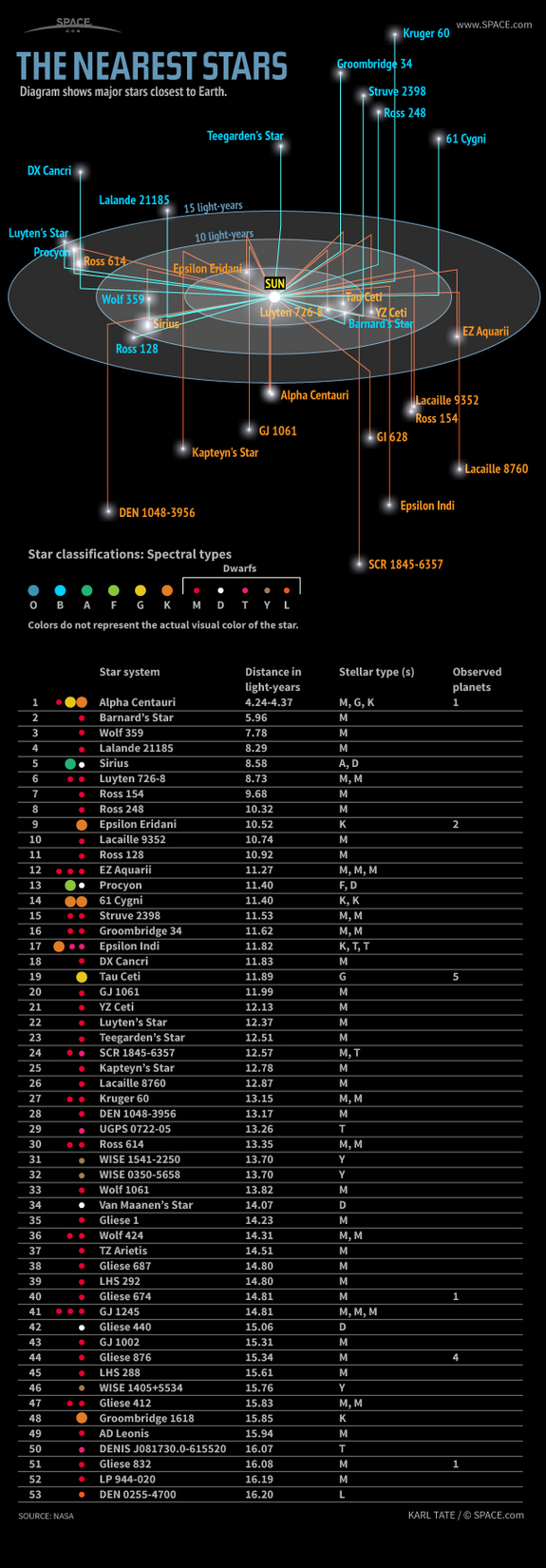
Learn about the nearest stars, their distances in light-years, spectral types and known planets, in this SPACE.com infographic.
Source SPACE.com: All about our solar system, outer space and exploration

I first saw this at The Nearest Stars by Randy Krum.

Curious if you see the same issues with the graphic that Randy does?

This type of display isn’t uncommon in amateur astronomy zines.

How would you change it?

My first thought was to lose the light year rings.

Why? Because I can’t rotate them visually with any degree of accuracy.

For example, how far do you think Kruger 60 is from Earth? More than 15 light years or less? (Follow the Kruger 60 link for the correct answer.)

If it makes you feel better, my answer to that question was wrong. 😉

Take another chance, what about SCR 1845-6357? (I got that one wrong as well.)

The information is correctly reported but I mis-read the graphic. How did you do?

Type Theory & Functional Programming [Types in Topic Maps]

Filed under: Mathematics,Programming,Types — Patrick Durusau @ 1:06 pm

Type Theory & Functional Programming by Simon Thompson.

From the introduction:

Constructive Type theory has been a topic of research interest to computer scientists, mathematicians, logicians and philosophers for a number of years. For computer scientists it provides a framework which brings together logic and programming languages in a most elegant and fertile way: program development and verification can proceed within a single system. Viewed in a different way, type theory is a functional programming language with some novel features, such as the totality of all its functions, its expressive type system allowing functions whose result type depends upon the value of its input, and sophisticated modules and abstract types whose interfaces can contain logical assertions as well as signature information. A third point of view emphasizes that programs (or functions) can be extracted from proofs in the logic.

Up until now most of the material on type theory has only appeared in proceedings of conferences and in research papers, so it seems appropriate to try to set down the current state of development in a form accessible to interested final-year undergraduates, graduate students, research workers and teachers in computer science and related fields – hence this book.

The book can be thought of as giving both a first and a second course in type theory. We begin with introductory material on logic and functional programming, and follow this by presenting the system of type theory itself, together with many examples. As well as this we go further, looking at the system from a mathematical perspective, thus elucidating a number of its important properties. Then we take a critical look at the profusion of suggestions in the literature about why and how type theory could be augmented. In doing this we are aiming at a moving target; it must be the case that further developments will have been made before the book reaches the press. Nonetheless, such an survey can give the reader a much more developed sense of the potential of type theory, as well as giving the background of what is to come.

The goal posts of type theory have moved since 1999, when this work was published, but the need to learn the foundations of type theory has not.

In a topic map context, consider the potential of types that define:

  1. applicable merging rules
  2. allowable sub-types
  3. permitted roles
  4. presence of other values (by type or value)

among other potential rules.

Preservation Vocabularies [3 types of magnetic storage medium?]

Filed under: Archives,Library,Linked Data,Vocabularies — Patrick Durusau @ 12:30 pm

Preservation Datasets

From the webpage:

The Linked Data Service is to provide access to commonly found standards and vocabularies promulgated by the Library of Congress. This includes data values and the controlled vocabularies that house them. Below are descriptions of each preservation vocabulary derived from the PREMIS standard. Inside each, a search box allows you to search the vocabularies individually .

New preservation vocabularies from the Library of Congress.

Your mileage will vary with these vocabularies.

Take storage for example.

As we all learned in school, there are only three kinds of magnetic “storage medium:”

  • hard disk
  • magnetic tape
  • TSM

😉

In case you don’t recognize TSM, it stands for IBM Tivoli Storage Manager.

Hmmmm, what about the twenty (20) types of optical disks?

Or other forms of magnetic media? Such as thumb drives, floppy disks, etc.

I pick “storage medium” at random.

Take a look at some of the other vocabularies and let me know what you think.

Please include links to more information in case the LOC decides to add more entries to its vocabularies.

I first saw this at: 21 New Preservation Vocabularies available at id.loc.gov.

June 29, 2013

Linked Data Glossary

Filed under: Glossary,Linked Data — Patrick Durusau @ 3:44 pm

Linked Data Glossary

Abstract:

This document is a glossary of terms defined and used to describe Linked Data, and its associated vocabularies and Best Practices. This document published by the W3C Government Linked Data Working Group as a Working Group Note, is intended to help information management professionals, Web developers, scientists and the general public better understand publishing structured data using Linked Data Principles.

A glossary of one hundred and thirty-two terms used with Linked Data.

Hortonworks Data Platform 2.0 Community…

Filed under: Hadoop YARN,Hortonworks — Patrick Durusau @ 3:38 pm

Hortonworks Data Platform 2.0 Community Preview Now Available

June 26, 2013—Hortonworks, a leading contributor and provider to enterprise Apache™ Hadoop®, today announced the availability of the Hortonworks Data Platform (HDP) 2.0 Community Preview and the launch of the Hortonworks Certification Program for Apache Hadoop YARN to accelerate the availability of YARN-based partner solutions. Based on the next evolution of Apache Hadoop, including the first functional Apache YARN framework that has been more than four years in the making, the 100-percent open source HDP 2.0 features the latest advancements from the open source community that are igniting a new wave of Hadoop innovation.

[Jumping to the chase]

Please join Hortonworks for a webinar on HDP 2.0 on Wednesday, July 10 at 10 a.m. PT / 1:00 p.m. ET. To register for the webinar, please visit: http://bit.ly/1226vAP.

Availability

Hortonworks Data Platform 2.0 Community Preview is available today as a downloadable single-node instance that runs inside a virtual machine, and also as a complete installation for deployment to distributed infrastructure. To download HDP 2.0, please visit: http://bit.ly/15DBbd1.

New in this release: Apache YARN, Apache Tex, and, Stinger.

Twitter visualizes billions of tweets…

Filed under: Tweets,Visualization — Patrick Durusau @ 2:31 pm

Twitter visualizes billions of tweets in artful, interactive 3D maps by Nathan Olivarez-Giles.

From the post:

On June 1st, Twitter created beautiful maps visualizing billions of geotagged tweets. Today, the social network is getting artsy once agsain, using the same dataset — which it calls Billion Strokes — to produce interactive elevation maps that render geotagged tweets in 3D. This time around, Twitter visualized geotagged tweets from San Francisco, New York, and Istanbul in maps that viewers can manipulate.

For each city map, Twitter gives users the option of adding eight different layers over the topography. Users can also change the size of the elevation differences mapped out, to get a better idea of where most tweets are sent from. The maps can be seen from either an overhead view, or on a horizontal plane. The resulting maps looking like harsh mountain ranges, but the peaks and valleys aren’t representative of the land — rather, a peak illustrates a high amount of tweets being sent from that location, while a trough displays an area where fewer tweets are sent. The whole thing was put together by Nicolas Belmonte, Twitter’s in-house data visualization scientist. You can check out the interactive maps on Twitter’s GitHub page.

I thought the contour view was the most interesting.

A visualization that shows tweet frequency by business address would be interesting as well.

Are more tweets sent from movie theaters or churches?

Big Data, n.:

Filed under: BigData,NSA — Patrick Durusau @ 1:00 pm

Big Data, n.: the belief that any sufficiently large pile of shit contains a pony with probability approaching 1

A tweet by James Grimmelman.

A perfect summary of the non-corrupt reasoning behind the PRISM project!

The corrupt reasons are about the money for contractors and agency bloat.

Indexing data in Solr…

Filed under: Apache Camel,Indexing,Solr — Patrick Durusau @ 12:44 pm

Indexing data in Solr from disparate sources using Camel by Bilgin Ibryam.

From the post:

Apache Solr is ‘the popular, blazing fast open source enterprise search platform’ built on top of Lucene. In order to do a search (and find results) there is the initial requirement of data ingestion usually from disparate sources like content management systems, relational databases, legacy systems, you name it… Then there is also the challenge of keeping the index up to date by adding new data, updating existing records, removing obsolete data. The new sources of data could be the same as the initial ones, but could also be sources like twitter, AWS or rest endpoints.

Solr can understand different file formats and provides fair amount of options for data indexing:

  1. Direct HTTP and remote streaming – allows you to interact with Solr over HTTP by posting a file for direct indexing or the path to the file for remote streaming.
  2. DataImportHandler – is a module that enables both full and incremental delta imports from relational databases or file system.
  3. SolrJ – a java client to access Solr using Apache Commons HTTP Client.

But in real life, indexing data from different sources with millions of documents, dozens of transformations, filtering, content enriching, replication, parallel processing requires much more than that. One way to cope with such a challenge is by reinventing the wheel: write few custom applications, combine them with some scripts or run cronjobs. Another approach would be to use a tool that is flexible and designed to be configurable and plugable, that can help you to scale and distribute the load with ease. Such a tool is Apache Camel which has also a Solr connector now.

(…)

Avoid reinventing the wheel: check mark

Robust software: check mark

Name recognition of Lucene/Solr: check mark

Name recognition of Camel: check mark

Do you see any negatives?

BTW, the examples that round out Bilgin’s post are quite useful!

June 28, 2013

Resources for Mapping Census Data

Filed under: Census Data,Mapping,Maps — Patrick Durusau @ 4:18 pm

Resources for Mapping Census Data by Katy Rossiter.

From the post:

Mapping data makes statistics come to life. Viewing statistics spatially can give you a better understanding, help identify patterns, and answer tough questions about our nation. Therefore, the Census Bureau provides maps, including digital files for use in a Geographic Information System (GIS), and interactive mapping capabilities in order to visualize our statistics.

Here are some of the mapping resources available from the Census Bureau:

(…)

That listing is just some of the resources that Katy covers in her post.

Combining your data or public data along with census data could result in a commercially successful map.

Neo4j 1.9.1 Released!

Filed under: Graphs,Neo4j — Patrick Durusau @ 4:08 pm

Neo4j 1.9.1 Released! by Jim Webber.

From the post:

It’s been a while since I was last let loose on the Neo4j blog, and I’ve marked my return with some good news. This week marks the release of Neo4j 1.9.1, numerically at least just a maintenance release in the 1.9 series.

However under the covers the engineering team has been working away developing more safety features for high-availability clustered deployments, squashing a couple of bugs, and improving SSL support for chained certificates and adding streaming support for paged traversals in the REST API.

If you’re a 1.9 user, you’re strongly recommended to upgrade to 1.9.1 and new users should proceed directly to 1.9.1. You won’t need any store upgrades going from 1.9 to 1.9.1 so it’s an easy upgrade.

Download at the usual place and happy graphing!

Unless you are otherwise occupied, this weekend sounds like the time to upgrade!

Are You Tracking Emails?

Filed under: Cypher,Graphs,Neo4j — Patrick Durusau @ 4:01 pm

neo4j/cypher: Aggregating relationships within a path by Mark Needham.

From the post:

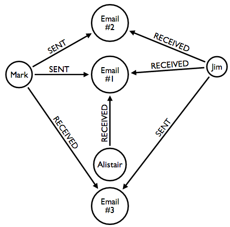
I recently came across an interesting use case of paths in a graph where we wanted to calculate the frequency of communication between two people by showing how frequently each emailed the other.

The model looked like this:

email graph

I can’t imagine why Mark would think about tracking emails between people. 😉

And as Mark says, the query he settles on isn’t guaranteed to scale.

Still, it is an interesting exercise.

Force Atlas 3D:…

Filed under: Gephi,Graphs,Visualization — Patrick Durusau @ 3:55 pm

3d graph

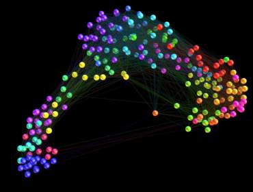
Force Atlas 3D: New plugin to visualize your graphs in 3D with Gephi by Clement Levallois.

From the post:

Hi, Just released today a plugin to visualize your networks in 3D with Gephi: Force Atlas 3D. Find it here, but you can install it directly from within Gephi, by following these instructions.

Your 2D networks are now visualized in the 3D space. Effects of depth and perspective make it easier to perceive the structure of your network.

“Which node is most central” can get a new answer, visually: nodes “nested” inside the network are surely interesting to look at.

This plugin was written on top of the Force Atlas 2 plugin, developed by Mathieu Jacomy et al. and that you can find installed by default in Gephi already. Thanks to them for this great work!

I think you will find this quite impressive!

Poor man’s “entity” extraction with Solr

Filed under: Entity Extraction,Solr — Patrick Durusau @ 3:38 pm

Poor man’s “entity” extraction with Solr by Erik Hatcher.

From the post:

My work at LucidWorks primarily involves helping customers build their desired solutions. Recently, more than one customer has inquired about doing “entity extraction”. Entity extraction, as defined on Wikipedia, “seeks to locate and classify atomic elements in text into predefined categories such as the names of persons, organizations, locations, expressions of times, quantities, monetary values, percentages, etc.” When drilling down into the specifics of the requirements from our customers, it turns out that many of them have straightforward solutions using built-in (Solr 4.x) components, such as:

  • Acronyms as facets
  • Key words or phrases, from a fixed list, as facets
  • Lat/long mentions as geospatial points

This article will describe and demonstrate how to do these, and as a bonus we’ll also extract URLs found in text too. Let’s start with an example input and the corresponding output all of the described techniques provides.

If you have been thinking about experimenting with Solr, Erik touches on some of its features by example.

Making Sense Out of Datomic,…

Filed under: Datomic,NoSQL — Patrick Durusau @ 3:24 pm

Making Sense Out of Datomic, The Revolutionary Non-NoSQL Database by Jakub Holy.

From the post:

I have finally managed to understand one of the most unusual databases of today, Datomic, and would like to share it with you. Thanks to Stuart Halloway and his workshop!

Why? Why?!?

As we shall see shortly, Datomic is very different from the traditional RDBMS databases as well as the various NoSQL databases. It even isn’t a database – it is a database on top of a database. I couldn’t wrap my head around that until now. The key to the understanding of Datomic and its unique design and advantages is actually simple.

The mainstream databases (and languages) have been designed around the following constraints of 1970s:

  • memory is expensive
  • storage is expensive
  • it is necessary to use dedicated, expensive machines

Datomic is essentially an exploration of what database we would have designed if we hadn’t these constraints. What design would we choose having gigabytes of RAM, networks with bandwidth and speed matching and exceeding harddisk access, the ability to spin and kill servers at a whim.

But Datomic isn’t an academical project. It is pragmatic, it wants to fit into our existing environments and make it easy for us to start using its futuristic capabilities now. And it is not as fresh and green as it might seem. Rich Hickey, the master mind behind Clojure and Datomic, has reportedly thought about both these projects for years and the designs have been really well thought through.

(…)

Deeply interesting summary of Datomic.

The only point I would have added about traditional databases was the requirement for normalized data. Placing load on designers and users instead of the software.

Pricing Dirty Data

Filed under: Data,Data Quality — Patrick Durusau @ 3:00 pm

Putting a Price on the Value of Poor Quality Data by Dylan Jones.

From the post:

When you start out learning about data quality management, you invariably have to get your head around the cost impact of bad data.

One of the most common scenarios is the mail order catalogue business case. If you have a 5% conversion rate on your catalogue orders and the average order price is £20 – and if you have 100,000 customer contacts – then you know that with perfect-quality data you should be netting about £100,000 per mail campaign.

However, we all know that data is never perfect. So if 20% of your data is inaccurate or incomplete and the catalogue cannot be delivered, then you’ll only make £80,000.

I always see the mail order scenario as the entry-level data quality business case as it’s common throughout textbooks, but there is another case I prefer: that of customer churn, which I think is even more compelling.

(…)

The absence of the impact of dirty data as a line item in the budget makes it difficult to argue for better data.

Dylan finds a way to relate dirty data to something of concern to every commercial enterprise, customers.

How much customers spend and how long they are retained, can be translated into line items (negative ones) in the budget.

Suggestions on how to measure the impact of a topic maps-based solution for delivery of information to customers?

Integrating controlled vocabularies… (webinar)

Filed under: AGROVOC,Ontology,Vocabularies — Patrick Durusau @ 2:38 pm

Integrating controlled vocabularies in information management systems : the new ontology plug-in”, 4th July

From the post:

The Webinar will introduce the new ontology plug-in developed in the context of the AIMS Community, how it works and the usage possibilities. It was created within the context of AgriOcean DSpace, however it is an independent plug-in and can be used in any other applications and information management systems.

The ontology plug-in searches multiple thesauri and ontologies simultaneously by using a web service broker (e.g. AGROVOC, ASFA, Plant Ontology, NERC-C19 ontology, and OceanExpert). It delivers as output a list of selected concepts, where each concept has a URI (or unique ID), a preferred label with optional language definition and the ontology from which the concepts has been selected. The application uses JAVA, Javascript and JQuery. As it is open software, developers are invited to reuse, enrich and enhance the existing source code.

We invite the participants of the webinar to give their view how thesauri and ontologies can be used in repositories and other types of information management systems and how the ontology plug-in can be further developed.

Date

4th of July 2013 – 16:00 Rome Time (Use Time Converter to calculate the time difference between your location and Rome , Italy)

On my must watch list.

Demo: http://193.190.8.15/ontwebapp/ontology.html

Source: https://code.google.com/p/ontology-plugin/

Imagine adapting the plugin to search for URIs in <a> elements and searching a database for the subjects they identify.

Basic Interactive Unix for Data Processing

Filed under: Data Analysis — Patrick Durusau @ 2:25 pm

Basic Interactive Unix for Data Processing

Abstract:

For most types of “conversational” data analysis problems, using Unix tools interactively is a superior alternative to downloading data files into a spreadsheet application (e.g. Excel) or writing one-shot custom scripts. The technique is to use combinations of standard Unix tools (and a very small number of general purpose Python scripts). This allows one to accomplish much more than might seem possible, especially with tabular data.

A reminder that not all data analysis requires you to pull out an app.

Apache Nutch v1.7 Released

Filed under: Nutch,Searching — Patrick Durusau @ 2:12 pm

Apache Nutch v1.7 Released

Main new feature is a pluggable indexing architecture that supports both Apache Solr and ElasticSearch.

Enjoy!

June 27, 2013

Getting $erious about $emantics

Filed under: Finance Services,Marketing,Semantics — Patrick Durusau @ 6:31 pm

State Street’s Chief Scientist on How to Tame Big Data Using Semantics by Bryan Yurcan.

From the post in Bank Systems & Technology:

Financial institutions are accumulating data at a rapid pace. Between massive amounts of internal information and an ever-growing pool of unstructured data to deal with, banks’ data management and storage capabilities are being stretched thin. But relief may come in the form of semantic databases, which could be the next evolution in how banks manage big data, says David Saul, Chief Scientist for Boston-based State Street Corp.

The semantic data model associates a meaning to each piece of data to allow for better evaluation and analysis, Saul notes, adding that given their ability to analyze relationships, semantic databases are particularly well-suited for the financial services industry.

“Our most important asset is the data we own and the data we act as a custodian for,” he says. “A lot of what we do for our customers, and what they do with the information we deliver to them, is aggregate data from different sources and correlate it to make better business decisions.”

Semantic technology, notes Saul, is based on the same technology “that all of us use on the World Wide Web, and that’s the concept of being able to hyperlink from one location to another location. Semantic technology does the same thing for linking data.”

Using a semantic database, each piece of data has a meaning associated with it, says Saul. For example, a typical data field might be a customer name. Semantic technology knows where that piece of information is in both the database and ununstructured data, he says. Semantic data would then allow for a financial institutions to create a report or dashboard that shows all of their interactions with that customer.

“The way it’s done now, you write data extract programs and create a repository,” he says. “There’s a lot of translation that’s required.”

Semantic data can also be greatly beneficial for banks in conducting risk calculations for regulatory requirements, Saul adds.

“That is something regulators are constantly looking for us to do, they want to know what our total exposure is to a particular customer or geographic area,” he says. “That requires quite a bit of development effort, which equals time and money. With semantic technology, once you describe the data sources, you can do that very, very quickly. You don’t have to write new extract programs.”

(…)

When banks and their technology people start talking about semantics, you know serious opportunities abound.

A growing awareness of the value of the semantics of data and data structures can’t help but create market opportunities for topic maps.

Big data needs big semantics!

GHCJS introduction – Concurrent Haskell in the browser

Filed under: Concurrent Programming,Functional Programming,Haskell — Patrick Durusau @ 6:17 pm

GHCJS introduction – Concurrent Haskell in the browser by Luite Stegeman.

From the post:

After many months of hard work, we are finally ready to show you the new version of GHCJS. Our goal is to provide a full-featured Haskell runtime in the browser, with features like threading, exceptions, weak references and STM, allowing you to run existing libraries with minimal modification. In addition we have some JavaScript-specific features to make communication with the JS world more convenient. GHCJS uses its own package database and comes with Cabal and Template Haskell support.

The new version (gen2) is almost a ground-up rewrite of the older (trampoline/plain) versions. We built on our experience with the trampoline code generator, by Victor Nazarov and Hamish Mackenzie. The most important changes are that we now use regular JavaScript objects to store Haskell heap objects (instead of JS closures), and that we have switched to explicit stacks in a JavaScript array. This helps reduce the amount of memory allocation considerably, making the resulting code run much faster. GHCJS now uses Gershom Bazerman’s JMacro library for generating JavaScript and for the Foreign Function Interface.

This post is a practical introduction to get started with GHCJS. Even though the compiler mostly works now, it’s far from finished. We’d love to hear some feedback from users and get some help preparing libraries for GHCJS before we make our first official release (planned to coincide with the GHC 7.8 release). I have listed some fun projects that you can help us with at the end of this post. Join #ghcjs on freenode for discussion with the developers and other users.

Functional programming in your browser.

Dissecting FITS files – The FITS extension & Astronomy

Filed under: Astroinformatics — Patrick Durusau @ 6:03 pm

Dissecting FITS files – The FITS extension & Astronomy by Rahul Poruri.

From the post:

FITS is a very common extension used in astronomy.

It stands for Flexible Image Transport System.

Literally any image or spectrum produced by any observatory or telescope in this world (or orbiting this world) will eventually be converted from RAW CCD format into a FITS file! I still don’t know how it caught on or what the advantages of the FITS extension are over the other types like .txt or .asc (ASCII) but hey, it’s the convention and i’d (and any one interested in pursuing Astronomy seriously) should learn how to go about using FITS files i.e accessing them, understanding the data structure in a FITS file and performing operations on them.

Astronomical data is usually pictures in one color. Yes. Only one color.

Yes. Everything you know IS a lie. All of the colored pictures of nebulae, star forming regions, the galaxy and what not are actually false-color images where images of the same object observed at different wavelengths are clubbed together – stacked – to create a false color image. Usually the color red stands for a H Balmer emission line, green corresponds to OII lines (singly ionized oxygen) etc etc. Because the H Balmer lines are at lower energy i.e higher wavelength in comparison to the OII lines, it is convenient to represent emission from the H nebulae as red!

A very good summary of tools for working with the FITS file format.

Knowledge of the FITS format is essential if you want to venture into astroinformatics.

Trying to get the coding Pig,

Filed under: BigData,Hadoop,Mahout,MapReduce,Pig,Talend — Patrick Durusau @ 3:00 pm

Trying to get the coding Pig, er – monkey off your back?

From the webpage:

Are you struggling with the basic ‘WordCount’ demo, or which Mahout algorithm you should be using? Forget hand-coding and see what you can do with Talend Studio.

In this on-demand webinar we demonstrate how you could become MUCH more productive with Hadoop and NoSQL. Talend Big Data allows you to develop in Eclipse and run your data jobs 100% natively on Hadoop… and become a big data guru over night. Rémy Dubois, big data specialist and Talend Lead developer, shows you in real-time:

  • How to visually create the ‘WordCount’ example in under 5 minutes
  • How to graphically build a big data job to perform sentiment analysis
  • How to archive NoSQL and optimize data warehouse usage

A content filled webinar! Who knew?

Be forewarned that the demos presume familiarity with the Talend interface and the demo presenter is difficult to understand.

From what I got out of the earlier parts of the webinar, very much a step in the right direction to empower users with big data.

Think of the distance between stacks of punch cards (Hadoop/MapReduce a few years ago) and the personal computer (Talend and others).

That was a big shift. This one is likely to be as well.

Looks like I need to spend some serious time with the latest Talend release!

Overview

Filed under: Interface Research/Design,News,UX — Patrick Durusau @ 2:08 pm

Overview: Visualization to connect the dots by Jonathan Stray.

Overview has a new UI!

It’s a screen shot and difficult to describe. Check it out!

About Overview:

Overview is intended to help journalists, researchers, and other curious people make sense of massive, disorganized collections of electronic documents. It’s a visualization and analysis tool designed for sets of documents, typically thousands of pages of material.

Overview applies natural language processing algorithms to automatically sort the documents into folders and sub-folders based on their topic. Like a table of contents, this organization helps you to understand “what’s in there?” This is more powerful than text search, because it helps you to find what you don’t even know to look for.

Overview has been used to analyze emails, a declassified document dumps, material from Wikileaks releases, social media posts, online comments, and more.

My question would be how difficult/easy it is to integrate connected dots from one project/reporter to another?

Or to search the semantics of dots discovered in a project?

Older Posts »

Powered by WordPress