Mapping Militant Selfies – Application of Entity Recognition/Extraction Methods to Generate Battlefield Data in Northern Syria (video) – presentation by Akin Unver.
From the seminar description:
As the Middle East goes through one of its most historic, yet painful episodes, the fate of the region’s Kurds have drawn substantial interest. Transnational Kurdish awakening—both political and armed—has attracted unprecedented global interest as individual Kurdish minorities across four countries, Turkey, Iraq, Iran, and Syria, have begun to shake their respective political status quo in various ways. In order to analyse this trend in a region in flux, this paper introduces a new methodology in generating computerised geopolitical data. Selfies of militants from three main warring non-state actors, ISIS, YPG and FSA, through February 2014 – February 2016, was sorted and operationalized through a dedicated repository of geopolitical events, extracted from a comprehensive open source archive of Turkish, Kurdish, Arabic, and Farsi sources, and constructed using entity extraction and recognition algorithms. These selfies were crosschecked against events related to conflict, such as unrest, attack, sabotage and bombings were then filtered based on human- curated lists of actors and locations. The result is a focused data set of more than 2000 events (or activity nodes) with a high level of geographical and temporal granularity. This data is then used to generate a series of four heat maps based on six-month intervals. They highlight the intensity of armed group events and the evolution of multiple fronts in the border regions of Turkey, Syria, Iraq and Iran.
Great presentation that includes the goal of:
With no reliance on ‘official’ (censored) data
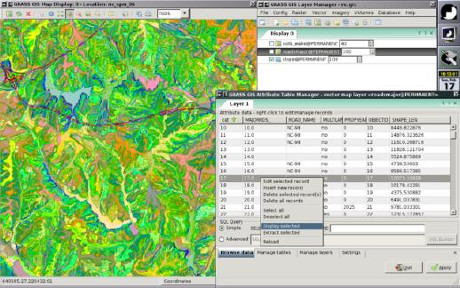
Unfortunately, the technical infrastructure isn’t touched upon nor were any links given. I have written to Professor Unver asking for further information.
Although Unver focuses on the Kurds, these techniques support ad-hoc battlefield data systems, putting irregular forces to an information parity with better funded adversaries.
Replace selfies with time-stamped, geo-located images of government forces, plus image recognition, with a little discipline you have a start towards a highly effective force even if badly out numbered.
If you are interested in more academic application of this technology, see:
Schrödinger’s Kurds: Transnational Kurdish Geopolitics In The Age Of Shifting Borders
Abstract:
As the Middle East goes through one of its most historic, yet painful episodes, the fate of the region’s Kurds have drawn substantial interest. Transnational Kurdish awakening—both political and armed—has attracted unprecedented global interest as individual Kurdish minorities across four countries, Turkey, Iraq, Iran, and Syria, have begun to shake their respective political status quo in various ways. It is in Syria that the Kurds have made perhaps their largest impact, largely owing to the intensification of the civil war and the breakdown of state authority along Kurdish-dominated northern borderlands. However, in Turkey, Iraq, and Iran too, Kurds are searching for a new status quo, using multiple and sometimes mutually defeating methods. This article looks at the future of the Kurds in the Middle East through a geopolitical approach. It begins with an exposition of the Kurds’ geographical history and politics, emphasizing the natural anchor provided by the Taurus and Zagros mountains. That anchor, history tells us, has both rendered the Kurds extremely resilient to systemic changes to larger states in their environment, and also provided hindrance to the materialization of a unified Kurdish political will. Then, the article assesses the theoretical relationship between weak states and strong non-states, and examines why the weakening of state authority in Syria has created a spillover effect on all Kurds in its neighborhood. In addition to discussing classical geopolitics, the article also reflects upon demography, tribalism, Islam, and socialism as additional variables that add and expand the debate of Kurdish geopolitics. The article also takes a big-data approach to Kurdish geopolitics by introducing a new geopolitical research methodology, using large-volume and rapid-processed entity extraction and recognition algorithms to convert data into heat maps that reveal the general pattern of Kurdish geopolitics in transition across four host countries.
A basic app should run on Tails, in memory, such that if your coordinating position is compromised, powering down (jerking out the power cord) destroys all the data.
Hmmm, encrypted delivery of processed data from a web service to the coordinator, such that their computer is only displaying data.
Other requirements?