I assume you are starting with DKIM-complete-podesta-1-18.txt.gz.
If you are starting with another source, you will need different instructions. 
First, remember from Clinton/Podesta Emails – Towards A More Complete Graph (Part 1) that I wanted to delete all the < and > signs from the text.
That’s easy enough (uncompress the text first):
sed 's/<//g' DKIM-complete-podesta-1-18.txt > DKIM-complete-podesta-1-18-01.txt
followed by:
sed 's/>//g' DKIM-complete-podesta-1-18-01.txt > DKIM-complete-podesta-1-18-02.txt
Here’s where we started:
001 00032251.eml|False|2010-10-06 18:29:52-04:00|Joshua Dorner <jdorner@americanprogress.org>|”‘bigcampaign@googlegroups.com'” <bigcampaign@googlegroups.com>|[big campaign] Follow-up Materials from Background Briefing on the Chamber’s Foreign Funding, fyi|<A28459BA2B4D5D49BED0238513058A7F012ADC1EF58F @CAPMAILBOX.americanprogresscenter.org>
002 00032146.eml|True|2015-04-14 18:19:46-04:00|Josh Schwerin <jschwerin@hillaryclinton.com>|hrcrapid <HRCrapid@googlegroups.com>|=?UTF-8?Q?NYT=3A_Hillary_Clinton=E2=80=99s_Chipotle_Order=3A_Above_Avera?= =?UTF-8?Q?ge?=|<CAPrY+5KJ=NG+Vs-khDVpe-L=bP5=qvPcZTS5FDam5LixueQsKA@mail.gmail.com>
Here’s the result after the first two sed scripts:
001 00032251.eml|False|2010-10-06 18:29:52-04:00|Joshua Dorner jdorner@americanprogress.org|”‘bigcampaign@googlegroups.com'” bigcampaign@googlegroups.com|[big campaign] Follow-up Materials from Background Briefing on the Chamber’s Foreign Funding, fyi|
A28459BA2B4D5D49BED0238513058A7F012ADC1EF58F
@CAPMAILBOX.americanprogresscenter.org
002 00032146.eml|True|2015-04-14 18:19:46-04:00|Josh Schwerin jschwerin@hillaryclinton.com|hrcrapid HRCrapid@googlegroups.com|=?UTF-8?Q?NYT=3A_Hillary_Clinton=E2=80=99s_Chipotle_Order=3A_Above_Avera?= =?UTF-8?Q?ge?=|CAPrY+5KJ=NG+Vs-khDVpe-L=bP5=qvPcZTS5FDam5LixueQsKA@mail.gmail.com
BTW, I increment the numbers of my result files, DKIM-complete-podesta-1-18-01.txt, DKIM-complete-podesta-1-18-02.txt, because when I don’t, I run different sed commands on the same original file, expecting a cumulative result.
That’s spelled – disappointment and wasted effort looking for problems that aren’t problems. Number your result files.
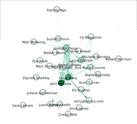
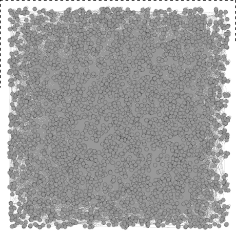
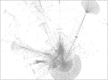
The nodes and edges mentioned in Clinton/Podesta Emails – Towards A More Complete Graph (Part 1):
Nodes
- Emails, message-id is ID and subject is label, make Wikileaks id into link
- From/To, email addresses are ID and name is label
- True/False, true/false as ID, True/False as labels
- Date, truncated to 2015-07-24 (example), date as id and label
Edges
- To/From – Edges with message-id (source) email-address (target) to/from (label)
- Verify – Edges with message-id (source) true/false (target) verify (label)
- Date – Edges with message-id (source) – date (target) date (label)
Am I missing anything? The longer I look at problems like this the more likely my thinking/modeling will change.
What follows is very crude, command line creation of the node and edge files. Something more elaborate could be scripted/written in any number of languages.
Our fields (numbered for reference) are:
ID – 1| Verified – 2| Date – 3| From – 4| To – 5| Subject -6| Message-Id – 7
You don’t have to take my word for it, try this:
awk 'FS="|" { print $7}' DKIM-complete-podesta-1-18-02.txt
The output prints to the console. Those all look like message-ids to me, well, with the exception of the one that reads ” 24 September.”
How much dirty data do you think is in the message-id field?
A crude starting assumption is that any message-id field without the “@” character is dirty.
Let’s try:
awk ‘FS = “|” { print $7} DKIM-complete-podesta-1-18-02.txt | grep -v @ | wc -l
Which means we are going to extract the 7th field, search (grep) over those results for the “@” sign, where the -v switch means only print lines that DO NOT match, and we will count those lines with wc -l.
Ready? Press return.
I get 594 “dirty” message-ids.
Here is a sampling:
…
Rolling Stone
TheHill
MSNBC, Jeff Weaver interview on Sanders health care plan and his Wall St. ad
Texas Tribune
20160120 Burlington, IA Organizing Event
start spreadin’ the news…..
Building Trades Union (Keystone XL)
Rubio Hits HRC On Cuba, Russia
2.19.2016
Sourcing Story
Drivers Licenses
Day 1
H1N1 Flu Shot Available
…
Those look an awful lot like subject lines to me. You?
I suspect those subject lines had the separator character “|” in those lines, before we extracted the data from the .eml files.
I’ve tried to repair the existing files but the cleaner solution is to return to the extraction script and the original email files.
More on that tomorrow!