Another Word For It Patrick Durusau on Topic Maps and Semantic Diversity

August 3, 2016

Interactive 3D Clusters of all 721 Pokémon Using Spark and Plotly

Filed under: Clustering,Plotly,Spark,Visualization — Patrick Durusau @ 10:26 am

Interactive 3D Clusters of all 721 Pokémon Using Spark and Plotly by Max Woolf.

721-pokemon-460

My screen capture falls far short of doing justice to the 3D image, not to mention it isn’t interactive. See Max’s post if you really want to appreciate it.

From the post:

There has been a lot of talk lately about Pokémon due to the runaway success of Pokémon GO (I myself am Trainer Level 18 and on Team Valor). Players revel in the nostalgia of 1996 by now having the ability catching the original 151 Pokémon in real life.

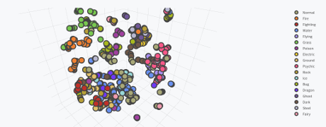
However, while players most-fondly remember the first generation, Pokémon is currently on its sixth generation, with the seventh generation beginning later this year with Pokémon Sun and Moon. As of now, there are 721 total Pokémon in the Pokédex, from Bulbasaur to Volcanion, not counting alternate Forms of several Pokémon such as Mega Evolutions.

In the meantime, I’ve seen a few interesting data visualizations which capitalize on the frenzy. A highly-upvoted post on the Reddit subreddit /r/dataisbeautiful by /u/nvvknvvk charts the Height vs. Weight of the original 151 Pokémon. Anh Le of Duke University posted a cluster analysis of the original 151 Pokémon using principal component analysis (PCA), by compressing the 6 primary Pokémon stats into 2 dimensions.

However, those visualizations think too small, and only on a small subset of Pokémon. Why not capture every single aspect of every Pokémon and violently crush that data into three dimensions?

If you need encouragement to explore the recent release of Spark 2.0, Max’s post that in abundance!

Caveat: Pokémon is popular outside of geek/IT circles. Familiarity with Pokémon may result in social interaction with others and/or interest in Pokémon. You have been warned.

April 8, 2015

Four Mistakes To Avoid If You’re Analyzing Data

Filed under: Data Analysis,Plotly — Patrick Durusau @ 9:54 am

Four Mistakes To Avoid If You’re Analyzing Data

The post highlights four (4) common mistakes in analyzing data, with visualizations.

Four (4) seems like a low number, at least in my personal experience. 😉

Still, I am encouraged that the post concludes with:

Analyzing data is not easy. We hope this post helps. Has your team made or avoided any of these mistakes? Do you have suggestions for a future post? Let us know; we’re @plotlygraphs, or email us at feedback at plot dot ly.

I just thought of a common data analysis mistake, reliance on source or authority.

As we saw in Photoshopping Science? Where Was Peer Review?, apparently peer reviewers were too impressed by the author’s status to take a close look at photos submitted with his articles. On later and closer examination, those same photos, as published, revealed problems that should have been caught by the peer reviewers.

Do you spot check all your data sources?

March 2, 2015

CartoDB and Plotly Analyze Earthquakes

Filed under: CartoDB,Mapping,Maps,Plotly — Patrick Durusau @ 8:06 pm

CartoDB and Plotly Analyze Earthquakes

From the post:

CartoDB lets you easily make web-based maps driven by a PostgreSQL/PostGIS backend, so data management is easy. Plotly is a cloud-based graphing and analytics platform with Python, R, & MATLAB APIs where collaboration is easy. This IPython Notebook shows how to use them together to analyze earthquake data.

Assuming your data/events have geographic coordinates, this post should enable you to plot that information as easy as earthquakes.

For example, if you had traffic accident locations, delays caused by those accidents and weather conditions, you could plot where the most disruptive accidents happen and the weather conditions in which they occur.

Powered by WordPress