Another Word For It Patrick Durusau on Topic Maps and Semantic Diversity

December 6, 2016

The Great Scone Map…

Filed under: Food,Mapping,Maps — Patrick Durusau @ 5:52 pm

uk-scone-map-460

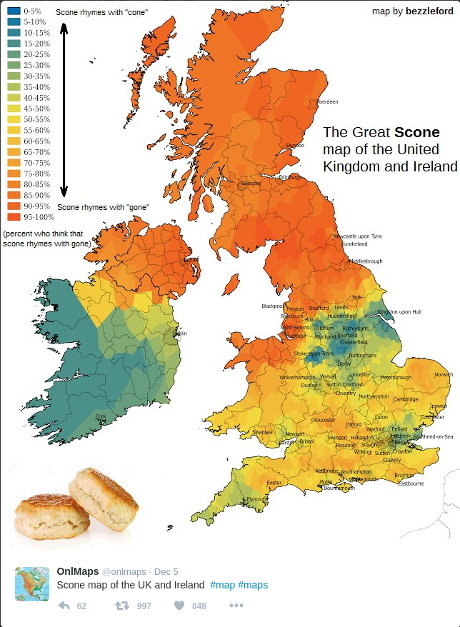
I was deeply disappointed to find the “Great Scone Map” represents differing pronunciations of “scone.”

Reading hurriedly, I thought perhaps it was a map of scone recipes. 😉

Suggestions of maps of biscuit (a small, typically round cake of bread leavened with baking powder, baking soda, or sometimes yeast) recipes?

To avoid confusion over the term “biscuit,” ask it the “biscuit” in question is eaten by the British. If yes, then odds are it not a “biscuit” in the North American sense of the word.

There’s an a/b test for you.

Put a British “biscuit” along side a buttered Popeyes biscuit and see which one is chosen more often.

Eat several Popeyes biscuits before starting to avoid being stuck with British “biscuits.”

August 18, 2016

National Food Days

Filed under: Food,Graphics,Visualization — Patrick Durusau @ 2:12 pm

All the National Food Days by Nathan Yau.

Nathan has created an interactive calendar of all the U.S. national food days.

Here is a non-working replica to entice you to see his interactive version:

national-food-days-460

What’s with July having a national food day every day?

Lobby for your favorite food and month!

April 27, 2016

Topic Map Fooddie Alert!

Filed under: Food,Topic Maps — Patrick Durusau @ 4:02 pm

Our Tagged Ingredients Data is Now on GitHub by Erica Greene and Adam McKaig.

From the post:

Since publishing our post about “Extracting Structured Data From Recipes Using Conditional Random Fields,” we’ve received a tremendous number of requests to release the data and our code. Today, we’re excited to release the roughly 180,000 labeled ingredient phrases that we used to train our machine learning model.

You can find the data and code in the ingredient-phrase-tagger GitHub repo. Instructions are in the README and the raw data is in nyt-ingredients-snapshot-2015.csv.

Reaching a critical mass for any domain is a stumbling block for any topic map. Erica and Adam kick start your foodie topic map adventures with ~ 180,000 labeled ingredient phrases.

You are looking at the end result of six years of data mining and some clever programming so be sure to:

  1. Always acknowledge this project along with Erica and Alex in your work.
  2. Contribute back improved data.
  3. Contribute back improvements on the conditional random fields (CRF).
  4. Have a great time extending this data set!

Possible extensions include automatic translation (with mapping of “equivalent” terms), melding in the USDA food database (it’s formally known as: USDA National Nutrient Database for Standard Reference) with nutrient content information on ~8,800 foods, and, of course, the “correct” way to make a roux as reflected in your mother’s cookbook.

It is, unfortunately, true that you can buy a mix for roux in a cardboard box. That requires a food processor to chop up the cardboard to enjoy with the roux that came in it. I’m originally from Louisiana and the thought of a roux mix is depressing, if not heretical.

December 19, 2013

Fascinating food networks, in neo4j

Filed under: Food,Graphs,Neo4j — Patrick Durusau @ 7:38 pm

Fascinating food networks, in neo4j by Rik Van Bruggen.

From the post:

When you’re passionate about graphs like I am, you start to see them everywhere. And as we are getting closer to the food-heavy season of the year, it’s perhaps no coincidence that this graph I will be introducing in this blogpost – is about food.

A couple of weeks ago, when I woke up early (!) Sunday morning to get “pistolets” and croissants for my family from our local bakery, I immediately took notice when I saw a graph behind the bakery counter. It was a “foodpairing” graph, sponsored by the people of Puratos – a wholesale provider of bakery products, grains, etc. So I get home and start googling, and before you know it I find some terribly interesting research by Yong-Yeol (YY) Ahn, featured in a Wired article, and in Scientific American, and in Nature. This researcher had done some fascinating work in understanding al 57k recipes from Epicurious, Allrecipes and Menupan, their composing ingredients and ingredient categories, their origin and – perhaps most fascinating of all – their chemical compounds.

Rik walks you through acquiring some of these datasets, cleaning them up and then loading the datasets into Neo4j.

My only suggestion is that before you start browsing the dataset that you have cookies and milk within easy reach. 😉

December 29, 2011

Backbone of the flavor network

Filed under: Food,Graphs,Networks — Patrick Durusau @ 9:12 pm

Backbone of the flavor network by Nathan Yau at FlowingData.

From the post:

Food flavors across cultures and geography vary a lot. Some cuisines use a lot of scallion and ginger, whereas another might use a lot of onion and butter. Then again, everyone seems to use garlic. Yong-Yeol Ahn, et al. took a closer look at what makes food taste different, breaking ingredients into flavor compounds and examining what the ingredients had in common. A flavor network was the result:

Each node denotes an ingredient, the node color indicates food category, and node size reflects the ingredient prevalence in recipes. Two ingredients are connected if they share a significant number of flavor compounds, link thickness representing the number of shared compounds between the two ingredients. Adjacent links are bundled to reduce the clutter.

Mushrooms and liver are on the edges, out on their lonesome.

You really need to see the graph/network with the post.

I am not ready to throw over my Julia Child’s cookbook in favor of using it to create recipes but it is an impressive piece of work.

Certainly could figure into being data that is merged into a recipe topic map to explain (possibly) substitutions or possible substitutions of ingredients.

Any foodies in the house?

Powered by WordPress