Another Word For It Patrick Durusau on Topic Maps and Semantic Diversity

September 11, 2018

Middle Earth Map Style

Filed under: Cartography,Mapping,Maps — Patrick Durusau @ 4:23 pm

Middle Earth Map Style by John Nelson.

From the post:

Here are a couple maps made to resemble the epic collaboration of JRR Tolkien and Pauline Baynes. I would consume every little pen stroke as a kid, pouring over the insert maps of Middle Earth in my sister’s LOTR set (which mysteriously now live on my shelf)…

If you are interested in trying out making digital Middle Earths, here is an ArcGIS Pro style file with all the doodads you’ll need. If you don’t run that, then here is a zip file with all of the textures and graphics that you can use to symbolize your layers.

The format of my blog would mar examples of Nelson’s maps beyond recognition. Visit them at Nelson’s site and spread word of them and the aids for producing more such maps.

Any bets on where I would locate Mordor on a map of the United States? 😉

February 1, 2017

Flattening the Earth: Two Thousand Years of Map Projections

Filed under: Cartography,Mapping,Maps — Patrick Durusau @ 5:08 pm

Flattening the Earth: Two Thousand Years of Map Projections by John P. Snyder. (Amazon link)

From the Amazon description:

As long as there have been maps, cartographers have grappled with the impossibility of portraying the earth in two dimensions. To solve this problem mapmakers have created hundreds of map projections, mathematical methods for drawing the round earth on a flat surface. Yet of the hundreds of existing projections, and the infinite number that are theoretically possible, none is perfectly accurate.

Flattening the Earth is the first detailed history of map projections since 1863. John P. Snyder discusses and illustrates the hundreds of known projections created from 500 B.C. to the present, emphasizing developments since the Renaissance and closing with a look at the variety of projections made possible by computers.

The book contains 170 illustrations, including outline maps from original sources and modern computerized reconstructions. Though the text is not mathematically based, a few equations are included to permit the more technical reader to plot some projections. Tables summarize the features of nearly two hundred different projections and list those used in nineteenth-and twentieth-century atlases.

“This book is unique and significant: a thorough, well-organized, and insightful history of map projections. Snyder is the world’s foremost authority on the subject and a significant innovator in his own right.”—Mark Monmonier, author of How to Lie with Maps and Mapping It Out: Expository Cartography for the Humanities and Social Sciences.

Perhaps not immediately useful for resistance but it isn’t healthy to remain in a state of rage all the time.

Delving into the history of cartography will help develop your understanding of and skills with map projections.

Government maps and projections represent the government’s hopes and wishes.

Shouldn’t you use projections that represent yours?

November 28, 2016

CIA Cartography [Comparison to other maps?]

Filed under: Cartography,Government Data,Intelligence,Maps — Patrick Durusau @ 10:15 pm

CIA Cartography

From the webpage:

Tracing its roots to October 1941, CIA’s Cartography Center has a long, proud history of service to the Intelligence Community (IC) and continues to respond to a variety of finished intelligence map requirements. The mission of the Cartography Center is to provide a full range of maps, geographic analysis, and research in support of the Agency, the White House, senior policymakers, and the IC at large. Its chief objectives are to analyze geospatial information, extract intelligence-related geodata, and present the information visually in creative and effective ways for maximum understanding by intelligence consumers.

Since 1941, the Cartography Center maps have told the stories of post-WWII reconstruction, the Suez crisis, the Cuban Missile crisis, the Falklands War, and many other important events in history.

There you will find:

Cartography Tools 211 photos

Cartography Maps 1940s 22 photos

Cartography Maps 1950s 14 photos

Cartography Maps 1960s 16 photos

Cartography Maps 1970s 19 photos

Cartography Maps 1980s 12 photos

Cartography Maps 1990s 16 photos

Cartography Maps 2000s 16 photos

Cartography Maps 2010s 15 photos

The albums have this motto at the top:

CIA Cartography Center has been making vital contributions to our Nation’s security, providing policymakers with crucial insights that simply cannot be conveyed through words alone.

President-elect Trump is said to be gaining foreign intelligence from sources other than his national security briefings. Trump is ignoring daily intelligence briefings, relying on ‘a number of sources’ instead. That report is based on a Washington Post account, which puts its credibility somewhere between a conversation overhead in a laundry mat and a stump speech by a member of Congress.

Assuming Trump is gaining intelligence from other sources, just how good are other sources of intelligence?

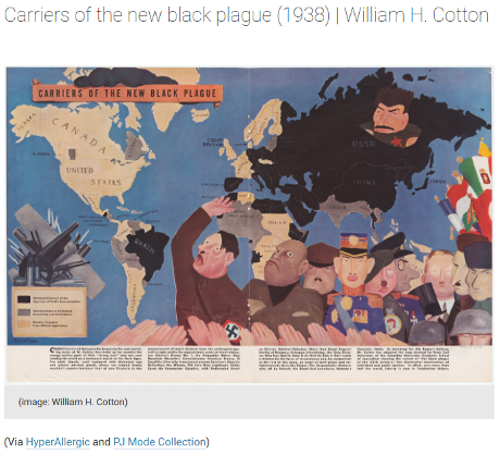
This release of maps by the CIA, some 160 maps spread from the 1940’s to the 2010’s, provides one axis for evaluating CIA intelligence versus what was commonly known at the time.

As a starting point, may I suggest: Image matching for historical maps comparison by C. Balletti and F. Guerrae, Perimetron, Vol. 4, No. 3, 2009 [180-186] www.e-perimetron.org | ISSN 1790-3769?

Abstract:

In cartographic heritage we suddenly find maps of the same mapmaker and of the same area, published in different years, or new editions due to integration of cartographic, such us in national cartographic series. These maps have the same projective system and the same cut, but they present very small differences. The manual comparison can be very difficult and with uncertain results, because it’s easy to leave some particulars out. It is necessary to find an automatic procedure to compare these maps and a solution can be given by digital maps comparison.

In the last years our experience in cartographic data processing was opted for find new tools for digital comparison and today solution is given by a new software, ACM (Automatic Correlation Map), which finds areas that are candidate to contain differences between two maps. ACM is based on image matching, a key component in almost any image analysis process.

Interesting paper but it presupposes a closeness of the maps that is likely to be missing when comparing CIA maps to other maps of the same places and time period.

I am in the process of locating other tools for map comparison.

Any favorites you would like to suggest?

September 17, 2016

How Mapmakers Make Mountains Rise Off the Page

Filed under: Cartography,Graphics,Mapping,Maps,Visualization — Patrick Durusau @ 10:34 am

How Mapmakers Make Mountains Rise Off the Page by Greg Miller.

From the post:

The world’s most beautiful places are rarely flat. From the soaring peaks of the Himalaya to the vast chasm of the Grand Canyon, many of the most stunning sites on Earth extend in all three dimensions. This poses a problem for mapmakers, who typically only have two dimensions to work with.

Fortunately, cartographers have some clever techniques for creating the illusion of depth, many of them developed by trial and error in the days before computers. The best examples of this work use a combination of art and science to evoke a sense of standing on a mountain peak or looking out an airplane window.

One of the oldest surviving maps, scratched onto an earthenware plate in Mesopotamia more than 4,000 years ago, depicts mountains as a series of little domes. It’s an effective symbol, still used today in schoolchildren’s drawings and a smartphone emoji, but it’s hardly an accurate representation of terrain. Over the subsequent centuries, mapmakers made mostly subtle improvements, varying the size and shape of their mountains, for example, to indicate that some were bigger than others.

But cartography became much more sophisticated during the Renaissance. Topographic surveys were done for the first time with compasses, measuring chains, and other instruments, resulting in accurate measurements of height. And mapmakers developed new methods for depicting terrain. One method, called hachuring, used lines to indicate the direction and steepness of a slope. You can see a later example of this in the 1807 map below of the Mexican volcano Pico de Orizaba. Cartographers today refer (somewhat dismissively) to mountains depicted this way as “woolly caterpillars.”

Stunning illusions of depth on maps, creating depth illusions in 2 dimensions (think computer monitors), history of map making techniques, are all reasons to read this post.

What seals it for me is that the quest for the “best” depth illusion continues. It’s not a “solved” problem. (No spoiler, see the post.)

Physical topography to one side, how are you going to bring “depth” to your topic map?

Some resources in a topic map may have great depth and others, unfortunately, may be like Wikipedia articles marked as:

This article has multiple issues.

How do you define and then enable navigation of your topic maps?

September 12, 2016

Persuasive Cartography

Filed under: Cartography,Mapping,Maps,Persuasion — Patrick Durusau @ 8:12 pm

Vintage Infodesign [161]: More examples of persuasive cartography, diagrams and charts from before 1960 by Tiago Veloso.

From the post:

A recurrent topic here on Vintage InfoDesign is “persuasive cartography” – the use of maps to influence and in many cases, deceive. We showcased examples of these maps here and here, with a special mention to the PJ Mode Collection at Cornell University Library. The collection was donated to Cornell back in 2014, and until now more than 300 examples are available online in high resolution.

A must for all of those interested in the subject, and we picked a few examples to open this post, courtesy of Allison Meier, who published a rente article about the PJ Mode Collection over at Hyperallergic.

new-black-plague-460

Re-reading The Power of Maps (1992) by Denis Wood, in preparation to read Rethinking The Power of Maps (2010), also by Denis Wood, has made me acutely aware of aspersions such as:

“persuasive cartography” – the use of maps to influence and in many cases, deceive.

I say “aspersion” because Wood makes the case that all maps, with no exceptions, are the results of omissions, characterizations, enhancements, emphasis on some features and not others, for stated and/or unstated purposes.

Indeed, all of The Power of Maps (1992) is devoted to teasing out, with copious examples, where a user of a map may fail to recognize the “truth” of any map, is a social construct in a context shaped by factors known and unknown.

I characterize maps I disagree with as being deceptive, disingenuous, inaccurate, etc., but doesn’t take away from Wood’s central point that all maps are acts of persuasion.

The critical question being: Do you support the persuasion a map is attempting to make?

When I teach topic maps again I will make The Power of Maps (1992) required reading.

It is an important lesson to realize that any map, even a topic map, need only map so much of the territory or domain, as is sufficient for the task at hand.

A topic maps for nuclear physics won’t have much in common with one for war criminals of the George W. Bush and Barack Obama administrations.

Moreover, even topic maps of the same subject domain, may or may not merge in a meaningful way.

The idea of useful merger of arbitrary topic maps, like the idea of “objective maps,” is a false one that serves no useful purpose.

Say rather that topic maps can make enough information explicit about subjects to determine if merging will be meaningful to one or more users of a topic map. That alone is quite a feat.

August 11, 2016

Eduard Imhof – Swiss Cartographer (Video)

Filed under: Cartography,Mapping,Maps,Visualization — Patrick Durusau @ 3:49 pm

Eduard Imhof – Swiss Cartographer

A tv documentary on the Swiss cartographer Eduard Imhof.

In Swiss German but this English sub-title caught my eye:

But what can be extracted again from the map is also important.

A concern that should be voiced with attractive but complex visualizations.

The production of topographical maps at differing scales is a recurring theme in the video.

How to visualize knowledge at different scales is an open question. Not to mention an important one as more data becomes available for visualization.

Imhof tells a number of amusing anecdotes, including answering the question: Which two cantons in Switzerland have the highest density of pigs?

Enjoy!

For background:

Virtual Library Eduard Imhof

Eduard Imhof (1895-1986) was professor of cartography at the Swiss Federal Institute of Technology Zurich from 1925 – 1965. His fame far beyond the Institute of Technology was based on his school maps and atlases. In 1995 it was 100 years since his birthday. On this occasion several exhibitions celebrated his life and work, among others in Zurich, Bern, Bad Ragaz, Küsnacht/ZH, Barcelona, Karlsruhe and Berlin. The last such exhibition took place in summer 1997 in the Graphische Sammlung of the ETH. There it was possible to show a large number of maps and pictures in the original. At the conclusion of the exhibition Imhof’s family bequested his original works to the ETH-Bibliothek Zurich. Mrs. Viola Imhof, the widow of Eduard Imhof, being very much attached to his work, had a major part in making it accessible to the public.

Imhof wie ein Kartographische Rockstar

Eduard Imhof was born in Schiers on 25 Jan 1895 to the geographer Dr. Eduard Imhof and his wife Sophie.1 At the age of 19 he enrolled in ETH Zürich,2 and after several interruptions for military service, was awarded a geodesist/surveyor diploma in 1919.

He returned to ETH as an assistant to his mentor Prof. Fridolin Becker, himself a cartographic god widely viewed as the inventor of the Swiss style shaded relief map.3 In 1925, the year after Becker’s death, Imhof became an assistent professor and founded the Kartographische Institut (Institute of Cartography). Although the Institute was initially little more than a hand-painted sign above his small office, it was nevertheless the first of its kind in the world.

In 1925 he produced his first major work – the Schulkarte der Schweiz 1:500 000 (the School map of Switzerland). Over the years he would update the national school map several times as well as produce school maps for nearly half of the cantons in the Federation. He even did the school map for the Austrian Bundesländer of Vorarlberg. (footnotes omitted)

July 20, 2016

The History of Cartography

Filed under: Cartography,History,Mapping,Maps — Patrick Durusau @ 8:02 pm

The History of Cartography

From the webpage:

The first volume of the History of Cartography was published in 1987 and the three books that constitute Volume Two appeared over the following eleven years. In 1987 the worldwide web did not exist, and since 1998 book publishing has gone through a revolution in the production and dissemination of work. Although the large format and high quality image reproduction of the printed books (see right column) are still well-suited to the requirements for the publishing of maps, the online availability of material is a boon to scholars and map enthusiasts.

On this site the University of Chicago Press is pleased to present the first three volumes of the History of Cartography in PDF format. Navigate to the PDFs from the left column. Each chapter of each book is a single PDF. The search box on the left allows searching across the content of all the PDFs that make up the first six books.

Links to the parts, which are then divided into separate PDF files of each chapter:

Volume One: Cartography in Prehistoric, Ancient, and Medieval Europe and the Mediterranean

Volume Two: Book 1: Cartography in the Traditional Islamic and South Asian Societies

Volume Two: Book 2: Cartography in the Traditional East and Southeast Asian Societies

Volume Two: Book 3: Cartography in the Traditional African, American, Arctic, Australian, and Pacific Societies

Volume Three: Cartography in the European Renaissance, Part 1

Volume Three: Cartography in the European Renaissance, Part 2

Unless you want to index the parts for yourself, remember the search box at this site that searches across all six volumes.

This can be a real time sink, deeply educational but a time sink none the less.

April 2, 2016

2.95 Million Satellite Images (Did I mention free?)

Filed under: Cartography,Image Processing,Image Understanding,Maps — Patrick Durusau @ 8:40 pm

NASA just released 2.95 million satellite images to the public — here are 21 of the best by Rebecca Harrington.

From the post:

An instrument called the Advanced Spaceborne Thermal Emission and Reflection Radiometer — or ASTER, for short — has been taking pictures of the Earth since it launched into space in 1999.

In that time, it has photographed an incredible 99% of the planet’s surface.

Although it’s aboard NASA’s Terra spacecraft, ASTER is a Japanese instrument and most of its data and images weren’t free to the public — until now.

NASA announced April 1 that ASTER’s 2.95 million scenes of our planet are now ready-to-download and analyze for free.

With 16 years’ worth of images, there are a lot to sort through.

One of Rebecca’s favorites:

andes-mountains

You really need to select that image and view it at full size. I promise.

The Andes Mountains. Colors reflect changes in surface temperature, materials and elevation.

March 22, 2016

Mapping Mountains – Tangram

Filed under: Cartography,Mapping,Maps,Military — Patrick Durusau @ 8:15 pm

Mapping Mountains by Peter Richardson.

From the post:

I’ve been spending a lot of time over the mountains of Northern California lately. To view mountains from above is to journey through time itself: over ancient shorelines, the trails of glaciers, the marks of countless seasons, and the front lines of perpetual tectonic struggle. Fly with me now, on a tour through the world of elevation data:

A stunning display of mapping technology!

Peter starts with an illustrated history of the depiction of elevation on maps, including a map that was a declared to be a military secret!

It’s a quick romp that leads to “Tangram functionality” which is described elsewhere as:

Tangram is a map renderer designed to grant you ludicrous levels of control over your map design. By drawing vector tiles live in a web browser, it allows real-time map design, display, and interactivity.

Using WebGL, Tangram saddles and rides your graphics card into a new world of cartographic exploration. Animated shaders, 3D buildings, and dynamic filtering can be combined to produce effects normally seen only in science fiction.

Map styles, data filters, labels, and even graphics card code can be defined in a human-readable and -writable plaintext scene file, and a JavaScript API permits direct interactive control of the style.

The balance of the post is a lengthy demonstration of Tangram that ends in a call for test pilots!

Tangram reminded of the Art of War by Sun Tzu, where it reads:

All armies prefer high ground to low and sunny places to dark.

Which should now read:

All armies prefer Tangram map renderers to all others.

Seriously. Protesters, direct action movements, irregulars, etc. should take a long look at this post.

I first saw this in a tweet by Lynn Cherny.

October 30, 2015

Free Your Maps from Web Mercator!

Filed under: CartoDB,Cartography,Maps,Projection — Patrick Durusau @ 4:51 pm

Free Your Maps from Web Mercator! by Mamata Akella.

From the post:

Most maps that we see on the web use the Web Mercator projection. Web Mercator gained its popularity because it provides an efficient way for a two-dimensional flat map to be chopped up into seamless 256×256 pixel map tiles that load quickly into the rectangular shape of your browser.

If you asked a cartographer which map projection you should choose for your map, most of the time the answer would not be Web Mercator. What projection you choose depends on your map’s extent, the type of data you are mapping, and as with all maps, the story you want to tell.

Well, get excited because with a few lines of SQL in CartoDB, you can free your maps from Web Mercator!

Not only can you choose from a variety of projections at CartoDB but you can also define your own projections!

Mamata’s post walks you through these new features and promises that more detailed posts are to follow with “advanced cartographic effects on a variety of maps….”

You are probably already following the CartoDB blog but if not…, well today is a good day to start!

October 23, 2015

Information Cartography

Filed under: Cartography,Information Theory — Patrick Durusau @ 8:29 pm

Information Cartography by Carlos Guestrin and Eric Horvitz. (cacm.acm.org/magazines/2015/11/193323)

Brief discussion of the CACM paper that I think will capture your interest.

From the introduction:

We demonstrate that metro maps can help people understand information in many areas, including news stories, research areas, legal cases, even works of literature. Metro maps can help them cope with information overload, framing a direction for research on automated extraction of information, as well as on new representations for summarizing and presenting complex sets of interrelated concepts.

Spend some time this weekend with this article and its references.

More to follow next week!

June 18, 2015

Thematic Cartography Guide

Filed under: Cartography,Mapping,Maps — Patrick Durusau @ 8:29 pm

Thematic Cartography Guide

From the webpage:

Welcome! In this short guide we share some insights and tips for making thematic maps. Our goal is to cover the important concepts in cartography and flag the important decision points in the map-making process. As with many activities in life, there isn’t always a single best answer in cartography, and in those cases we’ve tried to outline some of the pros and cons to different solutions.

This is by no means a replacement for a full textbook on cartography; rather it is a quick reference guide for those moments when you’re stumped, unsure of what to do next, or unfamiliar with the terminology. While the recommendations on these pages are short and not loaded with academic references, please appreciate that they represent a thoughtful synthesis of decades of map-making research.

This guide was written by Axis Maps, adapted from documentation written for indiemapper in 2010. However, the content here is about general cartography principles, not software-specific tips. To see the material in its original context, visit indiemapper and its help pages.

If that doesn’t sound exciting, perhaps this will:

Thematic maps are meant not simply to show locations, but rather to show attributes or statistics about places, spatial patterns of those attributes, and relationships between places. For example, while a reference map might show the locations of cities, a thematic map might also represent the population of those cities. It’s the difference between mapping places and mapping data. This site is about thematic maps, describing some of the different types and basic principles.

Hmmm, data about places? Relationships? That’s starting to sound suspiciously like a topic map expressed in a different vocabulary.

The same principles apply, in addition to places on a geographic grid, you can have subjects that exist only on your own intellectual grid, arranged in relationships as you see fit.

Over the years you have no doubt seen a number of offenses against the art of presentation in the name of topic maps. You have the power to break from that tradition. Seeing what works in other mapping domains is one place to start.

Where else would you look for fresh ideas and themes?

May 28, 2015

Understanding Map Projections

Filed under: Cartography,Geography,Mapping,Maps — Patrick Durusau @ 3:22 pm

Understanding Map Projections by Tiago Veloso.

From the post:

Few subjects are so controversial – or at least, misunderstood- in cartography as map projections, especially if you’re taking your first steps in this field. And that’s simply because every flat map misrepresents the surface of the Earth in some way. So, in this matter, your work in map-mapping is basically to choose the best projection that suits your needs and reduces the distortion of the most important features you are trying to show/highlight.

But it’s not because you don’t have enough literature about it. There are actually a bunch of great resources and articles that will help you choose the correct projection for your map, so we decided to bring together a quick reference list.

Hope you enjoy it!

I rather like the remark:

…reduces the distortion of the most important features you are trying to show/highlight.

In part because I read it as a concession that all projections are distortions, including those that suit our particular purposes.

I would argue that all maps are at their inception distortions. They never represent every detail of what is being mapped and that implies a process of selective omission. Someone will consider what was omitted important, but it was less important than some other detail to the map maker.

Would the equivalent of projections for topic maps be choice of associations between topics or choices of subjects? Or both?

I lean towards the choice of associations and subjects because graphical rendering of associations creates impressions of the existence and strengths of relationships. Subjects because they are the anchors of the associations.

Speaking of distortion, I would consider any topic map about George H. W. Bush that doesn’t list his war crimes and members of his administration who were also guilty of war crimes as incomplete. There are other opinions on that topic (or at least so I am told).

Suggestions on how to spot “tells” of omission? What can be left out of a map that clues you in that something is missing? Varies from subject to subject but even a rough list would be helpful.

April 13, 2015

An experimental bird migration visualization

Filed under: CartoDB,Cartography,Mapping,Science — Patrick Durusau @ 9:36 am

Time Integrated Multi-Altitude Migration Patterns by Wouter Van den Broeck, Jan Klaas Van Den Meersche, Kyle Horton, and Sérgio Branco.

From the webpage:

The Problem

Every year hundreds of millions of birds migrate to and from their wintering and breeding grounds, often traveling hundreds, if not thousands of kilometers twice a year. Many of these individuals make concentrated movements under the cover of darkness, and often at high altitudes, making it exceedingly difficult to precisely monitor the passage of these animals.

However one tool, radar, has the ability to measure the mass flow of migrants both day and night at a temporal and spatial resolution that cannot be matched by any other monitoring tool. Weather surveillance radars such as those of the EUMETNET/OPERA and NEXRAD networks continually monitor and collect data in real-time, monitoring meteorological phenomena, but also biological scatters (birds, bats, and insects). For this reason radar offers a unique tool for collecting large-scale data on biological movements. However, visualizing these data in a comprehensive manner that facilitates insight acquisition, remains a challenge.

Our contribution

To help tackle this challenge, the European Network for the Radar Surveillance of Animal Movement (ENRAM) organized the Bird Migration Visualization Challenge & Hackathon in March 2015 with the support of the European Cooperation in Science and Technology (COST) programme. We participated and explored a particular approach.

Using radar measures of bioscatter (birds, bats, and insects), algorithms can estimate the density, speed, and direction of migration movement at different altitudes around a radar. By interpolating these data both spatially and temporally, and mapping these geographically in the form of flow lines, a visualization might be obtained that offers insights in the migration patterns when applied to a large-scale dataset. The result is an experimental interactive web-based visualization that dynamically loads data from the given case study served by the CartoDB system.

Impressive work with both static and interactive visualizations!

Enjoy!

February 12, 2015

Digital Cartography [87]

Filed under: Cartography,Mapping,Maps — Patrick Durusau @ 7:44 pm

Digital Cartography [87] by Tiago Veloso.

Tiago has collected twenty-two (22) interactive maps that cover everything from “Why Measles May Just Be Getting Started | Bloomberg Visual Data” and “A History of New York City Basketball | NBA” (includes early stars as well) to “Map of 73 Years of Lynchings | The New York Times” and “House Vote 58 – Repeals Affordable Care Act | The New York Times.”

Sad to have come so far and yet not so far. Rather than a mob we have Congress, special interest groups and lobbyists. Rather than lynchings, everyone outside of the top 5% or so becomes poorer, less healthy, more stressed and more disposable. But we have a “free market” Shouting that at Galgotha would not have been much comfort.

February 5, 2015

Linguistic Geographies: The Gough Map of Great Britain and its Making

Filed under: Cartography,History,Mapping,Maps — Patrick Durusau @ 2:31 pm

Linguistic Geographies: The Gough Map of Great Britain and its Making

From the home page:

The Gough Map is internationally-renowned as one of the earliest maps to show Britain in a geographically-recognizable form. Yet to date, questions remain of how the map was made, who made it, when and why.

This website presents an interactive, searchable edition of the Gough Map, together with contextual material, a blog, and information about the project and the Language of Maps colloquium.

Another snippet from the about page:

The Linguistic Geographies project involved a group of researchers from across three UK HEIs, each bringing distinctive skills and expertise to bear. Each has an interest in maps and mapping, though from differing disciplinary perspectives, from geography, cartography and history. Our aim was to learn more about the Gough Map, specifically, but more generally to contribute to ongoing intellectual debates about how maps can be read and interpreted; about how maps are created and disseminated across time and space; and about technologies of collating and representing geographical information in visual, cartographic form. An audio interview with two of the project team members – Keith Lilley and Elizabeth Solopova – is available via the Beyond Text web-site, at http://projects.beyondtext.ac.uk/video.php (also on YouTube).

The project’s focus on a map, as opposed to a conventional written text, thus opens up theoretical and conceptual issues about the relationships between ‘image’ and ‘text’ – for maps comprise both – and about maps as objects and artifacts with a complex and complicated ‘language’ of production and consumption. To explore these issues the project team organized an international colloquium on The Language of Maps, held over the weekend of June 23-25 2011 at the Bodleian Library Oxford. Further details and a short report on the colloquium are available here.

Be sure to visit the Beyond Text web-site. The interface under publications isn’t impressive but the publications for any given project are.

January 22, 2015

Digital Cartography [84]

Filed under: Cartography,Mapping,Maps — Patrick Durusau @ 6:35 pm

Digital Cartography [84] by Visual Loop.

From the post:

Welcome to the year’s first edition of Digital Cartography, our weekly column where we feature the most recent interactive maps that came to our way. And being this the first issue of 2015, of course that it’s fully packed with more than 40 new interactive maps and cartographic-based narratives.

That means that you’ll need quite a bit of time to spend exploring these examples, but if that isn’t enough, there’s always the list with our 100 favorite interactive maps of 2014 (part one and two), guaranteed to keep you occupied for the next day or so.

…[M]ore than 40 new interactive maps and cartographic-based narratives.

How very cool!

With a couple of notable exceptions (see the article) mostly geography based mappings. There’s nothing wrong with geography based mappings but it makes me curious why there isn’t more diversity in mapping?

Just as a preliminary thought, could it be that geography gives us a common starting point for making ourselves understood? Rather than undertaking a burden of persuasion before we can induce someone to use the map?

From what little I have heard (intentionally) about #Gamergate, I would say a mapping of the people, attitudes, expressions of same and the various forums would vary significantly from person to person. If you did a non-geographic mapping of that event(?) (sorry, I don’t have more precise language to use), what would it look like? What major attitudes, factors, positions would you use to lay out the territory?

Personally I don’t find the lack of a common starting point all that troubling. If a map is extensive enough, it will surely intersect some areas of interest and a reader can start to work outwards from that intersection. They may or may not agree with what they find but it would have the advantage of not being snippet sized texts divorced from some over arching context.

A difficult mapping problem to be sure, one that poses far more difficulties than one that uses physical geography as a starting point. Would even an imperfect map be of use to those trying to sort though issues in such a case?

December 25, 2014

Cartographer: Interactive Maps for Data Exploration

Filed under: Cartography,D3,Mapping,Maps,R — Patrick Durusau @ 11:45 am

Cartographer: Interactive Maps for Data Exploration by Lincoln Mullen.

From the webpage:

Cartographer provides interactive maps in R Markdown documents or at the R console. These maps are suitable for data exploration. This package is an R wrapper around Elijah Meeks’s d3-carto-map and d3.js, using htmlwidgets for R.

Cartographer is under very early development.

Data visualization enthusiasts should consider the screen shot used to illustrate use of the software.

What geographic assumptions are “cooked” in that display? Or are they?

Screenshot makes me think data “exploration” is quite misleading. As though data contains insights that are simply awaiting our arrival. On the contrary, we manipulate data until we create one or more patterns of interest to us.

Patterns of non-interest to us are called noise, gibberish, etc. That is to say there are no meaningful patterns aside from us choosing patterns as meaningful.

If data “exploration” is iffy, then so are data “mining” and data “visualization.” All three imply there is something inherent in the data to be found, mined or visualized. But, apart from us, those “somethings” are never manifest and two different people can find different “somethings” in the same data.

The different “somethings” implies to me that users of data play a creative role in finding, mining or visualizing data. A role that adds something to the data that wasn’t present before. I don’t know of a phrase that captures the creative interaction between a person and data. Do you?

In this particular case, the “cooked” in data isn’t quite that subtle. When I say “United States,” I don’t make a habit of including parts of Canada and a large portion of Mexico in that idea.

Map displays often have adjacent countries displayed for context but in this mapping, data values are assigned to points outside of the United State proper. Were the data values constructed on a different geographic basis than the designation of “United States?”

October 21, 2014

The Cartographer Who’s Transforming Map Design

Filed under: Cartography,Mapping,Maps — Patrick Durusau @ 7:30 pm

The Cartographer Who’s Transforming Map Design by Greg Miller.

From the post:

Cindy Brewer seemed to attract a small crowd everywhere she went at a recent cartography conference here. If she sat, students and colleagues milled around, waiting for a chance to talk to her. If she walked, a gaggle of people followed.

Brewer, who chairs the geography program at Penn State, is a popular figure in part because she has devoted much of her career to helping other people make better maps. By bringing research on visual perception to bear on design, Brewer says, cartographers can make maps that are more effective and more intuitive to understand. Many of the same lessons apply equally well to other types of data visualization.

Brewer’s best-known invention is a website called Color Brewer, which helps mapmakers pick a color scheme that’s well-suited for communicating the particular type of data they’re mapping. More recently she’s moved on to other cartographic design dilemmas, from picking fonts to deciding what features should change or disappear as the scale of a map changes (or zooms in and out, as non-cartographers would say). She’s currently helping the U.S. Geological Survey apply the lessons she’s learned from her research to redesign its huge collection of national topographic maps.

A must read if you want to improve the usefulness of your interfaces.

I say a “must read,” but this is just an overview of Cindy’s work.

A better starting place would be Cindy’s homepage at UPenn.

June 9, 2014

Map Distortion!

Filed under: Cartography,Geography,Mapping,Maps — Patrick Durusau @ 1:49 pm

Mercator: Extreme by Drew Roos.

The link takes you to a display setting the pole to Atlanta, GA (near my present location).

You should search for a location near you for the maximum impact of the display. Intellectually I have known about map distortion but seeing it for your location, that’s something different.

Highly interactive and strongly recommended!

Makes me wonder about visual displays of other map distortions. Not just well known map projections but policy distortions as well.

Take for example a map that sizes countries by the amount of aid for the United States divided by their population.

Are there any map artists in the audience?

I first saw this in a tweet by Lincoln Mullen.

September 23, 2013

Radical Cartography

Filed under: Cartography,Mapping,Maps — Patrick Durusau @ 6:04 pm

Radical Cartography

A very rich site with examples of cartography that I find hard to describe.

Rather than an inadequate description, here is an example of a custom map that the site generated at my request:

2013 Calendar for Atlanta

For best viewing, save the image to your computer and view in a browser.

See Your Calendar if you want to generate a custom calendar for yourself.

Don’t skip exploring the other projects at this site.

September 12, 2013

Cartographies of Time:…

Filed under: Cartography,Maps,News,Time — Patrick Durusau @ 2:43 pm

Cartographies of Time: A Visual History of the Timeline by Maria Popova.

Maria reviews Cartographies of Time: A History of the Timeline by Daniel Rosenberg and Anthony Grafton.

More examples drawn from the text than analysis of the same.

The examples represent events but attempt to make the viewer aware of their embedding in time and place. A location that is only partially represented by a map.

I mention that because maps shown on news casts, particularly about military action, seem to operate the other way.

News maps appear to subtract time and its close cousin, distance, out of their maps.

Events happen in the artificial area created by the map, where the rules of normal physics don’t apply.

More troubling, the maps become the “reality” for the viewing audience rather than a representative of a much bloodier and more ambiguous reality on the ground.

Just curious if you have noticed that difference.

January 5, 2013

Map Projections

Filed under: Cartography,D3,Graphics,Mapping,Maps — Patrick Durusau @ 7:36 am

Map Projections by Jason Davies.

If you are interested in map projections or D3, this page is a real delight!

Jason has draggable examples of:

Along with various demonstrations:

OK, one image to whet your appetite!

Waterman Butterfly Map

Follow the image to its homepage, then drag the image. I think you will be pleased.

November 9, 2012

Cartograms for Topic Maps?

Filed under: Cartogram,Cartography,Mapping,Maps — Patrick Durusau @ 7:18 am

Simon St. Laurent tweeted a link to: Maps of the 2012 US presidential election results by M. E. J. Newman.

Newman used cartograms to create presentations of the 2012 U.S. presidential election results. (Cartograms substitute another variable for land area in the presentation.)

Newman’s maps correct the distortion that has most of the U.S. colored “red,” when in fact the “blue” candidate, Obama, carried both the popular and electorial vote.

I don’t recall any topic map display that I would call cartograms. You?

Leaving aside a cartogram applied to a geographic map as an interface to a topic map, how else to apply cartograms to a topic map?

Depends on the characteristics of the topics but are there general principles? Even for classes of characteristics?

October 25, 2012

Insisting on beautiful maps

Filed under: Cartography,Mapping,Maps — Patrick Durusau @ 3:00 pm

Insisting on beautiful maps by Nathan Yau.

Nathan calls our attention to the publication of:

the Atlas of Design, published by the North American Cartographic Information Society,….

Definitely be on the short list of books for the holiday season!

May 2, 2012

Bed Cartography

Filed under: Cartography,Humor — Patrick Durusau @ 7:53 am

Bed Cartography from Nathan Yau.

It had to happen. Cartography has spread to the bedroom.

Can graphs be far behind? 😉

October 28, 2011

Radical Cartography

Filed under: Cartography,Geographic Data,Maps,Visualization — Patrick Durusau @ 3:12 pm

Radical Cartography

You have to choose categories from the left-hand menu to see any content.

A wide variety of content, some of which may be familiar, some of which may not be.

I was particularly amused by the “Center of the World” map. Look for New York and you will find it.

To me it explains why 9/11 retains currency while the poisoning of a large area in Japan with radiation has slipped from view, at least in the United States. (To pick only one event that merits more informed coverage and attention that it has gotten in the United States.)

Powered by WordPress