Eric Singerman reports on a recent conference titled: Understanding and Addressing the Disinformation Ecosystem.
He summarizes the conference saying:
The problem of mis- and disinformation is far more complex than the current obsession with Russian troll factories. It’s the product of the platforms that distribute this information, the audiences that consume it, the journalist and fact-checkers that try to correct it – and even the researchers who study it.
In mid-December, First Draft, the Annenberg School of Communication at the University of Pennsylvania and the Knight Foundation brought academics, journalists, fact-checkers, technologists and funders together in a two-day workshop to discuss the challenges produced by the current disinformation ecosystem. The convening was intended to highlight relevant research, share best-practices, identify key questions of scholarly and practical concern and outline a potential research agenda designed to answer these questions.
In preparation for the workshop, a number of attendees prepared short papers that could act as starting points for discussion. These papers covered a broad range of topics – from the ways that we define false and harmful content, to the dystopian future of computer-generated visual disinformation.
Download the papers here.
…
Singerman points out the very first essay concedes that “fake news” isn’t anything new. Although I would read Schudson and Zelizer (authors of the first paper) with care. They contend:
…
Fake news lessened in centrality only in the late 1800s as printed news, particularly in Britain and the United States, came to center on what Jean Chalaby called “fact-centered discursive practices” and people realized that newspapers could compete with one another not simply on the basis of partisan affiliation or on the quality of philosophical and political essays but on the immediacy and accuracy of factual reports (Chalaby 1996).
…
I’m sorry, that’s just factually incorrect. The 1890’s were the age of “yellow journalism,” a statement confirmed by the Digital Library of America‘s resource collection: Fake News in the 1890s: Yellow Journalism:
Alternative facts, fake news, and post-truth have become common terms in the contemporary news industry. Today, social media platforms allow sensational news to “go viral,” crowdsourced news from ordinary people to compete with professional reporting, and public figures in offices as high as the US presidency to bypass established media outlets when sharing news. However, dramatic reporting in daily news coverage predates the smartphone and tablet by over a century. In the late nineteenth century, the news media war between Joseph Pulitzer’s New York World and William Randolph Hearst’s New York Journal resulted in the rise of yellow journalism, as each newspaper used sensationalism and manipulated facts to increase sales and attract readers.
Many trace the origin of yellow journalism to coverage of the sinking of the USS Maine in Havana Harbor on February 15, 1898, and America’s entry in the Spanish-American War. Both papers’ reporting on this event featured sensational headlines, jaw-dropping images, bold fonts, and aggrandizement of facts, which influenced public opinion and helped incite America’s involvement in what Hearst termed the “Journal’s War.”
The practice, and nomenclature, of yellow journalism actually predates the war, however. It originated with a popular comic strip character known as The Yellow Kid in Hogan’s Alley. Created by Richard F. Outcault in 1895, Hogan’s Alley was published in color by Pulitzer’s New York World. When circulation increased at the New York World, William Randolph Hearst lured Outcault to his newspaper, the New York Journal. Pulitzer fought back by hiring another artist to continue the comic strip in his newspaper.
The period of peak yellow journalism by the two New York papers ended in the late 1890s, and each shifted priorities, but still included investigative exposés, partisan political coverage, and other articles designed to attract readers. Yellow journalism, past and present, conflicts with the principles of journalistic integrity. Today, media consumers will still encounter sensational journalism in print, on television, and online, as media outlets use eye-catching headlines to compete for audiences. To distinguish truth from “fake news,” readers must seek multiple viewpoints, verify sources, and investigate evidence provided by journalists to support their claims.
You can see the evidence relied upon by the DPLA for its claims about yellow dog journalism here: Fake News in the 1890s: Yellow Journalism.
Why Schudson and Zelizer thought Chalaby, J. “Journalism as an Anglo-American Invention,” European Journal of Communication 11 (3), 1996, 303-326, supported their case isn’t clear.
If you read the Chalaby article, you find it is primarily concerned with contrasting the French press with Anglo-American practices, a comparison in which the French come off a distant second best.
More to the point, the New York World, the New York Journal, nor yellowdog journalism appears anywhere in the Chalaby article. Check for yourself: Journalism as an Anglo-American Invention.
Chalaby does claim the origin of “fact-centered discursive practices” in the 1890’s but the absence of any mention of journalism that lead to the Spanish-American war, casts doubt on how much we should credit Chalaby’s knowledge of US journalism.
I haven’t checked the other footnotes of Schudson and Zelizer, I leave that as an exercise for interested readers.
I do think Schudson and Zelizer capture the main driver of concern over “fake news” when they say:
First, there is a great anxiety today about the border between professional journalists and others who through digital media have easy access to promoting their ideas, perspectives, factual reports, pranks, inanities, conspiracy theories, fakes and lies….
Despite being framed as a contest between factual reporting and disinformation, the dispute over disinformation/fake news is over the right to profit from disinformation/fake news.
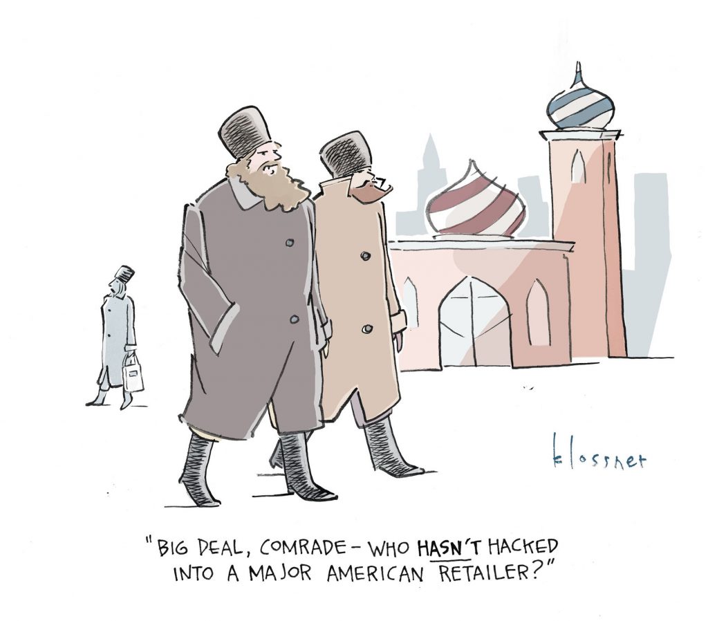
If you need a modern example of yellow journalism, consider the ongoing media frenzy over Russian “interference” in US elections.
How often do you hear reports of context that include instances of US-sponsored assassinations, funded and armed government overthrows, active military interference with both elections and governments, by the US?
What? Some Russians bought Facebook ads and used election hashtags on Twitter? That compares to overthrowing other governments? The long history of the U.S. interfering with elections elsewhere. (tip of the iceberg)
The constant hyperbole in the “Russian interference” story is a clue that journalists and social media are re-enacting the roles played by the New York World and the New York Journal, which lead to the Spanish-American war.
Truth be told, we should thank social media for the free distribution of disinformation, previously available only by subscription.
Discerning what is or is not accurate information, as always, falls on the shoulders of readers. It has ever been thus.
 https://t.co/B9Tno5REjm”
 #MakeAmericaGreatAgain #Blacks4Trump…”