Watching a user test your product for the first time. pic.twitter.com/NFWqyW25ld
— 〰 (@darylginn) March 8, 2016
Two humorous reminders that design and user testing should go hand in hand.
Enjoy!
Watching a user test your product for the first time. pic.twitter.com/NFWqyW25ld
— 〰 (@darylginn) March 8, 2016
Two humorous reminders that design and user testing should go hand in hand.
Enjoy!
Americans want to be safer online – but not if they have to do anything by Bill Camarda.
From the post:
In the wake of non-stop news about identity theft, malware, ransomware, and all manner of information security catastrophes, Americans have educated themselves and are fully leveraging today’s powerful technologies to keep themselves safe… not.
While 67% told Morar Consulting they “would like extra layers of privacy,” far fewer use the technological tools now available to them. That’s the top-line finding of a brand-new survey of 2,000 consumers by Morar on behalf of the worldwide VPN provider “Hide My Ass!”
A key related finding: 63% of survey respondents have encountered online security issues. But, among the folks who’ve been bitten, just 56% have permanently changed their online behavior afterwards. (If you don’t learn the “hard way,” when do you learn?)
According to Morar, there’s still an odd disconnect between the way some people protect themselves offline and what they’re willing to do on the web. 51% of respondents would publicly post their email addresses, 26% their home addresses, and 21% their personal phone numbers.
…
Does this result surprise you?
If not:
How should we judge projects/solutions that presume conscious effort by users to:
I mention “search results” as it is commonly admitted that search results are, at best, a pig’s breakfast. The amount of improvement possible over current search results is too large to even be guesstimated.
Rather than beat the dead horse, “…users ought to…,” yes, they should, but they don’t, it is better to ask “Now what?”
Why not try metrics?
Monitor user interactions with information and test systems to anticipate those needs. Both are measurable categories.
Consider that back in the day, indexes never indexed everything. Magazine indexes omitted ads for example. Could have been indexed but indexing ads didn’t offer enough return for the effort required.
Why not apply that model to modern information systems? Yes, we can create linked data or other representations for everything in every post, but if no one uses 90% of that encoding, we have spent a lot of money for very little gain.
Yes, that means we will be discriminating against less often cited authors, for example. And your point?
The preservation of the Greek literature discriminated against authors whose work wasn’t important enough for someone to invest in preserving it.
Of course, we may not lose data in quite the same way but if it can’t be found, isn’t that the same a being lost?
Let’s apply metrics to information retrieval and determine what return justifies the investment to make information easily available.
Consign/condemn the rest of it to search.
All Talk and No Buttons: The Conversational UI by Matty Mariansky.
From the post:
We’re witnessing an explosion of applications that no longer have a graphical user interface (GUI). They’ve actually been around for a while, but they’ve only recently started spreading into the mainstream. They are called bots, virtual assistants, invisible apps. They can run on Slack, WeChat, Facebook Messenger, plain SMS, or Amazon Echo. They can be entirely driven by artificial intelligence, or there can be a human behind the curtain.
…
Not to put too sharp a point on it but they used to be called sales associates or sales clerks, if you imagine a human being behind the curtain.
Since they are no longer visible in distinctive clothing, you have the task of creating a UI that isn’t quite as full bandwidth as human to human proximity but still useful.
A two part series that will have you thinking more seriously about what a conversational UI might look like.
Enjoy!
The Utopian UI Architect by John Pavlus.
Following all the links and projects mentioned in this post will take some time but the concluding paragraph will provide enough incentive:
…
“The example I like to give is back in the days of Roman numerals, basic multiplication was considered this incredibly technical concept that only official mathematicians could handle,” he continues. “But then once Arabic numerals came around, you could actually do arithmetic on paper, and we found that 7-year-olds can understand multiplication. It’s not that multiplication itself was difficult. It was just that the representation of numbers — the interface — was wrong.”
Imagine that. A change in representation changed multiplication from a professional activity to one for 7-year olds.
Now that is testimony to the power of representation.
What other representations, common logic, RDF, category theory, compilers, etc., are making those activities more difficult than necessary?
There are no known or general answer to that question but Bret Victor’s work may spark clues from others.
A must read!
I first saw this in a tweet by Max Roser.
Can Good Web Design Create Joyful User Experiences? by Daniel O’Neil.
From the post:
The next revolution in web design is Joy.
Karen Holtzblatt, who is one of the creators of modern interaction design, argues that the discussion about interaction design needs to change to focus more on the idea of “Joy,”—for want of a better word—both in life and in use.
What does this look like for users of sites? Well, in short, the fundamental role of website and app designers is to help users avoid doing anything hard at all.
And yet we don’t always want things to be easy; in fact if everything is easy, the sense of accomplishment in life can be lost. Jesse Schell recently gave a talk called “Lessons in Game Design” that explores this idea. In Schell’s talk, he gives a lot of examples of people who seek out—in fact, expect—challenges in their gaming experience, even if they were not easy. Schell argues that many games cannot be good unless such challenges exist, largely because games need to appeal to the core facets of self-determination theory.
…
I am quite intrigued by the discussion of “friction:”
…
The first concept is friction. Any effort we take as human beings involves specific steps, be they throwing off the covers when we wake up to browsing a website. The feeling of fulfillment is in the stated goal or objective at that moment in time. When there is friction in the steps to achieve that goal, the effort to accomplish it increases it, but more importantly the steps are a distraction from the specific accomplishment. If, for example, I wanted to drive somewhere but I had to scrape ice off my windshield first, I would be experiencing friction. The step distracts from the objective.
…
Recalling Steve Newcomb’s metaphor of semantic friction between universes of discourse.
The post goes on to point out that some “friction” may not be viewed as an impediment. Can be an impediment but a particular user may not see it that way.
Makes me wonder if information systems (think large search engines and their equally inept cousins, both electronic and paper) are inefficient and generate friction on purpose?
To give their users a sense of accomplishment by wrangling a sensible answer from a complex (to an outsider) data set.
I haven’t done any due diligence on that notion but it is something I will try to follow up on.
Perhaps topic maps need to reduce “semantic friction” gradually or only in some cases. Make sure that users still feel like they are accomplishing something.
Would enabling users to contribute to a mapping or “tweeting” results to co-workers generate a sense of accomplishment? Hard to say without testing.
Certainly broadens software design parameters beyond not failing and/or becoming a software pestilence like Adobe Flash.
Do one thing… I don’t want barely distinguishable tools that are mediocre at everything; I want tools that do one thing and do it well. by Mike Loukides.
From the post:
I’ve been lamenting the demise of the Unix philosophy: tools should do one thing, and do it well. The ability to connect many small tools is better than having a single tool that does everything poorly.
That philosophy was great, but hasn’t survived into the Web age. Unfortunately, nothing better has come along to replace it. Instead, we have “convergence”: a lot of tools converging on doing all the same things poorly.
The poster child for this blight is Evernote. I started using Evernote because it did an excellent job of solving one problem. I’d take notes at a conference or a meeting, or add someone to my phone list, and have to distribute those files by hand from my laptop to my desktop, to my tablets, to my phone, and to any and all other machines that I might use.
…
Mike takes a stick to Evernote, Gmail, Google Maps, Skype, Twitter, Flickr, Dropbox (insert your list of non-single purpose tools here), etc.
Then he offers a critical insight about web applications:
…There’s no good way to connect one Web application to another. Therefore, everything tends to be monolithic; and in a world of monolithic apps, everyone wants to build their own garden, inevitably with all the features that are in all the other gardens.
Mike mentions IFTTT, which connects web services but wants something a bit more generic.
I think of IFTTT as walkways between a designated set of walled gardens. Useful for traveling between walled gardens but not anything else.
Mike concludes:
I don’t want anyone’s walled garden. I’ve seen what’s inside the walls, and it isn’t a palace; it’s a tenement. I don’t want barely distinguishable tools that are mediocre at everything. I want tools that do one thing, and do it well. And that can be connected to each other to build powerful tools.
What single purpose tool are you developing?
How will it interact with other single purpose tools?
UI Events (Formerly DOM Level 3 Events) Draft Published
From the post:
The Web Applications Working Group has published a Working Draft of UI Events (formerly DOM Level 3 Events). This specification defines UI Events which extend the DOM Event objects defined in DOM4. UI Events are those typically implemented by visual user agents for handling user interaction such as mouse and keyboard input. Learn more about the Rich Web Client Activity.
If you are planning on building rich web clients, now would be the time to start monitoring W3C drafts in this area. To make sure your use cases are met.
People have different expectations with regard to features and standards quality. Make sure your expectations are heard.
Futures of text by Jonathan Libov.
From the post:
I believe comfort, not convenience, is the most important thing in software, and text is an incredibly comfortable medium. Text-based interaction is fast, fun, funny, flexible, intimate, descriptive and even consistent in ways that voice and user interface often are not. Always bet on text:
Text is the most socially useful communication technology. It works well in 1:1, 1:N, and M:N modes. It can be indexed and searched efficiently, even by hand. It can be translated. It can be produced and consumed at variable speeds. It is asynchronous. It can be compared, diffed, clustered, corrected, summarized and filtered algorithmically. It permits multiparty editing. It permits branching conversations, lurking, annotation, quoting, reviewing, summarizing, structured responses, exegesis, even fan fic. The breadth, scale and depth of ways people use text is unmatched by anything.
[Apologies, I lost some of Jonathan’s layout of the quote.]
Jonathan focuses on the use of text/messaging for interactions in a mobile environment, with many examples and suggestions for improvements along the way.
One observation that will have the fearful of an AI future (Elon Musk among others) running for the hills:
Messaging is the only interface in which the machine communicates with you much the same as the way you communicate with it. If some of the trends outlined in this post pervade, it would mark a qualitative shift in how we interact with computers. Whereas computer interaction to date has largely been about discrete, deliberate events — typing in the command line, clicking on files, clicking on hyperlinks, tapping on icons — a shift to messaging- or conversational-based UI’s and implicit hyperlinks would make computer interaction far more fluid and natural.
What’s more, messaging AI benefits from an obvious feedback loop: The more we interact with bots and messaging UI’s, the better it’ll get. That’s perhaps true for GUI as well, but to a far lesser degree. Messaging AI may get better at a rate we’ve never seen in the GUI world. Hold on tight.[Emphasis added.]
Think of it this way, a GUI locks you into the developer’s imagination. A text interface empowers the user and the AI’s imagination. I’m betting on the latter.
BTW, Jonathan ends with a great list of further reading on messaging and mobile applications.
Enjoy!
I first saw this in a tweet by Aloyna Medelyan.
User Onboarding does a teardown of Rdio, a highly successful music streaming site.
Highly successful does not equal perfect onboarding!
Interesting exercise to duplicate with your web/application interface.
Typography Teardown of Advertising Age by Jeremiah Shoaf.
From the post:
I’m a huge fan of Samuel Hulick’s user onboarding teardowns so I thought it would be fun to try a new feature on Typewolf where I do a “typography teardown” of a popular website. I’ll review the design from a typographic perspective and discuss what makes the type work and what could potentially have been done better.
In this first edition I’m going to take a deep dive into the type behind the Advertising Age website. But first, a disclaimer.
Disclaimer: The following site was created by designers way more talented than myself. This is simply my opinion on the typography and how, at times, I may have approached things differently. Rules in typography are meant to be broken.
As you already know, I’m at least graphically challenged if not worse. 😉
Still, it doesn’t prevent me from enjoying graphics and layouts, I just have a hard time originating them. And I keep trying by reading resources such as this one.
While a website is reviewed by Jeremiah, the same principles should apply to an application interface.
Enjoy!
Oranges and Blues by Edmund Helmer.
From the post:
When I launched this site over two years ago, one of my first decisions was to pick a color scheme – it didn’t take long. Anyone who watches enough film becomes quickly used to Hollywood’s taste for oranges and blues, and it’s no question that these represent the default palette of the industry; so I made those the default of BoxOfficeQuant as well. But just how prevalent are the oranges and blues?
Some people have commented and researched how often those colors appear in movies and movie posters, and so I wanted to take it to the next step and look at the colors used in film trailers. Although I’d like to eventually apply this to films themselves, I used trailers because 1) They’re our first window into what a movie will look like, and 2) they’re easy to get (legally). So I’ve downloaded all the trailers available on the-numbers.com, 312 in total – not a complete set, but the selection looks random enough – and I’ve sampled across all the frames of these trailers to extract their Hue, Saturation, and Value. If you’re new to those terms, the chart below should make it clear enough: Hue is the color, Value is the distance from black, (and saturation, not shown, is the color intensity).
…
Edmund’s data isn’t “big” or “fast” but it is “interesting.” Unfortunately, “interesting” data is one of those categories where I know it when I see it.
I have seen movies and movie trailers but it never occurred to me to inspect the colors used in movie trailers. Turns out to not be a random choice. Great visualizations in this post and a link to further research on genre and colors, etc.
How is this relevant to you? Do you really want to use scary colors for your UI? It’s not really that simple but neither are movie trailers. What makes some capture your attention and stay with you? Others you could not repeat at the end of the next commercial. Personally, I would prefer a UI that captured my attention and that I remembered from the first time I saw it. (Especially if I were selling the product with that UI.)
You?
I first saw this in a tweet by Neil Saunders.
PS: If you are interested in statistics and film, BoxOfficeQuant – Statistics and Film (Edmund’s blog) is a great blog to follow.
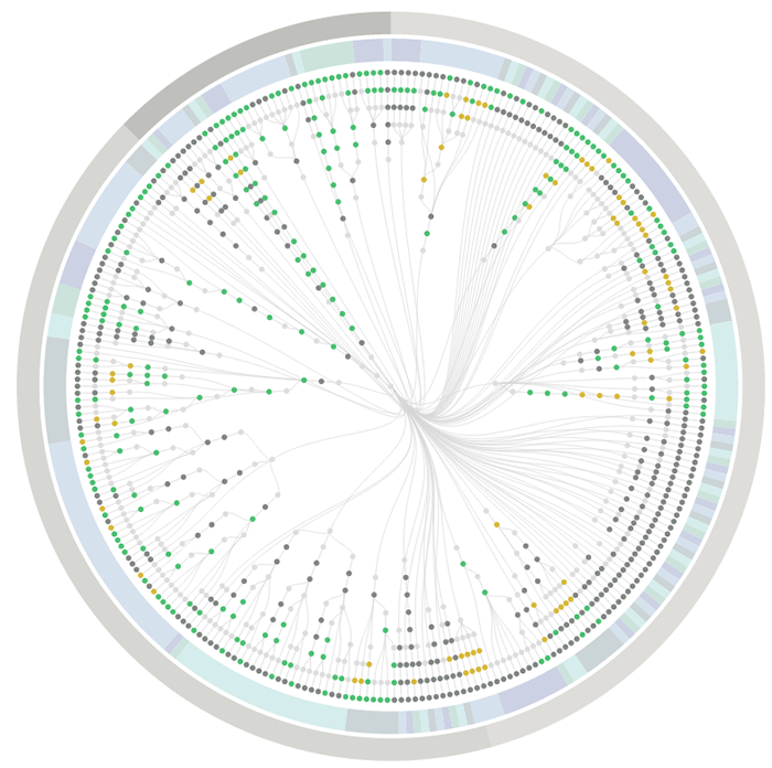
From the webpage:
PhantomFlow
UI testing with decision trees. An experimental approach to UI testing, based on Decision Trees. A NodeJS wrapper for PhantomJS, CasperJS and PhantomCSS, PhantomFlow enables a fluent way of describing user flows in code whilst generating structured tree data for visualisation.
The above visualisation is a real-world example, showing the complexity of visual testing at Huddle.
Aims
- Enable a more expressive way of describing user interaction paths within tests
- Fluently communicate UI complexity to stakeholders and team members through generated visualisations
- Support TDD and BDD for web applications and responsive web sites
- Provide a fast feedback loop for UI testing
- Raise profile of visual regression testing
- Support misual regression workflows, quick inspection & rebasing via UI.
If you are planning on being more user focused (translation: successful in gaining users) this year, PhantomFlow may be the tool for you!
It strikes me as a tool that can present the workflow differently than you are accustomed to seeing it. I find that helpful because I will overlook potential difficulties because I already know how some function works.
The red button labeled STOP! may mean to a user that the application stops. Not that the decryption key on the hard drive is trashed to prevent decryption even if I give up the key under torture. That may not occur to them. If that happens on their hard drive, they may be rather miffed.
19 Amazing Sites To Get Free Stock Photos (SideJobr)
From the post:
As you are building your website photography is always an integral part of web design. If you use google image search you will find crappy or low res images of staged people on the phone or shaking hands. These photos are not only going to cheapen your site but many cost money! Stop the insanity!
As a small business owner myself, having quality photos on my site is imperative to convey professionalism and get customers. Secretly, I am just a cheap person and hate to spend more money than is necessary and trust me, it is not necessary to spend money on quality stock photos.
In this post, we’ve created a list for you of awesome websites that have free stock photos.
This is not the end all – be all of sites and if you find others, please feel free to list them in the comment section.
Note: Most of these images fall under a creative commons license (just make sure you attribute properly) or are old enough that the photos have returned to the public domain. (This happens once the copyright on an image expires.)
Reading is a recent and acquired skill when compared to image recognition, which appears to be handled by hard-wired machinery in our brains. (obvious once pointed out) The upshot of that observation (which I read, did not independently discover) is that I have been trying to use more images/graphics in my posts. This post by SideJobr is a collection of some sources for free stock photos. May be useful for your presentations, website, blog posts.
If retitled: A Hadoop Tea Party, would this image be more memorable than the usual yellow elephant in a slide presentation?

From New Old Stock as: Elephant’s tea party, Robur Tea Room, 24 March 1939, by Sam Hood.
Leading from the Back: Making Data Science Work at a UX-driven Business by John Foreman. (Microsoft Visiting Speaker Series)
The first thirty (30) minutes are easily the best ones I have spent on a video this year. (I haven’t finished the Q&A part yet.)
John is a very good speaker but in part his presentation is fascinating because it illustrates how to “sell” data analysis to customers (internal and external).
You will find that while John can do the math, he is also very adept at delivering value to his customer.
Not surprisingly, customers are less interested in bells and whistles or your semantic religion and more interested in value as they perceive it.
Catch the switch in point of view, it isn’t value from your point of view but the customer’s point of view.
You need to set aside some time to watch at least the first thirty minutes of this presentation.
BTW, John Foreman is the author of Data Smart, which he confesses is “not sexy.”
I first saw this in a tweet by Microsoft Research.
From the post:
This week, MailChimp published its first ebook, The UX Reader. I could just tell you that it features revised and updated pieces from our UX Newsletter, that you can download it here for $5, and that all proceeds go to RailsBridge. But instead, I’m hearing the voice of Mrs. McLogan, my high school physics teacher:
“Look, I know you’ve figured out the answer, but I want you to show your work.”
Just typing those words makes me sweat—I still get nervous when I’m asked to show how to solve a problem, even if I’m confident in the solution. But I always learn new things and get valuable feedback whenever I do.
So today I want to show you the work of putting together The UX Reader and talk more about the problem it helped us solve.
…
After you read this post, you too will be a subscriber to the UX Newsletter. Not to mention having a copy of the updated book, The UX Reader.
Worth the time to read and put in to practice what it reports.
Or as I told an old friend earlier today:
The greatest technology/paradigm without use is only interesting, not compelling or game changing.
What Is the Relationship Between HCI Research and UX Practice? by Stuart Reeves
From the post:
Human-computer interaction (HCI) is a rapidly expanding academic research domain. Academic institutions conduct most HCI research—in the US, UK, Europe, Australasia, and Japan, with growth in Southeast Asia and China. HCI research often occurs in Computer Science departments, but retains its historically strong relationship to Psychology and Human Factors. Plus, there are several large, prominent corporations that both conduct HCI research themselves and engage with the academic research community—for example, Microsoft Research, PARC, and Google.
If you aren’t concerned with the relationship between HCI research and UX practice you should be.
I was in a meeting discussing the addition of RDFa to ODF when a W3C expert commented that the difficulty users have with RDFa syntax was a “user problem.”
Not to pick on RDFa, I think many of us in the topic map camp felt that users weren’t putting enough effort into learning topic maps. (I will only confess that for myself. Others can speak for themselves.)
Anytime an advocate and/or developer takes the view that syntax, interfaces or interaction with a program is a “user problem,” they pointing the wrong way with the stick.
They should be pointing at the developers, designers, advocates who have not made interaction with their program/software intuitive for the “targeted audience.”
If your program is a LaTeX macro targeted at physicists who eat LaTeX for breakfast, lunch and dinner, that’s one audience.
If your program is an editing application is targeted at users crippled by the typical office suite menus, then you had best make different choices.
That is assuming that use of your application is your measure of success.
Otherwise you can strive to be the second longest running non-profitable software project (Xandu, started in 1960 has first place) in history.
Rather than being right, or saving the world, or any of the other …ologies, I would prefer to have software that users find useful and do in fact use.
Use is pre-condition to any software or paradigm changing the world.
Yes?
PS: Don’t get me wrong, Xandu is a great project but its adoption of web browsers as means of delivery is a mistake. True, they are everywhere but also subject to the crippled design of web security which prevents transclusion. Which ties you to a server where the NSA can more conveniently scoop up your content.
Better would be a document browser that uses web protocols and ignores web security rules, thus enabling client-side transclusion. Fork one of the open source browsers and be done with it. Only use digitally signed PDFs or from particular sources. Once utility is demonstrated in a PDF-only universe, the demand will grow for extending it to other sources as well.
True, some EU/US trade delegates and others will get caught in phishing schemes but I consider that grounds for dismissal and forfeiture of all retirement benefits. (Yes, I retain a certain degree of users be damned but not about UI/UX experiences. 😉 )
My method of avoiding phishing schemes is to never follow links in emails. If there is an offer I want to look at, I log directly into the site from my browser and not via email. Even for valid messages, which they rarely are.
I first saw this in a tweet by Raffaele Boiano.
Two Hundred and six (206) resources listed under the following categories:
If you have a new resource that should be on this list, contact abetteruserexperience@gmail.com
I first saw this in Nat Torkington’s Four short links: 28 October 2014.
User Onboarding by Samuel Hulick.
From the webpage:
Want to see how popular web apps handle their signup experiences? Here’s every one I’ve ever reviewed, in one handy list.
I have substantially altered Samuel’s presentation to fit the list onto one screen and to open new tabs, enabling quick comparison of onboarding experiences.
Writers become better by reading good writers.
Non-random good onboarding comes from studying previous good onboarding.
Enjoy!
I first saw this in a tweet by Jason Ziccardi.
User Experience Research at Scale by Nick Cawthon.
From the post:
An important part of any user experience department should be a consistent outreach effort to users both familiar and unfamiliar. Yet, it is hard to both establish and sustain a continued voice amongst the business of our schedules.
Recruiting, screening, and scheduling daily or weekly one-on-one walkthroughs can be daunting for someone in a small department having more than just user research responsibilities, and the investment of time eventually outweighs the returns as both the number of participants and size of the company grow.
This article is targeted at user experience practitioners at small- to mid-size companies who want to incorporate a component of user research into their workflow.
It first outlines a point of advocacy around why it is important to build user research into a company’s ethos from the very start and states why relying upon standard analytics packages are not enough. The article then addresses some of the challenges around being able to automate, scale, document, and share these efforts as your user base (hopefully) increases.
Finally, the article goes on to propose a methodology that allows for an adjustable balance between a department’s user research and product design and highlights the evolution of trends, best practices, and common avoidances found within the user research industry, especially as they relate to SaaS-based products.
…
If you have an interest in producing products/services that meet users’ needs, i.e., the kind of products or services that sell, this is an article for you.
Why governments need hack days by Amy Whitney.
Amy describes a hackathon at the DVLA (Driver and Vehicle Licensing Agency) and it includes this jewel on user input:
First they went to talk to others into the DVLA to fully understand the problem. Then they went out onto the street to talk to real users about their needs. In some cases the results were eye-opening and unexpected. User research is a team sport, and users are a crucial part of that team. Guessing user needs doesn’t work. (emphasis in original)
I would emphasize: Guessing user needs doesn’t work.
Are you guessing user needs or do you have some other method to establish their needs?
I first saw this in a tweet by Mark Hurrell.
PS: Would “Guessing user needs doesn’t work.” also apply to FOL? 😉
My future response to all interface statements that begin:
These statements and others mean that “users,” those folks who are going to pay money for services/products, aren’t going to be happy.
Making a potential customer unhappy is a very poor sales technique.
I saw this in a tweet by Startup Vitamins.
Honing Your Research Skills Through Ad-hoc Contextual Inquiry by Will Hacker.
From the post:
It’s common in our field to hear that we don’t get enough time to regularly practice all the types of research available to us, and that’s often true, given tight project deadlines and limited resources. But one form of user research–contextual inquiry–can be practiced regularly just by watching people use the things around them and asking a few questions.
I started thinking about this after a recent experience returning a rental car to a national brand at the Phoenix, Arizona, airport.
My experience was something like this: I pulled into the appropriate lane and an attendant came up to get the rental papers and send me on my way. But, as soon as he started, someone farther up the lane called loudly to him saying he’d been waiting longer. The attendant looked at me, said “sorry,” and ran ahead to attend to the other customer.
A few seconds later a second attendant came up, took my papers, and jumped into the car to check it in. She was using an app on an tablet that was attached to a large case with a battery pack, which she carried over her shoulder. She started quickly tapping buttons, but I noticed she kept navigating back to the previous screen to tap another button.
Curious being that I am, I asked her if she had to go back and forth like that a lot. She said “yes, I keep hitting the wrong thing and have to go back.”
…
Will expands his story into why and how to explore random user interactions with technology.
If you want to become better at contextual inquiry and observation, Will has the agenda for you.
He concludes:
Although exercises like this won’t tell us the things we’d like to know about the products we work on, they do let us practice the techniques of contextual inquiry and observation and make us more sensitive to various design issues. These experiences may also help us build the case in more companies for scheduling time and resources for in-field research with our actual customers.
10 questions to ask when reviewing design work by Ben Terrett.
Ben and a colleague reduced a list of design review questions by Jason Fried down to ten:
10 questions to ask when reviewing design work
1. What is the user need?
2. Is what it says and what it means the same thing?
3. What’s the take away after 3 seconds? (We thought 8 seconds was a bit long.)
4. Who needs to know that?
5. What does someone know now that they didn’t know before?
6. Why is that worth a click?
7. Are we assuming too much?
8. Why that order?
9. What would happen if we got rid of that?
10. How can we make this more obvious?
I’m Ben, Director of Design at GDS. You can follow me on twitter @benterrett
A great list for reviewing any design!
Where design doesn’t just mean an interface but presentation of data as well.
I am now following @benterrett and you should too.
It is a healthy reminder that not everyone in government wants to harm their own citizens and others. A minority do but let’s not forget true public servants while opposing tyrants.
I first saw the ten questions post in Nat Torkington’s Four short links: 18 July 2014.
10 Tips to Immediately Improve User Onboarding by Pieter Walraven.
From the post:
User onboarding is an art. It can be deceivingly simple, but anyone that has ever designed a new user journey knows it’s incredibly hard.
For starters, there’s some tough questions to answer. What main value does my product offer? Who am I talking to? What is the one most important thing new users need to see? What does my product do? Why do we even exist?!
Luckily, there’s many great products out there with tested and optimized onboarding flows to get inspiration from (read: steal).
To make your life easier, I’ve analyzed some of the web’s most popular onboarding flows. I’ve also included some gaming-inspired learnings from my time as Product Manager at social games developer Playfish as well as insights from the onboarding design of Pie, the smart team chat app I’m currently working on.
Let’s dive in!
…
See Pieter’s post for the details but the highlights are:
In terms of training/education, very little of this is new. For #6 “Use fewer words,” remember Strunk & White’s – “#13 Omit needless words.” Or compare #9 “remove noise” with Strunk & White #14 “Avoid a succession of loose sentences.”
Any decent UI/UX guide is going to give these rules in one form or another.
But it is important that they are repeated by different people and in various forms. Why? Open five applications at random on your phone or computer. How many out of those five have an interface that is immediately usable by a new user?
The message of what is required for good UI design is well known. Where that message fails is in the application of those principles.
At least to judge from current UIs. Yes?
Any “intuitive” UIs you would like to suggest as examples?
How To Design A Great User Interface
From the post:
The goal and only purpose of a user interface (UI), as the name implies, is to create an experience for the user.
Many automated solutions exist to make UI design simpler and faster; however, the designer must understand some basic rules of how to design a user interface. Because the focus is centered on the potential user, the user’s needs must primarily drive all design choices.
What are the needs of the user?
- To accomplish the task with relative ease
- To complete the task quickly
- To enjoy the experience
The single most important characteristic of the UI is that it has to work well and work consistently. Secondly, the UI must carry out commands and respond quickly and intuitively. Lastly, but still very important the user interface should be visually appealing to the user.
Projects like Egas may give you a boost in the right direction for a topic map authoring/navigation interface but you are going to be ultimately responsible for your own design.
This post and the related ones will give you an opportunity to understand some of the primary issues you will face in creating a great user interface.
If you have no other take away from this post, notice that “impressing the user with how you view the paradigm” isn’t one of the goals of a great user interface.
UX Crash Course: 31 Fundamentals by Joel Marsh.
From the post:
Basic UX Principles: How to get started
The following list isn’t everything you can learn in UX. It’s a quick overview, so you can go from zero-to-hero as quickly as possible. You will get a practical taste of all the big parts of UX, and a sense of where you need to learn more. The order of the lessons follows a real-life UX process (more or less) so you can apply these ideas as-you-go. Each lesson also stands alone, so feel free to bookmark them as a reference!
Main topics:
Introduction & Key Ideas
How to Understand Users
Information Architecture
Visual Design Principles
Functional Layout Design
User Psychology
Designing with Data
Users who interact with designers, librarians and library students come to mind, would do well to review these posts. If nothing else, it will give users better questions to ask vendors about their web interface design process.
Sixteen tips on creating a better UI with more promised to be on the way.
Newsletter promises two (2) per month.
The test of a UI is not whether the designer or you find it intuitive.
The test of a UI is whether an untrained user finds it intuitive.
I first saw this at Nat Torkington’s Four short links: 26 July 2013.
Comparing text to data by importing tags by Jonathan Stray.
From the post:
Overview sorts documents into folders based on the topic of each document, as determined by analyzing every word in each document. But it can also be used to see how the document text relates to the date of publication, document type, or any other field related to each document.
This is possible because Overview can import tags. To use this feature, you will need to get your documents into CSV file, which is a simple rows and columns spreadsheet format. As usual, the text of each document does in the “text” column. But you can also add a “tags” column which gives the tag or tags to be initially assigned to each document, separated by commas if more than one.
Jonathan demonstrates this technique on the Afghanistan War Logs.
Associations at the level of a document are useful.
Such as Jonathan suggests, document + date of publication; document + document type, etc.
But doesn’t that leave the reader with the last semantic mile to travel on their own?
That is I would rather have: document + source/author + term in document + data of publication and a host of other associations represented.
Otherwise, once I find the document, using tags perhaps, I have to retrace the steps of anyone who discovered the “document + source/author + term in document + data of publication” relationship before I did.
And anyone following me will have to retrace my steps.
How many searches get retraced in your department every month?
Overview: Visualization to connect the dots by Jonathan Stray.
Overview has a new UI!
It’s a screen shot and difficult to describe. Check it out!
About Overview:
Overview is intended to help journalists, researchers, and other curious people make sense of massive, disorganized collections of electronic documents. It’s a visualization and analysis tool designed for sets of documents, typically thousands of pages of material.
Overview applies natural language processing algorithms to automatically sort the documents into folders and sub-folders based on their topic. Like a table of contents, this organization helps you to understand “what’s in there?” This is more powerful than text search, because it helps you to find what you don’t even know to look for.
Overview has been used to analyze emails, a declassified document dumps, material from Wikileaks releases, social media posts, online comments, and more.
My question would be how difficult/easy it is to integrate connected dots from one project/reporter to another?
Or to search the semantics of dots discovered in a project?
Quantitative Research and Eye-Tracking: A match made in UX heaven by James Breeze and Alexis Conomos.
From the post:
Administering many sessions of usability testing has shown us that people either attribute their failures to forces outside of their control (e.g. “The website doesn’t work and needs to be fixed) or to things they have influence over (e.g. “I’m not that good with computers but I could probably learn how to use it”).
A person’s perceived influence over outcomes is known, in psychobabble, as their ‘locus of control’ and it has a profound effect on usability testing results.
Qualitative data and verbatims from individuals with an internal locus of control often reflect a positive user experience, even when they have made several errors performing tasks. Similar to the respondent in the scenario depicted in the cartoon below, these individuals attribute their errors to their own actions, rather than failures of the product being tested.
(…)
The higher end of research on user experiences with technology.
Being aware of the issues may help you even if you lack funding for some of the tools and testing described in the post.
Powered by WordPress