Another Word For It Patrick Durusau on Topic Maps and Semantic Diversity

August 31, 2018

Leonardo da Vinci’s Notebooks [IIIF + Topic Maps]

Victoria and Albert Museum brings Leonardo da Vinci’s notebooks to life online by Gareth Harris.

From the post:

Scholars and digital experts at the Victoria and Albert Museum (V&A) in London have posted online the contents of two notebooks by Leonardo da Vinci, enabling devotees of the Renaissance polymath to zoom in and examine his revolutionary ideas and concepts.

On the technical front, the use of IIIF (International Image Interoperability Framework) to present a digital version of the notebooks is an innovation. “It’s our use of the IIIF standard that has enabled us to present the codex in a new way. The V&A digital team has been doing a lot of work in the last 18 months using IIIF. We’ve used the deep-zoom functionality enabled through IIIF to present some of the most spectacular and detailed items in our collection,” says Kati Price, the V&A’s head of digital media and publishing.

Crucially, IIIF also lets scholars compare similar objects across several institutions’ collections. “Researchers can easily see the images together with Leonardo da Vinci items held by other institutions using IIIF, for side-by-side digital comparison,” Yvard says.

These two notebooks, not to mention those to be posted next year for the 500th anniversary of Leonardo’s death, are important in their own right.

However, I want to draw your attention to the use of International Image Interoperability Framework (IIIF) in this project.

From the IIIF FAQ:

What is IIIF?

The International Image Interoperability Framework (IIIF) is a set of shared application programming interface (API) specifications for interoperable functionality in digital image repositories. The IIIF is comprised of and driven by a community of libraries, museums, archives, software companies, and other organizations working together to create, test, refine, implement and promote the IIIF specifications. Using JSON-LD, linked data, and standard W3C web protocols such as Web Annotation, IIIF makes it easy to parse and share digital image data, migrate across technology systems, and provide enhanced image access for scholars and researchers. In short, IIIF enables better, faster and cheaper image delivery. It lets you leverage interoperability and the fabric of the Web to access new possibilities and new users for your image-based resources, while reducing long term maintenance and technological lock in. IIIF gives users a rich set of baseline functionality for viewing, zooming, and assembling the best mix of resources and tools to view, compare, manipulate and work with images on the Web, an experience made portable–shareable, citable, and embeddable.

What are the benefits of IIIF?

….

Advanced, interactive functionality for end users

  • Fast, rich, zoom and pan delivery of images
  • Manipulation of size, scale, region of interest, rotation, quality and format.
  • Annotation – IIIF has native compatibility with the W3C annotation working group’s Web Annotation Data Model, which supports annotating content on the Web. Users can comment on, transcribe, and draw on image-based resources using the Web’s inherent architecture.
  • Assemble and use image-based resources from across the Web, regardless of source. Compare pages, build an exhibit, or view a virtual collection of items served from different sites.
  • Cite and Share – IIIF APIs provide motivation for persistence, providing portable views of images and/or regions of images. Cite an image with confidence in stable image URIs, or share it for reference by others–or yourself in a different environment.

If you are looking to enhance your topic map with images, this sounds like the right way to go. Ping me with your examples of your uses of IIIF with topic maps.

BTW, the Draft IIIF v.3.0 Specifications have been released for review.

February 22, 2018

Learning Drawing Skills To Help You Communicate

Filed under: Art,Graphics,Visualization — Patrick Durusau @ 9:19 pm

I sigh with despair every time I see yet another drawing by Julia Evans.

All of it is clever, clear and without effort on my part, beyond me.

Yeah, it’s the “without effort on my part” that keeps me from learning basic drawing skills.

You’re never going to say of a drawing by me, “There’s a proper Julia Evans!” but I don’t think basic drawing skills beyond me, provided I take the time to practice.

How expensive are guidebooks? Does free sound OK?

By E.G. Lutz, What to Draw and How to Draw It (1913), Drawing Made Easy (1935).

BTW, Lutz inspired Walt Disney with: Animated Cartoons: How They Are Made, Their Origin and Development.

I found this at The Public Domain Review. Support for them is always a good idea.

Of course I would rather be exploring nuances of XQuery, but that’s because XQuery is already familiar.

It’s trying the unfamiliar that leads to new skills, hopefully. 😉

February 15, 2018

Krita (open source painting program)

Filed under: Art,Graphics,Visualization — Patrick Durusau @ 9:30 am

Krita

Do you know Krita? Not being artistically inclined, I don’t often encounter digital art tools. Judging from the examples though:

I’m missing some great imagery, even if I can’t create the same.

Great graphics can enhance your interfaces, education apps, games, propaganda, etc.

February 5, 2018

#ColorOurCollections

Filed under: Art,FBI,Library — Patrick Durusau @ 5:12 pm

#ColorOurCollections

From the webpage:

From February 5-9, 2018, libraries, archives, and other cultural institutions around the world are sharing free coloring sheets and books based on materials in their collections.

Something fun to start the week!

In addition to more than one hundred participating institutions, you can also find instructions for creating your own coloring pages.

Any of the images you find at Mardi Gras New Orleans will make great coloring pages (modulo non-commercial use and/or permissions as appropriate).

The same instructions will help you make “adult” coloring pages as well.

I wasn’t able to get attractive results for Pedro Berruguete Saint Dominic Presiding over an Auto-da-fe 1495 using the simple instructions but will continue to play with it.

High hopes for an Auto-da-fe coloring page. FBI leaders who violate the privacy of American citizens as the focal point. (There are honest, decent and valuable FBI agents, but like other groups, only the bad apples get the press.)

January 15, 2018

The Art & Science Factory

Filed under: Art,Complexity,Science — Patrick Durusau @ 8:10 pm

The Art & Science Factory

From the about page:


The Art & Science Factory was started in 2008 by Dr. Brian Castellani to organize the various artistic, scientific and educational endeavours he and different collaborators have engaged in to address the growing complexity of global life.

Dr. Castellani is a complexity scientist/artist.

He is internationally recognized for his expertise in complexity science and its history and for his development of the SACS Toolkit, a case-based, mixed-methods, computationally-grounded framework for modeling complex systems. Dr. Castellani’s main area of study is applying complexity science and the SACS Toolkit to various topics in health and healthcare, including community health and medical education.

In terms of visual complexity, Castellani is recognized around the world for his creation of the complexity map, which can be found on Wikipedia and on this website. He is also recognized for his blog on “all things complexity science and art,” the Sociology and Complexity Science Blog.
… (emphasis in original)

Dr. Castellani apparently dislikes searchable text, the about page quote being hand transcribed from an image that is that page.

Unexpectedly, the SACS toolkit, etc. were not hyperlinks so: SACS toolkit, complexity map, and Sociology and Complexity Science Blog, respectively.

June 30, 2017

Mistaken Location of Creativity in “Machine Creativity Beats Some Modern Art”

Filed under: Art,Artificial Intelligence,Machine Learning — Patrick Durusau @ 12:13 pm

Machine Creativity Beats Some Modern Art

From the post:

Creativity is one of the great challenges for machine intelligence. There is no shortage of evidence showing how machines can match and even outperform humans in vast areas of endeavor, such as face and object recognition, doodling, image synthesis, language translation, a vast variety of games such as chess and Go, and so on. But when it comes to creativity, the machines lag well behind.

Not through lack of effort. For example, machines have learned to recognize artistic style, separate it from the content of an image, and then apply it to other images. That makes it possible to convert any photograph into the style of Van Gogh’s Starry Night, for instance. But while this and other work provides important insight into the nature of artistic style, it doesn’t count as creativity. So the challenge remains to find ways of exploiting machine intelligence for creative purposes.

Today, we get some insight into progress in this area thanks to the work of Ahmed Elgammal at the Art & AI Laboratory at Rutgers University in New Jersey, along with colleagues at Facebook’s AI labs and elsewhere.
… (emphasis in original)

This summary of CAN: Creative Adversarial Networks, Generating “Art” by Learning About Styles and Deviating from Style Norms by Ahmed Elgammal, Bingchen Liu, Mohamed Elhoseiny, Marian Mazzone, repeats a mistake made by the authors, that is the misplacement of creativity.

Creativity, indeed, even art itself, is easily argued to reside in the viewer (reader) and not the creator at all.

To illustrate, I quote a long passage from Stanley Fish’s How to Recognize a Poem When You See One below but a quick summary/reminder goes like this:

Fish was teaching back to back classes in the same classroom and for the first class, wrote a list of authors on the blackboard. After the first class ended but before the second class, a poetry class, arrived, he enclosed the list of authors in a rectangle and wrote a page number, as though the list was from a book. When the second class arrived, he asked them to interpret the “poem” that was on the board. Which they proceeded to do. Where would you locate creativity in that situation?

The longer and better written start of the story (by Fish):

[1] Last time I sketched out an argument by which meanings are the property neither of fixed and stable texts nor of free and independent readers but of interpretive communities that are responsible both for the shape of a reader’s activities and for the texts those activities produce. In this lecture I propose to extend that argument so as to account not only for the meanings a poem might be said to have but for the fact of its being recognized as a poem in the first place. And once again I would like to begin with an anecdote.

[2] In the summer of 1971 I was teaching two courses under the joint auspices of the Linguistic Institute of America and the English Department of the State University of New York at Buffalo. I taught these courses in the morning and in the same room. At 9:30 I would meet a group of students who were interested in the relationship between linguistics and literary criticism. Our nominal subject was stylistics but our concerns were finally theoretical and extended to the presuppositions and assumptions which underlie both linguistic and literary practice. At 11:00 these students were replaced by another group whose concerns were exclusively literary and were in fact confined to English religious poetry of the seventeenth century. These students had been learning how to identify Christian symbols and how to recognize typological patterns and how to move from the observation of these symbols and patterns to the specification of a poetic intention that was usually didactic or homiletic. On the day I am thinking about, the only connection between the two classes was an assignment given to the first which was still on the blackboard at the beginning of the second. It read:

Jacobs-Rosenbaum
Levin
Thorne
Hayes
Ohman (?)

[3] I am sure that many of you will already have recognized the names on this list, but for the sake of the record, allow me to identify them. Roderick Jacobs and Peter Rosenbaum are two linguists who have coauthored a number of textbooks and coedited a number of anthologies. Samuel Levin is a linguist who was one of the first to apply the operations of transformational grammar to literary texts. J. P. Thorne is a linguist at Edinburgh who, like Levin, was attempting to extend the rules of transformational grammar to the notorious ir-regularities of poetic language. Curtis Hayes is a linguist who was then using transformational grammar in order to establish an objective basis for his intuitive impression that the language of Gibbon’s Decline and Fall of the Roman Empire is more complex than the language of Hemingway’s novels. And Richard Ohmann is the literary critic who, more than any other, was responsible for introducing the vocabulary of transformational grammar to the literary community. Ohmann’s name was spelled as you see it here because I could not remember whether it contained one or two n’s. In other words, the question mark in parenthesis signified nothing more than a faulty memory and a desire on my part to appear scrupulous. The fact that the names appeared in a list that was arranged vertically, and that Levin, Thorne, and Hayes formed a column that was more or less centered in relation to the paired names of Jacobs and Rosenbaum, was similarly accidental and was evidence only of a certain compulsiveness if, indeed, it was evidence of anything at all.

[4] In the time between the two classes I made only one change. I drew a frame around the assignment and wrote on the top of that frame “p. 43.” When the members of the second class filed in I told them that what they saw on the blackboard was a religious poem of the kind they had been studying and I asked them to interpret it. Immediately they began to perform in a manner that, for reasons which will become clear, was more or less predictable. The first student to speak pointed out that the poem was probably a hieroglyph, although he was not sure whether it was in the shape of a cross or an altar. This question was set aside as the other students, following his lead, began to concentrate on individual words, interrupting each other with suggestions that came so quickly that they seemed spontaneous. The first line of the poem (the very order of events assumed the already constituted status of the object) received the most attention: Jacobs was explicated as a reference to Jacob’s ladder, traditionally allegorized as a figure for the Christian ascent to heaven. In this poem, however, or so my students told me, the means of ascent is not a ladder but a tree, a rose tree or rosenbaum. This was seen to be an obvious reference to the Virgin Mary who was often characterized as a rose without thorns, itself an emblem of the immaculate conception. At this point the poem appeared to the students to be operating in the familiar manner of an iconographic riddle. It at once posed the question, “How is it that a man can climb to heaven by means of a rose tree?” and directed the reader to the inevitable answer: by the fruit of that tree, the fruit of Mary’s womb, Jesus. Once this interpretation was established it received support from, and conferred significance on, the word “thorne,” which could only be an allusion to the crown of thorns, a symbol of the trial suffered by Jesus and of the price he paid to save us all. It was only a short step (really no step at all) from this insight to the recognition of Levin as a double reference, first to the tribe of Levi, of whose priestly function Christ was the fulfillment, and second to the unleavened bread carried by the children of Israel on their exodus from Egypt, the place of sin, and in response to the call of Moses, perhaps the most familiar of the old testament types of Christ. The final word of the poem was given at least three complementary readings: it could be “omen,” especially since so much of the poem is concerned with foreshadowing and prophecy; it could be Oh Man, since it is mans story as it intersects with the divine plan that is the poem’s subject; and it could, of course, be simply “amen,” the proper conclusion to a poem celebrating the love and mercy shown by a God who gave his only begotten son so that we may live.

[5] In addition to specifying significances for the words of the poem and relating those significances to one another, the students began to discern larger structural patterns. It was noted that of the six names in the poem three–Jacobs, Rosenbaum, and Levin–are Hebrew, two–Thorne and Hayes–are Christian, and one–Ohman–is ambiguous, the ambiguity being marked in the poem itself (as the phrase goes) by the question mark in parenthesis. This division was seen as a reflection of the basic distinction between the old dis-pensation and the new, the law of sin and the law of love. That distinction, however, is blurred and finally dissolved by the typological perspective which invests the old testament events and heroes with new testament meanings. The structure of the poem, my students concluded, is therefore a double one, establishing and undermining its basic pattern (Hebrew vs. Christian) at the same time. In this context there is finally no pressure to resolve the ambiguity of Ohman since the two possible readings–the name is Hebrew, the name is Christian–are both authorized by the reconciling presence in the poem of Jesus Christ. Finally, I must report that one student took to counting letters and found, to no one’s surprise, that the most prominent letters in the poem were S, O, N.

The account by Fish isn’t long and is highly recommended if you are interested in this issue.

If readers/viewers interpret images as art, is the “creativity” of the process that brought it into being even meaningful? Or does polling of viewers measure their appreciation of an image as art, without regard to the process that created it? Exactly what are we measuring when polling such viewers?

By Fish’s account, such a poll tells us a great deal about the viewers but nothing about the creator of the art.

FYI, that same lesson applies to column headers, metadata keys, and indeed, data itself. Which means the “meaning” of what you wrote may be obvious to you, but not to anyone else.

Topic maps can increase your odds of being understood or discovering the understanding captured by others.


June 8, 2017

Medieval illuminated manuscripts

Filed under: Art,Humanities,Manuscripts — Patrick Durusau @ 4:55 pm

Medieval illuminated manuscripts by Robert Miller (reference and instruction librarian at the University of Maryland University College)

From the post:

With their rich representation of medieval life and thought, illuminated manuscripts serve as primary sources for scholars in any number of fields: history, literature, art history, women’s studies, religious studies, philosophy, the history of science, and more.

But you needn’t be conducting research to immerse yourself in the world of medieval manuscripts. The beauty, pathos, and earthy humor of illuminated manuscripts make them a delight for all. Thanks to digitization efforts by libraries and museums worldwide, the colorful creations of the medieval imagination—dreadful demons, armies of Amazons, gardens, gems, bugs, birds, celestial vistas, and simple scenes of everyday life—are easily accessible online.

I count:

  • 10 twitter accounts to follow/search
  • 11 sites with manuscript collections
  • 15 blogs and other manuscript sites

A great resource for students of all ages who are preparing research papers!

Enjoy and pass this one along!

June 7, 2017

Where the Greeks and Romans White Supremacists?

Filed under: Art,Bias,Diversity,History,Humanities — Patrick Durusau @ 3:02 pm

Why We Need to Start Seeing the Classical World in Color by Sarah E. Bond.

From the post:

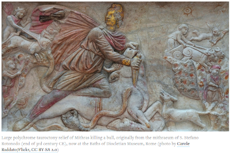
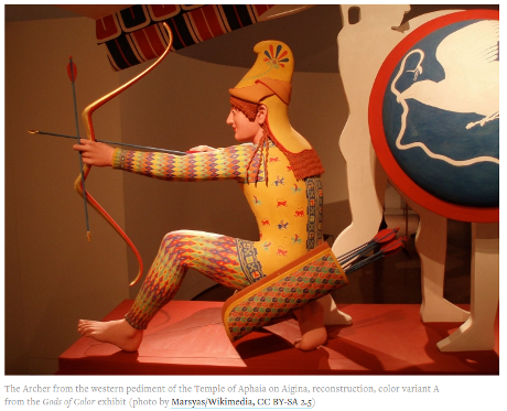
Modern technology has revealed an irrefutable, if unpopular, truth: many of the statues, reliefs, and sarcophagi created in the ancient Western world were in fact painted. Marble was a precious material for Greco-Roman artisans, but it was considered a canvas, not the finished product for sculpture. It was carefully selected and then often painted in gold, red, green, black, white, and brown, among other colors.

A number of fantastic museum shows throughout Europe and the US in recent years have addressed the issue of ancient polychromy. The Gods in Color exhibit travelled the world between 2003–15, after its initial display at the Glyptothek in Munich. (Many of the photos in this essay come from that exhibit, including the famed Caligula bust and the Alexander Sarcophagus.) Digital humanists and archaeologists have played a large part in making those shows possible. In particular, the archaeologist Vinzenz Brinkmann, whose research informed Gods in Color, has done important work, applying various technologies and ultraviolet light to antique statues in order to analyze the minute vestiges of paint on them and then recreate polychrome versions.

Acceptance of polychromy by the public is another matter. A friend peering up at early-20th-century polychrome terra cottas of mythological figures at the Philadelphia Museum of Art once remarked to me: “There is no way the Greeks were that gauche.” How did color become gauche? Where does this aesthetic disgust come from? To many, the pristine whiteness of marble statues is the expectation and thus the classical ideal. But the equation of white marble with beauty is not an inherent truth of the universe. Where this standard came from and how it continues to influence white supremacist ideas today are often ignored.

Most museums and art history textbooks contain a predominantly neon white display of skin tone when it comes to classical statues and sarcophagi. This has an impact on the way we view the antique world. The assemblage of neon whiteness serves to create a false idea of homogeneity — everyone was very white! — across the Mediterranean region. The Romans, in fact, did not define people as “white”; where, then, did this notion of race come from?

A great post and reminder that learning history (or current events) through a particular lens isn’t the same as the only view of history (or current events).

I originally wrote “an accurate view of history….” but that’s not true. At best we have one or more views and when called upon to act, make decisions upon those views. “Accuracy” is something that lies beyond our human grasp.

The reminder I would add to this post is that recognition of a lens, in this case, the absence of color in our learning of history, isn’t overcome by our naming it and perhaps nodding in agreement, yes, that was a short fall in our learning.

“Knowing” about the coloration of familiar art work doesn’t erase centuries of considering it without color. No amount of pretending will make it otherwise.

Humanists should learn about and promote the use of colorization so the youth of today learn different traditions than the ones we learned.

June 1, 2017

30,000 Getty Museum Images Published Online as IIIF

Filed under: Art,Museums — Patrick Durusau @ 3:18 pm

30,000 Getty Museum Images Published Online as IIIF by Rob Sanderson.

From the post:

Today we published more than 30,000 images from the Getty Museum’s collection on Getty.edu using IIIF. You can see and click on the red-and-blue logo underneath the main image of any of the Museum collections, such as Van Gogh’s Irises, to explore our content through any IIIF-compatible viewer.

We’re happy to join another IIIF partner, the Yale Center for British Art, which is also releasing images as IIIF today—you can read their announcement here and browse their collection here.

About IIIF

IIIF (pronounced “triple eye eff”) is the acronym for the International Image Interoperability Framework. This framework comes from a broad community of primarily cultural heritage organizations that are working together to come to practical consensus around the publishing of digital images. By adopting the framework, the public as well as scholars can bring together images from any of the participating organizations for comparison, manipulation, and annotation in a single user interface. This community has agreed upon, published, and implemented two major specifications. Representing the Getty in this community, and working toward implementation of IIIF here, has been one of my major roles since joining the Getty as semantic architect.

The images now available via IIIF are from the Open Content Program. These were selected as the first tranche of content, as the rights have already been cleared to make them openly available. Any new images added to the Open Content set will automatically be available via IIIF, and images from Getty Research Institute collections are expected to be available before the end of the year.

I could attempt to describe the visualization capabilities of IIIF, but it’s best that you explore Van Gogh’s Irises on your own.

Impressive!

May 21, 2017

Gotta Minute To Help @WikiCommons?

Filed under: Art,Open Access,Public Data — Patrick Durusau @ 3:17 pm

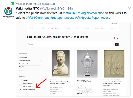
Wikimedia NYC tweeted and Michael Peter Edison retweeted:

I know. Moving images from one silo to another.

But, it does increase the odds of @WikiCommons users finding the additional images. That’s a good thing.

Take a minute to visit, https://metmuseum.org/art/collection, select the public domain facet and grab an image to upload to WikiMedia Commons.

The process is quite painless, I uploaded The Pit of Acheron, or the Birth of of the Plagues of England today.

With practice it should take less than a minute but I got diverted looking for more background on the image.

Rowlandson the Caricaturist: A Selection from His Works, with Anecdotal Descriptions of His Famous Caricatures and a Sketch of His Life, Times, and Contemporaries, Volume 1 by Joseph Greco, J. W. Bouton, New York, 1880, page 112:

January 1. 1784. The Pit of Acheron, or the Birth of of the Plagues of England. —

The Pit of Acheron, if we may trust the satirist, is not situated at any considerable distance from Westminister; the precincts of that city appear through the smoke of the incantations which are carried on in the Pit. Three weird sisters, like the Witches in ‘Macbeth,’ are working the famous charm; a monstrous cauldron is supported by death’s-heads and harpies; the ingredients of the broth are various; a crucifix, a rosary, Deceit, Loans, Lotteries, and Pride, together with a fox’s head, cards, dice, daggers, and an executioner’s axe, &c., form portions of the accessories employed in these uncanny rites. Three heads are rising from the flames—the good-natured face of Lord North, the spectacled and incisive outline of Burke, and Fox’s ‘gunpowder jowl,’ which is drifting Westminster-wards. One hag, who is dropping Rebellion into the brew, is demanding, ‘Well, sister, what hast thou got for the ingredients of our charm’d pot?’ To this her fellow-witch, who is turning out certain mischievous ingredients which she has collected in her bag, is responding, ‘A best from Scotland called an Erskine, famous for duplicity, low art, and cunning; the other a monster who’d spurn even at Charter’s Rights.’ Erskine is shot out of the bag, crying, ‘I am like a Proteus, can turn any shape, from a sailor to a lawyer, and always lean to the strongest side!’ The other member, whose tail is that of a serpent, is singing, ‘Over the water and over the lee, thro’ hell I would follow my Charlie.’

I remain uncertain about the facts and circumstances surrounding the Westminster election of 1784 that would further explain this satire. Perhaps another day.

If you can’t wait, consider reading History of the Westminster Election, containing Every Material Occurrence, from its commencement On the First of April to the Close of the Poll, on the 17th of May, to which is prefixed A Summary Account of the Proceedings of the Late Parliament by James Hartley. (562 pages)

Rowlandson was also noted for his erotica: collection of erotica by Rowlandson.

May 12, 2017

The Cartoon Bank

Filed under: Art,Image Recognition,Indexing,Searching — Patrick Durusau @ 4:30 pm

The Cartoon Bank by the Condé Nast Collection.

While searching for a cartoon depicting Sean Spicer at a White House news briefing, I encountered The Cartoon Bank.

A great source of instantly recognized cartoons but I’m still searching for one I remember from decades ago. 😉

June 12, 2016

Art and the Law: [UK Focused]

Filed under: Art,Censorship,Free Speech,Law — Patrick Durusau @ 4:29 pm

Art and the Law: Guides to the legal framework and its impact on artistic freedom of expression by Jodie Ginsberg, chief executive, Index on Censorship.

From the post:

Freedom of expression is essential to the arts. But the laws and practices that protect and nurture free expression are often poorly understood both by practitioners and by those enforcing the law.

As part of Index on Censorship’s work on art and offence, Index has published a series of law packs intended to address questions about legal limits related to free expression and the arts.

We intend them as “living” documents, to be enhanced and developed in partnership with arts groups so that artistic freedom is nurtured and nourished.

This work builds on an earlier study by Index on Censorship, Taking the Offensive, which showed how self-censorship manifests itself in arts organisations and institutions.

Descriptions of:

Child Protection: PDF | web

Counter Terrorism: PDF | web

Obscene Publications: PDF | web

Public Order: PDF | web

Race and Religion: PDF | web

along with numerous other resources appear on this page.

Realize these are UK specific and the laws on such matters vary widely. That’s not a criticism but an observation for the safety of readers. Check your local laws with qualified legal advisers.

Unlike Jonathan “I Want To Be A Twitter Censor” Weisman, my advice for when you find offensive content, is to look away.

What other people choose to create, publish, perform, listen to, view, read, etc., is their business and certainly none of yours.

Criminal acts against other people, children in particular, are already unlawful and censorship isn’t required outlaw them.

May 12, 2016

For The Artistically Challenged (that includes me)

Filed under: Art,Graphics,Visualization — Patrick Durusau @ 8:29 pm

via GIPHY

If you are looking for animated gifs for a blog post, presentation, etc., give GIPHY a try.

Now that I have found it, I’m likely to spend too much time looking for the perfect animated GIF.

Enjoy!

April 14, 2016

Clojure Code Sample Appears to VBA team

Filed under: Art,Humor,Programming — Patrick Durusau @ 8:17 pm

clojure-code-sample-vba-team

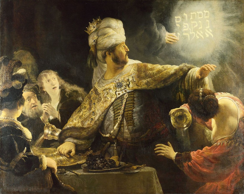
The caption as reported at: Classic Programmer Paintings reads:

“Consultant shows Clojure code sample to VBA team”, Rembrandt, Oil on canvas, 1635

Whether shown by a consultant or being written on the wall by a disembodied hand, I suspect the impact would be the same. 😉

There is a Bosch triplet at Classic Programmer Paintings.

I was about to lament the lack of high-resolution Bosch images but then discovered Extraordinary Interactive Hi-Res Exhibit of Bosch’s ‘Garden of Earthly Delights’ by Christopher Jobson.

As Jobson comments:

This is the internet we were promised.

Enjoy!

April 6, 2016

Exploratory Programming for the Arts and Humanities

Filed under: Art,Humanities,Programming — Patrick Durusau @ 8:28 pm

Exploratory Programming for the Arts and Humanities by Nick Montfort.

From the webpage:

This book introduces programming to readers with a background in the arts and humanities; there are no prerequisites, and no knowledge of computation is assumed. In it, Nick Montfort reveals programming to be not merely a technical exercise within given constraints but a tool for sketching, brainstorming, and inquiring about important topics. He emphasizes programming’s exploratory potential—its facility to create new kinds of artworks and to probe data for new ideas.

The book is designed to be read alongside the computer, allowing readers to program while making their way through the chapters. It offers practical exercises in writing and modifying code, beginning on a small scale and increasing in substance. In some cases, a specification is given for a program, but the core activities are a series of “free projects,” intentionally underspecified exercises that leave room for readers to determine their own direction and write different sorts of programs. Throughout the book, Montfort also considers how computation and programming are culturally situated—how programming relates to the methods and questions of the arts and humanities. The book uses Python and Processing, both of which are free software, as the primary programming languages.

Full Disclosure: I haven’t seen a copy of Exploratory Programming.

I am reluctant to part with $40.00 US for either print or an electronic version where the major heads in the table of contents read as follows:

1 Modifying a Program

2 Calculating

3 Double, Double

4 Programming Fundamentals

5 Standard Starting Points

6 Text I

7 Text II

8 Image I

9 Image II

10 Text III

11 Statistics and Visualization

12 Animation

13 Sound

14 Interaction

15 Onward

The table of contents shows more than one hundred pages out of two hundred and sixty-three are spend on introduction to computer programming topics.

Text, which has a healthy section on string operations, merits a mere seventy pages. The other one hundred pages is split between visualization, sound, animation, etc.

Compare that table of contents with this one*:

Chapter One – Modular Programming: An Approach

Chapter Two – Data Entry and Text Verification

Chapter Three – Index and Concordance

Chapter Four – Text Criticism

Chapter Five – Improved Searching Techniques

Chapter Six – Morphological Analysis

Which table of contents promises to be more useful for exploration?

Personal computers are vastly more powerful today than when the second table of contents was penned.

Yet, students start off as though they are going to write their own tools from scratch. Unlikely and certainly not the best use of their time.

In depth coverage of the NLTK Toolkit historical or contemporary texts, in depth, would teach them a useful tool. A tool they could apply to other material.

To cover machine learning, consider Weka. A tool students can learn in class and then apply in new and different situations.

There are tools for image and sound analysis but the important term is tool.

Just as we don’t teach students to make their own paper, we should focus on enabling them to reap the riches that modern software tools offer.

Or to put it another way, let’s stop repeating the past and move forward.

* Oh, the second table of contents? Computer Programs for Literary Analysis, John R. Abercrombie, Philadelphia : Univ. of Philadelphia Press, ©1984. Yes, 1984.

March 4, 2016

Paul Klee’s Personal Notebooks Online (Art, Design)

Filed under: Art,Design — Patrick Durusau @ 5:33 pm

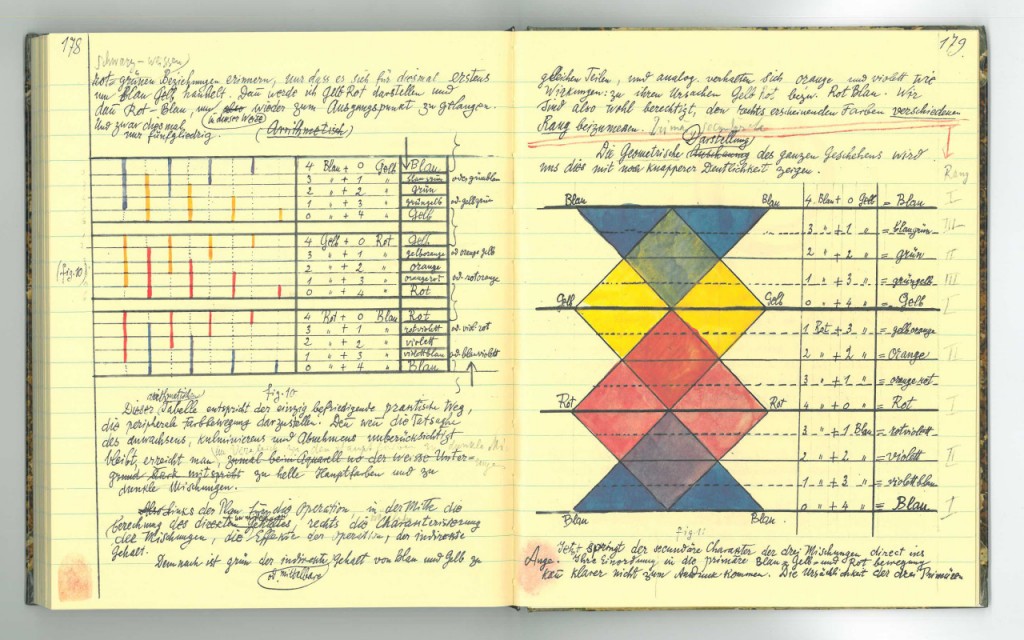
3,900 Pages of Paul Klee’s Personal Notebooks Are Now Online, Presenting His Bauhaus Teachings (1921-1931)

Two snippets and an image to get you interested:

Paul Klee led an artistic life that spanned the 19th and 20th centuries, but he kept his aesthetic sensibility tuned to the future. Because of that, much of the Swiss-German Bauhaus-associated painter’s work, which at its most distinctive defines its own category of abstraction, still exudes a vitality today.

Klee-Notebooks-3

More recently, the Zentrum Paul Klee made available online almost all 3,900 pages of Klee’s personal notebooks, which he used as the source for his Bauhaus teaching between 1921 and 1931. If you can’t read German, his extensively detailed textual theorizing on the mechanics of art (especially the use of color, with which he struggled before returning from a 1914 trip to Tunisia declaring, “Color and I are one. I am a painter”) may not immediately resonate with you. But his copious illustrations of all these observations and principles, in their vividness, clarity, and reflection of a truly active mind, can still captivate anybody — just as his paintings do.

A reminder that design is never a “solved” problem but one that changes as culture does.

I first saw this in a tweet by Alexis Lloyd.

February 7, 2016

‘Avengers’ Comic Book Covers [ + MAD, National Lampoon]

Filed under: Art,Graphics,Visualization — Patrick Durusau @ 3:31 pm

50 Years of ‘Avengers’ Comic Book Covers Through Color by Jon Keegan.

From the post:

When Marvel’s “Avengers: Age of Ultron” opens in theaters next month, a familiar set of iconic colors will be splashed across movie screens world-wide: The gamma ray-induced green of the Hulk, Iron Man’s red and gold armor, and Captain America’s red, white and blue uniform.

How the Avengers look today differs significantly from their appearance in classic comic-book versions, thanks to advancements in technology and a shift to a more cinematic aesthetic. As Marvel’s characters started to appear in big-budget superhero films such as “X-Men” in 2000, the darker, muted colors of the movies began to creep into the look of the comics. Explore this shift in color palettes and browse more than 50 years of “Avengers” cover artwork below. Read more about this shift in color.

The fifty years of palettes are a real treat and should be used alongside your collection of the Avenger comics for the same time period. 😉

From what I could find quickly, you will have to purchase the forty year collection separately from more recent issues.

Of course, if you really want insight into American culture, you would order Absolutely MAD Magazine – 50+ Years.

MAD issues from 1952 to 2005 (17,500 pages in full color). Annotating those issues to include social context would be a massive but highly amusing project. And you would have to find a source for the following issues.

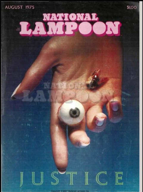
A more accessible collection that is easily as amusing as MAD would be the National Lampoon collection. Unfortunately, only 1970 – 1975 are online. 🙁

One of my personal favorites:

justice-lampoon

Visualization of covers is a “different” way to view all of these collections and with no promises, could be interesting comparisons to contemporary events when they were published.

Mapping the commentaries you will find in MAD and National Lampoon to current events when they were published, say to articles in New York Time historical archive, would be a great history project for students and an education in social satire as well.

If anyone objects to the lack of a “serious” nature of such a project, be sure to remind them that reading the leading political science journal of the 1960’s, the American Political Science Review would have left the casual reader with few clues that the United States was engaged in a war that would destroy the lives of millions in Vietnam.

In my experience, “serious” usually equates with “supports the current system of privilege and prejudice.”

You can be “serious” or you can choose to shape a new system of privilege and prejudice.

Your call.

February 6, 2016

Between the Words [Alternate Visualizations of Texts]

Filed under: Art,Literature,Visualization — Patrick Durusau @ 8:49 pm

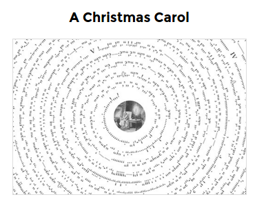
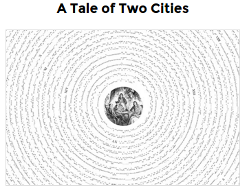
Between the Words – Exploring the punctuation in literary classics by Nicholas Rougeux.

From the webpage:

Between the Words is an exploration of visual rhythm of punctuation in well-known literary works. All letters, numbers, spaces, and line breaks were removed from entire texts of classic stories like Alice’s Adventures in Wonderland, Moby Dick, and Pride and Prejudice—leaving only the punctuation in one continuous line of symbols in the order they appear in texts. The remaining punctuation was arranged in a spiral starting at the top center with markings for each chapter and classic illustrations at the center.

The posters are 24″ X 36.”

Some small images to illustrate the concept:

achistmascarol

ataleoftwocities

aliceinwonderland

I’m not an art critic but I can say that unusual or unexpected visualizations of data can lead to new insights. Or should I say different insights than you may have previously held.

Seeing this visualization reminded me of a presentation too any years ago at Cambridge that argued the cantillation (think crudely “accents”) marks in the Hebrew Bible were a reliable guide to clause boundaries and reading.

FYI, the versification and divisions in the oldest known witnesses to the Hebrew Bible were added centuries after the text stabilized. There are generally accepted positions on the text but at best, they are just that, generally accepted positions.

Any number of alternative presentations of texts suggest themselves.

I haven’t performed the experiment but for numeric data, reordering the data so as to force re-casting of formulas, could be a way to explore presumptions that are glossed over the the “usual form.”

Not unlike copying a text by hand as opposed to typing or photocopying the text. Each step of performing the task with less deliberation increases the odds you will miss some decision that you are making unconsciously.

If you like these posters ore know an English major/professor who may, pass this site along to them. (I have no interest, financial or otherwise in this site but I like to encourage creative thinking.)

I first saw this in a tweet by Christopher Phipps.

May 12, 2015

Creative computing with Clojure

Filed under: Art,Clojure,Music — Patrick Durusau @ 3:56 pm

Creative computing with Clojure by Carin Meier.

From the post:

Clojure is gaining traction and popularity as a programming language. Both enterprises and startups are adopting this functional language because of the simplicity, elegance, and power that it brings to their business. The language originated on the JVM, but has since spread to run on the CLR and Node.js, including web browsers and mobile devices. With this spread of practical innovation, there has been another delightful development: a groundswell of people making art with Clojure.

Carin covers music, visual arts, dance, and animation, with pointers to videos and projects.

If you are looking for a challenging but enjoyable escape from the daily news, this is a good place to start!

April 9, 2015

Web Gallery of Art

Filed under: Art,Humanities — Patrick Durusau @ 11:11 am

Web Gallery of Art

From the homepage:

The Web Gallery of Art is a virtual museum and searchable database of European fine arts from 11th to 19th centuries. It was started in 1996 as a topical site of the Renaissance art, originated in the Italian city-states of the 14th century and spread to other countries in the 15th and 16th centuries. Intending to present Renaissance art as comprehensively as possible, the scope of the collection was later extended to show its Medieval roots as well as its evolution to Baroque and Rococo via Mannerism. Encouraged by the feedback from the visitors, recently 19th-century art was also included. However, we do not intend to present 20th-century and contemporary art.

The collection has some of the characteristics of a virtual museum. The experience of the visitors is enhanced by guided tours helping to understand the artistic and historical relationship between different works and artists, by period music of choice in the background and a free postcard service. At the same time the collection serves the visitors’ need for a site where various information on art, artists and history can be found together with corresponding pictorial illustrations. Although not a conventional one, the collection is a searchable database supplemented by a glossary containing articles on art terms, relevant historical events, personages, cities, museums and churches.

The Web Gallery of Art is intended to be a free resource of art history primarily for students and teachers. It is a private initiative not related to any museums or art institutions, and not supported financially by any state or corporate sponsors. However, we do our utmost, using authentic literature and advice from professionals, to ensure the quality and authenticity of the content.

We are convinced that such a collection of digital reproductions, containing a balanced mixture of interlinked visual and textual information, can serve multiple purposes. On one hand it can simply be a source of artistic enjoyment; a convenient alternative to visiting a distant museum, or an incentive to do just that. On the other hand, it can serve as a tool for public education both in schools and at home.

The Gallery doesn’t own the works in question and so resolves the copyright issue thus:

The Web Gallery of Art is copyrighted as a database. Images and documents downloaded from this database can only be used for educational and personal purposes. Distribution of the images in any form is prohibited without the authorization of their legal owner.

The Gallery suggests contacting the Scala Group (or Art Resource, Scala’s U.S. representative) if you need rights beyond educational and personal purposes.

To see how images are presented, view 10 random images from the database. (Warning: The 10 random images link will work only once. If you try it again, images briefly display and then an invalid CGI environment message pops up. Suspect if you clear the browser cache it should work a second time.)

BTW, you can listen to classical music in the background while you browse/search. That is a very nice touch.

The site offers other features and options so take time to explore.

Having seen some of Michelangelo‘s works in person, I can attest no computer screen can duplicate that experience. However, if given the choice between viewing a pale imitation on a computer screen and not seeing his work at all, the computer version is a no brainer.

Rijksmuseum Online Collection Doubles!

Filed under: Art — Patrick Durusau @ 10:21 am

Rijksmuseum Digitizes & Makes Free Online 210,000 Works of Art, Masterpieces Included! by Colin Marshall.

From the post:

We all found it impressive when Amsterdam’s Rijksmuseum put up 125,000 Dutch works of art online. “Users can explore the entire collection, which is handily sorted by artist, subject, style and even by events in Dutch history,” explained Kate Rix in our first post announcing it. ” “Not only can users create their own online galleries from selected works in the museum’s collection, they can download Rijksmuseum artwork for free to decorate new products.”

I first posted about the Rijksmuseum in 2011, High-Quality Images from the Amsterdam Rijksmuseum, when the collection was “only” 103,000 items.

Significant not only for the quantity of high quality materials but also because you are free to remix the images found here to create your own! Unusual to say the least in these IP maddened times.

Remember there is an API to access this collection, see: https://www.rijksmuseum.nl/nl/api. API keys are free for the asking.

You have to register with the museum (free) and after creating your login, etc. choose “Advanced setting” while on your profile page. Describe your intended use and request a key.

BTW, the one improvement I would make to the museum pages would be to make registering in order to obtain an API key a bit more obvious. Say on the “About” page? I didn’t find an obvious page to register. Fortunately the GitHub site mentions it, so start at: https://www.rijksmuseum.nl/nl/mijn/gegevens, create a new account and then you will see “Advanced settings” at the bottom of the full registration page.

Enjoy!

April 7, 2015

Download 422 Free Art Books from The Metropolitan Museum of Art

Filed under: Art,Museums — Patrick Durusau @ 2:54 pm

Download 422 Free Art Books from The Metropolitan Museum of Art by Colin Marshall.

From the post:

Met-1

You could pay $118 on Amazon for the Metropolitan Museum of Art’s catalog The Art of Illumination: The Limbourg Brothers and the Belles Heures of Jean de France, Duc de Berry. Or you could pay $0 to download it at MetPublications, the site offering “five decades of Met Museum publications on art history available to read, download, and/or search for free.” If that strikes you as an obvious choice, prepare to spend some serious time browsing MetPublications’ collection of free art books and catalogs.

Judging from the speed of my download today, this is a really popular announcement!

Stash this with your other links for art, artwork, etc. as resources for a topic map.

August 19, 2014

Seeing Things Art Historians Don’t

Filed under: Art,Artificial Intelligence,Machine Learning — Patrick Durusau @ 3:33 pm

When A Machine Learning Algorithm Studied Fine Art Paintings, It Saw Things Art Historians Had Never Noticed: Artificial intelligence reveals previously unrecognised influences between great artists

From the post:

The task of classifying pieces of fine art is hugely complex. When examining a painting, an art expert can usually determine its style, its genre, the artist and the period to which it belongs. Art historians often go further by looking for the influences and connections between artists, a task that is even trickier.

So the possibility that a computer might be able to classify paintings and find connections between them at first glance seems laughable. And yet, that is exactly what Babak Saleh and pals have done at Rutgers University in New Jersey.

These guys have used some of the latest image processing and classifying techniques to automate the process of discovering how great artists have influenced each other. They have even been able to uncover influences between artists that art historians have never recognised until now.

At first I thought the claim was that computer saw something art historians did not. That’s not hard. The question is whether you can convince anyone else to see what you saw. 😉

I stumbled a bit on figure 1 both in the post and in the paper. The caption for figure 1 in the article says:

Figure 1: An example of an often cited comparison in the context of influence. Left: Diego Vel´azquez’s Portrait of Pope Innocent X (1650), and, Right: Francis Bacon’s Study After Vel´azquez’s Portrait of Pope Innocent X (1953). Similar composition, pose, and subject matter but a different view of the work.

Well, not exactly. Bacon never saw the original Portrait of Pope Innocent X but produced over forty-five variants of it. It wasn’t a question of “influence” but of subsequent interpretations of the portrait. Not really the same thing as influence. See: Study after Velázquez’s Portrait of Pope Innocent X

I feel certain this will be a useful technique for exploration but naming objects in a painting would result in a large number of painting of popes sitting in chairs. Some of which may or may not have been “influences” in subsequent artists.

Or to put it another way, concluding influence, based on when artists lived, is a post hoc ergo propter hoc fallacy. Good technique to find possible places to look but not a definitive answer.

The original post was based on: Toward Automated Discovery of Artistic Influence

Abstract:

Considering the huge amount of art pieces that exist, there is valuable information to be discovered. Examining a painting, an expert can determine its style, genre, and the time period that the painting belongs. One important task for art historians is to find influences and connections between artists. Is influence a task that a computer can measure? The contribution of this paper is in exploring the problem of computer-automated suggestion of influences between artists, a problem that was not addressed before in a general setting. We first present a comparative study of different classification methodologies for the task of fine-art style classification. A two-level comparative study is performed for this classification problem. The first level reviews the performance of discriminative vs. generative models, while the second level touches the features aspect of the paintings and compares semantic-level features vs. low-level and intermediate-level features present in the painting. Then, we investigate the question “Who influenced this artist?” by looking at his masterpieces and comparing them to others. We pose this interesting question as a knowledge discovery problem. For this purpose, we investigated several painting-similarity and artist-similarity measures. As a result, we provide a visualization of artists (Map of Artists) based on the similarity between their works

I first saw this in a tweet by yarapavan.

March 5, 2014

On Data and Performance

Filed under: Art,Data,Topic Maps — Patrick Durusau @ 4:46 pm

On Data and Performance by Jer Thorp.

From the post:

Data live utilitarian lives. From the moment they are conceived, as measurements of some thing or system or person, they are conscripted to the cause of being useful. They are fed into algorithms, clustered and merged, mapped and reduced. They are graphed and charted, plotted and visualized. A rare datum might find itself turned into sound, or, more seldom, manifested as a physical object. Always, though, the measure of the life of data is in its utility. Data that are collected but not used are condemned to a quiet life in a database. They dwell in obscure tables, are quickly discarded, or worse (cue violin) – labelled as ‘exhaust’.

Perhaps this isn’t the only role for a datum? To be operated on? To be useful?

Over the last couple of years, with my collaborators Ben Rubin & Mark Hansen, we’ve been investigating the possibility of using data as a medium for performance. Here, data becomes the script, or the score, and in turn technologies that we typically think of as tools become instruments, and in some cases performers.

The most recent manifestation of these explorations is a performance called A Thousand Exhausted Things, which we recently staged at The Museum of Modern Art, with the experimental theater group Elevator Repair Service. In this performance, the script is MoMA’s collections database, an eighty year-old, 120k object strong archive. The instruments are a variety of custom-written natural language processing algorithms, which are used to turn the text of the database (largely the titles of artworks) into a performable form.

The video would have been far more effective had it included the visualization at all time with the script and actors.

The use of algorithms to create a performance from the titles of works reminds me of Stanley Fish’s How to Recognize a Poem When You See One. From my perspective, the semantics you “see” in data are the semantics you expect to see. What else would they be?

What I find very powerful about topic maps is that different semantics can reside side by side for the same data.

I first saw this in tweet by blprnt.

February 22, 2014

Getty Art & Architecture Thesaurus Now Available

Filed under: Architecture,Art,Linked Data,Museums,Thesaurus — Patrick Durusau @ 8:36 pm

Art & Architecture Thesaurus Now Available as Linked Open Data by James Cuno.

From the post:

We’re delighted to announce that today, the Getty has released the Art & Architecture Thesaurus (AAT)® as Linked Open Data. The data set is available for download at vocab.getty.edu under an Open Data Commons Attribution License (ODC BY 1.0).

The Art & Architecture Thesaurus is a reference of over 250,000 terms on art and architectural history, styles, and techniques. It’s one of the Getty Research Institute’s four Getty Vocabularies, a collection of databases that serves as the premier resource for cultural heritage terms, artists’ names, and geographical information, reflecting over 30 years of collaborative scholarship. The other three Getty Vocabularies will be released as Linked Open Data over the coming 18 months.

In recent months the Getty has launched the Open Content Program, which makes thousands of images of works of art available for download, and the Virtual Library, offering free online access to hundreds of Getty Publications backlist titles. Today’s release, another collaborative project between our scholars and technologists, is the next step in our goal to make our art and research resources as accessible as possible.

What’s Next

Over the next 18 months, the Research Institute’s other three Getty Vocabularies—The Getty Thesaurus of Geographic Names (TGN)®, The Union List of Artist Names®, and The Cultural Objects Name Authority (CONA)®—will all become available as Linked Open Data. To follow the progress of the Linked Open Data project at the Research Institute, see their page here.

A couple of points of particular interest:

Getty documentation says this is the first industrial application of ISO 25964 Information and documentation – Thesauri and interoperability with other vocabularies..

You will probably want to read AAT Semantic Representation rather carefully.

A great source of data and interesting reading on the infrastructure as well.

I first saw this in a tweet by Semantic Web Company.

Powered by WordPress