BBC trials a way to explain complex backstories in its shows by Nick Summers.
From the post:
Most of the BBC’s programming is only available for 30 days on iPlayer, so trying to keep up with long-running and complicated TV shows can be a pain. Want to remember how River Song fits into the Doctor Who universe, but don’t have the DVD box sets to hand? Your best option is normally to browse Wikipedia or some Whovian fan sites. To tackle the problem, the BBC is experimenting with a site format called “Story Explorer,” which could explain storylines and characters for some of its most popular shows. Today, the broadcaster is launching a version for its Home Front radio drama with custom illustrations, text descriptions and audio snippets. More importantly, the key events are laid out as simple, vertical timelines so that you can easily track the show’s wartime chronology.
With three seasons, sixteen interlocking storylines and 21 hours of audio, Story Explorer could be a valuable resource for new and lapsed Home Front fans. It’s been released as part of BBC Taster, a place where the broadcaster can share some of its more creative and forward-thinking ideas with the public. There’s a good chance it won’t be taken any further, although the BBC is already asking on its blog whether license fee payers would like an “informative, attractive and scalable” version “linked through to the rest of the BBC and the web.” Sort of like a multimedia Wikipedia for BBC shows, then. The broadcaster has suggested that the same format could be used to support shows like Doctor Who, Casualty, Luther, Poldark, Wolf Hall and The Killing. It sounds like a pretty good idea to us — an easy way for younger Who fans to recap early seasons would go down a storm.
This is one of those times when you wonder why you don’t live in the UK? Isn’t the presence of the BBC enough of a reason for immigration?
There are all those fascists at the ports of entry, so say nothing of the lidless eyes and their operators that follow you around. But still, there is the BBC, at the cost of living in a perpetual security state.
Doesn’t the idea of navigating through a series with links to other BBC and one presumes British Library and Museum resources sound quite topic map like? Rather than forcing viewers to rely upon fan sites with their trolls and fanatics? (sorry, no pun intended)
Of course, if the BBC had an effective (read user friendly) topic map authoring tool on its website, then fans could contribute content, linked to programs or even scenes, at their own expense, to be lightly edited by staff, in order to grow viewers around BBC offerings.
I suspect some nominal payment could be required to defray the cost of editing comments. Most of the people I know would pay for the right to “have their say,” even if the reading of other people’s content was free.
Should the BBC try that suggestion, I hope it works very well for them. I only ask in return is that they market the BBC more heavily to cable providers in the American South. Thanks!
For a deeper background on Story Explorer, see: Home Front Story Explorer: Putting BBC drama on the web by Tristan Ferne.
Check out this graphic from Tristan’s post:
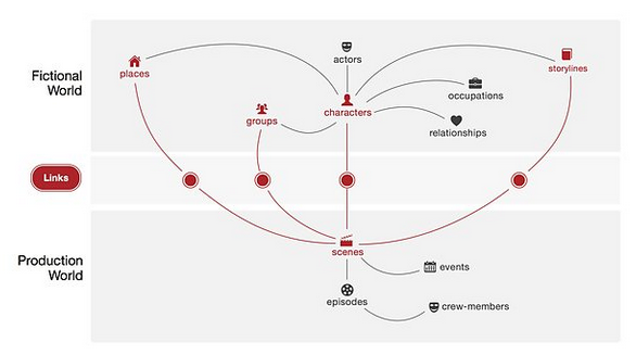
Doesn’t that look like a topic map to you?
Well, except that I would have topics to represent the relationships (associations) and include the “real world” (gag, how I hate that phrase) as well as those shown.
