Another Word For It Patrick Durusau on Topic Maps and Semantic Diversity

April 2, 2016

Time Maps:…

Filed under: Mapping,Maps,Time,Timelines — Patrick Durusau @ 4:49 pm

Time Maps: Visualizing Discrete Events Across Many Timescales by Max Watson.

From the post:

In this blog post, I’ll describe a technique for visualizing many events across multiple timescales in a single image, where little or no zooming is required. It allows the viewer to quickly identify critical features, whether they occur on a timescale of milliseconds or months. It is adopted from the field of chaotic systems, and was originally conceived to study the timing of water drops from a dripping faucet. The visualization has gone by various names: return map, return-time map, and time vs. time plot. For conciseness, I will call them “time maps.” Though time maps have been used to visualize chaotic systems, they have not been applied to information technology. I will show how time maps can provide valuable insights into the behavior of Twitter accounts and the activity of a certain type of online entity, known as a bot.

This blog post is a shorter version of a paper I recently wrote, but with slightly different examples. The paper was accepted to the 2015 IEEE Big Data Conference. The end of the blog also contains sample Python code for creating time maps.

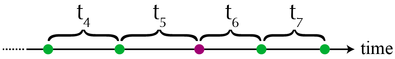
Building a time map is easy. First, imagine a series of events as dots along a time axis. The time intervals between each event are labeled as t1, t2, t3, t4, …

watson-1

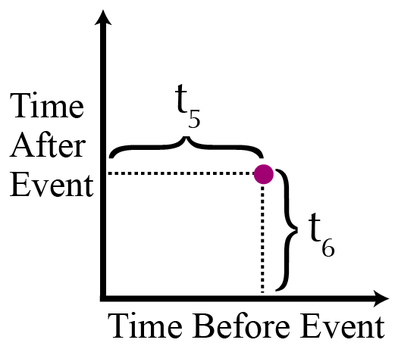
A time map is simply a two-dimensional scatterplot, where the xy coordinates of the events are: (t1,t2), (t2, t3), (t3, t4), and so on. On a time map, the purple dot would be plotted like this:

watson-2

In other words, each point in the scatterplot represents an event. The x-coordinate of an event is the time between the event itself and the preceding event. An event’s y-coordinate is the time between the event itself and the subsequent event. The only points that are not displayed in a time map are the first and last events of the dataset.

Max goes on to cover the heuristics of time maps, along with the Python code for generating them.

Max’s time maps use a common time line for events and so aren’t well suited to visualizing overlapping narrative time frames such as occur in novels and/or real life.

I first saw this in a tweet by Data Science Renee

October 30, 2015

Time Curves

Filed under: Temporal Data,Temporal Semantic Analysis,Time,Time Series,Visualization — Patrick Durusau @ 4:33 pm

Time Curves by Benjamin Bach, Conglei Shi, Nicolas Heulot, Tara Madhyastha, Tom Grabowski, Pierre Dragicevic.

From What are time curves?:

Time curves are a general approach to visualize patterns of evolution in temporal data, such as:

  • Progression and stagantion,
  • sudden changes,
  • regularity and irregularity,
  • reversals to previous states,
  • temporal states and transitions,
  • reversals to previous states,
  • etc..

Time curves are based on the metaphor of folding a timeline visualization into itself so as to bring similar time points close to each other. This metaphor can be applied to any dataset where a similarity metric between temporal snapshots can be defined, thus it is largely datatype-agnostic. We illustrate how time curves can visually reveal informative patterns in a range of different datasets.

A website to accompany:

Time Curves: Folding Time to Visualize Patterns of Temporal Evolution in Data

Abstract:

We introduce time curves as a general approach for visualizing patterns of evolution in temporal data. Examples of such patterns include slow and regular progressions, large sudden changes, and reversals to previous states. These patterns can be of interest in a range of domains, such as collaborative document editing, dynamic network analysis, and video analysis. Time curves employ the metaphor of folding a timeline visualization into itself so as to bring similar time points close to each other. This metaphor can be applied to any dataset where a similarity metric between temporal snapshots can be defined, thus it is largely datatype-agnostic. We illustrate how time curves can visually reveal informative patterns in a range of different datasets.

From the introduction:


The time curve technique is a generic approach for visualizing temporal data based on self-similarity. It only assumes that the underlying information artefact can be broken down into discrete time points, and that the similarity between any two time points can be quantified through a meaningful metric. For example, a Wikipedia article can be broken down into revisions, and the edit distance can be used to quantify the similarity between any two revisions. A time curve can be seen as a timeline that has been folded into itself to reflect self-similarity (see Figure 1(a)). On the initial timeline, each dot is a time point, and position encodes time. The timeline is then stretched and folded into itself so that similar time points are brought close to each other (bottom). Quantitative temporal information is discarded as spacing now reflects similarity, but the temporal ordering is preserved.

Figure 1(a) also appears on the webpage as:

benjamin-bach01

Obviously a great visualization tool for temporal data but the treatment of self-similarity is greatly encouraging:

that the similarity between any two time points can be quantified through a meaningful metric.

Time curves don’t dictate to users what “meaningful metric” to use for similarity.

BTW, as a bonus, you can upload your data (JSON format) to generate time curves from your own data.

Users/analysts of temporal data need to take a long look at time curves. A very long look.

I first saw this in a tweet by Moritz Stefaner.

March 29, 2015

OpenTSDB 2.0.1

Filed under: Database,OpenTSDB,Time,Time Series — Patrick Durusau @ 6:52 pm

OpenTSDB 2.0.1

From the homepage:

Store

  • Data is stored exactly as you give it
  • Write with millisecond precision
  • Keep raw data forever

Scale

  • Runs on Hadoop and HBase
  • Scales to millions of writes per second
  • Add capacity by adding nodes

Read

  • Generate graphs from the GUI
  • Pull from the HTTP API
  • Choose an open source front-end

If that isn’t impressive enough, check out the features added for the 2.0 release:

OpenTSDB has a thriving community who contributed and requested a number of new features. 2.0 has the following new features:

  • Lock-less UID Assignment – Drastically improves write speed when storing new metrics, tag names, or values
  • Restful API – Provides access to all of OpenTSDB’s features as well as offering new options, defaulting to JSON
  • Cross Origin Resource Sharing – For the API so you can make AJAX calls easily
  • Store Data Via HTTP – Write data points over HTTP as an alternative to Telnet
  • Configuration File – A key/value file shared by the TSD and command line tools
  • Pluggable Serializers – Enable different inputs and outputs for the API
  • Annotations – Record meta data about specific time series or data points
  • Meta Data – Record meta data for each time series, metrics, tag names, or values
  • Trees – Flatten metric and tag combinations into a single name for navigation or usage with different tools
  • Search Plugins – Send meta data to search engines to delve into your data and figure out what’s in your database
  • Real-Time Publishing Plugin – Send data to external systems as they arrive to your TSD
  • Ingest Plugins – Accept data points in different formats
  • Millisecond Resolution – Optionally store data with millisecond precision
  • Variable Length Encoding – Use less storage space for smaller integer values
  • Non-Interpolating Aggregation Functions – For situations where you require raw data
  • Rate Counter Calculations – Handle roll-over and anomaly supression
  • Additional Statistics – Including the number of UIDs assigned and available

I suppose traffic patterns (license plates) are a form of time series data. Yes?

April 29, 2014

Physical Manifestation of a Topic Map

Filed under: Maps,Marketing,Time,Topic Maps — Patrick Durusau @ 11:59 am

I saw a tweet today referencing Cartographies of Time: A Visual History of the Timeline by Maria Popova by The O.C.R. I have posted about it before Cartographies of Time:… but re-reading material can result in different takes on it. Today is an example of that.

Today when I read the post I recognized the potential of the Discus chronologicus (which has no Wikipedia entry), could be the physical manifestation of a topic map. Or at least one with undisclosed reasons for mapping between domains.

discus chronologicus - Christoph Weigel

Granting it does not provide you with the properties of each subject, save possibly a name (you need something to recognize), with each ring representing what Steve Newcomb calls a “universe of discourse,” and the movable arm represents warp holes between those universes of discourse at particular subjects.

This could be a useful prop for marketing topic maps.

First, it introduces the notion of different vocabularies (universes of discourse) in a very concrete way and demonstrates the advantage of being able to move from one to another. (Assuming here you have chosen universes of discourse of interest to the prospect.)

Second, the lack of space means that it is missing the properties that enabled the mapping, a nice analogy to the construction of most information systems. You can assure the prospect that digital topic maps include that information.

Third, unlike this fixed mapping, another analogy to current data systems, more universes of discourse and subjects can be added to a digital topic map. While at the same time, you retain all the previous mappings. “Recycling prior work,” “not paying 2, 3 or more times for mappings,” are just some of the phrases that come to mind.

I am assuming composing the map in Gimp or other graphics program is doable. The printing and assembly would be more problematic. Will be looking around. Suggestions welcome!

December 26, 2013

Topotime gallery & sandbox

Filed under: D3,Graphics,JSON,Time,Time Series,Timelines,Visualization — Patrick Durusau @ 8:31 pm

Topotime gallery & sandbox

From the website:

A pragmatic JSON data format, D3 timeline layout, and functions for representing and computing over complex temporal phenomena. It is under active development by its instigators, Elijah Meeks (emeeks) and Karl Grossner (kgeographer), who welcome forks, comments, suggestions, and reasonably polite brickbats.

Topotime currently permits the representation of:

  • Singular, multipart, cyclical, and duration-defined timespans in periods (tSpan in Period). A Period can be any discrete temporal thing, e.g. an historical period, an event, or a lifespan (of a person, group, country).
  • The tSpan elements start (s), latest start (ls), earliest end (ee), end (e) can be ISO-8601 (YYYY-MM-DD, YYYY-MM or YYYY), or pointers to other tSpans or their individual elements. For example, >23.s stands for ‘after the start of Period 23 in this collection.’
    • Uncertain temporal extents; operators for tSpan elements include: before (<), after (>), about (~), and equals (=).
  • Further articulated start and end ranges in sls and eee elements, respectively.
  • An estimated timespan when no tSpan is defined
  • Relations between events. So far, part-of, and participates-in. Further relations including has-location are in development.

Topotime currently permits the computation of:

  • Intersections (overlap) between between a query timespan and a collection of Periods, answering questions like “what periods overlapped with the timespan [-433, -344] (Plato’s lifespan possibilities)?” with an ordered list.

To learn more, check out these and other pages in the Wiki and the Topotime web page

I am currently reading the A Song of Fire and Ice (first volume, A Game of Thrones) and the uncertain temporal extents of Topotime may be useful for modeling some aspects of the narrative.

What will be more difficult to model will be facts known to some parties but not to others, at any point in the narrative.

Unlike graph models where every vertex is connected to every other vertex.

As I type that, I wonder if the edge connecting a vertex (representing a person) to some fact or event (another vertex), could have a property that represents the time in the novel’s narrative when the person in question knows a fact or event?

I need to plot out knowledge of a lineage. If you know the novel you can guess which one. 😉

December 5, 2013

InfluxDB

Filed under: InfluxDB,NoSQL,Time,Time Series — Patrick Durusau @ 7:19 pm

InfluxDB

From the webpage:

An open-source, distributed, time series, events, and metrics database with no external dependencies.

Time Series

Everything in InfluxDB is a time series that you can perform standard functions on like min, max, sum, count, mean, median, percentiles, and more.

Metrics

Scalable metrics that you can collect on any interval, computing rollups on the fly later. Track 100 metrics or 1 million, InfluxDB scales horizontally.

Events

InfluxDB’s data model supports arbitrary event data. Just write in a hash of associated data and count events, uniques, or grouped columns on the fly later.

The overview page gives some greater detail:

When we built Errplane, we wanted the data model to be flexible enough to store events like exceptions along with more traditional metrics like response times and server stats. At the same time we noticed that other companies were also building custom time series APIs on top of a database for analytics and metrics. Depending on the requirements these APIs would be built on top of a regular SQL database, Redis, HBase, or Cassandra.

We thought the community might benefit from the work we’d already done with our scalable backend. We wanted something that had the HTTP API built in that would scale out to billions of metrics or events. We also wanted sometehing that would make it simple to query for downsampled data, percentiles, and other aggregates at scale. Our hope is that once there’s a standard API, the community will be able to build useful tooling around it for data collection, visualization, and analysis.

While phrased as tracking server stats and events, I suspect InfluxDB would be just as happy tracking other types of stats or events.

I don’t know, say like the “I’m alive” messages your cellphone sends to the local towers for instance.

I first saw this in Nat Torkington’s Four short links: 5 November 2013.

November 22, 2013

Harry Potter (Neo4j GraphGist)

Filed under: Graphs,Literature,Neo4j,Time — Patrick Durusau @ 4:08 pm

Harry Potter (Neo4j GraphGist)

From the webpage:

v0 of this graph models some of Harrys friends, enemies and their parents. Also have some pets and a few killings. The obvious relation missing is the one between Harry Potter and Voldemort- it took us 7 books to figure that one out, so you’ll have to wait till I add more data 🙂

Great start on a graph representation of Harry Potter!

But the graph model has a different perspective than Harry or others the book series had.

Harry Potter model

I’m a Harry Potter fan. When Harry Potter and the Philosopher’s Stone starts, Harry doesn’t know Ron Weasley, Hermione Granger, Voldemort, or Hedwig.

The graph presents the vantage point of an omniscience observer, who knows facts the rest of us waited seven (7) volumes to discover.

A useful point of view, but it doesn’t show how knowledge and events unfolded to the characters in the story.

We loose any tension over whether Harry will choose Cho Chang or Ginny Weasley

And certainly the outcomes for Albus Dumbledore and Serverus Snape lose their rich texture.

If you object that I am confusing a novel with a graph, are you saying a graph cannot represent the development of information over time?*

That’s a fairly serious shortcoming for any information representation technique.

In stock trading, for example, when I “knew” your shaving lotion causes “purple pustules spelling PIMP” to break out on an user’s face would be critically important.

Did I know before or after I unloaded my shares in your company? 😉

A silly example but illustrates that “when” we know information can be very important.

Not to mention that “static” data is only an illusion of our information systems. Or rather information systems that don’t allow for tracking changing information.

Is your information system one of those?


* I’m in the camp that thinks graphs can represent the development of information over time. Depends on your use case whether you need the extra machinery that enables time-based views.

The granularity of time requirements vary when you are talking about Harry Potter versus the Divine Comedy versus leaks from the current White House.

In topic maps, the range of validity for an association was called its “scope.” Scope and time needs more than one or two other posts.

November 7, 2013

Enhancing Time Series Data by Applying Bitemporality

Filed under: Data,Time,Time Series,Timelines,Topic Maps — Patrick Durusau @ 5:30 pm

Enhancing Time Series Data by Applying Bitemporality (It’s not just what you know, it’s when you know it) by Jeffrey Shmain.

A “white paper” and all that implies but it raises the interesting question of setting time boundaries for the validity of data.

From the context of the paper, “bitemporality” means setting a start and end time for the validity of some unit of data.

We all know the static view of the world presented by most data systems is false. But it works well enough in some cases.

The problem is that most data systems don’t allow you to choose static versus some other view of the world.

In part because to get a non-static view, you have to modify your data system (often not a good idea) or migrate to another data system (which is expensive and not risk free) to obtain a non-static view of the world.

Jeffrey remarks in the paper that “all data is time series data” and he’s right. Data arrives at time X, was sent at time T, was logged at time Y, was seen by the CIO at Z, etc. To say nothing of tracking changes to that data.

Not all cases require that much detail but if you need it, wouldn’t it be nice to have?

Your present system may limit you to static views but topic maps can enhance your system in place. Avoiding the dangers of upgrading in place and/or migrating into unknown perils and hazards.

When did you know you needed time based validity for your data?

For a bit more technical view of bitemporality. (authored by Robbert van Dalen)

November 6, 2013

Taming Galactus [Entity Fluidity, Complex Bibliography, Hyperedges]

Filed under: Biography,Graphs,Neo4j,Time — Patrick Durusau @ 2:57 pm

Taming Galactus by Peter Olson.

From the description:

Marvel Entertainment’s Peter Olson talk about how Marvel uses graph theory and the emerging NoSQL space to understand, model and ultimately represent the uncanny Marvel Universe.

Marvel Comics by any other name. 😉

From the slides:

  • 70+ Years of Stories
  • 30,000+ Comic Issues
  • 5,000+ Creators
  • 8,000+ Named Characters
  • 32 Movies (Marvel Studios and Licensed Movies)
  • 30+ Television Series
  • 100+ Video Games

Peter’s question: “How do you model a world where anything can happen?”

Main problems addressed are:

  • Entity fluidity, that is entities changing over time (sort of like people tracked by the NSA).
  • Complex bibliography, that is publication order isn’t story order. Not to mention that characters “reboot.”

Marvel uses graph databases.

Using hyperedges for modeling.

For example, the relationship between a character and person who plays the character is represented by a hyperedge that includes a node for the moment when that relationship is true.

Very good illustration of why hyperedges are useful.

Makes you wonder.

If a comic book company is using hypergraph techniques with its data, why are governments sharing data with data dumpster methods?

Like the data dumpster where Snowden obtained his supply of documents.

BTW, for experiments with graphs, sans the hyperedges, Marvel is using Neo4j.

September 26, 2013

Time-varying social networks in a graph database…

Filed under: AutoComplete,Graphs,Neo4j,Networks,Social Networks,Time — Patrick Durusau @ 4:02 pm

Time-varying social networks in a graph database: a Neo4j use case by Ciro Cattuto, Marco Quaggiotto, André Panisson, and Alex Averbuch.

Abstract:

Representing and efficiently querying time-varying social network data is a central challenge that needs to be addressed in order to support a variety of emerging applications that leverage high-resolution records of human activities and interactions from mobile devices and wearable sensors. In order to support the needs of specific applications, as well as general tasks related to data curation, cleaning, linking, post-processing, and data analysis, data models and data stores are needed that afford efficient and scalable querying of the data. In particular, it is important to design solutions that allow rich queries that simultaneously involve the topology of the social network, temporal information on the presence and interactions of individual nodes, and node metadata. Here we introduce a data model for time-varying social network data that can be represented as a property graph in the Neo4j graph database. We use time-varying social network data collected by using wearable sensors and study the performance of real-world queries, pointing to strengths, weaknesses and challenges of the proposed approach.

A good start on modeling networks that vary based on time.

If the overhead sounds daunting, remember the graph data used here measured the proximity of actors every 20 seconds for three days.

Imagine if you added social connections between those actors, attended the same schools/conferences, co-authored papers, etc.

We are slowly loosing our reliance on simplification of data and models to make them computationally tractable.

September 22, 2013

Relationship Timelines

Filed under: Associations,Networks,Time,Timelines — Patrick Durusau @ 3:09 pm

Relationship Timelines by Skye Bender-deMoll.

From the post:

I finally had a chance to pull together a bunch of interesting timeline examples–mostly about the U.S. Congress. Although several of these are about networks, the primary features being visualized are changes in group structure and membership over time. Should these be called “alluvial diagrams”, “stream graphs” “Sankey charts”, “phase diagrams”, “cluster timelines”?

From the U.S. Congress to characters in the Lord of the Rings (movie version) and beyond, Skye explores visualization of dynamic relationships over time.

Raises the interesting issue of how do you represent a dynamic relationship in a topic map?

For example, at some point in a topic map of a family, the mother and father did not know each other. At some later point they met, but were not yet married. Still later they were married and later still, had children. Other events in their lives happened before or after those major events.

Scope could segment off a segment of events, but you would have to create a date/time datatype or use one from the W3C, XML Schema Part 2: Datatypes Second Edition, for calculation of which scope precedes or follows another scope.

A closely related problem is to show what facts were known to a person at some point in time. Or as put by Howard Baker:

“What did the President know and when did he know it?” [During the Watergate Hearings

That may again be a relevant question in the not too distant future.

Suggestions for a robust topic map modeling solution would be most welcome!

September 12, 2013

Cartographies of Time:…

Filed under: Cartography,Maps,News,Time — Patrick Durusau @ 2:43 pm

Cartographies of Time: A Visual History of the Timeline by Maria Popova.

Maria reviews Cartographies of Time: A History of the Timeline by Daniel Rosenberg and Anthony Grafton.

More examples drawn from the text than analysis of the same.

The examples represent events but attempt to make the viewer aware of their embedding in time and place. A location that is only partially represented by a map.

I mention that because maps shown on news casts, particularly about military action, seem to operate the other way.

News maps appear to subtract time and its close cousin, distance, out of their maps.

Events happen in the artificial area created by the map, where the rules of normal physics don’t apply.

More troubling, the maps become the “reality” for the viewing audience rather than a representative of a much bloodier and more ambiguous reality on the ground.

Just curious if you have noticed that difference.

September 11, 2013

how to write a to-do list

Filed under: Project Management,Time — Patrick Durusau @ 5:15 pm

Important: how to write a to-do list by Divya Pahwa.

From the post:

I remember trying out my first hour-by-hour schedule to help me get things done when I was 10. Wasn’t really my thing. I’ve since retired the hourly schedule, but I still rely on a daily to-do list.

I went through the same motions every night in university. I wrote out, by hand, my to-do list for the next day, ranked by priority. Beside each task I wrote down the number of hours each task should take.

This was and still is a habit and finding a system that works has been a struggle for me. I’ve tested out a variety of methods, bought a number of books on the subject, and experimented: colour-coded writing, post-it note reminders in the bathroom, apps, day-timers….you name it, I’ve tried it.

In my moment of retrospection I still wasn’t sure if my current system was spot on. So, I went on an adventure to figure out the most effective way to not only write my daily to-do list but to get more things done.

(…)

A friend was recently tasked with reading the latest “fad” management book. I can’t mention its name in case it appears in a search, etc. But it is one of those big print, wide margins, “…this has never been said this way before…,” type books.

Of course it has never been said that way before. Every rogue has a unique pitch for every fool they meet. I thought everyone knew that. Apparently not since rogues have to assure us they are unique in such publications.

I can’t help my friend but when I saw this short post on to-do lists, I thought it might help both you and me.

Oh, I keep to-do lists but too much stuff falls over to the next day, next day, etc. Some weeks I am better than others. Some weeks are worse.

Take it as a reminder of a best practice. A best practice that will make you more productive at very little expense.

No tapes, audio book, paperback book, software, binders (spiral or otherwise), etc. Hell, you don’t even need a smart phone to do it. 😉

Read Divya’s post and more importantly, put it into practice for a week.

Did you get more done than the week before?

April 6, 2013

KairosDB

Filed under: KairosDB,Time,Time Series — Patrick Durusau @ 5:05 pm

KairosDB

From the webpage:

KairosDB is a fast distributed scalable time series database written primarily for Cassandra but works with HBase as well.

It is a rewrite of the original OpenTSDB project started at Stumble Upon. Many thanks go out to the original authors for laying the groundwork and direction for this great product. See a list of changes here.

Because it is written on top of Cassandra (or HBase) it is very fast and scalable. With a single node we are able to capture 40,000 points of data per second.

Why do you need a time series database? The quick answer is so you can be data driven in your IT decisions. With KairosDB you can use it to track the number of hits on your web server and compare that with the load average on your MySQL database.

Getting Started

Metrics

KairosDB stores metrics. Each metric consists of a name, data points (measurements), and tags. Tags are used to classify the metric.

Metrics can be submitted to KairosDB via telnet protocol or a REST API.

Metrics can be queried using a REST API. Aggregators can be used to manipulate the data as it is returned. This allows downsampling, summing, averaging, etc.

Do be aware that values must be either longs or doubles.

If your data can be mapped into metric space, KairosDB may be quite useful.

The intersection of time series data with non-metric data or events awaits a different solution.

I first saw this at Alex Popescu’s Kairosdb – Fast Scalable Time Series Database.

February 2, 2013

Davy Suvee on FluxGraph – Towards a time aware graph built on Datomic

Filed under: Datomic,FluxGraph,Time — Patrick Durusau @ 3:08 pm

Davy Suvee on FluxGraph – Towards a time aware graph built on Datomic by René Pickhardt.

From the post:

Davy really nicely introduced the problem of looking at a snapshot of a data base. This problem obviously exists for any data base technology. You have a lot of timestamped records but running a query as if you fired it a couple of month ago is always a difficult challange.

With FluxGraph a solution to this is introduced.

How I understood him in the talk he introduces new versions of a vertex or an edge everytime it gets updated, added or removed. So far I am wondering about scaling and runtime. This approach seems like a lot of overhead to me. Later during Q & A I began to have the feeling that he has a more efficient way of storing this information so I really have to get in touch with davy to rediscuss the internals.

FluxGraph anyway provides a very clean API to access these temporal information.

FluxGraph at GitHub.

Time is an obvious issue in any business or medical context.

But also important when the news hounds ask: “Who knew what when?”

And there you may have personal relationships, meetings, communications, etc.

November 24, 2012

Futures in literature from the past

Filed under: Graphics,Time,Timelines,Visualization — Patrick Durusau @ 7:58 pm

Futures in literature from the past by Nathan Yau.

Another very graphic post that merits your attention. In part because of the visualization and Nathan’s suggestions about it. How would you recast the data?

But in a topic map context, how would you represent past projections about the future, both when the future is the present, but also against other projected futures?

I ask because the “Dark Ages” weren’t called that at the time. And in fact, they were a fairly lively time of invention and innovation.

The term was coined in the Renaissance to distinguish their “enlightened” civilization from the “dark” times between them and the fall of the Roman Empire.

It is an old trick but none the less effective for being an old one.

Recent political elections offered a number of examples that will be recognized as such in the fullness of time.

September 28, 2012

Windows into Relational Events: Data Structures for Contiguous Subsequences of Edges

Filed under: Graphs,Networks,Social Media,Social Networks,Time,Time Series — Patrick Durusau @ 12:59 pm

Windows into Relational Events: Data Structures for Contiguous Subsequences of Edges by Michael J. Bannister, Christopher DuBois, David Eppstein, Padhraic Smyth.

Abstract:

We consider the problem of analyzing social network data sets in which the edges of the network have timestamps, and we wish to analyze the subgraphs formed from edges in contiguous subintervals of these timestamps. We provide data structures for these problems that use near-linear preprocessing time, linear space, and sublogarithmic query time to handle queries that ask for the number of connected components, number of components that contain cycles, number of vertices whose degree equals or is at most some predetermined value, number of vertices that can be reached from a starting set of vertices by time-increasing paths, and related queries.

Among other interesting questions, raises the issue of what time span of connections constitutes a network of interest? More than being “dynamic.” A definitional issue for the social network in question.

If you are working with social networks, a must read.

PS: You probably need to read: Relational events vs graphs, a posting by David Eppstein.

David details several different terms for “relational event data,” and says there are probably others they did not find. (Topic maps anyone?)

July 23, 2012

Wrinkling Time

Filed under: Modeling,Time,Timelines,Topic Maps — Patrick Durusau @ 6:25 pm

The post by Dan Brickley that I mentioned earlier today, Dilbert schematics, made me start thinking about more complex time scenarios than serial assignment of cubicles.

Like Hermione Granger and Harry Potter’s adventure in the Prisoner of Azkaban.

For those of you who are vague on the story, Hermione uses a “Time-Turner” to go back in time several hours. As a result, she and Harry must avoid being seen by themselves (and others). Works quite well in the story but what if I wanted to model that narrative in a topic map?

Some issues/questions that occurred to me:

Harry and Hermione are the same subjects they were during the prior time interval. Or are they?

Does a linear notion of time mean they are different subjects?

How would I model their interactions with others? Such as Buckbeak? Who interacted with both versions (for lack of a better term) of Harry?

Is there a time line running parallel to the “original” time line?

Just curious, what happens if the Time-Turner fails and Harry and Hermoine don’t return to the present, ever? That is their “current” present is forever 3 hours behind their “real” present.

What other time issues, either in literature or elsewhere seem difficult to model to you?

June 21, 2012

Basic Time Series with Cassandra

Filed under: Cassandra,Time,Time Series — Patrick Durusau @ 4:24 pm

Basic Time Series with Cassandra

From the post:

One of the most common use cases for Cassandra is tracking time-series data. Server log files, usage, sensor data, SIP packets, stuff that changes over time. For the most part this is a straight forward process but given that Cassandra has real-world limitations on how much data can or should be in a row, there are a few details to consider.

As it says in the title, “basic” time series, the post concludes with:

Indexing and Aggregation

Indexing and aggregation of time-series data is a more complicated topic as they are highly application dependent. Various new and upcoming features of Cassandra also change the best practices for how things like aggregation are done so I won’t go into that. For more details, hit #cassandra on irc.freenode and ask around. There is usually somebody there to help.

But why would you collect time-series data if you weren’t going to index and/or aggregate it?

Anyone care to suggest “best practices?”

April 11, 2012

Timeline Maps

Filed under: Mapping,Maps,Time,Timelines — Patrick Durusau @ 6:17 pm

Timeline Maps

From the post:

Mapping time has long been an interest of cartographers. Visualizing historical events in a timeline or chart or diagram is an effective way to show the rise and fall of empires and states, religious history, and important human and natural occurrences. We have over 100 examples in the Rumsey Map Collection, ranging in date from 1770 to 1967. We highlight a few below.

Sebastian Adams’ 1881 Synchronological Chart of Universal History is 23 feet long and shows 5,885 years of history, from 4004 B.C. to 1881 A.D. It is the longest timeline we have seen. The recently published Cartographies of Time calls it “nineteenth-century America’s surpassing achievement in complexity and synthetic power.” In the key to the map, Adams states that timeline maps enable learning and comprehension “through the eye to the mind.”

Below is a close up detail of a very small part of the chart: (click on the title or the image to open up the full chart)

Stunning visuals.

Our present day narratives aren’t any less arrogant than those of the 19th century but the distance is great enough for us to laugh at their presumption. Which unlike our own, isn’t “true.” 😉

Worth all the time you can spend with the maps. Likely to provoke insights into how you have viewed “history” as well as how you view current “events.”

April 18, 2011

Perception and Action: An Introduction to Clojure’s Time Model

Filed under: Clojure,Subject Identity,Time — Patrick Durusau @ 1:54 pm

Perception and Action: An Introduction to Clojure’s Time Model

Summary:

Stuart Halloway discusses how we use a total control time model, proposing a different one that represents the world more accurately helping to solve some of the concurrency and parallelism problem.

To tempt you into watching this video, consider the following slide:

identity

  • continuity over time
    • built by minds
  • sameness across a series of perceptions
  • not a name, but can be named
  • can be composite

I will be posting other material from this presentation (as well as watching the video more than once).

(BTW, I saw the reference to this presentation in a tweet from Alex Popescu, myNoSQL.)

March 15, 2011

Era of the Interest Graph

Filed under: Graphs,Time,Topic Maps,Versioning — Patrick Durusau @ 5:11 am

Era of the Interest Graph

From the blog:

Social media is maturing as are the people embracing its most engaging tools and networks. Perhaps most notably, is the maturation of relationships and how we are expanding our horizons when it comes to connecting to one another. What started as the social graph, the network of people we knew and connected to in social networks, is now spawning new branches that resemble how we interact in real life.

This is the era of the interest graph – the expansion and contraction of social networks around common interests and events. Interest graphs represent a potential goldmine for brands seeking insight and inspiration to design more meaningful products and services as well as new marketing campaigns that better target potential stakeholders.

While many companies are learning to listen to the conversations related to their brands and competitors, many are simply documenting activity and mentions as a reporting function and in some cases, as part of conversational workflow. However, there’s more to Twitter intelligence than tracking conversations.

We’re now looking beyond the social graph as we move into focused networks that share more than just a relationship.

What struck me about this post was the sense that the graph was a non-stable construct.

Whereas most of the topic maps I have seen are not only stable, but their subjects are as well.

Which is fine for some areas of information, but not all.

A dynamic topic map seems to have different requirements than one that is a fixed editorial product, or at least it seems so to me.

Rather than versioning, for example, a dynamic topic map should have a tracking mechanism to show what information was available at any point in time.

So that say a physician relying upon a dynamic topic map for drug warning information can establish that a warning was or was not available at the time he prescribed a medication.

Oh, that’s not commonly possible even with static topic maps is it?

Hmmm, will have to give some thought to that issue.

It may just be the maps I have looked at but there is a timeless nature to them.

Much like governments, whatever is the case has always been the case. And if you remember differently, well, you are just wrong. If not subversive.

Powered by WordPress