Another Word For It Patrick Durusau on Topic Maps and Semantic Diversity

October 31, 2018

FeatherCast – Apache Software Foundation Podcast – Follow @FeatherCast

Filed under: Data Science,Podcasting — Patrick Durusau @ 9:25 am

FeatherCast – Apache Software Foundation Podcast

From the about page:

The Apache Software Foundation is a highly diverse organisation, with projects covering a wide range of technologies. Keeping track of them all is no easy task, nor is keeping track of all the news that it generates.

This podcast aims to provide a regular update and insight into the world of the foundation. We’re going to try and bring you interviews from the people who make the decisions and guide the foundation and its projects, giving you the chance to have your questions put to them.

FeatherCast was created by David Reid and Rich Bowen, both of whom are members of the Apache Software Foundation. Over time we have added and lost a number of interviewers. Right now, our active interviewers include Rich, and Sharan Foga.

Like many of you, my first visit to the Apache.org website is lost in the depths of time. It was certainly to explore the HTTP Server Project, which even today appears outside the list of equally important software projects.

Add @FeatherCast to the list of Twitter accounts you follow. The content is about what you would expect from one of the defining forces of the Internet and data science as we know it. That is to say, excellent!

Enjoy and please spread the news about Feathercast!

October 27, 2018

How To Learn Data Science If You’re Broke

Filed under: Data Science — Patrick Durusau @ 8:30 pm

How To Learn Data Science If You’re Broke by Harrison Jansma.

From the post:

Over the last year, I taught myself data science. I learned from hundreds of online resources and studied 6–8 hours every day. All while working for minimum wage at a day-care.

My goal was to start a career I was passionate about, despite my lack of funds.

Because of this choice I have accomplished a lot over the last few months. I published my own website, was posted in a major online data science publication, and was given scholarships to a competitive computer science graduate program.

In the following article, I give guidelines and advice so you can make your own data science curriculum. I hope to give others the tools to begin their own educational journey. So they can begin to work towards a more passionate career in data science.

Great resource to keep bookmarked for people who ask about getting started in data science.

August 22, 2018

Data and the Midterm Elections:… [Enigma contest, swag prizes, September 21 deadline]

Filed under: Data Science,Government,Python — Patrick Durusau @ 4:44 pm

Data and the Midterm Elections: Enigma Public Call for Submissions

Calling all public data enthusiasts! To celebrate the launch of Enigma Public’s Python SDK, Enigma is hosting a contest for projects – ranging from data science to data visualization, data journalism and more – featuring Enigma’s public data in exploration of the upcoming U.S. elections.

We are excited to incentivize the creation of data-driven projects, exploring the critical U.S. midterm elections this fall. In this turbulent and confusing period in U.S. politics, data can help us interpret and understand both the news we’re reading and changes we’re seeing.

One of the suggested ideas:

Census Bureau data on voter registration by demographic category.

shows that Lakoff’s point about Clinton losing educated women around Philadelphia, “her” demographic, has failed to register with political types.

Let me say it in bold type: Demographics are not a reliable indicator of voting behavior.

Twice? Demographics are not a reliable indicator of voting behavior.

Demographics are easy to gather. Demographics are easy to analyze. But easy to gather and analyze, does not equal useful in planning campaign strategy.

Here’s an idea: Don’t waste money on traditional demographics, voting patterns, etc., but enlist vendors who market to those voting populations to learn what they focus on for their products.

There’s no golden bullet but repeating the mistakes of the past is a step towards repeating the failures of the past. (How would you like to be known as the only candidate for president beaten by a WWF promoter? That’s got to sting.)

August 2, 2018

Visual Guide to Data Joins – Leigh Tami

Filed under: .Net,Data Aggregation,Data Integration,Data Science,Joins — Patrick Durusau @ 7:06 pm

Leigh Tami created a graphic involving a person and a coat to explain data set joins.

Scaling it down won’t do it justice here so see the original.

Preview any data science book with this image in mind. If it doesn’t match or exceed this explanation of joins, pass it by.

June 20, 2018

Intentional Ignorance For Data Science: Ignore All Females

Filed under: Bias,Bioinformatics,Biology,Biomedical,Data Science — Patrick Durusau @ 4:10 pm

When Research Excludes Female Rodents, Human Women Lose by Naseem Jamnia.

From the post:


Even when I was at the University of Pennsylvania, one of the best research institutes in the world, I talked to researchers who were reluctant to use female rodents in their studies, especially if they weren’t examining sex differences. For example, one of the labs I was interested in working in looked at social behavior in a mouse model of autism—but only in male mice, even though we need more studies of autism in girls/female models. PhD-level scientists told me that the estrous cycle (the rodent menstrual cycle) introduced too many complications. But consider that the ultimate goal of biomedical research is to understand the mechanisms of disease so that we can ultimately treat them in humans. By excluding female animals—not to mention intersex animals, which I’ll get to in a bit—modern scientists perpetuate the historical bias of a medical community that frequently dismisses, pathologizes, and actively harms non-male patients.

The scientific implications of not using female animals in scientific and biomedical research are astounding. How can we generalize a drug’s effect if we only look at part of the population? Given that sex hormones have a ton of roles outside of reproduction—for example, in brain development, cell growth and division, and gene regulation—are there interactions we don’t know about? We already know that certain diseases often present differently in men and women—for example, stroke and heart disease—so a lack of female animal studies means we can’t fully understand these differing mechanisms. On top of it all, a 2014 Nature paper showed that rodents behave differently depending on the researcher’s gender (it appears they react to the scent of secreted androgens) which puts decades of research into question.

Jamnia’s not describing medical research in the 19th century, nor at Tuskegee, Alabama or Nazi medical experiments.

Jamnia is describing the current practice of medical research, today, now.

This is beyond bias in data sampling, this is intentional ignorance of more than half of all the people on earth.

I hasten to add, this isn’t new, it has been known and maintained throughout the 20th century and thus far in the 21st.

The lack of newness should not diminish your rage against intentional ignorance of how drugs and treatments impact, ultimately, women.

If you won’t tolerate intentional ignorance of females in data science (you should not), then don’t tolerant of intentional ignorance in medical research.

Ban funding of projects that exclude female test subjects.

So-called “researchers” can continue to exclude female test subjects, just not on your dime.

June 11, 2018

Weaponize Information

Filed under: Data Science,Government,Military — Patrick Durusau @ 4:39 pm

Military Seeks New Tech to Weaponize Information by Aaron Boyd.

Knowledge is power, and the Defense Department wants to ensure it can outpower any enemy in any domain. But first, it needs to know what is technically possible and how industry can support those efforts.

Information warfare—controlling the flow of information in and out of a battlespace to gain a tactical edge—is one of the oldest military tactics in existence. But with the rise of the internet and other advanced communications technologies, it is fast becoming a core tool in every military’s playbook.

In February 2017, Russian military leaders announced the existence of an information warfare branch, replete with troops trained in propaganda and other information operations. In the U.S., these duties are performed by troops in the Joint Information Operations Warfare Center.

The U.S. Army and JIOWC are hosting an industry event on June 26-28 in McLean, Virginia, to identify potential industry and academic partners, find out what new technologies are available to support information operations and determine what kind of products and services the military might want to contract for in the future. While the Army is hosting the event, representatives from the entire Defense Department have been invited to attend.

The information gathered during the event will help JIOWC develop requirements for future procurements to “support the emerging domain of operations in the information environment,” according to a notice on FedBizOpps. Those requirements will likely fall under one of four capability areas:

Only nine (9) days left to file a request to attend and presentation abstracts (June 20th at 3:00pm EST), http://www.cvent.com/d/mgqsvs.

Further information: Elizabeth Bowman, (410) 278-5924, E-Mail: Elizabeth.k.bowman.civ@mail.mil.

Lacking a pet retired colonel and/or any interest in acquiring one, this event is of little interest to me.

If after reviewing the vaguely worded descriptions, you would like to discuss breaching present and future information silos, please feel free to contact me with your semantic integration requirements. patrick@durusau.net.

May 21, 2018

Contrived Russian Facebook Ad Data

Filed under: Data Preservation,Data Quality,Data Science,Facebook,Politics — Patrick Durusau @ 2:16 pm

When I first read about: Facebook Ads: Exposing Russia’s Effort to Sow Discord Online: The Internet Research Agency and Advertisements, a release of alleged Facebook ads, by Democrats of the House Permanent Select Committee on Intelligence, I should have just ignored it.

But any number of people whose opinions I respect, seem deadly certain that Facebook ads, purchased by Russians, had a tipping impact on the 2016 presidential election. At least I should look at the purported evidence offered by House Democrats. The reporting I have seen on the release indicates at best skimming of the data, if it is read at all.

It wasn’t until I started noticing oddities in a sample of the data that I cleaned that the full import of:

Redactions Completed at the Direction of Ranking Member of the US House Permanent Select Committee on Intelligence

That statement appears in every PDF file. Moreover, if you check the properties of any of the PDF files, you will find a creation date in May of 2018.

I had been wondering why Facebook would deliver ad data to Congress as PDF files. Just seemed odd, something nagging in the back of my mind. Terribly inefficient way to deliver ad data.

The “redaction” notice and creation dates make it clear that the so-called Facebook ad PDFs, are wholly creations of the House Permanent Select Committee on Intelligence, and not Facebook.

I bring that break in the data chain because without knowing the content of the original data from Facebook, there is no basis for evaluating the accuracy of the data being delivered by Congressional Democrats. It may or may not bear any resemblance to the data from Facebook.

Rather than a blow against whoever the Democrats think is responsible, this is a teaching moment about the provenance of data. If there is a gap, such as the one here, the only criteria for judging the data is do you like the results? If so, it’s good data, if not, then it’s bad data.

Why so-called media watch-dogs on “fake news” and mis-information missed such an elementary point isn’t clear. Perhaps you should ask them.

While cleaning the data for October of 2016, my suspicions were re-enforced by the following:

Doesn’t it strike you as odd that both the exclusion targets and ad targets are the same? Granting it’s only seven instances in this one data sample of 135 ads, but that’s enough for me to worry about the process of producing the files in question.

If you decide to invest any time in this artifice of congressional Democrats, study the distribution of the so-called ads. I find it less than credible that August of 2017 had one ad placed by (drum roll), the Russians! FYI, July 2017 had only seven.

Being convinced the Facebook ad files from Congress are contrived representations with some unknown relationship to Facebook data, I abandoned the idea of producing a clean data set.

Resources:

PDFs produced by Congress, relationship to Facebook data unknown.

Cleaned July, 2015 data set by Patrick Durusau.

Text of all the Facebook ads (uncleaned), September 2015 – August 2017 (missing June – 2017) by Patrick Durusau. (1.2 MB vs. their 8 GB.)

Seriously pursuit of any theory of ads influencing the 2016 presidential election, has the following minimal data requirements:

  1. All the Facebook content posted for the relevant time period.
  2. Identification of paid ads and by what group, organization, government they were placed.

Assuming that data is available, similarity measures of paid versus user content and measures of exposure should be undertaken.

Notice that none of the foregoing “prove” influence on an election. Those are all preparatory steps towards testing theories of influence and on who, to what extent?

April 29, 2018

The Feminist Data Set Project

Filed under: Data Science,Feminism — Patrick Durusau @ 7:15 pm

This Designer Is Fighting Back Against Bad Data–With Feminism by Katharine Schwab.

From the post:


“Intersectionality,” declares one in all caps. “Men Explain Things to Me– Solnit,” another one reads, referencing a 2008 essay by the writer Rebecca Solnit. “Is there a feminist programming language?” asks another. “Buffy 4eva,” reads an orange Post-it Note, next to a blue note that proclaims, “Transwomen are women.”

These are all ideas for the themes and pieces of content that will inform the “Feminist Data Set”: a project to collect data about intersectional feminism in a feminist way. Most data is scraped from existing networks and websites or collected by surveilling people as they move through digital and physical space–as such, it reflects the biases these existing systems have. The Feminist Data Set, on the other hand, aspires to a more equitable goal: collaborative, ethical data collection.

Step one? Sinders asks everyone in the room to spend five minutes brainstorming ideologies (like femininity, virtue, and implicit bias) and specific pieces of content (like old maid, cyberfeminism, and Mary Shelley) for the data set on sticky notes. Then, the entire group organizes them into categories, from high-level ideological frameworks down to individual pieces of content. The exercise is a chance for a particular artistic community to have a say over what feminist data is, while participating in an open-source project that they’ll one day be able to use for their own purposes. Right now, the data set includes a gender-neutral dictionary, essays by Donna Haraway, and journalist Clare Evans’s new book, Broad Band, a female-centric history of computing.

If you know the work of Caroline Sinders, @carolinesinders, you are already following her. If you don’t, get to Twitter and follow her!

There are any number of aspects of Sinders’ work that are important but the “Feminist Data Set” foregrounds one that is often overlooked.

As you start to speak, the mere shifting your weight to enter a conversation, you are making decisions that will shape the data set that results from a group discussion.

No ill will or evil intent on your part, or anyone else’s, but the context that shapes our contributions, the other voices, prior suggestions, all shape the resulting view of “data.” Moreover, that shaping is unavoidable.

I see Sinder’s as pulling to the foreground what is often taken as “that’s the way it is.” No indeed, data is never the way it is. Data and data sets are the product of social agreements between people, people no more or less skilled than you.

This looks like deeply promising work and I look forward to hearing more about its progress.

February 1, 2018

George “Machine Gun” Kelly (Bank Commissioner), DJ Patil (Data Science Ethics)

Filed under: Data Science,Ethics — Patrick Durusau @ 9:04 pm

A Code of Ethics for Data Science by DJ Patil. (Former U.S. Chief Data Scientist)

From the post:


With the old adage that with great power comes great responsibility, it’s time for the data science community to take a leadership role in defining right from wrong. Much like the Hippocratic Oath defines Do No Harm for the medical profession, the data science community must have a set of principles to guide and hold each other accountable as data science professionals. To collectively understand the difference between helpful and harmful. To guide and push each other in putting responsible behaviors into practice. And to help empower the masses rather than to disenfranchise them. Data is such an incredible lever arm for change, we need to make sure that the change that is coming, is the one we all want to see.

So how do we do it? First, there is no single voice that determines these choices. This MUST be community effort. Data Science is a team sport and we’ve got to decide what kind of team we want to be.

Consider the specifics of Patil’s regime (2015-2017), when government data scientists:

  • Mined information on U.S. citizens. (check)
  • Mined information on non-U.S. citizens. (check)
  • Hackd computer systems of both citizens and non-citizens. (check)
  • Spread disinformation both domestically and abroad. (check)

Unless you want to resurrect George “Machine Gun” Kelly to be your banking commissioner, Patil is a poor choice to lead a charge on ethics.

Despite violations of U.S. law during his tenure as U.S. Chief Data Scientist, Patil was responsible for NO prosecutions, investigations or even whistle-blowing on a single government data scientist.

Patil’s lemming traits come to the fore when he says:


And finally, our democratic systems have been under attack using our very own data to incite hate and sow discord.

Patil ignores two very critical aspects of that claim:

  1. There has been no, repeat no forensic evidence released to support that claim. All that supports it are claims by people who claim to have seen something, but they can’t say what.
  2. The United States (that would be us), has tried to overthrow governments seventy-two times during the Cold War. Sometimes the U.S. has succeeded. Posts on Twitter and Facebook pale by comparison.

Don’t mistake Patil’s use of the term “ethics” as meaning what you mean by “ethics.” Based on his prior record and his post, you can guess that Patil’s “ethics” gives a wide berth to abusive governments and corporations.

January 29, 2018

Have You Been Drafted by Data Science Ethics?

Filed under: Data Science,Ethics — Patrick Durusau @ 8:25 pm

I ask because Strava‘s recent heatmap release (Fitness tracking app Strava gives away location of secret US army bases) is being used as a platform to urge unpaid consideration of government and military interests by data scientists.

Consider Ray Crowell‘s Strava Heatmaps: Why Ethics in Design Matters which presumes data scientists have an unpaid obligation to consider the interests of the military:

From the post:


These organizations have been warned for years (including by myself) of the information/operational security (specifically with pattern of life, that is, the data collected and analyzed establish an individual’s past behavior, determine their current behavior, and predict their future behavior) implications associated with social platforms and advanced analytical technology. I spent my career stabilizing this intersection between national security and progress — having a deep understanding of the protection of lives, billion-dollar weapon systems, and geopolitical assurances and on the other side, the power of many of these technological advancements in enabling access to health and wellness for all.

Getting at this balance requires us to not get enamored by the idea or implications of ethically sound solutions, but rather exposing our design practices to ethical scrutiny.

These tools are not only beneficial for the designer, but for the user as well. I mention these specifically for institutions like the Defense Department, impacted from the Strava heatmap and frankly many other technologies being employed both sanctioned and unsanctioned by military members and on military installations. These tools are beneficial the institution’s leadership to “reverse engineer” what technologies on the market can do by way of harm … in balance with the good. I learned a long time ago, from wiser mentors than myself, that you don’t know what you’re missing, if you’re not looking to begin with.

Crowell imposes an unpaid ethical obligation any unsuspecting reader/data scientist to consider their impact on government or military organizations.

In that effort, Crowell is certainly not alone:

If you contract to work for a government or military group, you owe them an ethical obligation of your best efforts. Just as for any other client.

However, volunteering unpaid assistance for military or government organizations, damages the market for data scientists.

Now that’s unethical!

PS: I agree there are ethical obligations to consider the impact of your work on disenfranchised, oppressed or abused populations. Governments and military organizations don’t qualify as any of those.

January 24, 2018

Data Science at the Command Line (update, now online for free)

Filed under: Data Science — Patrick Durusau @ 3:14 pm

Data Science at the Command Line by Jeroen Janssens.

From the webpage:

This is the website for Data Science at the Command Line, published by O’Reilly October 2014 First Edition. This hands-on guide demonstrates how the flexibility of the command line can help you become a more efficient and productive data scientist. You’ll learn how to combine small, yet powerful, command-line tools to quickly obtain, scrub, explore, and model your data.

To get you started—whether you’re on Windows, macOS, or Linux—author Jeroen Janssens has developed a Docker image packed with over 80 command-line tools.

Discover why the command line is an agile, scalable, and extensible technology. Even if you’re already comfortable processing data with, say, Python or R, you’ll greatly improve your data science workflow by also leveraging the power of the command line.

I posted about Data Science at the Command Line in August of 2014 and it remains as relevant today as when originally published.

Impress your friends, perhaps your manager, but most importantly, yourself.

Enjoy!

January 16, 2018

Data Science Bowl 2018 – Spot Nuclei. Speed Cures.

Filed under: Bioinformatics,Biomedical,Contest,Data Science — Patrick Durusau @ 5:16 pm

Spot Nuclei. Speed Cures.

From the webpage:

The 2018 Data Science Bowl offers our most ambitious mission yet: Create an algorithm to automate nucleus detection and unlock faster cures.

Compete on Kaggle

Three months. $100,000.

Even if you “lose,” think of the experience you will gain. No losers.

Enjoy!

PS: Just thinking outloud but if:


This dataset contains a large number of segmented nuclei images. The images were acquired under a variety of conditions and vary in the cell type, magnification, and imaging modality (brightfield vs. fluorescence). The dataset is designed to challenge an algorithm’s ability to generalize across these variations.

isn’t the ability to generalize, with lower performance a downside?

Why not use the best algorithm for a specified set of data conditions, “merging” that algorithm so to speak, so that scientists always have the best algorithm for their specific data set.

So outside the contest, perhaps recognizing the conditions of the images are the most important subjects and they should be matched to the best conditions for particular algorithms.

Anyone interested in collaborating on a topic map entry?

January 11, 2018

W. E. B. Du Bois as Data Scientist

Filed under: Data Science,Social Sciences,Socioeconomic Data,Visualization — Patrick Durusau @ 3:51 pm

W. E. B. Du Bois’s Modernist Data Visualizations of Black Life by Allison Meier.

From the post:

For the 1900 Exposition Universelle in Paris, African American activist and sociologist W. E. B. Du Bois led the creation of over 60 charts, graphs, and maps that visualized data on the state of black life. The hand-drawn illustrations were part of an “Exhibit of American Negroes,” which Du Bois, in collaboration with Thomas J. Calloway and Booker T. Washington, organized to represent black contributions to the United States at the world’s fair.

This was less than half a century after the end of American slavery, and at a time when human zoos displaying people from colonized countries in replicas of their homes were still common at fairs (the ruins of one from the 1907 colonial exhibition in Paris remain in the Bois de Vincennes). Du Bois’s charts (recently shared by data artist Josh Begley on Twitter) focus on Georgia, tracing the routes of the slave trade to the Southern state, the value of black-owned property between 1875 and 1889, comparing occupations practiced by blacks and whites, and calculating the number of black students in different school courses (2 in business, 2,252 in industrial).

Ellen Terrell, a business reference specialist at the Library of Congress, wrote a blog post in which she cites a report by Calloway that laid out the 1900 exhibit’s goals:

It was decided in advance to try to show ten things concerning the negroes in America since their emancipation: (1) Something of the negro’s history; (2) education of the race; (3) effects of education upon illiteracy; (4) effects of education upon occupation; (5) effects of education upon property; (6) the negro’s mental development as shown by the books, high class pamphlets, newspapers, and other periodicals written or edited by members of the race; (7) his mechanical genius as shown by patents granted to American negroes; (8) business and industrial development in general; (9) what the negro is doing for himself though his own separate church organizations, particularly in the work of education; (10) a general sociological study of the racial conditions in the United States.

Georgia was selected to represent these 10 points because, according to Calloway, “it has the largest negro population and because it is a leader in Southern sentiment.” Rebecca Onion on Slate Vault notes that Du Bois created the charts in collaboration with his students at Atlanta University, examining everything from the value of household and kitchen furniture to the “rise of the negroes from slavery to freedom in one generation.”

The post is replete with images created by Du Bois for the exposition, of which this is an example:

As we all know, but rarely say in public, data science and visualization of data isn’t a new discipline.

The data science/visualization by Du Bois merits notice during Black History month (February) but the rest of the year as well. It’s part of our legacy in data science and we should be proud of it.

November 19, 2017

Shirriffs and Elephant Poaching

Filed under: Data Science,Environment — Patrick Durusau @ 9:27 am

I asked on Twitter yesterday:

How can data/computer science disrupt, interfere with, burden, expose elephant hunters and their facilitators? Serious question.

@Pembient pointed to Vulcan’s Domain Awareness Tool, describe in New Tech Gives Rangers Real-Time Tools to Protect Elephants as:


The Domain Awareness System (DAS) is a tool that aggregates the positions of radios, vehicles, aircraft and animal sensors to provide users with a real-time dashboard that depicts the wildlife being protected, the people and resources protecting them, and the potential illegal activity threatening them.

“Accurate data plays a critical role in conservation,” said Paul Allen. “Rangers deserve more than just dedication and good luck. They need to know in real-time what is happening in their parks.”

The visualization and analysis capabilities of DAS allow park managers to make immediate tactical decisions to then efficiently deploy resources for interdiction and active management. “DAS has enabled us to establish a fully integrated approach to our security and anti-poaching work within northern Kenya,” said Mike Watson, chief executive officer of Lewa Conservancy where the first DAS installation was deployed late last year. “This is making us significantly more effective and coordinated and is showing us limitless opportunities for conservation applications.”

The system has been installed at six protected wildlife conservation sites since November 2016. Working with Save the Elephants, African Parks Network, Wildlife Conservation Society, and the Singita Grumeti Fund as well as the Lewa Conservancy and Northern Rangelands Trust, a total of 15 locations are expected to adopt the system this year.

Which is great and a project that needs support and expansion.

However, the question remains that having “spotted” poachers, where are the resources to physically safeguard elephants and other targets of poachers?

A second link, also suggested by @Pembient, Wildlife Works, Wildlife Works Carbon / Kasigau Corridor, Kenya, another great project, reminds me of the Shirriffs of the Hobbits, who were distinguished from other Hobbits by a feather they wore in their caps:


Physical protection and monitoring – Wildlife Works trained over 120 young people, men and women, from the local communities to be Wildlife Rangers, and they perform daily foot patrols of the forest to ensure that it remains intact. The rangers are unarmed, but have the power of arrest granted by the local community.

Environmental monitoring isn’t like confronting poachers, or ordinary elephant hunters for that matter, who travel in packs, armed with automatic weapons, with dubious regard for lives other than their own.

Great programs, having a real impact, that merit your support, but not quite on point to my question of:

How can data/computer science disrupt, interfere with, burden, expose elephant hunters and their facilitators? Serious question.

Poachers must be stopped with police/military force. The use of DAS and similar information systems have the potential to effective deploy forces to stop poachers. Assuming adequate forces are available. The estimated loss of 100 elephants per day suggests they are not.

Hunters, on the other hand, are protected by law and tradition in their slaughter of adult elephants, who have no natural predators.

To be clearer, we know the classes of elephant hunters and facilitators exist, how should we go about populating those classes with instances, where each instance has a name, address, employer, website, email, etc.?

And once having that information, what can be done to to acknowledge their past, present or ongoing hunting of elephants? Acknowledge it in such a way as to discourage any further elephant hunting by themselves or anyone who reads about them?

Elephants aren’t killed by anonymous labels such as “elephant hunters,” or “poachers,” but by identifiable, nameable, traceable individuals.

Use data science to identify, name and trace those individuals.

November 11, 2017

Practical advice for analysis of large, complex data sets [IC tl;dr]

Filed under: Data Analysis,Data Science — Patrick Durusau @ 9:37 pm

Practical advice for analysis of large, complex data sets by Patrick Riley.

From the post:

For a number of years, I led the data science team for Google Search logs. We were often asked to make sense of confusing results, measure new phenomena from logged behavior, validate analyses done by others, and interpret metrics of user behavior. Some people seemed to be naturally good at doing this kind of high quality data analysis. These engineers and analysts were often described as “careful” and “methodical”. But what do those adjectives actually mean? What actions earn you these labels?

To answer those questions, I put together a document shared Google-wide which I optimistically and simply titled “Good Data Analysis.” To my surprise, this document has been read more than anything else I’ve done at Google over the last eleven years. Even four years after the last major update, I find that there are multiple Googlers with the document open any time I check.

Why has this document resonated with so many people over time? I think the main reason is that it’s full of specific actions to take, not just abstract ideals. I’ve seen many engineers and analysts pick up these habits and do high quality work with them. I’d like to share the contents of that document in this blog post.

Great post and should be read and re-read until it becomes second nature.

I wave off the intelligence community (IC) with tl;dr because intelligence conclusions are policy and not fact, artifacts.

The best data science practices in the world have no practical application in intelligence circles, unless they support the desired conclusions.

Rather than sully data science, intelligence communities should publish their conclusions and claim the evidence cannot be shared.

Before you leap to defend the intelligence community, recall their lying about mass surveillance of Americans, lying about weapons of mass destruction in Iraq, numerous lies about US activities in Vietnam (before 50K+ Americans and millions of Vietnamese were killed).

The question to ask about American intelligence community reports isn’t whether they are lies (they are), but rather why they are lying?

For those interested in data driven analysis, follow Riley’s advice.

November 6, 2017

Data Munging with R (MEAP)

Filed under: Data Science,R — Patrick Durusau @ 2:21 pm

Data Munging with R (MEAP) by Dr. Jonathan Carroll.

From the description:

Data Munging with R shows you how to take raw data and transform it for use in computations, tables, graphs, and more. Whether you already have some programming experience or you’re just a spreadsheet whiz looking for a more powerful data manipulation tool, this book will help you get started. You’ll discover the ins and outs of using the data-oriented R programming language and its many task-specific packages. With dozens of practical examples to follow, learn to fill in missing values, make predictions, and visualize data as graphs. By the time you’re done, you’ll be a master munger, with a robust, reproducible workflow and the skills to use data to strengthen your conclusions!

Five (5) out of eleven (11) parts available now under the Manning Early Access Program (MEAP). Chapter one, Introducing Data and the R Language is free.

Even though everyone writes books from front to back (or at least claim to), it would be nice to see a free “advanced” chapter every now and again. There’s not much you can say about an introductory chapter other than it’s an introductory chapter. That’s no different here.

I suspect you will get a better idea about Dr. Carroll’s writing from his blog, Irregularly Scheduled Programming or by following him on Twitter: @carroll_jono.

October 7, 2017

Building Data Science with JS – Lifting the Curtain on Game Reviews

Filed under: Data Science,Javascript,Natural Language Processing,Programming,Stanford NLP — Patrick Durusau @ 4:52 pm

Building Data Science with JS by Tim Ermilov.

Three videos thus far:

Building Data Science with JS – Part 1 – Introduction

Building Data Science with JS – Part 2 – Microservices

Building Data Science with JS – Part 3 – RabbitMQ and OpenCritic microservice

Tim starts with the observation that the percentage of users assigning a score to a game isn’t very helpful. It tells you nothing about the content of the game and/or the person rating it.

In subject identity terms, each level, mighty, strong, weak, fair, collapses information about the game and a particular reviewer into a single summary subject. OpenCritic then displays the percent of reviewers who are represented by that summary subject.

The problem with the summary subject is that one critic may have down rated the game for poor content, another for sexism and still another for bad graphics. But a user only knows for reasons unknown, a critic whose past behavior is unknown, evaluated unknown content and assigned it a rating.

A user could read all the reviews, study the history of each reviewer, along with the other movies they have evaluated, but Ermilov proposes a more efficient means to peak behind the curtain of game ratings. (part 1)

In part 2, Ermilov designs a microservice based application to extract, process and display game reviews.

If you thought the first two parts were slow, you should enjoy Part 3. 😉 Ermilov speeds through a number of resources, documents, JS libraries, not to mention his source code for the project. You are likely to hit pause during this video.

Some links you will find helpful for Part 3:

AMQP 0-9-1 library and client for Node.JS – Channel-oriented API reference

AMQP 0-9-1 library and client for Node.JS (Github)

https://github.com/BuildingXwithJS

https://github.com/BuildingXwithJS/building-data-science-with-js

Microwork – simple creation of distributed scalable microservices in node.js with RabbitMQ (simplifies use of AMQP)

node-unfluff – Automatically extract body content (and other cool stuff) from an html document

OpenCritic

RabbitMQ. (Recommends looking at the RabbitMQ tutorials.)

September 24, 2017

Women in Data Science (~1200) – Potential Speaker List

Filed under: Data Science,Twitter — Patrick Durusau @ 3:49 pm

When I last posted about Data Science Renee‘s twitter list of women in data science in had ~632 members.

That was in April of 2016.

As of today, the list has 1,203 members! By the time you look, that number will be different again.

I call this a “potential speaker list” because not every member may be interested in your conference or have the time to attend.

Have you made a serious effort to recruit women speakers if you have not consulted this list and others like it?

Serious question.

Do you have a serious answer?

August 31, 2017

brename – data munging tool

Filed under: Data Conversion,Data Management,Data Science — Patrick Durusau @ 10:55 am

brename — a practical cross-platform command-line tool for safely batch renaming files/directories via regular expression

Renaming files is a daily activity when data munging. Wei Shen has created a batch renaming tool with these features:

  • Cross-platform. Supporting Windows, Mac OS X and Linux.
  • Safe. By checking potential conflicts and errors.
  • File filtering. Supporting including and excluding files via regular expression.
    No need to run commands like find ./ -name "*.html" -exec CMD.
  • Renaming submatch with corresponding value via key-value file.
  • Renaming via ascending integer.
  • Recursively renaming both files and directories.
  • Supporting dry run.
  • Colorful output. Screenshots:

Binaries are available for Linux, OS X and Windows, both 32 and 64-bit versions.

Linux has a variety of batch file renaming options but I didn’t see any short-comings in brename that jumped out at me.

You?

HT, Stephen Turner.

August 30, 2017

Are You Investing in Data Prep or Technology Skills?

Filed under: Data Contamination,Data Conversion,Data Quality,Data Science — Patrick Durusau @ 4:35 pm

Kirk Borne posted for #wisdomwednesday:

New technologies are my weakness.

What about you?

What if we used data driven decision making?

Different result?

June 6, 2017

John Carlisle Hunts Bad Science (you can too!)

Filed under: Data Science,Science,Statistics — Patrick Durusau @ 6:42 pm

Carlisle’s statistics bombshell names and shames rigged clinical trials by Leonid Schneider.

From the post:

John Carlisle is a British anaesthesiologist, who works in a seaside Torbay Hospital near Exeter, at the English Channel. Despite not being a professor or in academia at all, he is a legend in medical research, because his amazing statistics skills and his fearlessness to use them exposed scientific fraud of several of his esteemed anaesthesiologist colleagues and professors: the retraction record holder Yoshitaka Fujii and his partner Yuhji Saitoh, as well as Scott Reuben and Joachim Boldt. This method needs no access to the original data: the number presented in the published paper suffice to check if they are actually real. Carlisle was fortunate also to have the support of his journal, Anaesthesia, when evidence of data manipulations in their clinical trials was found using his methodology. Now, the editor Carlisle dropped a major bomb by exposing many likely rigged clinical trial publications not only in his own Anaesthesia, but in five more anaesthesiology journals and two “general” ones, the stellar medical research outlets NEJM and JAMA. The clinical trials exposed in the latter for their unrealistic statistics are therefore from various fields of medicine, not just anaesthesiology. The medical publishing scandal caused by Carlisle now is perfect, and the elite journals had no choice but to announce investigations which they even intend to coordinate. Time will show how seriously their effort is meant.

Carlisle’s bombshell paper “Data fabrication and other reasons for non-random sampling in 5087 randomised, controlled trials in anaesthetic and general medical journals” was published today in Anaesthesia, Carlisle 2017, DOI: 10.1111/anae.13962. It is accompanied by an explanatory editorial, Loadsman & McCulloch 2017, doi: 10.1111/anae.13938. A Guardian article written by Stephen Buranyi provides the details. There is also another, earlier editorial in Anaesthesia, which explains Carlisle’s methodology rather well (Pandit, 2012).

… (emphasis in original)

Cutting to the chase, Carlisle found 90 papers with statistical patterns unlikely to occur by chance in 5,087 clinical trials.

There is a wealth of science papers to be investigated, Sarah Boon, in 21st Century Science Overload points out (2016) there are 2.5 million new scientific papers published every year, in 28,100 active scholarly peer-reviewed journals (2014).

Since Carlisle has done eight (8) journals, that leaves ~28,092 for your review. 😉

Happy hunting!

PS: I can easily imagine an exercise along these lines being the final project for a data mining curriculum. You?

May 28, 2017

Ethics, Data Scientists, Google, Wage Discrimination Against Women

Filed under: Data Science,Ethics — Patrick Durusau @ 4:50 pm

Accused of underpaying women, Google says it’s too expensive to get wage data by Sam Levin.

From the post:

Google argued that it was too financially burdensome and logistically challenging to compile and hand over salary records that the government has requested, sparking a strong rebuke from the US Department of Labor (DoL), which has accused the Silicon Valley firm of underpaying women.

Google officials testified in federal court on Friday that it would have to spend up to 500 hours of work and $100,000 to comply with investigators’ ongoing demands for wage data that the DoL believes will help explain why the technology corporation appears to be systematically discriminating against women.

Noting Google’s nearly $28bn annual income as one of the most profitable companies in the US, DoL attorney Ian Eliasoph scoffed at the company’s defense, saying, “Google would be able to absorb the cost as easy as a dry kitchen sponge could absorb a single drop of water.”

Disclosure: I assume Google is resisting disclosure because it has in fact has a history of engaging in discrimination against women. It may or may not be discriminating this month/year, but if known, the facts will support the government’s claim. The $100,000 alleged cost is chump change to prove such a charge groundless. Resistance signals the charge has merit.

Levin’s post gives me reason to doubt Google will prevail on this issue or on the merits in general. Read it in full.

My question is what of the ethical obligations of data scientists at Google?

Should data scientists inside Google come forward with the requested information?

Should data scientists inside Google stage a work slow down to protest Googles’ resistance?

Exactly what should ethical data scientists do when their employer is the 500 pound gorilla in their field?

Do you think Google executives need a memo from their data scientists cluing them in on the ethical issues here?

Possibly not, this is old fashioned gender discrimination.

Google’s resistance signals to all of its mid-level managers that gender based discrimination will be defended.

Does that really qualify for “Don’t be evil?”

February 16, 2017

DataBASIC

Filed under: Data Science,Education — Patrick Durusau @ 3:37 pm

DataBASIC

Not for you but an interesting resource for introducing children to working with data.

Includes WordCounter, WTFcsv, SameDiff and ConnectTheDots.

The network template is a csv file with a header, two fields separated by commas.

Pick the right text/examples and you could have a class captivated pretty quickly.

Enjoy!

January 11, 2017

Missing The Beltway Blockade? Considering Blockading A Ball?

Filed under: Data Science,Politics,Protests — Patrick Durusau @ 7:18 pm

For one reason or another, you may not be able to participate in a Beltway Blockade January 20, 2017, see:

Don’t Panic!

You can still enjoy a non-permitted protest and contribute to the least attended inauguration in history!

2017 Presidential Inaugural Balls

The list is short on location information for many of the scheduled balls but the Commander in Chief’s Ball, Presidential Inaugural Ball, Mid-Atlantic Inauguration Ball, Midwest Inaugural Ball, Western Inaugural Ball, and the Neighborhood Inaugural Ball, are all being held at the: Walter E. Washington Convention Center.

Apologies but I haven’t looked up prior attendance records but just based on known scheduling, disruption in the area of Walter E. Washington Convention Center looks like it will pay the highest returns.

For the balls with location information and/or location information that I can discover, I will post a fuller list with Google Map links tomorrow.

Oh, for inside protesting, here are floor plans of the Walter E. Washington Convention Center.

Those are the official, posted floor plans.

Should that link go dark, let me know. I have a backup copy of them. 😉

January 1, 2017

The Best And Worst Data Stories Of 2016

Filed under: Data Science,Humor — Patrick Durusau @ 9:13 pm

The Best And Worst Data Stories Of 2016 by Walt Hickey.

From the post:

It’s time once again to dole out FiveThirtyEight’s Data Awards, our annual (OK, we’ve done it once before) chance to honor those who did remarkably good stuff with data, to shame those who did remarkably bad stuff with data, and to acknowledge the key numbers that help describe what went down over the past year. As always, these are based on the considered analysis of an esteemed panel of judges, by which I mean that I pestered people around the FiveThirtyEight offices until they gave me some suggestions.

I had to list this under both data science and humor. 😉

What “…bad stuff with data…” stories do you know and how will you avoid being listed in 2017? (Assuming there is another listing.)

I suspect we learn more from data fail stories than ones that report success.

You?

Enjoy!

December 31, 2016

Getting Started in Open Source: A Primer for Data Scientists

Filed under: Data Science,Open Source — Patrick Durusau @ 4:26 pm

Getting Started in Open Source: A Primer for Data Scientists by Rebecca Bilbro.

From the post:

The phrase "open source” evokes an egalitarian, welcoming niche where programmers can work together towards a common purpose — creating software to be freely available to the public in a community that sees contribution as its own reward. But for data scientists who are just entering into the open source milieu, it can sometimes feel like an intimidating place. Even experienced, established open source developers like Jon Schlinkert have found the community to be less than welcoming at times. If the author of more than a thousand projects, someone whose scripts are downloaded millions of times every month, has to remind himself to stay positive, you might question whether the open source community is really the developer Shangri-la it would appear to be!

And yet, open source development does have a lot going for it:

  • Users have access to both the functionality and the methodology of the software (as opposed to just the functionality, as with proprietary software).
  • Contributors are also users, meaning that contributions track closely with user stories, and are intrinsically (rather than extrinsically) motivated.
  • Everyone has equal access to the code, and no one is excluded from making changes (at least locally).
  • Contributor identities are open to the extent that a contributor wants to take credit for her work.
  • Changes to the code are documented over time.

So why start a blog post for open source noobs with a quotation from an expert like Jon, especially one that paints such a dreary picture? It's because I want to show that the bar for contributing is… pretty low.

Ask yourself these questions: Do you like programming? Enjoy collaborating? Like learning? Appreciate feedback? Do you want to help make a great open source project even better? If your answer is 'yes' to one or more of these, you're probably a good fit for open source. Not a professional programmer? Just getting started with a new programming language? Don't know everything yet? Trust me, you're in good company.

Becoming a contributor to an open source project is a great way to support your own learning, to get more deeply involved in the community, and to share your own unique thoughts and ideas with the world. In this post, we'll provide a walkthrough for data scientists who are interested in getting started in open source — including everything from version control basics to advanced GitHub etiquette.

Two of Rebecca’s points are more important than the rest:

  • the bar for contributing is low
  • contributing builds community and a sense of ownership

Will 2017 be the year you move from the sidelines of open source and into the game?

December 30, 2016

Data Science, Protests and the Washington Metro – Feasibility

Filed under: Data Science,Politics,Protests — Patrick Durusau @ 4:54 pm

Steven Nelson writes of plans to block DC traffic:


Protest plans often are overambitious and it’s unclear if there will be enough bodies or sacrificial vehicles to block roadways, or people willing to risk arrest by doing so, though Carrefour says the group has coordinated housing for a large number of out-of-town visitors and believes preliminary signs point to massive turnout.
….(Anti-Trump Activists Plan Road-Blocking ‘Clusterf–k’ for Inauguration)

Looking at a map of the ninety-one (91) Metro rail stations, you may feel discouragement at Steven’s question of “enough bodies or sacrificial vehicles to block roadways….”

www-wmata-com-rail-stations-460

(Screenshot of map from https://www.wmata.com/schedules/maps/, Rail maps selected, 30 December 2016.)

Steve’s question and data science

Steven’s question is a good one and it’s one data science and public data can address.

For a feel of the larger problem of blockading all 91 Metro Rail stations, download and view/print this color map of Metro stations from the Washington Metropolitan Area Transit Authority.

For every station where you don’t see:

metro-parking-460

you will need to move protesters to those locations. As you already know, moving protesters in a coordinated way is a logistical and resource intensive task.

Just so you know, there are forty-three (43) stations with no parking lots.

Data insight: If you look at the Metro Rail map: color map of Metro stations, you will notice that all the stations with parking are located at the outer stations of the Metro.

That’s no accident. The Metro Rail system is designed to move people into and out of the city, which of necessity means, if you block access to the stations with parking lots, you have substantially impeded access into the city.

Armed with that insight, the total of Metro Rail stations to be blocked drops to thirty-eight (38). Not a great number but less than half of the starting 91.

Blocking 38 Metro Rail Stations Still Sounds Like A Lot

You’re right.

Blocking all 38 Metro Rail stations with parking lots is a protest organizer’s pipe dream.

It’s in keeping with seeing themselves as proclaiming “Peace! Land! Bread!” to huddled masses.

Data science and public data won’t help block all 38 stations but it can help with strategic selection of stations based on your resources.

Earlier this year, Dan Malouff posted: All 91 Metro stations, ranked by ridership.

If you put that data into a spreadsheet, eliminate the 43 stations with no parking lots, you can then sort the parking lot stations by their daily ridership.

Moreover, you can keep a running total of the riders in order to calculate the percentage of Metro Rail riders blocked (assuming 100% blockage) as you progress down the list of stations.

The total daily ridership for those stations is 183,535.

You can review my numbers and calculations with a copy of Metro-Rail-Ridership-Station-Percentage.xls

Strategic Choice of Metro Rail Stations

Consider this excerpt from the spreadsheet:

Station Avg. # Count % of Total.
Silver Spring 12269 12269 6.68%
Shady Grove 11732 24001 13.08%
Vienna 10005 34006 18.53%
Fort Totten 7543 41549 22.64%
Wiehle 7306 48855 26.62%
New Carrollton 7209 56064 30.55%
Huntington 7002 63066 34.36%
Franconia-Springfield 6821 69887 38.08%
Anacostia 6799 76686 41.78%
Glenmont 5881 82567 44.99%
Greenbelt 5738 88305 48.11%
Rhode Island Avenue 5727 94032 51.23%
Branch Avenue 5449 99481 54.20%
Takoma 5329 104810 57.11%
Grosvenor 5206 110016 59.94%

The average ridership as reported by Dan Malouff in All 91 Metro stations, ranked by ridership comes to: 652,183. Of course, that includes people who rode from one station to transfer to another one. (I’m investigating ways/data to separate those out.)

As you can see, blocking only the first four stations Silver Spring, Shady Grove, Vienna and Fort Totten, is almost 23% of the traffic from stations with parking lots. It’s not quite 10% of the total ridership on a day but certainly noticeable.

The other important point to notice is that with public data and data science, the problem has been reduced from 91 potential stations to 4.

A reduction of more than an order of magnitude.

Not a bad payoff for using public data and data science.


That’s all I have for you now, but I can promise that deeper analysis of metro DC public data sets reveals event locations that impact both the “beltway” as well as Metro Rail lines.

More on that and maps for the top five (5) locations, a little over 25% of the stations with parking traffic, next week!

If you can’t make it to #DisruptJ20 protests, want to protest early or want to support research on data science and protests, consider a donation.

Disclaimer: I am exploring the potential of data science for planning protests. What you choose to do or not to do and when, is entirely up to you.

December 16, 2016

neveragain.tech [Or at least not any further]

Filed under: Data Science,Ethics,Government,Politics — Patrick Durusau @ 9:55 am

neveragain.tech [Or at least not any further]

Write a list of things you would never do. Because it is possible that in the next year, you will do them. —Sarah Kendzior [1]

We, the undersigned, are employees of tech organizations and companies based in the United States. We are engineers, designers, business executives, and others whose jobs include managing or processing data about people. We are choosing to stand in solidarity with Muslim Americans, immigrants, and all people whose lives and livelihoods are threatened by the incoming administration’s proposed data collection policies. We refuse to build a database of people based on their Constitutionally-protected religious beliefs. We refuse to facilitate mass deportations of people the government believes to be undesirable.

We have educated ourselves on the history of threats like these, and on the roles that technology and technologists played in carrying them out. We see how IBM collaborated to digitize and streamline the Holocaust, contributing to the deaths of six million Jews and millions of others. We recall the internment of Japanese Americans during the Second World War. We recognize that mass deportations precipitated the very atrocity the word genocide was created to describe: the murder of 1.5 million Armenians in Turkey. We acknowledge that genocides are not merely a relic of the distant past—among others, Tutsi Rwandans and Bosnian Muslims have been victims in our lifetimes.

Today we stand together to say: not on our watch, and never again.

I signed up but FYI, the databases we are pledging to not build, already exist.

The US Census Bureau collects information on race, religion and national origin.

The Statistical Abstract of the United States: 2012 (131st Edition) Section 1. Population confirms the Census Bureau has this data:

Population tables are grouped by category as follows:

  • Ancestry, Language Spoken At Home
  • Elderly, Racial And Hispanic Origin Population Profiles
  • Estimates And Projections By Age, Sex, Race/Ethnicity
  • Estimates And Projections–States, Metropolitan Areas, Cities
  • Households, Families, Group Quarters
  • Marital status And Living Arrangements
  • Migration
  • National Estimates And Projections
  • Native And Foreign-Born Populations
  • Religion

To be fair, the privacy principles of the Census Bureau state:

Respectful Treatment of Respondents: Are our efforts reasonable and did we treat you with respect?

  • We promise to ensure that any collection of sensitive information from children and other sensitive populations does not violate federal protections for research participants and is done only when it benefits the public good.

Disclosure: I like the US Census Bureau. Left to their own devices, I don’t have any reasonable fear of their mis-using the data in question.

But that’s the question isn’t it? Will the US Census Bureau be left to its own policies and traditions?

I view the various “proposed data collection policies” of the incoming administrations as intentional distractions. While everyone is focused on Trump’s Theater of the Absurd, appointments and policies at the US Census Bureau, may achieve the same ends.

Sign the pledge yes, but use FOIA requests, personal contacts with Census staff, etc., to keep track of the use of dangerous data at the Census Bureau and elsewhere.


Instructions for adding your name to the pledge are found at: https://github.com/neveragaindottech/neveragaindottech.github.io/.

Assume Census Bureau staff are committed to their privacy and appropriate use policies. A friendly approach will be far more productive than a confrontational or suspicious one. Let’s work with them to maintain their agency’s long history of data security.

December 14, 2016

How To Brick A School Bus, Data Science Helps Park It (Part 2)

Filed under: Data Science,Government,Politics,Protests — Patrick Durusau @ 8:20 pm

Immediate reactions to How To Brick A School Bus, Data Science Helps Park It (Part 1) include:

  • Blocking a public street with a bricked school bus is a crime.
  • Publicly committing a crime isn’t on your bucket list.
  • School buses are expensive.
  • Turning over a school bus is dangerous.

All true and all likely to diminish any enthusiasm for participation.

Bright yellow school buses bricked and blocking transportation routes attract the press like flies to …, well, you know, but may not be your best option.

Alternatives to a Bricked School Bus

Despite the government denying your right to assemble near the inauguration on January 20, 2017 in Washington, D.C., what other rights could lead to a newsworthy result?

You have the right to travel, although the Supreme Court has differed on the constitutional basis for that right. (Constitution of the United States of America: Analysis and Interpretation, 14th Admendment, page 1834, footnote 21).

You also have the right to be inattentive, which I suspect is secured 9th Amendment:

The enumeration in the Constitution, of certain rights, shall not be construed to deny or disparage others retained by the people.

If we put the right to travel together with the right to be inattentive (or negligent), then it stands to reason that your car could run out of gas on the highways normally used to attend an inauguration.

Moreover, we know from past cases, that drivers have not been held to be negligent simply for running out of gas, even at the White House.

Where to Run Out of Gas?

Interesting question and the one that originally had me reaching for historic traffic data.

It does exist, yearly summaries (Virginia), Inrix (Washington, DC), Traffic Volume Maps (District Department of Transportation), and others.

But we don’t want to be like the data scientist who used GPS and satellite data to investigate why you can’t get a taxi in Singapore when it rains. Starting Data Analysis with Assumptions Crunching large amounts of data discovered that taxis in Singapore stop moving when it rains.

Interesting observation but not the answer to the original question. Asking a local taxi driver, it was discovered that draconian traffic liability laws are the reason taxi drivers pull over when it rains. Not a “big data” question at all.

What Do We Know About DC Metro Traffic Congestion?

Let’s review what is commonly known about DC metro traffic congestion:

D.C. tops list of nation’s worst traffic gridlock (2015), Study ranks D.C. traffic 2nd-worst in U.S. (2016), DC Commuters Abandon Metro, Making Already Horrible Traffic Even Worse (metro repairs make traffic far worse).

At the outset, we know that motor vehicle traffic is a chaotic system, so small changes, such as addition impediment of traffic flow by cars running out of gas, can have large effects. Especially on a system that teeters on the edge of gridlock every day.

The loss of Metro usage has a cascading impact on metro traffic (from above). Which means blockage of access to Metro stations will exacerbate the impact of blockages on the highway system.

Time and expense could be spent on overly precise positioning of out-of-gas cars, but a two part directive is just as effective if not more so:

  • Go to Metro stations ingresses.
  • Go to any location on traffic map that is not red.

Here’s a sample traffic map that has traffic cameras:

fox5dc-map-460

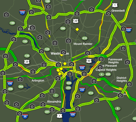
From Fox5 DC but it is just one of many.

The use of existing traffic maps removes the need to construct the same and enable chaotic participation, which means you quite innocently ran out of gas and did not at any time contact and/or conspire with others to run out of gas.

Conspiracy is a crime and you should always avoid committing crimes.

General Comments

You may be wondering if authorities being aware of a theoretical discussion of people running out of gas will provoke effective counter measures?

I don’t think so and here’s why: What would be the logical response of an authority? Position more tow trucks? Setup temporary refueling stations?

Do you think the press will be interested in those changes? Such that not only do you have the additional friction of the additional equipment but the press buzzing about asking about the changes?

An authorities best strategy would be to do nothing at all but that advice is rarely taken. At the very best, local authorities will make transportation even more fragile in anticipation someone might run out of gas.

The numbers I hear tossed about as additional visitors, some activities are expecting more than 100,000 (Women’s March on Washington), so even random participation in running out of gas should have a significant impact.

What if they held the inauguration to empty bleachers?

Data Science Traditionalists – Don’t Re-invent the Wheel

Nudging a chaotic traffic system into gridlock, for hours if not more than a day, may not strike you as traditional data science.

Perhaps not but please don’t re-invent the wheel.

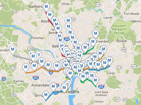
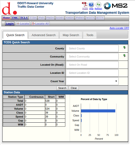
If you want to be more precise, perhaps to block particular activities or locations, let me direct you to the Howard University Transportation Safety Data Center.

They have the Traffic Count Database System (TCDS). Two screen shots that don’t do it justice:

tdc1-460

tdc2-460

From their guide to the system:

The Traffic Count Database System (TCDS) module is a powerful tool for the traffic engineer or planner to organize an agency’s traffic count data. It allows you to upload data from a traffic counter; view graphs, lists and reports of historic traffic count data; search for count data using either the database or the Google map; and print or export data to your desktop.

This guide is for users who are new to the TCDS system. It will provide you with the tools to carry out many common tasks. Any features not discussed in this guide are considered advanced features. If you have further questions, feel free to explore the online help guide or to contact the staff at MS2 for assistance.

I have referred to the inauguration of president-elect Donald J. Trump but the same lessons are applicable, with local modifications, to many other locations.

PS: Nothing should be construed as approval and/or encouragement that you break local laws in any venue. Those vary from jurisdiction to jurisdiction and what are acceptable risks and consequences are entirely your decision.

If you do run out of gas in or near Washington, DC on January 20, 2017, be polite to first-responders, including police officers. If you don’t realize your real enemies lie elsewhere, then you too have false class consciousness.

If you are tail-gating on the “Beltway,” offer responders a soft drink (they are on duty) and a hot dog.

Reporting in Aleppo: Can data science help?

Filed under: Data Science,Journalism,News,Reporting — Patrick Durusau @ 9:47 am

Reporting in Aleppo: Can data science help? by Nausicaa Renner. (Columbia Journalism Review)

from the post:

In war zones, reporting is hard to come by. Nowhere is this truer than in Syria, where many international journalists are banned, and more than one hundred journalists have been killed since the war began in early 2011. A deal was made on Tuesday between the Syrian government and the rebels allowing civilians and rebels to evacuate eastern Aleppo, but after years of bloody conflict, clarity is still hard to come by.

Is there a way for data science to give access to understudied war zones? A project at the Center for Spatial Research at Columbia University, partly funded by the Tow Center for Digital Journalism, uses what information we do have to “link eyes in the sky with algorithms and ears on the ground” in Aleppo.

The Center overlaid satellite images from 2012 to 2016 to create a map showing how Aleppo has changed: Destroyed buildings were identified by discrepancies in the images from year to year. Visualization can also put things in perspective; at a seminar the Center held, one student created a map showing how little the front lines of Aleppo have moved—a stark expression of the futility of war.

As of this AM, I saw reports that the ceasefire mentioned in this post failed.

The content is horrific but using the techniques described in The Twitterverse of Donald Trump to harvest Aleppo videos and images could preserve a record of the fall of Aleppo. Would mapping geo-locations to a map of Aleppo help document/confirm reports of atrocities?

Unlike the wall of silence around US military operations, there is a great deal of first-hand data and opportunities for analysis and confirmation. (It’s hard to analyze or confirm a press briefing document.)

Older Posts »

Powered by WordPress