Another Word For It Patrick Durusau on Topic Maps and Semantic Diversity

August 22, 2018

Battle of Impressively Bad Military Graphics

Filed under: Communication,Graphics,Visualization — Patrick Durusau @ 3:32 pm

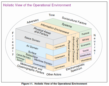
Cav The Knife started a thread on Twitter with this image:

The original can be found in Joint Intelligence Preparation of the Operational Environment, page I-3.

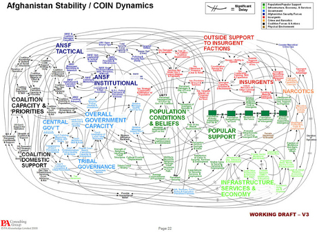
Rob Levinson counters with:

The original can be found in Dynamic Planning for COIN in Afghanistan at page 22. The slide deck includes numerous other offenses against the art of explanation and visualization.

The contest is somewhat unfair because the Joint Intelligence graphic was composed by military lifers versus the COIN in Afghanistan, created by professionals at PA Consulting Group.

For my money, COIN in Afghanistan takes the prize in this comparison as the worst graphic, but Joint Intelligence should get a “best in amateur class” mention.

Other contestants?

July 30, 2018

Introducing VizHub

Filed under: D3,SVG,Visualization — Patrick Durusau @ 3:53 pm

Introducing VizHub by Curran Kelleher.

From the post:

I’d like to tell you a bit about VizHub, the next generation of Datavis.tech, a data visualization platform I worked on for about a year, and from which I learned how I wanted to develop VizHub.

VizHub is still early work in progress (alpha software), but the beta release should be ready by September, at which time I plan to use it as the platform for teaching (creating example code) and learning (students doing homework assignments) data visualization with D3.js and SVG in an online course this Fall at @WPI ! Many students are remote and transfer credit from WPI to other universities. If you’re a graduate student in Computer Science anywhere, you can register (see enrollment details). Here’s a taste of what my students made last year.

Difficulties with WordPress accepting images at the moment but here are links to three of the more impressive visualizations from Kelleher’s class:

If your visualization isn’t working, it’s unlikely its the tool. 😉

PS: CS 573 Data Visualization:

This course exposes students to the field of data visualization, i.e., the graphical communication of data and information for the purposes of presentation, confirmation, and exploration. The course introduces the stages of the visualization pipeline. This includes data modeling, mapping data attributes to graphical attributes, visual display techniques, tools, paradigms, and perceptual issues. Students learn to evaluate the effectiveness of visualizations for specific data, task, and user types. Students implement visualization algorithms and undertake projects involving the use of commercial and public-domain visualization tools. Students also read papers from the current visualization literature and do classroom presentations. Prerequisite: a graduate or undergraduate course in computer graphics.

March 1, 2018

An Interactive Timeline of the Most Iconic Infographics

Filed under: Graphics,Infographics,Visualization — Patrick Durusau @ 8:26 pm

Map of Firsts: An Interactive Timeline of the Most Iconic Infographics by R. J. Andrews.

Careful with this one!

You might learn some history as well as discovering an infographic for your next project!

Enjoy!

February 26, 2018

FastPhotoStyle [Re-writing Dickens]

Filed under: Graphics,Visualization — Patrick Durusau @ 9:18 pm

Start Photo:

Style Photo:

Result Photo (start + style):

Impressive!

There are several other sample transformations at the webpage.

From the webpage:

This code repository contains an implementation of our fast photorealistic style transfer algorithm. Given a content photo and a style photo, the code can transfer the style of the style photo to the content photo. The details of the algorithm behind the code is documented in our arxiv paper. Please cite the paper if this code repository is used in your publications.

Yijun Li (UC Merced), Ming-Yu Liu (NVIDIA), Xueting Li (UC Merced), Ming-Hsuan Yang (NVIDIA, UC Merced), Jan Kautz (NVIDIA)A Closed-form Solution to Photorealistic Image Stylization” arXiv preprint arXiv:1802.06474

Re-writing Dickens:


Marley: Why do you not believe your own eyes?

Scrooge: Software makes them a cheat! A pass of PhotoShop or a round with Gimp, to say nothing of fast photorealistic style transfer algorithms.

Doesn’t have the same ring to it does it?

February 22, 2018

Learning Drawing Skills To Help You Communicate

Filed under: Art,Graphics,Visualization — Patrick Durusau @ 9:19 pm

I sigh with despair every time I see yet another drawing by Julia Evans.

All of it is clever, clear and without effort on my part, beyond me.

Yeah, it’s the “without effort on my part” that keeps me from learning basic drawing skills.

You’re never going to say of a drawing by me, “There’s a proper Julia Evans!” but I don’t think basic drawing skills beyond me, provided I take the time to practice.

How expensive are guidebooks? Does free sound OK?

By E.G. Lutz, What to Draw and How to Draw It (1913), Drawing Made Easy (1935).

BTW, Lutz inspired Walt Disney with: Animated Cartoons: How They Are Made, Their Origin and Development.

I found this at The Public Domain Review. Support for them is always a good idea.

Of course I would rather be exploring nuances of XQuery, but that’s because XQuery is already familiar.

It’s trying the unfamiliar that leads to new skills, hopefully. 😉

February 15, 2018

Krita (open source painting program)

Filed under: Art,Graphics,Visualization — Patrick Durusau @ 9:30 am

Krita

Do you know Krita? Not being artistically inclined, I don’t often encounter digital art tools. Judging from the examples though:

I’m missing some great imagery, even if I can’t create the same.

Great graphics can enhance your interfaces, education apps, games, propaganda, etc.

January 24, 2018

Visualizing trigrams with the Tidyverse (Who Reads Jane Austen?)

Filed under: Literature,R,Visualization — Patrick Durusau @ 4:41 pm

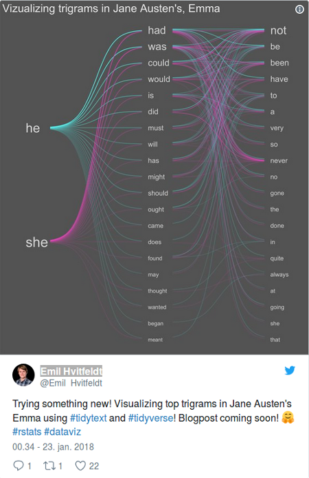
Visualizing trigrams with the Tidyverse by Emil Hvitfeldt.

From the post:

In this post I’ll go though how I created the data visualization I posted yesterday on twitter:

Great post and R code, but who reads Jane Austen? 😉

I have a serious weakness for academic and ancient texts so the Jane Austen question is meant in jest.

The more direct question is to what other texts would you apply this trigram/visualization technique?

Suggestions?

I have some texts in mind but defer mentioning them while I prepare a demonstration of Hvitfeldt’s technique to them.

PS: I ran across an odd comment in the janeaustenr package:

Each text is in a character vector with elements of about 70 characters.

You have to hunt for a bit but 70 characters is the default plain text line length at Gutenberg. Some poor decisions are going to be with us for a very long time.

January 15, 2018

2018 Map of the Complexity Sciences

Filed under: Complexity,Visualization — Patrick Durusau @ 5:07 pm

2018 Map of the Complexity Sciences by Brian Castellani.

At full screen this map barely displays on my 22″ monitor so I’m not going to mangle it into something smaller for this post.

The reading instructions read in part:


Also, in order to present some type of organizational structure, the history of the complexity sciences is developed along the field’s five major intellectual traditions: dynamical systems theory (purple), systems science (blue, complex systems theory (yellow, cybernetics (gray) and artificial intelligence (orange. Again, the fit is not exact (and sometimes even somewhat forced); but it is sufficient to help those new to the field gain a sense of its evolving history.

The subject and person nodes are all hyperlinks to additional resources!

Enjoy!

January 11, 2018

W. E. B. Du Bois as Data Scientist

Filed under: Data Science,Social Sciences,Socioeconomic Data,Visualization — Patrick Durusau @ 3:51 pm

W. E. B. Du Bois’s Modernist Data Visualizations of Black Life by Allison Meier.

From the post:

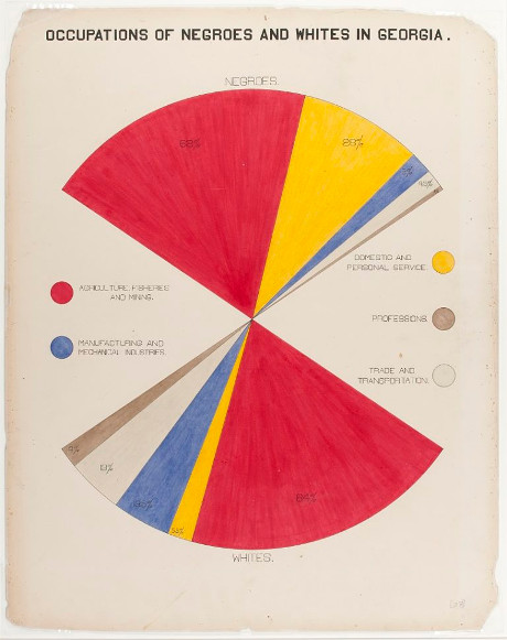
For the 1900 Exposition Universelle in Paris, African American activist and sociologist W. E. B. Du Bois led the creation of over 60 charts, graphs, and maps that visualized data on the state of black life. The hand-drawn illustrations were part of an “Exhibit of American Negroes,” which Du Bois, in collaboration with Thomas J. Calloway and Booker T. Washington, organized to represent black contributions to the United States at the world’s fair.

This was less than half a century after the end of American slavery, and at a time when human zoos displaying people from colonized countries in replicas of their homes were still common at fairs (the ruins of one from the 1907 colonial exhibition in Paris remain in the Bois de Vincennes). Du Bois’s charts (recently shared by data artist Josh Begley on Twitter) focus on Georgia, tracing the routes of the slave trade to the Southern state, the value of black-owned property between 1875 and 1889, comparing occupations practiced by blacks and whites, and calculating the number of black students in different school courses (2 in business, 2,252 in industrial).

Ellen Terrell, a business reference specialist at the Library of Congress, wrote a blog post in which she cites a report by Calloway that laid out the 1900 exhibit’s goals:

It was decided in advance to try to show ten things concerning the negroes in America since their emancipation: (1) Something of the negro’s history; (2) education of the race; (3) effects of education upon illiteracy; (4) effects of education upon occupation; (5) effects of education upon property; (6) the negro’s mental development as shown by the books, high class pamphlets, newspapers, and other periodicals written or edited by members of the race; (7) his mechanical genius as shown by patents granted to American negroes; (8) business and industrial development in general; (9) what the negro is doing for himself though his own separate church organizations, particularly in the work of education; (10) a general sociological study of the racial conditions in the United States.

Georgia was selected to represent these 10 points because, according to Calloway, “it has the largest negro population and because it is a leader in Southern sentiment.” Rebecca Onion on Slate Vault notes that Du Bois created the charts in collaboration with his students at Atlanta University, examining everything from the value of household and kitchen furniture to the “rise of the negroes from slavery to freedom in one generation.”

The post is replete with images created by Du Bois for the exposition, of which this is an example:

As we all know, but rarely say in public, data science and visualization of data isn’t a new discipline.

The data science/visualization by Du Bois merits notice during Black History month (February) but the rest of the year as well. It’s part of our legacy in data science and we should be proud of it.

December 15, 2017

Colorized Math Equations [Algorithms?]

Filed under: Algorithms,Examples,Visualization — Patrick Durusau @ 5:13 pm

Colorized Math Equations by Kalid Azad.

From the post:

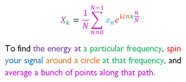
Years ago, while working on an explanation of the Fourier Transform, I found this diagram:

(source)

Argh! Why aren’t more math concepts introduced this way?

Most ideas aren’t inherently confusing, but their technical description can be (e.g., reading sheet music vs. hearing the song.)

My learning strategy is to find what actually helps when learning a concept, and do more of it. Not the stodgy description in the textbook — what made it click for you?

The checklist of what I need is ADEPT: Analogy, Diagram, Example, Plain-English Definition, and Technical Definition.

Here’s a few reasons I like the colorized equations so much:

  • The plain-English description forces an analogy for the equation. Concepts like “energy”, “path”, “spin” aren’t directly stated in the equation.
  • The colors, text, and equations are themselves a diagram. Our eyes bounce back and forth, reading the equation like a map (not a string of symbols).
  • The technical description — our ultimate goal — is not hidden. We’re not choosing between intuition or technical, it’s intuition for the technical.

Of course, we still need examples to check our understanding, but 4/5 ain’t bad!

Azad includes a LaTeX template that he uses to create colorized math equations.

Consider the potential use of color + explanation for algorithms. Being mindful that use of color presents accessibility issues that will require cleverness on your part.

Another tool for your explanation quiver!

October 5, 2017

Visualizing Nonlinear Narratives with Story Curves [Nonlinear Investigations, Markup, Statements]

Filed under: Literature,Narrative,Nonlinear Models,Visualization — Patrick Durusau @ 3:44 pm

Visualizing Nonlinear Narratives with Story Curves by Nam Wook Kim, et al.

From the webpage:

A nonlinear narrative is a storytelling device that portrays events of a story out of chronological order, e.g., in reverse order or going back and forth between past and future events. Story curves visualize the nonlinear narrative of a movie by showing the order in which events are told in the movie and comparing them to their actual chronological order, resulting in possibly meandering visual patterns in the curve. We also developed Story Explorer, an interactive tool that visualizes a story curve together with complementary information such as characters and settings. Story Explorer further provides a script curation interface that allows users to specify the chronological order of events in movies. We used Story Explorer to analyze 10 popular nonlinear movies and describe the spectrum of narrative patterns that we discovered, including some novel patterns not previously described in the literature. (emphasis in original)

Applied here to movie scripts, an innovative visualization that has much broader application.

Investigations by journalists or police officers don’t develop in linear fashion. There are leaps forwards and backwards in time as a narrative is assembled. The resulting “linear” narrative bears little resemblance to its construction.

Imagine being able to visualize and compare the nonlinear narratives of multiple witnesses to a series of events. Use of the same nonlinear sequence isn’t proof they are lying but should suggest at least coordination of their testimony.

Linear markup systems struggle with nonlinear narratives and there may be value here for at least visualizing those pinch points.

Sadly the code for Story Curve and Story Explorer is temporarily unavailable as of 5 October 2017. Hoping that gets sorted out in the near future.

September 18, 2017

Game of Thrones, Murder Network Analysis

Filed under: Games,Graphs,Networks,Social Graphs,Social Networks,Visualization — Patrick Durusau @ 1:03 pm

Game of Thrones, Murder Network Analysis by George McIntire.

From the post:

Everybody’s favorite show about bloody power struggles and dragons, Game of Thrones, is back for its seventh season. And since we’re such big GoT fans here, we just had to do a project on analyzing data from the hit HBO show. You might not expect it, but the show is rife with data and has been the subject of various data projects from data scientists, who we all know love to combine their data powers with the hobbies and interests.

Milan Janosov of the Central European University devised a machine learning algorithm to predict the death of certain characters. A handy tool, for any fan tired of being surprised by the shock murders of the show. Dr. Allen Downey, author of the popular ThinkStats textbooks conducted a Bayesian analysis of the characters’ survival rate in the show. Data Scientist and biologist Shirin Glander applied social network analysis tools to analyze and visualize the family and house relationships of the characters.

The project we did is quite similar to that of Glander’s, we’ll be playing around with network analysis, but with data on the murderers and their victims. We constructed a giant network that maps out every murder of character’s with minor, recurring, and major roles.

The data comes courtesy of Ændrew Rininsland of The Financial Times, who’s done a great of collecting, cleaning, and formatting the data. For the purposes of this project, I had to do a whole lot of wrangling and cleaning of my own and in addition to my subjective decisions about which characters to include as well and what constitutes a murder. My finalized dataset produced a total of of 240 murders from 79 killers. For my network graph, the data produced a total of 225 nodes and 173 edges.

I prefer the Game of Thrones (GoT) books over the TV series. The text exercises a reader’s imagination in ways that aren’t matched by visual media.

That said, the TV series murder data set (Ændrew Rininsland of The Financial Times) is a great resource to demonstrate the power of network analysis.

After some searching, it appears that sometime in 2018 is the earliest date for the next volume in the GoT series. Sorry.

July 13, 2017

Locate Your Representative/Senator In Hell

Filed under: Government,Humanities,Literature,Maps,Politics,Visualization — Patrick Durusau @ 3:38 pm

Mapping Dante’s Inferno, One Circle of Hell at a Time by Anika Burgess.

From the post:

I found myself, in truth, on the brink of the valley of the sad abyss that gathers the thunder of an infinite howling. It was so dark, and deep, and clouded, that I could see nothing by staring into its depths.”

This is the vision that greets the author and narrator upon entry the first circle of Hell—Limbo, home to honorable pagans—in Dante Alighieri’s Inferno, the first part of his 14th-century epic poem, Divine Comedy. Before Dante and his guide, the classical poet Virgil, encounter Purgatorio and Paradiso, they must first journey through a multilayered hellscape of sinners—from the lustful and gluttonous of the early circles to the heretics and traitors that dwell below. This first leg of their journey culminates, at Earth’s very core, with Satan, encased in ice up to his waist, eternally gnawing on Judas, Brutus, and Cassius (traitors to God) in his three mouths. In addition to being among the greatest Italian literary works, Divine Comedy also heralded a craze for “infernal cartography,” or mapping the Hell that Dante had created.
… (emphasis in original)

Burgess has collected seven (7) traditional maps of the Inferno. I take them to be early essays in the art of visualization. They are by no means, individually or collectively, the definitive visualizations of the Inferno.

The chief deficit of all seven, to me, is the narrowness of the circles/ledges. As I read the Inferno, Dante and Virgil are not pressed for space. Expanding and populating the circles more realistically is one starting point.

The Inferno has no shortage of characters in each circle, Dante predicting the fate of Pope Boniface VIII, to place him in the eight circle of Hell (simoniacs A subclass of fraud.). (Use the online Britannica with caution. It’s entry for Boniface VIII doesn’t even mention the Inferno. (As of July 13, 2017.)

I would like to think being condemned to Hell by no less than Dante would rate at least a mention in my biography!

Sadly, Dante is no longer around to add to the populace of the Inferno but new visualizations could take the opportunity to update the resident list for Hell!

It’s an exercise in visualization, mapping, 14th century literature, and, an excuse to learn the name of your representative and senators.

Enjoy!

June 30, 2017

Neo4j 3.3.0-alpha02 (Graphs For Schemas?)

Filed under: Cypher,Graphs,Neo4j,Visualization,XML Schema — Patrick Durusau @ 10:19 am

Neo4j 3.3.0-alpha02

A bit late (release was 06/15/2017) but give Neo4j 3.3.0-alpha02 a spin over the weekend.

From the post:


Detailed Changes and Docs

For the complete list of all changes, please see the changelog. Look for 3.3 Developer manual here, and 3.3 Operations manual here.

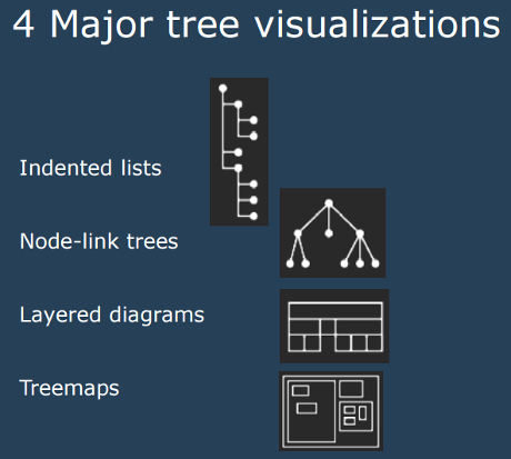
Neo4j is one of the graph engines a friend wants to use for analysis/modeling of the ODF 1.2 schema. The traditional indented list is only one tree visualization out of the four major ones.

(From: Trees & Graphs by Nathalie Henry Riche, Microsoft Research)

Riche’s presentation covers a number of other ways to visualize trees and if you relax the “tree” requirement for display, interesting graph visualizations that may give insight into a schema design.

The slides are part of the materials for CSE512 Data Visualization (Winter 2014), so references for visualizing trees and graphs need to be updated. Check the course resources link for more visualization resources.

June 8, 2017

Roman Roads (Drawn Like The London Subway)

Filed under: History,Humanities,Mapping,Maps,Visualization — Patrick Durusau @ 8:20 pm

Roman Roads by Sasha Trubetskoy.

See Trubetskoy’s website for a much better rendering of this map of Roman roads, drawn in subway-style.

From the post:

It’s finally done. A subway-style diagram of the major Roman roads, based on the Empire of ca. 125 AD.

Creating this required far more research than I had expected—there is not a single consistent source that was particularly good for this. Huge shoutout to: Stanford’s ORBIS model, The Pelagios Project, and the Antonine Itinerary (found a full PDF online but lost the url).

The lines are a combination of actual, named roads (like the Via Appia or Via Militaris) as well as roads that do not have a known historic name (in which case I creatively invented some names). Skip to the “Creative liberties taken” section for specifics.

How long would it actually take to travel this network? That depends a lot on what method of transport you are using, which depends on how much money you have. Another big factor is the season – each time of year poses its own challenges. In the summer, it would take you about two months to walk on foot from Rome to Byzantium. If you had a horse, it would only take you a month.

However, no sane Roman would use only roads where sea travel is available. Sailing was much cheaper and faster – a combination of horse and sailboat would get you from Rome to Byzantium in about 25 days, Rome to Carthage in 4-5 days. Check out ORBIS if you want to play around with a “Google Maps” for Ancient Rome. I decided not to include maritime routes on the map for simplicity’s sake.

Subway-style drawing lose details but make relationships between routes clearer. Or at least that is one of the arguments in their favor.

Thoughts on a subway-style drawing that captures the development of the Roman road system? To illustrate how that corresponds in broad strokes to the expansion of Rome?

Be sure to visit Trubetskoy’s homepage. Lot’s of interesting maps and projects.

June 7, 2017

Financial Times Visual Vocabulary

Filed under: D3,Graphics,Visualization — Patrick Durusau @ 4:08 pm

Financial Times Visual Vocabulary

From the webpage:

A poster and web site to assist designers and journalists to select the optimal symbology for data visualisations, by the Financial Times Visual Journalism Team. Inspired by the Graphic Continuum by Jon Schwabish and Severino Ribecca.

Read the Chart Doctor feature column for full background on why we made this: Simple techniques for bridging the graphics language gap

For D3 templates for producing many of these chart types in FT style, see our Visual Vocabulary repo.

The Financial Times sets a high bar for financial graphics.

Here it provides tools and guidance to help you meet with similar success.

Enjoy and pass this along.

May 29, 2017

Data Journalists! Data Gif Tool (Google)

Filed under: Graphics,Journalism,News,Reporting,Visualization — Patrick Durusau @ 10:03 am

While not hiding its prior salary discrimination against women, Google has created and released a tool for creating data gifs.

Make your own data gifs with our new tool by Simon Rogers.

From the post:

Data visualizations are an essential storytelling tool in journalism, and though they are often intricate, they don’t have to be complex. In fact, with the growth of mobile devices as a primary method of consuming news, data visualizations can be simple images formatted for the device they appear on.

Enter data gifs.

(gif omitted)

These animations can be used for a variety of sophisticated storytelling approaches among data journalists: one example is Lena Groeger, who has become *the* expert in working with data gifs.

Today we are releasing Data Gif Maker, a tool to help journalists make these visuals, which show share of search interest for two competing topics.

A good way to get your feet wet with simple data gifs.

Don’t be surprised that Google does good things for the larger community while engaging in evil conduct.

Racists sheriffs who used water cannon and dogs on Black children loved their own children and remembered their birthdays. WWII death camps guards attended church. Were kind to small animals.

People and their organizations are complicated and the reading public is ill-served by shallow reporting of only one aspect or another as the “true” view.

May 14, 2017

The Hitchhiker’s Guide to d3.js [+ a question]

Filed under: D3,Graphics,Visualization — Patrick Durusau @ 7:46 pm

The Hitchhiker’s Guide to d3.js by Ian Johnson.

From the post:

[graphic omitted: see post]

The landscape for learning d3 is rich, vast and sometimes perilous. You may be intimidated by the long list of functions in d3’s API documentation or paralyzed by choice reviewing the dozens of tutorials on the home page. There are over 20,000+ d3 examples you could learn from, but you never know how approachable any given one will be.

[graphic omitted: see post]

If all you need is a quick bar or line chart, maybe this article isn’t for you, there are plenty of charting libraries out there for that. If you’re into books, check out Interactive Data Visualization for the Web by Scott Murray as a great place to start. D3.js in Action by Elijah Meeks is a comprehensive way to go much deeper into some regions of the API.

This guide is meant to prepare you mentally as well as give you some fruitful directions to pursue. There is a lot to learn besides the d3.js API, both technical knowledge around web standards like HTML, SVG, CSS and JavaScript as well as communication concepts and data visualization principles. Chances are you know something about some of those things, so this guide will attempt to give you good starting points for the things you want to learn more about.

Depending on your needs and learning style, The Hitchhiker’s Guide to d3.js (Guide), may be just what you need.

The Guide focuses on how to use d3.js and not on: What visualization should I create?

Suggestions on what should be considered when moving from raw data to a visualization? Resources?

Thanks!

May 8, 2017

How to Spot Visualization Lies

Filed under: Graphics,Statistics,Visualization — Patrick Durusau @ 4:47 pm

How to Spot Visualization Lies : Keep your eyes open by Nathan Yau.

From the post:

It used to be that we’d see a poorly made graph or a data design goof, laugh it up a bit, and then carry on. At some point though — during this past year especially — it grew more difficult to distinguish a visualization snafu from bias and deliberate misinformation.

Of course, lying with statistics has been a thing for a long time, but charts tend to spread far and wide these days. There’s a lot of them. Some don’t tell the truth. Maybe you glance at it and that’s it, but a simple message sticks and builds. Before you know it, Leonardo DiCaprio spins a top on a table and no one cares if it falls or continues to rotate.

So it’s all the more important now to quickly decide if a graph is telling the truth. This a guide to help you spot the visualization lies.

Warning: Your blind acceptance/enjoyment of news graphics may be diminished by this post. You have been warned.

Beautifully illustrated as always.

Perhaps Nathan will product a double-sided, laminated version to keep by your TV chair. A great graduation present!

May 3, 2017

Interactive Data Visualization (D3, 2nd Ed) / Who Sank My Battleship?

Filed under: D3,Graphics,Visualization — Patrick Durusau @ 4:24 pm

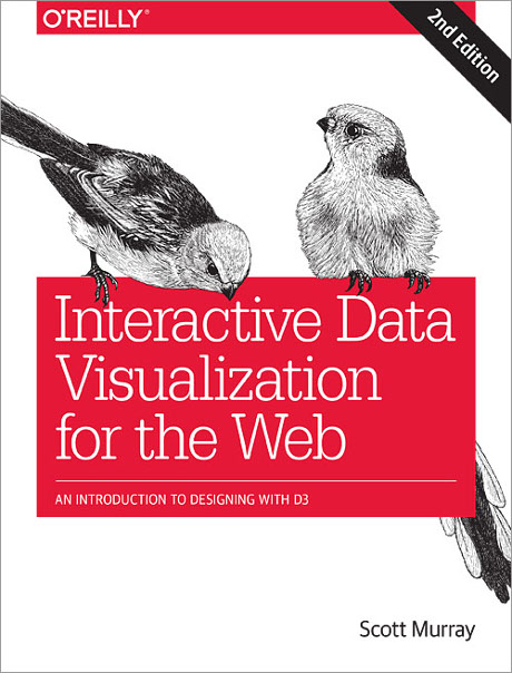
Interactive Data Visualization for the Web, 2nd Edition: An Introduction to Designing with D3 by Scott Murray.

From the webpage:

Interactive Data Visualization for the Web addresses people interested in data visualization but new to programming or web development, giving them what they need to get started creating and publishing their own data visualization projects on the web. The recent explosion of interest in visualization and publicly available data sources has created need for making these skills accessible at an introductory level. The second edition includes greatly expanded geomapping coverage, more real-world examples, a chapter on how to put together all the pieces, and an appendix of case studies, in addition to other improvements.

It’s pre-order time!

Estimated to appear in August of 2017 at $49.99.

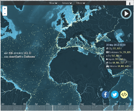
This shipping map, created by Kiln, based on data from the UCL Energy Institute, should inspire you to try D3.

The Interactive version, using 2012 data, illustrates the ability to select types of shipping:

  • Container
  • Dry Bulk
  • Gas Bulk
  • Tanker
  • Vehicles

with locations, port information and a variety of other information.

All of which reminds me of the Who Sank My Battleship? episode with Gen. Paul Van Riper (ret.), who during war games, used pleasure craft and highly original tactics to sink the vast majority of the opposing American fleet. So much so that the American fleet had to be “refloated” to continue the games with any chance of winning. War game was fixed to ensure American victory, claims general.

Given the effectiveness of Gen. Van Riper’s tactics had on military vessels, you can imagine how unarmored civilian shipping would fare. You don’t need an self-immolating F-35 or a nuclear sub to damage civilian shipping.

What you need is shipping broken down into targeting categories with their locations (see https://www.shipmap.org/), one or more pleasure craft stuffed with explosives and some rudimentary planning.


For the details of what I call the Who Sank My Battleship? episode, the official report, U.S. Joint Forces Command Millennium Challenge 2002: Experiment Report, runs some 752 pages.

March 13, 2017

AI Brain Scans

Filed under: Artificial Intelligence,Graphs,Neural Networks,Visualization — Patrick Durusau @ 3:19 pm

‘AI brain scans’ reveal what happens inside machine learning


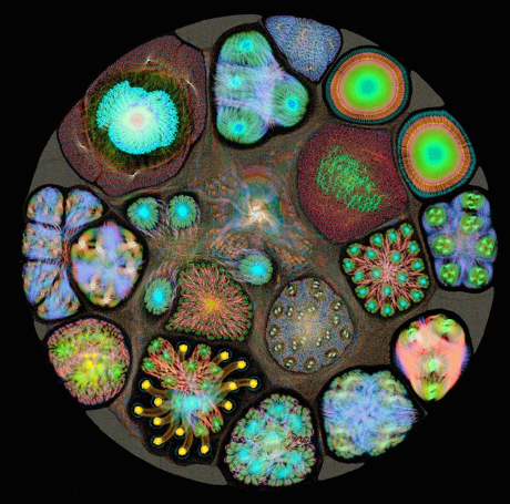
The ResNet architecture is used for building deep neural networks for computer vision and image recognition. The image shown here is the forward (inference) pass of the ResNet 50 layer network used to classify images after being trained using the Graphcore neural network graph library

Credit Graphcore / Matt Fyles

The image is great eye candy, but if you want to see images annotated with information, check out: Inside an AI ‘brain’ – What does machine learning look like? (Graphcore)

From the product overview:

Poplar™ is a scalable graph programming framework targeting Intelligent Processing Unit (IPU) accelerated servers and IPU accelerated server clusters, designed to meet the growing needs of both advanced research teams and commercial deployment in the enterprise. It’s not a new language, it’s a C++ framework which abstracts the graph-based machine learning development process from the underlying graph processing IPU hardware.

Poplar includes a comprehensive, open source set of Poplar graph libraries for machine learning. In essence, this means existing user applications written in standard machine learning frameworks, like Tensorflow and MXNet, will work out of the box on an IPU. It will also be a natural basis for future machine intelligence programming paradigms which extend beyond tensor-centric deep learning. Poplar has a full set of debugging and analysis tools to help tune performance and a C++ and Python interface for application development if required.

The IPU-Appliance for the Cloud is due out in 2017. I have looked at Graphcore but came up dry on the Poplar graph libraries and/or an emulator for the IPU.

Perhaps those will both appear later in 2017.

Optimized hardware for graph calculations sounds promising but rapidly processing nodes that may or may not represent the same subject seems like a defect waiting to make itself known.

Many approaches rapidly process uncertain big data but being no more ignorant than your competition is hardly a selling point.

February 25, 2017

9 Powerful Maps: Earthquakes, Elections, and Space Exploration

Filed under: Mapping,Maps,Visualization — Patrick Durusau @ 9:00 pm

9 Powerful Maps: Earthquakes, Elections, and Space Exploration by Marisa Krystian.

Nine really great maps with links:

  1. NOAA Science On a Sphere — Earthquakes
  2. The New York Times — Election Results
  3. Pop Chart Lab — Space Exploration
  4. Tomorrow — Electricity Map
  5. NASA — Hottest Year on Record
  6. Radio Garden — Share Music
  7. Facebook — Visualizing Friendships
  8. Transparency International — Corruption
  9. NOAA — Daily Real-Time Satellite Imagery

Two added bonuses:

  1. infogr.am offers a newsletter on visualization techniques
  2. There is an Infogram Ambassadorship program.

I just signed up for the newsletter and am pondering the Ambassadorship program.

If you sign up for the Ambassadorship program, be sure to share your experience and ping me with a link.

January 31, 2017

Repulsion On A Galactic Scale (Really Big Data/Visualization)

Filed under: Astroinformatics,BigData,Science,Scientific Computing,Visualization — Patrick Durusau @ 10:14 am

Newly discovered intergalactic void repels Milky Way by Rol Gal.

From the post:

For decades, astronomers have known that our Milky Way galaxy—along with our companion galaxy, Andromeda—is moving through space at about 1.4 million miles per hour with respect to the expanding universe. Scientists generally assumed that dense regions of the universe, populated with an excess of galaxies, are pulling us in the same way that gravity made Newton’s apple fall toward earth.

In a groundbreaking study published in Nature Astronomy, a team of researchers, including Brent Tully from the University of Hawaiʻi Institute for Astronomy, reports the discovery of a previously unknown, nearly empty region in our extragalactic neighborhood. Largely devoid of galaxies, this void exerts a repelling force, pushing our Local Group of galaxies through space.

Astronomers initially attributed the Milky Way’s motion to the Great Attractor, a region of a half-dozen rich clusters of galaxies 150 million light-years away. Soon after, attention was drawn to a much larger structure called the Shapley Concentration, located 600 million light-years away, in the same direction as the Great Attractor. However, there has been ongoing debate about the relative importance of these two attractors and whether they suffice to explain our motion.

The work appears in the January 30 issue of Nature Astronomy and can be found online here.

Additional images, video, and links to previous related productions can be found at http://irfu.cea.fr/dipolerepeller.

If you are looking for processing/visualization of data on a galactic scale, this work by Yehuda Hoffman, Daniel Pomarède, R. Brent Tully & Hélène M. Courtois, hits the spot!

It is also a reminder that when you look up from your social media device, there is a universe waiting to be explored.

January 12, 2017

Interactive Color Wheel

Filed under: Graphics,Visualization — Patrick Durusau @ 9:05 pm

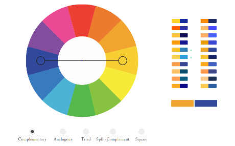
Interactive Color Wheel

color-wheel-460

You will need to visit this interactive color wheel to really appreciate its capabilities.

What I find most helpful is the display of hex codes for the colors. I can distinguish colors but getting the codes right can be a real challenge.

Enjoy!

December 31, 2016

Good visualizations optimize for the human visual system

Filed under: Interface Research/Design,Visualization — Patrick Durusau @ 8:30 pm

How Humans See Data by John Rauser.

Apologies to John for stepping on his title but at time mark 3:26, he says:

Good visualizations optimize for the human visual system.

That one insight sets a basis for distinguishing between good visualizations and bad ones.

Do watch the rest of the video, it is all as good as that moment.

What’s your favorite moment?

From the description:

John Rauser explains a few of the most important results from research into the functioning of the human visual system and the question of how humans decode information presented in graphical form. By understanding and applying this research when designing statistical graphics, you can simplify difficult analytical tasks as much as possible.

Links:

R/GGplot2 code for all plots in presentation.

Slides for Good visualizations optimize for the human visual system

Graphical Perception and Graphical Methods for Analyzing Scientific Data by William S. Cleveland and Robert McGill. (cited in the presentation)

The Elements of Graphing Data by William S. Cleveland. (also cited in the presentation)

December 23, 2016

2017/18 – When you can’t believe your eyes

Filed under: Artificial Intelligence,Graphics,Journalism,News,Reporting,Visualization — Patrick Durusau @ 9:15 pm

Artificial intelligence is going to make it easier than ever to fake images and video by James Vincent.

From the post:

Smile Vector is a Twitter bot that can make any celebrity smile. It scrapes the web for pictures of faces, and then it morphs their expressions using a deep-learning-powered neural network. Its results aren’t perfect, but they’re created completely automatically, and it’s just a small hint of what’s to come as artificial intelligence opens a new world of image, audio, and video fakery. Imagine a version of Photoshop that can edit an image as easily as you can edit a Word document — will we ever trust our own eyes again?

“I definitely think that this will be a quantum step forward,” Tom White, the creator of Smile Vector, tells The Verge. “Not only in our ability to manipulate images but really their prevalence in our society.” White says he created his bot in order to be “provocative,” and to show people what’s happening with AI in this space. “I don’t think many people outside the machine learning community knew this was even possible,” says White, a lecturer in creative coding at Victoria University School of design. “You can imagine an Instagram-like filter that just says ‘more smile’ or ‘less smile,’ and suddenly that’s in everyone’s pocket and everyone can use it.”

Vincent reviews a number of exciting advances this year and concludes:


AI researchers involved in this fields are already getting a firsthand experience of the coming media environment. “I currently exist in a world of reality vertigo,” says Clune. “People send me real images and I start to wonder if they look fake. And when they send me fake images I assume they’re real because the quality is so good. Increasingly, I think, we won’t know the difference between the real and the fake. It’s up to people to try and educate themselves.”

An image sent to you may appear to be very convincing, but like the general in War Games, you have to ask does it make any sense?

Verification, subject identity in my terminology, requires more than an image. What do we know about the area? Or the people (if any) in the image? Where were they supposed to be today? And many other questions that depend upon the image and its contents.

Unless you are using a subject-identity based technology, where are you going to store that additional information? Or express your concerns about authenticity?

December 22, 2016

Low fat computing

Filed under: Computer Science,Forth,Graphics,Visualization — Patrick Durusau @ 8:53 pm

Low fat computing by Karsten Schmidt

A summary of the presentation by Schmidt by Malcolm Sparks, along with the presentation itself.

Lots of strange and 3-D printable eye candy for the first 15 minutes or so with Schmidt’s background. Starts to really rock around 20 minutes in with Forth code and very low level coding.

To get a better idea of what Schmidt has been doing, see his website: thi.ng, or his Forth repl in Javascript, http://forth.thi.ng/, or his GitHub repository or at: Github: thi.ng

Stop by at http://toxiclibs.org/ although the material there looks dated.

December 11, 2016

Poor Presentation – Failure to Communicate

Filed under: Graphics,Maps,Visualization — Patrick Durusau @ 5:44 pm

If you ask about the age of city, do you expect to be told it founding date or its age?

If you said founding date, you will be as confused as I was by:

german-cities-poor-03

You can see the map in its full confusion.

The age of Aubsburg is indeed 2013, but 15 BCE (on orders of the Emperor Augustus) established the same fact with less effort on the part of the reader.

Making users work for information is always a poor communication strategy. Always.

December 6, 2016

Four Experiments in Handwriting with a Neural Network

Four Experiments in Handwriting with a Neural Network by Shan Carter, David Ha, Ian Johnson, and Chris Olah.

While the handwriting experiments are compelling and entertaining, the author’s have a more profound goal for this activity:


The black box reputation of machine learning models is well deserved, but we believe part of that reputation has been born from the programming context into which they have been locked into. The experience of having an easily inspectable model available in the same programming context as the interactive visualization environment (here, javascript) proved to be very productive for prototyping and exploring new ideas for this post.

As we are able to move them more and more into the same programming context that user interface work is done, we believe we will see richer modes of human-ai interactions flourish. This could have a marked impact on debugging and building models, for sure, but also in how the models are used. Machine learning research typically seeks to mimic and substitute humans, and increasingly it’s able to. What seems less explored is using machine learning to augment humans. This sort of complicated human-machine interaction is best explored when the full capabilities of the model are available in the user interface context.

Setting up a search alert for future work from these authors!

December 2, 2016

War and Peace & R

Filed under: Humanities,Literature,R,Visualization — Patrick Durusau @ 5:13 pm

No, not a post about R versus Python but about R and Tolstoy‘s War and Peace.

Using R to Gain Insights into the Emotional Journeys in War and Peace by Wee Hyong Tok.

From the post:

How do you read a novel in record time, and gain insights into the emotional journey of main characters, as they go through various trials and tribulations, as an exciting story unfolds from chapter to chapter?

I remembered my experiences when I start reading a novel, and I get intrigued by the story, and simply cannot wait to get to the last chapter. I also recall many conversations with friends on some of the interesting novels that I have read awhile back, and somehow have only vague recollection of what happened in a specific chapter. In this post, I’ll work through how we can use R to analyze the English translation of War and Peace.

War and Peace is a novel by Leo Tolstoy, and captures the salient points about Russian history from the period 1805 to 1812. The novel consists of the stories of five families, and captures the trials and tribulations of various characters (e.g. Natasha and Andre). The novel consists of about 1400 pages, and is one of the longest novels that have been written.

We hypothesize that if we can build a dashboard (shown below), this will allow us to gain insights into the emotional journey undertaken by the characters in War and Peace.

Impressive work, even though I would not use it as a short-cut to “read a novel in record time.”

Rather I take this as an alternative way of reading War and Peace, one that can capture insights a casual reader may miss.

Moreover, the techniques demonstrated here could be used with other works of literature, or even non-fictional works.

Imagine conducting this analysis over the reportedly more than 7,000 page full CIA Torture Report, for example.

A heatmap does not connect any dots, but points a user towards places where interesting dots may be found.

Certainly a tool for exploring large releases/leaks of text data.

Enjoy!

PS: Large, tiresome, obscure-on-purpose, government reports to practice on with this method?
Older Posts »

Powered by WordPress