Another Word For It Patrick Durusau on Topic Maps and Semantic Diversity

July 5, 2019

Surveilling Concentration Camps (Weaponizing Data)

Filed under: Government,Protests,Weaponize Data,Weaponized Open Data,Weather Data — Patrick Durusau @ 4:32 pm

A tweet I saw yesterday suggested surveilling U.S. concentration camps using a drone. That’s certainly possible but hobbyist type drones put you within easy visual distance of government forces. There are long range drones, all of which carry hefty price tags. What if you don’t have access to a long range drone? Alternatives?

Low-cost, low-tech answer: Consider the lowly helium balloon. With some experimenting, you can discover a stable buoyancy height for a ballon suitable for carrying a wireless digital camera.

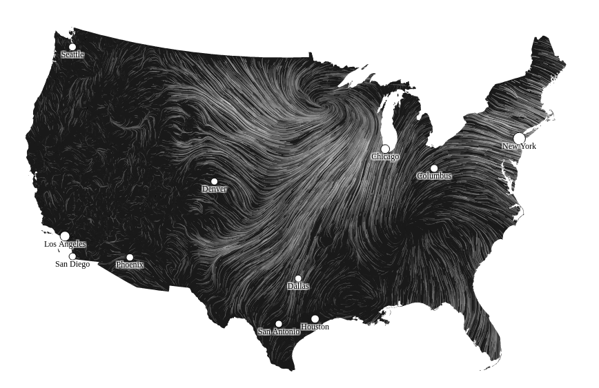
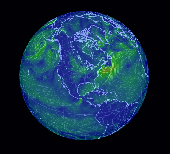
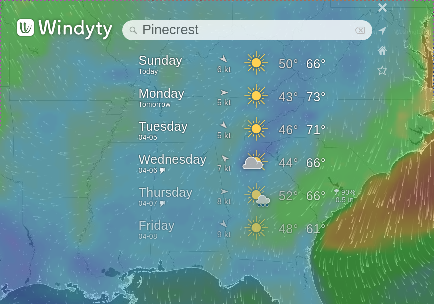
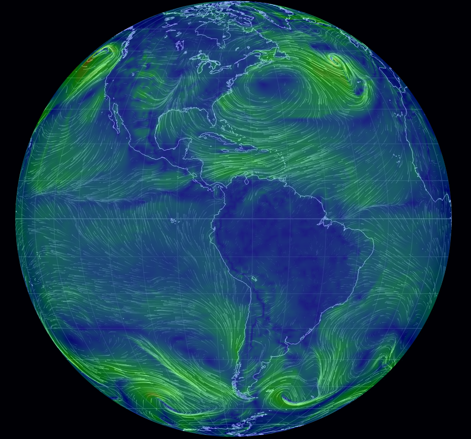
Unlike a short range drone, you can launch a balloon plus digital camera from random and distant locations from an actual concentration camp. Launch locations are chosen based on weaponizing weather data, made available by most governments. In the United States, the National Weather Service provides current wind data and maintains historical weather data.

Once you have a stable buoyancy height for your balloon plus digital camera (password protected), record the harness and camera weight so you can create other balloons to accompany the one or more balloons with cameras at a similar height. Authorities will go nuts trying to chase every balloon down as “evidence” and it creates opportunities for balloon spotters (BSers) to call in reports of balloon sightings and landings.

For surveillance purposes, use maps of wind conditions to select launch points that will result in your balloons passing over the concentration camps of interest. Concentration camps tend to be fixed locations and as you develop more experience with local wind patterns, the more successful you will be on a regular basis.

Perhaps old school but I would insure that every balloon has a physical limit to its travels. If you can’t think of any ways to do that, ask your former eight grade (US educational system) science teacher. That’s good for the environment. Should you find balloons released by others, remember that some devices bite upon discovery. Report discovered balloons to local law enforcement.

Balloons are cheap, annoying to government officials, and provide low-risk ways to document government activities, from rain forests to concentration camps. Weaponizing weather data for surveillance is only one way to use the common balloon. Other suggestions are forthcoming.

PS: Here is one list of U.S. concentration camps. I express no opinion about the accuracy of that list or the legality of surveilling any location mentioned therein. To avoid being U.S. specific, I’m happy to update this portion of the post with pointers to other lists of concentration camps around the world. Go carefully.

January 24, 2019

Weather Data – 100K stations – Hourly

Filed under: Data,Weather Data — Patrick Durusau @ 8:09 pm

Weather Directory Contents

From the webpage:

This directory contains hourly weather dumps. The files are compressed using Zstandard compression (.zst). Each file is a collection of JSON objects (ndjson) and can easily be parsed by any utility that has a JSON decode library (including Python, Java, Perl, PHP, etc.) Please contact me if you have any questions about the file format or the fields within the JSON objects. The field “retrieved_utc” is a field that I added that gives the time of when the data was retrieved. The format of the files is WEATHER_YYYY-MM-DD-HH (UTC time format).

Please consider making a donation (https://pushshift.io/donations) if you download a lot of data. This helps offset the costs of my time collecting data and providing bandwidth to make these files available to the public. Thank you!

If you have any questions about the data formats of the files or any other questions, please feel free to contact me at jason@pushshift.io

A project of pushshift.io, the homepage of which is a collection of statistics on Reddit posts.

Looking at the compressed files for today (24 January 2019), the earliest file is dated Jan 24 2019 AM and tips the scales at 35,067,516 bytes. Hourly files, running between 72,272,568 and 65,989336 bytes. Remembering these files are compressed so you need a lot of space or work with them compressed.

The perfect data is your boss is a weather freak. Be sure to mention the donation link to them.

Enjoy!

September 26, 2017

Exploratory Data Analysis of Tropical Storms in R

Filed under: Programming,R,Weather Data — Patrick Durusau @ 7:52 pm

Exploratory Data Analysis of Tropical Storms in R by Scott Stoltzman.

From the post:

The disastrous impact of recent hurricanes, Harvey and Irma, generated a large influx of data within the online community. I was curious about the history of hurricanes and tropical storms so I found a data set on data.world and started some basic Exploratory data analysis (EDA).

EDA is crucial to starting any project. Through EDA you can start to identify errors & inconsistencies in your data, find interesting patterns, see correlations and start to develop hypotheses to test. For most people, basic spreadsheets and charts are handy and provide a great place to start. They are an easy-to-use method to manipulate and visualize your data quickly. Data scientists may cringe at the idea of using a graphical user interface (GUI) to kick-off the EDA process but those tools are very effective and efficient when used properly. However, if you’re reading this, you’re probably trying to take EDA to the next level. The best way to learn is to get your hands dirty, let’s get started.

The original source of the data was can be found at DHS.gov.

Great walk through on exploratory data analysis.

Everyone talks about the weather but did you know there is a forty (40) year climate lag between cause and effect?

The human impact on the environment today, won’t be felt for another forty (40) years.

Can to predict the impact of a hurricane in 2057?

Some other data/analysis resources on hurricanes, Climate Prediction Center, Hurricane Forecast Computer Models, National Hurricane Center.

PS: Is a Category 6 Hurricane Possible? by Brian Donegan is an interesting discussion on going beyond category 5 for hurricanes. For reference on speeds, see: Fujita Scale (tornadoes).

August 29, 2016

Mapping U.S. wildfire data from public feeds

Filed under: MapBox,Mapping,Maps,Open Data,Weather Data — Patrick Durusau @ 7:45 pm

Mapping U.S. wildfire data from public feeds by David Clark.

From the post:

With the Mapbox Datasets API, you can create data-based maps that continuously update. As new data arrives, you can push incremental changes to your datasets, then update connected tilesets or use the data directly in a map.

U.S. wildfires have been in the news this summer, as they are every summer, so I set out to create an automatically updating wildfire map.

An excellent example of using public data feeds to create a resource not otherwise available.

Historical fire data can be found at: Federal Wildland Fire Occurrence Data, spanning 1980 through 2015.

The Outlooks page of the National Interagency Coordination Center provides four month (from current month) outlook and weekly outlook fire potential reports and maps.

August 20, 2016

Everybody Discusses The Weather In R (+ Trigger Warning)

Filed under: Climate Data,Climate Informatics,R,Weather Data — Patrick Durusau @ 3:01 pm

Well, maybe not everybody but if you are interested in weather statistics, there’s a trio of posts at R-Bloggers made for you.

Trigger Warning: If you are a climate change denier, you won’t like the results presented by the posts cited below. Facts dead ahead.

Tracking Precipitation by Day-of-Year

From the post:

Plotting cumulative day-of-year precipitation can helpful in assessing how the current year’s rainfall compares with long term averages. This plot shows the cumulative rainfall by day-of-year for Philadelphia International Airports rain gauge.

Checking Historical Precipitation Data Quality

From the post:

I am interested in evaluating potential changes in precipitation patterns caused by climate change. I have been working with daily precipitation data for the Philadelphia International Airport, site id KPHL, for the period 1950 to present time using R.

I originally used the Pennsylvania State Climatologist web site to download a CSV file of daily precipitation data from 1950 to the present. After some fits and starts analyzing this data set, I discovered that data for January was missing for the period 1950 – 1969. This data gap seriously limited the usable time record.

John Yagecic, (Adventures In Data) told me about the weatherData package which provides easy to use functions to retrieve Weather Underground data. I have found several precipitation data quality issues that may be of interest to other investigators.

Access and Analyze 170 Monthly Climate Time Series Using Simple R Scripts

From the post:

Open Mind, a climate trend data analysis blog, has a great Climate Data Service that provides updated consolidated csv file with 170 monthly climate time series. This is a great resource for those interested in studying climate change. Quick, reliable access to 170 up-to-date climate time series will save interested analysts hundreds – thousands of data wrangling hours of work.

This post presents a simple R script to show how a user can select one of the 170 data series and generate a time series plot like this:

All of these posts originated at RClimate, a new blog that focuses on R and climate data.

Drop by to say hello to D Kelly O’Day, PE (professional engineer) Retired.

Relevant searches at R-Bloggers (as of today):

Climate – 218 results

Flood – 61 results

Rainfall – 55 results

Weather – 291 results

Caution: These results contain duplicates.

Enjoy!

April 3, 2016

Wind/Weather Maps

Filed under: Visualization,Weather Data — Patrick Durusau @ 3:16 pm

A Twitter thread started by Data Science Renee mentioned these three wind map resources:

Wind Map

wind-map-03-April-2016

EarthWindMap Select “earth” for a menu of settings and controls.

wind-earth

Windyty Perhaps the most full featured of the three wind maps. Numerous controls that are not captured in the screenshot. Including webcams.

wind-windyty

Suggestions of other real time visualizations of weather data?

Leaving you to answer the question:

What other data would you tie to weather conditions/locations? Perhaps more importantly, why?

June 18, 2015

stationaRy (R package)

Filed under: R,Weather Data — Patrick Durusau @ 5:20 pm

stationaRy by Richard Iannone.

From the webpage:

Get hourly meteorological data from one of thousands of global stations.

Want some tools to acquire and process meteorological and air quality monitoring station data? Well, you’ve come to the right repo. So far, because this is merely the beginning, there’s only a few functions that get you data. These are:

  • get_ncdc_station_info
  • select_ncdc_station
  • get_ncdc_station_data

They will help you get the hourly met data you need from a met station located somewhere on Earth.

I’m old school about the weather. I go outside to check on it. 😉

But, my beloved is interested in earthquakes, volcanoes, hurricanes, weather, etc. so I track resources for those.

Some weather conditions lend themselves more to some activities than others. As Hitler discovered in the winter of 1943-44. Weather can help or hinder your plans, whatever those may be.

You may like the Farmer’s Almanac, but it isn’t a good source for strategic weather data. Try stationaRy.

If you know of any unclassified military strategy guides that cover collection and analysis of weather data, give me a shout.

August 15, 2014

Photoshopping The Weather

Filed under: Graphics,Visualization,Weather Data — Patrick Durusau @ 10:23 am

Photo editing algorithm changes weather, seasons automatically

From the post:

We may not be able control the weather outside, but thanks to a new algorithm being developed by Brown University computer scientists, we can control it in photographs.

The new program enables users to change a suite of “transient attributes” of outdoor photos — the weather, time of day, season, and other features — with simple, natural language commands. To make a sunny photo rainy, for example, just input a photo and type, “more rain.” A picture taken in July can be made to look a bit more January simply by typing “more winter.” All told, the algorithm can edit photos according to 40 commonly changing outdoor attributes.

The idea behind the program is to make photo editing easy for people who might not be familiar with the ins and outs of complex photo editing software.

“It’s been a longstanding interest on mine to make image editing easier for non-experts,” said James Hays, Manning Assistant Professor of Computer Science at Brown. “Programs like Photoshop are really powerful, but you basically need to be an artist to use them. We want anybody to be able to manipulate photographs as easily as you’d manipulate text.”

A paper describing the work will be presented next week at SIGGRAPH, the world’s premier computer graphics conference. The team is continuing to refine the program, and hopes to have a consumer version of the program soon. The paper is available at http://transattr.cs.brown.edu/. Hays’s coauthors on the paper were postdoctoral researcher Pierre-Yves Laffont, and Brown graduate students Zhile Ren, Xiaofeng Tao, and Chao Qian.

For all the talk about photoshopping models, soon the Weather Channel won’t send reporters to windy, rain soaked beaches, snow bound roads, or even chasing tornadoes.

With enough information, the reporters can have weather effects around them simulated and eliminate the travel cost for such assignments.

Something to keep in mind when people claim to have “photographic” evidence. Goes double for cellphone video. A cellphone only captures the context selected by its user. A non-photographic distortion that is hard to avoid.

I first saw this in a tweet by Gregory Piatetsky.

March 1, 2014

R and the Weather

Filed under: Data,R,Weather Data — Patrick Durusau @ 6:13 pm

R and the Weather by Joseph Rickert.

From the post:

The weather is on everybody’s mind these days: too much ice and snow east of the Rockies and no rain to speak fo in California. Ram Narasimhan has made it a little easier for R users to keep track of what’s going on and also get a historical perspective. His new R package weatherData makes it easy to down load weather data from various stations around the world collecting data. Here is a time series plot of the average temperature recorded at SFO last year with the help of the weatherData’s getWeatherForYear() function. It is really nice that the function returns a data frame of hourly data with the Time variable as class POSIXct.

Everyone is still talking about winter weather but summer isn’t far off and with that comes hurricane season.

You can capture a historical perspective that goes beyond the highest and lowest temperature for a particular day.

Enjoy!

I first saw this in The week in stats (Feb. 10th edition).

January 10, 2014

Dirty Wind Paths

Filed under: Climate Data,Climate Informatics,Graphics,Visualization,Weather Data — Patrick Durusau @ 6:38 pm

earth wind patterns

Interactive display of wind patterns on the Earth. Turn the globe, zoom in, etc.

Useful the next time a nuclear power plant cooks off.

If you doubt the “next time” part of that comment, review Timeline: Nuclear plant accidents from the BBC.

I count eleven (11) “serious” incidents between 1957 and 2014.

Highly dangerous activities are subject to catastrophic failure. Not every time or even often.

On the other hand, how often is an equivalent to the two U.S. space shuttle failures acceptable with a nuclear power plant?

If I were living nearby or in the wind path from a nuclear accident, I would say never.

You?

According to Dustin Smith at Chart Porn, where I first saw this, the chart updates every three hours.

January 9, 2014

The Rain Project:…

Filed under: Climate Data,Data,Weather Data — Patrick Durusau @ 7:30 pm

The Rain Project: An R-based Open Source Analysis of Publicly Available Rainfall Data by Gopi Goteti.

From the post:

Rainfall data used by researchers in academia and industry does not always come in the same format. Data is often in atypical formats and in extremely large number of files and there is not always guidance on how to obtain, process and visualize the data. This project attempts to resolve this issue by serving as a hub for the processing of such publicly available rainfall data using R.

The goal of this project is to reformat rainfall data from their native format to a consistent format, suitable for use in data analysis. Within this project site, each dataset is intended to have its own wiki. Eventually, an R package would be developed for each data source.

Currently R code is available to process data from three sources – Climate Prediction Center (global coverage), US Historical Climatology Network (USA coverage) and APHRODITE (Asia/Eurasia and Middle East).

The project home page is here – http://rationshop.github.io/rain_r/

Links to the original sources:

Climate Prediction Center

US Historical Climatology Network

APHRODITE

There are five (5) other sources listed at the project home page “to be included in the future.”

All of these datasets were “transparent” to someone, once upon a time.

Restoring them to transparency is a good deed.

Preventing datasets from going dark is an even better one.

December 22, 2013

Twitter Weather Radar – Test Data for Language Analytics

Filed under: Analytics,Language,Tweets,Weather Data — Patrick Durusau @ 8:17 pm

Twitter Weather Radar – Test Data for Language Analytics by Nicholas Hartman.

From the post:

Today we’d like to share with you some fun charts that have come out of our internal linguistics research efforts. Specifically, studying weather events by analyzing social media traffic from Twitter.

We do not specialize in social media and most of our data analytics work focuses on the internal operations of leading organizations. Why then would we bother playing around with Twitter data? In short, because it’s good practice. Twitter data mimics a lot of the challenges we face when analyzing the free text streams generated by complex processes. Specifically:

  • High Volume: The analysis represented here is looking at around 1 million tweets a day. In the grand scheme of things, that’s not a lot but we’re intentionally running the analysis on a small server. That forces us to write code that rapidly assess what’s relevant to the question we’re trying to answer and what’s not. In this case the raw tweets were quickly tested live on receipt with about 90% of them discarded. The remaining 10% were passed onto the analytics code.
  • Messy Language: A lot of text analytics exercises I’ve seen published use books and news articles as their testing ground. That’s fine if you’re trying to write code to analyze books or news articles, but most of the world’s text is not written with such clean and polished prose. The types of text we encounter (e.g., worklogs from an IT incident management system) are full of slang, incomplete sentences and typos. Our language code needs to be good and determining the messages contained within this messy text.
  • Varying Signal to Noise: The incoming stream of tweets will always contain a certain percentage of data that isn’t relevant to the item we’re studying. For example, if a band member from One Direction tweets something even tangentially related to what some code is scanning for the dataset can be suddenly overwhelmed with a lot of off-topic tweets. Real world data is similarly has a lot of unexpected noise.

In the exercise below, tweets from Twitter’s streaming API JSON stream were scanned in near real-time for their ability to 1) be pinpointed to a specific location and 2) provide potential details on local weather conditions. The vast majority of tweets passing through our code failed to meet both of these conditions. The tweets that remained were analyzed to determine the type of precipitation being discussed.

An interesting reminder that data to test your data mining/analytics is never far away.

If not Twitter, pick one of the numerous email archives or open data datasets.

The post doesn’t offer any substantial technical details but then you need to work those out for yourself.

May 22, 2013

Open Access to Weather Data for International Development

Filed under: Agriculture,Open Data,Weather Data — Patrick Durusau @ 3:28 pm

Open Access to Weather Data for International Development

From the post:

Farming communities in Africa and South Asia are becoming increasingly vulnerable to shock as the effects of climate change become a reality. This increased vulnerability, however, comes at a time when improved technology makes critical information more accessible than ever before. aWhere Weather, an online platform offering free weather data for locations in Western, Eastern and Southern Africa and South Asia provides instant and interactive access to highly localized weather data, instrumental for improved decision making and providing greater context in shaping policies relating to agricultural development and global health.

Weather Data in 9km Grid Cells

Weather data is collected at meteorological stations around the world and interpolated to create accurate data in detailed 9km grids. Within each cell, users can access historical, daily-observed and 8 days of daily forecasted ‘localized’ weather data for the following variables:

  • Precipitation 
  • Minimum and Maximum Temperature
  • Minimum and Maximum Relative Humidity 
  • Solar Radiation 
  • Maximum and Morning Wind Speed
  • Growing degree days (dynamically calculated for your base and cap temperature) 

These data prove essential for risk adaption efforts, food security interventions, climate-smart decision making, and agricultural or environmental research activities.

Sign up Now

Access is free and easy. Register at http://www.awhere.com/en-us/weather-p. Then, you can log back in anytime at me.awhere.com.  

For questions on the platform, please contact weather@awhere.com

At least as a public observer, I could not determine how much “interpolation” is going to the weather data. That would have a major impact on the risk of accepting the data provided at face value.

I suspect it varies from little interpolation at all in heavily instrumented areas to quite a bit in areas with sparser readings. How much is unclear.

It maybe that the amount of interpolation in the data is a factor of whether you use the free version or some upgraded commercial version.

Still, an interesting data source to combine with others, if you are mindful of the risks.

March 26, 2013

If you want to talk about the weather…

Filed under: Data,Weather Data — Patrick Durusau @ 4:24 pm

Forecast for Developers

From the webpage:

The same API that powers Forecast.io and Dark Sky for iOS can provide accurate short­term and long­term weather predictions to your business, application, or crazy idea.

We’re developers too, and we like playing with new APIs, so we want you to be able to try ours hassle-free: all you need is an email address.

First thousand API calls a day are free.

Every 10,000 API calls after that are $1.

It could be useful/amusing to merge personal weather observations based on profile characteristics.

Like a recommendation system except for how you are going to experience the weather.

October 6, 2012

Applying Parallel Prediction to Big Data

Filed under: Hadoop,Mahout,Oracle,Pig,Weather Data,Weka — Patrick Durusau @ 3:20 pm

Applying Parallel Prediction to Big Data by Dan McClary (Principal Product Manager for Big Data and Hadoop at Oracle).

From the post:

One of the constants in discussions around Big Data is the desire for richer analytics and models. However, for those who don’t have a deep background in statistics or machine learning, it can be difficult to know not only just what techniques to apply, but on what data to apply them. Moreover, how can we leverage the power of Apache Hadoop to effectively operationalize the model-building process? In this post we’re going to take a look at a simple approach for applying well-known machine learning approaches to our big datasets. We’ll use Pig and Hadoop to quickly parallelize a standalone machine-learning program written in Jython.

Playing Weatherman

I’d like to predict the weather. Heck, we all would – there’s personal and business value in knowing the likelihood of sun, rain, or snow. Do I need an umbrella? Can I sell more umbrellas? Better yet, groups like the National Climatic Data Center offer public access to weather data stretching back to the 1930s. I’ve got a question I want to answer and some big data with which to do it. On first reaction, because I want to do machine learning on data stored in HDFS, I might be tempted to reach for a massively scalable machine learning library like Mahout.

For the problem at hand, that may be overkill and we can get it solved in an easier way, without understanding Mahout. Something becomes apparent on thinking about the problem: I don’t want my climate model for San Francisco to include the weather data from Providence, RI. Weather is a local problem and we want to model it locally. Therefore what we need is many models across different subsets of data. For the purpose of example, I’d like to model the weather on a state-by-state basis. But if I have to build 50 models sequentially, tomorrow’s weather will have happened before I’ve got a national forecast. Fortunately, this is an area where Pig shines.

Two quick observations:

First, Dan makes my point about your needing the “right” data, which may or may not be the same thing as “big data.” Decide what you want to do before you reach for big iron and data.

Second, I never hear references to the “weatherman” without remembering: “you don’t need to be a weatherman to know which way the wind blows.” (link to the manifesto) If you prefer a softer version, Subterranean Homesick Blues by Bob Dylan.

September 12, 2012

Do You Just Talk About The Weather?

Filed under: Dataset,Machine Learning,Mahout,Weather Data — Patrick Durusau @ 9:24 am

After reading this post by Alex you will still just be talking about the weather, but you may have something interesting to say. 😉

Locating Mountains and More with Mahout and Public Weather Dataset by Alex Baranau

From the post:

Recently I was playing with Mahout and public weather dataset. In this post I will describe how I used Mahout library and weather statistics to fill missing gaps in weather measurements and how I managed to locate steep mountains in US with a little Machine Learning (n.b. we are looking for people with Machine Learning or Data Mining backgrounds – see our jobs).

The idea was to just play and learn something, so the effort I did and the decisions chosen along with the approaches should not be considered as a research or serious thoughts by any means. In fact, things done during this effort may appear too simple and straightforward to some. Read on if you want to learn about the fun stuff you can do with Mahout!
Tools & Data

The data and tools used during this effort are: Apache Mahout project and public weather statistics dataset. Mahout is a machine learning library which provided a handful of machine learning tools. During this effort I used just small piece of this big pie. The public weather dataset is a collection of daily weather measurements (temperature, wind speed, humidity, pressure, &c.) from 9000+ weather stations around the world.

What other questions could you explore with the weather data set?

The real power of “big data” access and tools may be that we no longer have to rely on the summaries of others.

Summaries still have a value-add, perhaps even more so when the original data is available for verification.

June 27, 2012

Kiss the Weatherman [Weaponizing Data]

Filed under: BigData,Data,Dataset,Weather Data — Patrick Durusau @ 8:05 am

Kiss the Weatherman by James Locus.

From the post:

Weather Hurts

Catastrophic weather events like the historic 2011 floods in Pakistan or prolonged droughts in the horn of Africa make living conditions unspeakably harsh for tens of millions of families living in these affected areas. In the US, the winter storms of 2009-2010 and 2010-2011 brought record-setting snowfall, forcing mighty metropolises into an icy standstill. Extreme weather can profoundly impact the landscape of the planet.

The effects of extreme weather can send terrible ripples throughout an entire community. Unexpected cold snaps or overly hot summers can devastate crop yields and forcing producers to raise prices. When food prices rise, it becomes more difficult for some people to earn enough money to provide for their families, creating even larger problems for societies as a whole.

The central problem is the inability of current measuring technologies to more accurately predict large-scale weather patterns. Weathermen are good at predicting weather but poor at predicting climate. Weather occurs over a shorter period of time and can be reliability predicted within a 3-day timeframe. Climate stretches many months, years, or even centuries. Matching historical climate data with current weather data to make future weather and climate is a major challenge for scientists.

James has a good survey of both data sources and researchers working on using “big data” (read historical weather data) for both weather (short term) and climate (longer term) prediction.

Weather data by itself is just weather data.

What other data would you combine with it and on what basis to weaponize the data?

No one can control the weather but you can control your plans for particular weather events.

Powered by WordPress