W. E. B. Du Bois’s Modernist Data Visualizations of Black Life by Allison Meier.
From the post:
For the 1900 Exposition Universelle in Paris, African American activist and sociologist W. E. B. Du Bois led the creation of over 60 charts, graphs, and maps that visualized data on the state of black life. The hand-drawn illustrations were part of an “Exhibit of American Negroes,” which Du Bois, in collaboration with Thomas J. Calloway and Booker T. Washington, organized to represent black contributions to the United States at the world’s fair.
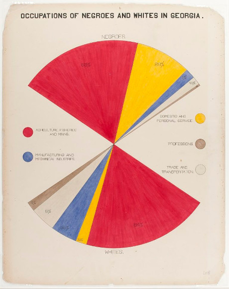
This was less than half a century after the end of American slavery, and at a time when human zoos displaying people from colonized countries in replicas of their homes were still common at fairs (the ruins of one from the 1907 colonial exhibition in Paris remain in the Bois de Vincennes). Du Bois’s charts (recently shared by data artist Josh Begley on Twitter) focus on Georgia, tracing the routes of the slave trade to the Southern state, the value of black-owned property between 1875 and 1889, comparing occupations practiced by blacks and whites, and calculating the number of black students in different school courses (2 in business, 2,252 in industrial).
Ellen Terrell, a business reference specialist at the Library of Congress, wrote a blog post in which she cites a report by Calloway that laid out the 1900 exhibit’s goals:
It was decided in advance to try to show ten things concerning the negroes in America since their emancipation: (1) Something of the negro’s history; (2) education of the race; (3) effects of education upon illiteracy; (4) effects of education upon occupation; (5) effects of education upon property; (6) the negro’s mental development as shown by the books, high class pamphlets, newspapers, and other periodicals written or edited by members of the race; (7) his mechanical genius as shown by patents granted to American negroes; (8) business and industrial development in general; (9) what the negro is doing for himself though his own separate church organizations, particularly in the work of education; (10) a general sociological study of the racial conditions in the United States.
Georgia was selected to represent these 10 points because, according to Calloway, “it has the largest negro population and because it is a leader in Southern sentiment.” Rebecca Onion on Slate Vault notes that Du Bois created the charts in collaboration with his students at Atlanta University, examining everything from the value of household and kitchen furniture to the “rise of the negroes from slavery to freedom in one generation.”
…
The post is replete with images created by Du Bois for the exposition, of which this is an example:
As we all know, but rarely say in public, data science and visualization of data isn’t a new discipline.
The data science/visualization by Du Bois merits notice during Black History month (February) but the rest of the year as well. It’s part of our legacy in data science and we should be proud of it.