Cav The Knife started a thread on Twitter with this image:
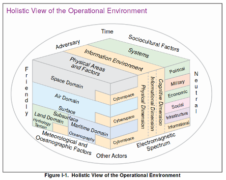
The original can be found in Joint Intelligence Preparation of the Operational Environment, page I-3.
Rob Levinson counters with:
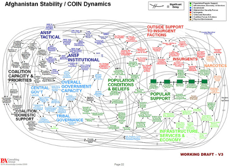
The original can be found in Dynamic Planning for COIN in Afghanistan at page 22. The slide deck includes numerous other offenses against the art of explanation and visualization.
The contest is somewhat unfair because the Joint Intelligence graphic was composed by military lifers versus the COIN in Afghanistan, created by professionals at PA Consulting Group.
For my money, COIN in Afghanistan takes the prize in this comparison as the worst graphic, but Joint Intelligence should get a “best in amateur class” mention.
Other contestants?