I don’t have one of the commercial XML packages at the moment and was casting about for a free visualization technique for a large XML schema when I encountered:
I won’t be trying it on my schema until tomorrow but I thought it looked interesting enough to pass along.
Before you get started on any data-related project, you need data. I know. It sounds crazy, but it’s the truth. It can be frustrating to sleuth for the data you need, so here are some tips on finding it (the openly available variety) and some topic-specific resources to begin your travels.
This is an update to the guide I wrote in 2009, which as it turns out, is now mostly outdated. So, 2016. Here we go.
…
If you know Nathan Yau’s work, FlowingData, then you know this is “the” starting list for data.
Enjoy!
Comments Off on Resources to Find the Data You Need, 2016 Edition
Ghana has always been getting flooded, but it seems that only floods in Accra are getting attention. I wrote about it here, and the key visualization was an animated map showing the floods in Ghana, and built in R. In this post, I document how I did it, hopefully you can do one also!
…
David’s focus is on Ghana but the same techniques work for data of greater local interest.
Comments Off on How the Ghana Floods animation was created [Animating Your Local Flood Data With R]
Using Gephi 8.2, you can create graphs of the Clinton/Podesta emails based on terms in subject lines or the body of the emails. You can interactively work with all 30K+ (as of today) emails and extract networks based on terms in the posts. No programming required. (Networks based on terms will appear tomorrow.)
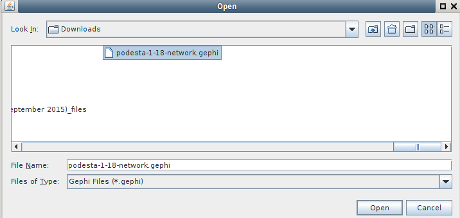
If you have Gephi 8.2 (I can’t find the import spigot in 9.0 or 9.1), you can import the Clinton/Podesta Emails (1-18) for analysis as a network.
To save you the trouble of regressing to Gephi 8.2, I performed a no frills/default import and exported that file as podesta-1-18-network.gephi.gz.
Download and uncompress podesta-1-18-network.gephi.gz, then you can pickup at timemark 3.49.
Open the file (your location may differ):
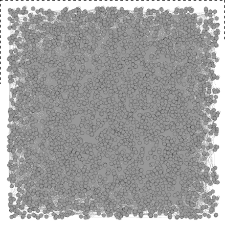
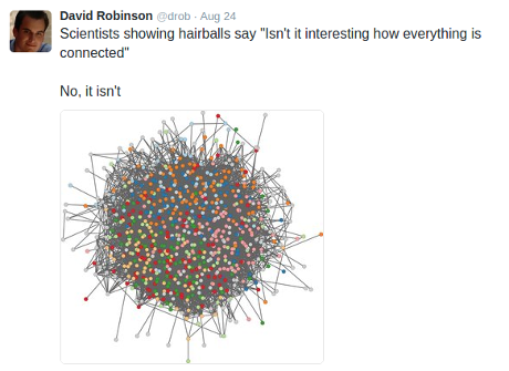
Obligatory hair-ball graph visualization. 😉
Considerably less appealing that Jennifer Golbeck’s but be patient!
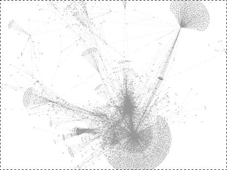
First step, Layout -> Yifan Hu. My results:
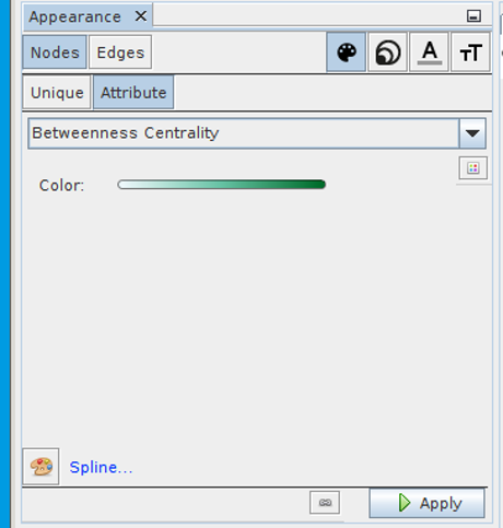
Second step, Network Diameter statistics (right side, run).
No visible impact on the graph but, now you can change the color and size of nodes in the graph. That is they have attributes on which you can base the assignment of color and size.
Tutorial gotcha: Not one of Jennifer’s tutorials but I was watching a Gephi tutorial that skipped the part about running statistics on the graph prior to assignment of color and size. Or I just didn’t hear it. The menu options appear in documentation but you can’t access them unless and until you run network statistics or have attributes for the assignment of color and size. Run statistics first!
Next, assign colors based on betweenness centrality:
The densest node is John Podesta, but if you remove his node, rerun the network statistics and re-layout the graph, here is part of what results:
A no frills import of 31,819 emails results in a graph of 3235 nodes and 11,831 edges.
That’s because nodes and edges combine (merge to you topic map readers) when they have the same identifier or for edges are between the same nodes.
Subject to correction, when that combining/merging occurs, the properties on the respective nodes/edges are accumulated.
Topic mappers already realize there are important subjects missing, some 31,819 of them. That is the emails themselves don’t by default appear as nodes in the network.
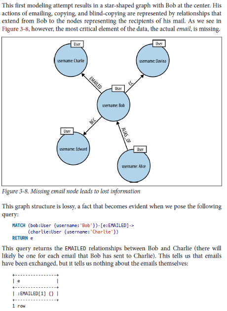
Ian Robinson, Jim Webber & Emil Eifrem illustrate this lossy modeling in Graph Databases this way:
Modeling emails without the emails is rather lossy. 😉
Other nodes/subjects we might want:
Multiple to: emails – Is who was also addressed important?
Multiple cc: emails – Same question as with to:.
Date sent as properties? So evolution of network/emails can be modeled.
Capture “reply-to” for relationships between emails?
Other modeling concerns?
Bear in mind that we can suppress a large amount of the detail so you can interactively explore the graph and only zoom into/display data after finding interesting patterns.
Last year the New York City Taxi and Limousine Commission released a massive dataset of pickup and dropoff locations, times, payment types, and other attributes for 1.2 billion trips between 2009 and 2015. The dataset is a model for municipal open data, a tool for transportation planners, and a benchmark for database and visualization platforms looking to test their mettle.
MapD, a GPU-powered database that uses Mapbox for its visualization layer, made it possible to quickly and easily interact with the data. Mapbox enables MapD to display the entire results set on an interactive map. That map powers MapD’s dynamic dashboard, updating the data as you zoom and pan across New York.
…
Very impressive demonstration of the capabilities of MapD!
Imagine how you can visualize data from your hundreds of users geo-spotting security forces with their smartphones.
Or visualizing data from security forces tracking your citizens.
Technology cuts both ways.
The question is whether the sharper technology sword is going to be in your hands or those of your opponents?
Comments Off on Going My Way? – Explore 1.2 billion taxi rides
The world’s most beautiful places are rarely flat. From the soaring peaks of the Himalaya to the vast chasm of the Grand Canyon, many of the most stunning sites on Earth extend in all three dimensions. This poses a problem for mapmakers, who typically only have two dimensions to work with.
Fortunately, cartographers have some clever techniques for creating the illusion of depth, many of them developed by trial and error in the days before computers. The best examples of this work use a combination of art and science to evoke a sense of standing on a mountain peak or looking out an airplane window.
One of the oldest surviving maps, scratched onto an earthenware plate in Mesopotamia more than 4,000 years ago, depicts mountains as a series of little domes. It’s an effective symbol, still used today in schoolchildren’s drawings and a smartphone emoji, but it’s hardly an accurate representation of terrain. Over the subsequent centuries, mapmakers made mostly subtle improvements, varying the size and shape of their mountains, for example, to indicate that some were bigger than others.
But cartography became much more sophisticated during the Renaissance. Topographic surveys were done for the first time with compasses, measuring chains, and other instruments, resulting in accurate measurements of height. And mapmakers developed new methods for depicting terrain. One method, called hachuring, used lines to indicate the direction and steepness of a slope. You can see a later example of this in the 1807 map below of the Mexican volcano Pico de Orizaba. Cartographers today refer (somewhat dismissively) to mountains depicted this way as “woolly caterpillars.”
…
Stunning illusions of depth on maps, creating depth illusions in 2 dimensions (think computer monitors), history of map making techniques, are all reasons to read this post.
What seals it for me is that the quest for the “best” depth illusion continues. It’s not a “solved” problem. (No spoiler, see the post.)
Physical topography to one side, how are you going to bring “depth” to your topic map?
Some resources in a topic map may have great depth and others, unfortunately, may be like Wikipedia articles marked as:
This article has multiple issues.
How do you define and then enable navigation of your topic maps?
Comments Off on How Mapmakers Make Mountains Rise Off the Page
on the grounds of her adultery. Effectively removing her as queen of England.
Queen Caroline was represented by Lord Brougham, who had evidence of a secret prior marriage by King George the IV to Catholic (which was illegal), Mrs Fitzherbert.
Brougham’s speech is worth your reading in full but the portion most often cited for zealous defense reads as follows:
…
I once before took leave to remind your lordships — which was unnecessary, but there are many whom it may be needful to remind — that an advocate, by the sacred duty of his connection with his client, knows, in the discharge of that office, but one person in the world, that client and none other. To save that client by all expedient means — to protect that client at all hazards and costs to all others, and among others to himself — is the highest and most unquestioned of his duties; and he must not regard the alarm, the suffering, the torment, the destruction, which he may bring upon any other; nay, separating even the duties of a patriot from those of an advocate, he must go on reckless of the consequences, if his fate it should unhappily be, to involve his country in confusion for his client.
…
The name Mrs. Fitzherbert never slips Lord Brougham’s lips but the House of Lords has been warned that may not remain to be the case, should it choose to proceed. The House of Lords did grant the divorce but didn’t enforce it. Saving fact one supposes. Queen Caroline died less than a month after the coronation of George IV.
For data analysis, cybersecurity, or any of the other topics I touch on in this blog, I take the last line of Lord Brougham’s speech:
To save that client by all expedient means — to protect that client at all hazards and costs to all others, and among others to himself — is the highest and most unquestioned of his duties; and he must not regard the alarm, the suffering, the torment, the destruction, which he may bring upon any other; nay, separating even the duties of a patriot from those of an advocate, he must go on reckless of the consequences, if his fate it should unhappily be, to involve his country in confusion for his client.
as the height of professionalism.
Post-engagement of course.
If ethics are your concern, have that discussion with your prospective client before you are hired.
Otherwise, clients have goals and the task of a professional is how to achieve them. Nothing more.
Eduard Imhof (1895-1986) was professor of cartography at the Swiss Federal Institute of Technology Zurich from 1925 – 1965. His fame far beyond the Institute of Technology was based on his school maps and atlases. In 1995 it was 100 years since his birthday. On this occasion several exhibitions celebrated his life and work, among others in Zurich, Bern, Bad Ragaz, Küsnacht/ZH, Barcelona, Karlsruhe and Berlin. The last such exhibition took place in summer 1997 in the Graphische Sammlung of the ETH. There it was possible to show a large number of maps and pictures in the original. At the conclusion of the exhibition Imhof’s family bequested his original works to the ETH-Bibliothek Zurich. Mrs. Viola Imhof, the widow of Eduard Imhof, being very much attached to his work, had a major part in making it accessible to the public.
Eduard Imhof was born in Schiers on 25 Jan 1895 to the geographer Dr. Eduard Imhof and his wife Sophie.1 At the age of 19 he enrolled in ETH Zürich,2 and after several interruptions for military service, was awarded a geodesist/surveyor diploma in 1919.
He returned to ETH as an assistant to his mentor Prof. Fridolin Becker, himself a cartographic god widely viewed as the inventor of the Swiss style shaded relief map.3 In 1925, the year after Becker’s death, Imhof became an assistent professor and founded the Kartographische Institut (Institute of Cartography). Although the Institute was initially little more than a hand-painted sign above his small office, it was nevertheless the first of its kind in the world.
In 1925 he produced his first major work – the Schulkarte der Schweiz 1:500 000 (the School map of Switzerland). Over the years he would update the national school map several times as well as produce school maps for nearly half of the cantons in the Federation. He even did the school map for the Austrian Bundesländer of Vorarlberg. (footnotes omitted)
…
Comments Off on Eduard Imhof – Swiss Cartographer (Video)
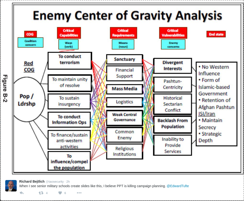
Richard Bejtlich posted this image (thumbnail, select for full size) with the note:
When I see senior military schools create slides like this, I believe PPT is killing campaign planning. @EdwardTufte
I am loathe to defend PPT but the problem here lies with the author and not PPT.
Or quite possibly with concept of “center of gravity analysis.”
Whatever your opinion about the imperialistic use of U.S. military force, 😉 , the U.S. military is composed of professional warriors who study their craft in great detail.
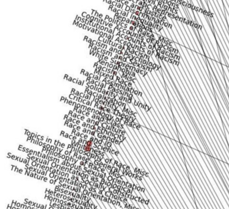
Some people go to PhilPapers, get the information they need, and then just go. Not Valentin Lageard, a graduate student in philosophy at Université Paris-Sorbonne. The Categories page at the site caught his eye. He says:
The completeness of their taxonomy was striking and I thought : “Could it be possible to map this taxonomy ?”. I decided it was a nice idea and i started to work on it.
The first step was to select the kind of graph and since their taxonomy includes a hierarchy permitting to sub-categories to be children of more than one parent categories, I selected a concentric circles graph.
Because I’m a python user, I choosed Networkx for the graph part and BeautifulSoup for the scraping part. Furthermore, since Philpapers gives the articles number for each category, I decided to add this data to my graph.
[See update, below, for the more detailed 5-layer version]
… NEW UPDATE: Here is the 5-layer version. You can view it in more detail here (open it in a new tab or window for best results).
…
Impressive but is it informative?
In order to read the edge, I had to magnify the graph several times its original size, which then meant navigation was problematic.
Despite the beauty of the image, a graph file that enables filtering of nodes and edges would be far more useful for exploring the categories as well as the articles therein.
For example:
If you are wondering what falls under “whiteness,” apparently studies of “whiteness” in the racial sense but also authors whose surnames are “White.”
As the top of the categories page for whiteness advises:
This category needs an editor. We encourage you to help if you are qualified.
Caution: You may encounter resources at PhilPapers that render you unable to repeat commonly held opinions. Read at your own risk.
At the bottom of Justin’s blog post he wrote this:
For bonus points you can also push those JSON files into Elasticsearch (or modify onionrunner.py to do so on the fly) and analyze the results using Kibana!
Always being up for a challenge I’ve done just that. The onionrunner.py script outputs each scan result as a json file, you have two options for loading this into ElasticSearch. You can either load your results after you’ve run a scan or you can load them into ElasticSearch as a scan runs. Now this might sound scary but it’s not, lets tackle each option separately.
…
A great enhancement to Justin’s original OnionRunner!
You will need a version of Maltego to perform the visualization as described. Not a bad idea to become familiar with Maltego in general.
Data is just data, until it is analyzed.
Enjoy!
Comments Off on OnionRunner, ElasticSearch & Maltego
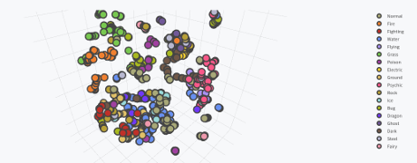
My screen capture falls far short of doing justice to the 3D image, not to mention it isn’t interactive. See Max’s post if you really want to appreciate it.
From the post:
There has been a lot of talk lately about Pokémon due to the runaway success of Pokémon GO (I myself am Trainer Level 18 and on Team Valor). Players revel in the nostalgia of 1996 by now having the ability catching the original 151 Pokémon in real life.
However, while players most-fondly remember the first generation, Pokémon is currently on its sixth generation, with the seventh generation beginning later this year with Pokémon Sun and Moon. As of now, there are 721 total Pokémon in the Pokédex, from Bulbasaur to Volcanion, not counting alternate Forms of several Pokémon such as Mega Evolutions.
In the meantime, I’ve seen a few interesting data visualizations which capitalize on the frenzy. A highly-upvoted post on the Reddit subreddit /r/dataisbeautiful by /u/nvvknvvk charts the Height vs. Weight of the original 151 Pokémon. Anh Le of Duke University posted a cluster analysis of the original 151 Pokémon using principal component analysis (PCA), by compressing the 6 primary Pokémon stats into 2 dimensions.
However, those visualizations think too small, and only on a small subset of Pokémon. Why not capture every single aspect of every Pokémon and violently crush that data into three dimensions?
…
If you need encouragement to explore the recent release of Spark 2.0, Max’s post that in abundance!
Caveat: Pokémon is popular outside of geek/IT circles. Familiarity with Pokémon may result in social interaction with others and/or interest in Pokémon. You have been warned.
Comments Off on Interactive 3D Clusters of all 721 Pokémon Using Spark and Plotly
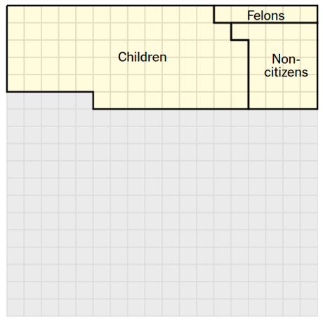
If you have been wondering who is responsible for choosing Trump and Clinton as the presidential nominees in 2016, you will find Only 9% of America Chose Trump and Clinton as the Nominees by Alicia Parlapiano and Adam Pearce quite interesting.
Using a fixed grid on the left hand side of the page that represents 324 million Americans, 1 square = 1 million people, the article inscribes boundaries on the grid for a series of factual statements.
For example, the first statement after the grid reads:
103 million of them are children, noncitizens or ineligible felons, and they do not have the right to vote.
For that statement, the grid displays:
An excellent demonstration that effective visualization requires a lot of thought and not necessarily graphics that jump and buzz with every movement of the mouse.
Successive statements reduce the area of people who voted in the primaries and even further by who voted for Trump or Clinton.
Eventually you are left with the 9% who chose the current nominees.
To be safe, you need 5% of the voting population to secure the nomination. Check the voting rolls for who votes in primaries and pay them directly. Cheaper than media campaigns and has the added advantage of not annoying the rest of the electorate with your ads.
If that sounds “undemocratic,” tell me what definition of democracy you are using where 9% of the population chooses the candidates and a little more than 30% will choose the winner?
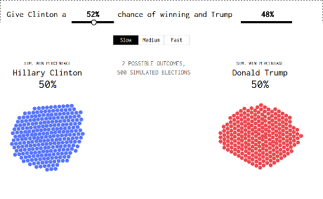
We now have our presidential candidates, and for the next few months you get to hear about the changing probability of Hillary Clinton and Donald Trump winning the election. As of this writing, the Upshot estimates a 68% probability for Clinton and 32% for Donald Trump. FiveThirtyEight estimates 52% and 48% for Clinton and Trump, respectively. Forecasts are kind of all over the place this far out from November. Plus, the numbers aren’t especially accurate post-convention.
But the probabilities will start to converge and grow more significant.
So what does it mean when Clinton has a 68% chance of becoming president? What if there were a 90% chance that Trump wins?
Some interpret a high percentage as a landslide, which often isn’t the case with these election forecasts, and it certainly doesn’t mean the candidate with a low chance will lose. If this were the case, the Cleveland Cavaliers would not have beaten the Golden State Warriors, and I would not be sitting here hating basketball.
Fiddle with the probabilities in the graphic below to see what I mean.
…
As always, visualizations from Nathan are a joy to view and valuable in practice.
You need to run it several times but here’s the result I got with “FiveThirtyEight estimates 52% and 48% for Clinton and Trump, respectively.”
You have to wonder what a similar simulation for breach/no-breach would look like for your enterprise?
Would that be an effective marketing tool for cybersecurity?
Perhaps not if you are putting insecure code on top of insecure code but there are other solutions.
For example, having state legislatures prohibit the operation of escape from liability clauses in EULAs.
Assuming someone who has read one in sufficient detail to draft legislation. 😉
That could be an interesting data project. Anyone have a pointer to a collection of EULAs?
Comments Off on What That Election Probability Means [500 Simulated Clinton-Trump Elections]
JuxtaposeJS helps storytellers compare two pieces of similar media, including photos, and GIFs. It’s ideal for highlighting then/now stories that explain slow changes over time (growth of a city skyline, regrowth of a forest, etc.) or before/after stories that show the impact of single dramatic events (natural disasters, protests, wars, etc.).
It is free, easy to use, and works on all devices. All you need to get started are links to the images you’d like to compare.
Perhaps an unexpected use, but if you are stumped on a “find all the differences” pair of photos, split them and create a slider!
This isn’t a hard one but for example use these two images:
As the slider moves over a change between the two images, your eye will be drawn towards the motion. (Visit Cranium Crunches Blog for more puzzles and images like this one.)
On a more serious note, imagine the use of this app for comparison of aerial imagery (satellite, plane, drone) and using the human eye to spot changes in images. Could be more timely than streaming video for automated analysis.
Or put differently, it isn’t the person with the most intell, eventually, that wins, but the person with the best intell, in time.
I am one of the 8% of men of Northern European descent who suffers from red-green colorblindness. Specifically, I have a mild case of protanopia (also called protanomaly), which means that my eyes lack a sufficient number of retinal cones to accurately see red wavelengths. To me some purples appear closer to blue; some oranges and light greens appear closer to yellow; dark greens and brown are sometimes indistinguishable.
Most of the time this has little impact on my day-to-day life, but as a news consumer and designer I often find myself struggling to read certain visualizations because my eyes just can’t distinguish the color scheme. (If you’re not colorblind and are interested in experiencing it, check out Dan Kaminsky’s iPhone app DanKam which uses augmented reality to let you experience the world through different color visions.)
As information architects, data visualizers and web designers, we need to make our work accessible to as many people as possible, which includes people with colorblindness.
…
Alex is writing from a journalism perspective but accessibility is a concern for any information delivery system.
A pair of rather remarkable tools, Vischeck, simulates colorblindness on your images and Daltonize, “corrects” images for colorblind users will be useful in vetting your graphics. Both are available at: http://www.vischeck.com/. Plugins for Photoshop (Win/Mac/ImageJ).
Loren Petrich has a collection of resources, including filters for GIMP to simulate colorblindness at: Color-Blindness Simulators.
After looking at the highlights page on Github, I couldn’t in good conscience omit any of it:
D3 is now modular, composed of many small libraries that you can also use independently. Each library has its own repo and release cycle for faster development. The modular approach also improves the process for custom bundles and plugins.
There are a lot of improvements in 4.0: there were about as many commits in 4.0 as in all prior versions of D3. Some changes make D3 easier to learn and use, such as immutable selections. But there are lots of new features, too! These are covered in detail in the release notes; here are a few highlights.
As discussed in the Book Design thread of Edward Tufte’s Ask E.T Forum, this site is home to LaTeX classes for producing handouts and books according to the style of Edward R. Tufte and Richard Feynman.
Download the latest release, browse the source, join the mailing list, and/or submit patches. Contributors are welcome to help polish these classes!
Some examples of the Tufte-LaTeX classes in action:
Some papers by Jason Catena using the handout class
A handout for a math club lecture on volumes of n-dimensional spheres by Marty Weissman
An example handout (source) using XeLaTeX with the bidi class option for the ancient Hebrew by Kirk Lowery
…
Caution: A Tufte-inspired LaTeX class is no substitute for professional design advice and assistance. It will help you do “better,” for some definition of “better,” but professional design is in a class of its own.
If you are interested in TeX/LaTeX tips, follow: TexTips. One of several excellent Twitter feeds by John D. Cook.
Comments Off on Tufte-inspired LaTeX (handouts, papers, and books)
yt is a python package for analyzing and visualizing volumetric, multi-resolution data from astrophysical simulations, radio telescopes, and a burgeoning interdisciplinary community.
Quantitative Analysis and Visualization
yt is more than a visualization package: it is a tool to seamlessly handle simulation output files to make analysis simple. yt can easily knit together volumetric data to investigate phase-space distributions, averages, line integrals, streamline queries, region selection, halo finding, contour identification, surface extraction and more.
Many formats, one language
yt aims to provide a simple uniform way of handling volumetric data, regardless of where it is generated. yt currently supports FLASH, Enzo, Boxlib, Athena, arbitrary volumes, Gadget, Tipsy, ART, RAMSES and MOAB. If your data isn’t already supported, why not add it?
From the non-rotating part of the homepage:
To get started using yt to explore data, we provide resources including documentation, workshop material, and even a fully-executable quick start guide demonstrating many of yt’s capabilities.
But if you just want to dive in and start using yt, we have a long list of recipes demonstrating how to do various tasks in yt. We even have sample datasets from all of our supported codes on which you can test these recipes. While yt should just work with your data, here are some instructions on loading in datasets from our supported codes and formats.
Professional astronomical data and tools like yt put exploration of the universe at your fingertips!
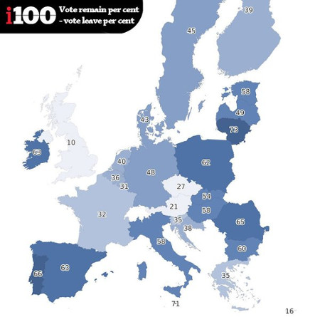
Do countries shaded in lighter colors support the UK remaining in the EU?
Simple enough question.
Unfortunately you are looking at one of the worst representations of sentiment I have seen in a long time.
From the post:
The indy100 have created the following graphic based on the data. In the map, the darker the shade of blue, the more support there is in that country for the UK to remain in the EU. The scores are calculated by subtracting the percentage of people who want Britain to leave, from those who want Britain to remain.
That last line:
“The scores are calculated by subtracting the percentage of people who want Britain to leave, from those who want Britain to remain.”
is what results in the odd visualization.
A chart later in the post reports that support for UK leaving the EU is only 18% in France, which would be hard to guess from the “32” shown on the map.
The map shows the gap between two positions, one for the UK to stay and the other for it to leave, and the shading represents the distance between staying and supporting positions.
That is if public opinion were 50% to stay in the EU and 50% to leave the EU, that county would be colored clear with a score of 0.
Reporting support and/or opposition percentages with coloration based on those percentages would be far clearer.
Comments Off on Countries Wanting UK to Stay in EU [Bad Graphics]
The increasing number and complexity of planetary exploration space missions require new tools to access, visualize and analyse data to improve their scientific return.
ASI Science Data Center (ASDC) addresses this request with the web-tool MATISSE (Multi-purpose Advanced Tool for the Instruments of the Solar System Exploration), allowing the visualization of single observation or real-time computed high-order products, directly projected on the three-dimensional model of the selected target body.
Using MATISSE it will be no longer needed to download huge quantity of data or to write down a specific code for every instrument analysed, greatly encouraging studies based on joint analysis of different datasets.
In addition the extremely high-resolution output, to be used offline with a Python-based free software, together with the files to be read with specific GIS software, makes it a valuable tool to further process the data at the best spatial accuracy available.
MATISSE modular structure permits addition of new missions or tasks and, thanks to dedicated future developments, it would be possible to make it compliant to the Planetary Virtual Observatory standards currently under definition. In this context the recent development of an interface to the NASA ODE REST API by which it is possible to access to public repositories is set.
Continuing a long tradition of making big data and tools for processing big data freely available online (hint, hint, Panama Papers hoarders), this paper describes MATISSE (Multi-purpose Advanced Tool for the Instruments for the Solar System Exploration), which you can find online at:
MATISSE currently ingests both public and proprietary data from 4 missions (ESA Rosetta, NASA Dawn, Chinese Chang’e-1 and Chang’e-2), 4 targets (4 Vesta, 21 Lutetia, 67P ChuryumovGerasimenko, the Moon) and 6 instruments (GIADA, OSIRIS, VIRTIS-M, all onboard Rosetta, VIR onboard Dawn, elemental abundance maps from Gamma Ray Spectrometer, Digital Elevation Models by Laser Altimeter and Digital Ortophoto by CCD Camera from Chang’e-1 and Chang’e-2).
If those names don’t sound familiar (links to mission pages):
You can do professional level research on extra-worldly data, but with worldly data (Panama Papers), not so much. Don’t be deceived by the forthcoming May 9th dribble of corporate data from the Panama Papers. Without the details contained in the documents, it’s little more than a suspect’s list.
Comments Off on MATISSE – Solar System Exploration
I was exhilarated (and honored) to have my talk accepted for OpenVis 2016. Yesterday April 25th, 2016, I was on the stage of the Simons IMAX Theatre in Boston’s New England Aquarium to inspire the audience with some dataviz eye candy. My talk was titled SVGs beyond mere shapes:
SVG can do much more than create nice shapes and paths. In my talk I discuss several techniques and demonstrate how to implement them in D3: from dynamic gradients based on data, to SVG filters, to creating glow, gooey, and fuzzy effects that brighten up any visual.
My eventual goal was to give people a whole bunch of effective or fun examples but to also show them that, even if I focus on a subject as narrow as SVG gradient and filters, if you try to experiment and use things in an unconventional manner you can create some very interesting results. I hope I’ve managed to inspire the audience to show a dedication to the details, to go beyond the norm, so they have to make as few concessions to the computer as possible to recreate the image that they have in their mind.
I’ve received so many wonderful reactions, it was really an amazing experience and well worth the time invested and the nerves I’ve had building up inside of me since hearing I’d been accepted last November 🙂
…
Are you ready to take SVG beyond shapes?
The start of a series so check back often and/or follow @NadiehBremer.
Last week, I showed you how to use Excel’s Conditional Formatting menu to add cell formats to highlight specific data values. Here, I’ll show you how to easily use the Color Scales options in that menu to create a Heatmap.
Simply put, a heatmap is a table where the data are visualized using color. They pop up fairly regularly these days, sometimes showing the actual data values and sometimes not, like these two I pulled from FlowingData.
…
In addition to this post, there are a number of other Excel-centric visualization posts, podcasts and other high quality materials.
Even if you aren’t sold on Excel, you will learn a lot about visualization here.
As I was listening to Anil talk about daemons spawning processes and sysadmins killing them, I thought, “What a great user interface!” Imagine running around with a shotgun blowing away your daemons and processes, never needing to type kill -9 again.
…
In Doom: The Aftermath you will find some later references, the most recent being from 2004.
You will have better luck at the ACM Digital library entry for Doom as an interface for process management that lists 29 subsequent papers citing Chao’s work on Doom. Latest is 2015.
If system administration with a Doom interface sounds cool, imagine a Doom hacking interface.
I can drive a car but I don’t set the timing, adjust the fuel injection, program the exhaust controls to beat inspectors, etc.
A higher level of abstraction for tools carries a cost but advantages as well.
Imagine cadres of junior high/high school students competing in pen testing contests.
Learning a marketable skill and helping cash-strapped IT departments with security testing.
Isn’t that a win-win situation?
Comments Off on Doom as a tool for system administration (1999) – Pen Testing?


