Time Curves by Benjamin Bach, Conglei Shi, Nicolas Heulot, Tara Madhyastha, Tom Grabowski, Pierre Dragicevic.
From What are time curves?:
Time curves are a general approach to visualize patterns of evolution in temporal data, such as:
- Progression and stagantion,
- sudden changes,
- regularity and irregularity,
reversals to previous states,- temporal states and transitions,
- reversals to previous states,
- etc..
Time curves are based on the metaphor of folding a timeline visualization into itself so as to bring similar time points close to each other. This metaphor can be applied to any dataset where a similarity metric between temporal snapshots can be defined, thus it is largely datatype-agnostic. We illustrate how time curves can visually reveal informative patterns in a range of different datasets.
A website to accompany:
Time Curves: Folding Time to Visualize Patterns of Temporal Evolution in Data
Abstract:
We introduce time curves as a general approach for visualizing patterns of evolution in temporal data. Examples of such patterns include slow and regular progressions, large sudden changes, and reversals to previous states. These patterns can be of interest in a range of domains, such as collaborative document editing, dynamic network analysis, and video analysis. Time curves employ the metaphor of folding a timeline visualization into itself so as to bring similar time points close to each other. This metaphor can be applied to any dataset where a similarity metric between temporal snapshots can be defined, thus it is largely datatype-agnostic. We illustrate how time curves can visually reveal informative patterns in a range of different datasets.
From the introduction:
…
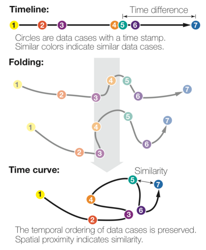
The time curve technique is a generic approach for visualizing temporal data based on self-similarity. It only assumes that the underlying information artefact can be broken down into discrete time points, and that the similarity between any two time points can be quantified through a meaningful metric. For example, a Wikipedia article can be broken down into revisions, and the edit distance can be used to quantify the similarity between any two revisions. A time curve can be seen as a timeline that has been folded into itself to reflect self-similarity (see Figure 1(a)). On the initial timeline, each dot is a time point, and position encodes time. The timeline is then stretched and folded into itself so that similar time points are brought close to each other (bottom). Quantitative temporal information is discarded as spacing now reflects similarity, but the temporal ordering is preserved.
…
Figure 1(a) also appears on the webpage as:
Obviously a great visualization tool for temporal data but the treatment of self-similarity is greatly encouraging:
that the similarity between any two time points can be quantified through a meaningful metric.
Time curves don’t dictate to users what “meaningful metric” to use for similarity.
BTW, as a bonus, you can upload your data (JSON format) to generate time curves from your own data.
Users/analysts of temporal data need to take a long look at time curves. A very long look.
I first saw this in a tweet by Moritz Stefaner.