Time Maps: Visualizing Discrete Events Across Many Timescales by Max Watson.
From the post:
In this blog post, I’ll describe a technique for visualizing many events across multiple timescales in a single image, where little or no zooming is required. It allows the viewer to quickly identify critical features, whether they occur on a timescale of milliseconds or months. It is adopted from the field of chaotic systems, and was originally conceived to study the timing of water drops from a dripping faucet. The visualization has gone by various names: return map, return-time map, and time vs. time plot. For conciseness, I will call them “time maps.” Though time maps have been used to visualize chaotic systems, they have not been applied to information technology. I will show how time maps can provide valuable insights into the behavior of Twitter accounts and the activity of a certain type of online entity, known as a bot.
This blog post is a shorter version of a paper I recently wrote, but with slightly different examples. The paper was accepted to the 2015 IEEE Big Data Conference. The end of the blog also contains sample Python code for creating time maps.
Building a time map is easy. First, imagine a series of events as dots along a time axis. The time intervals between each event are labeled as t1, t2, t3, t4, …
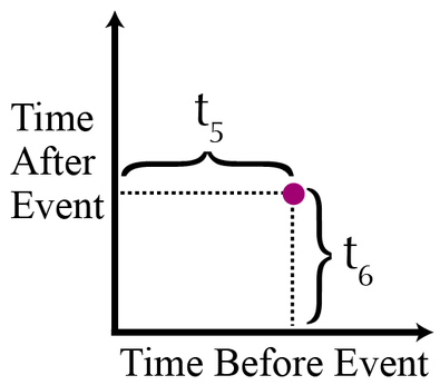
A time map is simply a two-dimensional scatterplot, where the xy coordinates of the events are: (t1,t2), (t2, t3), (t3, t4), and so on. On a time map, the purple dot would be plotted like this:
In other words, each point in the scatterplot represents an event. The x-coordinate of an event is the time between the event itself and the preceding event. An event’s y-coordinate is the time between the event itself and the subsequent event. The only points that are not displayed in a time map are the first and last events of the dataset.
…
Max goes on to cover the heuristics of time maps, along with the Python code for generating them.
Max’s time maps use a common time line for events and so aren’t well suited to visualizing overlapping narrative time frames such as occur in novels and/or real life.
I first saw this in a tweet by Data Science Renee

