Another Word For It Patrick Durusau on Topic Maps and Semantic Diversity

February 20, 2015

27 hilariously bad maps that explain nothing

Filed under: Humor,Maps — Patrick Durusau @ 5:46 pm

27 hilariously bad maps that explain nothing by Max Fisher.

For your weekend enjoyment!

One sample:

wrongest-map

Max says that the United States is incorrect and I agree.

Should extend down to the tip of South America, plus our clients states in Europe and two still occupied countries, Germany and Japan.

Oh, it was supposed to be acknowledged international borders! I see. A fictional map available at many locations on the Internet and at better stores everywhere.

February 17, 2015

Making Maps in R

Filed under: Mapping,Maps,R — Patrick Durusau @ 5:14 pm

Making Maps in R by Kevin Johnson.

from the post:

I make a lot of maps in my line of work. R is not the easiest way to create maps, but it is convenient and it allows for full control of what the map looks like. There are tons of different ways to create maps, even just within R. In this post I’ll talk about the method I use most of the time. I will assume you are proficient in R and have some level of familiarity with the ggplot2 package.

The American Community Survey provides data on almost any topic imaginable for various geographic levels in the US. For this example I will look at the 2012 5-year estimates of the percent of people without health insurance by census tract in the state of Georgia (obtained from the US Census FactFinder). Shapefiles were obtained from the US Census TIGER database. I generally use the cartographic boundary files since they are simplified representations of the boundaries, which saves a lot of space and processing time.

Occurs to me that getting students to make maps of their home states with a short list of data options (for a class), could be an illustration of testing whether results are “likely” or not. Reasoning that students are likely to have some sense of demographic distributions for their home states (or should).

I first saw this in a tweet by Neil Saunders.

February 14, 2015

Streets of Paris Colored by Orientation

Filed under: Mapping,Maps,R — Patrick Durusau @ 8:12 pm

Streets of Paris Colored by Orientation by Mathieu Rajerison.

From the post:

Recently, I read an article by datapointed which presented maps of streets of different cities colored by orientation.

The author gave some details about the method, which I tried to reproduce. In this post, I present the different steps from the calculation in my favorite spatial R ToolBox to the rendering in QGIS using a specific blending mode.

An opportunity to practice R and work with maps. More enjoyable than sifting data to find less corrupt politicians.

I first saw this in a tweet by Caroline Moussy.

In Defense of the Good Old-Fashioned Map

Filed under: Interface Research/Design,Mapping,Maps — Patrick Durusau @ 1:40 pm

In Defense of the Good Old-Fashioned Map – Sometimes, a piece of folded paper takes you to places the GPS can’t by Jason H. Harper.

A great testimonial to hard copy maps in addition to being a great read!

From the post:


But just like reading an actual, bound book or magazine versus an iPad or Kindle, you consume a real map differently. It’s easier to orient yourself on a big spread of paper, and your eye is drawn to roads and routes and green spaces you’d never notice on a small screen. A map invites time and care and observance of the details. It encourages the kind of exploration that happens in real life, when you’re out on the road, instead of the turn-by-turn rigidity of a digital device.

You can scroll or zoom with a digital map or digital representation of a topic map, but that isn’t quite the same as using a large, hard copy representation. Digital scrolling and zooming is like exploring a large scale world map through a toilet paper tube. It’s doable but I would argue it is a very different experience from a physical large scale world map.

Unless you are at a high-end visualization center or until we have walls as high resolution displays, you may want to think about production of topic maps as hard copy maps for some applications. While having maps printed isn’t cheap, it pales next to the intellectual effort that goes into constructing a useful topic map.

A physical representation of a topic map would have all the other advantages of a hard copy map. It would survive and be accessible without electrical power, it could be manually annotated, it could shared with others in the absence of computers, it could be compared to observations and/or resources, in fact it could be rather handy.

I don’t have a specific instance in mind but raise the point to keep in mind the range of topic map deliverables.

February 12, 2015

Digital Cartography [87]

Filed under: Cartography,Mapping,Maps — Patrick Durusau @ 7:44 pm

Digital Cartography [87] by Tiago Veloso.

Tiago has collected twenty-two (22) interactive maps that cover everything from “Why Measles May Just Be Getting Started | Bloomberg Visual Data” and “A History of New York City Basketball | NBA” (includes early stars as well) to “Map of 73 Years of Lynchings | The New York Times” and “House Vote 58 – Repeals Affordable Care Act | The New York Times.”

Sad to have come so far and yet not so far. Rather than a mob we have Congress, special interest groups and lobbyists. Rather than lynchings, everyone outside of the top 5% or so becomes poorer, less healthy, more stressed and more disposable. But we have a “free market” Shouting that at Galgotha would not have been much comfort.

February 7, 2015

Geojournalism.org

Filed under: Geographic Data,Geography,Geospatial Data,Journalism,Mapping,Maps — Patrick Durusau @ 3:05 pm

Geojournalism.org

From the webpage:

Geojournalism.org provides online resources and training for journalists, designers and developers to dive into the world of data visualization using geographic data.

From the about page:

Geojournalism.org is made for:

Journalists

Reporters, editors and other professionals involved on the noble mission of producing relevant news for their audiences can use Geojournalism.org to produce multimedia stories or simple maps and data visualization to help creating context for complex environmental issues

Developers

Programmers and geeks using a wide variety of languages and tools can drink on the vast knowledge of our contributors. Some of our tutorials explore open source libraries to make maps, infographics or simply deal with large geographical datasets

Designers

Graphic designers and experts on data visualizations find in the Geojournalism.org platform a large amount of resources and tips. They can, for example, improve their knowledge on the right options for coloring maps or how to set up simple charts to depict issues such as deforestation and climate change

It is one thing to have an idea or even a story and quite another to communicate it effectively to a large audience. Geojournalism is designed as a community site that will help you communicate geophysical data to a non-technical audience.

I think it is clear that most governments are shy about accurate and timely communication with their citizens. Are you going to be one of those who fills in the gaps? Geojournalism.org is definitely a site you will be needing.

February 5, 2015

Linguistic Geographies: The Gough Map of Great Britain and its Making

Filed under: Cartography,History,Mapping,Maps — Patrick Durusau @ 2:31 pm

Linguistic Geographies: The Gough Map of Great Britain and its Making

From the home page:

The Gough Map is internationally-renowned as one of the earliest maps to show Britain in a geographically-recognizable form. Yet to date, questions remain of how the map was made, who made it, when and why.

This website presents an interactive, searchable edition of the Gough Map, together with contextual material, a blog, and information about the project and the Language of Maps colloquium.

Another snippet from the about page:

The Linguistic Geographies project involved a group of researchers from across three UK HEIs, each bringing distinctive skills and expertise to bear. Each has an interest in maps and mapping, though from differing disciplinary perspectives, from geography, cartography and history. Our aim was to learn more about the Gough Map, specifically, but more generally to contribute to ongoing intellectual debates about how maps can be read and interpreted; about how maps are created and disseminated across time and space; and about technologies of collating and representing geographical information in visual, cartographic form. An audio interview with two of the project team members – Keith Lilley and Elizabeth Solopova – is available via the Beyond Text web-site, at http://projects.beyondtext.ac.uk/video.php (also on YouTube).

The project’s focus on a map, as opposed to a conventional written text, thus opens up theoretical and conceptual issues about the relationships between ‘image’ and ‘text’ – for maps comprise both – and about maps as objects and artifacts with a complex and complicated ‘language’ of production and consumption. To explore these issues the project team organized an international colloquium on The Language of Maps, held over the weekend of June 23-25 2011 at the Bodleian Library Oxford. Further details and a short report on the colloquium are available here.

Be sure to visit the Beyond Text web-site. The interface under publications isn’t impressive but the publications for any given project are.

February 1, 2015

Mapping the Blind Spots:…

Filed under: Data Science,Mapping,Maps,Privacy — Patrick Durusau @ 4:48 pm

Mapping the Blind Spots: Developer Unearths Secret U.S. Military Bases by Lorenzo Franceschi-Bicchierai.

From the post:

If you look closely enough on Google or Bing Maps, some places are blanked out, hidden from public view. Many of those places disguise secret or sensitive American military facilities.

The United States military has a foothold in every corner of the world, with military bases on every continent. It’s not even clear how many there are out there. The Pentagon says there are around 5,000 in total, and 598 in foreign countries, but those numbers are disputed by the media.

But how do these facilities look from above? To answer that question, you first need to locate the bases. Which, as it turns out, is relatively easy.

That’s what Josh Begley, a data artist, found out when he embarked on a project to map all known U.S. military bases around the world, collect satellite pictures of them using Google Maps and Bing Maps, and display them all online.

The project, which he warns is ongoing, was inspired by Trevor Paglen’s book “Blank Spots on the Map” which goes inside the world of secret military bases that are sometimes censored on maps.

A great description of how to combine public data to find information others prefer to not be found.

I suspect the area is well enough understood to make a great high school science fair project, particularly if countries that aren’t as open as the United States were used as targets for filling in the blank spaces. Would involve obtaining public maps for that country, determining what areas are “blank,” photo analysis of imagery, correlation with press and other reports.

Or detection of illegal cutting of forests, mining, or other ecological crimes. All of those are too large scale to be secret.

Better imagery is only a year or two away, perhaps sufficient to start tracking polluters who truck industrial wastes to particular states for dumping.

With satellite/drone imagery and enough eyes, no crime is secret.

The practices of illegal forestry, mining, pollution, virtually any large scale outdoor crime will wither under public surveillance.

That might not be a bad trade-off in terms of privacy.

January 30, 2015

So You’d Like To Make a Map Using Python

Filed under: Mapping,Maps,Python — Patrick Durusau @ 8:25 pm

So You’d Like To Make a Map Using Python by Stephan Hügel.

From the post:

Making thematic maps has traditionally been the preserve of a ‘proper’ GIS, such as ArcGIS or QGIS. While these tools make it easy to work with shapefiles, and expose a range of common everyday GIS operations, they aren’t particularly well-suited to exploratory data analysis. In short, if you need to obtain, reshape, and otherwise wrangle data before you use it to make a map, it’s easier to use a data analysis tool (such as Pandas), and couple it to a plotting library. This tutorial will be demonstrating the use of:

  • Pandas
  • Matplotlib
  • The matplotlib Basemap toolkit, for plotting 2D data on maps
  • Fiona, a Python interface to OGR
  • Shapely, for analyzing and manipulating planar geometric objects
  • Descartes, which turns said geometric objects into matplotlib “patches”
  • PySAL, a spatial analysis library

The approach I’m using here uses an interactive REPL (IPython Notebook) for data exploration and analysis, and the Descartes package to render individual polygons (in this case, wards in London) as matplotlib patches, before adding them to a matplotlib axes instance. I should stress that many of the plotting operations could be more quickly accomplished, but my aim here is to demonstrate how to precisely control certain operations, in order to achieve e.g. the precise line width, colour, alpha value or label position you want.

I didn’t catch this when it was originally published (2013) so you will probably have to update some of the specific package versions.

Still, this looks like an incredibly useful exercise.

Not just for learning Python and map creation but deeper knowledge about particular cities as well. On a good day I can find my way around the older parts of Rome from the Trevi Fountain but my knowledge fades pretty rapidly.

Creating a map using Python could help flesh out your knowledge of cities that are otherwise just names on the news. Isn’t that one of those quadruple learning environments? Geography + Cartography + Programming + Demographics? That’s how I would pitch it in any event.

I first saw this in a tweet by YHat, Inc.

January 22, 2015

Digital Cartography [84]

Filed under: Cartography,Mapping,Maps — Patrick Durusau @ 6:35 pm

Digital Cartography [84] by Visual Loop.

From the post:

Welcome to the year’s first edition of Digital Cartography, our weekly column where we feature the most recent interactive maps that came to our way. And being this the first issue of 2015, of course that it’s fully packed with more than 40 new interactive maps and cartographic-based narratives.

That means that you’ll need quite a bit of time to spend exploring these examples, but if that isn’t enough, there’s always the list with our 100 favorite interactive maps of 2014 (part one and two), guaranteed to keep you occupied for the next day or so.

…[M]ore than 40 new interactive maps and cartographic-based narratives.

How very cool!

With a couple of notable exceptions (see the article) mostly geography based mappings. There’s nothing wrong with geography based mappings but it makes me curious why there isn’t more diversity in mapping?

Just as a preliminary thought, could it be that geography gives us a common starting point for making ourselves understood? Rather than undertaking a burden of persuasion before we can induce someone to use the map?

From what little I have heard (intentionally) about #Gamergate, I would say a mapping of the people, attitudes, expressions of same and the various forums would vary significantly from person to person. If you did a non-geographic mapping of that event(?) (sorry, I don’t have more precise language to use), what would it look like? What major attitudes, factors, positions would you use to lay out the territory?

Personally I don’t find the lack of a common starting point all that troubling. If a map is extensive enough, it will surely intersect some areas of interest and a reader can start to work outwards from that intersection. They may or may not agree with what they find but it would have the advantage of not being snippet sized texts divorced from some over arching context.

A difficult mapping problem to be sure, one that poses far more difficulties than one that uses physical geography as a starting point. Would even an imperfect map be of use to those trying to sort though issues in such a case?

January 5, 2015

Mapping Boston’s Religions:…

Filed under: History,Mapping,Maps — Patrick Durusau @ 8:13 pm

Mapping Boston’s Religions: Next Steps in Mapping U.S. Religious History by Lincoln Mullen.

From the first slide:

This conference paper and visualizations are to be delivered January 5, 2015, at the annual meeting of the American Society of Church History. It is part of a panel on “Mapping Religious Space: Four American Cities from the Colonial Era to the Twentieth Century.

The slides aren’t numbered but I think from slide 4:

My general argument is that there are large sources of data on American religion after the colonial period and before Word War II which historians have not used to make maps. Scholars have not passed over these sources because they are unaware of them, but because they could not meaningfully represent them in print maps. The problem is one of resolution. Print atlases could convey relatively few data points. Furthermore, because atlases can contain only so many maps, they have often been forced to set their chronological or geographic scope very large. By using these more detailed sources we are able to make maps which better approximate the sophisticated thinking about religious categories that we expect from our prose. These richer maps can tell us not just more, but more humanistic, things about religious history. To take advantage of these more comprehensive sources we need digital maps. To be sure, digital history has had more than its share of hubris, more than we have time to repent of today. But digital maps do offer the possibility for working at different scales, for displaying change over time, for integrating maps with our sources, and for crafting narratives with maps. While none of these advantages entirely solves with the problem of mapping humanistically, they do permit us to at least start to address these theoretical concerns.

Lowering the barriers and constraints on map making, such as the limitations and cost of print maps, is empowering new map makers, like Lincoln Mullen, to craft maps no one has attempted before. Where those maps will take us remains to be seen.

I first saw this in a tweet by Lincoln Mullen.

January 2, 2015

Making a Map with QGIS

Filed under: Mapping,Maps,QGIS — Tags: — Patrick Durusau @ 3:57 pm

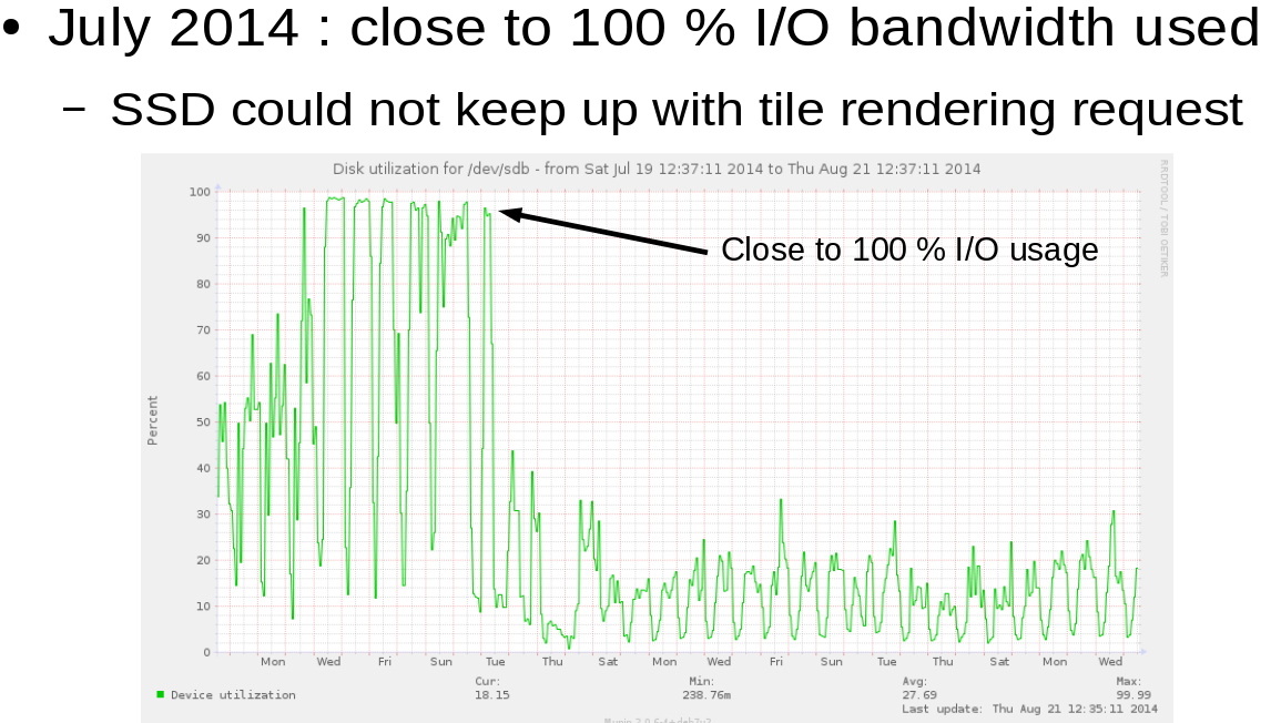
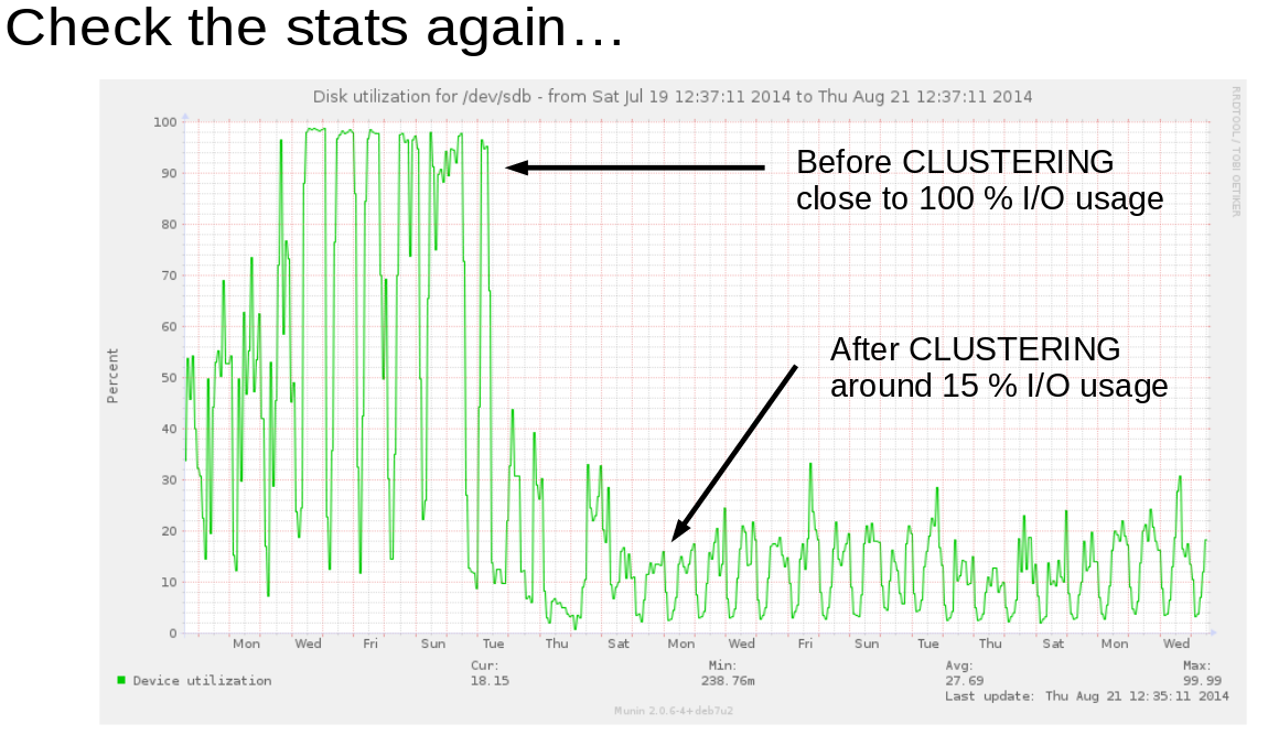
Making a Map with QGIS by Fred Gibbs.

From the post:

Even if you have some experience with GIS in general and QGIS in particular, it’s always helpful to review the fundamentals. Read through “Introducing GIS”, “Vector Data”, and “Raster Data” from this gentle introduction to GIS.

If (= when), during your QGIS adventures, you get stuck or have questions, consult the QGIS Training Manual, the QGIS wiki, and an array of tutorials. You may not at first find exactly what you’re looking for, but it’s worth browsing through these sites to help better understand the software and prevent conceptual misunderstandings. Be aware that many tutorials are for older versions of QGIS, so the screen shots and menu labels may not match exactly what you see in your version–but often the concepts are the same.

Also, remember that Google searches are your friend. You’re not the first one to haul yourself up the learning curve of QGIS; many people have likely posted similar questions on forums where someone eventually provided a useful explanation. Others have written tutorials or blog posts that can shed more light on your issue. You won’t always find exactly what you need, but this kind of searching helps you better understand the tool and build your vocabulary for how to search and solve problems on your own.

If you think maps may not be relevant to issues of interest to you, consider the following passage:

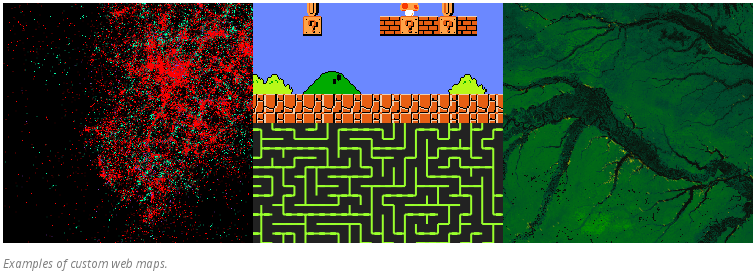
The first thing to recognize when it comes to GIS software like QGIS is that it doesn’t display maps, it displays data (most of which will have strong geographic ties). You are in charge of composing the map you want from the relevant geographic and social data you’re interested in. This might sound annoying, but it’s actually incredibly powerful.

The second thing to recognize is that GIS tools are not only for projects centered on geographic analysis. Whether you’re thinking about people, commodities, ideas, political power, or whatever, these all have a grounding in space with various features (transportation networks like roads or railroads, political boundaries, access to natural resources, wealth disparity, demographic data, etc). While these features might not be a direct concern of yours, they can add extremely useful context to your research. Before easily accessible data and GIS software, the work to create maps for secondary research concerns far exceeded the benefit. The barrier now is far, far lower.

The last two sentences of the first paragraph:

You are in charge of composing the map you want from the relevant geographic and social data you’re interested in. This might sound annoying, but it’s actually incredibly powerful. (emphasis added)

are directly applicable to topic maps. If you are expecting to open most topic maps software and find a map for you, you are likely to be very disappointed.

The second paragraph, about maps not being limited to geographic analysis, comes to mind when you think about #blacklivesmatter, for instance. Where do most fatal police shootings happen, geographically speaking? It is one thing to “know” where they happen and quite another to have a map that graphically displays that knowledge. It is harder for others to dodge pointed questions if the data is presented in an open and persuasive manner.

Or if you want to do some data mining, where do most police stops occur for particular types of traffic violations? Or do that by time of day.

Or map all the petit jury pools by geographic location.

Rather hard for the establishment to argue with data it generated. Yes?

PS: If you are interested, I have suggestions on how a local neighborhood police watch could collect verifiable data on police patrols and their activities. Collate that to a map and other documents. Areas without regular patrols might stand out, areas with high levels of police activity, etc.

Mapbox: Innovating with Landsat

Filed under: Government,MapBox,Mapping,Maps — Patrick Durusau @ 2:52 pm

Mapbox: Innovating with Landsat by Larisa Serbina and Holly Miller.

From the post:

Mapbox* is a cloud-based map platform startup that creates custom maps with open source tools. The team at Mapbox consists of over fifty cartographers, data analysts and software engineers, located in Washington, D.C. and San Francisco, California. One of the open-source tools used by Mapbox is Landsat imagery. The company has a satellite team consisting of five employees dedicated to projects that use Landsat imagery to develop new products and enhance existing imagery.

Charlie Loyd, a member of the satellite team at Mapbox, points out that Landsat imagery is an integral part of the satellite base layer which is a vital part of the business. “There are more than 800 billion Landsat-derived pixels of land in our imagery. If we printed out just our Landsat-based world map at poster resolution, it would cover two acres,” says Loyd.

Internal estimates at Mapbox show that licensing commercial imagery equivalent to Landsat would cost $4 million per year for the base layer alone. The company would face costs beyond $4 million to produce the current cloudless basemap product, which requires more input pixels than output pixels. These costs would prohibit further development of medium-resolution products. “In other words,” Loyd notes, “we make goods with Landsat that otherwise would not get made.” An example of a cloudless map derived from Landsat is shown in Figure 1.

MapBox Figure 1.65 percent

Figure 1. Example of a cloudless image of the western states in the U.S., composed using Landsat. Courtesy of Mapbox.

A great example of government undertaking a task that is beyond the reach of any individual and most enterprises. A task that results in data that can be re-used by others for a multitude of purposes.

Kudos to Mapbox and the USGS (US Geological Survey)!

If you are not familiar with the resources available from the USGS (US Geological Survey), you are in for a real treat.

December 25, 2014

Turf: GIS for web maps

Filed under: GIS,MapBox,Mapping,Maps — Patrick Durusau @ 8:51 pm

Turf: GIS for web maps by Morgan Herlocker.

From the post:

Turf is GIS for web maps. It’s a fast, compact, and open-source JavaScript library that implements the most common geospatial operations: buffering, contouring, triangular irregular networks (TINs), and more. Turf speaks GeoJSON natively, easily connects to Leaflet, and is now available as a Mapbox.js plugin on our cloud platform. We’re also working to integrate Turf into our offline products and next-generation map rendering tools.

newyork-pop-lines

(Population data from the US Census transformed in read-time into population isolines with turf-isoline.)

The image in the original post is interactive. Plus there are several other remarkable examples.

Turf is part of a new geospatial infrastructure. Unlike the ArcGIS API for JavaScript, Turf can run completely client-side for all operations, so web apps can work offline and sensitive information can be kept local. We’re constantly refining Turf’s performance. Recent research algorithms can make operations like clipping and buffering faster than ever, and as JavaScript engines like V8 continue to optimize, Turf will compete with native code.

Can you imagine how “Steal This Book” would have been different if Abbie Hoffman had access to technology such as this?

Would you like to try? 😉

Cartographer: Interactive Maps for Data Exploration

Filed under: Cartography,D3,Mapping,Maps,R — Patrick Durusau @ 11:45 am

Cartographer: Interactive Maps for Data Exploration by Lincoln Mullen.

From the webpage:

Cartographer provides interactive maps in R Markdown documents or at the R console. These maps are suitable for data exploration. This package is an R wrapper around Elijah Meeks’s d3-carto-map and d3.js, using htmlwidgets for R.

Cartographer is under very early development.

Data visualization enthusiasts should consider the screen shot used to illustrate use of the software.

What geographic assumptions are “cooked” in that display? Or are they?

Screenshot makes me think data “exploration” is quite misleading. As though data contains insights that are simply awaiting our arrival. On the contrary, we manipulate data until we create one or more patterns of interest to us.

Patterns of non-interest to us are called noise, gibberish, etc. That is to say there are no meaningful patterns aside from us choosing patterns as meaningful.

If data “exploration” is iffy, then so are data “mining” and data “visualization.” All three imply there is something inherent in the data to be found, mined or visualized. But, apart from us, those “somethings” are never manifest and two different people can find different “somethings” in the same data.

The different “somethings” implies to me that users of data play a creative role in finding, mining or visualizing data. A role that adds something to the data that wasn’t present before. I don’t know of a phrase that captures the creative interaction between a person and data. Do you?

In this particular case, the “cooked” in data isn’t quite that subtle. When I say “United States,” I don’t make a habit of including parts of Canada and a large portion of Mexico in that idea.

Map displays often have adjacent countries displayed for context but in this mapping, data values are assigned to points outside of the United State proper. Were the data values constructed on a different geographic basis than the designation of “United States?”

December 20, 2014

Our Favorite Maps of the Year Cover Everything From Bayous to Bullet Trains

Filed under: Mapping,Maps — Patrick Durusau @ 8:48 pm

Our Favorite Maps of the Year Cover Everything From Bayous to Bullet Trains by Greg Miller (Wired MapLab)

From the post:

What makes a great map? It depends, of course, on who’s doing the judging. Teh internetz loves a map with dazzling colors and a simple message, preferably related to some pop-culture phenomenon. Professional mapmakers love a map that’s aesthetically pleasing and based on solid principles of cartographic design.

We love maps that have a story to tell, the kind of maps where the more you look the more you see. Sometimes we fall for a map mostly because of the data behind it. Sometimes, we’re not ashamed to say, we love a map just for the way it looks. Here are some of the maps we came across this year that captivated us with their brains, their beauty, and in many cases, both.

First, check out the animated map below to see a day’s worth of air traffic over the UK, then toggle the arrow at top right to see the rest of the maps in fullscreen mode.

The “arrow at top right” refers to an arrow that appears when you mouse over the map of the United States at the top of the post. An impressive collection of maps!

For an even more impressive display of air traffic:

Bear in mind that there are approximately 93,000 flights per day, zero (0) of which are troubled by terrorists. The next time your leaders decry terrorism, do remember to ask where?

Mapazonia (Mapping the Amazon)

Filed under: Mapping,Maps — Patrick Durusau @ 7:55 pm

Mapazonia (Mapping the Amazon)

From the about page:

Mapazonia has the aim of improve the OSM data in the Amazon region, using satellite images to map roads and rivers geometry.

A detailed cartography will help many organizations that are working in the Amazon to accomplish their objectives. Together we can collaborate to look after the Amazon and its inhabitants.

The project was born as an initiative of the Latinamerican OpenStreetMap Community with the objective of go ahead with collaborative mapping of common areas and problems in the continent.

We use the Tasking Manager of the Humanitarian OpenStreetMap Team to define the areas where we are going to work. Furthermore we will organize mapathons to teach the persons how to use the tools of collaborative mapping.

Normally I am a big supporter of mapping and especially crowd-sourced mapping projects.

However, a goal of an improved mapping of the Amazon makes me wonder who benefits from such a map?

The local inhabitants have known their portions of the Amazon for centuries well enough for their purposes. So I don’t think they are going to benefit from such a map for their day to day activities.

Hmmm, hmmm, who else might benefit from such a map? I haven’t seen any discussion of that topic in the mailing list archives. There seems to be a great deal of enthusiasm for the project, which is a good thing, but little awareness of potential future uses.

Who uses maps of as of yet not well mapped places? Oil, logging, and mining companies, just to name of few of the more pernicious users of maps that come to mind.

To say that the depredations of such users will be checked by government regulations is a jest too cruel for laughter.

There is a valid reason why maps were historically considered as military secrets. One’s opponent could use them to better plan their attacks.

An accurate map of the Amazon will be putting the Amazon directly in the cross-hairs of multiple attackers, with no effective defenders in sight. The Amazon may become as polluted as some American waterways but being unmapped will delay that unhappy day.

I first saw this in a tweet by Alex Barth.

December 6, 2014

Making the most detailed tweet map ever

Filed under: Mapping,Maps,Tweets — Patrick Durusau @ 2:15 pm

Making the most detailed tweet map ever by Eric Fisher.

From the post:

I’ve been tracking geotagged tweets from Twitter’s public API for the last three and a half years. There are about 10 million public geotagged tweets every day, which is about 120 per second, up from about 3 million a day when I first started watching. The accumulated history adds up to nearly three terabytes of compressed JSON and is growing by four gigabytes a day. And here is what those 6,341,973,478 tweets look like on a map, at any scale you want.

twitter map

[Static screenshot of a much cooler interactive map at original post.]

I’ve open sourced the tools I used to manipulate the data and did all the design work in Mapbox Studio. Here’s how you can make one like it yourself.

Eric gives a detailed account of how you can start tracking tweets on your own!

This rocks! If you use or adapt Eric’s code, be sure to give him a shout out in your code and/or documentation.

December 3, 2014

Periodic Table of Elements

Filed under: Maps,Science,Visualization — Patrick Durusau @ 8:17 pm

Periodic Table of Elements

You will have to follow the link to get anything approaching the full impact of this interactive graphic.

Would be even more impressive if elements linked to locations with raw resources and current futures markets.

I first saw this in a tweet by Lauren Wolf.

PS: You could even say that each element symbol is a locus for gathering all available information about that element.

November 24, 2014

How to Make a Better Map—Using Neuroscience

Filed under: Mapping,Maps — Patrick Durusau @ 2:30 pm

How to Make a Better Map—Using Neuroscience by Laura Bliss.

From the post:

The neuroscience of navigation has been big news lately. In September, Nobel Prizes went to the discoverers of place cells and grid cells, the neurons responsible for our mental maps and inner GPS. That’s on top of an ever-growing pile of fMRI research, where scientists connect regions of the brain to specific navigation processes.

But the more we learn about how our bodies steer from A to B, are cartographers and geographers listening up? Is the science of wayfinding finding its way into the actual maps we use?

It’s beginning to. CityLab spoke to three prominent geographers who are thinking about the perceptual, cognitive, and neurological processes that go on when a person picks up a web of lines and words and tries to use it—or, the emerging science of map-making.

The post tackles questions like:

How do users make inferences from the design elements on a map, and how can mapmakers work to make their maps more perceptually salient?

But her current research looks at not just how the brain correlates visual information with thematic relevance, but how different kinds of visualization actually affect decision-making.

“I’m not interested in mapping the human brain,” she says. “A brain area in itself is only interesting to me if it can tell me something about how someone is using a map. And people use maps really differently.”

Ready to put your map design on more than an ad hoc basis? No definite answers in Laura’s post but several pointers towards exploration yet to be done.

I first saw this in a tweet by Greg Miller.

November 14, 2014

Open Sourcing 3D City Reconstruction

Filed under: Graphics,Mapillary,Maps,Visualization — Patrick Durusau @ 3:05 pm

Open Sourcing 3D City Reconstruction by Jan Erik Solem.

From the post:

One of the downsides of using simple devices for mapping the world is that the GPS accuracy is not always great, especially in cities with tall buildings. Since the start we have always wanted to correct this using image matching and we are now making progress in that area.

The technique is called ‘Structure from Motion‘ (SfM) and means that you compute the relative camera positions and a 3D reconstruction of the environment using only the images.

We are now open sourcing our tools under the name OpenSfM and developing it in the open under a permissive BSD license. The project is intended to be a complete end-to-end easy-to-use SfM pipeline on top of OpenCV. We welcome all contributors, from industry and academia, to join the project. Driving this work inside Mapillary is Pau and Yubin.

Moving forward we are initially going to use this for improving the positioning and connection between Mapillary photos. Later, we are going to have an ever improving 3D reconstruction of every place on the planet too ;).

Are you ready to enhance your maps with 3D?

BTW, evidence that small vendors also support open source.

I first saw this in a tweet by Peter Neubauer.

November 12, 2014

Mapnik

Filed under: Mapping,Maps — Patrick Durusau @ 8:31 pm

Mapnik

From the FAQ:

What is mapnik?

Mapnik is a Free Toolkit for developing mapping applications. It’s written in C++ and there are Python bindings to facilitate fast-paced agile development. It can comfortably be used for both desktop and web development, which was something I wanted from the beginning.

Mapnik is about making beautiful maps. It uses the AGG library and offers world class anti-aliasing rendering with subpixel accuracy for geographic data. It is written from scratch in modern C++ and doesn’t suffer from design decisions made a decade ago. When it comes to handling common software tasks such as memory management, filesystem access, regular expressions, parsing and so on, Mapnik doesn’t re-invent the wheel, but utilizes best of breed industry standard libraries from boost.org

Which platforms does it run on?

Mapnik is a cross platform toolkit that runs on Windows, Mac, and Linux (Since release 0.4). Users commonly run Mapnik on Mac >=10.4.x (both intel and PPC), as well as Debian/Ubuntu, Fedora, Centos, OpenSuse, and FreeBSD. If you run Mapnik on another Linux platform please add to the list on the Trac Wiki

What data formats are supported?

Mapnik uses a plugin architecture to read different datasources. Current plugins can read ESRI shapefiles, PostGIS, TIFF raster, OSM xml, Kismet, as well as all OGR/GDAL formats. More data access plug-ins will be available in the future. If you cannot wait and/or like coding in C++, why not write your own data access plug-in?

What are the plans for the future?

As always, there are lots of things in the pipeline. Sign up for the mapnik-users list or mapnik-devel list to join the community discussion.

Governments as well as NGOs need mapping applications.

What mapping application will you create? What data will it merge on the fly for your users?

November 11, 2014

I/O Problem @ OpenStreetMap France

Filed under: Clustering,Mapping,Maps,Topic Maps — Patrick Durusau @ 2:54 pm

Benefit of data clustering for osm2pgsql/mapnik rending by Christian Quest.

The main server for OpenStreetMap France had an I/O problem:

OSM-FR

See Christian’s post for the details but the essence of the solution was to cluster geographic data on the basis of its location. To reduce the amount of I/O. Not unlike randomly seeking topics with similar characteristics.

How much did clustering reduce the I/O?

OSM-FR stats

Nearly 100% I/O was reduced to 15% I/O. 85% improvement.

An 85% improvement in I/O doesn’t look bad on a weekly/monthly activity report!

Now imagine clustering topics for dynamic merging and presentation to a user. Among other things, you can have an “auditing” view that shows all the topics that will merge to form a single topic in a presentation view.

Or a “pay-per-view” view that uses a different cluster to reveal more information for paying customers.

All while retaining the capacity to produce a serialized static file as an information product.

November 8, 2014

An Open Platform (MapBox)

Filed under: MapBox,Mapping,Maps — Patrick Durusau @ 2:04 pm

An Open Platform (Mapbox)

From the post:

When you hear the term web map, what comes to mind first? You might have thought of a road map – maps created to help you get from one place to another. However, there are many other types of maps that use the same mapping conventions.

maps

Mapbox is built from open specifications to serve all types of maps, not just road maps. Open specifications solve specific problems so the solution is simple and direct.

This guide runs through all the open specifications Mapbox uses.

If you aren’t familiar with Mapbox, you need to correct that oversight.

There are Starter (free to start) and Basic ($5/month) plans, so it isn’t a burden to learn the basics.

Maps offer a familiar way to present information to users.

October 21, 2014

The Cartographer Who’s Transforming Map Design

Filed under: Cartography,Mapping,Maps — Patrick Durusau @ 7:30 pm

The Cartographer Who’s Transforming Map Design by Greg Miller.

From the post:

Cindy Brewer seemed to attract a small crowd everywhere she went at a recent cartography conference here. If she sat, students and colleagues milled around, waiting for a chance to talk to her. If she walked, a gaggle of people followed.

Brewer, who chairs the geography program at Penn State, is a popular figure in part because she has devoted much of her career to helping other people make better maps. By bringing research on visual perception to bear on design, Brewer says, cartographers can make maps that are more effective and more intuitive to understand. Many of the same lessons apply equally well to other types of data visualization.

Brewer’s best-known invention is a website called Color Brewer, which helps mapmakers pick a color scheme that’s well-suited for communicating the particular type of data they’re mapping. More recently she’s moved on to other cartographic design dilemmas, from picking fonts to deciding what features should change or disappear as the scale of a map changes (or zooms in and out, as non-cartographers would say). She’s currently helping the U.S. Geological Survey apply the lessons she’s learned from her research to redesign its huge collection of national topographic maps.

A must read if you want to improve the usefulness of your interfaces.

I say a “must read,” but this is just an overview of Cindy’s work.

A better starting place would be Cindy’s homepage at UPenn.

October 12, 2014

Twitter Mapping: Foundations

Filed under: Mapping,Maps,Tweets — Patrick Durusau @ 10:32 am

Twitter Mapping: Foundations by Simon Rogers.

From the post:

With more than 500 million tweets sent every day, Twitter data as a whole can seem huge and unimaginable, like cramming the contents of the Library of Congress into your living room.

One way of trying to make that big data understandable is by making it smaller and easier to handle by giving it context; by putting it on a map.

It’s something I do a lot—I’ve published over 1,000 maps in the past five years, mostly at Guardian Data. At Twitter, with 77% of users outside the US, it’s often aimed at seeing if regional variations can give us a global picture, an insight into the way a story spreads around the globe. Here’s what I’ve learned about using Twitter data on maps.

… (lots of really cool maps and links omitted)

Creating data visualizations is simpler now than it’s ever been, with a plethora of tools (free and paid) meaning that any journalist working in any newsroom can make a chart or a map in a matter of minutes. Because of time constraints, we often use CartoDB to animate maps of tweets over time. The process is straightforward—I’ve written a how-to guide on my blog that shows how to create an animated map of dots using the basic interface, and if the data is not too big it won’t cost you anything. CartoDB is also handy for other reasons: as it has access to Twitter data, you can use it to get the geotagged tweets too. And it’s not the only one: Trendsmap is a great way to see location of conversations over time.

Have you made a map with Twitter Data that tells a compelling story? Share it with us via @TwitterData.

While composing this post I looked at CartoDB solution for geotagged tweets and while impressive, it is currently in beta with a starting price of $300/month. Works if you get your expenses paid but a bit pricey for occasional use.

There is a free option for CartoDB (up to 50 MB of data) but I don’t think it includes the twitter capabilities.

Sample mapping tweets on your favorite issues. Maps are persuasive in ways that are not completely understood.

October 11, 2014

Making Your First Map

Filed under: MapBox,Mapping,Maps — Patrick Durusau @ 1:09 pm

Making Your First Map from Mapbox.

From the webpage:

Regardless of your skill level, we have the tools that allow you to quickly build maps and share them online in minutes.

In this guide, we’ll cover the basics of our online tool, the Mapbox Editor, by creating a store location map for a bike shop.

A great example of the sort of authoring interface that is needed by topic maps.

Hmmm, by the way, did you notice that “…creating a store location map for a bike shop” is creating an association between the “bike shop” and a “street location?” True, Mapbox doesn’t include roles or the association type but the role players are present.

For a topic map authoring interface, you could default the role of location for any geographic point on the map and the association type to be “street-location.”

The user would only have to pick, possibly from a pick list, the role of the role player, bike shop, bar, etc.

Mapbox could have started their guide with a review of map projections, used and theoretical.

Or covered the basics of surveying and a brief overview of surveying instruments. They didn’t.

I think there is a lesson there.

The 100 Worst Landlords in New York City [Here Be Bastards]

Filed under: Mapping,Maps — Patrick Durusau @ 11:17 am

The 100 Worst Landlords in New York City

A great illustration of the power of mapping to bring information together! (Like a topic map does.)

I don’t live in New York so the classes of violations (mis-named “details”) wasn’t helpful to me. Nor were the actual “details” of particular violations available. (If I am wrong on that, please post a response saying how to obtain the details via the map interface.)

Suggested Improvement: Names of owners as hyperlinks to their residences on a map with the notation “Here Be Bastards” (a riff off of the “Here Be Dragons” from early sea maps).

October 10, 2014

Super-Detailed Interactive 3-D Seafloor Map

Filed under: Mapping,Maps,Oceanography — Patrick Durusau @ 9:47 am

Super-Detailed Interactive 3-D Seafloor Map by Nick Stockton.

From the post:

This super-detailed map of the ocean floor’s topography is based on satellite measurements of subtle lumps on the ocean’s surface. These lumps of water, which are subtle, low, and wide on the ocean’s surface, are caused by the gravitational pull of underwater features like mountains and ridges. The team of scientists wrapped their data around a Google Earth globe, so you and I could explore it ourselves, in the visualization above.

The map has more than twice the resolution of previous seafloor maps, and shows a plethora of never-before-seen features. These include thousands of volcanoes and what could be the ridge where two plates pulled apart to create the Gulf of Mexico. The map is part of new research published last week in Science.

The visualization at the top of the page (click here for a full screen view) lets you play with the vertical exaggeration of both continental and subsea topography using the upper left drop-down menu. (They might seem huge to us at ground level, but the planet’s mountains and valleys are almost imperceptible from the vantage of space.) Another visualization of the study’s map lets you drag a time bar to simulate the movement of tectonic plates.

Great seafloor map and visualization techniques!

Read Nick’s post to get some background on “gravitational mapping.” In short, gravitational mapping relies on the impact of features of the seafloor on ocean height to create detailed seafloor maps.

Sounds like very interesting data sets with many discoveries left to be made.

September 15, 2014

A Guide To Who Hates Whom In The Middle East

Filed under: Associations,Mapping,Maps — Patrick Durusau @ 7:01 pm

A Guide To Who Hates Whom In The Middle East by John Brown Lee.

John reviews an interactive visualization of players with an interest in the Middle East by David McCandless of Information is Beautiful.

The full interactive version of The Middle East Key players & notable relationships.

I would use this graphic with caution, mostly because if you select Jordan, it show no relationship to Israel. As you know, Jordan signed a peace agreement with Israel twenty years ago and Israel recently agreed to sell gas to Jordan’s state-owned National Electric Power Co.

Nor does it show any relationship between Turkey and the United States. At the very least, the United States and Turkey have a complicated relationship. Would you include the reported pettiness of Senator John McCain towards Turkey in an enhanced map?

Not to take anything away from a useful way to explore the web of relationships in the Middle East but more in the nature of a request for a fuller story.

« Newer PostsOlder Posts »

Powered by WordPress