Another Word For It Patrick Durusau on Topic Maps and Semantic Diversity

March 24, 2013

Expectation and Data Quality

Filed under: Marketing,Topic Maps — Patrick Durusau @ 6:35 pm

Expectation and Data Quality by Jim Harris.

From the post:

One of my favorite recently read books is You Are Not So Smart by David McRaney. Earlier this week, the book’s chapter about expectation was excerpted as an online article on Why We Can’t Tell Good Wine From Bad, which also provided additional examples about how we can be fooled by altering our expectations.

“In one Dutch study,” McRaney explained, “participants were put in a room with posters proclaiming the awesomeness of high-definition, and were told they would be watching a new high-definition program. Afterward, the subjects said they found the sharper, more colorful television to be a superior experience to standard programming.”

No surprise there, right? After all, a high-definition television is expected to produce a high-quality image.

“What they didn’t know,” McRaney continued, “was they were actually watching a standard-definition image. The expectation of seeing a better quality image led them to believe they had. Recent research shows about 18 percent of people who own high-definition televisions are still watching standard-definition programming on the set, but think they are getting a better picture.”

I couldn’t help but wonder if establishing an expectation of delivering high-quality data could lead business users to believe that, for example, the data quality of the data warehouse met or exceeded their expectations. Could business users actually be fooled by altering their expectations about data quality? Wouldn’t their experience of using the data eventually reveal the truth?

See Jim’s post for the answer on the quality of data warehouses.

Rather than arguing the “facts” of one methodology over another, what if an opponent were using a different technique and kept winning?

Would that influence an enterprise, agency or government view of a technology?

Genuine question because a large percentage of enterprises don’t believe in routine computer security if the statistics are to be credited.

That despite being victimized by script kiddies on a regular basis.

Of course, if the opponent were a paying customer, would it really matter?

March 20, 2013

Start with the Second Slide

Filed under: Marketing,Topic Maps — Patrick Durusau @ 1:42 pm

Start Presentations on the Second Slide by Kent Beck.

From the slide:

Technical presos need background but it’s not engaging. What’s a geeky presenter to do?

I’ve been coaching technical presenters lately, and a couple of concepts come up with almost all of them. I figured I’d write them down so I don’t necessarily have to explain them all the time. One is to use specifics and data. I’ll write that later. This post explains why to start your presentation on the second slide.

I stole this technique from Lawrence Block’s outstanding Telling Lies for Fun and Profit http://amzn.to/YTAf3C, a book about writing fiction. He suggests drafting a story the “natural” way, with the first chapter introducing the hero and the second getting the action going, then swapping the two chapters. Now the first chapter starts with a gun pointed at the hero’s head. By the end, he is teetering on a cliff about to jump into a crocodile-infested river. Just when the tension reaches a peak, we’re introduced to the character but we have reason to want to get to know him.

Technical presentations need to set some context and then present the problem to be solved. When presenters follow this order, though, the resulting presentation starts with information some listeners already know and other listeners don’t have any motivation to try to understand. It’s like our adventure story where we’re not interested in the color of the hero’s hair, at least not until he’s about to become a croc-snack.

Be honest. At least with yourself.

How many times have you started a topic maps (or other) technical presentation with content either known or irrelevant (at that point) to your audience?

We may be covering what we think is essential background information, but at that point, the audience has no reason to care.

Let me put it this way: explaining topic maps isn’t for our benefit. It isn’t supposed to make us look clever or industrious.

Explaining topic maps is supposed to interest other people in topic maps. And the problems they solve.

Have you tried the dramatic situation approach in a presentation? How did it work out?

March 15, 2013

Netflix Cloud Prize [$10K plus other stuff]

Filed under: Contest,Marketing,Topic Maps — Patrick Durusau @ 12:29 pm

Netflix Cloud Prize

Duration of Contest: 13th March 2013 to 15th September 2013.

From github:

This contest is for software developers.

Step 0 – You need your own GitHub account

Step 1 – Read the rules in the Wiki

Step 2 – Fork this repo to your own GitHub account

Step 3 – Send us your email address

Step 4 – Modify your copy of the repo as your Submission

Categories/Prizes:

We want you to build something cool using or modifying our open source software. Your submission will be a standalone program or a patch for one of our open source projects. Your submission will be judged in these categories:

  1. Best Example Application Mash-Up

  2. Best New Monkey

  3. Best Contribution to Code Quality

  4. Best New Feature

  5. Best Contribution to Operational Tools, Availability, and Manageability

  6. Best Portability Enhancement

  7. Best Contribution to Performance Improvements

  8. Best Datastore Integration

  9. Best Usability Enhancement

  10. Judges Choice Award

If you win, you’ll get US$10,000 cash, US$5000 AWS credits, a trip to Las Vegas for two, a ticket to Amazon’s user conference, and fame and notoriety (at least within Netflix Engineering).

I can see several of those categories where topic maps would make a nice fit.

You?

Yes, I have an ulterior motive. Having topic maps underlying one or more winners or even runners-up in this contest would promote topic maps and gain needed visibility.

I first saw this at: $10k prizes up for grabs in Netflix cloud contest by Elliot Bentley.

March 11, 2013

The Annotation-enriched non-redundant patent sequence databases [Curation vs. Search]

Filed under: Bioinformatics,Biomedical,Marketing,Medical Informatics,Patents,Topic Maps — Patrick Durusau @ 2:01 pm

The Annotation-enriched non-redundant patent sequence databases Weizhong Li, Bartosz Kondratowicz, Hamish McWilliam, Stephane Nauche and Rodrigo Lopez.

Not a real promising title is it? 😉 The reason I cite it here is that by curation, the database is “non-redundant.”

Try searching for some of these sequences at the USPTO and compare the results.

The power of curation will be immediately obvious.

Abstract:

The EMBL-European Bioinformatics Institute (EMBL-EBI) offers public access to patent sequence data, providing a valuable service to the intellectual property and scientific communities. The non-redundant (NR) patent sequence databases comprise two-level nucleotide and protein sequence clusters (NRNL1, NRNL2, NRPL1 and NRPL2) based on sequence identity (level-1) and patent family (level-2). Annotation from the source entries in these databases is merged and enhanced with additional information from the patent literature and biological context. Corrections in patent publication numbers, kind-codes and patent equivalents significantly improve the data quality. Data are available through various user interfaces including web browser, downloads via FTP, SRS, Dbfetch and EBI-Search. Sequence similarity/homology searches against the databases are available using BLAST, FASTA and PSI-Search. In this article, we describe the data collection and annotation and also outline major changes and improvements introduced since 2009. Apart from data growth, these changes include additional annotation for singleton clusters, the identifier versioning for tracking entry change and the entry mappings between the two-level databases.

Database URL: http://www.ebi.ac.uk/patentdata/nr/

Topic maps are curated data. Which one do you prefer?

March 10, 2013

Tom Sawyer and Crowdsourcing

Filed under: Crowd Sourcing,Marketing — Patrick Durusau @ 3:15 pm

Crowdsource from your Community the Tom Sawyer Way – Community Nuggets Vol.1 (video by Dave Olson)

Crowdsource From Your Community – the Tom Sawyer Way (article by Connor Meakin)

Deeply impressive video/article.

More of the nuts and bolts of the social side of crowd sourcing.

The side that makes it so successful (or not) depending on how well you do the social side.

Makes me wonder how to adapt the lessons of crowd sourcing both for development of topic maps but also for topic maps standardization?

Suggestions/comments?

March 5, 2013

Marketing Data Sets (Read Topic Maps)

Filed under: Marketing,News,Reporting — Patrick Durusau @ 11:50 am

The National Institute for Computer-Assisted Reporting (NICAR) has forty-seven (47) databases for sale in bulk or by geographic region.

Data sets range from “AJC School Test Scores” and “FAA Accidents and Incidents” to “Social Security Administration Death Master File” and “Wage and Hour Enforcement.”

The data sets cover decades of records.

There is a one hundred (100) record sample for each database.

The samples offer an avenue to show what more is possible with topic maps, to paying customers based upon a familiar dataset.

With all the talk of gun control in the United States, consider the Federal Firearms/Explosives Licensees database.

For free you can see:

Main documentation (readme.txt)

Sample Data (sampleatf_ffl.xls)

Record layout (Layout.txt)

Do remember that NICAR already has the attention of an interested audience, should you need a partner in marketing a fuller result.

Addictive Topic Map Forums

Filed under: Interface Research/Design,Marketing,Topic Maps,Users — Patrick Durusau @ 10:37 am

They exist in theory at this point and I would like to see that change. But I don’t know how.

Here are three examples of addictive forums:

Y Hacker News: It has default settings to keep you from spending too much time on the site.

Facebook: Different in organization and theme from Y Hacker News.

Stack Overflow: Different from the other two but also qualifies as addictive.

There are others but those represent a range of approaches that have produced addictive forums.

I’m not looking for a “smoking gun” sort of answer but some thoughts on what lessons these sites have for creating other sites.

Not just for use in creating a topic map forum but for creating topic map powered information resources that have those same characteristics.

An addictive information service would quite a marketing coup.

Some information resource interfaces are better than others but I have yet to see one I would voluntarily seek out just for fun.

March 3, 2013

TAXMAP GOES HEAD TO HEAD WITH GOOGLE

Filed under: Marketing,Topic Maps — Patrick Durusau @ 4:20 pm

TAXMAP GOES HEAD TO HEAD WITH GOOGLE

I wrote it for Topicmaps.com.

You can self-guide yourself in a comparison of TaxMap (the oldest online topic map based application) to Google.

What do you conclude from the comparison?

February 27, 2013

School of Data

Filed under: Data,Education,Marketing,Topic Maps — Patrick Durusau @ 2:55 pm

School of Data

From their “about:”

School of Data is an online community of people who are passionate about using data to improve our understanding of the world, in particular journalists, researchers and analysts.

Our mission

Our aim is to spread data literacy through the world by offering online and offline learning opportunities. With School of Data you’ll learn how to:

  • scout out the best data sources
  • speed up and hone your data handling and analysis
  • visualise and present data creatively

Readers of this blog are very unlikely to find something they don’t know at this site.

However, readers of this blog know a great deal that doesn’t appear on this site.

Such as information on topic maps? Yes?

Something to think about.

I can’t really imagine data literacy without some awareness of subject identity issues.

Once you get to subject identity issues, semantic diversity, topic maps are just an idle thought away!

I first saw this at Nat Torkington’s Four Short Links: 26 Feb 2013.

February 25, 2013

Calculate Return On Analytics Investment! [TM ROI/ROA?]

Filed under: Analytics,Marketing — Patrick Durusau @ 5:29 am

Excellent Analytics Tip #22: Calculate Return On Analytics Investment! by Avinash Kaushik.

From the post:

Analysts: Put up or shut up time!

This blog is centered around creating incredible digital experiences powered by qualitative and quantitative data insights. Every post is about unleashing the power of digital analytics (the potent combination of data, systems, software and people). But we’ve never stopped to consider this question:

What is the return on investment (ROI) of digital analytics? What is the incremental revenue impact on the company’s bottom-line for the investment in data, systems and people?

Isn’t it amazing? We’ve not pointed the sexy arrow of accountability on ourselves!

Let’s fix that in this post. Let’s calculate the ROI of digital analytics. Let’s show, with real numbers (!) and a mathematical formula (oh, my!), that we are worth it!

We shall do that in in two parts.

In part one, my good friend Jesse Nichols will present his wonderful formula for computing ROA (return on analytics).

In part two, we are going to build on the formula and create a model (ok, spreadsheet :)) that you can use to compute ROA for your own company. We’ll have a lot of detail in the model. It contains a sample computation you can use to build your own. It also contains multiple tabs full of specific computations of revenue incrementality delivered for various analytical efforts (Paid Search, Email Marketing, Attribution Analysis, and more). It also has one tab so full of awesomeness, you are going to have to download it to bathe in its glory.

Bottom-line: The model will give you the context you need to shine the bright sunshine of Madam Accountability on your own analytics practice.

Ready? (It is okay if you are scared. :)).

Would this work for measuring topic map ROI/ROA?

What other measurement techniques would you suggest?

February 24, 2013

Charging for Your Product is…

Filed under: Marketing,Topic Maps — Patrick Durusau @ 8:47 pm

Charging for Your Product is About 2000 Times More Effective than Relying on Ad Revenue by Bob Warfield.

From the post:

I was reading Gabriel Weinberg’s piece on the depressing math behind consumer-facing apps. He’s talking about conversion rates for folks to actually use such apps and I got to thinking about the additional conversion rate of an ad-based revenue model since he refers to the Facebooks and Twitters of the world. Just for grins, I put together a comparison between the numbers Gabriel uses and the numbers from my bootstrapped company, CNCCookbook. The difference is stark:

Ad-Based Revenue Model CNCCookbook Selling a B2B and B2C Product
Conversion from impression to user 5% Conversion to Trial from Visitor 0.50%
Add clickthrough rate 0.10% Trial Purchase Rate 13%
Clickthrough Revenue $ 1.00 Avg Order Size $ 152.03
Value of an impression $ 0.00005 $ 0.10 = 1,976.35 times better

Apologies, the table doesn’t display very well but its point is clear.

I mention this to ask:

What topic map product are you charging for?

February 16, 2013

10 Important Questions [Business Questions]

Filed under: Marketing,Topic Maps — Patrick Durusau @ 4:49 pm

10 Important Questions by Kevin Hillstrom.

Planning on making a profit on topic maps or any other semantic technology product/service?

Print out and answer Kevin’s questions, in writing.

I would suggest doing the same exercise annually, without peeking at last year’s.

Then have someone else compare the two.

If semantic technologies are going to be taken seriously, we all need to have good answers to these questions.

February 9, 2013

Production-Ready Hadoop 2 Distribution

Filed under: Hadoop,MapReduce,Marketing — Patrick Durusau @ 8:21 pm

WANdisco Launches Production-Ready Hadoop 2 Distribution

From the post:

WANdisco today announced it has made its WANdisco Distro (WDD) available for free download.

WDD is a production-ready version powered by Apache Hadoop 2 based on the most recent release, including the latest fixes. These certified Apache Hadoop binaries undergo the same quality assurance process as WANdisco’s enterprise software solutions.

The WDD team is led by Dr. Konstantin Boudnik, who is one of the original Hadoop developers, has been an Apache Hadoop committer since 2009 and served as a Hadoop architect with Yahoo! This team of Hadoop development, QA and support professionals is focused on software quality. WANdisco’s Apache Hadoop developers have been involved in the open source project since its inception and have the authority within the Apache Hadoop community to make changes to the code base, for fast fixes and enhancements.

By adding its active-active replication technology to WDD, WANdisco is able to eliminate the single points of failure (SPOFs) and performance bottlenecks inherent in Hadoop. With this technology, the same data is simultaneously readable and writable on every server, and every server is actively supporting user requests. There are no passive or standby servers with complex administration procedures required for failover and recovery.

WANdisco (Somehow the quoted post failed to include the link.)

Download WANdisco Distro (WDD)

Two versions for download:

64-bit WDD v3.1.0 for RHEL 6.1 and above

64-bit WDD v3.1.0 for CentOS 6.1 and above

You do have to register and are emailed a download link.

I know marketing people have a formula that if you pester 100 people you will make N sales.

I suppose but if your product is compelling enough, people are going to be calling you.

When was the last time you heard of a drug dealer making cold calls to sell dope?

February 7, 2013

Open Source Rookies of the Year

Filed under: Marketing,Open Source — Patrick Durusau @ 11:26 am

Open Source Rookies of the Year

From the webpage:

The fifth annual Black Duck Open Source Rookies of the Year program recognizes the top new open source projects initiated in 2012. This year’s Open Source Rookies honorees span JavaScript frameworks, cloud, mobile, and messaging projects that address needs in the enterprise, government, gaming and consumer applications, among others, and reflect important trends in the open source community.

The 2012 Winners:

Honorable Mention: DCPUToolChain – an assembler, compiler, emulator and IDE for DCPU-16 virtual CPU (Ohloh entry).

What lessons do you draw from these awards about possible topic map projects for the coming year?

Projects that would interest developers that is. 😉

For example, Inasafe is described as:

InaSAFE provides a simple but rigorous way to combine data from scientists, local governments and communities to provide insights into the likely impacts of future disaster events. The software is focused on examining, in detail, the impacts that a single hazard would have on specific sectors, for example, the location of primary schools and estimated number of students affected by a possible tsunami like in Maumere, for instance, when it happened during the school hours.

Which is fine so long as I am seated in a reinforced concrete bunker with redundant power supplies.

On the other hand, if I am using a mobile device to access the same data source during a tornado watch, shouldn’t I get the nearest safe location?

Reduced or even eliminated navigation with minimal data could be returned from a topic map based on geo-location and active weather alerts.

I am sure there are others.

Comments/suggestions?

Marketplace in Query Libraries? Marketplace in Identified Entities?

Filed under: Entities,Marketing,SPARQL — Patrick Durusau @ 10:20 am

Using SPARQL Query Libraries to Generate Simple Linked Data API Wrappers by Tony Hirst.

From the post:

A handful of open Linked Data have appeared through my feeds in the last couple of days, including (via RBloggers) SPARQL with R in less than 5 minutes, which shows how to query US data.gov Linked Data and then Leigh Dodds’ Brief Review of the Land Registry Linked Data.

I was going to post a couple of of examples merging those two posts – showing how to access Land Registry data via Leigh’s example queries in R, then plotting some of the results using ggplot2, but another post of Leigh’s today – SPARQL-doc – a simple convention for documenting individual SPARQL queries, has sparked another thought…

For some time I’ve been intrigued by the idea of a marketplace in queries over public datasets, as well as the public sharing of generally useful queries. A good query is like a good gold pan, or a good interview question – it can get a dataset to reveal something valuable that may otherwise have laid hidden. Coming up with a good query in part requires having a good understanding of the structure of a dataset, in part having an eye for what sorts of secret the data may contain: the next step is crafting a well phrased query that can tease that secret out. Creating the query might take some time, some effort, and some degree of expertise in query optimisation to make it actually runnable in reasonable time (which is why I figure there may be a market for such things*) but once written, the query is there. And if it can be appropriately parameterised, it may generalise.

Tony’s marketplace of queries has a great deal of potential.

But I don’t think they need to be limited to SPARQL queries.

By extension his arguments should be true for searches on Google, Bing, etc., as well as vendor specialized search interfaces.

I would take that a step further into libraries for post-processing the results of such queries and presenting users with enhanced presentations and/or content.

And as part of that post-processing, I would add robust identification of entities as an additional feature of such a library/service.

For example, what if you have curated some significant portion of the ACM digital library and when passed what could be an ambiguous reference to a concept, you return to the user the properties that distinguish their reference into several groups.

Which frees every user from wading through unrelated papers and proceedings, when that reference comes up.

Would that be a service users would pay for?

I suppose that depends on how valuable their time is to them and/or their employers.

Ads 182 Times More Dangerous Than Porn

Filed under: Malware,Marketing,Security — Patrick Durusau @ 5:44 am

Cisco Annual Security Report: Threats Step Out of the Shadows

From the post:

Despite popular assumptions that security risks increase as a person’s online activity becomes shadier, findings from Cisco’s 2013 Annual Security Report (ASR) reveal that the highest concentration of online security threats do not target pornography, pharmaceutical or gambling sites as much as they do legitimate destinations visited by mass audiences, such as major search engines, retail sites and social media outlets. In fact, Cisco found that online shopping sites are 21 times as likely, and search engines are 27 times as likely, to deliver malicious content than a counterfeit software site. Viewing online advertisements? Advertisements are 182 as times likely to deliver malicious content than pornography. (emphasis added)

Numbers like this make me wonder: Is anyone indexing ads?

Or better yet, creating a topic map that maps back to the creators/origins of ad content?

That has the potential to be a useful service, unlike porn blocking ones.

Legitimate brands would have an incentive to stop malware in their ads, origins of malware ads would be exposed (blocked?).

I first saw this at Quick Links by Greg Linden.

February 6, 2013

Three charts are all I need

Filed under: Graphics,Marketing,Visualization — Patrick Durusau @ 1:53 pm

Three charts are all I need by Noah Lorang.

See Noah’s post for his top three chart picks.

I am more interested in his reasons for his choices:

  1. Spend your energy on selling the message, not the medium
  2. Your job is to solve a problem, not make a picture
  3. Safe doesn’t mean boring

How would you apply #1 and #2 to marketing topic maps?

January 28, 2013

Emulate Drug Dealers [Marketing Topic Maps]

Filed under: Marketing,Topic Maps — Patrick Durusau @ 1:20 pm

The title, “Emulate Drug Dealers,” is a chapter title in Rework by Jason Fried and David Heinemeier Hansson, 2010.

The chapter reads in part:

Drug Dealers get it right.

Drug dealers are astute businesspeople. They know their product is so good they’re willing to give a little away for free upfront. They know you’ll be back for more — with money.

Emulate drug dealers. Make your product so good, so addictive, so “can’t miss” that giving customers a small, free taste makes them come back with cash in hand.

This will force you to make something about your product bite-size. You want an easily disgestible introduction to what you sell. This gives people a way to try it without investing any money or a lot of time.

Open source software and the like for topic maps, doesn’t meet the test for “free” as described by Fried and Hansson.

Note the last sentence in the quote:

This gives people a way to try it without investing any money or a lot of time.

If I have to install the software, reconfigure my Java classpath, read a tutorial, plus some other documentation, then learn an editor, well, hell, I’ve lost interest already.

Once I am “sold” on topic maps, most of that won’t be a problem. But I have to be “sold” first.

I suspect that Fried and Hansson are serious about “bite-sized.” Doesn’t have to be an example of reliable merging of all extant linked data. 😉

Could be something far smaller, but clever and unexpected. Something that would catch the average user’s imagination.

If I knew of an example of “bite-sized” I would have started this post with it or have included it by now.

I don’t.

Trying to think of one and wanted to ask for your help in finding one or more.

Suggestions?

January 23, 2013

Data Warfare: Big Data As Another Battlefield

Filed under: Data,Marketing,Topic Maps — Patrick Durusau @ 7:40 pm

Stacks get hacked: The inevitable rise of data warfare by Alistair Croll.

A snippet from Alistair’s post:

First, technology is good. Then it gets bad. Then it gets stable.

Geeks often talk about “layer 8.” When an IT operator sighs resignedly that it’s a layer 8 problem, she means it’s a human’s fault. It’s where humanity’s rubber meets technology’s road. And big data is interesting precisely because it’s the layer 8 protocol. It’s got great power, demands great responsibility, and portends great risk unless we do it right. And just like the layers beneath it, it’s going to get good, then bad, then stable.

Other layers of the protocol stack have come under assault by spammers, hackers, and activists. There’s no reason to think layer 8 won’t as well. And just as hackers find a clever exploit to intercept and spike an SSL session, or trick an app server into running arbitrary code, so they’ll find an exploit for big data.

The term “data warfare” might seem a bit hyperbolic, so I’ll try to provide a few concrete examples. I’m hoping for plenty more in the Strata Online Conference we’re running next week, which has a stellar lineup of people who have spent time thinking about how to do naughty things with information at scale.

Alistair has interesting example cases but layer 8 warfare has been the norm for years.

Big data is just another battlefield.

Consider the lack of sharing within governmental agencies.

How else would you explain: U.S. Government’s Fiscal Years 2012 and 2011 Consolidated Financial Statements, a two hundred and seventy page report from the Government Accounting Office (GAO), detailing why it can’t audit the government due to problems at the Pentagon and elsewhere?

It isn’t like double entry accounting was invented last year and accounting software is all that buggy.

Forcing the Pentagon and others to disgorge accounting data would be a fire step.

The second step would be to map the data with its original identifiers. So it would be possible to return to that same location as last year and if the data is missing, to ask where is it now? With enough specifics to have teeth.

Let the Pentagon keep it self-licking ice cream cone accounting systems.

But attack it with mapping of data and semantics to create audit trails into that wasteland.

Data warfare is a given. The question is whether you intend to win or lose?

January 21, 2013

Mapping Mashups using Google Maps, Facebook and Twitter

Filed under: Marketing,Mashups,Topic Maps — Patrick Durusau @ 7:30 pm

Mapping Mashups using Google Maps, Facebook and Twitter by Wendell Santos.

From the post:

Over one-third of our mashup directory is made up of mapping mashups and their popularity shows no signs of slowing down. We have taken two looks at mapping mashups in the past. With it being a year since our last review, now is a good time to look at the newest mashups taking advantage of mapping APIs. Read below for more information on each.

Covers four (4) mashup APIs:

Should we be marketing topic maps as “re-usable” mashups?

Or as possessing the ability to “recycle” mashups?

January 20, 2013

Promoting Topic Maps With Disasters?

Filed under: Geographic Data,Marketing,Topic Maps — Patrick Durusau @ 8:04 pm

When I saw the post headline:

Unrestricted access to the details of deadly eruptions

I immediately thought about the recent (ongoing?) rash of disaster movies. What they lack in variety they make up for in special effects.

The only unrealistic part is that largely governments respond effectively or at least attempt to, rather than making the rounds on the few Sunday morning interview programs. Well, it is fiction after all.

But the data set sounds like one that could be used to market topic maps as a “disaster” app.

Imagine a location based app that shows your proximity to the “kill” zone of a historic volcano.

Along with mapping to other vital data, such as the nearest movie star. 😉

Something to think about.

Volcanic eruptions have the potential to cause loss of life, disrupt air traffic, impact climate, and significantly alter the surrounding landscape. Knowledge of the past behaviours of volcanoes is key to producing risk assessments of the hazards of modern explosive events.

The open access database of Large Magnitude Explosive Eruptions (LaMEVE) will provide this crucial information to researchers, civil authorities and the general public alike.

Compiled by an international team headed by Dr Sian Crosweller from the Bristol’s School of Earth Sciences with support from the British Geological Survey, the LaMEVE database provides – for the first time – rapid, searchable access to the breadth of information available for large volcanic events of magnitude 4 or greater with a quantitative data quality score.

Dr Crosweller said: “Magnitude 4 or greater eruptions – such as Vesuvius in 79AD, Krakatoa in 1883 and Mount St Helens in 1980 – are typically responsible for the most loss of life in the historical period. The database’s restriction to eruptions of this size puts the emphasis on events whose low frequency and large hazard footprint mean preparation and response are often poor.”

Currently, data fields include: magnitude, Volcanic Explosivity Index (VEI), deposit volumes, eruption dates, and rock type; such parameters constituting the mainstay for description of eruptive activity.

Planned expansion of LaMEVE will include the principal volcanic hazards (such as pyroclastic flows, tephra fall, lahars, debris avalanches, ballistics), and vulnerability (for example, population figures, building type) – details of value to those involved in research and decisions relating to risk.

LaMEVE is the first component of the Volcanic Global Risk Identification and Analysis Project (VOGRIPA) database for volcanic hazards developed as part of the Global Volcano Model (GVM).

Principal Investigator and co-author, Professor Stephen Sparks of Bristol’s School of Earth Sciences said: “The long-term goal of this project is to have a global source of freely available information on volcanic hazards that can be used to develop protocols in the event of volcanic eruptions.

“Importantly, the scientific community are invited to actively participate with the database by sending new data and modifications to the database manager and, after being given clearance as a GVM user, entering data thereby maintaining the resource’s dynamism and relevance.”

LaMEVE is freely available online at http://www.bgs.ac.uk/vogripa.

January 15, 2013

Poorly Researched Infographics [Adaptation for Topic Maps?]

Filed under: Advertising,Marketing,Topic Maps — Patrick Durusau @ 8:31 pm

Phillip Price posted this at When you SHARE poorly researched infographics….

Ride with Hitler

Two questions:

  1. Your suggestions for a line about topic maps (same image)?
  2. What other “classic” posters merit re-casting to promote topic maps?

I am not sure how to adapt the Scot Towel poster that headlines:

Is your washroom breeding Bolsheviks?

Comments/suggestions?

January 14, 2013

How To Make That One Thing Go Viral

Filed under: Advertising,Marketing,Topic Maps — Patrick Durusau @ 8:37 pm

How To Make That One Thing Go Viral (Slideshare)

From the description:

Everyone wants to know how to make that one thing go viral. Especially bosses. Here’s the answer. So now maybe they will stop asking you. See the Upworthy version of this here: http://www.upworthy.com/how-to-make-that-one-thing-go-viral-just-kidding?c=slideshare.

Worth reviewing every week or so until it becomes second nature.

Somehow I doubt: “Topic Maps: Reliable Sharing of Content Across Semantic Domains” is ever going viral.

Well, one down, 24 more to go.

😉

I first saw this at Four short links: 10 January 2013 by Nat Torkington.

January 13, 2013

Principles for effective risk data aggregation and risk reporting

Filed under: Finance Services,Marketing,Topic Maps — Patrick Durusau @ 8:16 pm

Basel Committee issues “Principles for effective risk data aggregation and risk reporting – final document”

Not a very inviting title is it? 😉

Still, the report is important for banks, enterprises in general (if you take out the “r” word) and illustrates the need for topic maps.

From the post:

The Basel Committee on Banking Supervision today issued Principles for effective risk data aggregation and risk reporting.

The financial crisis that began in 2007 revealed that many banks, including global systemically important banks (G-SIBs), were unable to aggregate risk exposures and identify concentrations fully, quickly and accurately. This meant that banks’ ability to take risk decisions in a timely fashion was seriously impaired with wide-ranging consequences for the banks themselves and for the stability of the financial system as a whole.

The report goes into detail but the crux of the problem is contained in: “…were unable to aggregate risk exposures and identify concentrations fully, quickly and accurately.”

Easy said than fixed but the critical failure was the inability to reliable aggregate data. (Where have you heard that before?)

Principles for effective risk data aggregation and risk reporting (full text) is only twenty-eight (28) pages and worth reading in full.

Of the fourteen (14) principles, seven (7) of them could be directly advanced by the use of topic maps:

Principle 2 Data architecture and IT infrastructure – A bank should design, build and maintain data architecture and IT infrastructure which fully supports its risk data aggregation capabilities and risk reporting practices not only in normal times but also during times of stress or crisis, while still meeting the other Principles….

33. A bank should establish integrated 16 data taxonomies and architecture across the banking group, which includes information on the characteristics of the data (metadata), as well as use of single identifiers and/or unified naming conventions for data including legal entities, counterparties, customers and accounts.

16 Banks do not necessarily need to have one data model; rather, there should be robust automated reconciliation procedures where multiple models are in use.

Principle 3 Accuracy and Integrity – A bank should be able to generate accurate and reliable risk data to meet normal and stress/crisis reporting accuracy requirements. Data should be aggregated on a largely automated basis so as to minimise the probability of errors….

As a precondition, a bank should have a “dictionary” of the concepts used, such that data is defined consistently across an organisation. [What about across banks/sources?]

Principle 4 Completeness – A bank should be able to capture and aggregate all material risk data across the banking group. Data should be available by business line, legal entity, asset type, industry, region and other groupings, as relevant for the risk in question, that permit identifying and reporting risk exposures, concentrations and emerging risks….

A banking organisation is not required to express all forms of risk in a common metric or basis, but risk data aggregation capabilities should be the same regardless of the choice of risk aggregation systems implemented. However, each system should make clear the specific approach used to aggregate exposures for any given risk measure, in order to allow the board and senior management to assess the results properly.

Principle 5 Timeliness – A bank should be able to generate aggregate and up-to-date risk data in a timely manner while also meeting the principles relating to accuracy and integrity, completeness and adaptability. The precise timing will depend upon the nature and potential volatility of the risk being measured as well as its criticality to the overall risk profile of the bank. The precise timing will also depend on the bank-specific frequency requirements for risk management reporting, under both normal and stress/crisis situations, set based on the characteristics and overall risk profile of the bank….

The Basel Committee acknowledges that different types of data will be required at different speeds, depending on the type of risk, and that certain risk data may be needed faster in a stress/crisis situation. Banks need to build their risk systems to be capable of producing aggregated risk data rapidly during times of stress/crisis for all critical risks.

Principle 6 Adaptability – A bank should be able to generate aggregate risk data to meet a broad range of on-demand, ad hoc risk management reporting requests, including requests during stress/crisis situations, requests due to changing internal needs and requests to meet supervisory queries….

(a) Data aggregation processes that are flexible and enable risk data to be aggregated for assessment and quick decision-making;

(b) Capabilities for data customisation to users’ needs (eg dashboards, key takeaways, anomalies), to drill down as needed, and to produce quick summary reports;

[Flexible merging and tracking sources through merging.]

Principle 7 Accuracy – Risk management reports should accurately and precisely convey aggregated risk data and reflect risk in an exact manner. Reports should be reconciled and validated….

(b) Automated and manual edit and reasonableness checks, including an inventory of the validation rules that are applied to quantitative information. The inventory should include explanations of the conventions used to describe any mathematical or logical relationships that should be verified through these validations or checks; and

(c) Integrated procedures for identifying, reporting and explaining data errors or weaknesses in data integrity via exceptions reports.

Principle 8 Comprehensiveness – Risk management reports should cover all material risk areas within the organisation. The depth and scope of these reports should be consistent with the size and complexity of the bank’s operations and risk profile, as well as the requirements of the recipients….

Risk management reports should include exposure and position information for all significant risk areas (eg credit risk, market risk, liquidity risk, operational risk) and all significant components of those risk areas (eg single name, country and industry sector for
credit risk). Risk management reports should also cover risk-related measures (eg regulatory and economic capital).

You have heard Willie Sutton’s answer to: “Why do you rob banks, Mr. Sutton?”, Answer: “Because that’s where the money is.”

Same answer for: “Why write topic maps for banks?”

I first saw this at Basel Committee issues “Principles for effective risk data aggregation and risk reporting – final document” by Ken O’Connor.

January 8, 2013

Kids, programming, and doing more

Filed under: Marketing,Teaching,Topic Maps — Patrick Durusau @ 11:45 am

Kids, programming, and doing more by Greg Linden.

From the post:

I built Code Monster and Code Maven to get more kids interested in programming. Why is programming important?

Computers are a powerful tool. They let you do things that would be hard or impossible without them.

Trying to find a name that might be misspelled in a million names would take weeks to do by hand, but takes mere moments with a computer program. Computers can run calculations and transformations of data in seconds that would be impossible to do yourself in any amount of time. People can only keep about seven things in their mind at once; computers excel at looking at millions of pieces of data and discovering correlations in them.

Being able to fully use a computer requires programming. If you can program, you can do things others can’t. You can do things faster, you can do things that otherwise would be impossible. You are more powerful.

A reminder from Greg that our presentation of programming can make it “difficult” or “attractive.”

The latter requires more effort on our part but as he has demonstrated, it is possible.

Children (allegedly) being more flexible than adults, should be good candidates for attractive interfaces that use topic map principles.

So they become conditioned to options such as searching under different names for the same subjects. Or associations using different names appear as one association.

Topic map flexibility becomes their expectation rather than an exception to the rule.

Big Data Applications Not Meeting Expectations

Filed under: BigData,Marketing,Topic Maps — Patrick Durusau @ 11:43 am

Big Data Applications Not Meeting Expectations by Ian Armas Foster.

From the post:

Now that the calendar has turned over to 2013, it is as good a time as any to check in on how big corporations are faring with big data.

The answer? According to an Actuate study, not that well. The study showed that 49% of companies overall are not planning on even evaluating big data, including 40% of companies that take in revenues of over a billion dollars. Meanwhile, only 19% of companies have implemented big data, including 26% of billion-plus revenue streams. The remaining are either planning big data applications (10% overall, 12% billion-plus) or evaluating its viability.

Where is the disconnect? According to the study, the problem lies in both a lack of expertise in handling big data and an unease regarding the cost of possible initiatives. Noting the fact that the plurality of companies are turning to Hadoop, either through Apache itself or the vendor Cloudera, that disconnect makes a little more sense. After all, it is well documented that the talent to make sense of and work in Hadoop does not quite reach the demand.

When you look at slides 12 – 15 of the report, how many of those would require agreement on the semantics of data?

All of them you say? 😉

As Dr. AnHai Doan pointed out in his ACM award winning dissertation, Learning to Map Between Structured Representations of Data, the costs of mapping between data can be extremely high.

Perhaps the companies that choose to forego big data projects are more aware than most of the difficulties they face?

If you can’t capture the “why” of those mappings, enabling an incremental approach with benefits along the way, not a bad reason for reluctance.

On the other hand, if using a topic map to capture those mappings for re-use, and generate benefits in the short term, not someday by and by, might reach a different decision.

Data Integration Is Now A Business Problem – That’s Good

Filed under: Data Integration,Marketing,Semantics — Patrick Durusau @ 11:43 am

Data Integration Is Now A Business Problem – That’s Good by John Schmidt.

From the post:

Since the advent of middleware technology in the mid-1990’s, data integration has been primarily an IT-lead technical problem. Business leaders had their hands full focusing on their individual silos and were happy to delegate the complex task of integrating enterprise data and creating one version of the truth to IT. The problem is that there is now too much data that is highly fragmented across myriad internal systems, customer/supplier systems, cloud applications, mobile devices and automatic sensors. Traditional IT-lead approaches whereby a project is launched involving dozens (or hundreds) of staff to address every new opportunity are just too slow.

The good news is that data integration challenges have become so large, and the opportunities for competitive advantage from leveraging data are so compelling, that business leaders are stepping out of their silos to take charge of the enterprise integration task. This is good news because data integration is largely an agreement problem that requires business leadership; technical solutions alone can’t fully solve the problem. It also shifts the emphasis for financial justification of integration initiatives from IT cost-saving activities to revenue-generating and business process improvement initiatives. (emphasis added)

I think the key point for me is the bolded line: data integration is largely an agreement problem that requires business leadership; technical solutions alone can’t fully solve the problem.

Data integration never was a technical problem, not really. It just wasn’t important enough for leaders to create agreements to solve it.

Like a lack of sharing between U.S. intelligence agencies. Which is still the case, twelve years this next September 11th as a matter of fact.

Topic maps can capture data integration agreements, but only if users have the business leadership to reach them.

Could be a very good year!

January 4, 2013

Stop Explaining UX and Start Doing UX [External Validation and Topic Maps?]

Filed under: Interface Research/Design,Marketing,Topic Maps — Patrick Durusau @ 8:02 pm

Stop Explaining UX and Start Doing UX by Kim Bieler.

I started reading this post for the UX comments and got hooked when I read the “external validation model:”

External Validation

The problem with this strategy is we’re stuck in step 1—endlessly explaining, getting nowhere, and waiting like wallflowers to be asked to dance.

I ought to know—I spent years as a consultant fruitlessly trying to convince clients to spend money on things like the discovery phase, user interviews, and usability testing. I knew this stuff was important because I’d read a lot of books and articles and had gone to a lot of conferences. Moreover, I knew that I couldn’t claim to be a “real” UX designer unless I was doing this stuff.

Here’s the ugly truth: I wanted clients to pay me to do user research in order to cement my credentials, not because I truly understood its value. How could I understand it? I’d never tried it, because I was waiting for permission.

The problem with the external validation model is that it puts success out of our control and into the hands of our clients, bosses, and managers. It creates a culture of learned helplessness and a childish “poor me” attitude that frequently manifests in withering scorn for clients and executives—the very people upon whom our livelihood depends.

Does any of that sound familiar?

Kim continues with great advice on an internal validation model, but you will have to see her post for the answers.

Read those, then comment here.

Thanks!

December 22, 2012

The Untapped Big Data Gap (2012) [Merry Christmas Topic Maps!]

Filed under: BigData,Marketing,Topic Maps — Patrick Durusau @ 3:04 pm

The latest Digital Universe Study by International Data Corporation (IDC), sponsored by EMC has good tidings for topic maps:

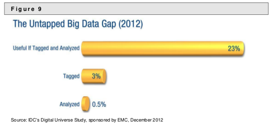
All in all, in 2012, we believe 23% of the information in the digital universe (or 643 exabytes) would be useful for Big Data if it were tagged and analyzed. However, technology is far from where it needs to be, and in practice, we think only 3% of the potentially useful data is tagged, and even less is analyzed.

Call this the Big Data gap — information that is untapped, ready for enterprising digital explorers to extract the hidden value in the data. The bad news: This will take hard work and significant investment. The good news: As the digital universe expands, so does the amount of useful data within it.

But their “good news” is blunted by a poor graphic:

Digital Universe Study - Untapped Big Data Chart

A graphic poor enough to mislead John Burn-Murdock to mis-report in Study: less than 1% of the world’s data is analysed, over 80% is unprotected (Guardian):

The global data supply reached 2.8 zettabytes (ZB) in 2012 – or 2.8 trillion GB – but just 0.5% of this is used for analysis, according to the Digital Universe Study.

and,

Just 3% of all data is currently tagged and ready for manipulation, and only one sixth of this – 0.5% – is used for analysis. The gulf between availability and exploitation represents a significant opportunity for businesses worldwide, with global revenues surrounding the collection, storage, and analysis of big data set to reach $16.9bn in 2015 – a fivefold increase since 2010.

The 3% and 0.5% figures apply to the amount of “potentially useful data, as is made clear by the opening prose quote in this post.

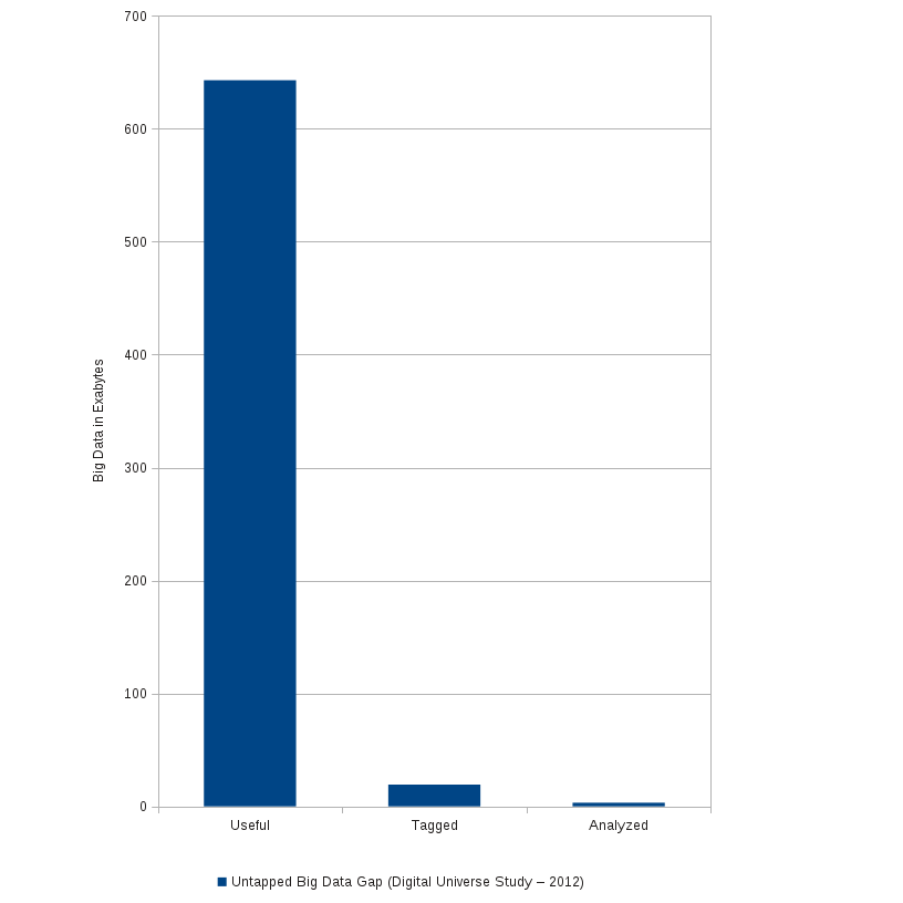
A clearer chart on that point:

Durusau's Re-renering of the Untapped Big Data chart

Or if you want the approximate numbers: 643 exabytes of “potentially useful data,” of which 3%, or 19.29 exabytes is tagged, and 0.5%, or 3.21 exabytes has been analyzed.

Given the varying semantics of the tagged data, to say nothing of the more than 624 Exabytes of untagged data, there major opportunities for topic maps in 2013!

Merry Christmas Topic Maps!

December 19, 2012

Is Your Information System “Sticky?”

Filed under: Citation Analysis,Citation Indexing,Citation Practices,Marketing,Topic Maps — Patrick Durusau @ 11:41 am

In “Put This On My List…” Michael Mitzenmacher writes:

Put this on my list of papers I wish I had written: Manipulating Google Scholar Citations and Google Scholar Metrics: simple, easy and tempting. I think the title is sufficiently descriptive of the content, but the idea was they created a fake researcher and posted fake papers on a real university web site to inflate citation counts for some papers. (Apparently, Google scholar is pretty “sticky”; even after the papers came down, the citation counts stayed up…)

The traditional way to boost citations is to re-arrange the order of the authors and the same paper, then re-publish it.

Gaming citation systems isn’t news, although the Google Scholar Citations paper demonstrates that it has become easier.

For me the “news” part was the “sticky” behavior of Google’s information system, retaining the citation counts even after the fake documents were removed.

Is your information system “sticky?” That is does it store information as “static” data that isn’t dependent on other data?

If it does, you and anyone who uses your data is running the risk of using stale or even incorrect data. The potential cost of that risk depends on your industry.

For legal, medical, banking and similar industries, the potential liability argues against assuming recorded data is current and valid data.

Representing critical data as a topic with constrained (TMCL) occurrences that must be present is one way to address this problem with a topic map.

If a constrained occurrences is absent, the topic in question fails the TMCL constraint and so can be reported as an error.

I suspect you could duplicate that behavior in a graph database.

When you query for a particular node (read “fact”), check to see if all the required links are present. Not as elegant as invalidation by constraint but should work.

« Newer PostsOlder Posts »

Powered by WordPress