Another Word For It Patrick Durusau on Topic Maps and Semantic Diversity

January 20, 2016

Writing Clickbait TopicMaps?

Filed under: Marketing,Topic Maps — Patrick Durusau @ 4:13 pm

‘Shocking Celebrity Nip Slips’: Secrets I Learned Writing Clickbait Journalism by Kate Lloyd.

I’m sat at a desk in a glossy London publishing house. On the floors around me, writers are working on tough investigations and hard news. I, meanwhile, am updating a feature called “Shocking celebrity nip-slips: boobs on the loose.” My computer screen is packed with images of tanned reality star flesh as I write captions in the voice of a strip club announcer: “Snooki’s nunga-nungas just popped out to say hello!” I type. “Whoops! Looks like Kim Kardashian forgot to wear a bra today!”

Back in 2013, I worked for a women’s celebrity news website. I stumbled into the industry at a time when online editors were panicking: Their sites were funded by advertisers who demanded that as many people as possible viewed stories. This meant writing things readers loved and shared, but also resorting to shadier tactics. With views dwindling, publications like mine often turned to the gospel of search engine optimisation, also known as SEO, for guidance.

Like making a deal with a highly-optimized devil, relying heavily on SEO to push readers to websites has a high moral price for publishers. When it comes to female pop stars and actors, people are often more likely to search for the celebrity’s name with the words “naked,” “boobs,” “butt,” “weight,” and “bikini” than with the names of their albums or movies. Since 2008, “Miley Cyrus naked” has been consistently Googled more than “Miley Cyrus music,” “Miley Cyrus album,” “Miley Cyrus show,” and “Miley Cyrus Instagram.” Plus, “Emma Watson naked” has been Googled more than “Emma Watson movie” since she was 15. In fact, “Emma Watson feet” gets more search traffic than “Emma Watson style,” which might explain why one women’s site has a fashion feature called “Emma Watson is an excellent foot fetish candidate.”

If you don’t know what other people are be searching for, try these two resources on Google Trends:

Hacking the Google Trends API (2014)

PyTrends – Pseudo API for Google Trends (Updated six days ago)

Depending on your sensibilities, you could collect content on celebrities into a topic map and when their searches spike, you can release links to the new material plus save readers the time of locating older content.

That might even be a viable business model.

Thoughts?

January 9, 2016

Intuitionism and Constructive Mathematics 80-518/818 — Spring 2016

Filed under: Mathematical Reasoning,Mathematics,Topic Maps — Patrick Durusau @ 9:23 pm

Intuitionism and Constructive Mathematics 80-518/818 — Spring 2016

From the course description:

In this seminar we shall read primary and secondary sources on the origins and developments of intuitionism and constructive mathematics from Brouwer and the Russian constructivists, Bishop, Martin-Löf, up to and including modern developments such as homotopy type theory. We shall focus both on philosophical and metamathematical aspects. Topics could include the Brouwer-Heyting-Kolmogorov (BHK) interpretation, Kripke semantics, topological semantics, the Curry-Howard correspondence with constructive type theories, constructive set theory, realizability, relations to topos theory, formal topology, meaning explanations, homotopy type theory, and/or additional topics according to the interests of participants.

Texts

  • Jean van Heijenoort (1967), From Frege to Gödel: A Source Book in Mathematical Logic 1879–1931, Cambridge, MA: Harvard University Press.
  • Michael Dummett (1977/2000), Elements of Intuitionism (Oxford Logic Guides, 39), Oxford: Clarendon Press, 1977; 2nd edition, 2000.
  • Michael Beeson (1985), Foundations of Constructive Mathematics, Heidelberg: Springer Verlag.
  • Anne Sjerp Troelstra and Dirk van Dalen (1988), Constructivism in Mathematics: An Introduction (two volumes), Amsterdam: North Holland.

Additional resources

Not online but a Spring course at Carnegie Mellon with a reading list that should exercise your mental engines!

Any subject with a two volume “introduction” (Anne Sjerp Troelstra and Dirk van Dalen), is likely to be heavy sledding. 😉

But the immediate relevance to topic maps is evident by this statement from Rosalie Iemhoff:

Intuitionism is a philosophy of mathematics that was introduced by the Dutch mathematician L.E.J. Brouwer (1881–1966). Intuitionism is based on the idea that mathematics is a creation of the mind. The truth of a mathematical statement can only be conceived via a mental construction that proves it to be true, and the communication between mathematicians only serves as a means to create the same mental process in different minds.

I would recast that to say:

Language is a creation of the mind. The truth of a language statement can only be conceived via a mental construction that proves it to be true, and the communication between people only serves as a means to create the same mental process in different minds.

There are those who claim there is some correspondence between language and something they call “reality.” Since no one has experienced “reality” in the absence of language, I prefer to ask: Is X useful for purpose Y? rather than the doubtful metaphysics of “Is X true?”

Think of it as helping get down to what’s really important, what’s in this for you?

BTW, don’t be troubled by anyone who suggests this position removes all limits on discussion. What motivations do you think caused people to adopt the varying positions they have now?

It certainly wasn’t a detached and disinterested search for the truth, whatever people may pretend once they have found the “truth” they are presently defending. The same constraints will persist even if we are truthful with ourselves.

January 4, 2016

Math Translator Wanted/Topic Map Needed: Mochizuki and the ABC Conjecture

Filed under: Mathematics,Topic Maps,Translation — Patrick Durusau @ 10:07 pm

What if you Discovered the Answer to a Famous Math Problem, but No One was able to Understand It? by Kevin Knudson.

From the post:

The conjecture is fairly easy to state. Suppose we have three positive integers a,b,c satisfying a+b=c and having no prime factors in common. Let d denote the product of the distinct prime factors of the product abc. Then the conjecture asserts roughly there are only finitely many such triples with c > d. Or, put another way, if a and b are built up from small prime factors then c is usually divisible only by large primes.

Here’s a simple example. Take a=16, b=21, and c=37. In this case, d = 2x3x7x37 = 1554, which is greater than c. The ABC conjecture says that this happens almost all the time. There is plenty of numerical evidence to support the conjecture, and most experts in the field believe it to be true. But it hasn’t been mathematically proven — yet.

Enter Mochizuki. His papers develop a subject he calls Inter-Universal Teichmüller Theory, and in this setting he proves a vast collection of results that culminate in a putative proof of the ABC conjecture. Full of definitions and new terminology invented by Mochizuki (there’s something called a Frobenioid, for example), almost everyone who has attempted to read and understand it has given up in despair. Add to that Mochizuki’s odd refusal to speak to the press or to travel to discuss his work and you would think the mathematical community would have given up on the papers by now, dismissing them as unlikely to be correct. And yet, his previous work is so careful and clever that the experts aren’t quite ready to give up.

It’s not clear what the future holds for Mochizuki’s proof. A small handful of mathematicians claim to have read, understood and verified the argument; a much larger group remains completely baffled. The December workshop reinforced the community’s desperate need for a translator, someone who can explain Mochizuki’s strange new universe of ideas and provide concrete examples to illustrate the concepts. Until that happens, the status of the ABC conjecture will remain unclear.

It’s hard to imagine a more classic topic map problem.

At some point, Shinichi Mochizuki shared a common vocabulary with his colleagues in number theory and arithmetic geometry but no longer.

As Kevin points out:

The December workshop reinforced the community’s desperate need for a translator, someone who can explain Mochizuki’s strange new universe of ideas and provide concrete examples to illustrate the concepts.

Taking Mochizuki’s present vocabulary and working backwards to where he shared a common vocabulary with colleagues is simple enough to say.

The crux of the problem being that discussions are going to be fragmented, distributed in a variety of formal and informal venues.

Combining those discussions to construct a path back to where most number theorists reside today would require something with as few starting assumptions as is possible.

Where you could describe as much or as little about new subjects and their relations to other subjects as is necessary for an expert audience to continue to fill in any gaps.

I’m not qualified to venture an opinion on the conjecture or Mochizuki’s proof but the problem of mapping from new terminology that has its own context back to “standard” terminology is a problem uniquely suited to topic maps.

December 29, 2015

Going Viral in 2016

Filed under: Humor,Marketing,Topic Maps — Patrick Durusau @ 3:12 pm

How To Go Viral: Lessons From The Most Shared Content of 2015 by Steve Rayson.

I offer this as at least as amusing as it may be useful.

The topic element of a viral post is said to include:

Trending topic (e.g. Zombies), Health & fitness, Cats & Dogs, Babies, Long Life, Love

Hard to get any of those in with technical blog but I could try:

TM’s produce healthy and fit ED-free 90 year-old bi-sexuals with dogs & cats as pets who love all non-Zombies.

That’s 115 characters if you are counting.

Produce random variations on that until I find one that goes viral. 😉

But, I have never cared for click-bait or false advertising. Personally I find it insulting when marketers falsify research.

I may have to document some of those cases in 2016. There is no shortage of it.

None of my tweets may go viral in 2016 but Steve’s post will make it more likely they will be re-tweeted.

Feel free to re-use my suggested tweet as I am fairly certain that “…healthy and fit ED-free 90 year-old bi-sexuals…” is in the public domain.

December 25, 2015

Apache Ignite – In-Memory Data Fabric – With No Semantics

Filed under: Apache Ignite,Semantics,Topic Maps — Patrick Durusau @ 4:52 pm

I saw a tweet from the Apache Ignite project pointing to its contributors page: Start Contributing.

The documentation describes Apache Ignite™ as:

Apache Ignite™ In-Memory Data Fabric is a high-performance, integrated and distributed in-memory platform for computing and transacting on large-scale data sets in real-time, orders of magnitude faster than possible with traditional disk-based or flash-based technologies.

If you think that is impressive, here’s a block representation of Ignite:

apache-ignite

Or a more textual view:

You can view Ignite as a collection of independent, well-integrated, in-memory components geared to improve performance and scalability of your application. Some of these components include:

Imagine my surprise when as search on “semantics” said

No Results Found.”

Even without data, whose semantics could be documented, there should be hooks for documenting of the semantics of future data.

I’m not advocating Apache Ignite jury-rig some means of documenting the semantics of data and Ignite processes.

The need for semantic documentation varies what is sufficient for one case will be wholly inadequate for another. Not to mention that documentation and semantics, often require different skills than possessed by most developers.

What semantics do you need documented with your Apache Ignite installation?

December 17, 2015

What’s New for 2016 MeSH

Filed under: MeSH,Thesaurus,Topic Maps,Vocabularies — Patrick Durusau @ 3:41 pm

What’s New for 2016 MeSH by Jacque-Lynne Schulman.

From the post:

MeSH is the National Library of Medicine controlled vocabulary thesaurus which is updated annually. NLM uses the MeSH thesaurus to index articles from thousands of biomedical journals for the MEDLINE/PubMed database and for the cataloging of books, documents, and audiovisuals acquired by the Library.

MeSH experts/users will need to absorb the details but some of the changes include:

Overview of Vocabulary Development and Changes for 2016 MeSH

  • 438 Descriptors added
  • 17 Descriptor terms replaced with more up-to-date terminology
  • 9 Descriptors deleted
  • 1 Qualifier (Subheading) deleted

and,

MeSH Tree Changes: Uncle vs. Nephew Project

In the past, MeSH headings were loosely organized in trees and could appear in multiple locations depending upon the importance and specificity. In some cases the heading would appear two or more times in the same tree at higher and lower levels. This arrangement led to some headings appearing as a sibling (uncle) next to the heading under which they were treed as a nephew. In other cases a heading was included at a top level so it could be seen more readily in printed material. We reviewed these headings in MeSH and removed either the Uncle or Nephew depending upon the judgement of our Internal and External reviewers. There were over 1,000 tree changes resulting from this work, many of which will affect search retrieval in MEDLINE/PubMed and the NLM Catalog.

and,

MeSH Scope Notes

MeSH had a policy that each descriptor should have a scope note regardless of how obvious its meaning. There were many legacy headings that were created without scope notes before this rule came into effect. This year we initiated a project to write scope notes for all existing headings. Thus far 481 scope notes to MeSH were added and the project continues for 2017 MeSH.

Echoes of Heraclitus:

It is not possible to step twice into the same river according to Heraclitus, or to come into contact twice with a mortal being in the same state. (Plutarch) (Heraclitus)

Semantics and the words we use to invoke them are always in a state of flux. Sometimes more, sometimes less.

The lesson here is that anyone who says you can have a fixed and stable vocabulary is not only selling something, they are selling you a broken something. If not broken on the day you start to use it, then fairly soon thereafter.

It took time for me to come to the realization that the same is true about information systems that attempt to capture changing semantics at any given point.

Topic maps in the sense of ISO 13250-2, for example, can capture and map changing semantics, but if and only if you are willing to accept its data model.

Which is good as far as it goes but what if I want a different data model? That is to still capture changing semantics and map between them, but using a different data model.

We may have a use case to map back to ISO 13250-2 or to some other data model. The point being that we should not privilege any data model or syntax in advance, at least not absolutely.

Not only do communities change but their preferences for technologies change as well. It seems just a bit odd to be selling an approach on the basis of capturing change only to build a dike to prevent change in your implementation.

Yes?

December 10, 2015

Kidnapping Caitlynn (47 AKAs – Is There a Topic Map in the House?)

Filed under: Semantic Diversity,Semantic Inconsistency,Topic Maps — Patrick Durusau @ 10:05 pm

Kidnapping Caitlynn in 10 minutes long, but has accumulated forty-seven (47 AKAs).

Imagine the search difficulty in finding reviews under all forty-eight (48) titles.

Even better, imagine your search request was for something that really mattered.

Like known terrorists crossing national borders using their real names and passports.

Intelligence services aren’t doing all that hot even with string to string matches.

Perhaps that explains their inability to consider more sophisticated doctrines of identity.

If you can’t do string to string, more complex notions will grind your system to a halt.

Maybe intelligence agencies need new contractors. You think?

December 6, 2015

Learning from Distributed Data:… [Beating the Bounds]

Filed under: Distributed Computing,Distributed Systems,Topic Maps — Patrick Durusau @ 10:35 pm

Learning from Distributed Data: Mathematical and Computational Methods to Analyze De-centralized Information.

From the post:

Scientific advances typically produce massive amounts of data, which is, of course, a good thing. But when many of these datasets are at multiple locations, instead of all in one place, it becomes difficult and costly for researchers to extract meaningful information from them.

So, the question becomes: “How do we learn from these datasets if they cannot be shared or placed in a central location?” says Trilce Estrada-Piedra.

Estrada-Piedra, an assistant professor of computer sciences at the University of New Mexico (UNM) is working to find the solution. She designs software that will enable researchers to collaborate with one another, using decentralized data, without jeopardizing privacy or raising infrastructure concerns.

“Our contributions will help speed research in a variety of sciences like health informatics, astronomy, high energy physics, climate simulations and drug design,” Estrada-Piedra says. “It will be relevant for problems where data is spread out in many different locations.”

The aim of the National Science Foundation (NSF)-funded scientist’s project is to build mathematical models from each of the “local” data banks — those at each distributed site. These models will capture data patterns, rather than specific data points.

“Researchers then can share only the models, instead of sharing the actual data,” she says, citing a medical database as an example. “The original data, for example, would have the patient’s name, age, gender and particular metrics like blood pressure, heart rate, etcetera, and that one patient would be a data point. But the models will project his or her information and extract knowledge from the data. It would just be math. The idea is to build these local models that don’t have personal information, and then share the models without compromising privacy.”

Estrada-Piedra is designing algorithms for data projections and middleware: software that acts as a bridge between an operating system or database and applications, especially on a network. This will allow distributed data to be analyzed effectively.
….

I’m looking forward to hearing more about Estrada-Piedra’s work, although we all know there are more than data projection and middleware issues involved. Those are very real and very large problems, but as with all human endeavors, the last mile is defined by local semantics.

Efficiently managing local semantics, that is enabling others to seamlessly navigate your local semantics and to in turn navigate the local semantics of others, isn’t a technical task, or at least not primarily.

The primary obstacle to such a task is captured by John D. Cook in Medieval software project management.

The post isn’t long so I will quite it here:

Centuries ago, English communities would walk the little boys around the perimeter of their parish as a way of preserving land records. This was called “beating the bounds.” The idea was that by teaching the boundaries to someone young, the knowledge would be preserved for the lifespan of that person. Of course modern geological survey techniques make beating the bounds unnecessary.

Software development hasn’t reached the sophistication of geographic survey. Many software shops use a knowledge management system remarkably similar to beating the bounds. They hire a new developer to work on a new project. That developer will remain tied to that project for the rest of his or her career, like a serf tied to the land. The knowledge essential to maintaining that project resides only in the brain of its developer. There are no useful written records or reliable maps, just like medieval property boundaries.

Does that sound familiar? That only you or another person “know” the semantics of your datastores? Are you still “beating the bounds” to document your data semantics?

Or as John puts it:

There are no useful written records or reliable maps, just like medieval property boundaries.

It doesn’t have to be that way. You could have reliable maps, reliable maps that are updated when your data is mapped for yet another project. Another ETL is the acronym.

You can, as a manager, of course, simply allow data knowledge to evaporate from your projects but that seems like a very poor business practice.

Johanna Rothman responded to John’s post in Breaking Free of Legacy Projects with the suggestion that every project should have several young boys and girls “beating the bounds” for every major project.

The equivalent of avoiding a single point of failure in medieval software project management.

Better than relying on a single programmer but using more modern information management/retention techniques would be a better option.

I guess the question is do you like using medieval project management techniques for your data or not?

If you do, you won’t be any worse off than any of your competitors with a similar policy.

On the other hand, should one of your competitors break ranks, start using topic maps for example for mission critical data, well, you have been warned.

November 16, 2015

Connecting News Stories and Topic Maps

Filed under: Journalism,Marketing,News,Topic Maps — Patrick Durusau @ 2:39 pm

New WordPress plug-in Catamount aims to connect data sets and stories by Mădălina Ciobanu.

From the post:

Non-profit news organisation VT Digger, based in the United States, is building an open-source WordPress plug-in that can automatically link news stories to relevant information collected in data sets.

The tool, called Catamount, is being developed with a $35,000 (£22,900) grant from Knight Foundation Prototype Fund, and aims to give news organisations a better way of linking existing data to their daily news coverage.

Rather than hyperlinking a person’s name in a story and sending readers to a different website, publishers can use the open-source plug-in to build a small window that pops up when readers hover over a selected section of the text.

“We have this great data set, but if people don’t know it exists, they’re not going to be racing to it every single day.

“The news cycle, however, provides a hook into data,” Diane Zeigler, publisher at VT Digger, told Journalism.co.uk.

If a person is mentioned in a news story and they are also a donor, candidate or representative of an organisation involved in campaign finance, for example, an editor would be able to check the two names coincide, and give Catamount permission to link the individual to all relevant information that exists in the database.

A brief overview of this information will then be available in a pop-up box, which readers can click in order to access the full data in a separate browser window or tab.

“It’s about being able to take large data sets and make them relevant to a daily news story, so thinking about ‘why does it matter that this data has been collected for years and years’?

“In theory, it might just sit there if people don’t have a reason to draw a connection,” said Zeigler.

While Catamount only works with WordPress, the code will be made available for publishers to customise and integrate with their own content management systems.

VTDigger.org reports on the grant and other winners in Knight Foundation awards $35,000 grant to VTDigger.

Assuming that the plugin will be agnostic as to the data source, this looks like an excellent opportunity to bind topic map managed content to news stories.

You could, I suppose, return one of those dreary listings of all the prior related stories from a news source.

But that is always a lot of repetitive text to wade through for very little gain.

If you curated content with a topic map, excerpting paragraphs from prior stories when necessary for quotes, that would be a high value return for a user following your link.

Since the award was made only days ago I assume there isn’t much to be reported on the Catamount tool, as of yet. I will be following the project and will report back when something testable surfaces.

I first saw this story in an alert from Journalism.co.uk. If you aren’t already following them you should be.

November 13, 2015

Wandora – 2015-11-13 Release

Filed under: Topic Map Software,Topic Maps,Wandora — Patrick Durusau @ 1:44 pm

Wandora (download page)

The change log is rather brief:

Wandora 2015-11-13 fixes a lot of OS X related bugs. Release introduces enhanced subject locator previews for WWW resources, including videos, images, audio files and interactive fiction (z-machine). The release has been compiled and tested in Java 8.

Judging from tweets between this release and the prior one, new features include:

  • Subject locator preview for web pages
  • Subject locator preview for a #mp3 #ogg #mod #sidtune #wav

If you are new to Wandora be sure to check out the Wandora YouTube Channel.

I need to do an update on the Wandora YouTube Channel, lots of good stuff there!

November 5, 2015

BEOMAPS:…

Filed under: Social Media,Topic Maps — Patrick Durusau @ 4:49 pm

BEOMAPS: Ad-hoc topic maps for enhanced search in social network data. by Peter Dolog, Martin Leginus, and ChengXiang Zhai.

From the webpage:


The aim of this project is to develop a novel system – a proof of concept that will enable more effective search, exploration, analysis and browsing of social media data. The main novelty of the system is an ad-hoc multi-dimensional topic map. The ad-hoc topic map can be generated and visualized according to multiple predefined dimensions e.g., recency, relevance, popularity or location based dimension. These dimensions will provide a better means for enhanced browsing, understanding and navigating to related relevant topics from underlying social media data. The ad-hoc aspect of the topic map allows user-guided exploration and browsing of the underlying social media topics space. It enables the user to explore and navigate the topic space through user-chosen dimensions and ad-hoc user-defined queries. Similarly, as in standard search engines, we consider the possibility of freely defined ad-hoc queries to generate a topic map as a possible paradigm for social media data exploration, navigation and browsing. An additional benefit of the novel system is an enhanced query expansion to allow users narrow their difficult queries with the terms suggested by an ad-hoc multi-dimensional topic map. Further, ad-hoc topic maps enable the exploration and analysis of relations between individual topics, which might lead to serendipitous discoveries.

This looks very cool and accords with some recent thinking I have been doing on waterfall versus agile authoring of topic maps.

The conference paper on this project is lodged behind a paywall at:

Beomap: Ad Hoc Topic Maps for Enhanced Exploration of Social Media Data, with this abstract:

Social media is ubiquitous. There is a need for intelligent retrieval interfaces that will enable a better understanding, exploration and browsing of social media data. A novel two dimensional ad hoc topic map is proposed (called Beomap). The main novelty of Beomap is that it allows a user to define an ad hoc semantic dimension with a keyword query when visualizing topics in text data. This not only helps to impose more meaningful spatial dimensions for visualization, but also allows users to steer browsing and exploration of the topic map through ad hoc defined queries. We developed a system to implement Beomap for exploring Twitter data, and evaluated the proposed Beomap in two ways, including an offline simulation and a user study. Results of both evaluation strategies show that the new Beomap interface is better than a standard interactive interface.

It has attracted 224 downloads as of today so I would say it is a popular chapter on topic maps.

I have contacted the authors in an attempt to locate a copy that isn’t behind a paywall.

Enjoy!

November 3, 2015

UpSet: Visualization of Intersecting Sets [Authoring Topic Maps – Waterfall or Agile?]

Filed under: Set Intersection,Sets,Topic Maps — Patrick Durusau @ 8:43 pm

UpSet: Visualization of Intersecting Sets by Alexander Lex, Nils Gehlenborg, Hendrik Strobelt, Romain Vuillemot, Hanspeter Pfister.

From the post:

Understanding relationships between sets is an important analysis task that has received widespread attention in the visualization community. The major challenge in this context is the combinatorial explosion of the number of set intersections if the number of sets exceeds a trivial threshold. To address this, we introduce UpSet, a novel visualization technique for the quantitative analysis of sets, their intersections, and aggregates of intersections.

UpSet is focused on creating task-driven aggregates, communicating the size and properties of aggregates and intersections, and a duality between the visualization of the elements in a dataset and their set membership. UpSet visualizes set intersections in a matrix layout and introduces aggregates based on groupings and queries. The matrix layout enables the effective representation of associated data, such as the number of elements in the aggregates and intersections, as well as additional summary statistics derived from subset or element attributes.

Sorting according to various measures enables a task-driven analysis of relevant intersections and aggregates. The elements represented in the sets and their associated attributes are visualized in a separate view. Queries based on containment in specific intersections, aggregates or driven by attribute filters are propagated between both views. UpSet also introduces several advanced visual encodings and interaction methods to overcome the problems of varying scales and to address scalability.

Definitely paper and software to have on hand while you read and explore AggreSet, which I mentioned yesterday in: Exploring and Visualizing Pre-Topic Map Data.

Interested to hear your thoughts comparing the two.

Something to keep in mind is that topic map authoring can be thought of as a waterfall model, where ontological decisions, merging criteria, etc. are worked out in advance versus using an agile methodology, that explores data and iterates over it, allowing the topic map to grow and evolve.

An evolutionary topic map could well miss places the waterfall method would catch but if no one goes there, or not often, is that a real issue?

I must admit, I am less than fond of “agile” methodologies but that is from a bad experience where an inappropriate person was in charge of a project and thought a one paragraph description was sufficient for a new CMS system built upon subversion. Sufficient because the project was “agile.” Fortunately that project was tanked after a long struggle with management.

Perhaps I should think about the potential use of “agile” methodologies in authoring and evolving topic maps.

Suggestions/comments?

November 2, 2015

Exploring and Visualizing Pre-Topic Map Data

Filed under: Aggregation,Data Aggregation,Sets,Topic Maps,Visualization — Patrick Durusau @ 3:06 pm

AggreSet: Rich and Scalable Set Exploration using Visualizations of Element Aggregations by M. Adil Yalçın, Niklas Elmqvist, and Benjamin B. Bederson.

Abstract:

Datasets commonly include multi-value (set-typed) attributes that describe set memberships over elements, such as genres per movie or courses taken per student. Set-typed attributes describe rich relations across elements, sets, and the set intersections. Increasing the number of sets results in a combinatorial growth of relations and creates scalability challenges. Exploratory tasks (e.g. selection, comparison) have commonly been designed in separation for set-typed attributes, which reduces interface consistency. To improve on scalability and to support rich, contextual exploration of set-typed data, we present AggreSet. AggreSet creates aggregations for each data dimension: sets, set-degrees, set-pair intersections, and other attributes. It visualizes the element count per aggregate using a matrix plot for set-pair intersections, and histograms for set lists, set-degrees and other attributes. Its non-overlapping visual design is scalable to numerous and large sets. AggreSet supports selection, filtering, and comparison as core exploratory tasks. It allows analysis of set relations inluding subsets, disjoint sets and set intersection strength, and also features perceptual set ordering for detecting patterns in set matrices. Its interaction is designed for rich and rapid data exploration. We demonstrate results on a wide range of datasets from different domains with varying characteristics, and report on expert reviews and a case study using student enrollment and degree data with assistant deans at a major public university.

These two videos will give you a better overview of AggreSet than I can. The first one is about 30 seconds and the second one about 5 minutes.

The visualization of characters from Les Misérables (the second video) is a dynamite demonstration of how you could explore pre-topic map data with an eye towards creating roles and associations between characters as well as with the text.

First use case that pops to mind would be harvesting the fan posts on Harry Potter and crossing them with a similar listing of characters from the Harry Potter book series. With author, date, book, character, etc., relationships.

While you are at the GitHub site: https://github.com/adilyalcin/Keshif/tree/master/AggreSet, be sure to bounce up a level to Keshif:

Keshif is a web-based tool that lets you browse and understand datasets easily.

To start using Keshif:

  • Get the source code from github,
  • Explore the existing datasets and their source codes, and
  • Check out the wiki.

Or just go directly to the Keshif site, with 110 datasets (as of today)>

For the impatient, see Loading Data.

For the even more impatient:

You can load data to Keshif from :

  • Google Sheets
  • Text File
    • On Google Drive
    • On Dropbox
    • File on your webserver

Text File Types

Keshif can be used with the following data file types:

  • CSV / TSV
  • JSON
  • XML
  • Any other file type that you can load and parse in JavaScript. See Custom Data Loading

Hint: The dataset explorer at the frontpage indexes demos by file type and resource. Filter by data source to find example source code on how to apply a specific file loading approach.

The critical factor, in addition to its obvious usefulness, is that it works in a web browser. You don’t have to install software, set Java paths, download additional libraries, etc.

Are you using the modern web browser as your target for user facing topic map applications?

I first saw this in a tweet by Christophe Lalanne.

November 1, 2015

Locked doors, headaches, and intellectual need (teaching monads)

Filed under: Education,Functional Programming,Teaching,Topic Maps — Patrick Durusau @ 8:34 pm

Locked doors, headaches, and intellectual need by Max Kreminski.

From the post:


I was first introduced to the idea of problem-solution ordering issues by Richard Lemarchand, one of my game design professors. The idea stuck with me, mostly because it provided a satisfying explanation for a certain confusing pattern of player behavior that I’d witnessed many times in the past.

Here’s the pattern. A new player jumps into your game and starts bouncing around your carefully crafted tutorial level. The level funnels them to the key, which they collect, and then on to the corresponding locked door, which they successfully open. Then, somewhere down the road, they encounter a second locked door… and are completely stumped. They’ve solved this problem once before – why are they having such a hard time solving it again?

What we have here is a problem-solution ordering issue. Because the player got the key in the first level before encountering the locked door, they never really formed an understanding of the causal link between “get key” and “open door”. They got the key, and then some other stuff happened, and then they reached the door, and were able to open it; but “acquiring the key” and “opening the door” were stored as two separate, disconnected events in the player’s mind.

If the player had encountered the locked door first, tried to open it, been unable to, and then found the key and used it to open the door, the causal link would be unmistakable. You use the key to open the locked door, because you can’t open the locked door without the key.

This problem becomes a lot more obvious when you don’t call the key a key, or when the door doesn’t look like a locked door. The “key/door” metaphor is widely understood and frequently used in video games, so many players will assume that you use a key to open a locked door even if your own game doesn’t do a great job of teaching them this fact. But if the “key” is really a thermal detonator and the “door” is really a power generator, a lot of players are going to wind up trying to destroy the second generator they encounter by whacking it ineffectually with a sword.

Max goes on to apply problem-solution ordering to teaching both math and monads.

I don’t recall seeing or writing any topic map materials that started with concrete problems that would be of interest to the average user.

Make no mistake, there were always lots of references to where semantic confusion was problematic but that isn’t the same as starting with problems a user is likely to encounter.

The examples and literature Max points to makes me interested in started with concrete problems topic maps are good at solving and then introducing topic map concepts as necessary.

Suggestions?

October 28, 2015

SXSW turns tail and runs… [Rejoice SXSW Organizers Weren’t Civil Rights Organizers] Troll Police

Filed under: #gamergate,Online Harassment,Topic Maps — Patrick Durusau @ 2:57 pm

SXSW turns tail and runs, nixing panels on harassment by Lisa Vaas.

From the post:

Threats of violence have led the popular South by Southwest (SXSW) festival to nix two panel discussions about online harassment, organizers announced on Monday.

In his post, SXSW Interactive Director Hugh Forrest didn’t go into detail about the threats.

But given the names of the panels cancelled, there’s a strong smell of #gamergate in the air.

Namely, the panels for the 2016 event, announced about a week ago, were titled “SavePoint: A Discussion on the Gaming Community” and “Level Up: Overcoming Harassment in Games.”

This reaction sure isn’t what they had in mind, Forrest wrote:

We had hoped that hosting these two discussions in March 2016 in Austin would lead to a valuable exchange of ideas on this very important topic.

However, in the seven days since announcing these two sessions, SXSW has received numerous threats of on-site violence related to this programming. SXSW prides itself on being a big tent and a marketplace of diverse people and diverse ideas.

However, preserving the sanctity of the big tent at SXSW Interactive necessitates that we keep the dialogue civil and respectful.

Arthur Chu, who was going to be a male ally on the Level Up panel, has written up the behind-the-scenes mayhem for The Daily Beast.

As Chu tells it, SXSW has a process of making proposed panels available for – disastrously enough, given the tactics of torch-bearing villagers – a public vote.

I rejoice the SXSW organizers weren’t civil rights organizers.

Here is an entirely fictional account of that possible conversation about marching across the Pettus Bridge.

Hugh Forrest: Yesterday (March 6, 1965), Gov. Wallace ordered the state police to prevent a march on between Selma and Montgomery by “whatever means are necessary….”

SXSW organizer: I heard that! And the police turned off the street lights and beat a large group on February 18, 1965 and followed Jimmie Lee Jackson into a cafe, shooting him. He died eight days later.

Another SXSW organizer: There has been nothing but violence and more violence for weeks, plus threats of more violence.

Hugh Forrest: Run away! Run away!

A video compilation of the violence Hugh Forrest and his fellow cowards would have dodged as civil rights organizers: Selma-to-Montgomery “Bloody Sunday” – Video Compilation.

Hugh Forrest and SXSW have pitched a big tent that is comfortable for abusers.

I consider that siding with the abusers.

How about you?

Safety and Physical Violence at Public Gatherings:

Assume that a panel discussion on online harassment does attract threats of physical violence. Isn’t that what police officers are trained to deal with?

And for that matter, victims of online harassment are more likely to be harmed in the real world when they are alone aren’t they?

So a public panel discussion, with the police in attendance, is actually safer for victims of online harassment than any other place for a real world confrontation.

Their abusers and their vermin-like supporters would have to come out from under their couches and closets into the light to harass them. Police officers are well equipped to hand out immediate consequences for such acts.

Abusers would become entangled in a legal system with little patience with or respect for their online presences.

Lessons from the Pettus Bridge:

In my view, civil and respectful dialogue isn’t how you deal with abusers, online or off. Civil and respectful dialogue didn’t protect the marchers to Montgomery and it won’t protect victims of online harassment.

The marchers to Montgomery were protected when forces more powerful than the local and state police moved into protect them.

What is required to protect targets of online harassment is a force larger and more powerful than their abusers.

Troll Police:

Consider this a call upon those with long histories of fighting online abuse individually and collectively to create a crowd-sourced Troll Police.

Public debate over the criteria for troll behavior and appropriate responses will take time but is an essential component to community validation for such an effort.

Imagine the Troll Police amassing a “big data” size database of online abuse. A database where members of the public can contribute analysis or research to help identify trolls.

That would be far more satisfying than wringing your hands when you hear of stories of abuse and wish things were better. Things can be better but if and only if we take steps to make them better.

I have some ideas and cycles I would contribute to such an effort.

How about you?

Five Design Sheet [TM Interface Design]

Filed under: Design,Interface Research/Design,Topic Maps — Patrick Durusau @ 1:02 pm

Five Design Sheet

Blog, resources and introductory materials for the Five Design Sheet (FdS) methodology.

FdS is described more formally in:

Sketching Designs Using the Five Design-Sheet Methodology by Jonathan C. Roberts, Chris James Headleand, Panagiotis D. Ritsos. (2015)

Abstract:

Sketching designs has been shown to be a useful way of planning and considering alternative solutions. The use of lo-fidelity prototyping, especially paper-based sketching, can save time, money and converge to better solutions more quickly. However, this design process is often viewed to be too informal. Consequently users do not know how to manage their thoughts and ideas (to first think divergently, to then finally converge on a suitable solution). We present the Five Design Sheet (FdS) methodology. The methodology enables users to create information visualization interfaces through lo-fidelity methods. Users sketch and plan their ideas, helping them express different possibilities, think through these ideas to consider their potential effectiveness as solutions to the task (sheet 1); they create three principle designs (sheets 2,3 and 4); before converging on a final realization design that can then be implemented (sheet 5). In this article, we present (i) a review of the use of sketching as a planning method for visualization and the benefits of sketching, (ii) a detailed description of the Five Design Sheet (FdS) methodology, and (iii) an evaluation of the FdS using the System Usability Scale, along with a case-study of its use in industry and experience of its use in teaching.

The Five Design-Sheet (FdS) approach for Sketching Information Visualization Designs by Jonathan C. Roberts. (2011)

Abstract:

There are many challenges for a developer when creating an information visualization tool of some data for a
client. In particular students, learners and in fact any designer trying to apply the skills of information visualization
often find it difficult to understand what, how and when to do various aspects of the ideation. They need to
interact with clients, understand their requirements, design some solutions, implement and evaluate them. Thus,
they need a process to follow. Taking inspiration from product design, we present the Five design-Sheet approach.
The FdS methodology provides a clear set of stages and a simple approach to ideate information visualization
design solutions and critically analyze their worth in discussion with the client.

As written, FdS is entirely appropriate for a topic map interface, but how do you capture the subjects users do or want to talk about?

Suggestions?

October 21, 2015

Learning Topic Map Concepts Through Topic Map Completion Puzzles

Filed under: Education,Teaching,Topic Maps — Patrick Durusau @ 4:49 pm

Enabling Independent Learning of Programming Concepts through Programming Completion Puzzles — Kyle Harms by Felienne Hermans.

From the post:

There are lots of puzzle programming tutorials currently in fashion: Code.org, Gidget and Parson’s programming puzzles. But, we don’t really know if they work? There is work [1] that shows that completion exercises do work well, but what about puzzles? That is what Kyle wants to find out.

Felienne is live blogging presentations from VL/HCC 2015 IEEE Symposium on Visual Languages and Human-Centric.

The post is quick read and should generate interest in both programming completion puzzles as well as similar puzzles for authoring topic maps.

There is a pre-print: Enabling Independent Learning of Programming Concepts through Programming Completion Puzzles.

Before you question the results based on the sample size, 27 students, realize that is 27 more test subjects than a database project to replace all the outward services for 5K+ users. Fortunately, very fortunately, a group was able to convince management to tank the entire project. Quite a nightmare and slur on “agile development.”

The lesson here is that puzzles are useful and some test subjects are better than no test subjects at all.

Suggestions for topic map puzzles?

September 23, 2015

Government Travel Cards at Casinos or Adult Entertainment Establishments

Filed under: Auditing,Government,Humor,Topic Maps — Patrick Durusau @ 7:38 pm

Audit of DoD Cardholders Who Used Government Travel Cards at Casinos or Adult Entertainment Establishments by Michael J. Roark, Assistant Inspector General, Contract Management and Payments, Department of Defense.

From the memorandum:

We plan to begin the subject audit in September 2015. The Senate Armed Services Committee requested this audit as a follow-on review of transactions identified in Report No. DODIG-2015-125, “DoD Cardholders Used Their Government Travel Cards for Personal Use at Casinos and Adult Entertainment Establishments,” May 19, 2015. Our objective is to determine whether DoD cardholders who used government travel cards at casinos and adult entertainment establishments for personal use sought or received reimbursement for the charges. In addition, we will determine whether disciplinary actions have been taken in cases of personal use and if the misuse was repo1ted to the appropriate security office. We will consider suggestions from management on additional or revised objectives.

This project is a follow up to: Report No. DODIG-2015-125, “DoD Cardholders Used Their Government Travel Cards for Personal Use at Casinos and Adult Entertainment Establishments” (May 19, 2015), which summarizes its findings as:

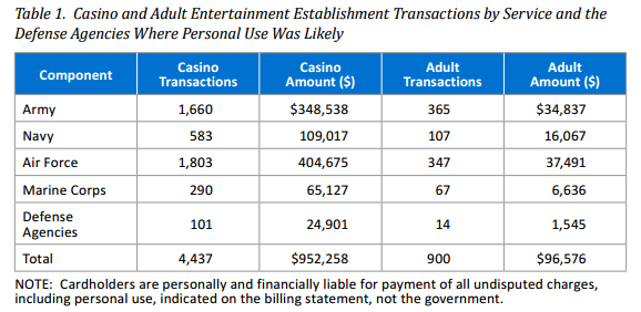
We are providing this report for your review and comment. We considered management comments on a draft of this report when preparing the final report. DoD cardholders improperly used their Government Travel Charge Card for personal use at casinos and adult entertainment establishments. From July 1, 2013, through June 30, 2014, DoD cardholders had 4,437 transactions totaling $952,258, where they likely used their travel cards at casinos for personal use and had 900 additional transactions for $96,576 at adult entertainment establishments. We conducted this audit in accordance with generally accepted government auditing standards.

Let me highlight that for you:

July 1, 2013 through June 30, 2014, DoD cardholders:

4,437 transactions at casinos for $952,258

900 transactions at adult entertainment establishments for $96,576

Are lap dances that cheap? 😉

Almost no one goes to a casino or adult entertainment establishment alone, so topic maps would be a perfect fit for finding “associations” between DoD personnel.

The current project is to track the outcome of the earlier report, that is what if any actions resulted.

What do you think?

Will the DoD personnel claim they were doing off the record surveillance of suspected information leaks? Or just checking their resistance to temptation?

Before I forget, here is the breakdown by service (from the May 19, 2015 report, page 6):

DoD-hookers

I don’t know what to make up the distribution of “adult transactions” between the services.

Suggestions?

September 15, 2015

Value of Big Data Depends on Identities in Big Data

Filed under: BigData,Subject Identity,Topic Maps — Patrick Durusau @ 9:42 pm

Intel Exec: Extracting Value From Big Data Remains Elusive by George Leopold.

From the post:

Intel Corp. is convinced it can sell a lot of server and storage silicon as big data takes off in the datacenter. Still, the chipmaker finds that major barriers to big data adoption remain, most especially what to do with all those zettabytes of data.

“The dirty little secret about big data is no one actually knows what to do with it,” Jason Waxman, general manager of Intel’s Cloud Platforms Group, asserted during a recent company datacenter event. Early adopters “think they know what to do with it, and they know they have to collect it because you have to have a big data strategy, of course. But when it comes to actually deriving the insight, it’s a little harder to go do.”

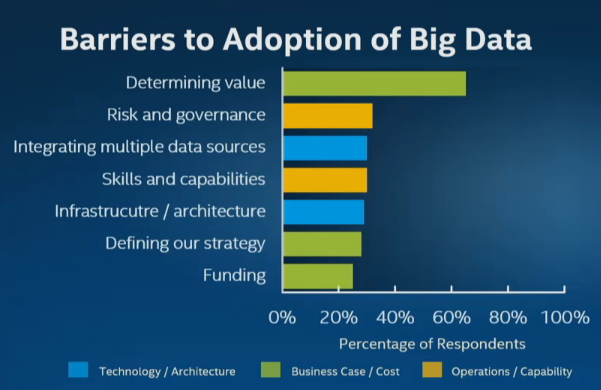
Put another way, industry analysts rate the difficulty of determining the value of big data as far outweighing considerations like technological complexity, integration, scaling and other infrastructure issues. Nearly two-thirds of respondents to a Gartner survey last year cited by Intel stressed they are still struggling to determine the value of big data.

“Increased investment has not led to an associated increase in organizations reporting deployed big data projects,” Gartner noted in its September 2014 big data survey. “Much of the work today revolves around strategy development and the creation of pilots and experimental projects.”

gartner-barriers-to-big-data

It may just be me, but “determing value,” “risk and governance,” and “integrating multiple data sources,” the top three barriers to use of big data, all depend on knowing the identities represented in big data.

The trivial data integration demos that share “customer-ID” fields, don’t inspire a lot of confidence about data integration when “customer-ID” maybe identified in as many ways as there are data sources. And that is a minor example.

It would be very hard to determine the value you can extract from data when you don’t know what the data represents, its accuracy (risk and governance), and what may be necessary to integrate it with other data sources.

More processing power from Intel is always welcome but churning poorly understood big data faster isn’t going to create value. Quite the contrary, investment in more powerful hardware isn’t going to be favorably reflected on the bottom line.

Investment in capturing the diverse identities in big data will empower easier valuation of big data, evaluation of its risks and uncovering how to integrate diverse data sources.

Capturing diverse identities won’t be easy, cheap or quick. But not capturing them will leave the value of Big Data unknown, its risks uncertain and integration a crap shoot when it is ever attempted.

Your call.

September 5, 2015

Topic Map Fodder – Standards For DATA Act

Filed under: DATA Act,Government,Topic Maps — Patrick Durusau @ 8:40 pm

OMB, Treasury finalize standards for DATA Act by Greg Otto.

From the post:

The White House’s Office of Management and Budget announced Monday that after more than a year of discussion, all 57 data standards related to the Digital Accountability and Transparency Act have been finalized.

In a White House blog post, OMB Controller and acting Deputy Director for Management David Mader and Commissioner of the Treasury Department’s Financial Management Service David Lebryk called the standards decree a “key milestone” in making sure the public eventually has a transparent way to track government spending.

Twenty-seven standards were already agreed upon as of July 10, with another 30 open for comment on the act’s GitHub page over the past few weeks. These data points will be part of the law that requires agencies to make their financial, budget, payment, grant and contract data interoperable when published to USASpending.gov, the federal government’s hub of publicly available financial data, by May 9, 2017.

The Data Transparency Coalition, a technology-based nonprofit, released a statement Monday applauding the government’s overall work, yet took exception to the fact the DUNS number is the favored, governmentwide identifier for recipients of federal funds. DUNS numbers are nine-digit identifiers privately owned by the company Dun & Bradstreet Inc. that users must pay for to view corresponding business information.

“Standards” doesn’t mean what Greg thinks it means.

What has been posted by the government are twenty-seven (27) terms agreed on as of July 10th and another thirty (30) terms open for comment.

Terms, not standards.

I suppose that Legal Entity Congressional District is clear enough but that is a long way from being able to track the expenditure of funds in a transparent manner.

As far as the DUNS number complaint, a DUNS number is an accepted international business identifier. Widely accepted. Creating an alternative government identifier to snub Dun & Bradstreet, Inc., is a waste of government funds.

Bear in mind that the DUNS number for any organization is a public fact. Just as street addresses, stock ticker symbols, etc. are public facts. You can collect data about companies and include their DUNS number.

By issuing DUNS numbers, Dun and Bradstreet, Inc. is actually performing a public service by creating international identifiers for businesses. They charge for access to information collected on those entities but so will anyone with a sustainable information trade about businesses.

Refining the DATA Act terms across agencies and adding additional information to make them useful looks like a good use case for topic maps.

August 31, 2015

Rendering big geodata on the fly with GeoJSON-VT

Filed under: Geospatial Data,MapBox,Topic Maps,Visualization — Patrick Durusau @ 8:33 pm

Rendering big geodata on the fly with GeoJSON-VT by Vladimir Agafonkin.

From the post:

Despite the amazing advancements of computing technologies in recent years, processing and displaying large amounts of data dynamically is still a daunting, complex task. However, a smart approach with a good algorithmic foundation can enable things that were considered impossible before.

Let’s see if Mapbox GL JS can handle loading a 106 MB GeoJSON dataset of US ZIP code areas with 33,000+ features shaped by 5.4+ million points directly in the browser (without server support):

An observation from the post:


It isn’t possible to render such a crazy amount of data in its entirety at 60 frames per second, but luckily, we don’t have to:

  • at lower zoom levels, shapes don’t need to be as detailed
  • at higher zoom levels, a lot of data is off-screen

The best way to optimize the data for all zoom levels and screens is to cut it into vector tiles. Traditionally, this is done on the server, using tools like Mapnik and PostGIS.

Could we create vector tiles on the fly, in the browser? Specifically for this purpose, I wrote a new JavaScript library — geojson-vt.

It turned out to be crazy fast, with its usefulness going way beyond the browser:

In addition to being a great demonstration of the visualization of geodata, I mention this post because it offers insights into the visualization of topic maps.

When you read:

  • at lower zoom levels, shapes don’t need to be as detailed
  • at higher zoom levels, a lot of data is off-screen

What do you think the equivalents would be for topic map navigation?

If we think of “shapes don’t need to be as detailed” for a crime topic map, could it be that all offenders, men, women, various ages, races and religions are lumped into an “offender” topic?

And if we think of “a lot of data is off-screen,” is that when we have narrowed a suspect pool down by gender, age, race, etc.?

Those dimensions would vary by the subject of the topic map and would require considering “merging” as a function of the “zoom” into a set of subjects.

Suggestions?

PS: BTW, do work through the post. For geodata this looks very good.

August 24, 2015

Linux on the Mainframe

Filed under: Linux OS,Topic Maps — Patrick Durusau @ 10:54 am

Linux Foundation Launches Open Mainframe Project to Advance Linux on the Mainframe

From the post:

The Linux Foundation, the nonprofit organization dedicated to accelerating the growth of Linux and collaborative development, announced the Open Mainframe Project. This initiative brings together industry experts to drive innovation and development of Linux on the mainframe.

Founding Platinum members of the Open Mainframe Project include ADP, CA Technologies, IBM and SUSE. Founding Silver members include BMC, Compuware, LC3, RSM Partners and Vicom Infinity. The first academic institutions participating in the effort include Marist College, University of Bedfordshire and The Center for Information Assurance and Cybersecurity at University of Washington. The announcement comes as the industry marks 15 years of Linux on the mainframe.

In just the last few years, demand for mainframe capabilities have drastically increased due to Big Data, mobile processing, cloud computing and virtualization. Linux excels in all these areas, often being recognized as the operating system of the cloud and for advancing the most complex technologies across data, mobile and virtualized environments. Linux on the mainframe today has reached a critical mass such that vendors, users and academia need a neutral forum to work together to advance Linux tools and technologies and increase enterprise innovation.

“Linux today is the fastest growing operating system in the world. As mobile and cloud computing become globally pervasive, new levels of speed and efficiency are required in the enterprise and Linux on the mainframe is poised to deliver,” said Jim Zemlin executive director at The Linux Foundation. “The Open Mainframe Project will bring the best technology leaders together to work on Linux and advanced technologies from across the IT industry and academia to advance the most complex enterprise operations of our time.”

Linux Foundation Collaborative Projects, visit: http://collabprojects.linuxfoundation.org/

Open Mainframe Project, visit: https://www.openmainframeproject.org/

In terms of ancient topic map history, recall that both topic maps and DocBook arose out of what became the X-Windows series by O’Reilly. If you are familiar with the series, you can imagine the difficulty of adapting it to the nuances of different vendor releases and vocabularies.

Several of the volumes from the X-Windows series are available in the O’Reilly OpenBook Project.

I mention that item of topic map history because documenting mainframe Linux isn’t going to be a trivial task. A useful index across documentation from multiple authors is going to require topic maps or something very close to it.

One last bit of trivia, the X-Windows project can be found at www.x.org. How’s that for cool? A single letter name.

August 14, 2015

Death and Rebirth? (a moon shot in government IT)

Filed under: Government,Topic Maps — Patrick Durusau @ 10:25 am

mooning-garden-gnome_zps08471463

No, not that sort of moon shot!

Steve O’Keeffe writes in Death and Rebirth?

The OPM breach – and the subsequent Cyber Sprint – may be just the jolt we need to euthanize our geriatric Fed IT. According to Tony Scott and GAO at this week’s FITARA Forum, we spend more than 80 percent of the $80 billion IT budget on operations and maintenance for legacy systems. You see with the Cyber Sprint we’ve been looking hard at how to secure our systems. And, the simple truth of the matter is – it’s impossible. It’s impossible to apply two-factor authentication to systems and applications built in the ’60s, ’70s, ’80s, ’90s, and naughties.

Here’s an opportunity for real leadership – to move away from advocating for incremental change, like Cloud First, Mobile First, FDCCI, HSPD-12, TIC, etc. These approaches have clearly failed us. Now’s the time for a moon shot in government IT – a digital Interstate Highway program. I’m going to call this .usa 2020 – the idea to completely replace our aging Federal IT infrastructure by 2020. You see, IT is the highway artery system that connects America today. I’m proposing that we take inspiration from the OPM disaster – and the next cyber disaster lurking oh so inevitably around the next corner – to undertake a mainstream modernization of the Federal government’s IT infrastructure and applications. It’s not about transformation, it’s about death and rebirth.

To be clear, this is not simply about moving to the cloud. It’s about really reinventing government IT. It’s not just that our Federal IT systems are decrepit and insecure – it’s about the fact they’re dysfunctional. How can it be that the top five addresses in America received 4,900 tax refunds in 2014? How did a single address in Lithuania get 699 tax refunds? How can we have 777 supply chain systems in the Federal government?

You can’t see it but when Steve asked the tax refunds question, my hand looked like a helicopter blade in the air. 😉 I know the answer to that question.

First, the IRS estimates 249 million tax returns will be filed in 2015.

Second, in addition to IT reductions, the IRS is required by law to “pay first, ask questions later,” and to deliver refunds within thirty (30) days. Tax-refund fraud to hit $21 billion, and there’s little the IRS can do.

I agree that federal IT systems could be improved, but if funds are not available for present systems, what are the odds of adequate funding being available for a complete overhaul?

BTW, the “80 percent of the $80 billion IT budget” works out to about $64 billion. If you were getting part of that $64 billion now, how hard would you resist changes that eliminated your part of that $64 billion?

Bear in mind that elimination of legacy systems also means users of those legacy systems will have to be re-trained on the replacement systems. We all know how popular forsaking legacy applications is among users.

As a practical matter, rip-n-replace proposals buy you virulent opposition from people currently enjoying $64 billion in payments every year and the staffers who use those legacy systems.

On the other hand, layering solutions, like topic maps, buy you support from people currently enjoying $64 billion in payments every year and the staffer who use those legacy systems.

Being a bright, entrepreneurial sort of person, which option are you going to choose?

August 13, 2015

Spreadsheets – 90+ million End User Programmers…

Filed under: Spreadsheets,TMRM,Topic Maps — Patrick Durusau @ 6:56 pm

Spreadsheets – 90+ million End User Programmers With No Comment Tracking or Version Control by Patrick Durusau and Sam Hunting.

From all available reports, Sam Hunting did a killer job presenting our paper at the Balisage conference on Wednesday of this week! Way to go Sam!

I will be posting the slides and the files shown in the presentation tomorrow.

BTW, development of the topic map for one or more Enron spreadsheets will continue.

Watch this blog for future developments!

July 28, 2015

IoT Pinger (Wandora)

Filed under: IoT - Internet of Things,Topic Maps,Wandora — Patrick Durusau @ 6:18 pm

IoT Pinger (Wandora)

From the webpage:

This is an upcoming feature and is not included yet in the public release.

The IoT (Internet of Things) pinger is a general purpose API consumer intended to aggregate data from several different sources providing data via HTTP. The IoT Panel is found in the Wandora menu bar and presents most of the pinger’s configuration options. The Pinger searches the current Topic Map for topics with an occurrence with Source Occurrence Type. Those topics are expected to correspond to an API endpoint defined by corresponding occurrence data. The pinger queries each endpoint every specified time interval and saves the response as an occurrence with Target Occurrence Type. The pinger process can be configured to stop at a set time using the Expires toggle. Save on tick saves the current Topic Map in the specified folder after each tick of the pinger in the form iot_yyyy_mm_dd_hh_mm_ss.jtm.

Now there’s an interesting idea!

Looking forward to the next release!

July 23, 2015

Exploring the Enron Spreadsheet/Email Archive

Filed under: Enron,Spreadsheets,Topic Maps — Patrick Durusau @ 2:55 pm

I forgot to say yesterday that if you cite the work of Felienne Hermans and Emerson Murphy-Hill Enron archive, use this citation:

@inproceedings{hermans2015,
  author    = {Felienne Hermans and
               Emerson Murphy-Hill},
  title     = {Enron's Spreadsheets and Related Emails: A Dataset and Analysis},
  booktitle = {37th International Conference on Software Engineering, {ICSE} '15},
  note     =  {to appear}
}

A couple of interesting tidbits from this morning.

Non-Matching Spreadsheet Names

If you look at:

(local)/84_JUDY_TOWNSEND_000_1_1.PST/townsend-j/JTOWNSE (Non-Privileged)/Inbox/_1687004514.eml

You will find that David.Jones@ENRON.com (sender), sent an email with Tport Max Rates Calculations 10-27-01.xls attached, to fletcjv@NU.COM and cc:ed “Concannon” and “Townsend” . (Potential subjects in bold.)

I selected this completely at random, save for finding an email that using the word “spreadsheet.”

If you look in the spreadsheet archive, you will not find “Tport Max Rates Calculations 10-27-01.xls,” at least not by that name. You will find: “judy_townsend__17745__Tport Max Rates Calculations 10-27-01.xlsx.”

I don’t know when that conversion took place but thought it was worth noting. BTW, the spreadsheet archive has 15,871 .xlsx files and 58 .xls files. Michelle Lokay has thirty-two of the fifty-eight (58) .xls files but they all appear to be duplicated by files with the .xlsx extension.

Given the small number, I suspect an anomaly in a bulk conversion process. When I do group operations on the spreadsheets I will be using the .xlsx extension only to avoid duplicates.

Dirty, Very Dirty Data

I was just randomly opening spreadsheets when I encountered this jewel:

andrea_ring_ENRONGAS(1200)

Using rows to format column headers. There are worse examples, try:

albert_meyers_1_1-25act

No columns headers at all! (On this tab.)

I am beginning to suspect that the conversion to .xslx format was to enable the use of better tooling to explore the originally .xls files.

Be sure to register for Balisage 2015 if you want to see the outcome of all this running around!

Tomorrow I think we are going to have a conversation about indexing email with Solr. Having all 15K spreadsheets doesn’t tell me which ones were spoken of the most often in email.

July 22, 2015

Enron, Spreadsheets and 7z

Filed under: Enron,Spreadsheets,Topic Maps — Patrick Durusau @ 9:00 pm

Sam Hunting and I are working on a presentation for Balisage that involves a subset of the Enron dataset focused on spreadsheets.

You will have to attend Balisage to see the floor show but I will be posting notes about our preparations for the demo under the category Enron and/or Spreadsheets.

Origin of the Enron dataset on Spreadsheets

First things first, the subset of the Enron dataset focused on spreadsheets was announced by Felienne Hermans in A modern day Pompeii: Spreadsheets at Enron.

The data set: Hermans, Felienne (2014): Enron Spreadsheets and Emails. figshare. http://dx.doi.org/10.6084/m9.figshare.1221767

Feilienne has numerous presentations and publications on spreadsheets and issues with spreadsheets.

I have always thought of spreadsheets as duller versions of tables.

Felienne, on the other hand, has found intrigue, fraud, error, misunderstanding, opacity, and the usual chicanery of modern business practice.

Whether you want to “understand” a spreadsheet depends on whether you need plausible deniability or if you are trying to detect efforts at plausible deniability. Auditors for example.

Felienne’s Enron spreadsheet data set is a great starting point for investigating spreadsheets and their issues.

Unpacking the Archives with 7z

The email archive comes in thirteen separate files, eml.7z.001 – eml.7z.013.

At first I tried to use 7z to assemble the archive, decompress it and grep the results without writing it out. No go.

On a subsequent attempt, just unpacking the multi-part file, a message appeared announcing a name conflict and asking what to do with the conflict.

IMPORTANT POINT: Thinking I don’t want to lose any data, I foolishly said to rename files to avoid naming conflicts.

You are probably laughing at this point because you can see where this is going.

The command I used to first extract the files reads: 7z e eml.7z.001 (remembering that in the case of name conflicts I said to rename the conflicting file).

But if you use 7z e, all the files are written to a single directory. Which of course means for every single file write, it has to check for conflicting file names. Opps!

After more than twenty-four (24) hours of ever slowing output (# of files was at 528,000, approximately), I killed the process and took another path.

I used 7z x eml.7z001 (correct command), which restores all of the original directories and therefore there are no file name conflicts. File writing I/O jumped up to 20MB/sec+, etc.

Still took seventy-eight (78) minutes to extract but there were other heavy processes going on at the same time.

Like deleting the 528K+ files in the original unpacked directory. Did you know that rm has an argument limit? I’m sure you won’t encounter it often but it can be a real pain when you do. I was deleting all the now unwanted files from the first run when I encountered it.

A shell limitation according to: Argument List Too Long. A 128K limit to give you an idea of the number of files you need to encounter before hitting this issue.

The Lesson

Unpack the Enron email archive with: 7z x eml.7z.001.

Tomorrow I will be posting about using Unix shell tools to explore the email data.

PS: Register for Balisage today!

July 15, 2015

Increase Multi-Language Productivity with Document Translator

Filed under: Topic Maps,Translation — Patrick Durusau @ 7:47 pm

Increase Multi-Language Productivity with Document Translator

From the post:

The Document Translator app and the associated source code demonstrate how Microsoft Translator can be integrated into enterprise and business workflows. The app allows you to rapidly translate documents, individually or in batches, with full fidelity—keeping formatting such as headers and fonts intact, and allowing you to continue editing if necessary. Using the Document Translator code and documentation, developers can learn how to incorporate the functionality of the Microsoft Translator cloud service into a custom workflow, or add extensions and modifications to the batch translation app experience. Document Translator is a showcase for use of the Microsoft Translator API to increase productivity in a multi-language environment, released as an open source project on GitHub.

Whether you are writing in Word, pulling together the latest numbers into Excel, or creating presentations in PowerPoint, documents are at the center of many of your everyday activities. When your team speaks multiple languages, quick and efficient translation is essential to your organization’s communication and productivity. Microsoft Translator already brings the speed and efficiency of automatic translation to Office, Yammer, as well as a number of other apps, websites and workflows. Document Translator uses the power of the Translator API to accelerate the translation of large numbers of Word, PDF*, PowerPoint, or Excel documents into all the languages supported by Microsoft Translator.

How many languages does your topic map offer?

That many?

The Translator FAQ lists these languages for the Document Translator:

Microsoft Translator supports languages that cover more than 95% of worldwide gross domestic product (GDP)…and one language that is truly out of this world: Klingon.

Arabic English Hungarian Maltese Slovak Yucatec Maya
Bosnian (Latin) Estonian Indonesian Norwegian Slovenian
Bulgarian Finnish Italian Persian Spanish
Catalan French Japanese Polish Swedish
Chinese Simplified German Klingon Portuguese Thai
Chinese Traditional Greek Klingon (plqaD) Queretaro Otomi Turkish
Croatian Haitian Creole Korean Romanian Ukrainian
Czech Hebrew Latvian Russian Urdu
Danish Hindi Lithuanian Serbian (Cyrillic) Vietnamese
Dutch Hmong Daw Malay Serbian (Latin) Welsh

I have never looked for a topic map in Klingon but a translation could be handy at DragonCon.

Fifty-one languages by my count. What did you say your count was? 😉

July 2, 2015

Introducing LegalPad [free editor]

Filed under: Editor,Government,Law,Law - Sources,Topic Map Software,Topic Maps — Patrick Durusau @ 4:29 pm

Introducing LegalPad by Jake Heller.

From the webpage:

I’m thrilled to officially announce something we’ve been working on behind the scenes here at Casetext: LegalPad. It’s live on the site right now: you can use it, for free, and without registering. So before reading about it from me, I recommend checking it out for yourself!

A rethought writing experience

LegalPad is designed to be the best way to write commentary about the law.

This means a few things. First, we created a clean writing experience, easier to use than traditional blogging platforms. Editing is done through a simplified editor bar that is there only when you need it so you can stay focused on your writing.

Second, the writing experience is especially tailored towards legal writing in particular. Legal writing is hard. Because law is based on precedent and authority, you need to juggle dozens of primary sources and documents. And as you write, you’re constantly formatting, cite-checking, BlueBooking, editing, emailing versions for comments, and researching. All of this overhead distracts from the one thing you really want to focus on: perfecting your argument.

LegalPad was designed to help you focus on what matters and avoid unnecessary distractions. A sidebar enables you to quickly pull up bookmarks collected while doing research on Casetext. You can add a reference to the cases, statutes, regulations, or other posts you bookmarked, which are added with the correct citation and a hyperlink to the original source.

You can also pull up the full text of the items you’ve bookmarked in what we are calling the PocketCase. Not only does the PocketCase enable you to read the full text of the case you are writing about while you’re writing, you can also drop in quotes directly into the text. They’ll be correctly formatted, have the right citation, and even include the pincite to the page you’ve copied from.

LegalPad also has one final, very special feature. If your post cites to legal authority, it will be connected to the case, statute, or regulation you referenced such that next time someone reads the authority, they’ll be alerted to your commentary. This makes the world’s best free legal research platform an even better resource. It also helps you reach an audience of over 350,000 attorneys, in-house counsel, professors, law students, other legal professionals, and business leaders who use Casetext as a resource every month.

LegalPad and CaseNote are free so I signed up.

I am working on an annotation of Lamont v. Postmaster General 381 U.S. 301 (1965) to demonstrate it relevancy to FBI Director James Comey’s plan to track contacts with ISIS over social media.

A great deal of thought and effort has gone into this editing interface! I was particularly pleased by the quote insert with link back to the original material feature.

At first blush and with about fifteen (15) minutes of experience with the interface, I suspect that enhancing it with entity recognition and stock associations would not be that much of a leap. Could be very interesting.

More after I have written more text with it.

June 29, 2015

« Newer PostsOlder Posts »

Powered by WordPress