Another Word For It Patrick Durusau on Topic Maps and Semantic Diversity

September 15, 2014

Uncovering Hidden Text on a 500-Year-Old Map That Guided Columbus

Filed under: Mapping,Maps — Patrick Durusau @ 4:20 pm

Uncovering Hidden Text on a 500-Year-Old Map That Guided Columbus by Greg Miller.

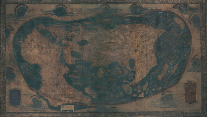
Martellus map

Christopher Columbus probably used the map above as he planned his first voyage across the Atlantic in 1492. It represents much of what Europeans knew about geography on the verge discovering the New World, and it’s packed with text historians would love to read—if only the faded paint and five centuries of wear and tear hadn’t rendered most of it illegible.

But that’s about to change. A team of researchers is using a technique called multispectral imaging to uncover the hidden text. They scanned the map last month at Yale University and expect to start extracting readable text in the next few months, says Chet Van Duzer, an independent map scholar who’s leading the project, which was funded by the National Endowment for the Humanities.

The map was made in or around 1491 by Henricus Martellus, a German cartographer working in Florence. It’s not known how many were made, but Yale owns the only surviving copy. It’s a big map, especially for its time: about 4 by 6.5 feet. “It’s a substantial map, meant to be hung on a wall,” Van Duzer said.

Extracting the text is going to take some effort but expectations are that high resolution images will appear at the Beinecke Digital Library at Yale in 2015.

Greg covers a number of differences between the Martellus map (1491) and the Waldseeüller map (1507), as well as their places in historical context.

You should pass this post onto any friends who think Columbus “discovered” the world was round. I don’t see any end of the world markers on the Martellus map.

Do you?

September 13, 2014

Why Use Google Maps When You Can Get GPS Directions On The Death Star Instead?

Filed under: Graphics,MapBox,Mapping,Maps — Patrick Durusau @ 5:05 pm

Why Use Google Maps When You Can Get GPS Directions On The Death Star Instead? by John Brownlee.

From the post:

Mapbox Studio is a toolkit that allows apps and websites to serve up their own custom-designed maps to users. Companies like Square, Pinterest, Foursquare, and Evernote con provide custom-skinned Mapboxes instead, changing map elements to better fit in with their brand.

But Mapbox can do far cooler stuff. It can blast you to Space Station Earth, a Mapbox that makes the entire planet look like the blinking, slate gray skin of the Star Wars Death Star.

Great if your target audience are Star Wars or similar science fiction fans or you can convince management that it will hold the attention of users longer.

Even routine tasks, like logging service calls answered, would be more enjoyable using an X-Wing fighter to destroy the location of the call after service has been completed. 😉

First map of Rosetta’s comet

Filed under: Astroinformatics,Mapping,Maps — Patrick Durusau @ 6:15 am

First map of Rosetta’s comet

From the webpage:

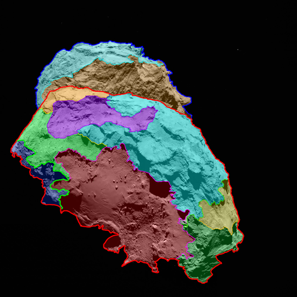
Scientists have found that the surface of comet 67P/Churyumov-Gerasimenko — the target of study for the European Space Agency’s Rosetta mission — can be divided into several regions, each characterized by different classes of features. High-resolution images of the comet reveal a unique, multifaceted world.

ESA’s Rosetta spacecraft arrived at its destination about a month ago and is currently accompanying the comet as it progresses on its route toward the inner solar system. Scientists have analyzed images of the comet’s surface taken by OSIRIS, Rosetta’s scientific imaging system, and defined several different regions, each of which has a distinctive physical appearance. This analysis provides the basis for a detailed scientific description of 67P’s surface. A map showing the comet’s various regions is available at: http://go.nasa.gov/1pU26L2

“Never before have we seen a cometary surface in such detail,” says OSIRIS Principal Investigator Holger Sierks from the Max Planck Institute for Solar System Science (MPS) in Germany. In some of the images, one pixel corresponds to a scale of 30 inches (75 centimeters) on the nucleus. “It is a historic moment — we have an unprecedented resolution to map a comet,” he says.

The comet has areas dominated by cliffs, depressions, craters, boulders and even parallel grooves. While some of these areas appear to be quiet, others seem to be shaped by the comet’s activity, in which grains emitted from below the surface fall back to the ground in the nearby area.

comet

The Rosetta mission:

Rosetta launched in 2004 and will arrive at comet 67P/Churyumov-Gerasimenko on 6 August. It will be the first mission in history to rendezvous with a comet, escort it as it orbits the Sun, and deploy a lander to its surface. Rosetta is an ESA mission with contributions from its member states and NASA. Rosetta’s Philae lander is provided by a consortium led by DLR, MPS, CNES and ASI.

Not to mention being your opportunity to watch semantic diversity develop from a known starting point.

Already the comet has two names: (1 67P/Churyumov-Gerasimenko and 2) Rosetta’s comet. Can you guess which one will be used in the popular press?

Surface features will be described in different languages, which have different terms for features and the processes that formed them. Not to mention that even within natural languages there can be diversity as well.

Semantic diversity is our natural state. Normalization is an abnormal state, perhaps that is why it is so elusive on a large scale.

September 8, 2014

Shoothill GaugeMap

Filed under: Mapping,Maps — Patrick Durusau @ 12:47 pm

Shoothill GaugeMap

From the about page:

The Shoothill GaugeMap is the first interactive map with live river level data from over 2,400 Environment Agency and Natural Resources Wales river level gauges in England and Wales.

The extensive network of river level gauges across England and Wales covers all the major rivers as well as many smaller rivers, streams and brooks. The data displayed on each of the river level gauges on GaugeMap is recorded at 15 minute intervals by the Environment Agency and Natural Resources Wales.

For more information on how to use GaugeMap, please see the help file.

If you live in England or Wales and are concerned about potential flooding, this may be the map for you!

The map reports data from 2400 river level gauges and you can follow individual gauges via Twitter.

I first saw this in a tweet by Rod Plummer.

In case you are interested in other river gauge information:

RiverGauges.com USA only but excludes most of Texas, Georgia, Florida, and most of the Eastern seaboard. Not sure why. Has historical and current data.

RiverApp USA and Europe, over 1,000 rivers. Can’t really comment since I don’t have a smart phone. (Contact me for an smail address if you want to donate a recent smart phone.)

September 2, 2014

Maps Published on GOV.UK

Filed under: Mapping,Maps — Patrick Durusau @ 6:34 am

How to find all the maps published on GOV.UK by Giles Turnbull.

A “trick” you need to note for finding all the maps published on GOV.UK.

I don’t know of any comparable “trick” or even a single location for all the maps published by the United States government. If you were to include state and local governments, the problem would be even worse.

If you know of cross-agency map directories in the United States (or elsewhere), please sing out!

Thanks!

August 19, 2014

Complete Antarctic Map

Filed under: Environment,Mapping,Maps — Patrick Durusau @ 1:31 pm

Waterloo makes public most complete Antarctic map for climate research

From the post:

The University of Waterloo has unveiled a new satellite image of Antarctica, and the imagery will help scientists all over the world gain new insight into the effects of climate change.

Thanks to a partnership between the Canadian Space Agency (CSA), MacDonald, Dettwiler and Associates Ltd. (MDA), the prime contractor for the RADARSAT-2 program, and the Canadian Cryospheric Information Network (CCIN) at UWaterloo, the mosaic is free and fully accessible to the academic world and the public.

Using Synthetic Aperture Radar with multiple polarization modes aboard the RADARSAT-2 satellite, the CSA collected more than 3,150 images of the continent in the autumn of 2008, comprising a single pole-to-coast map covering all of Antarctica. This is the first such map of the area since RADARSAT-1 created one in 1997.

You can access the data at: Polar Data Catalogue.

From the Catalogue homepage:

The Polar Data Catalogue is a database of metadata and data that describes, indexes, and provides access to diverse data sets generated by Arctic and Antarctic researchers. The metadata records follow ISO 19115 and Federal Geographic Data Committee (FGDC) standard formats to provide exchange with other data centres. The records cover a wide range of disciplines from natural sciences and policy, to health and social sciences. The PDC Geospatial Search tool is available to the public and researchers alike and allows searching data using a mapping interface and other parameters.

What data would you associate with such a map?

I first saw this at: Most complete Antarctic map for climate research made public.

August 5, 2014

Mapping Phone Calls

Filed under: Mapping,Maps,Visualization — Patrick Durusau @ 12:52 pm

Map: Every call Obama has made to a foreign leader in 2014 by Max Fisher.

From the post:

What foreign leaders has Obama spoken to this year? Reddit user nyshtick combed through official White House press releases to make this map showing every phone call Obama has made in 2014 to another head of state or head of government. The results are revealing, a great little window into the year in American foreign policy so far:

It’s a visual so you need to visit Max’s post to see the resulting world map.

I think you will be surprised.

There is another lesson lurking in the post.

The analysis did not require big data, distributed GPU compuations or category theory.

What it did require was:

  • An interesting question: “What foreign leaders has Obama spoken to this year?”
  • A likely data set: press releases
  • A user willing to dig through the data and to create a visualization.

Writing as much to myself as to anyone:

Don’t overlook smallish data with simple visualizations. (If you goal is impact and not the technology you used.)

August 1, 2014

Interactive Map: First World War: A Global View

Filed under: History,Mapping,Maps — Patrick Durusau @ 2:47 pm

Interactive Map: First World War: A Global View by UkNatArchives.

From the pop-up when you visit the map:

A global view

Explore the global impact of the First World War through our interactive map, which highlights key events and figures in countries from Aden to Zanzibar. Drawn directly from our records at The National Archives, the map aims to go beyond the trenches of the Western Front and shows how the war affected different parts of the world.

The First World War: A global view is part of our First World War 100 programme. It currently focuses on the contributions of the countries and territories that made up the British Empire during wartime. We will continue to develop the map over the next four years, to show more countries and territories across Europe, the Middle East, the Americas, Africa and Asia.

About this map

To get started, select a country or territory by clicking on a marker Map maker icon on the map, or select a name from the list on the left. Navigate through the tabs to read about battles, life on the Home Front and much more. Each country or territory is illustrated with images, maps and other documents from our collections. Click on the references to find key documents in Discovery, our catalogue, or images in our image library.

To reflect changing borders and names since 1914, we have provided two map views. Switch between the global map as it was during wartime, and as it is today, by using the buttons at the top of the map.

My assumptions about certain phrases do jump up to bite me every now and again. This was one of those cases.

I think I know what is meant by “First World War,” and “A Global View.” And even the language about “changing borders and names since 1914,” makes sense given the rise of so many new nations in the last century.

Hence, my puzzlement when I looked at the Country/Territory list only to see:

Aden Jamaica
Anglo-Egyptian Sudan Leeward Islands
Ascension Island Malaya
Australia Maldives
Barbados Malta
Bermuda Mauritius
Britian New Zealand
British East Africa Newfoundland
British Gold Coast Nigeria
British Honduras Northern Rhodesia
British New Guinea and German New Guinea Nyasaland
British North Borneo and Sarawak Pacific Islands
Burma Seychelles
Canada Sierra Leone
Ceylon Straits Settlements
Cocos (Keeling) Islands Southern Rhodesia
Cyprus St Helena
Egypt The Gambia
Falkland Islands Trinidad and Tobago
Gibraltar Uganda
Hong Kong and Wei-Hai-Wei Windward Islands
India Zanzibar

In my history lessons, I had learned there were many other countries that were involved in World War I, especially from a “global” view. 😉

My purpose is not to disagree with the definition of World War I or “global perspective” used by the UK National Archive. It is their map and they are free to use whatever definitions seem appropriate to their purpose.

My point is that even common phrases, such as World War I and “global perspective” can be understood in radically different ways by different readers of the same text.

For an American class, I would re-title this resources as England and its territories during World War I. To which a UK teacher could rightly reply, “That’s what we said.”

More examples of unexpected semantic dissonance welcome!

PS: You should be following The National Archives (UK). Truly a remarkable effort.
July 27, 2014

Street Slope Map

Filed under: Mapping,Maps — Patrick Durusau @ 4:38 pm

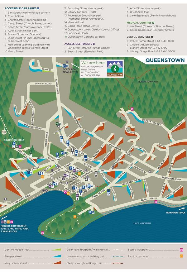
A neat idea for maps:

street slope map

See on Twitter.

I can think of a number of use cases for street slope information. Along with surveillance camera coverage, average lighting conditions, average police patrols, etc.

I first saw this in a tweet by Bob Lehman.

July 24, 2014

How to Make a Complete Map…

Filed under: Books,Mapping,Maps — Patrick Durusau @ 6:57 pm

How to Make a Complete Map of Every Thought You Think by Lion Kimbro.

From the introduction:

This book is about how to make a complete map of everything you think for as long as you like.

Whether that’s good or not, I don’t know- keeping a map of all your thoughts has a “freezing” effect on the mind. It takes a lot of (albeit pleasurable) work, but produces nothing but SIGHT.

If you do the things described in this book, you will be IMMOBILIZED for the duration of your commitment.The immobilization will come on gradually, but steadily. In the end, you will be incapable of going somewhere without your cache of notes, and will always want a pen and paper w/ you. When you do not have pen and paper, you will rely on complex memory pegging devices, described in “The Memory Book”. You will NEVER BE WITHOUT RECORD, and you will ALWAYS RECORD.

YOU MAY ALSO ARTICULATE. Your thoughts will be clearer to you than they have ever been before. You will see things you have never seen before. When someone shows you one corner, you’ll have the other 3 in mind. This is both good and bad. It means you will have the right information at the right time in the right place. It also means you may have trouble shutting up. Your mileage may vary.

You will not only be immobilized in the arena of action, but you will also be immobilized in the arena of thought. This appears to be contradictory, but it’s not really. When you are writing down your thoughts, you are making them clear to yourself, but when you revise your thoughts, it requires a lot of work- you have to update old ideas to point to new ideas. This discourages a lot of new thinking. There is also a “structural integrity” to your old thoughts that will resist change. You may actively not-think certain things, because it would demand a lot of note keeping work. (Thus the notion that notebooks are best applied to things that are not changing.)
….

Sounds bizarre. Yes?

Here is how the BBC’s Giles Turnbull summarized the system:

The system breaks down into simple jottings made during the day – what he calls “speeds”. These can be made on sheets of paper set aside for multiple subjects, or added directly to sheets dedicated to a specific subject. Speeds are made on the fly, as they happen, and it’s up to the writer to transcribe these into another section of the notebook system later on.

Lion suggests using large binders full of loose sheets of paper so that individual sheets can be added, removed and moved from one place to another. Notes can be given subjects and context hints as they are made, to help the writer file them into larger, archived binders when the time comes to organise their thoughts.

Even so, the writer is expected to carry one binder around with them at all times, and add new notes as often as possible, augmented with diagrams, arrows and maps.

With that summary description, it becomes apparent that Lion has reinvented the commonplace book, this one limited to your own thoughts.

Have you thought any more about how to create a digital commonbook interface?

July 7, 2014

OpenStreetMap Nears Ten

Filed under: Mapping,Maps,OpenStreetMap — Patrick Durusau @ 3:17 pm

OpenStreetMap – What’s next for the ‘Wikipedia of mapping” as it turns 10? by Ed Freyfogle.

From the post:

OpenStreetMap (OSM) has come a long way. After starting almost 10 years ago in London, OSM is now an entrenched part of the geo/location-based service toolchain and one of the leading examples of crowdsourcing at a massive scale.

Since 2004, over 1.5 million volunteers have signed up to contribute terabytes of geo-data to the project often referred to as the “Wikipedia of mapping”. What began as one guy wandering around London with his GPS has now turned into a global movement and spawned countless spinoff projects (see: WheelMap, OpenCycleMap and OpenRailwayMap).

Ed details the amazing progress that OpenStreetMap has made in ten years but also mentions diversity, governance and licensing issues that continue to hold OSM back from greater adoption.

Another concern is breadth of coverage:

A recent study found that just five countries make up 58% of OpenStreetMap’s data coverage. It needs to be asked what dynamics are preventing local communities from forming around the world. Is OSM just a ‘rich world’ phenomenon?

A difference in perspective. I would be thrilled to have the level of participation for topic maps that OSM has, even if it were mostly limited to five countries.

My question would be what is it about mapping physical terrain or the interfaces for mapping it, that makes it more attractive than mapping subjects and how they are identified?

Is there a lesson here for topic maps?

On the licensing issue, I hopeful OSM will adopt an Apache license. The rosters of Apache projects with their corporate sponsored participants and commercial products based on those projects are the best evidence for Apache licensing on a project.

That is, assuming being successful is more important to you than some private notion of purity. I recommend successful.

July 2, 2014

Maps need context

Filed under: Mapping,Maps — Patrick Durusau @ 6:33 pm

Maps need context by Jon Schwabish and Bryan Connor.

From the post:

It might be the case that maps are the most data-dense visualizations. Consider your basic roadmap: it includes road types (highways, toll roads), directions (one-way, two-way), geography (rivers, lakes), cities, types of cities (capitals), points of interest (schools, parks), and distance. Maps that encode statistical data, such as bubble plots or choropleth maps, are also data-dense and replace some of these geographic characteristics with different types of data encodings. But lately we’ve been wondering if most maps fail to convey enough context.

As an example, consider this map of poverty rates by districts in India. It’s a fairly simple choropleth map and you can immediately discern different patterns: high poverty rates are concentrated in the districts in the northernmost part of the country, on part of the southeast border, and in a stretch across the middle of the country. Another set of high-poverty areas can be found in the land mass in the northeast part of the map. But here’s the thing: we don’t know much about India’s geography. Without some context—plotting cities or population centers—we can only just guess what this map is telling me.

Many readers will be more familiar with the geography of the United States. So when maps like this one from the Census Bureau show up, we are better equipped to understand it because we’re familiar with areas such as the high-poverty South and around the Texas-Mexico border. But then again, what about readers familiar with basic U.S. geography, but not familiar with patterns of poverty? How useful is this map for them?

In addition to establishing the potential need for more context, Jon and Bryan go on to describe a tool for building and comparing maps with different data sets included.

You should take context into account in deciding what groups of topics and associations to merge into or leave out of a topic map. Too much detail and your user may lose sight of the forest. Too little and they may not be able to find it at all.

June 23, 2014

How Mapbox Works

Filed under: MapBox,Mapping,Maps — Patrick Durusau @ 6:59 pm

How Mapbox Works

From the post:

Mapbox is a platform for creating and using maps. That means that it’s a collection of tools and services that connect together in different ways: you can draw a map on the website, use it on an iPhone, and get raw data from an API.

Let’s look at the parts and how they connect.

Great post!

Just in time if you have been considering Iraq in 27 Maps and how some of the maps are just “wrong” from your point of view.

Using modern mapping technology, users are no longer relegated to passive acceptance of the maps of others.

Iraq in 27 Maps

Filed under: History,Mapping,Maps — Patrick Durusau @ 6:00 pm

27 maps that explain the crisis in Iraq by Zack Beauchamp, Max Fisher and Dylan Matthews.

From the post:

The current Iraq crisis began in early June, when the extremist group Islamic State of Iraq and the Levant (ISIS), which already controls parts of Syria, seized much of northern Iraq, including the major city of Mosul. The conflict has roots in Iraq’s complicated history, its religious and ethnic divisions, and of course in the Iraq War that began with the 2003 US-led invasion. These 27 maps are a rough guide to today’s crisis and the deeper forces behind it.

I am not at all sure if “explain” is the right word to use for these maps relative to the crisis in Iraq. Perhaps “illuminate” the complexity of the crisis in Iraq would be more accurate.

Moreover, these maps have the potential, in digital form, to act as interfaces to the complex religious, ethnic and historical background to the current crisis.

Western governments, to say nothing of governments in the Middle East, should be cautious about waving the “extremist” label around. Labeling any group as “extremist” reduces the options on all sides.

June 20, 2014

Processing satellite imagery

Filed under: Image Processing,Mapping,Maps — Patrick Durusau @ 7:06 pm

Processing satellite imagery

From the post:

Need to add imagery to your map? This tutorial will teach you the basics of image processing for mapping, including an introduction to raster data, and how to acquire, publish and process raster imagery of our world.

Open-source and at your fingertips. Let’s dive in.

From Mapbox and very cool!

It’s not short so get a fresh cup of coffee and enjoy the tour!

June 16, 2014

Digital Mapping + Geospatial Humanities

Filed under: Geographic Data,GIS,Humanities,Mapping,Maps — Patrick Durusau @ 3:59 pm

Digital Mapping + Geospatial Humanities by Fred Gibbs.

From the course description:

We are in the midst of a major paradigm shift in human consciousness and society caused by our ubiquitous connectedness via the internet and smartphones. These globalizing forces have telescoped space and time to an unprecedented degree, while paradoxically heightening the importance of local places.

The course explores the technologies, tools, and workflows that can help collect, connect, and present online interpretations of the spaces around us. Throughout the week, we’ll discuss the theoretical and practical challenges of deep mapping (producing rich, interactive maps with multiple layers of information). Woven into our discussions will be numerous technical tutorials that will allow us to tell map-based stories about Albuquerque’s fascinating past.


This course combines cartography, geography, GIS, history, sociology, ethnography, computer science, and graphic design. While we cover some of the basics of each of these, the course eschews developing deep expertise in any of these in favor of exploring their intersections with each other, and formulating critical questions that span these normally disconnected disciplines. By the end, you should be able to think more critically about maps, place, and our online experiences with them.


We’ll move from creating simple maps with Google Maps/Earth to creating your own custom, interactive online maps with various open source tools like QGIS, Open Street Map, and D3 that leverage the power of open data from local and national repositories to provide new perspectives on the built environment. We’ll also use various mobile apps for data collection, online exhibit software, (physical and digital) historical archives at the Center for Southwest Research. Along the way we’ll cover the various data formats (KML, XML, GeoJSON, TopoJSON) used by different tools and how to move between them, allowing you to craft the most efficient workflow for your mapping purposes.

Course readings that aren’t freely availabe online (and even some that are) can be accessed via the course Zotero Library. You’ll need to be invited to join the group since we use it to distribute course readings. If you are not familiar with Zotero, here are some instructions.

All of that in a week! This week as a matter of fact.

One of the things I miss about academia are the occasions when you can concentrate on one subject to the exclusion of all else. Of course, being unmarried at that age, unemployed, etc. may have contributed to the ability to focus. 😉

Just sampled some of the readings and this appears to be a really rocking course!

June 10, 2014

Invading Almost Everybody

Filed under: History,Mapping,Maps — Patrick Durusau @ 7:14 pm

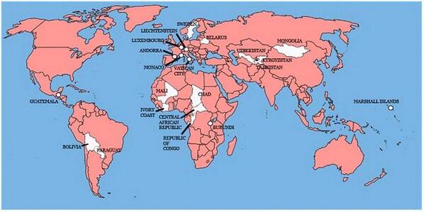
A map showing the 22 countries that Great Britain has not invaded

Britian invades

A map that makes the United States look almost benign. 😉

Invasion of America

Filed under: History,Mapping,Maps — Patrick Durusau @ 7:06 pm

Invasion of America

One of the most compelling combinations of a history timeline and a map I have ever seen!

In a nutshell, the map shows the loss of territory by native Americans from 1776 until present.

This should be shown and assigned as homework in every American history class.

Some people who merit a special shout-out for this work:

The Invasion of America is a project of eHistory.org.

Project director: Claudio Saunt, Russell Professor of History at the University of Georgia

Technical director: Sergio Bernardes, Center for Geospatial Research

Special thanks to David Holcomb and Daniel Reeves at ITOS for implementing the map on ArcGIS Server.

The Invasion of America

Filed under: Graphics,History,Mapping,Maps,Visualization — Patrick Durusau @ 3:30 pm

The Invasion of America

A dynamic map with a timeline of United States history and its “acquisition” of land from the inhabitants already present.

The continued power of American exceptionalism, the force that drove that conquest, makes the map all the more frightening.

I first saw this in a tweet by Lincoln Mullen.

June 9, 2014

Map Distortion!

Filed under: Cartography,Geography,Mapping,Maps — Patrick Durusau @ 1:49 pm

Mercator: Extreme by Drew Roos.

The link takes you to a display setting the pole to Atlanta, GA (near my present location).

You should search for a location near you for the maximum impact of the display. Intellectually I have known about map distortion but seeing it for your location, that’s something different.

Highly interactive and strongly recommended!

Makes me wonder about visual displays of other map distortions. Not just well known map projections but policy distortions as well.

Take for example a map that sizes countries by the amount of aid for the United States divided by their population.

Are there any map artists in the audience?

I first saw this in a tweet by Lincoln Mullen.

May 21, 2014

Mapped with a purpose

Filed under: Mapping,Maps — Patrick Durusau @ 8:02 pm

Mapped with a purpose by Andrew Janes.

From the post:

A few years ago, a colleague asked me for help in finding a map. What he wanted, he told me, was a fairly up-to-date map that showed Great Britain at ‘a normal scale’.

After laughing briefly at him, and then apologising for my rudeness, I plucked a road atlas from one of the bookshelves in our staff reading room. Fortunately, this seemed to fit the bill perfectly.

With the benefit of hindsight, I think that there are two morals to this story:

1. What is obvious to one person is not obvious to another. Like any good researcher, my colleague should have tried to explain what he wanted in a less ambiguous way. Equally, like any good public services archivist, I should have helped him to shape his request into something more sensible.

2. There is no such thing as a ‘normal’ map. The features and attributes of any map (including its scale) depend on its purpose. Why was it made and what was it intended to be used for? Two maps of the same place made at roughly the same time, but for different reasons, can look quite unlike one another.

Andrew illustrates his point with three maps of Nottingham made during the early 20th century. Vastly different even to the unpracticed eye.

The maps are quite fascinating but I leave to you to visit Andrew’s post for those.

Andrew then concludes with:

If you want to look for an old map and you think that The National Archives might have what you want, the map pages on our website are your best starting point.

When searching, bear in mind that a map showing the right place at the right date may not suit your needs in other ways. In other words, think about ‘what’ and ‘why’, as well as ‘where’ and ‘when’.

Those are some of the same rules for writing and reading topic maps.

I say “some” because Andrew is presuming a location on a particular sphere, whereas topic maps don’t start with that presumption. 😉

May 20, 2014

Interactive Maps with D3.js, Three.js, and Mapbox

Filed under: D3,MapBox,Mapping,Maps — Patrick Durusau @ 7:05 pm

Interactive Maps with D3.js, Three.js, and Mapbox by Steven Hall.

From the post:

Over the past couple of weeks I have been experimenting with creating 2D maps that can be explored in three dimensional space using D3.js and Three.js.  The goal was to produce some highly polished prototypes with multiple choropleth maps that could be easily navigated on a single page.  Additionally, I wanted to make sure to address some of the common tasks that arise when presenting map data such as applying well-formatted titles, legends and elegantly handling mouse-over events. The two examples presented below use D3.js for for generating nested HTML elements that contain the maps, titles and labeling information and use Three.js to position the elements in 3D space using CSS 3D transforms.  Importantly, there is no WebGL used in these examples.  Everything is rendered in the DOM using CSS 3D transforms which, at the time of writing, has much wider browser support than WebGL.

This article is an extension of two of my previous articles on D3.js and Three.js that can be found here and here.   Below, I’ll go into more depth about how the examples are produced and some of the roadblocks I encountered in putting these demos together, but for more background on the general process it may be good to look at the first article in this series: D3.js, Three.js and CSS 3D Transforms.

The maps here are geographical maps but what Steve covers could be easily applied to other types of maps.

May 19, 2014

The Internet Is Obsessed With Maps…

Filed under: Humor,Maps — Patrick Durusau @ 5:58 pm

The Internet Is Obsessed With Maps — Here’s Why It’s Gone Too Far by Mike Nudelman and Christina Sterbenz.

From the post:


“There’s something about maps that’s really authoritative and hard to question — we’re so used to seeing them …. But the more popular something becomes, the more people try to duplicate it without the expertise,” Fanning explained.

Condensing complex data into an easily and quickly digestible package often leads to oversimplification or, worse, misinformation. That becomes especially problematic when the map is viewed and shared far from its original context.

Of course, the maps in question are all visual but you could easily represent some topic maps as visual maps and capture that same sense of authority.

Have you faced issues of “oversimplification” or “misinformation” from use of a topic map? Any impact from a map being removed from its original context?

BTW, correction to the first map in the post. Tulane isn’t the “most desirable” college in Louisiana. LSU Baton Rouge is the “most desirable” college in Louisiana. 😉

May 16, 2014

There Should Be a Checklist for Maps

Filed under: Mapping,Maps — Patrick Durusau @ 7:07 pm

There Should Be a Checklist for Maps by Betsy Mason.

From the post:

Earlier this week, Stephanie Evergreen posted this great checklist for data visualizations. She and Ann Emery designed it to help social scientists understand the elements of a successful graph and offer guidance on how to make a graph better.

I’ve seen the list tweeted by data viz experts like Alberto Cairo and had it forwarded it to me by a designer I used to work with. It got me thinking that a list like this for maps would be really useful. We’re beginners at mapmaking here at Map Lab, and we’d love a list like this to check our own maps against, and to help us evaluate maps we come across.
….

Betsy has located one such guide but is seeking your advice on what should be on the checklist for map?

A checklist for maps, no disrespect intended towards data visualizations, is a very deep question. Maps, useful ones at any rate, reflect their author, purpose, intended audience, social context, technology for making the map, etc.

Suggestions? Comments?

May 6, 2014

The evolution of Ordnance Survey mapping

Filed under: Mapping,Maps — Patrick Durusau @ 6:58 pm

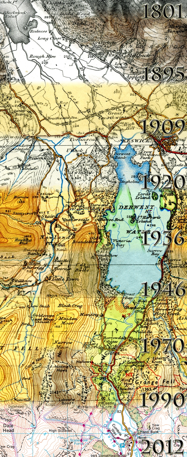
Evolution of Ordnance Survey mapping

From: The evolution of Ordance Survey mapping:

If you’re a lover of old maps, you may be aware of the changes that have taken place on Ordnance Survey maps over the years. Changes to colour, styling, the depiction of roads and vegetation for example. As you can imagine, visitors to our Southampton head office often want to visit our Cartography teams and see the work they’re doing now – and compare this to how things used to be done.

The Cartography team put their heads together and came up with a display to show visitors the past present and future roles of cartography. One aspect of the display was produced by Cartographer Alicja Karpinska, making use of her photography and digital image manipulation skills, to complete an image showing the evolution of Ordnance Survey mapping.

See the post for more details.

Assuming that topic maps recur in particular subject areas, a similar evolution of mapping is a distinct possibility at some point in the future.

Indexers map properties to subjects every day so topic map can’t claim to be the first to do so.

However, topic maps are the first technology that I am aware of that makes that mapping explicit. That a rather important difference and is crucial to supporting an “evolution of mapping” for topic maps at some point in the future.

May 3, 2014

Judgmental Maps

Filed under: Humor,Mapping,Maps — Patrick Durusau @ 3:59 pm

Judgmental Maps

Imagine a map of a city with the neighborhood names removed but the interstate highways and a few other geographic features remaining.

Now further imagine that you have annotated that map with new names to represent the neighborhoods and activities in that city.

I tried to pick my favorite but in these sensitive times, someone would be offended by any choice I made.

You can create an submit maps in addition to viewing ones already posted.

I first saw this at Judgmental Maps on Chart Porn.

May 1, 2014

Digitising Tithe Maps

Filed under: Mapping,Maps — Patrick Durusau @ 7:40 pm

Digitising Tithe Maps by Einion Gruffudd.

From the post:

Cynefin is a Welsh word for the area you are familiar with. It is also the name of a project for digitising the Tithe Maps of Wales. This is a considerable challenge, there are over a thousand of them and they are large, some are two by three metres or more. The maps are highly popular with the public, and with television programmes, and it is easy to see why. Not only are the maps very detailed, but they also have attached schedules or apportionment documents which include the names of the people who were paying tithes around the 1840s, and where they were farmers, as most were, more often than not the names of their fields are included.

The Cynefin project will produce digitised images of the maps and the apportionment documents, and much more as well. As there is such a wealth of information in the apportionment documents, they will be transcribed, but for this we are reliant on help from the community. We also plan to link the apportionment entries directly to the field numbers which are on the maps, this work will also involve volunteers. There will soon be a crowd sourcing platform giving the public an opportunity to contribute directly to the project.

Think of these maps as being the equivalents of a modern data tax assessor’s maps for property taxes, sans the need to tithe to support the local church.

Such rich maps offer many opportunities to create links (read associations) between these records and other sources of information from the same time period.

Enjoy!

April 30, 2014

Language is a Map

Filed under: Language,Maps,Topic Maps — Patrick Durusau @ 7:46 pm

Language is a Map by Tim O’Reilly.

From the post:

I’ve twice given an Ignite talk entitled Language is a Map, but I’ve never written up the fundamental concepts underlying that talk. Here I do that.

When I first moved to Sebastopol, before I raised horses, I’d look out at a meadow and I’d see grass. But over time, I learned to distinguish between oats, rye, orchard grass, and alfalfa. Having a language to make distinctions between different types of grass helped me to see what I was looking at.

I first learned this notion, that language is a map that reflects reality, and helps us to see it more deeply – or if wrong, blinds us to it – from George Simon, whom I first met in 1969. Later, George went on to teach workshops at the Esalen Institute, which was to the human potential movement of the 1970s as the Googleplex or Apple’s Infinite Loop is to the Silicon Valley of today. I taught at Esalen with George when I was barely out of high school, and his ideas have deeply influenced my thinking ever since.

If you accept Tim’s premise that “language is a map,” the next question that comes to mind is how faithfully can an information system represent your map?

Your map, not the map of an IT developer or a software vendor but your map?

Does your information system capture the shades and nuances of your map?

Enjoy!

April 29, 2014

Physical Manifestation of a Topic Map

Filed under: Maps,Marketing,Time,Topic Maps — Patrick Durusau @ 11:59 am

I saw a tweet today referencing Cartographies of Time: A Visual History of the Timeline by Maria Popova by The O.C.R. I have posted about it before Cartographies of Time:… but re-reading material can result in different takes on it. Today is an example of that.

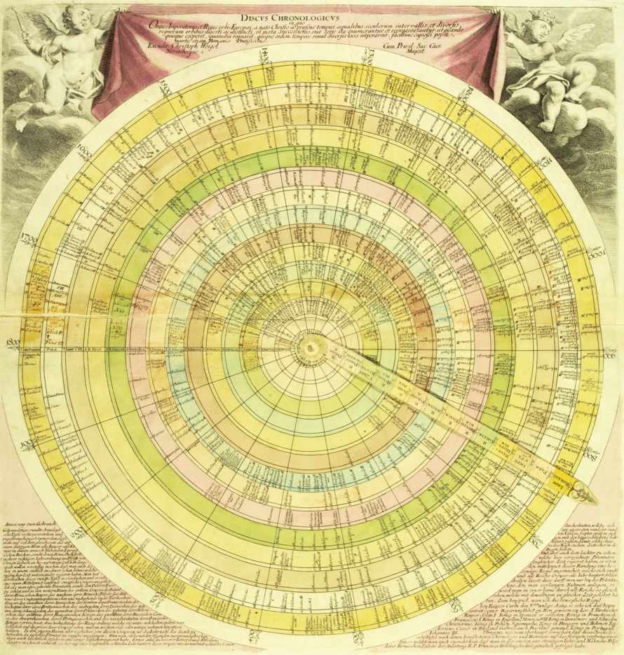
Today when I read the post I recognized the potential of the Discus chronologicus (which has no Wikipedia entry), could be the physical manifestation of a topic map. Or at least one with undisclosed reasons for mapping between domains.

discus chronologicus - Christoph Weigel

Granting it does not provide you with the properties of each subject, save possibly a name (you need something to recognize), with each ring representing what Steve Newcomb calls a “universe of discourse,” and the movable arm represents warp holes between those universes of discourse at particular subjects.

This could be a useful prop for marketing topic maps.

First, it introduces the notion of different vocabularies (universes of discourse) in a very concrete way and demonstrates the advantage of being able to move from one to another. (Assuming here you have chosen universes of discourse of interest to the prospect.)

Second, the lack of space means that it is missing the properties that enabled the mapping, a nice analogy to the construction of most information systems. You can assure the prospect that digital topic maps include that information.

Third, unlike this fixed mapping, another analogy to current data systems, more universes of discourse and subjects can be added to a digital topic map. While at the same time, you retain all the previous mappings. “Recycling prior work,” “not paying 2, 3 or more times for mappings,” are just some of the phrases that come to mind.

I am assuming composing the map in Gimp or other graphics program is doable. The printing and assembly would be more problematic. Will be looking around. Suggestions welcome!

April 22, 2014

Jane Goodall MOOC!

Filed under: Mapping,Maps — Patrick Durusau @ 7:20 pm

From Jane Goodall’s roots & shoots:

In Africa, the Jane Goodall Institute’s experts in conservation and science use Participatory Mapping to incorporate local, indigenous knowledge in the creation of conservation and development projects around chimpanzee habitats. At Roots & Shoots, our young people are the experts! You will use the same strategy as the Jane Goodall Institute field professionals to explore your community and identify areas to make a difference with a tool called Community Mapping.

Why Map?

How do you know where to make a difference if you don’t have a strong awareness of where you live? When you map your community you REALLY get to know about the people, animals and environment around you. Mapping is the key to discovering a real community need that leads to the most effective service campaigns. Master your mapping skills and get to know your community on a whole new level!

How to Map

There are several types of mapping tools for you to choose from. Are you tech savvy and love digital maps? Or are you the type that prefers to chart by hand? Regardless of which mapping tool you use (and you can use more than one), what matters is that you get out and take action!

Jane Goodall launched this effort on her 80th birthday.

Check out the course as well as the article that tipped me off about it.

It will be interesting to see how communities are viewed by their members and not urban planners.

Perhaps conventional maps are more imperialistic than they appear at first blush. Ordinary people have lacked to tools to put forth contending views on mapping their communities. Mapping between “conventional” and “community” maps could be contentious.

I first saw this at: Jane Goodall launches online course in digital mapping by Katie Collins.

« Newer PostsOlder Posts »

Powered by WordPress