Another Word For It Patrick Durusau on Topic Maps and Semantic Diversity

December 6, 2014

Resisting Arrests: 15% of Cops Make 1/2 of Cases

Filed under: Data Analysis,Graphics,Visualization — Patrick Durusau @ 7:19 pm

Resisting Arrests: 15% of Cops Make 1/2 of Cases by WNYC

From the webpage:

Police departments around the country consider frequent charges of resisting arrest a potential red flag, as some officers might add the charge to justify use of force. WNYC analyzed NYPD records and found 51,503 cases with resisting arrest charges since 2009. Just five percent of arresting officers during that period account for 40% of resisting arrest cases — and 15% account for more than half of such cases.

Be sure to hit the “play” button on the graphic.

Statistics can be simple, direct and very effective.

First question: What has the police department done to lower those numbers for the 5% of the officers in question?

Second question: Who are the officers in the 5%?

Without transparency there is no accountability.

November 30, 2014

Old World Language Families

Filed under: Graphics,Language,Visualization — Patrick Durusau @ 2:00 pm

language tree

Be design (limitation of space) not all languages were included.

Despite that, the original post has gotten seven hundred and twenty-two (722) comments as of today. A large number of which mention wanting a poster of this visualization.

I could assemble the same information, sans the interesting graphic and get no comments and no requests for a poster version.

😉

What makes this presentation (map) compelling? Could you transfer it to another body of information with the same impact?

What do you make of: “The approximate sizes of our known living language populations, compared to year 0.”

Suggested reading on what makes some graphics compelling and others not?

Originally from: Stand Still Stay Silent Comic, although I first saw it at: Old World Language Families by Randy Krum.

PS: For extra credit, how many languages can you name that don’t appear on this map?

November 25, 2014

The Sight and Sound of Cybercrime

Filed under: Cybersecurity,Graphics,Visualization — Patrick Durusau @ 2:56 pm

The Sight and Sound of Cybercrime Office for Creative Research.

From the post:

specimen box graphic

You might not personally be in the business of identity theft, spam delivery, or distributed hacking, but there’s a decent chance that your computer is. “Botnets” are criminal networks of computers that, unbeknownst to their owners, are being put to use for any number of nefarious purposes. Across the globe, millions of PCs have been infected with software that conscripts them into one of these networks, silently transforming these machines into accomplices in illegal activities and putting their users’ information at risk.

Microsoft’s Digital Crimes Unit has been tracking and neutralizing these threats for several years. In January, DCU asked The Office for Creative Research to explore novel ways to visualize botnet activity. The result is Specimen Box, a prototype exploratory tool that allows DCU’s investigators to examine the unique profiles of various botnets, focusing on the geographic and time-based communication patterns of millions of infected machines.

Specimen Box enables investigators to study a botnet the way a naturalist might examine a specimen collected in the wild: What are its unique characteristics? How does it behave? How does it propagate itself? How is it adapting to a changing environment?

Specimen Box combines visualization and sonification capabilities in a large-screen, touch-based application. Investigators can see and hear both live activity and historical ‘imprints’ of daily patterns across a set of 15 botnets. Because every botnet has its own unique properties, the visual and sonic portraits generated by the tool offer insight into the character of each individual network.

Very impressive graphic capabilities with several short video clips.

Would have been more impressive if the viewer was clued in on what the researchers were attempting to discover in the videos.

One point that merits special mention:

By default, the IP addresses are sorted around the circle by the level of communication activity. The huge data set has been optimized to allow researchers to instantly re-sort the IPs by longitude or by similarity. “Longitude Sort Mode” arranges the IPs geographically from east to west, while “Similarity Sort Mode” groups together IPs that have similar activity patterns over time, allowing analysts to see which groups of machines within the botnet are behaving the same way. These similarity clusters may represent botnet control groups, research activity from universities or other institutions, or machines with unique temporal patterns such as printers.

Think of “Similarity Sort Mode” as a group subject and this starts to resemble display of topics that have been merged* according to different criteria, in response to user requests.

*By “merged” I mean displayed as though “merged” in the TMDM sense of operations on a file.

November 18, 2014

emeeks’s blocks

Filed under: D3,Graphics,Visualization — Patrick Durusau @ 2:28 pm

emeeks’s blocks by Mike Bostock.

From the about page:

This is a simple viewer for code examples hosted on GitHub Gist. Code up an example using Gist, and then point people here to view the example and the source code, live!

The main source code for your example should be named index.html. You can also include a README.md using Markdown, and a thumbnail.png for preview. The index.html can use relative links to other files in your Gist; you can also use absolute links to shared files, such as D3, jQuery and Leaflet.

Rather remarkable page that includes a large number of examples from D3.js in Action.

November 14, 2014

Seaborn: statistical data visualization (Python)

Filed under: Graphics,Statistics,Visualization — Patrick Durusau @ 8:21 pm

Seaborn: statistical data visualization

From the introduction:

Seaborn is a library for making attractive and informative statistical graphics in Python. It is built on top of matplotlib and tightly integrated with the PyData stack, including support for numpy and pandas data structures and statistical routines from scipy and statsmodels.

Some of the features that seaborn offers are

Seaborn aims to make visualization a central part of exploring and understanding data. The plotting functions operate on dataframes and arrays containing a whole dataset and internally perform the necessary aggregation and statistical model-fitting to produce informative plots. Seaborn’s goals are similar to those of R’s ggplot, but it takes a different approach with an imperative and object-oriented style that tries to make it straightforward to construct sophisticated plots. If matplotlib “tries to make easy things easy and hard things possible”, seaborn aims to make a well-defined set of hard things easy too.

From the “What’s New” page:

v0.5.0 (November 2014)

This is a major release from 0.4. Highlights include new functions for plotting heatmaps, possibly while applying clustering algorithms to discover structured relationships. These functions are complemented by new custom colormap functions and a full set of IPython widgets that allow interactive selection of colormap parameters. The palette tutorial has been rewritten to cover these new tools and more generally provide guidance on how to use color in visualizations. There are also a number of smaller changes and bugfixes.

The What’s New page has a more detailed listing of the improvements over 0.40.

If you haven’t seen Seaborn before, let me suggest that you view the tutorial on Visual Dataset Exploration.

You will be impressed. But if you aren’t, check yourself for a pulse. 😉

I first saw this in a tweet by Michael Waskom.

Open Sourcing 3D City Reconstruction

Filed under: Graphics,Mapillary,Maps,Visualization — Patrick Durusau @ 3:05 pm

Open Sourcing 3D City Reconstruction by Jan Erik Solem.

From the post:

One of the downsides of using simple devices for mapping the world is that the GPS accuracy is not always great, especially in cities with tall buildings. Since the start we have always wanted to correct this using image matching and we are now making progress in that area.

The technique is called ‘Structure from Motion‘ (SfM) and means that you compute the relative camera positions and a 3D reconstruction of the environment using only the images.

We are now open sourcing our tools under the name OpenSfM and developing it in the open under a permissive BSD license. The project is intended to be a complete end-to-end easy-to-use SfM pipeline on top of OpenCV. We welcome all contributors, from industry and academia, to join the project. Driving this work inside Mapillary is Pau and Yubin.

Moving forward we are initially going to use this for improving the positioning and connection between Mapillary photos. Later, we are going to have an ever improving 3D reconstruction of every place on the planet too ;).

Are you ready to enhance your maps with 3D?

BTW, evidence that small vendors also support open source.

I first saw this in a tweet by Peter Neubauer.

November 4, 2014

Tabletop Whale’s guide to making GIFs

Filed under: Graphics,Visualization — Patrick Durusau @ 4:16 pm

Tabletop Whale’s guide to making GIFs by Eleanor Lutz.

From the post:

Recently I’ve been getting a lot of emails asking for a tutorial on how to make animations. So this week I put together a quick explanation for anyone who’s interested. I archived it as a link on the menu bar of my website, so it’ll always be easy to find if you need it.

This is just a run-through of my own personal animation workflow, so it’s not a definitive guide or anything. There are plenty of other ways to make animations in Photoshop and other programs.

I’ve never tried making a tutorial about my own work before, so sorry in advance if it’s confusing! Let me know if there’s anything I wrote that didn’t make any sense. I’ll try to fix it if I can (though I probably don’t have room to go into detail about every single Photoshop function I mention).

As you already know, I am graphically challenged but have been trying to improve, with the help of tutorials like this one from Eleanor Lutz.

Most of the steps should transfer directly to Gimp.

If you know of any Gimp specific tutorials on animation or otherwise useful for information visualization, drop me a line.

October 28, 2014

Text Visualization Browser [100 Techniques]

Filed under: Graphics,Visualization — Patrick Durusau @ 4:25 pm

Text Visualization Browser: A Visual Survey of Text Visualization Techniques by Kostiantyn Kucher and Andreas Kerren.

From the abstract:

Text visualization has become a growing and increasingly important subfield of information visualization. Thus, it is getting harder for researchers to look for related work with specific tasks or visual metaphors in mind. In this poster, we present an interactive visual survey of text visualization techniques that can be used for the purposes of search for related work, introduction to the subfield and gaining insight into research trends.

Even better is the Text Visual Browser webpage where one hundred (100) different techniques have thumbnails and links to the original papers.

Quite remarkable. I don’t think I can name anywhere close to all the techniques.

You?

October 22, 2014

FilterGraph

Filed under: Astroinformatics,Graphics,Visualization — Patrick Durusau @ 3:38 pm

FilterGraph

From the wiki:

Filtergraph allows you to create interactive portals from datasets that you import. As a web application, no downloads are necessary – it runs and updates in real time on your browser as you make changes within the portal. All that you need to start a portal is an email address and a dataset in a supported type. Creating an account is completely free, and Filtergraph supports a wide variety of data types. For a list of supported data types see “ Supported File Types ”. (emphasis in original)

Just in case you are curious about the file types:

Filtergraph will allow you to upload dataset files in the following formats:

ASCII text Tab, comma and space separated
Microsoft Excel *.xls, *.xlsx
SQLite *.sqlite
VOTable *.vot, *.xml
FITS *.fits
IPAC *.tbl
Numpy *.npy
HDF5 *.h5

You can upload files up to 50MB in size. Larger files can be accommodated if you contact us via a Feedback Form.

For best results:

  • Make sure each row has the same number of columns. If a row has an incorrect number of columns, it will be ignored.
  • Place a header in the first row to name each column. If a header cannot be found, the column names will be assigned as Column1, Column2, etc.
  • If you include a header, make the name of each column unique. Otherwise, the duplicate names will be modified.
  • For ASCII files, you may optionally use the ‘#’ symbol to designate a header.

Here is an example of an intereactive graph for earthquakes at FilterGraph:

graph of earthquakes

You can share the results of analysis and allow others to change the analysis of large data sets, without sending the data.

From the homepage:

Developed by astronomers at Vanderbilt University, Filtergraph is used by over 200 people in 28 countries to empower large-scale projects such as the KELT-North and KELT-South ground-based telescopes, the Kepler, Spitzer and TESS space telescopes, and a soil collection project in Bangladesh.

Enjoy!

October 20, 2014

20th Century Death

Filed under: Graphics,History,Visualization — Patrick Durusau @ 3:42 pm

20th century death

I first saw this visualization reported by Randy Krum at 20th Century Death, who then pointed to Information is Beautiful, a blog by David McCandless, where the image originates under: 20th Century Death.

David has posted a high-resolution PDF version, the underlying data and requests your assistance in honing the data.

What is missing from this visualization?

Give up?

Terrorism!

I don’t think extending the chart into the 21st century would make any difference. The smallest death total I saw was in the 1.5 million range. Hard to attribute that kind of death total to terrorism.

The reason I mention the absence of terrorism is that a comparison of these causes of death, at least the preventable ones, to spending on their prevention could be instructive.

You could insert a pin head dot terrorism and point to it with an arrow. Then compare the spending on terrorisms versus infectious diseases.

Between 1993 and 2010, Al-Qaeda was responsible for 4,004 deaths.

As of October 12, 2014, the current confirmed Ebola death toll is 4493.

The CDC is predicting (curently) some 550K Ebola cases by January 2015. With a seventy (70%) mortality rate, well, you do the numbers.

What graphic would you use to persuade decision makers on spending funds in the future?

October 13, 2014

Making of: Introduction to A*

Filed under: Graphics,Visualization — Patrick Durusau @ 4:23 pm

Making of: Introduction to A* by Amit Patel.

From the post:

(Warning: these notes are rough – the main page is here and these are some notes I wrote for a few colleagues and then I kept adding to it until it became a longer page)

Several people have asked me how I make the diagrams on my tutorials.

I need to learn the algorithm and data structures I want to demonstrate. Sometimes I already know them. Sometimes I know nothing about them. It varies a lot. It can take 1 to 5 months to make a tutorial. It’s slow, but the more I make, the faster I am getting.

I need to figure out what I want to show. I start with what’s in the algorithm itself: inputs, outputs, internal variables. With A*, the input is (start, goal, graph), the output is (parent pointers, distances), and the internal variables are (open set, closed set, parent pointers, distances, current node, neighbors, child node). I’m looking for the main idea to visualize. With A* it’s the frontier, which is the open set. Sometimes the thing I want to visualize is one of the algorithm’s internal variables, but not always.

Pure gold on making diagrams for tutorials here. You may make different choices but it isn’t often that the process of making a choice is exposed.

Pass this along. We all benefit from better illustrations in tutorials!

The Big List of D3.js Examples (Approx. 2500 Examples)

Filed under: D3,Graphics,Visualization — Patrick Durusau @ 3:48 pm

The Big List of D3.js Examples by Christophe Viau.

The interactive version has 2523 examples, whereas the numbered list has 1897 examples, as of 13 October 2014.

There is a rudimentary index of the examples. That’s an observation, not a compliant. Effective indexing of the examples would be a real challenge to the art of indexing.

The current index uses chart type, a rather open ended category. The subject matter of the chart would be another way to index. Indexing by the D3 techniques used would be useful. Data that is being combined with other data?

Effective access to the techniques and data represented by this collection would be awesome!

Give it some thought.

I first saw this in a tweet by Michael McGuffin.

Introduction to Graphing with D3.js

Filed under: D3,Graphics — Patrick Durusau @ 3:28 pm

Introduction to Graphing with D3.js by Jan Milosh.

From the post:

D3.js (d3js.org) stands for Data-Driven Documents, a JavaScript library for data visualization. It was created by Mike Bostock, based on his PhD studies in the Stanford University data visualization program. Mike now works at the New York Times who sponsors his open source work.

D3 was designed for more than just graphs and charts. It’s also capable of presenting maps, networks, and ordered lists. It was created for the efficient manipulation of documents based on data.

This demonstration will focus on creating a simple scatter plot.

If you are not already using D3 for graphics, Jan’s post is an easy introduction with additional references to take you further.

Enjoy!

I first saw this in a tweet by Christophe Viau.

September 13, 2014

Why Use Google Maps When You Can Get GPS Directions On The Death Star Instead?

Filed under: Graphics,MapBox,Mapping,Maps — Patrick Durusau @ 5:05 pm

Why Use Google Maps When You Can Get GPS Directions On The Death Star Instead? by John Brownlee.

From the post:

Mapbox Studio is a toolkit that allows apps and websites to serve up their own custom-designed maps to users. Companies like Square, Pinterest, Foursquare, and Evernote con provide custom-skinned Mapboxes instead, changing map elements to better fit in with their brand.

But Mapbox can do far cooler stuff. It can blast you to Space Station Earth, a Mapbox that makes the entire planet look like the blinking, slate gray skin of the Star Wars Death Star.

Great if your target audience are Star Wars or similar science fiction fans or you can convince management that it will hold the attention of users longer.

Even routine tasks, like logging service calls answered, would be more enjoyable using an X-Wing fighter to destroy the location of the call after service has been completed. 😉

September 12, 2014

Bokeh 0.6 release

Filed under: Graphics,Python,Visualization — Patrick Durusau @ 10:30 am

Bokeh 0.6 release by Bryan Van de Ven.

From the post:

Bokeh is a Python library for visualizing large and realtime datasets on the web. Its goal is to provide to developers (and domain experts) with capabilities to easily create novel and powerful visualizations that extract insight from local or remote (possibly large) data sets, and to easily publish those visualization to the web for others to explore and interact with.

This release includes many bug fixes and improvements over our most recent 0.5.2 release:

  • Abstract Rendering recipes for large data sets: isocontour, heatmap
  • New charts in bokeh.charts: Time Series and Categorical Heatmap
  • Full Python 3 support for bokeh-server
  • Much expanded User and Dev Guides
  • Multiple axes and ranges capability
  • Plot object graph query interface
  • Hit-testing (hover tool support) for patch glyphs

See the CHANGELOG for full details.

I’d also like to announce a new Github Organization for Bokeh: https://github.com/bokeh. Currently it is home to Scala and and Julia language bindings for Bokeh, but the Bokeh project itself will be moved there before the next 0.7 release. Any implementors of new language bindings who are interested in hosting your project under this organization are encouraged to contact us.

In upcoming releases, you should expect to see more new layout capabilities (colorbar axes, better grid plots and improved annotations), additional tools, even more widgets and more charts, R language bindings, Blaze integration and cloud hosting for Bokeh apps.

Don’t forget to check out the full documentation, interactive gallery, and tutorial at

http://bokeh.pydata.org

as well as the Bokeh IPython notebook nbviewer index (including all the tutorials) at:

http://nbviewer.ipython.org/github/ContinuumIO/bokeh-notebooks/blob/master/index.ipynb

One of the examples from the gallery:

plot graphic

reminds me of U.S. foreign policy. The unseen attractors are defense contractors and other special interests.

August 15, 2014

Photoshopping The Weather

Filed under: Graphics,Visualization,Weather Data — Patrick Durusau @ 10:23 am

Photo editing algorithm changes weather, seasons automatically

From the post:

We may not be able control the weather outside, but thanks to a new algorithm being developed by Brown University computer scientists, we can control it in photographs.

The new program enables users to change a suite of “transient attributes” of outdoor photos — the weather, time of day, season, and other features — with simple, natural language commands. To make a sunny photo rainy, for example, just input a photo and type, “more rain.” A picture taken in July can be made to look a bit more January simply by typing “more winter.” All told, the algorithm can edit photos according to 40 commonly changing outdoor attributes.

The idea behind the program is to make photo editing easy for people who might not be familiar with the ins and outs of complex photo editing software.

“It’s been a longstanding interest on mine to make image editing easier for non-experts,” said James Hays, Manning Assistant Professor of Computer Science at Brown. “Programs like Photoshop are really powerful, but you basically need to be an artist to use them. We want anybody to be able to manipulate photographs as easily as you’d manipulate text.”

A paper describing the work will be presented next week at SIGGRAPH, the world’s premier computer graphics conference. The team is continuing to refine the program, and hopes to have a consumer version of the program soon. The paper is available at http://transattr.cs.brown.edu/. Hays’s coauthors on the paper were postdoctoral researcher Pierre-Yves Laffont, and Brown graduate students Zhile Ren, Xiaofeng Tao, and Chao Qian.

For all the talk about photoshopping models, soon the Weather Channel won’t send reporters to windy, rain soaked beaches, snow bound roads, or even chasing tornadoes.

With enough information, the reporters can have weather effects around them simulated and eliminate the travel cost for such assignments.

Something to keep in mind when people claim to have “photographic” evidence. Goes double for cellphone video. A cellphone only captures the context selected by its user. A non-photographic distortion that is hard to avoid.

I first saw this in a tweet by Gregory Piatetsky.

August 13, 2014

Creating Custom D3 Directives in AngularJS

Filed under: D3,Graphics,Visualization — Patrick Durusau @ 4:47 pm

Creating Custom D3 Directives in AngularJS by Steven Hall.

From the post:

Among the most popular frameworks for making interactive data visualizations with D3 is AngularJS. Along with some great tools for code organization, Angular’s use of directives can be a powerful way to implement interactive charts and keep your code clean and organized. Here we are going to look at a simple example that creates a service that pulls data from last.fm using their public API. The returned data will be used to update two interactive charts created using Angular directives.

As usual in these tutorials the code is kept to a minimum to keep things clear and to the point. The code written for this example weighs in at about 250 lines of JavaScript and the results are pretty cool. The example uses D3’s enter, update, and exit selections to illustrate how thinking about object constancy when transitioning from one state to another can be really powerful for communicating relationships in the data that may be hard to spot otherwise.

I think the example presented here is a good one because it brings up a lot of the common concerns when developing using AngularJS (and in JavaScript in general really) with just a short amount of code.    

We’ll touch on all the following concerns:

  • Avoiding global variables
  • Creating data services
  • Dependency injection
  • Broadcasting events
  • Scoping directives
  • Making responsive charts

In addition to making a basic service to retrieve data from an API that can be injected into your controllers and directives, this article will cover different ways to scope your directives and using the AngularJS eventing tools.  As we’ll see, one chart in the example shares the entire root scope while the other creates an isolated scope that only has access to certain properties.  Your ability to manage scopes for directives is one of the most powerful concepts to understand in working with Angular.  Finally, we’ll look at broadcasting and listening for events in making the charts responsive.

Data delivery. Despite the complexity of data structures, formalisms used to develop algorithms for data analysis, network architectures, and the other topics that fill technical discussions, data delivery drives user judgments about your application/service.

This tutorial, along with others you will find here, will move you towards effective data delivery.

August 7, 2014

Mapbox GL For The Web

Filed under: Graphics,Javascript,MapBox,Visualization — Patrick Durusau @ 4:37 pm

Mapbox GL For The Web: An open source JavaScript framework for client-side vector maps by Eric Gundersen.

From the post:

Announcing Mapbox GL JS — a fast and powerful new system for web maps. Mapbox GL JS is a client-side renderer, so it uses JavaScript and WebGL to dynamically draw data with the speed and smoothness of a video game. Instead of fixing styles and zoom levels at the server level, Mapbox GL puts power in JavaScript, allowing for dynamic styling and freeform interactivity. Vector maps are the next evolution, and we’re excited to see what developers build with this framework. Get started now.

This rocks!

I not going to try to reproduce the examples here so see the original post!

What high performance maps are you going to create?

July 23, 2014

An A to Z of…D3 force layout

Filed under: D3,Graphics,Graphs,Visualization — Patrick Durusau @ 1:01 pm

An A to Z of extra features for the D3 force layout by Simon Raper.

From the post:

Since d3 can be a little inaccessible at times I thought I’d make things easier by starting with a basic skeleton force directed layout (Mike Bostock’s original example) and then giving you some blocks of code that can be plugged in to add various features that I have found useful.

The idea is that you can pick the features you want and slot in the code. In other words I’ve tried to make things sort of modular. The code I’ve taken from various places and adapted so thank you to everyone who has shared. I will try to provide the credits as far as I remember them!

A great read and an even greater bookmark for graph layouts.

In Simon’s alphabet:

A is for arrows.

B is for breaking links.

C is for collision detection.

F is for fisheye.

H is for highlighting.

L is for labels.

P is for pinning down nodes.

S is for search.

T is for tooltip.

Not only does Simon show the code, he also shows the result of the code.

A model of how to post useful information on D3.

July 15, 2014

Visualizing ggplot2 internals…

Filed under: Ggplot2,Graphics,Visualization — Patrick Durusau @ 1:27 pm

Visualizing ggplot2 internals with shiny and D3 by Carson Sievert.

From the post:

As I started this project, I became frustrated trying to understand/navigate through the nested list-like structure of ggplot objects. As you can imagine, it isn’t an optimal approach to print out the structure everytime you want to checkout a particular element. Out of this frustration came an idea to build this tool to help interact with and visualize this structure. Thankfully, my wonderful GSoC mentor Toby Dylan Hocking agreed that this project could bring value to the ggplot2 community and encouraged me to pursue it.

By default, this tool presents a radial Reingold–Tilford Tree of this nested list structure, but also has options to use the collapsable or cartesian versions. It also leverages the shinyAce package which allows users to send arbitrary ggplot2 code to a shiny server thats evaluate the results and re-renders the visuals. I’m quite happy with the results as I think this tool is a great way to quickly grasp the internal building blocks of ggplot(s). Please share your thoughts below!

I started with the blog post about the visualization but seeing the visualization is more powerful:

Visualizing ggplot2 internals (demo)

I rather like the radial layout.

For either topic map design or analysis, this looks like a good technique to explore the properties we assign to subjects.

July 7, 2014

Data Visualization in Sociology

Filed under: Graphics,Social Sciences,Visualization — Patrick Durusau @ 6:32 pm

Data Visualization in Sociology by Kieran Healy and James Moody. (Annu. Rev. Sociol. 2014. 40:5.1–5.24, DOI: 10.1146/annurev-soc-071312-145551)

Abstract:

Visualizing data is central to social scientific work. Despite a promising early beginning, sociology has lagged in the use of visual tools. We review the history and current state of visualization in sociology. Using examples throughout, we discuss recent developments in ways of seeing raw data and presenting the results of statistical modeling. We make a general distinction between those methods and tools designed to help explore data sets and those designed to help present results to others. We argue that recent advances should be seen as part of a broader shift toward easier sharing of the code and data both between researchers and with wider publics, and we encourage practitioners and publishers to work toward a higher and more consistent standard for the graphical display of sociological insights.

A great review of data visualization in sociology. I was impressed by the author’s catching the context of John Maynard Keyes‘ remark about the “evils of the graphical method unsupported by tables of figures.”

In 1938, tables of figures reported actual data, not summaries. With a table of figures, another researcher could verify a graphic representation and/or re-use the data for their own work.

Perhaps journals could adopt a standing rule that no graphic representations are allowed in a publication unless and until the authors provide the data and processing steps necessary to reproduce the graphic. For public re-use.

The authors’ also make the point that for all the wealth of books on visualization and graphics, there is no cookbook that will enable a user to create a great graphic.

My suggestion in that regard is to collect visualizations that are widely thought to be “great” visualizations. Study the data and background of the visualization. Not so that you can copy the technique but in order to develop a sense for what “works” or doesn’t for visualization.

No guarantees but at a minimum, you will have experienced a large number of visualizations. That can’t hurt in your quest to create better visualizations.

I first saw this in a tweet by Christophe Lalanne.

July 6, 2014

Data Visualization Contest @ use!R 2014

Filed under: Graphics,R,Visualization — Patrick Durusau @ 4:34 pm

Data Visualization Contest @ use!R 2014

From the webpage:

The aim of the Data Visualization Contest @ use!R 2014 is to show the potential of R for analysis and visualization of large and complex data sets.

Submissions are welcomed in these two broad areas:

  • Track 1: Schools matter: the importance of school factors in explaining academic performance.
  • Track 2: Inequalities in academic achievement.

Really impressive visualizations but I would treat some of the conclusions with a great deal of caution.

One participant alleges that the absence of computers makes math scores fall. I am assuming that is literally what the data says but that doesn’t establish a causal relationship.

I say that because all of the architects of atomic bomb, to say nothing of the digital computer, learned mathematics without the aid of computers. Yes?

ease()-y as Math.PI…

Filed under: D3,Graphics — Patrick Durusau @ 3:14 pm

ease()-y as Math.PI: 1,200,000ms of Fun with D3’s Animated Transitions by Scott Murray.

From the webpage:

This is a presentation I gave at the Eyeo Festival in Minneapolis on June 11, 2014, adapted for the web. The talk was entirely live-coded in the JavaScript console, an experience I’ve tried to recreate here.

I recommend viewing this in Chrome, with the developer tools open. Click the next button to step through the presentation. Or, of course you can retype any of the code directly into the console yourself. Click any code block to execute it (but note that running them out of the intended order may produce unexpected results).

If you have any interest in D3 or in graphics you are going to enjoy this presentation!

Perhaps it will inspire you to try a live coding presentation. 😉

Or at least give you more confidence in using D3 for visualization.

PS: One moment of confusion as I was stepping through the presentation. I did not have the DOM inspector open, so I did not see the SVG element containing circles. The circles on my monitor resembled a solid line. My bad. The lesson here is to: Follow the Directions!

June 14, 2014

Capturing Illogical Relationships

Filed under: Government,Graphics,Visualization — Patrick Durusau @ 12:48 pm

Syrian Conflict

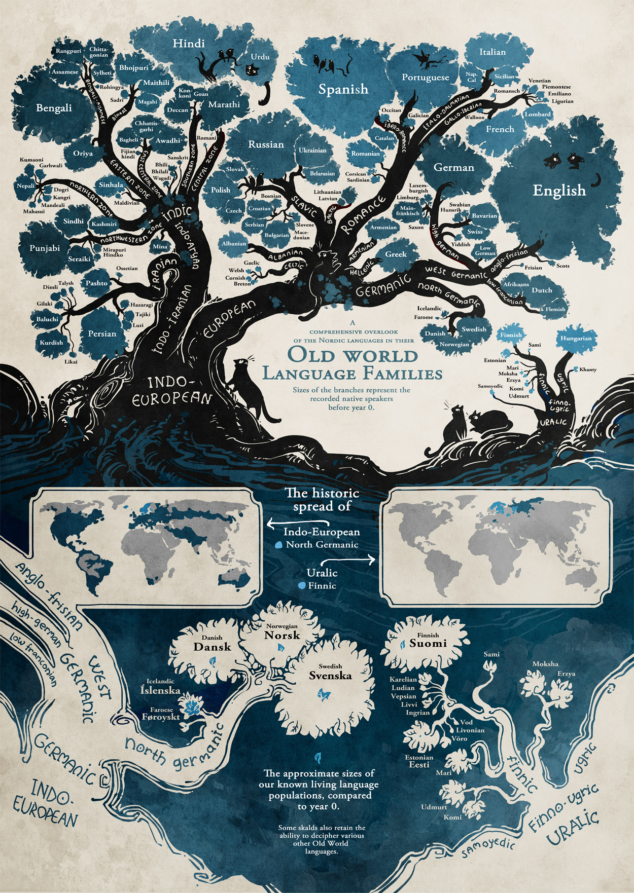
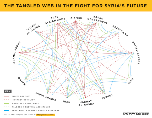
This graphic from ISIS Against The World is described as:

More Iraqi towns fell to “worse-than-al-Qaeda” overnight. The above chart from Hayes Brown and Adam Peck illustrates how ISIS is really at war with everybody:

A great illustration of the routine complexity of relationships between governments and other parties. (Is NGO the correct term for ISIS and al-Qaeda? Neither one is a government, yet.)

And it illustrates the lack of logic, first order or otherwise, in important events and relationships.

For example, the “indirect conflict” line between the United States and Iran may remain but in the near term, it will be supplemented with a lines showing monetary and weapons assistance, so long as Iran opposes ISIS. And other lines could change and/or be supplemented depending on the shifting fortunes of war and policy.

While this great graphic will get your attention, it doesn’t help navigate the vast stores of information on any of these parties or on relationships between individuals working for these parties.

For example, there were discussions with Qatar recently that resulted in the release of a prisoner held by al-Qaeda. Who were those discussions with and what could be done to enlist al-Qaeda to assist in taking down the leadership of ISIS?

Such details would not be in a public topic map, but as it is, I rather doubt the actual decisions makers know if that information is available or not.

The point being that mission critical information is no doubt siloed in Defense, State, NSA, CIA, and various other groups within the United States, if we are talking about a topic map from a U.S. perspective.

Not that we need another data dump facility like that maintained by Edward Snowden, but a topic map could point to holder of relevant information without disclosing its full content. Enabling someone with a “need to know” to be able to approach the holder with a request for the details.

Something to think about as the situation in the “Middle East” becomes more complicated.

PS: The graphic doesn’t encompass the “Middle East” as usually defined. Wikipedia in Middle East gives the following list of countries:

Can you think of a reason to use a smaller definition of “Middle East?”

June 13, 2014

Images Can Be Persuasive!

Filed under: Graphics,Visualization — Patrick Durusau @ 3:00 pm

Florence, Italy vs. Atlanta, GA

Florence Italy and hwy interchange Atlanta, same scale.

Just the image and identifying the locations is all that need be said!

What images would you contrast for topic maps and why?

I saw this in a tweet by Janek Hellqvist.

June 11, 2014

SIGGRAPHITTI Issue 3 – June 2014

Filed under: Graphics,Interface Research/Design,Visualization — Patrick Durusau @ 6:43 pm

SIGGRAPHITTI Issue 3 – June 2014

News for SIGGRAPH2014!

As you already know:

Conference 10-14 August 2014
Exhibition 12-14 August 2014
Vancouver Convention Center

What you may not know:

Should be easy to make the Balisage Conference, August 4-8, 2014, Washington, DC and then hop a flight to Vancouver. 😉

June 10, 2014

The Invasion of America

Filed under: Graphics,History,Mapping,Maps,Visualization — Patrick Durusau @ 3:30 pm

The Invasion of America

A dynamic map with a timeline of United States history and its “acquisition” of land from the inhabitants already present.

The continued power of American exceptionalism, the force that drove that conquest, makes the map all the more frightening.

I first saw this in a tweet by Lincoln Mullen.

June 4, 2014

RenderMan/RIS

Filed under: Graphics,Visualization — Patrick Durusau @ 6:28 pm

RenderMan/RIS and the start of next 25 years by Mike Seymour.

From the post:

At SIGGRAPH last July, Pixar celebrated 25 years of RenderMan (see our story here). Today the company has announced new breakthrough technology, a new commitment to R&D and massive pricing changes including free access to RenderMan for non-commercial use. Ed Catmull, President, Walt Disney and Pixar Animation Studios, along with Dana Batali, VP of RenderMan Products, Chris Ford, RenderMan’s Business Director and the Pixar RenderMan team have introduced sweeping changes to the way RenderMan will be developed, sold and the very latest technology that will ship before SIGGRAPH 2014 in Vancouver. This is clearly the start of the next 25 years.

The new product is a combination of RenderMan Pro Server and RenderMan Studio. There will now be one product, used by artists or on the farm, and movable between the two. The new RenderMan has a powerful bi-directional path tracer and serious new technology from Disney Animation, which underlines a new unified approach to rendering from the House of Mouse – the amazing powerhouse that is Disney today.
….

If you appreciate high-end graphics, you owe it to yourself to read Mike’s post and watch the videos.

And if you want to try the software, you have to appreciate the simplicity of their license:

There is only one RenderMan and the free non-commercial RenderMan is exactly the same as the commercial version. There are no watermarks, no time limits, and no reduced functionality. The only limitation is that upon acceptance of the EULA at initial installation, the software is to be only used for non-commercial purposes. We want to keep it very simple, and as importantly, RenderMan highly accessible.

Enjoy!

June 3, 2014

A first-person engine in 265 lines

Filed under: Games,Graphics,Interface Research/Design,Visualization — Patrick Durusau @ 6:18 pm

A first-person engine in 265 lines

From the post:

Today, let’s drop into a world you can reach out and touch. In this article, we’ll compose a first-person exploration from scratch, quickly and without difficult math, using a technique called raycasting. You may have seen it before in games like Daggerfall and Duke Nukem 3D, or more recently in Notch Persson’s ludum dare entries. If it’s good enough for Notch, it’s good enough for me!

Not a short exercise but I like the idea of quick to develop interfaces.

Do you know if in practice it makes it easier to change/discard interfaces?

Thanks!

I first saw this in a tweet by Hunter Loftis.

May 27, 2014

OpenVis Conf (videos 2014)

Filed under: Graphics,Visualization — Patrick Durusau @ 7:35 pm

OpenVis Conf

Eighteen (18) great videos are up for your viewing pleasure!

I will have to limit myself to one video per day so I won’t have too many new ideas. 😉

Enjoy!

I first saw this in a tweet by Rob Simon.

« Newer PostsOlder Posts »

Powered by WordPress