I first saw this visualization reported by Randy Krum at 20th Century Death, who then pointed to Information is Beautiful, a blog by David McCandless, where the image originates under: 20th Century Death.
David has posted a high-resolution PDF version, the underlying data and requests your assistance in honing the data.
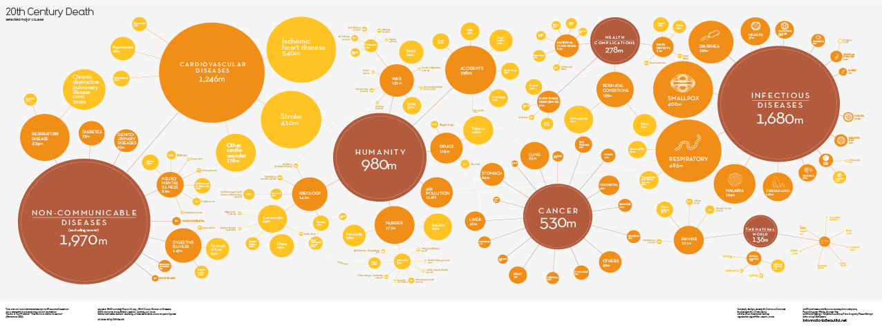
What is missing from this visualization?
Give up?
Terrorism!
I don’t think extending the chart into the 21st century would make any difference. The smallest death total I saw was in the 1.5 million range. Hard to attribute that kind of death total to terrorism.
The reason I mention the absence of terrorism is that a comparison of these causes of death, at least the preventable ones, to spending on their prevention could be instructive.
You could insert a pin head dot terrorism and point to it with an arrow. Then compare the spending on terrorisms versus infectious diseases.
Between 1993 and 2010, Al-Qaeda was responsible for 4,004 deaths.
As of October 12, 2014, the current confirmed Ebola death toll is 4493.
The CDC is predicting (curently) some 550K Ebola cases by January 2015. With a seventy (70%) mortality rate, well, you do the numbers.
What graphic would you use to persuade decision makers on spending funds in the future?