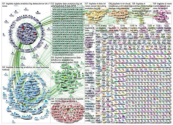
I’m sure you have seen this rather impressive Twitter graphic:
And you can see a larger version, with a link to the interactive version here: https://nodexlgraphgallery.org/Pages/Graph.aspx?graphID=61591
Impressive visualization but…, tell me, what can you learn from these tweets about big data?
I mean, visualization is a great tool but if I am not better informed after using the visualization than before, what’s the point?
If you go to the interactive version, you will find lists derived from the data, such as “top 10 vertices, ranked by Betweeness Centrality,” top 10 URLs in the graph and groups in the graph, top domains in the graph and groups in the graph, etc.
None of which is evident from casual inspection of the graph. (Top influencers might be if I could get the interactive version to resize but difficult unless the step between #11 and #10 was fairly large.
Nothing wrong with eye candy but for touting the usefulness of visualization, let’s look for more intuitive visualizations.
I saw this particular version in a tweet by Kirk D. Borne.