The PokitDok HealthGraph by Denise Gosnell, PhD and Alec Macrae.
From the post:
While the front-end team has been busy putting together version 3 of our healthcare marketplace, the data science team has been hard at work on several things that will soon turn into new products. Today, I’d like to give you a sneak peek at one of these projects, one that we think will profoundly change the way you think about health data. We call it the PokitDok HealthGraph. Let’s ring in the New Year with some data science!
Everyone’s been talking about Graph Theory, but what is it, exactly?
And we aren’t talking about bar graphs and pie charts.
Social networks have brought the world of graph theory to the forefront of conversation. Even though graph theory has been around since Euler solved the infamous Konigsberg bridge problem in the 1700’s, we can thank the current age of social networking for giving graph theory a modern revival.
At the very least, graph theory is the art of connecting the dots, kind of like those sweet pictures you drew as a kid. A bit more formally, graph theory studies relationships between people, places and/or things. Take any ol’ social network – Facebook, for example, uses a graph database to help people find friends and interests. In graph theory, we represent this type of information with nodes (dots) and edges (lines) where the nodes are people, places and/or things and the lines represent their relationship.
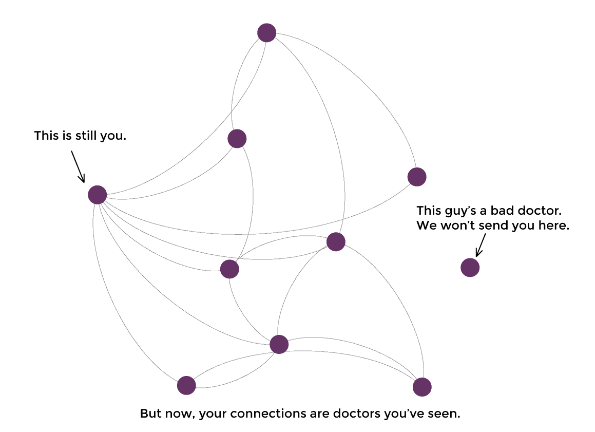
…
To make a long story short: healthcare is about you and connecting you with quality care. When data scientists think of connecting things together, graphs are most often the direction we go.
At PokitDok, we like to look at your healthcare needs as a social network, aka: your personal HealthGraph. The HealthGraph is a network of doctors, other patients, insurance providers, common ailments and all of the potential connections between them.
Hard to say in advance but it looks like Denise and Alec are close to the sweet spot on graph explanations for lay people. Having subject matter that is important to users helps. And using familiar names for the nodes of the graph works as well.
Worth following this series of posts to see if they continue along this path.