Cartography with complex survey data by David Smith.
From the post:
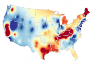
Visualizing complex survey data is something of an art. If the data has been collected and aggregated to geographic units (say, counties or states), a choropleth is one option. But if the data aren't so neatly arranged, making visual sense often requires some form of smoothing to represent it on a map.
R, of course, has a number of features and packages to help you, not least the survey package and the various mapping tools. Swmap (short for "survey-weighted maps") is a collection of R scripts that visualize some public data sets, for example this cartogram of transportation share of household spending based on data from the 2012-2013 Consumer Expenditure Survey.
In addition to finding data, there is also the problem of finding tools to process found data.
As in when I follow a link to a resource, that link is also submitted to a repository of other things associated with the data set I am requesting, such as the current locations of its authors, tools for processing the data, articles written using the data, etc.
That’s a long ways off but at least today you can record having found one more cache of tools for data processing.