New York Times API extractor and Google Maps visualization (Wandora Tutorial)
From the description:
Video reviews the New York Times API extractor, the Google Maps visualization, and the graph visualization of Wandora application. The extractor is used to collect event data which is then visualized on a map and as a graph. Wandora is an open source tool for people who collect and process information, especially networked knowledge and knowledge about WWW resources. For more information see http://wandora.org
This is impressive, although the UI may have more options than MS Word.  (It may not, I haven’t counted every way to access every option.)
Here is the result that was obtained by use of drop down menus and selecting:
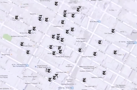
The Times logo marks events extracted from the New York Times and merged for display with Google Maps.
Not technically difficult but it is good to see a function of interest to ordinary users in a topic map application.
I have the latest release of Wandora. Need to start walking through the features.