An image from Stefano Bertolo (Attribution-NonCommercial-ShareAlike 2.0 Generic) for a presentation on big data.
Stefano notes:
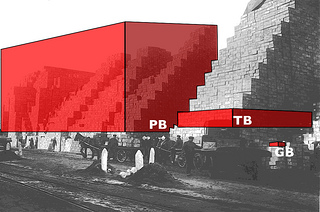
A pictured I edited with Inkscape to illustrate the non-linear effects in process management that result from changes in data volumes. I thank the National Library of Scotland for the original.
This illustrates the “…non-linear effects in process management that result from changes in data volumes” but does it also illustrate the increased demands on third-parties to use data?
I need an illustration for the proposition that if data (and its structures) are annotated at the moment of creation, that reduces the burden on every subsequent user.
Stefano’s image works fine for talking about the increased burden of non-documented data, but it doesn’t add a burden to each user who lacks knowledge of the data nor take it away if the data is properly prepared.
If you start with an unknown 1 GB of data, there is some additional cost for you to acquire knowledge of the data. If someone uses that data set after you, they have to go through the same process. So the cost of unknown data isn’t static but increases with the number of times it is used.
By the same token, properly documented data doesn’t exert a continual drag on its users.
Suggestions on imagery?
Comments/suggestions?