Another Word For It Patrick Durusau on Topic Maps and Semantic Diversity

June 17, 2017

American Archive of Public Broadcasting

Filed under: Archives,Broadcasting,Intellectual Property (IP) — Patrick Durusau @ 1:16 pm

American Archive of Public Broadcasting

From the post:

An archive worth knowing about: The Library of Congress and Boston’s WGBH have joined forces to create The American Archive of Public Broadcasting and “preserve for posterity the most significant public television and radio programs of the past 60 years.” Right now, they’re overseeing the digitization of approximately 40,000 hours of programs. And already you can start streaming “more than 7,000 historic public radio and television programs.”

The collection includes local news and public affairs programs, and “programs dealing with education, environmental issues, music, art, literature, dance, poetry, religion, and even filmmaking.” You can browse the complete collection here. Or search the archive here. For more on the archive, read this About page.

Follow Open Culture on Facebook and Twitter and share intelligent media with your friends. Or better yet, sign up for our daily email and get a daily dose of Open Culture in your inbox.

If you’d like to support Open Culture and our mission, please consider making a donation to our site. It’s hard to rely 100% on ads, and your contributions will help us provide the best free cultural and educational materials.

Hopeful someone is spinning cable/television content 24 x 7 to archival storage. The ability to research and document, reliably, patterns in shows, advertisements, news reporting, etc., is more important than any speculative copyright interest.

Are You A Serious Reader?

Filed under: Books,Journalism,Literature,News,Reporting — Patrick Durusau @ 10:32 am

What does it mean for a journalist today to be a Serious Reader? by Danny Funt.

From the post:

BEFORE THE BOOKS ARRIVED, Adam Gopnik, in an effort to be polite, almost contradicted the essential insight of his life. An essayist, critic, and reporter at The New Yorker for the last 31 years, he was asked whether there is an imperative for busy, ambitious journalists to read books seriously—especially with journalism, and not just White House reporting, feeling unusually high-stakes these days—when the doorbell rang in his apartment, a block east of Central Park. He came back with a shipment and said, “It would be,” pausing to think of and lean into the proper word, “brutally unkind and unrealistic to say, Oh, all of you should be reading Stendhal. You’ll be better BuzzFeeders for it.” For the part about the 19th-century French novelist, he switched from his naturally delicate voice to a buffoonish, apparently bookish, baritone.

Then, as he tore open the packaging of two nonfiction paperbacks (one, obscure research for an assignment on Ernest Hemingway; the other, a new book on Adam Smith, a past essay subject) and sat facing a wall-length bookcase and sliding ladder in his heavenly, all-white living room, Gopnik took that back. His instinct was to avoid sermonizing about books, particularly to colleagues with grueling workloads, because time for books is a privilege of his job. And yet, to achieve such an amazingly prolific life, the truth is he simply read his way here.

I spoke with a dozen accomplished journalists of various specialties who manage to do their work while reading a phenomenal number of books, about and beyond their latest project. With journalists so fiercely resented after last year’s election for their perceived elitist detachment, it might seem like a bizarre response to double down on something as hermetic as reading—unless you see books as the only way to fully see the world.

Being well-read is a transcendent achievement similar to training to run 26.2 miles, then showing up for a marathon in New York City and finding 50,000 people there. It is at once superhuman and pedestrian.

… (emphasis in original)

A deeply inspirational and instructive essay on serious readers and the benefits that accrue to them. Very much worth two or more slow reads, plus looking up the authors, writers and reporters who are mentioned.

Earlier this year I began the 2017 Women of Color Reading Challenge. I have not discovered any technical insights into data science or topic maps, but I am gaining, incrementally for sure, a deeper appreciation for how race and gender shapes a point of view.

Or perhaps more accurately, I am encountering points of view different enough from my own that I recognize them as being different. That in and of itself, the encountering of different views, is one reason I aspire to become a “serious reader.”

You?

OpSec Reminder

Filed under: Cybersecurity,Government Data,Security — Patrick Durusau @ 9:59 am

Catalin Cimpanu covers a hack of the DoD’s Enhanced Mobile Satellite Services (EMSS) satellite phone network in 2014 in British Hacker Used Home Internet Connection to Hack the DoD in 2014.

The details are amusing but the most important part of Cimpanu’s post is a reminder about OpSec:


In a statement released yesterday, the NCA said it had a solid case against Caffrey because they traced back the attack to his house, and found the stolen data on his computer. Furthermore, officers found an online messaging account linked to the hack on Caffrey’s computer.

Caffrey’s OpSec stumbles:

  1. Connection traced to his computer (No use of Tor or VPN)
  2. Data found on his hard drive (No use of encryption and/or storage elsewhere)
  3. Online account used in hack operated from his computer (Again, no use of Tor or VPN)

I’m sure the hack was a clever one but Caffrey’s OpSec was less so. Decidedly less so.

PS: The National Criminal Agency (NCA) report on Caffrey.

June 16, 2017

FOIA Success Prediction

Filed under: FOIA,Government,Government Data — Patrick Durusau @ 7:57 pm

Will your FOIA request succeed? This new machine will tell you by Benjamin Mullin.

From the post:

Many journalists know the feeling: There could be a cache of documents that might confirm an important story. Your big scoop hinges on one question: Will the government official responsible for the records respond to your FOIA request?

Now, thanks to a new project from a data storage and analysis company, some of the guesswork has been taken out of that question.

Want to know the chances your public records request will get rejected? Plug it into FOIA Predictor, a probability analysis web application from Data.World, and it will provide an estimation of your success based on factors including word count, average sentence length and specificity.

Accuracy?

Best way to gauge that is experience with your FOIA requests.

Try starting at MuckRock.com.

Enjoy!

June 15, 2017

Man Bites Dog Or Shoots Member of Congress – Novelty Rules the News

Filed under: Journalism,News,Reporting — Patrick Durusau @ 4:35 pm

The need for “novelty” in a 24 x 7 news cycle, identified by Lewis and Marwick in Megyn Kelly fiasco is one more instance of far right outmaneuvering media comes to the fore in coverage of the recent shooting reported in Capitol Hill shaken by baseball shooting.

Boiled down to the essentials, James Hodgkinson, 66, of Illinois, who is now dead, wounded “House Majority Whip Steve Scalise (R-La.) and four others in the Washington suburb of Alexandria, Va.,” on June 14, 2017. The medical status of the wounded vary from critical to released.

That’s all the useful information, aside from identification of the victims, that can be wrung from that story.

Not terribly useful information, considering Hodgkinson is dead and so not a candidate for a no-fly/sell list.

But you will read column inch after column inch of non-informative comments by and between special interest groups, “experts,” and even experienced political reporters, on a one-off event.

A per capita murder rate of 5 per 100,000, works out to 50 murderers per million people. Approximately 136 million people voted in the 2016 election so 50 x 136 means 6800 people who will commit murder this year voted in the 2016 election. (I’m assuming 1 murderer per murder, which isn’t true but it does simplify the calculation.)

One of those 6800 people (I could have used shootings per capita for an even larger number) shot a member of Congress.

Will this story, plus or minus hand wringing, accusations, counter-accusations, etc., change your routine tomorrow? Next week? Your plans for this year?

All I see is novelty and no news.

You?

PS: Identifying the “novelty” of this story did not require a large research/fact-checking budget. What it did require is a realization that everyone is talking about the shooting of a member of congress means only “everyone is talking about….” Whether that is just a freakish event or genuine news, requires deeper inquiry.

One nutter shoots a member of Congress, man bites dog, novelty, not news. Organization succeeds in killing 3rd member of Congress, that looks like news. Pattern, behavior, facts, goals, etc.

The Media and Far Right Trolls – Mutual Reinforcing Exploitation (MRE)

Filed under: Journalism,News,Reporting — Patrick Durusau @ 2:39 pm

The Columbia Journalism Review (CJR) normally has great headlines but the editors missed a serious opportunity with: Megyn Kelly fiasco is one more instance of far right outmaneuvering media by Becca Lewis and Alice Marwick.

Lewis and Marwick capture the essential facts and then lose their key insights in order to portray “the media” (whoever that is) as a victim of far right trolls.

Indeed, research suggests that even debunking falsehoods can reinforce and amplify them. In addition, if a media outlet declines to cover a story that has widely circulated in the far-right and mainstream conservative press, it is accused of lying and promoting a liberal agenda. Far-right subcultures are able to exploit this, using the media to spread ideas and target potential new recruits.

A number of factors make the mainstream media susceptible to manipulation from the far-right. The cost-cutting measures instituted by traditional newspapers since the 1990s have resulted in less fact-checking and investigative reporting. At the same time, there is a constant need for novelty to fill a 24/7 news cycle driven by cable networks and social media. Many of those outlets have benefited from the new and increased partisanship in the country, meaning there is now more incentive to address memes and half-truths, even if it’s only to shoot them down.

Did you catch them? The key insights/phrases?

  1. “…declines to cover a story that has widely circulated…it is accused of lying and promoting a liberal agenda…”
  2. “…less fact-checking and investigative reporting…”
  3. “…constant need for novelty to fill a 24/7 news cycle driven by cable networks and social media…”

Declining to Cover a Story

“Far-right subcultures” don’t exploit “the media” with just any stories, they are “…widely circulated…” stories. That is “the media” is being exploited over stories it carries out of fear of losing click-through advertising revenue. If a story is “widely circulated,” it attracts reader interest, page-views, click-throughs and hence, is news.

Less Fact-Checking and Investigative Reporting

Lewis and Marwick report the decline in fact-checking and investigative reporting as fact but don’t connect it to “the media” carrying stories promoted by “far-right subcultures.” Even if fact-checking and investigative reporting were available in abundance, for every story, given enough public interest (read “…widely circulated…”), is any editor going to decline a story of wide spread interest? (BTW, who chose to reduce fact-checking and investigative reporting? It wasn’t “far-right subcultures” choosing for “the media.”

Constant Need for Novelty

The “…constant need for novelty…” and its relationship to producing income for “the media” is best captured by the following dialogue from Santa Claus (1985)


How can I tell all the people
about my something special?
Advertise. Advertise?
How do I do that?
In my line,
television works best.
Oh, I know! Those little picture
box thingies? Can we get on those?
With enough money, a horse in a
hoop skirt can get on one of those.

In the context of Lewis and Marwick, far-right subculture news is the “horse in a hoop skirt” of the dialogue. It’s a “horse in a hoop skirt” that is generating page-views and click-through rates.

The Missed Headline

I’m partial to my headline but the CJR aims at a more literary audience, I would suggest:

The Media and Far Right Trolls – Imitating Alessandro and Napoleone

Alessandro and Napoleone, currently residents of Hell, are described in Canto 32 of the Inferno (Dante, Ciardi translation) as follows:

When I had stared about me, I looked down
and at my feet I saw two clamped together
so tightly that the hair of their heads had grown

together, “Who are you,” I said, “who lie
so tightly breast to breast?” They strained their necks
and when they had raised their heads as if to reply,

the tears their eyes had managed to contain
up to that time gushed out, and the cold froze them
between the lids, sealing them shut again

tighter than any clamp grips wood to wood,
and mad with pain, they fell to butting heads
like billy-goats in a sudden savage mood.

“The media” now reports its “butting heads” with “far-right subcultures,” generating more noise, in addition to reports of non-fact-checked but click-stream revenue producing right-wing fantasies.

June 13, 2017

Tails 3.0 is out (Don’t be a Bank or the NHS, Upgrade Today)

Filed under: Cybersecurity,Security,Tails — Patrick Durusau @ 4:46 pm

Tails 3.0 is out

From the webpage:

We are especially proud to present you Tails 3.0, the first version of Tails based on Debian 9 (Stretch). It brings a completely new startup and shutdown experience, a lot of polishing to the desktop, security improvements in depth, and major upgrades to a lot of the included software.

Debian 9 (Stretch) will be released on June 17. It is the first time that we are releasing a new version of Tails almost at the same time as the version of Debian it is based upon. This was an important objective for us as it is beneficial to both our users and users of Debian in general and strengthens our relationship with upstream:

  • Our users can benefit from the cool changes in Debian earlier.
  • We can detect and fix issues in the new version of Debian while it is still in development so that our work also benefits Debian earlier.

This release also fixes many security issues and users should upgrade as soon as possible.

Upgrade today, not tomorrow, not next week. Today!

Don’t be like banks and NHS and run out-dated software.

Promote software upgrades by

  • barring civil liability for
  • decriminalizing
  • prohibiting insurance coverage for damages due to

hacking of out-dated software.

Management will develop an interest in software upgrade policies.

Power Outage Data – 15 Years Worth

Filed under: Data,Security,Terrorism — Patrick Durusau @ 2:08 pm

Data: Explore 15 Years Of Power Outages by Jordan Wirfs-Brock.

From the post:

This database details 15 years of power outages across the United States, compiled and standardized from annual data available at from the Department of Energy.

For an explanation of what it means, how it came about, and how we got here, listen to this conversation between Inside Energy Reporter Dan Boyce and Data Journalist Jordan Wirfs-Brock:

You can also view the data as a Google Spreadsheet (where you can download it as a CSV). This version of the database also includes information about the amount of time it took power to be restored, the demand loss in megawatts, the NERC region, (NERC refers to the North American Electricity Reliability Corporation, formed to ensure the reliability of the grid) and a list of standardized tags.

The data set isn’t useful for tactical information, the submissions are too general to replicate the events leading up to an outage.

On the other hand, identifiable outage events, dates, locations, etc., do make recovery of tactical data from grid literature a manageable search problem.

Enjoy!

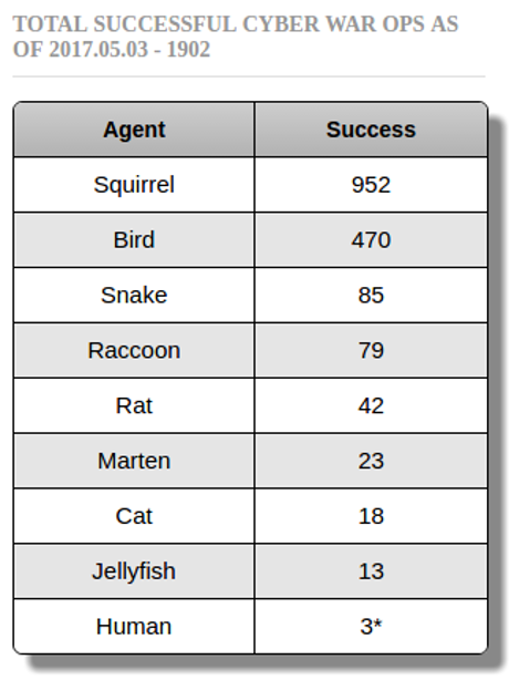
Electric Grid Threats – Squirrels 952 : CrashOverride 1 (maybe)

Filed under: Cybersecurity,Security,Terrorism — Patrick Durusau @ 9:44 am

If you are monitoring cyberthreats to the electric grid, compare the teaser document, Crash Override: Analysis of the Treat to Electric Grid Operators from Dragos, Inc. to the stats at CyberSquirrel1.com:

I say a “teaser” documents because the modules of greatest interest include: “This module was unavailable to Dragos at the time of publication” statements (4 out of 7) and:


If you are a Dragos, Inc. customer, you will have already received the more concise and technically in-depth intelligence report. It will be accompanied by follow-on reports, and the Dragos team will keep you up-to-date as things evolve.

If you have a copy of Dragos customer data on CrashOverride, be a dear and publish a diff against this public document.

Inquiring minds want to know. 😉

If you are planning to mount/defeat operations against an electric grid, a close study CyberSquirrel1.com cases will be instructive.

Creating and deploying grid damaging malware remains a challenging task.

Training an operative to mimic a squirrel, not so much.

June 12, 2017

FreeDiscovery

Filed under: Python,Scikit-Learn,Search Engines — Patrick Durusau @ 4:30 pm

FreeDiscovery: Open Source e-Discovery and Information Retrieval Engine

From the webpage:

FreeDiscovery is built on top of existing machine learning libraries (scikit-learn) and provides a REST API for information retrieval applications. It aims to benefit existing e-Discovery and information retrieval platforms with a focus on text categorization, semantic search, document clustering, duplicates detection and e-mail threading.

In addition, FreeDiscovery can be used as Python package and exposes several estimators with a scikit-learn compatible API.

Python 3.5+ required.

Homepage has command line examples, with a pointer to: http://freediscovery.io/doc/stable/examples/ for more examples.

The additional examples use a subset of the TREC 2009 legal collection. Cool!

I saw this in a tweet by Lynn Cherny today.

Enjoy!

The Hack2Win 2017 5K – IP Address 1 July 2017

Filed under: Contest,Cybersecurity — Patrick Durusau @ 8:09 am

No, an annoying road race, that’s $5K in USD!

Hack2Win 2017 – The Online Version

From the post:

Want to get paid for a vulnerability similar to this one?

Contact us at: ssd@beyondsecurity.com

We proud to announce the first online hacking competition!

The rules are very simple – you need to hack the D-link router (AC1200 / DIR-850L) and you can win up to 5,000$ USD.

To try and help you win – we bought a D-link DIR-850L device and plugged it to the internet (we will disclose the IP address on 1st of July 2017) for you to try to hack it, while the WAN access is the only point of entry for this device, we will be accepting LAN vulnerabilities as well.

If you successfully hack it – submit your findings to us ssd[]beyondsecurity.com, you will get paid and we will report the information to the vendor.

The competition will end on the 1st of September 2017 or if a total of 10,000$ USD was handed out to eligible research.
… (emphasis in original)

Great opportunity to learn about the D-link router (AC1200 / DIR-850L) because hacked doesn’t count:


Usage of any known method of hacking – known methods including anything that we can use Google/Bing/etc to locate – this includes: documented default password (that cannot be changed), known vulnerabilities/security holes (found via Google, exploit-db, etc)

Makes me think having all the known vulnerabilities of the D-link router (AC1200 / DIR-850L) could be a competitive advantage.

Topic maps anyone?

PS: For your convenience, I have packaged up the D-Link files as of Monday, 12 June 2017 for the AC1200, hardware version A1, AC1200-A1.zip.

June 10, 2017

If You Can’t See The Data, The Statistics Are False

Filed under: Advertising,Marketing,Statistics — Patrick Durusau @ 3:58 pm

The headline, If You Can’t See The Data, The Statistics Are False is my one line summary of 73.6% of all Statistics are Made Up – How to Interpret Analyst Reports by Mark Suster.

You should read Suster’s post in full, if for no other reason that his accounts of how statistics are created, that’s right, created, for reports:


But all of the data projections were so different so I decided to call some of the research companies and ask how they derived their data. I got the analyst who wrote one of the reports on the phone and asked how he got his projections. He must have been about 24. He said, literally, I sh*t you not, “well, my report was due and I didn’t have much time. My boss told me to look at the growth rate average over the past 3 years an increase it by 2% because mobile penetration is increasing.” There you go. As scientific as that.

I called another agency. They were more scientific. They had interviewed telecom operators, handset manufacturers and corporate buyers. They had come up with a CAGR (compounded annual growth rate) that was 3% higher that the other report, which in a few years makes a huge difference. I grilled the analyst a bit. I said, “So you interviewed the people to get a plausible story line and then just did a simple estimation of the numbers going forward?”

“Yes. Pretty much”

Write down the name of your favorite business magazine.

How many stories have you enjoyed over the past six months with “scientific” statistics like those?

Suster has five common tips for being a more informed consumer of data. All of which require effort on your part.

I have only one, which requires only reading on your part:

Can you see the data for the statistic? By that I mean is the original data, its collection method, who collected it, method of collection, when it was collected, etc., available to the reader?

If not, the statistic is either false or inflated.

The test I suggest is applicable at the point where you encounter the statistic. It puts the burden on the author who wants their statistic to be credited, to empower the user to evaluate their statistic.

Imagine the data analyst story where the growth rate statistic had this footnote:

1. Averaged growth rate over past three (3) years and added 2% at direction of management.

It reports the same statistic but also warns the reader the result is a management fantasy. Might be right, might be wrong.

Patronize publications with statistics + underlying data. Authors and publishers will get the idea soon enough.

June 9, 2017

Real Talk on Reality (Knowledge Gap on Leaking)

Filed under: Cybersecurity,Government Data,Leaks,NSA — Patrick Durusau @ 8:32 pm

Real Talk on Reality : Leaking is high risk by the grugq.

From the post:

On June 5th The Intercept released an article based on an anonymously leaked Top Secret NSA document. The article was about one aspect of the Russian cyber campaign against the 2016 US election — the targeting of election device manufacturers. The relevance of this aspect of the Russian operation is not exactly clear, but we’ll address that in a separate post because… just hours after The Intercept’s article went live the US Department of Justice released an affidavit (and search warrant) covering the arrest of Reality Winner — the alleged leaker. Let’s look at that!

You could teach a short course on leaking from this one post but there is one “meta” issue that merits your attention.

The failures of Reality Winner and the Intercept signal users need educating in the art of information leaking.

With wide spread tracking of web browsers, training on information leaking needs to be pushed to users. It would stand out if one member of the military requested and was sent an email lesson on leaking. An email that went to everyone in a particular command, not so much.

Public Service Announcements (PSAs) in web zines, as ads, etc. with only the barest of tips, is another mechanism to consider.

If you are very creative, perhaps “Mr. Bill” claymation episodes with one principle of leaking each? Need to be funny enough that viewing/sharing isn’t suspicious.

Other suggestions?

Raw FBI Uniform Crime Report (UCR) Files for 2015 (NICAR Database Library)

Filed under: FBI,Government Data,Journalism,News,Reporting — Patrick Durusau @ 7:31 pm

IRE & NICAR to freely publish unprocessed data by Charles Minshew.

From the post:

Inspired by our members, IRE is pleased to announce the first release of raw, unprocessed data from the NICAR Database Library.

The contents of the FBI’s Uniform Crime Report (UCR) master file for 2015 are now available for free download on our website. The package contains the original fixed-width files, data dictionaries for the tables as well as the FBI’s UCR user guide. We are planning subsequent releases of other raw data that is not readily available online.

The yearly data from the FBI details arrest and offense numbers for police agencies across the United States. If you download this unprocessed data, expect to do some work to get it in a useable format. The data is fixed-width, across multiple tables, contains many records on a single row that need to be unpacked and in some cases decoded, before being cleaned and imported for use in programs like Excel or your favorite database manager. Not up to the task? We do all of this work in the version of the data that we will soon have for sale in the Database Library.

I have peeked at the data and documentation files and “raw” is the correct term.

Think of it as great exercise for when an already cleaned and formatted data set isn’t available.

More to follow on processing this data set.

(Legal) Office of Personnel Management Data!

Filed under: Government,Government Data,Open Data,Open Government — Patrick Durusau @ 4:30 pm

We’re Sharing A Vast Trove Of Federal Payroll Records by Jeremy Singer-Vine.

From the post:

Today, BuzzFeed News is sharing an enormous dataset — one that sheds light on four decades of the United States’ federal payroll.

The dataset contains hundreds of millions of rows and stretches all the way back to 1973. It provides salary, title, and demographic details about millions of U.S. government employees, as well as their migrations into, out of, and through the federal bureaucracy. In many cases, the data also contains employees’ names.

We obtained the information — nearly 30 gigabytes of it — from the U.S. Office of Personnel Management, via the Freedom of Information Act (FOIA). Now, we’re sharing it with the public. You can download it for free on the Internet Archive.

This is the first time, it seems, that such extensive federal payroll data is freely available online, in bulk. (The Asbury Park Press and FedsDataCenter.com both publish searchable databases. They’re great for browsing, but don’t let you download the data.)

We hope that policy wonks, sociologists, statisticians, fellow journalists — or anyone else, for that matter — find the data useful.

We obtained the information through two Freedom of Information Act requests to OPM. The first chunk of data, provided in response to a request filed in September 2014, covers late 1973 through mid-2014. The second, provided in response to a request filed in December 2015, covers late 2014 through late 2016. We have submitted a third request, pending with the agency, to update the data further.

Between our first and second requests, OPM announced it had suffered a massive computer hack. As a result, the agency told us, it would no longer release certain information, including the employee “pseudo identifier” that had previously disambiguated employees with common names.

What a great data release! Kudos and thanks to BuzzFeed News!

If you need the “pseudo identifiers” for the second or following releases and/or data for the employees withheld (generally the more interesting ones), consult data from the massive computer hack.

Or obtain the excluded data directly from the Office of Personnel Management without permission.

Enjoy!

Open Data = Loss of Bureaucratic Power

Filed under: FOIA,Government,Open Data,Open Government — Patrick Durusau @ 1:07 pm

James Comey’s leaked memos about meetings with President Trump illustrates one reason for the lack of progress on open data reported in FOIA This! The Depressing State of Open Data by Toby McIntosh.

From Former DOJ Official on Comey Leak: ‘Standard Operating Procedure’ Among Bureaucrats:


On “Fox & Friends” today, J. Christian Adams said the leak of the memos by Comey was in line with “standard operating procedure” among Beltway bureaucrats.

“[They] were using the media, using confidential information to advance attacks on the President of the United States. That’s what they do,” said Adams, adding he saw it go on at DOJ.

Access to information is one locus of bureaucratic power, which makes the story in FOIA This! The Depressing State of Open Data a non-surprise:

In our latest look at FOIA around the world, we examine the state of open data sets. According to the new report by the World Wide Web Foundation, the news is not good.

“The number of global truly open datasets remains at a standstill,” according to the group’s researchers, who say that only seven percent of government data is fully open.

The findings come in the fourth edition of the Open Data Barometer, an annual assessment which was enlarged this year to include 1,725 datasets from 15 different sectors across 115 countries. The report summarizes:

Only seven governments include a statement on open data by default in their current policies. Furthermore, we found that only 7 percent of the data is fully open, only one of every two datasets is machine readable and only one in four datasets has an open license. While more data has become available in a machine-readable format and under an open license since the first edition of the Barometer, the number of global truly open datasets remains at a standstill.

Based on the detailed country-by-country rankings, the report says some countries continue to be leaders on open data, a few have stepped up their game, but some have slipped backwards.

With open data efforts at a standstill and/or sliding backwards, waiting for bureaucrats to voluntarily relinquish power is a non-starter.

There are other options.

Need I mention the Office of Personnel Management hack? The highly touted but apparently fundamentally vulnerable NSA?

If you need a list of cyber-vulnerable U.S. government agencies, see: A-Z Index of U.S. Government Departments and Agencies.

You can:

  • wait for bureaucrats to abase themselves,
  • post how government “…ought to be transparent and accountable…”
  • echo opinions of others on calling for open data,

or, help yourself to government collected, generated, or produced data.

Which one do you think is more effective?

June 8, 2017

Roman Roads (Drawn Like The London Subway)

Filed under: History,Humanities,Mapping,Maps,Visualization — Patrick Durusau @ 8:20 pm

Roman Roads by Sasha Trubetskoy.

See Trubetskoy’s website for a much better rendering of this map of Roman roads, drawn in subway-style.

From the post:

It’s finally done. A subway-style diagram of the major Roman roads, based on the Empire of ca. 125 AD.

Creating this required far more research than I had expected—there is not a single consistent source that was particularly good for this. Huge shoutout to: Stanford’s ORBIS model, The Pelagios Project, and the Antonine Itinerary (found a full PDF online but lost the url).

The lines are a combination of actual, named roads (like the Via Appia or Via Militaris) as well as roads that do not have a known historic name (in which case I creatively invented some names). Skip to the “Creative liberties taken” section for specifics.

How long would it actually take to travel this network? That depends a lot on what method of transport you are using, which depends on how much money you have. Another big factor is the season – each time of year poses its own challenges. In the summer, it would take you about two months to walk on foot from Rome to Byzantium. If you had a horse, it would only take you a month.

However, no sane Roman would use only roads where sea travel is available. Sailing was much cheaper and faster – a combination of horse and sailboat would get you from Rome to Byzantium in about 25 days, Rome to Carthage in 4-5 days. Check out ORBIS if you want to play around with a “Google Maps” for Ancient Rome. I decided not to include maritime routes on the map for simplicity’s sake.

Subway-style drawing lose details but make relationships between routes clearer. Or at least that is one of the arguments in their favor.

Thoughts on a subway-style drawing that captures the development of the Roman road system? To illustrate how that corresponds in broad strokes to the expansion of Rome?

Be sure to visit Trubetskoy’s homepage. Lot’s of interesting maps and projects.

Medieval illuminated manuscripts

Filed under: Art,Humanities,Manuscripts — Patrick Durusau @ 4:55 pm

Medieval illuminated manuscripts by Robert Miller (reference and instruction librarian at the University of Maryland University College)

From the post:

With their rich representation of medieval life and thought, illuminated manuscripts serve as primary sources for scholars in any number of fields: history, literature, art history, women’s studies, religious studies, philosophy, the history of science, and more.

But you needn’t be conducting research to immerse yourself in the world of medieval manuscripts. The beauty, pathos, and earthy humor of illuminated manuscripts make them a delight for all. Thanks to digitization efforts by libraries and museums worldwide, the colorful creations of the medieval imagination—dreadful demons, armies of Amazons, gardens, gems, bugs, birds, celestial vistas, and simple scenes of everyday life—are easily accessible online.

I count:

  • 10 twitter accounts to follow/search
  • 11 sites with manuscript collections
  • 15 blogs and other manuscript sites

A great resource for students of all ages who are preparing research papers!

Enjoy and pass this one along!

You Are Not Google (Blasphemy I Know, But He Said It, Not Me)

Filed under: Design,Programming,Project Management — Patrick Durusau @ 4:30 pm

You Are Not Google by Ozan Onay.

From the post:

Software engineers go crazy for the most ridiculous things. We like to think that we’re hyper-rational, but when we have to choose a technology, we end up in a kind of frenzy — bouncing from one person’s Hacker News comment to another’s blog post until, in a stupor, we float helplessly toward the brightest light and lay prone in front of it, oblivious to what we were looking for in the first place.

This is not how rational people make decisions, but it is how software engineers decide to use MapReduce.

Spoiler: Onay will also say you are not Amazon or LinkedIn.

Just so you know and can prepare for the ego shock.

Great read that invokes Poyla’s First Principle:


Understand the Problem

This seems so obvious that it is often not even mentioned, yet students are often stymied in their efforts to solve problems simply because they don’t understand it fully, or even in part. Polya taught teachers to ask students questions such as:

  • Do you understand all the words used in stating the problem?
  • What are you asked to find or show?
  • Can you restate the problem in your own words?
  • Can you think of a picture or a diagram that might help you understand the problem?
  • Is there enough information to enable you to find a solution?

Onay coins a mnemonic for you to apply and points to additional reading.

Enjoy!

PS: Caution: Understanding a problem can cast doubt on otherwise successful proposals for funding. Your call.

The Secret Life of Bar Codes

Filed under: Identifiers — Patrick Durusau @ 3:18 pm

The Secret Life of Bar Codes by Richard Baguley.

From the post:

Some technologies you use every day, but without thinking about them. The bar code is one of these: everything you buy has one of these black and white striped codes on it. We’ve all seen how they are used: the cashier scans the code and the details and price pop up on the screen. The bar code identifies one product of the millions that are on sale at any one time. How does it do that? Let’s find out.

The bar code

The bar code itself is very simple: a series of black and white stripes of varying width. These are scanned by a bar code reader. Here, a rapidly moving laser passes over the code, and a sensor detects the reflection, picking up the alternating pattern of light and dark. A computer translates the differences between the widths of the patterns into numbers. One pattern is translated into a 0, another into a 1, another into a 2 and so on. You don’t have to have a laser to read a bar code, though. There are plenty of apps that can find a bar code in a picture taken with the onboard camera.

(image omitted)

The type of bar code used on products is known as a linear code, because you read it from left to right in a straight line. There are many other types that work differently and that can encode more data, from the QR codes that often contain website addresses to more arcane types such as the Maxicode that UPS uses to store the delivery address on package labels. These aren’t used on products you buy in a store, though, because all the bar code needs to contain for a product sold in the US is a single 12-digit number, called the Universal Product Code (UPC).

The structure of the bar code on things that you buy at the store is based on the UPC-A standard UPC code, This is 12 digits long, but there is a version that shortens this down to seven digits (called the UPC-E standard) by removing some of the data. This makes the bar code smaller, which is useful for smaller products like candy bars or chewing gum.

Be careful with Baguley’s post. The links I saw while copying are full of tracking BS, which I removed from the quote you see.

Still, a nice treatment of bar codes, one form of identifiers and a common one.

The Barcode Island is a treasure trove of information on bar codes. See also Bar Code 1, which has a link to Magazines on Barcodes.

I can understand and appreciate people learning assembly but magazines on bar codes? Yikes! Different strokes I guess.

Enjoy!

Protecting Sources, Leaks and Journalistic Credibility

Filed under: Journalism,News,Reporting — Patrick Durusau @ 2:42 pm

Protecting Your Sources When Releasing Sensitive Documents by Ted Han and Quinn Norton.

From the post:

Extraordinary documentation can make for an extraordinary story—and terrible trouble for sources and vulnerable populations if handled without enough care. Recently, the Intercept published a story about a leaked NSA report, posted to DocumentCloud, that alleged Russian hacker involvement in a campaign to phish American election officials. Simultaneously, the FBI arrested a government contractor, Reality Winner, for allegedly leaking documents to an online news outlet. The affidavit partially revealed how Winner was caught leaking by the FBI, including a postmark and physical characteristics of the document that the Intercept posted.

The Intercept isn’t alone in leaving digital footprints in their article material. In a post called “We Are with John McAfee Right Now, Suckers,” Vice posted a picture of the at-the-time fugitive John McAfee, complete with GPS coordinates pinpointing their source’s location, who was shortly in official custody. In 2014, the New York Times improperly redacted an NSA document from the Snowden trove, revealing the name of an NSA agent.

The first step with any sensitive material is to consider what will happen when the subjects or public sees that material. It can be hard to pause in the rush of getting a story out, but giving some thought to the nature of the information you’re releasing, what needs to be released, what could be used in unexpected ways, and what could harm people, can prevent real problems.

Han and Norton cover document metadata, which I omitted in Are Printer Dots The Only Risk? along with some of the physical identifiers I mentioned.

Plus they have good advice on other identifying aspects of documents, such as content and locations.

Despite my waiting and calling for a full release of the Panama Papers, is there a credibility aspect to the publication of sensitive documents?

Another era but had Walter Cronkite said that he read a leaked NSA document and reported the same facts as the Intercept, his report would have been taken as the “facts” contained in that report.

To what extent is journalism losing credibility because it isn’t asking to be treated as credible? Merely as accurate repeaters of lies prepared and printed elsewhere?

Open data quality – Subject Identity By Another Name

Filed under: Open Data,Record Linkage,Subject Identity,Topic Maps,XQuery — Patrick Durusau @ 1:03 pm

Open data quality – the next shift in open data? by Danny Lämmerhirt and Mor Rubinstein.

From the post:

Some years ago, open data was heralded to unlock information to the public that would otherwise remain closed. In the pre-digital age, information was locked away, and an array of mechanisms was necessary to bridge the knowledge gap between institutions and people. So when the open data movement demanded “Openness By Default”, many data publishers followed the call by releasing vast amounts of data in its existing form to bridge that gap.

To date, it seems that opening this data has not reduced but rather shifted and multiplied the barriers to the use of data, as Open Knowledge International’s research around the Global Open Data Index (GODI) 2016/17 shows. Together with data experts and a network of volunteers, our team searched, accessed, and verified more than 1400 government datasets around the world.

We found that data is often stored in many different places on the web, sometimes split across documents, or hidden many pages deep on a website. Often data comes in various access modalities. It can be presented in various forms and file formats, sometimes using uncommon signs or codes that are in the worst case only understandable to their producer.

As the Open Data Handbook states, these emerging open data infrastructures resemble the myth of the ‘Tower of Babel’: more information is produced, but it is encoded in different languages and forms, preventing data publishers and their publics from communicating with one another. What makes data usable under these circumstances? How can we close the information chain loop? The short answer: by providing ‘good quality’ open data.

Congratulations to Open Knowledge International on re-discovering the ‘Tower of Babel’ problem that prevents easy re-use of data.

Contrary to Lämmerhirt and Rubinstein’s claim, barriers have not “…shifted and multiplied….” More accurate to say Lämmerhirt and Rubinstein have experienced what so many other researchers have found for decades:


We found that data is often stored in many different places on the web, sometimes split across documents, or hidden many pages deep on a website. Often data comes in various access modalities. It can be presented in various forms and file formats, sometimes using uncommon signs or codes that are in the worst case only understandable to their producer.

The record linkage community, think medical epidemiology, has been working on aspects of this problem since the 1950’s at least (under that name). It has a rich and deep history, focused in part on mapping diverse data sets to a common representation and then performing analysis upon the resulting set.

A common omission in record linkage is to capture in discoverable format, the basis for mapping of the diverse records to a common format. That is subjects represented by “…uncommon signs or codes that are in the worst case only understandable to their producer,” that Lämmerhirt and Rubinstein complain of, although signs and codes need not be “uncommon” to be misunderstood by others.

To their credit, unlike RDF and the topic maps default, record linkage has long recognized that identification consists of multiple parts and not single strings.

Topic maps, at least at their inception, was unaware of record linkage and the vast body of research done under that moniker. Topic maps were bitten by the very problem they were seeking to solve. That being a subject, could be identified many different ways and information discovered by others about that subject, could be nearby but undiscoverable/unknown.

Rather than building on the experience with record linkage, topic maps, at least in the XML version, defaulted to relying on URLs to identify the location of subjects (resources) and/of identifying subjects (identifiers). Avoiding the Philosophy 101 mistakes of RDF, confusing locators and identifiers + refusing to correct the confusion, wasn’t enough for topic maps to become widespread. One suspects in part because topic maps were premised on creating more identifiers for subjects which already had them.

Imagine that your company has 1,000 employees and in order to use a new system, say topic maps, everyone must get a new name. Can’t use the old one. Do you see a problem? Now multiple that by every subject anyone in your company wants to talk about. We won’t run out of identifiers but your staff will certainly run out of patience.

Robust solutions to the open data ‘Tower of Babel’ issue will include the use of multi-part identifications extant in data stores, dynamic creation of multi-part identifications when necessary (note, no change to existing data store), discoverable documentation of multi-part identifications and their mappings, where syntax and data models are up to the user of data.

That sounds like a job for XQuery to me.

You?
XSL Transformations (XSLT) Version 3.0 (That’s a Wrap!)

Filed under: XML,XSLT — Patrick Durusau @ 10:02 am

XSL Transformations (XSLT) Version 3.0 W3C Recommendation 8 June 2017

Abstract:

This specification defines the syntax and semantics of XSLT 3.0, a language designed primarily for transforming XML documents into other XML documents.

XSLT 3.0 is a revised version of the XSLT 2.0 Recommendation [XSLT 2.0] published on 23 January 2007.

The primary purpose of the changes in this version of the language is to enable transformations to be performed in streaming mode, where neither the source document nor the result document is ever held in memory in its entirety. Another important aim is to improve the modularity of large stylesheets, allowing stylesheets to be developed from independently-developed components with a high level of software engineering robustness.

XSLT 3.0 is designed to be used in conjunction with XPath 3.0, which is defined in [XPath 3.0]. XSLT shares the same data model as XPath 3.0, which is defined in [XDM 3.0], and it uses the library of functions and operators defined in [Functions and Operators 3.0]. XPath 3.0 and the underlying function library introduce a number of enhancements, for example the availability of higher-order functions.

As an implementer option, XSLT 3.0 can also be used with XPath 3.1. All XSLT 3.0 processors provide maps, an addition to the data model which is specified (identically) in both XSLT 3.0 and XPath 3.1. Other features from XPath 3.1, such as arrays, and new functions such as random-number-generatorFO31 and sortFO31, are available in XSLT 3.0 stylesheets only if the implementer chooses to support XPath 3.1.

Some of the functions that were previously defined in the XSLT 2.0 specification, such as the format-dateFO30 and format-numberFO30 functions, are now defined in the standard function library to make them available to other host languages.

XSLT 3.0 also includes optional facilities to serialize the results of a transformation, by means of an interface to the serialization component described in [XSLT and XQuery Serialization]. Again, the new serialization capabilities of [XSLT and XQuery Serialization 3.1] are available at the implementer’s option.

This document contains hyperlinks to specific sections or definitions within other documents in this family of specifications. These links are indicated visually by a superscript identifying the target specification: for example XP30 for XPath 3.0, DM30 for the XDM data model version 3.0, FO30 for Functions and Operators version 3.0.

A special shout out to Michael Kay for, in his words, “Done and dusted: ten years’ work.”

Thanks from an appreciative audience!

June 7, 2017

Copy-n-Paste Security Alert!

Filed under: Cybersecurity,Programming,R — Patrick Durusau @ 8:40 pm

Security: The Dangers Of Copying And Pasting R Code.

From the post:

Most of the time when we stumble across a code snippet online, we often blindly copy and paste it into the R console. I suspect almost everyone does this. After all, what’s the harm?

The post illustrates how innocent appearing R code can conceal unhappy surprises!

Concealment isn’t limited to R code.

Any CSS controlled display is capable of concealing code for you to copy-n-paste into a console, terminal window, script or program.

Endless possibilities for HTML pages/emails with code + a “little something extra.”

What are your copy-n-paste practices?

Personal Malware Analysis Lab – Summer Project

Filed under: Cybersecurity,Malware,Security — Patrick Durusau @ 7:30 pm

Set up your own malware analysis lab with VirtualBox, INetSim and Burp by Christophe Tafani-Dereeper.

Whether you are setting this up for yourself and/or a restless child, what a great summer project!

You can play as well so long as you don’t mind losing to nimble minded tweens and teens. 😉

It’s never too early to teach cybersecurity and penetration skills or to practice your own.

With a little imagination as far as prizes, this could be a great family activity.

It’s a long way from playing Yahtzee with your girlfriend, her little brother and her mother, but we have all come a long way since then.

Tor 7.0! (Won’t Protect You From @theintercept)

Filed under: Cybersecurity,Privacy,Tor — Patrick Durusau @ 7:11 pm

Tor Browser 7.0 Is Out!

The Tor browser is great but recognize its limitations.

A primary one is Tor can’t protect you from poor judgment @theintercept. No software can do that.

Change your other habits as appropriate.

Financial Times Visual Vocabulary

Filed under: D3,Graphics,Visualization — Patrick Durusau @ 4:08 pm

Financial Times Visual Vocabulary

From the webpage:

A poster and web site to assist designers and journalists to select the optimal symbology for data visualisations, by the Financial Times Visual Journalism Team. Inspired by the Graphic Continuum by Jon Schwabish and Severino Ribecca.

Read the Chart Doctor feature column for full background on why we made this: Simple techniques for bridging the graphics language gap

For D3 templates for producing many of these chart types in FT style, see our Visual Vocabulary repo.

The Financial Times sets a high bar for financial graphics.

Here it provides tools and guidance to help you meet with similar success.

Enjoy and pass this along.

Where the Greeks and Romans White Supremacists?

Filed under: Art,Bias,Diversity,History,Humanities — Patrick Durusau @ 3:02 pm

Why We Need to Start Seeing the Classical World in Color by Sarah E. Bond.

From the post:

Modern technology has revealed an irrefutable, if unpopular, truth: many of the statues, reliefs, and sarcophagi created in the ancient Western world were in fact painted. Marble was a precious material for Greco-Roman artisans, but it was considered a canvas, not the finished product for sculpture. It was carefully selected and then often painted in gold, red, green, black, white, and brown, among other colors.

A number of fantastic museum shows throughout Europe and the US in recent years have addressed the issue of ancient polychromy. The Gods in Color exhibit travelled the world between 2003–15, after its initial display at the Glyptothek in Munich. (Many of the photos in this essay come from that exhibit, including the famed Caligula bust and the Alexander Sarcophagus.) Digital humanists and archaeologists have played a large part in making those shows possible. In particular, the archaeologist Vinzenz Brinkmann, whose research informed Gods in Color, has done important work, applying various technologies and ultraviolet light to antique statues in order to analyze the minute vestiges of paint on them and then recreate polychrome versions.

Acceptance of polychromy by the public is another matter. A friend peering up at early-20th-century polychrome terra cottas of mythological figures at the Philadelphia Museum of Art once remarked to me: “There is no way the Greeks were that gauche.” How did color become gauche? Where does this aesthetic disgust come from? To many, the pristine whiteness of marble statues is the expectation and thus the classical ideal. But the equation of white marble with beauty is not an inherent truth of the universe. Where this standard came from and how it continues to influence white supremacist ideas today are often ignored.

Most museums and art history textbooks contain a predominantly neon white display of skin tone when it comes to classical statues and sarcophagi. This has an impact on the way we view the antique world. The assemblage of neon whiteness serves to create a false idea of homogeneity — everyone was very white! — across the Mediterranean region. The Romans, in fact, did not define people as “white”; where, then, did this notion of race come from?

A great post and reminder that learning history (or current events) through a particular lens isn’t the same as the only view of history (or current events).

I originally wrote “an accurate view of history….” but that’s not true. At best we have one or more views and when called upon to act, make decisions upon those views. “Accuracy” is something that lies beyond our human grasp.

The reminder I would add to this post is that recognition of a lens, in this case, the absence of color in our learning of history, isn’t overcome by our naming it and perhaps nodding in agreement, yes, that was a short fall in our learning.

“Knowing” about the coloration of familiar art work doesn’t erase centuries of considering it without color. No amount of pretending will make it otherwise.

Humanists should learn about and promote the use of colorization so the youth of today learn different traditions than the ones we learned.

June 6, 2017

Are Printer Dots The Only Risk?

Filed under: Cybersecurity,Security — Patrick Durusau @ 7:29 pm

Seth Schoen gives a good summary of printer dot issues in Printer Tracking Dots Back in the News.

From the post:

Several journalists and experts have recently focused on the fact that a scanned document published by The Intercept contained tiny yellow dots produced by a Xerox DocuColor printer. Those dots allow the document’s origin and date of printing to be ascertained, which could have played a role in the arrest of Reality Leigh Winner, accused of leaking the document. EFF has previously researched this tracking technology at some length; our work on it has helped bring it to public attention, including in a somewhat hilarious video.

Schoen’s post and references are fine as far as they go, but there are other dangers associated with printers.

For example:

  • The material in or omitted from a document can by used to identify the origin of a document.
  • The order of material in a document, a list, paragraph or footnote can be used to identify the origin of a document.
  • Micro-spacing of characters, invisible to the naked eye, may represent identification patterns.
  • Micro-spacing of margins or other white space characteristics may represent identification patterns.
  • Changes to the placement of headers, footers, page numbers, may represent identification patterns.

All of these techniques work with black and white printers as well as color printers.

The less security associated with a document and/or the wider its distribution, the less likely you are to encounter such techniques. Maybe.

Even if your source has an ironclad alibi, sharing a leaked document with a government agency is risky business. (full stop)

Just don’t do it!

John Carlisle Hunts Bad Science (you can too!)

Filed under: Data Science,Science,Statistics — Patrick Durusau @ 6:42 pm

Carlisle’s statistics bombshell names and shames rigged clinical trials by Leonid Schneider.

From the post:

John Carlisle is a British anaesthesiologist, who works in a seaside Torbay Hospital near Exeter, at the English Channel. Despite not being a professor or in academia at all, he is a legend in medical research, because his amazing statistics skills and his fearlessness to use them exposed scientific fraud of several of his esteemed anaesthesiologist colleagues and professors: the retraction record holder Yoshitaka Fujii and his partner Yuhji Saitoh, as well as Scott Reuben and Joachim Boldt. This method needs no access to the original data: the number presented in the published paper suffice to check if they are actually real. Carlisle was fortunate also to have the support of his journal, Anaesthesia, when evidence of data manipulations in their clinical trials was found using his methodology. Now, the editor Carlisle dropped a major bomb by exposing many likely rigged clinical trial publications not only in his own Anaesthesia, but in five more anaesthesiology journals and two “general” ones, the stellar medical research outlets NEJM and JAMA. The clinical trials exposed in the latter for their unrealistic statistics are therefore from various fields of medicine, not just anaesthesiology. The medical publishing scandal caused by Carlisle now is perfect, and the elite journals had no choice but to announce investigations which they even intend to coordinate. Time will show how seriously their effort is meant.

Carlisle’s bombshell paper “Data fabrication and other reasons for non-random sampling in 5087 randomised, controlled trials in anaesthetic and general medical journals” was published today in Anaesthesia, Carlisle 2017, DOI: 10.1111/anae.13962. It is accompanied by an explanatory editorial, Loadsman & McCulloch 2017, doi: 10.1111/anae.13938. A Guardian article written by Stephen Buranyi provides the details. There is also another, earlier editorial in Anaesthesia, which explains Carlisle’s methodology rather well (Pandit, 2012).

… (emphasis in original)

Cutting to the chase, Carlisle found 90 papers with statistical patterns unlikely to occur by chance in 5,087 clinical trials.

There is a wealth of science papers to be investigated, Sarah Boon, in 21st Century Science Overload points out (2016) there are 2.5 million new scientific papers published every year, in 28,100 active scholarly peer-reviewed journals (2014).

Since Carlisle has done eight (8) journals, that leaves ~28,092 for your review. 😉

Happy hunting!

PS: I can easily imagine an exercise along these lines being the final project for a data mining curriculum. You?

« Newer PostsOlder Posts »

Powered by WordPress