Another Word For It Patrick Durusau on Topic Maps and Semantic Diversity

March 2, 2014

One Thing Leads To Another (#NICAR2014)

Filed under: Data Mining,Government,Government Data,News,Reporting — Patrick Durusau @ 11:51 am

A tweet this morning read:

overviewproject ‏@overviewproject 1h
.@djournalismus talking about handling 2.5 million offshore leaks docs. Content equivalent to 50,000 bibles. #NICAR14

That sound interesting! Can’t ever tell when a leaked document will prove useful. But where to find this discussion?

Following #NICAR14 leaves you with the impression this is a conference. (I didn’t recognize the hashtag immediately.)

Searching on the web, the hashtag lead me to: 2014 Computer-Assisted Reporting Conference. (NICAR = National Institute for Computer-Assisted Reporting)

The handle @djournalismus offers the name Sebastian Mondia.

Checking the speakers list, I found this presentation:

Inside the global offshore money maze
Event: 2014 CAR Conference
Speakers: David Donald, Mar Cabra, Margot Williams, Sebastian Mondial
Date/Time: Saturday, March 1 at 2 p.m.
Location: Grand Ballroom West
Audio file: No audio file available.

The International Consortium of Investigative Journalists “Secrecy For Sale: Inside The Global Offshore Money Maze” is one of the largest and most complex cross-border investigative projects in journalism history. More than 110 journalists in about 60 countries analyzed a 260 GB leaked hard drive to expose the systematic use of tax havens. Learn how this multinational team mined 2.5 million files and cracked open the impenetrable offshore world by creating a web app that revealed the ownership behind more than 100,000 anonymous “shell companies” in 10 offshore jurisdictions.

Along the way I discovered the speakers list, who cover a wide range of subjects of interest to anyone mining data.

Another treasure is the Tip Sheets and Tutorial page. Here are six (6) selections out of sixty-one (61) items to pique your interest:

  • Follow the Fracking
  • Maps and charts in R: real newsroom examples
  • Wading through the sea of data on hospitals, doctors, medicine and more
  • Free the data: Getting government agencies to give up the goods
  • Campaign Finance I: Mining FEC data
  • Danger! Hazardous materials: Using data to uncover pollution

Not to mention that NICAR2012 and NICAR2013 are also accessible from the NICAR2014 page, with their own “tip” listings.

If you find this type of resource useful, be sure to check out Investigative Reporters and Editors (IRE)

About the IRE:

Investigative Reporters and Editors, Inc. is a grassroots nonprofit organization dedicated to improving the quality of investigative reporting. IRE was formed in 1975 to create a forum in which journalists throughout the world could help each other by sharing story ideas, newsgathering techniques and news sources.

IRE provides members access to thousands of reporting tip sheets and other materials through its resource center and hosts conferences and specialized training throughout the country. Programs of IRE include the National Institute for Computer Assisted Reporting, DocumentCloud and the Campus Coverage Project

Learn more about joining IRE and the benefits of membership.

Sounds like a win-win offer to me!

You?
February 25, 2014

The Data Mining Group releases PMML v 4.2

Filed under: Data Mining,Predictive Model Markup Language (PMML) — Patrick Durusau @ 5:09 pm

The Data Mining Group releases PMML v 4.2

From the announcement:

“As a standard, PMML provides the glue to unify data science and operational IT. With one common process and standard, PMML is the missing piece for Big Data initiatives to enable rapid deployment of data mining models. Broad vendor support and rapid customer adoption demonstrates that PMML delivers on its promise to reduce cost, complexity and risk of predictive analytics,” says Alex Guazzelli, Vice President of Analytics, Zementis. “You can not build and deploy predictive models over big data without using multiple models and no one should build multiple models without PMML,” says Bob Grossman, Founder and Partner at Open Data Group.

Some of the elements that are new to PMML v4.2 include:

  • Improved support for post-processing, model types, and model elements
  • A completely new element for text mining
  • Scorecards now introduce the ability to compute points based on expressions
  • New built-in functions, including “matches” and “replace” for the use of regular expressions

(emphasis added)

Hmmm, do you think they meant before 4.2 they didn’t have “matches” and “replace?” (I checked, they didn’t.)

However, kudos on the presentation of their schema, both current and prior versions.

More XML schemas had such documentation/presentation.

See PMML v.42 General Structure.

I first saw this at: The Data Mining Group releases PMML v4.2 Predictive Modeling Standard.

February 24, 2014

Word Tree [Standard Editor’s Delight]

Filed under: Data Mining,Text Analytics,Visualization — Patrick Durusau @ 3:45 pm

Word Tree by Jason Davies.

From the webpage:

The Word Tree visualisation technique was invented by the incredible duo Martin Wattenberg and Fernanda Viégas in 2007. Read their paper for the full details.

Be sure to also check out various text analysis projects by Santiago Ortiz

Created by Jason Davies. Thanks to Mike Bostock for comments and suggestions. .

This is excellent!

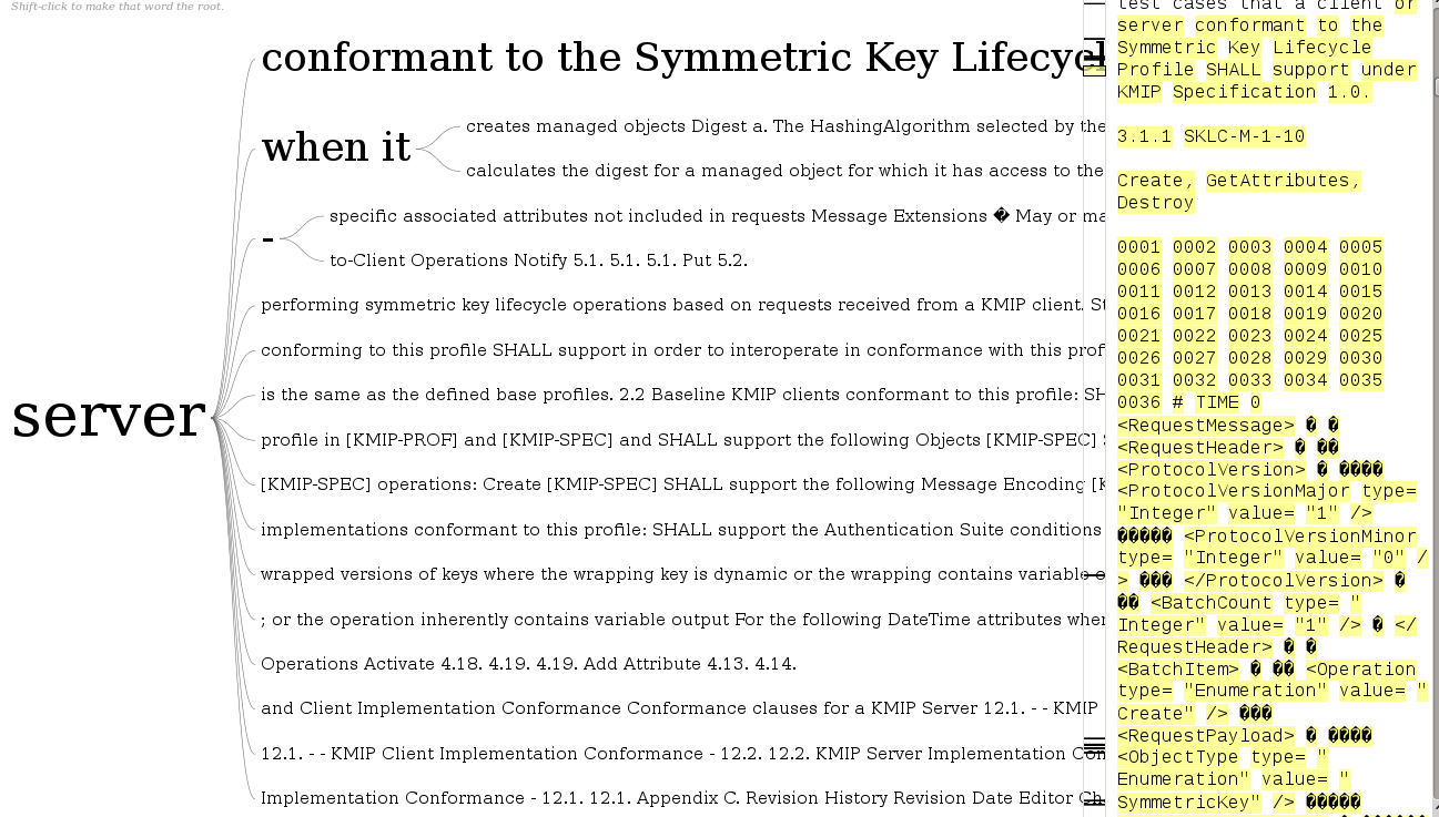
I pasted in the URL from a specification I am reviewing and got this result:

wordtree

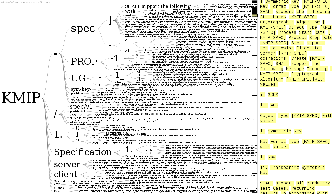
I then changed the focus to “server” and had this result:

wordtree2

Granted I need to play with it a good bit more but not bad for throwing a URL at the page.

I started to say this probably won’t work across multiple texts, in order to check consistency of the documents.

But, I already have text versions of the files with various formatting and boilerplate stripped out. I could just cat all the files together and then run word tree on the resulting file.

Would make checking for consistency a lot easier. True, tracking down the inconsistencies will be a pain but that’s going to be true in any event.

Not feasible to do it manually with 600+ pages of text spread over twelve (12) documents. Well, could if I were in a monastery and had several months to complete the task. 😉

This also looks like a great data exploration tool for topic map authoring as well.

I first saw this in a tweet by Elena Glassman.

February 18, 2014

Data Analysis: The Hard Parts

Filed under: Data Analysis,Data Mining — Patrick Durusau @ 11:51 am

Data Analysis: The Hard Parts by Milo Braun.

Milo has cautions about data tools that promise quick and easy data analysis:

  1. data analysis is so easy to get wrong
  2. it’s too easy to lie to yourself about it working
  3. it’s very hard to tell whether it could work if it doesn’t
  4. there is no free lunch

You will find yourself nodding along as you read Milo’s analysis.

I particularly liked:

So in essence, there is no way around properly learning data analysis skills. Just like you wouldn’t just give a blowtorch to anyone, you need proper training so that you know what you’re doing and produce robust and reliable results which deliver in the real-world. Unfortunately, this training is hard, as it requires familiarity with at least linear algebra and concepts of statistics and probability theory, stuff which classical coders are not that well trained in.

I agree on the blowtorch question but then I am not in corporate management.

The corporate management answer is yes, just about anyone can have a data blowtorch. “Who is more likely to provide a desired answer?,” is the management question for blowtorch assignments.

I recommend Milo’s post and the resources he points to in order for you to become a competent data scientist.

Competence may give you an advantage in a blowtorch war.

I first saw this in a tweet by Peter Skomoroch.

February 15, 2014

Anaconda 1.9

Filed under: Anaconda,Data Mining,Python — Patrick Durusau @ 10:22 am

Anaconda 1.9

From the homepage:

Completely free enterprise-ready Python distribution for large-scale data processing, predictive analytics, and scientific computing

  • 125+ of the most popular Python packages for science, math, engineering, data analysis
  • Completely free – including for commercial use and even redistribution
  • Cross platform on Linux, Windows, Mac
  • Installs into a single directory and doesn’t affect other Python installations on your system. Doesn’t require root or local administrator privileges.
  • Stay up-to-date by easily updating packages from our free, online repository
  • Easily switch between Python 2.6, 2.7, 3.3, and experiment with multiple versions of libraries, using our conda package manager and its great support for virtual environments

In addition to maintaining Anaconda as a free Python distribution, Continuum Analytics offers consulting/training services and commercial packages to enhance your use of Anaconda.

Before hitting “download,” know that the Linux 64-bit distribution is just short of 649 MB. Not an issue for most folks but there are some edge cases where it might be.

February 13, 2014

Mining of Massive Datasets 2.0

Filed under: BigData,Data Mining,Graphs,MapReduce — Patrick Durusau @ 3:29 pm

Mining of Massive Datasets 2.0

From the webpage:

The following is the second edition of the book, which we expect to be published soon. We have added Jure Leskovec as a coauthor. There are three new chapters, on mining large graphs, dimensionality reduction, and machine learning.

There is a revised Chapter 2 that treats map-reduce programming in a manner closer to how it is used in practice, rather than how it was described in the original paper. Chapter 2 also has new material on algorithm design techniques for map-reduce.

Aren’t you wishing for more winter now? 😉

I first saw this in a tweet by Gregory Piatetsky.

February 7, 2014

What’s behind a #1 ranking?

Filed under: Data Mining,Visualization — Patrick Durusau @ 3:08 pm

What’s behind a #1 ranking? by Manny Morone.

From the post:

Behind every “Top 100” list is a generous sprinkling of personal bias and subjective decisions. Lacking the tools to calculate how factors like median home prices and crime rates actually affect the “best places to live,” the public must take experts’ analysis at face value.

To shed light on the trustworthiness of rankings, Harvard researchers have created LineUp, an open-source application that empowers ordinary citizens to make quick, easy judgments about rankings based on multiple attributes.

“It liberates people,” says Alexander Lex, a postdoctoral researcher at the Harvard School of Engineering and Applied Sciences (SEAS). “Imagine if a magazine published a ranking of ‘best restaurants.’ With this tool, we don’t have to rely on the editors’ skewed or specific perceptions. Everybody on the Internet can go there and see what’s really in the data and what part is personal opinion.”

So intuitive and powerful is LineUp, that its creators—Lex; his adviser Hanspeter Pfister, An Wang Professor of Computer Science at SEAS; Nils Gehlenborg, a research associate at Harvard Medical School; and Marc Streit and Samuel Gratzl at Johannes Kepler University in Linz—earned the best paper award at the IEEE Information Visualization (InfoVis) conference in October 2013.

LineUp is part of a larger software package called Caleydo, an open-source visualization framework developed at Harvard, Johannes Kepler University, and Graz University of Technology. Caleydo visualizes genetic data and biological pathways—for example, to analyze and characterize cancer subtypes.

LineUp software: http://lineup.caleydo.org/

From the LineUp homepage:

While the visualization of a ranking itself is straightforward, its interpretation is not, because the rank of an item represents only a summary of a potentially complicated relationship between its attributes and those of the other items. It is also common that alternative rankings exist which need to be compared and analyzed to gain insight into how multiple heterogeneous attributes affect the rankings. Advanced visual exploration tools are needed to make this process efficient.

Interesting contrast. The blog post says that LineUp: “[we can see] what’s really in the data and what part is personal opinion” to “gain insight into how multiple heterogeneous attributes affect the rankings” at the website.

I think the website is being more realistic.

Being able to explore how the “multiple heterogeneous attributes affect the rankings” enables you to deliver rankings as close as possible to your boss’ or client’s expectations.

You can just imagine what software promoters will be doing with this. Our software is up 500% percent (Translation: We had 10 users, now we have 50 users.)

When asked they will truthfully say, it’s the best data we have.

Lessons From “Behind The Bloodshed”

Filed under: Data,Data Mining,Visualization — Patrick Durusau @ 12:22 pm

Lessons From “Behind The Bloodshed”

From the post:

Source has published a fantastic interview with the makers of Behind The Bloodshed, a visual narrative about mass killings produced by USA Today.

The entire interview with Anthony DeBarros is definitely worth a read but here are some highlights and commentary.

A synopsis of data issues in the production of “Behind The Bloodshed.”

Great visuals, as you would expect from USA Today.

A good illustration of simplifying a series of complex events for persuasive purposes.

That’s not a negative comment.

What other purpose would communication have if not to “persuade” others to act and/or believe as we wish?

I first saw this in a tweet by Bryan Connor.

January 31, 2014

Apps for Energy

Filed under: Contest,Data Integration,Data Mining — Patrick Durusau @ 3:16 pm

Apps for Energy

Deadline: March 9, 2014

From the webpage:

The Department of Energy is awarding $100,000 in prizes for the best web and mobile applications that use one or more featured APIs, standards or ideas to help solve a problem in a unique way.

Submit an application by March 9, 2014!

Not much in the way of semantic integration opportunities, at least as the contest is written.

Still, it is an opportunity to work with government data and there is a chance you could win some money!

January 27, 2014

The Sonification Handbook

Filed under: BigData,Data Mining,Music,Sonification,Sound — Patrick Durusau @ 5:26 pm

The Sonification Handbook. Edited by Thomas Hermann, Andy Hunt, John G. Neuhoff. (Logos Publishing House, Berlin 2011, 586 pages, 1. edition (11/2011) ISBN 978-3-8325-2819-5)

Summary:

This book is a comprehensive introductory presentation of the key research areas in the interdisciplinary fields of sonification and auditory display. Chapters are written by leading experts, providing a wide-range coverage of the central issues, and can be read from start to finish, or dipped into as required (like a smorgasbord menu).

Sonification conveys information by using non-speech sounds. To listen to data as sound and noise can be a surprising new experience with diverse applications ranging from novel interfaces for visually impaired people to data analysis problems in many scientific fields.

This book gives a solid introduction to the field of auditory display, the techniques for sonification, suitable technologies for developing sonification algorithms, and the most promising application areas. The book is accompanied by the online repository of sound examples.

The text has this advice for readers:

The Sonification Handbook is intended to be a resource for lectures, a textbook, a reference, and an inspiring book. One important objective was to enable a highly vivid experience for the reader, by interleaving as many sound examples and interaction videos as possible. We strongly recommend making use of these media. A text on auditory display without listening to the sounds would resemble a book on visualization without any pictures. When reading the pdf on screen, the sound example names link directly to the corresponding website at http://sonification.de/handbook. The margin symbol is also an active link to the chapter’s main page with supplementary material. Readers of the printed book are asked to check this website manually.

Did I mention the entire text, all 586 pages, can be downloaded for free?

Here’s an interesting idea: What if you had several dozen workers listening to sonofied versions of the same data stream, listening along different dimensions for changes in pitch or tone? When heard, each user signals the change. When some N of the dimensions all have a change at the same time, the data set is pulled at that point for further investigation.

I will regret suggesting that idea. Someone from a leading patent holder will boilerplate an application together tomorrow and file it with the patent office. 😉

January 22, 2014

Want to win $1,000,000,000 (yes, that’s one billion dollars)?

Want to win $1,000,000,000 (yes, that’s one billion dollars)? by Ann Drobnis.

The offer is one billion dollars for picking the winners of every game in the NCAA men’s basketball tournament in the Spring of 2014.

Unfortunately, none of the news stories I saw had links back to any authentic information from Quicken Loans and Berkshire Hathaway about the offer.

After some searching I found: Win a Billion Bucks with the Quicken Loans Billion Dollar Bracket Challenge by Clayton Closson, on January 21, 2014 on the Quicken Loans blog. (As far as I can tell it is an authentic post on the QL website.)

From that post:

You could be America’s next billionaire if you’re the grand prize winner of the Quicken Loans Billion Dollar Bracket Challenge. You read that right: one billion. Not one million. Not one hundred million. Not five hundred million. One billion U.S. dollars.

All you have to do is pick a perfect tournament bracket for the upcoming 2014 tournament. That’s it. Guess all the winners of all the games correctly, and Quicken Loans, along with Berkshire Hathaway, will make you a billionaire. The official press release is below. The contest starts March 3, 2014, so we’ll soon have all the info on how and when to enter your perfect bracket.

Good luck, my friends. This is your chance to play in perhaps the biggest sweepstakes in U.S. history. It’s your chance for a billion.

Oh, and by the way, the 20 closest imperfect brackets will win a cool hundred grand to put toward their home (or new home). Plus, in conjunction with the sweepstakes, Quicken Loans will donate $1 million to Detroit and Cleveland nonprofits to help with education of inner city youth.

So, to recap: If you’re perfect, you’ll win a billion. If you’re not perfect, you could win $100,000. The entry period begins Monday, March 3, 2014 and runs until Wednesday, March 19, 2014. Stay tuned on how to enter.

Contest updates at: Facebook.com/QuickenLoans.

The odds against winning are absurd but this has all the markings of a big data project. Historical data, current data on the teams and players, models, prior outcomes to test your models, etc.

I wonder if Watson likes basketball?

January 10, 2014

How a New Type of Astronomy…

Filed under: Astroinformatics,Data Mining — Patrick Durusau @ 4:38 pm

How a New Type of Astronomy Investigates the Most Mysterious Objects in the Universe by Sarah Scoles.

From the post:

In 2007, astronomer Duncan Lorimer was searching for pulsars in nine-year-old data when he found something he didn’t expect and couldn’t explain: a burst of radio waves appearing to come from outside our galaxy, lasting just 5 milliseconds but possessing as much energy as the sun releases in 30 days.

Pulsars, Lorimer’s original objects of affection, are strange enough. They’re as big as cities and as dense as an atom’s nucleus, and each time they spin around (which can be hundreds of times per second), they send a lighthouse-like beam of radio waves in our direction. But the single burst that Lorimer found was even weirder, and for years astronomers couldn’t even decide whether they thought it was real.

Tick, Tock

The burst belongs to a class of phenomena known as “fast radio transients” – objects and events that emit radio waves on ultra-short timescales. They could include stars’ flares, collisions between black holes, lightning on other planets, and RRATs – Rotating RAdio Transients, pulsars that only fire up when they feel like it. More speculatively, some scientists believe extraterrestrial civilizations could be flashing fast radio beacons into space.

Astronomers’ interest in fast radio transients is just beginning, as computers chop data into ever tinier pockets of time. Scientists call this kind of analysis “time domain astronomy.” Rather than focusing just on what wavelengths of light an object emits or how bright it is, time domain astronomy investigates how those properties change as the seconds, or milliseconds, tick by.

In non-time-domain astronomy, astronomers essentially leave the telescope’s shutter open for a while, as you would if you were using a camera at night. With such a long exposure, even if a radio burst is strong, it could easily disappear into the background. But with quick sampling – in essence, snapping picture after picture, like a space stop-motion film – it’s easier to see things that flash on and then disappear.

“The awareness of these short signals has long existed,” said Andrew Siemion, who searches the time domain for signs of extraterrestrial intelligence. “But it’s only the past decade or so that we’ve had the computational capacity to look for them.”

Gathering serious data for radio astronomy remains the task of professionals but the reference to mining old data and discovering transients caught my eye.

Among other places to look for more information: National Radio Astronomy Observatory (NRAO).

Or consider Detecting radioastronomical “Fast Radio Transient Events” via an OODTbased metadata processing by Chris Mattmann, et. al. at ApacheCon 2013.

Understandably, professional interest is in real time processing of their data streams but that doesn’t mean treasures aren’t still lurking in historical data.

January 9, 2014

Getting Into Overview

Filed under: Data Mining,Document Management,News,Reporting,Text Mining — Patrick Durusau @ 7:09 pm

Getting your documents into Overview — the complete guide Jonathan Stray.

From the post:

The first and most common question from Overview users is how do I get my documents in? The answer varies depending the format of your material. There are three basic paths to get documents into Overview: as multiple PDFs, from a single CSV file, and via DocumentCloud. But there are several other tricks you might need, depending on your situation.

Great coverage of the first step towards using Overview.

Just in case you are not familiar with Overview (for the about page):

Overview is an open-source tool to help journalists find stories in large numbers of documents, by automatically sorting them according to topic and providing a fast visualization and reading interface. Whether from government transparency initiatives, leaks or Freedom of Information requests, journalists are drowning in more documents than they can ever hope to read.

There are good tools for searching within large document sets for names and keywords, but that doesn’t help find the stories you’re not specifically looking for. Overview visualizes the relationships among topics, people, and places to help journalists to answer the question, “What’s in there?”

Overview is designed specifically for text documents where the interesting content is all in narrative form — that is, plain English (or other languages) as opposed to a table of numbers. It also works great for analyzing social media data, to find and understand the conversations around a particular topic.

It’s an interactive system where the computer reads every word of every document to create a visualization of topics and sub-topics, while a human guides the exploration. There is no installation required — just use the free web application. Or you can run this open-source software on your own server for extra security. The goal is to make advanced document mining capability available to anyone who needs it.

Examples of people using Overview? See Completed Stories for a sampling.

Overview is a good response to government “disclosures” that attempt to hide wheat in lots of chaff.

January 6, 2014

Why the Feds (U.S.) Need Topic Maps

Filed under: Data Mining,Project Management,Relevance,Text Mining — Patrick Durusau @ 7:29 pm

Earlier today I saw this offer to “license” technology for commercial development:

ORNL’s Piranha & Raptor Text Mining Technology

From the post:

UT-Battelle, LLC, acting under its Prime Contract No. DE-AC05-00OR22725 with the U.S. Department of Energy (DOE) for the management and operation of the Oak Ridge National Laboratory (ORNL), is seeking a commercialization partner for the Piranha/Raptor text mining technologies. The ORNL Technology Transfer Office will accept licensing applications through January 31, 2014.

ORNL’s Piranha and Raptor text mining technology solves the challenge most users face: finding a way to sift through large amounts of data that provide accurate and relevant information. This requires software that can quickly filter, relate, and show documents and relationships. Piranha is JavaScript search, analysis, storage, and retrieval software for uncertain, vague, or complex information retrieval from multiple sources such as the Internet. With the Piranha suite, researchers have pioneered an agent approach to text analysis that uses a large number of agents distributed over very large computer clusters. Piranha is faster than conventional software and provides the capability to cluster massive amounts of textual information relatively quickly due to the scalability of the agent architecture.

While computers can analyze massive amounts of data, the sheer volume of data makes the most promising approaches impractical. Piranha works on hundreds of raw data formats, and can process data extremely fast, on typical computers. The technology enables advanced textual analysis to be accomplished with unprecedented accuracy on very large and dynamic data. For data already acquired, this design allows discovery of new opportunities or new areas of concern. Piranha has been vetted in the scientific community as well as in a number of real-world applications.

The Raptor technology enables Piranha to run on SharePoint and MS SQL servers and can also operate as a filter for Piranha to make processing more efficient for larger volumes of text. The Raptor technology uses a set of documents as seed documents to recommend documents of interest from a large, target set of documents. The computer code provides results that show the recommended documents with the highest similarity to the seed documents.

Gee, that sounds so very hard. Using seed documents to recommend documents “…from a large, target set of documents.”?

Many ways to do that but just looking for “Latent Dirichlet Allocation” in “.gov” domains, my total is 14,000 “hits.”

If you were paying for search technology to be developed, how many times would you pay to develop the same technology?

Just curious.

In order to have a sensible development of technology process, the government needs a topic map to track its development efforts. Not only to track but prevent duplicate development.

Imagine if every web project had to develop its own httpd server, instead of the vast majority of them using Apache HTTPD.

With a common server base, a community has developed to maintain and extend that base product. That can’t happen where the same technology is contracted for over and over again.

Suggestions on what might be an incentive for the Feds to change their acquisition processes?

TU Delft Spreadsheet Lab

Filed under: Business Intelligence,Data Mining,Spreadsheets — Patrick Durusau @ 5:07 pm

TU Delft Spreadsheet Lab

From the about page:

The Delft Spreadsheet Lab is part of the Software Engineering Research Group of the Delft University of Technology. The lab is headed by Arie van Deursen and Felienne Hermans. We work on diverse topics concerning spreadsheets, such as spreadsheet quality, design patterns testing and refactoring. Our current members are:

This project started last June so there isn’t a lot of content here, yet.

Still, I mention it as a hedge against the day that some CEO “discovers” all the BI locked up in spreadsheets that are scattered from one end of their enterprise to another.

Perhaps they will name it: Big Relevant Data, or some such.

Oh, did I mention that spreadsheets have no change tracking? Or means to document as part of the spreadsheet the semantics of it data or operations?

At some point those and other issues are going to become serious concerns, not to mention demands upon IT to do something, anything.

For IT to have a reasoned response to demands of “do something, anything,” a better understanding of spreadsheets is essential.

PS: Before all the Excel folks object that Excel does track changes, you might want to read: Track Changes in a Shared Workbook. As Obi-Wan Kenobi would say, “it’s true, Excel does track changes, from a certain point of view.” 😉

January 4, 2014

How NetFlix Reverse Engineered Hollywood [+ Perry Mason Mystery]

Filed under: BigData,Data Analysis,Data Mining,Web Scrapers — Patrick Durusau @ 4:47 pm

How NetFlix Reverse Engineered Hollywood by Alexis C. Madrigal.

From the post:

If you use Netflix, you’ve probably wondered about the specific genres that it suggests to you. Some of them just seem so specific that it’s absurd. Emotional Fight-the-System Documentaries? Period Pieces About Royalty Based on Real Life? Foreign Satanic Stories from the 1980s?

If Netflix can show such tiny slices of cinema to any given user, and they have 40 million users, how vast did their set of “personalized genres” need to be to describe the entire Hollywood universe?

This idle wonder turned to rabid fascination when I realized that I could capture each and every microgenre that Netflix’s algorithm has ever created.

Through a combination of elbow grease and spam-level repetition, we discovered that Netflix possesses not several hundred genres, or even several thousand, but 76,897 unique ways to describe types of movies.

There are so many that just loading, copying, and pasting all of them took the little script I wrote more than 20 hours.

We’ve now spent several weeks understanding, analyzing, and reverse-engineering how Netflix’s vocabulary and grammar work. We’ve broken down its most popular descriptions, and counted its most popular actors and directors.

To my (and Netflix’s) knowledge, no one outside the company has ever assembled this data before.

What emerged from the work is this conclusion: Netflix has meticulously analyzed and tagged every movie and TV show imaginable. They possess a stockpile of data about Hollywood entertainment that is absolutely unprecedented. The genres that I scraped and that we caricature above are just the surface manifestation of this deeper database.

If you like data mining war stories in detail, then you will love this post by Alexis.

Along the way you will learn about:

  • Ubot Studio – Web scraping.
  • AntConc – Linguistic software.
  • Exploring other information to infer tagging practices.
  • More details about Netflix genres in general terms.

Be sure to read to the end to pick up on the Perry Mason mystery.

The Perry Mason mystery:

Netflix’s Favorite Actors (by number of genres)

  1. Raymond Burr (who played Perry Mason)
  2. Bruce Willis
  3. George Carlin
  4. Jackie Chan
  5. Andy Lau
  6. Robert De Niro
  7. Barbara Hale (also on Perry Mason)
  8. Clint Eastwood
  9. Elvis Presley
  10. Gene Autry

Question: Why is Raymond Burr in more genres than any other actor?

Some additional reading for this post: Sellling Blue Elephants

Just as a preview, the “Blue Elephants” book/site is about selling what consumers want to buy. Not about selling what you think is a world saving idea. Those are different. Sometimes very different.

I first saw this in a tweet by Gregory Piatetsky.

January 3, 2014

Data Without Meaning? [Dark Data]

Filed under: Data,Data Analysis,Data Mining,Data Quality,Data Silos — Patrick Durusau @ 5:47 pm

I was reading IDC: Tons of Customer Data Going to Waste by Beth Schultz when I saw:

As much as companies understand the need for data and analytics and are evolving their relationships with both, they’re really not moving quickly enough, Schaub suggested during an IDC webinar earlier this week about the firm’s top 10 predictions for CMOs in 2014. “The aspiration is know that customer, and know what the customer wants at every single touch point. This is going to be impossible in today’s siloed, channel orientation.”

Companies must use analytics to help take today’s multichannel reality and recreate “the intimacy of the corner store,” she added.

Yes, great idea. But as IDC pointed out in the prediction I found most disturbing — especially with how much we hear about customer analytics — gobs of data go unused. In 2014, IDC predicted, “80% of customer data will be wasted due to immature enterprise data ‘value chains.’ ” That has to set CMOs to shivering, and certainly IDC found it surprising, according to Schaub.

That’s not all that surprising, either the 80% and/or the cause being “immature enterprise data ‘value chains.'”

What did surprise me was:

IDC’s data group researchers say that some 80% of data collected has no meaning whatsoever, Schaub said.

I’m willing to bet the wasted 80% of consumer data and the “no meaning” 80% of consumer data, is the same 80%.

Think about it.

If your information chain isn’t associating meaning with the data you collect, the data may as well be streaming to /dev/null.

The data isn’t without meaning, you just failed to capture it. Not the same thing as having “no meaning.”

Failing to capture meaning along with data is one way to produce what I call “dark data.”

I first saw this in a tweet by Gregory Piatetsky.

December 28, 2013

Data Mining 22 Months of Kepler Data…

Filed under: Astroinformatics,BigData,Data Mining — Patrick Durusau @ 5:31 pm

Data Mining 22 Months of Kepler Data Produces 472 New Potential Exoplanet Candidates by Will Baird.

Will’s report on:

Planetary Candidates Observed by Kepler IV: Planet Sample From Q1-Q8 (22 Months)

Abstract:

We provide updates to the Kepler planet candidate sample based upon nearly two years of high-precision photometry (i.e., Q1-Q8). From an initial list of nearly 13,400 Threshold Crossing Events (TCEs), 480 new host stars are identified from their flux time series as consistent with hosting transiting planets. Potential transit signals are subjected to further analysis using the pixel-level data, which allows background eclipsing binaries to be identified through small image position shifts during transit. We also re-evaluate Kepler Objects of Interest (KOI) 1-1609, which were identified early in the mission, using substantially more data to test for background false positives and to find additional multiple systems. Combining the new and previous KOI samples, we provide updated parameters for 2,738 Kepler planet candidates distributed across 2,017 host stars. From the combined Kepler planet candidates, 472 are new from the Q1-Q8 data examined in this study. The new Kepler planet candidates represent ~40% of the sample with Rp~1 Rearth and represent ~40% of the low equilibrium temperature (Teq less than 300 K) sample. We review the known biases in the current sample of Kepler planet candidates relevant to evaluating planet population statistics with the current Kepler planet candidate sample.

If you are interested in the Kepler data, you can visit the Kepler Data Archives or the Kepler Mission site.

Unlike some scientific “research,” with astronomy you don’t have to go hounding scientists for copies of their privately held data.

December 22, 2013

Creating Data from Text…

Filed under: Data Mining,OpenRefine,Text Mining — Patrick Durusau @ 7:42 pm

Creating Data from Text – Regular Expressions in OpenRefine by Tony Hirst.

From the post:

Although data can take many forms, when generating visualisations, running statistical analyses, or simply querying the data so we can have a conversation with it, life is often made much easier by representing the data in a simple tabular form. A typical format would have one row per item and particular columns containing information or values about one specific attribute of the data item. Where column values are text based, rather than numerical items or dates, it can also help if text strings are ‘normalised’, coming from a fixed, controlled vocabulary (such as items selected from a drop down list) or fixed pattern (for example, a UK postcode in its ‘standard’ form with a space separating the two parts of the postcode).

Tables are also quick to spot as data, of course, even if they appear in a web page or PDF document, where we may have to do a little work to get the data as displayed into a table we can actually work with in a spreadsheet or analysis package.

More often than not, however, we come across situations where a data set is effectively encoded into a more rambling piece of text. One of the testbeds I used to use a lot for practising my data skills was Formula One motor sport, and though I’ve largely had a year away from that during 2013, it’s something I hope to return to in 2014. So here’s an example from F1 of recreational data activity that provided a bit of entertainment for me earlier this week. It comes from the VivaF1 blog in the form of a collation of sentences, by Grand Prix, about the penalties issued over the course of each race weekend. (The original data is published via PDF based press releases on the FIA website.)

This is a great step-by-step extraction of data example using regular expressions in OpenRefine.

If you don’t know OpenRefine, you should.

Debating possible or potential semantics is one thing.

Extracting, processing, and discovering the semantics of data is another.

In part because the latter is what most clients are willing to pay for. 😉

PS: Using OpenRefine is on sale now in eBook version for $5.00 http://www.packtpub.com/openrefine-guide-for-data-analysis-and-linking-dataset-to-the-web/book A tweet from Packt Publishing says the sale is on through January 3, 2014.

December 10, 2013

Statistics, Data Mining, and Machine Learning in Astronomy:…

Filed under: Astroinformatics,Data Mining,Machine Learning,Statistics — Patrick Durusau @ 3:26 pm

Statistics, Data Mining, and Machine Learning in Astronomy: A Practical Python Guide for the Analysis of Survey Data by Željko Ivezic, Andrew J. Connolly, Jacob T VanderPlas, Alexander Gray.

From the Amazon page:

As telescopes, detectors, and computers grow ever more powerful, the volume of data at the disposal of astronomers and astrophysicists will enter the petabyte domain, providing accurate measurements for billions of celestial objects. This book provides a comprehensive and accessible introduction to the cutting-edge statistical methods needed to efficiently analyze complex data sets from astronomical surveys such as the Panoramic Survey Telescope and Rapid Response System, the Dark Energy Survey, and the upcoming Large Synoptic Survey Telescope. It serves as a practical handbook for graduate students and advanced undergraduates in physics and astronomy, and as an indispensable reference for researchers.

Statistics, Data Mining, and Machine Learning in Astronomy presents a wealth of practical analysis problems, evaluates techniques for solving them, and explains how to use various approaches for different types and sizes of data sets. For all applications described in the book, Python code and example data sets are provided. The supporting data sets have been carefully selected from contemporary astronomical surveys (for example, the Sloan Digital Sky Survey) and are easy to download and use. The accompanying Python code is publicly available, well documented, and follows uniform coding standards. Together, the data sets and code enable readers to reproduce all the figures and examples, evaluate the methods, and adapt them to their own fields of interest.

  • Describes the most useful statistical and data-mining methods for extracting knowledge from huge and complex astronomical data sets
  • Features real-world data sets from contemporary astronomical surveys
  • Uses a freely available Python codebase throughout
  • Ideal for students and working astronomers

Still in pre-release but if you want to order the Kindle version (or hardback) to be sent to me, I’ll be sure to it on my list of items to blog about in 2014!

Or your favorite book on graphs, data analysis, etc, for that matter. 😉

November 28, 2013

Chordalysis: a new method to discover the structure of data

Filed under: Associations,Chordalysis,Data Mining,Log-linear analysis — Patrick Durusau @ 8:50 pm

Chordalysis: a new method to discover the structure of data by Francois Petitjean.

From the post:

…you can’t use log-linear analysis if your dataset has more than, say, 10 variables! This is because the process is exponential in the number of variables. That is where our new work makes a difference. The question was: how can we keep the rigorous statistical foundations of classical log-linear analysis but make it work for datasets with hundreds of variables?

The main part of the answer is “chordal graphs”, which are the graphs made of triangular structures. We showed that for this class of models, the theory is scalable for high-dimensional datasets. The rest of the solution involved melding the classical statistical machinery with advanced data mining techniques from association discovery and graphical modelling.

The result is Chordalysis: a log-linear analysis method for high-dimensional data. Chordalysis makes it possible to discover the structure of datasets with hundreds of variables on a standard computer. So far we’ve applied it successfully to datasets with up to 750 variables. (emphasis added)

Software: https://sourceforge.net/projects/chordalysis/

Scaling log-linear analysis to high-dimensional data (PDF), by Francois Petitjean, Geoffrey I. Webb and Ann E. Nicholson.

Abstract:

Association discovery is a fundamental data mining task. The primary statistical approach to association discovery between variables is log-linear analysis. Classical approaches to log-linear analysis do not scale beyond about ten variables. We develop an efficient approach to log-linear analysis that scales to hundreds of variables by melding the classical statistical machinery of log-linear analysis with advanced data mining techniques from association discovery and graphical modeling.

Being curious about what was meant by “…a standard computer…” I searched the paper to find:

The conjunction of these features makes it possible to scale log-linear analysis to hundreds of variables on a standard desktop computer. (page 3 of the PDF, the pages are unnumbered)

Not a lot clearer but certainly encouraging!

The data used in the paper can be found at: http://www.icpsr.umich.edu/icpsrweb/NACDA/studies/09915.

The Chordalysis wiki looks helpful.

So, are your clients going to be limited to 10 variables or a somewhat higher number?

November 25, 2013

MAST Discovery Portal

Filed under: Astroinformatics,Data Mining,Searching,Space Data — Patrick Durusau @ 8:11 pm

A New Way To Search, A New Way To Discover: MAST Discovery Portal Goes Live

From the post:

MAST is pleased to announce that the first release of our Discovery Portal is now available. The Discovery Portal is a one-stop web interface to access data from all of MAST’s supported missions, including HST, Kepler, GALEX, FUSE, IUE, EUVE, Swift, and XMM. Currently, users can search using resolvable target names or coordinates (RA and DEC). The returned data include preview plots of the data (images, spectra, or lightcurves), sortable columns, and advanced filtering options. An accompanying AstroViewer projects celestial sky backgrounds from DSS, GALEX, or SDSS on which to overlay footprints from your search results. A details panel allows you to see header information without downloading the file, visit external sites like interactive displays or MAST preview pages, and cross-search with the Virtual Observatory. In addition to searching MAST, users can also search the Virtual Observatory based on resolvable target names or coordinates, and download data from the VO directly through the Portal (Spitzer, 2MASS, WISE, ROSAT, etc.) You can quickly download data one row at a time, or add items to your Download Cart as you browse for download when finished, much like shopping online. Basic plotting tools allow you to visualize metadata from your search results. Users can also upload their own tables of targets (IDs and coordinates) for use within the Portal. Cross-matching can be done with all MAST data or any data available through the CDS at Strasbourg. All of these features interact with each other: you can use the charts to drag and select data points on a plot, whose footprints are highlighted in the AstroViewer and whose returned rows are brought to the top of your search results grid for further download or exploration.

Just a quick reminder that not every data mining project is concerned with recommendations of movies or mining reviews.

Seriously, astronomy has been dealing with “big data” long before it became a buzz word.

When you are looking for new techniques or insights into data exploration, check my posts under astroinformatics.

Yelp Dataset Challenge

Filed under: Challenges,Data Mining,Dataset — Patrick Durusau @ 4:43 pm

Yelp Dataset Challenge

Deadline: Monday, February 10, 2014.

From the webpage:

Yelp is proud to introduce a deep dataset for research-minded academics from our wealth of data. If you’ve used our Academic Dataset and want something richer to train your models on and use in publications, this is it. Tired of using the same standard datasets? Want some real-world relevance in your research project? This data is for you!

Yelp is bringing you a generous sample of our data from the greater Phoenix, AZ metropolitan area including:

  • 11,537 businesses
  • 8,282 checkin sets
  • 43,873 users
  • 229,907 reviews

Awards

If you are a student and come up with an appealing project, you’ll have the opportunity to win one of ten Yelp Dataset Challenge awards for $5,000. Yes, that’s $5,000 for showing us how you use our data in insightful, unique, and compelling ways.

Additionally, if you publish a research paper about your winning research in a peer-reviewed academic journal, then you’ll be awarded an additional $1,000 as recognition of your publication. If you are published, Yelp will also contribute up to $500 to travel expenses to present your research using our data at an academic or industry conference.

If you are a student, see the Yelp webpage for more details. If you are not a student, pass this along to someone who is.

Yes, this is dataset mentioned in How-to: Index and Search Data with Hue’s Search App.

November 24, 2013

GDELT:…

Filed under: Data Mining,Graphs,News,Reporting,Topic Maps — Patrick Durusau @ 3:26 pm

GDELT: The Global Database of Events, Language, and Tone

From the about page:

The Global Database of Events, Language, and Tone (GDELT) is an initiative to construct a catalog of human societal-scale behavior and beliefs across all countries of the world over the last two centuries down to the city level globally, to make all of this data freely available for open research, and to provide daily updates to create the first “realtime social sciences earth observatory.” Nearly a quarter-billion georeferenced events capture global behavior in more than 300 categories covering 1979 to present with daily updates.

GDELT is designed to help support new theories and descriptive understandings of the behaviors and driving forces of global-scale social systems from the micro-level of the individual through the macro-level of the entire planet by offering realtime synthesis of global societal-scale behavior into a rich quantitative database allowing realtime monitoring and analytical exploration of those trends.

GDELT’s evolving ability to capture ethnic, religious, and other social and cultural group relationships will offer profoundly new insights into the interplay of those groups over time, offering a rich new platform for understanding patterns of social evolution, while the data’s realtime nature will expand current understanding of social systems beyond static snapshots towards theories that incorporate the nonlinear behavior and feedback effects that define human interaction and greatly enrich fragility indexes, early warning systems, and forecasting efforts.

GDELT’s goal is to help uncover previously-obscured spatial, temporal, and perceptual evolutionary trends through new forms of analysis of the vast textual repositories that capture global societal activity, from news and social media archives to knowledge repositories.

Key Features


  • Covers all countries globally
  • Covers a quarter-century: 1979 to present
  • Daily updates every day, 365 days a year
  • Based on cross-section of all major international, national, regional, local, and hyper-local news sources, both print and broadcast, from nearly every corner of the globe, in both English and vernacular
  • 58 fields capture all available detail about event and actors
  • Ten fields capture significant detail about each actor, including role and type
  • All records georeferenced to the city or landmark as recorded in the article
  • Sophisticated geographic pipeline disambiguates and affiliates geography with actors
  • Separate geographic information for location of event and for both actors, including GNS and GNIS identifiers
  • All records include ethnic and religious affiliation of both actors as provided in the text
  • Even captures ambiguous events in conflict zones (“unidentified gunmen stormed the mosque and killed 20 civilians”)
  • Specialized filtering and linguistic rewriting filters considerably enhance TABARI’s accuracy
  • Wide array of media and emotion-based “importance” indicators for each event
  • Nearly a quarter-billion event records
  • 100% open, unclassified, and available for unlimited use and redistribution

The download page lists various data sets, including the GDELT Global Knowledge Graph and daily downloads of intake data.

If you are looking for data to challenge your graph, topic map or data mining skills, GDELT is the right spot.

November 23, 2013

SAMOA

Introducing SAMOA, an open source platform for mining big data streams by Gianmarco De Francisci Morales and Albert Bifet.

From the post:

https://github.com/yahoo/samoa

Machine learning and data mining are well established techniques in the world of IT and especially among web companies and startups. Spam detection, personalization and recommendations are just a few of the applications made possible by mining the huge quantity of data available nowadays. However, “big data” is not only about Volume, but also about Velocity (and Variety, 3V of big data).

The usual pipeline for modeling data (what “data scientists” do) involves taking a sample from production data, cleaning and preprocessing it to make it usable, training a model for the task at hand and finally deploying it to production. The final output of this process is a pipeline that needs to run periodically (and be maintained) in order to keep the model up to date. Hadoop and its ecosystem (e.g., Mahout) have proven to be an extremely successful platform to support this process at web scale.

However, no solution is perfect and big data is “data whose characteristics forces us to look beyond the traditional methods that are prevalent at the time”. The current challenge is to move towards analyzing data as soon as it arrives into the system, nearly in real-time.

For example, models for mail spam detection get outdated with time and need to be retrained with new data. New data (i.e., spam reports) comes in continuously and the model starts being outdated the moment it is deployed: all the new data is sitting without creating any value until the next model update. On the contrary, incorporating new data as soon as it arrives is what the “Velocity” in big data is about. In this case, Hadoop is not the ideal tool to cope with streams of fast changing data.

Distributed stream processing engines are emerging as the platform of choice to handle this use case. Examples of these platforms are Storm, S4, and recently Samza. These platforms join the scalability of distributed processing with the fast response of stream processing. Yahoo has already adopted Storm as a key technology for low-latency big data processing.

Alas, currently there is no common solution for mining big data streams, that is, for doing machine learning on streams on a distributed environment.

Enter SAMOA

SAMOA (Scalable Advanced Massive Online Analysis) is a framework for mining big data streams. As most of the big data ecosystem, it is written in Java. It features a pluggable architecture that allows it to run on several distributed stream processing engines such as Storm and S4. SAMOA includes distributed algorithms for the most common machine learning tasks such as classification and clustering. For a simple analogy, you can think of SAMOA as Mahout for streaming.

After you get SAMOA installed, you may want to read: Distributed Decision Tree Learning for Mining Big Data Streams by Arinto Murdopo (thesis).

The nature of streaming data prevents SAMOA from offering the range of machine learning algorithms common in machine learning packages.

But if the SAMOA algorithms fit your use cases, what other test would you apply?

November 15, 2013

In Praise of “Modest Data”

Filed under: BigData,Data Mining,Hadoop — Patrick Durusau @ 8:22 pm

From Big Data to Modest Data by Chuck Hollis.

Mea culpa.

Several years ago, I became thoroughly enamored with the whole notion of Big Data.

I, like many, saw a brave new world of petabyte-class data sets, gleaned through by trained data science professionals using advanced algorithms — all in the hopes of bringing amazing new insights to virtually every human endeavor.

It was pretty heady stuff — and still is.

While that vision has certainly is coming to pass in many ways, there’s an interesting distinct and separate offshoot: use of big data philosophies and toolsets — but being applied to much smaller use cases with far less ambitious goals.

Call it Modest Data for lack of a better term.

No rockstars, no glitz, no glam, no amazing keynote speeches — just ordinary people getting closer to their data more efficiently and effectively than before.

That’s the fun part about technology: you put the tools in people’s hands, and they come up with all sorts of interesting ways to use it — maybe quite differently than originally intended.

Master of the metaphor, Chuck manages to talk about “big data,” “teenage sex,” “rock stars,” “Hadoop,” “business data,” and “modest data,” all in one entertaining and useful post.

While the Hadoop eco-system can handle “big data,” it also brings new capabilities to processing less than “big data,” or what Chuck calls “modest data.”

Very much worth your while to read Chuck’s post and see if your “modest” data can profit from “big data” tools.

October 22, 2013

Titanic Machine Learning from Disaster (Kaggle Competition)

Filed under: Data Mining,Graphics,Machine Learning,Visualization — Patrick Durusau @ 4:34 pm

Titanic Machine Learning from Disaster (Kaggle Competition) by Andrew Conti.

From the post (and from the Kaggle page):

The sinking of the RMS Titanic is one of the most infamous shipwrecks in history. On April 15, 1912, during her maiden voyage, the Titanic sank after colliding with an iceberg, killing 1502 out of 2224 passengers and crew. This sensational tragedy shocked the international community and led to better safety regulations for ships.

One of the reasons that the shipwreck led to such loss of life was that there were not enough lifeboats for the passengers and crew. Although there was some element of luck involved in surviving the sinking, some groups of people were more likely to survive than others, such as women, children, and the upper-class.

In this contest, we ask you to complete the analysis of what sorts of people were likely to survive. In particular, we ask you to apply the tools of machine learning to predict which passengers survived the tragedy.

This Kaggle Getting Started Competition provides an ideal starting place for people who may not have a lot of experience in data science and machine learning.”

From Andrew’s post:

Goal for this Notebook:

Show a simple example of an analysis of the Titanic disaster in Python using a full complement of PyData utilities. This is aimed for those looking to get into the field or those who are already in the field and looking to see an example of an analysis done with Python.

This Notebook will show basic examples of:

Data Handling

  • Importing Data with Pandas
  • Cleaning Data
  • Exploring Data through Visualizations with Matplotlib

Data Analysis

  • Supervised Machine learning Techniques:
    • Logit Regression Model
    • Plotting results
  • Unsupervised Machine learning Techniques
    • Support Vector Machine (SVM) using 3 kernels
    • Basic Random Forest
    • Plotting results

Valuation of the Analysis

  • K-folds cross validation to valuate results locally
  • Output the results from the IPython Notebook to Kaggle

Required Libraries:

This is wicked cool!

I first saw this in Kaggle Titanic Contest Tutorial by Danny Bickson.

PS: Don’t miss Andrew Conti’s new homepage.

October 21, 2013

7 command-line tools for data science

Filed under: Data Mining,Data Science,Extraction — Patrick Durusau @ 4:54 pm

7 command-line tools for data science by Jeroen Janssens.

From the post:

Data science is OSEMN (pronounced as awesome). That is, it involves Obtaining, Scrubbing, Exploring, Modeling, and iNterpreting data. As a data scientist, I spend quite a bit of time on the command-line, especially when there's data to be obtained, scrubbed, or explored. And I'm not alone in this. Recently, Greg Reda discussed how the classics (e.g., head, cut, grep, sed, and awk) can be used for data science. Prior to that, Seth Brown discussed how to perform basic exploratory data analysis in Unix.

I would like to continue this discussion by sharing seven command-line tools that I have found useful in my day-to-day work. The tools are: jq, json2csv, csvkit, scrape, xml2json, sample, and Rio. (The home-made tools scrape, sample, and Rio can be found in this data science toolbox.) Any suggestions, questions, comments, and even pull requests are more than welcome.

Jeroen covers:

  1. jq – sed for JSON
  2. json2csv – convert JSON to CSV
  3. csvkit – suite of utilities for converting to and working with CSV
  4. scrape – HTML extraction using XPath or CSS selectors
  5. xml2json – convert XML to JSON
  6. sample – when you’re in debug mode
  7. Rio – making R part of the pipeline

There are fourteen (14) more suggested by readers at the bottom of the post.

Some definite additions to the tool belt here.

I first saw this in Pete Warden’s Five Short Links, October 19, 2013.

October 19, 2013

Data Mining Blogs

Filed under: Data Mining — Patrick Durusau @ 7:36 pm

Data Mining Blogs by Sandro Saitta.

An updated and impressive list of data mining blogs!

I count sixty (60) working blogs.

Might be time to update your RSS feeds.

September 17, 2013

Data Mining and Analysis Textbook

Filed under: Data Analysis,Data Mining — Patrick Durusau @ 4:40 pm

Data Mining and Analysis Textbook by Ryan Swanstrom.

Ryan points out: Data Mining and Analysis: Fundamental Concepts and Algorithms by Mohammed J. Zaki and Wagner Meira, Jr. is available for PDF download.

Due out from Cambridge Press in 2014.

If you want to encourage Cambridge Press and others to continue releasing pre-publication PDFs, please recommend this text over less available ones for classroom adoption.

Or for that matter, read the PDF version and submit comments and corrections, also pre-publication.

Good behavior reinforces good behavior. You know what the reverse brings.

« Newer PostsOlder Posts »

Powered by WordPress