Another Word For It Patrick Durusau on Topic Maps and Semantic Diversity

March 4, 2013

D3 World Maps: Tooltips, Zooming, and Queue

Filed under: D3,Graphics,Mapping,Maps,Visualization — Patrick Durusau @ 5:16 pm

D3 World Maps: Tooltips, Zooming, and Queue

From the post:

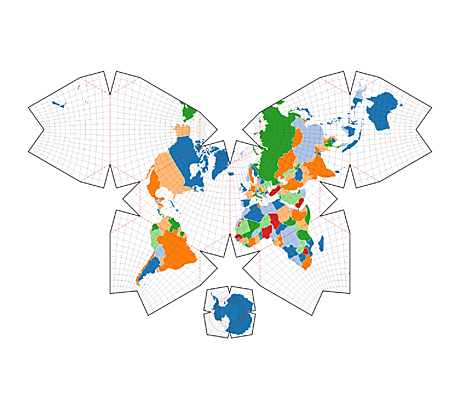
D3 has a lot of built in support (a powerful geographic projection system) for creating Maps from GeoJSON. If you have never used D3 for maps, I think you should take a look at this D3 Map Tutorial. It covers the essentials of making a map with D3 and TopoJSON, which I will use below in more advanced examples. TopoJson encodes topology and eliminates redundancy, resulting in a much smaller file and the GeoJSON to TopoJSON converter is built with NodeJS.

Thus, I encourage you all to start using TopoJSON and below, I will go over a couple examples of building a D3 World Map with colors, tooltips, different zooming options, plotting points from geo coordinates, and listening to click events to load new maps. I will also use Mike Bostock’s queue script to load the data asynchronously.

Creating geographic maps with D3? This is a must stop.

What I need to look for is a library not for geo-coordinates but one that supports arbitrary, user-defined coordinates.

The sort of thing that could map locations in library stacks.

Suggestions/pointers?

February 27, 2013

D3.js Gallery – A Filterable Gallery of D3.js Examples

Filed under: D3,Graphics,Visualization — Patrick Durusau @ 2:54 pm

D3.js Gallery – A Filterable Gallery of D3.js Examples

Description:

This filterable gallery of examples for D3.js is an alternative to the official wiki gallery. Filtering makes it easier to search by author, visualization type and so on. You can also share the url to a filtered result gallery. (From the DashingD3js.com Weekly Newsletter.)

Don’t be discouraged on the author filter, not all the visualizations are from Mike Bostock. 😉

It is a real visual treat. Take the time to visit even if you aren’t looking for that “special” visualization.

January 28, 2013

Learn how to make Data Visualizations with D3.js

Filed under: D3,Graphics,Visualization — Patrick Durusau @ 1:18 pm

Learn how to make Data Visualizations with D3.js

The current table of contents:

Part 1 – From Zero to Binding Data

  1. Why Data Visualizations
  2. Why build Data Visualizations with D3.js

  3. The Data Visualization Process

  4. Basic Building Blocks

  5. D3.js First Steps

  6. Adding a DOM element

  7. Adding an SVG element

  8. Binding Data to DOM Elements

  9. Using Data Bound to DOM Elements

Part 2 – Using Data to Create Data Visualizations

  1. Creating SVG Elements Based on Data

  2. Using the SVG Coordinate Space

  3. Data Structures D3.js Accepts

  4. Using JSON to Simplify Code

  5. SVG Basic Shapes and D3.js

  6. SVG Paths and D3.js

  7. Dynamic SVG Coordinate Space

  8. D3.js Scales

  9. SVG Group Element and D3.js

  10. SVG Text Element

  11. D3.js Axes

Consider signing up for the D3.js Weekly Newsletter while at Dashing D3.js. You won’t be disappointed.

January 9, 2013

Interactive SVG + Canvas Plot

Filed under: D3,Visualization — Patrick Durusau @ 12:04 pm

Interactive SVG + Canvas Plot by Sujay Vennam.

Amusing and potentially useful.

What forces, positive or negative would you have operating on your nodes?

I first saw this in a tweet by Christophe Viau.

January 6, 2013

CartoDB makes D3 maps a breeze

Filed under: CartoDB,D3,Geographic Data,Mapping,Maps — Patrick Durusau @ 9:59 pm

CartoDB makes D3 maps a breeze

From the post:

Anybody who loves maps and data can’t help but notice all the beautiful visualizations people are making with D3 right now. Huge thanks to Mike Bostock for such a cool technology.

We have done a lot of client-side rendering expirements over the past year or so and have to say, D3 is totally awesome. This is why we felt it might be helpful to show you how easy it is to use D3 with CartoDB. In the near future, we’ll be adding a few tutorials for D3 to our developer pages, but for now, let’s have a look.

Very impressive.

But populating a map with data isn’t the same as creating a useful map with data.

Take a look at the earthquake example.

What data would you add to it to make the information actionable?

January 5, 2013

Map Projections

Filed under: Cartography,D3,Graphics,Mapping,Maps — Patrick Durusau @ 7:36 am

Map Projections by Jason Davies.

If you are interested in map projections or D3, this page is a real delight!

Jason has draggable examples of:

Along with various demonstrations:

OK, one image to whet your appetite!

Waterman Butterfly Map

Follow the image to its homepage, then drag the image. I think you will be pleased.

December 21, 2012

D3 3.0 [New Features Illustrated]

Filed under: D3,Graphics,Visualization — Patrick Durusau @ 4:17 pm

D3 3.0

Illustrations of a new geographic projection system for D3, new geographic plugins, transitions, requests and other fixes and enhancements.

If the images don’t interest you in D3, you must not have any graphic issues. 😉

December 20, 2012

D3: IED Attacks in Afghanistan Explained

Filed under: D3,Graphics,Visualization — Patrick Durusau @ 11:47 am

D3: IED Attacks in Afghanistan Explained

A walk through the use of D3, jQuery and jQuery UI to create an interactive display of IED attacks in Afghanistan.

Adaptable to other time/location based data sets.

The working example: IED Attacks in Afghanistan (2004-2009)

The Department of Political Science, Ohio State University, hosts several D3 tutorials:

Data Visualization: Learning D3https://secure.polisci.ohio-state.edu/faq/d3.php

I first saw this in a tweet by Christophe Viau.

Web-Based Visualization Part 1: The D3.js Key Concept

Filed under: D3,Graphics,Visualization — Patrick Durusau @ 11:24 am

Web-Based Visualization Part 1: The D3.js Key Concept by Stephen Thomas.

From the post:

Those of us in the user interface community often obsess over the smallest details: shifting an element one pixel to the left or finding the perfect transparency setting for our drop shadows. Such an obsession is well and good; it can lead to a superior user experience. But sometimes perhaps we should take a step back from the details. In many cases, our interfaces exist to provide understanding. If the user doesn’t understand the information, then it doesn’t matter how pretty the interface looks. Fortunately, there’s an entire science devoted to understanding information, the science of data visualization. And on the web there is one particular tool that its practitioners rely on far more than any other—the excellent D3.js library from Mick Bostock. In a series of posts, we’ll take a close look at this library and its enormous power.

Stephen disagrees with the view that D3.js is difficult to learn and sets a goal to get readers on the way to using D3.js after fifteen minutes of reading.

How did you fare?

I first saw this in a tweet by Christophe Viau.

December 17, 2012

Visualizing Facebook Friends With D3.js…

Filed under: D3,Graphs,Networks,Visualization — Patrick Durusau @ 5:30 am

Visualizing Facebook Friends With D3.js or “How Wolfram|Alpha Does That Cool Friend Network Graph” by Tony Young.

From the post:

A while ago, Wolfram|Alpha got the ability to generate personal analytics based on your Facebook profile. It made some cool numbers and stuff, but the friend network graph was the most impressive:

clustering of friends

Wolfram|Alpha neatly separates your various social circles into clusters, based on proximity — with freaky accuracy.

With the awesome D3.js library, along with some gratuitous abuse of the Facebook API, we can make our own!

If you’re impatient, skip through all this text and check out the example or the screenshot!

A good example of the ease of deduplication (read merging) where the source of ids is uniform.

Possible classroom exercise to create additional Facebook accounts for students, so that each student has at least two (2) Facebook accounts. Each with friend lists.

Any overlapping friends will “merge” but the different accounts don’t, even though the same person.

Walk through solving the merging problem where there are different accounts.

I first saw this in a tweet by Christophe Viau.

December 13, 2012

D3 Replusive

Filed under: D3,Graphics,Humor — Patrick Durusau @ 4:50 pm

D3 Replusive

An unlikely key sequence that triggers this behavior in a graph interface to a topic map could be quite amusing. 😉

I first saw this in a tweet by Christophe Viau.

D3 Tips and Tricks

Filed under: D3,Graphics — Patrick Durusau @ 4:45 pm

D3 Tips and Tricks (PDF)

Introduction to graphics with D3.

Covers graphs (the sort you see in the male vitality ads, not nodes/arcs) at this point with more promised to follow.

You are going to have to learn the basics and this will get you started.

BTW, follow the blog as well: http://www.d3noob.org/

I first saw this in a tweet by Christophe Viau.

December 12, 2012

d3js/SVG Export demo

Filed under: D3,Graphics,SVG,Visualization — Patrick Durusau @ 8:20 pm

d3js/SVG Export demo

From the post:

d3js is a JavaScript library for manipulating documents based on data. The library enables stunning client-side visualization inside the webbrowser.

Commonly in science-related websites (and possibly many others), users need to save the generated visualization in vectorized format (e.g. PDF), to be able to incorporate the graphics in presentation or publications.

This website demonstate one possible method of saving d3js graphics to PDF.

See below for more technical details.

I can’t imagine anyone wanting a static image of a topic map but you never know. 😉

I first saw this in a tweet by Christophe Viau.

December 4, 2012

Interactive Models and La nuit blanche

Filed under: D3,Graphics,Visualization — Patrick Durusau @ 5:46 am

Jerome Cukier has posted a collection of simulations (Interactive Models) and a potential aid for museum visitors (La nuit blanche) using d3.

Hard to say which one I like better. The models page is an impressive demonstration of d3, but La nuit blanche has more immediate application with topic maps.

I first saw this in Christophe Lalanne’s A bag of tweets / November 2012.

November 24, 2012

GraphChi visual toolkit – or understanding your data

Filed under: D3,GraphChi,Graphs,Visualization — Patrick Durusau @ 7:46 pm

GraphChi visual toolkit – or understanding your data by Danny Bickson.

Danny walks through using GraphChi to visual the Orange d4d data set. (cell phone usage).

Easy instructions and heavy on interesting graphics so you need to read the original post.

Very cool!

November 21, 2012

Interactive Data Visualization for the Web [D3]

Filed under: D3,Graphics,Visualization — Patrick Durusau @ 5:24 am

Interactive Data Visualization for the Web by Scott Murray.

A preview version explaining D3.

Skimming the first couple of chapters it has a number of references/examples but could use one or more editing passes.

Still, if you are new to D3, it’s free and correcting any mistakes you find will be good practice.

I first saw this in a tweet by Jen Lowe.


Update: Final ebook and print copies are now available!

October 23, 2012

Basics of JavaScript and D3 for R Users

Filed under: D3,Javascript,R — Patrick Durusau @ 10:58 am

Basics of JavaScript and D3 for R Users by Jerzy Wieczorek.

From the post:

Hadley Wickham, creator of the ggplot2 R package, has been learning JavaScript and its D3 library for the next iteration of ggplot2 (tentatively titled r2d3?)… so I suspect it’s only a matter of time before he pulls the rest of the R community along.

Below are a few things that weren’t obvious when I first tried reading JavaScript code and the D3 library in particular. (Please comment if you notice any errors.) Then there’s also a quick walkthrough for getting D3 examples running locally on your computer, and finally a list of other tutorials & resources. In a future post, we’ll explore one of the D3 examples and practice tweaking it.

Perhaps these short notes will help other R users get started more quickly than I did. Even if you’re a ways away from writing complex JavaScript from scratch, it can still be useful to take one of the plentiful D3 examples and modify it for your own purposes.

Just in case you don’t have time today to build clusters on EC2. 😉

Being mindful that delivery of content is what leads to sales.

Or, knowing isn’t the same as showing.

The first may make you feel important. The second may lead to sales.

Up to you.

October 7, 2012

Parallel Coordinates [D3]

Filed under: D3,Graphics,Visualization — Patrick Durusau @ 6:11 pm

Parallel Coordinates [D3]

From the webpage:

A visual toolkit for multidimensional detectives.

Read paper at the link to “multidimensional detectives.”

What is at stake is visual exploration of data.

Are you the sort of person who sees patterns before others? Or patterns others miss even after you point them out?

You could have a profitable career in visual exploration of data. Seriously.

I first saw this at Christophe Lalanne’s A bag of tweets / September 2012.

August 28, 2012

D3 2.10.0 Update

Filed under: D3,Graphics,Visualization — Patrick Durusau @ 3:46 pm

D3 2.10.0 Update

An update of D3.js is out, just in case you are using it with topic map (or other) visualizations.

New features:

I first saw this at Christopher Lalanne’s A bag of tweets / August 2012.

August 13, 2012

New version of data-visualising D3 JavaScript library

Filed under: D3,Graphics,Visualization — Patrick Durusau @ 3:37 pm

New version of data-visualising D3 JavaScript library

From the post:

Version 2.10 of the open source D3 (Data Driven Development) JavaScript library features a good dozen additions or enhancements and can be used to visualise datasets both statically or interactively using HTML, CSS, and SVG. Like jQuery, the cross-browser library features generic DOM element selection, dynamic property annotation, event processing, transitions and transformations. D3’s web site includes more than 200 impressive examples, some from large media firms and institutions.

New features for present or future topic map visualizations!

August 2, 2012

How to Make an Interactive Network Visualization

Filed under: D3,Graphics,Graphs,Javascript,Music,Networks,Visualization — Patrick Durusau @ 10:10 am

How to Make an Interactive Network Visualization by Jim Vallandingham.

From the post:

Interactive network visualizations make it easy to rearrange, filter, and explore your connected data. Learn how to make one using D3 and JavaScript.

Networks! They are all around us. The universe is filled with systems and structures that can be organized as networks. Recently, we have seen them used to convict criminals, visualize friendships, and even to describe cereal ingredient combinations. We can understand their power to describe our complex world from Manuel Lima’s wonderful talk on organized complexity. Now let’s learn how to create our own.

In this tutorial, we will focus on creating an interactive network visualization that will allow us to get details about the nodes in the network, rearrange the network into different layouts, and sort, filter, and search through our data.

In this example, each node is a song. The nodes are sized based on popularity, and colored by artist. Links indicate two songs are similar to one another.

Try out the visualization on different songs to see how the different layouts and filters look with the different graphs.

You know this isn’t a post about politics because it would be visualizing friendships with convicted criminals. 😉

A degree of separation graph between elected public officials and convicted white collar criminals? A topic map for another day.

For today, enjoy learning how to use D3 and JavaScript for impressive network visualizations.

Imagine mapping the cereal visualization to the shelf locations at your local Kroger, where selecting one ingredient identifies the store locations of others.

May 30, 2012

D3 Tutorials

Filed under: D3,Graphics,Visualization — Patrick Durusau @ 3:07 pm

D3 Tutorials by Scott Murray.

I was following a link to the last tutorial in this series on axes when I discovered this resource.

Starts from a description of the tutorials:

  • Brief
  • Focused, each addressing a single topic
  • Modular, so you can reference only the topics relevant to your goals
  • Complete, with sample code illustrating each topic
  • Dynamic, updated and expanded as needed
  • Free, licensed so you can use the code however you wish

and ends sixteen (16) lessons later with a tutorial on axes, or as Scott puts it:

Let’s add horizontal and vertical axes, so we can do away with the horrible red numbers cluttering up our chart.

More tutorials are on the way but I am sure that Scott would appreciate your questions and encouragement.

I saw the reference to the axes tutorial in Christophe Lalanne’s Bag of Tweets for May 2012.

May 3, 2012

Parallel Sets for categorical data, D3 port

Filed under: D3,Graphics,Parallel Sets,Visualization — Patrick Durusau @ 6:23 pm

Parallel Sets for categorical data, D3 port

If you are working with categorical data, you need to become familiar with parallel sets.

Starting here isn’t a bad idea.

Very impressive graphics/visualization.

March 16, 2012

JUNG in Neo4j – Part 2

Filed under: Cypher,D3,Graphs,Neo4j,Visualization — Patrick Durusau @ 7:35 pm

JUNG in Neo4j – Part 2

Max De Marzi writes:

A few weeks ago I showed you how to visualize a graph using the chord flare visualization and how to visualize a network using a force directed graph visualization from D3.js.

Not content to rest on his laurels, Max points to additional resources on non-traditional graph visualizations and starts work on a matrix visualization of a graph (one step on the way to a node quilt).

I better post this quickly before Max posts another part. 😉

November 3, 2011

D3.js – Data Driven Documents

Filed under: D3,Graphics,Protovis,Visualization — Patrick Durusau @ 7:17 pm

D3.js – Data Driven Documents

From the webpage:

D3 allows you to bind arbitrary data to a Document Object Model (DOM), and then apply data-driven transformations to the document. As a trivial example, you can use D3 to generate a basic HTML table from an array of numbers. Or, use the same data to create an interactive SVG bar chart with smooth transitions and interaction.

D3 is not a traditional visualization framework. Rather than provide a monolithic system with all the features anyone may ever need, D3 solves only the crux of the problem: efficient manipulation of documents based on data. This gives D3 extraordinary flexibility, exposing the full capabilities of underlying technologies such as CSS3, HTML5 and SVG. It avoids learning a new intermediate proprietary representation. With minimal overhead, D3 is extremely fast, supporting large datasets and dynamic behaviors for interaction and animation. And, for those common needs, D3’s functional style allows code reuse through a diverse collection of optional modules.

Any description of the graphics on my part would be inadequate. Visit the site, you will see what I mean.

Pay special attention to the architecture of D3, there may be lessons for future topic maps development.

D3 replaces Protovis, which is no longer under active development. Protovis is, however, still suggested as a source of examples, etc.

« Newer Posts

Powered by WordPress