Another Word For It Patrick Durusau on Topic Maps and Semantic Diversity

March 16, 2015

A Compendium of Clean Graphs in R

Filed under: R,Visualization — Patrick Durusau @ 9:17 am

A Compendium of Clean Graphs in R by Eric-Jan Wagenmakers and Quentin Gronau.

From the post:

Every data analyst knows that a good graph is worth a thousand words, and perhaps a hundred tables. But how should one create a good, clean graph? In R, this task is anything but easy. Many users find it almost impossible to resist the siren song of adding grid lines, including grey backgrounds, using elaborate color schemes, and applying default font sizes that makes the text much too small in relation to the graphical elements. As a result, many R graphs are an aesthetic disaster; they are difficult to parse and unfit for publication.

In constrast, a good graph obeys the golden rule: “create graphs unto others as you want them to create graphs unto you”. This means that a good graph is a simple graph, in the Einsteinian sense that a graph should be made as simple as possible, but not simpler. A good graph communicates the main message effectively, without fuss and distraction. In addition, a good graph balances its graphical and textual elements – large symbols demand an increase in line width, and these together require an increase in font size.

In order to reduce the time needed to find relevant R code, we have constructed a compendium of clean graphs in R. This compendium, available at http://shinyapps.org/apps/RGraphCompendium/index.html, can also be used for teaching or as inspiration for improving one’s own graphs. In addition, the compendium provides a selective overview of the kind of graphs that researchers often use; the graphs cover a range of statistical scenarios and feature contributions of different data analysts. We do not wish to presume the graphs in the compendium are in any way perfect; some are better than others, and overall much remains to be improved. The compendium is undergoing continual refinement. Nevertheless, we hope the graphs are useful in their current state.

This rocks! A tribute to the authors, R and graphics!

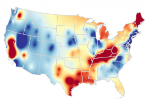
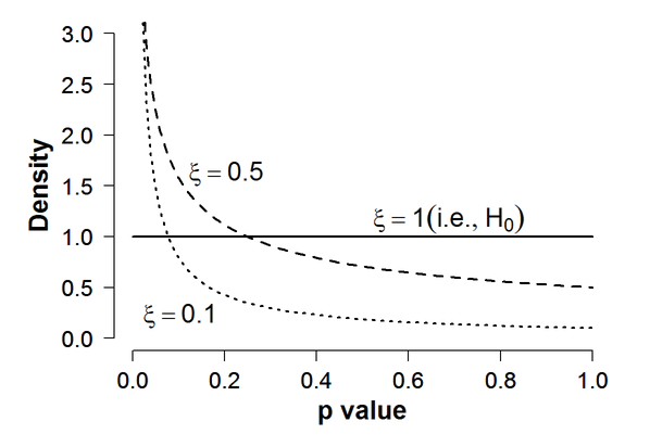
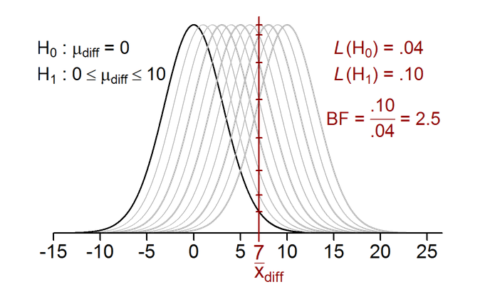
A couple samples to whet your appetite:

r-graph-1

r-graph-2

BTW, the images in the compendium have Show R-Code buttons!

Enjoy!

March 13, 2015

Quick start guide to R for Azure Machine Learning

Filed under: Azure Marketplace,Machine Learning,R — Patrick Durusau @ 7:22 pm

Quick start guide to R for Azure Machine Learning by Larry Franks.

From the post:

Microsoft Azure Machine Learning contains many powerful machine learning and data manipulation modules. The powerful R language has been described as the lingua franca of analytics. Happily, analytics and data manipulation in Azure Machine Learning can be extended by using R. This combination provides the scalability and ease of deployment of Azure Machine Learning with the flexibility and deep analytics of R.

This document will help you quickly start extending Azure Machine Learning by using the R language. This guide contains the information you will need to create, test and execute R code within Azure Machine Learning. As you work though this quick start guide, you will create a complete forecasting solution by using the R language in Azure Machine Learning.

BTW, I deleted an ad in the middle of the pasted text that said you can try Azure learning free. No credit card required. Check the site for details because terms can and do change.

I don’t know who suggested “quick” be in the title but it wasn’t anyone who read the post. 😉

Seriously, despite being long it is a great onboarding to using RStudio with Azure Machine Learning that ends with lots of good R resources.

Combining the strength of cloud based machine learning with a language that is standard in data science is a winning combination.

People will differ in their preferences for cloud based machine learning environments but this guide sets a high mark for guides concerning the same.

Enjoy!

I first saw this in a tweet by Ashish Bhatia.

March 8, 2015

How to Use R for Connecting Neo4j and Tableau (A Recommendation Use Case)

Filed under: Neo4j,R,Tableau — Patrick Durusau @ 5:57 pm

How to Use R for Connecting Neo4j and Tableau (A Recommendation Use Case) by Roberto Rösler.

From the post:

Year is just a little bit more than two months old and we got the good news from Tableau – beta testing for version 9.0 started. But it looks like that one of my most favored features didn’t manage to be part of the first release – the Tableau Web Data Connector (it’s mentioned in Christian Chabot keynote at 01:18:00 you can find here). The connector can be used to access REST APIs from within Tableau.
Instead of waiting for the unknown release containing the Web Data Connector, I will show in this post how you can still use the current version of Tableau together with R to build your own “Web Data Connector”. Specifically, this means we connect to an instance of the graph database Neo4j using Neo4js REST API. However, that is not the only good news: our approach that will create a life connection to the “REST API data source” goes beyond any attempt that utilizes Tableaus Data Extract API, static tde files that could be loaded in Tableau.

In case you aren’t familiar with Tableau, it is business analytics/visualization software that has both commercial and public versions.

Roberto moves data crunching off of Tableau (into Neo4j) and builds a dashboard (playing to Tableau’s strengths) for display of the results.

If you don’t have the time to follow R-Bloggers, you should make the time to follow Roberto’s blog, Data * Science + R. His posts explore interesting issues at length, with data and code.

I first saw this in a tweet by DataSciGeek.

March 3, 2015

The Matrix Cheatsheet

Filed under: Julia,Matrix,Numpy,R — Patrick Durusau @ 4:31 pm

The Matrix Cheatsheet by Sebastian Raschka.

Sebastian has created a spreadsheet of thirty (30) matrix tasks and compares the code for each in: MATLAB/Octave, Python NumPy, R, and Julia.

Given the prevalence of matrices in so many data science tasks, this can’t help but be useful.

A bit longer treatment can be found at: The Matrix Cookbook.

I first saw this in a tweet by Yhat, Inc.

ComputerWorld’s R for Beginners Hands-On Guide

Filed under: Data Science,R — Patrick Durusau @ 4:18 pm

ComputerWorld’s R for Beginners Hands-On Guide by David Smith.

From the post:

Computerworld’s Sharon Machlis has done a great service for the R community — and R especially novices — by creating the on-line Beginner’s Guide to R. You can read our overview of her guide from 2013 here, but it’s been regularly updated since then.

Now available in PDF format!

David also suggests that R beginners check out beginner’s tips for R from the Revolutions archive.

If you are using R, the Revolutions blog is on your browser toolbar. If you are learning R, the Revolutions blog should be on your browser toolbar.

February 17, 2015

Making Maps in R

Filed under: Mapping,Maps,R — Patrick Durusau @ 5:14 pm

Making Maps in R by Kevin Johnson.

from the post:

I make a lot of maps in my line of work. R is not the easiest way to create maps, but it is convenient and it allows for full control of what the map looks like. There are tons of different ways to create maps, even just within R. In this post I’ll talk about the method I use most of the time. I will assume you are proficient in R and have some level of familiarity with the ggplot2 package.

The American Community Survey provides data on almost any topic imaginable for various geographic levels in the US. For this example I will look at the 2012 5-year estimates of the percent of people without health insurance by census tract in the state of Georgia (obtained from the US Census FactFinder). Shapefiles were obtained from the US Census TIGER database. I generally use the cartographic boundary files since they are simplified representations of the boundaries, which saves a lot of space and processing time.

Occurs to me that getting students to make maps of their home states with a short list of data options (for a class), could be an illustration of testing whether results are “likely” or not. Reasoning that students are likely to have some sense of demographic distributions for their home states (or should).

I first saw this in a tweet by Neil Saunders.

Data Mining: Spring 2013 (CMU)

Filed under: Data Mining,R — Patrick Durusau @ 2:33 pm

Data Mining: Spring 2013 (CMU) by Ryan Tibshirani.

Overview and Objectives [from syllabus]

Data mining is the science of discovering structure and making predictions in data sets (typically, large ones). Applications of data mining are happening all around you|and if they are done well, they may sometimes even go unnoticed. How does Google web search work? How does Shazam recognize a song playing in the background? How does Net Flix recommend movies to each of its users? How could we predict whether or not a person will develop breast cancer based on genetic information? How could we search for possible subgroups among breast cancer patients, suggesting diff erent variants of the disease? An expert’s answer to any one of these questions may very well contain enough material to fill its own course, but basic answers stem from the principles of data mining.

Data mining spans the fi elds of statistics and computer science. Since this is a course in statistics, we will adopt a statistical perspective the majority of the course. Data mining also involves a good deal of both applied work (programming, problem solving, data analysis) and theoretical work (learning, understanding, and evaluating methodologies). We will try to maintain a balance between the two.

Upon completing this course, you should be able to tackle new data mining problems, by: (1) selecting the appropriate methods and justifying your choices; (2) implementing these methods programmatically (using, say, the R programming language) and evaluating your results; (3) explaining your results to a researcher outside of statistics or computer science.

Lecture notes, R files, what more could you want? 😉

Enjoy!

February 15, 2015

The software behind this clickbait data visualization will blow your mind

Filed under: R,Visualization — Patrick Durusau @ 4:26 pm

The software behind this clickbait data visualization will blow your mind by David Smith.

From the post:

New media sites like Buzzfeed and Upworthy have mastered the art of "clickbait": headlines and content designed to drive as much traffic as possible to their sites. One technique is to use coy headlines like "If you take a puppy video break today, make sure this is the dog video you watch." (Gawker apparently spends longer writing a headline than the actual article.) But the big stock-in-trade is "listicles": articles that are, well, just lists of things. (Exactly half of Buzzfeed's top 20 posts of this week are listicles, including "32 Paintings Paired With Quotes From 'Mean Girls'".)

If your goal is to maximize virality, how long should a listicle be? Max Woolf, an R user and Bay Area Software QA Engineer, set out to answer that question with data. Buzzfeed reports the number of Facebook shares for each of its articles, so he scraped BuzzFeed’s website and counted the number of items in 15,656 listicles. He then used R's ggplot2 package to plot number of Facebook shares versus number of listicle items, and added a smooth line to show the relationship:

Not that I read Buzzfeed very often but at least the lists are true lists, you aren’t forced to load each item separately with ads each time. Not great curation but one item at a time display or articles broken into multiple parts for ad reasons are far more objectionable.

That said, if you are looking for shares on Facebook, take this as your guide to creating listicles. 😉

February 14, 2015

Streets of Paris Colored by Orientation

Filed under: Mapping,Maps,R — Patrick Durusau @ 8:12 pm

Streets of Paris Colored by Orientation by Mathieu Rajerison.

From the post:

Recently, I read an article by datapointed which presented maps of streets of different cities colored by orientation.

The author gave some details about the method, which I tried to reproduce. In this post, I present the different steps from the calculation in my favorite spatial R ToolBox to the rendering in QGIS using a specific blending mode.

An opportunity to practice R and work with maps. More enjoyable than sifting data to find less corrupt politicians.

I first saw this in a tweet by Caroline Moussy.

February 13, 2015

An R Client for the Internet Archive API

Filed under: Data Mining,R — Patrick Durusau @ 8:19 pm

An R Client for the Internet Archive API by Lincoln Mullen.

From the webpage:

In support of some of my research projects, I created a simple R package to access the Internet Archive’s API. The package is intended to search for items, to retrieve their metadata in a usable form, and to download the files associated with the items. The package, called internetarchive, is available on GitHub. The README and the vignette have a full explanation, but here is a brief overview.

This is cool!

And a great way to contrast NSA data collection with useful data collection.

If you were the NSA, you would suck down all the new Internet Archive content everyday. Then you would “explore” that plus lots of other content for “relationships.” Which abound in any data set that large.

If you are Lincoln Mullen or someone empowered by his work, you search for items and incrementally build a set of items with context and additional information you add to that set.

If you were paying the bill, which of those approaches seems the most likely to produce useful results?

Information/data/text mining doesn’t change in nature due to size or content or the purpose of the searching or whose paying the bill. The goal is useful (or should be) useful results for some purpose X.

February 9, 2015

The National Centre for Biotechnology Information (NCBI) is part…

Filed under: Bioinformatics,DOI,R — Patrick Durusau @ 4:05 pm

The National Centre for Biotechnology Information (NCBI) is part…

The National Centre for Biotechnology Information (NCBI) is part of the National Institutes of Health’s National Library of Medicine, and most well-known for hosting Pubmed, the go-to search engine for biomedical literature – every (Medline-indexed) publication goes up there.

On a separate but related note, one thing I’m constantly looking to do is get DOIs for papers on demand. Most recently I found a package for R, knitcitations that generates bibliographies automatically from DOIs in the text, which worked quite well for a 10 page literature review chock full of references (I’m a little allergic to Mendeley and other clunky reference managers).

The “Digital Object Identifier”, as the name suggests, uniquely identifies a research paper (and recently it’s being co-opted to reference associated datasets). There’re lots of interesting and troublesome exceptions which I’ve mentioned previously, but in the vast majority of cases any paper published in at least the last 10 years or so will have one.

Although NCBI Pubmed does a great job of cataloguing biomedical literature, another site, doi.org provides a consistent gateway to the original source of the paper. You only need to append the DOI to “dx.doi.org/” to generate a working redirection link.

Last week the NCBI posted a webinar detailing the inner workings of Entrez Direct, the command line interface for Unix computers (GNU/Linux, and Macs; Windows users can fake it with Cygwin). It revolves around a custom XML parser written in Perl (typical for bioinformaticians) encoding subtle ‘switches’ to tailor the output just as you would from the web service (albeit with a fair portion more of the inner workings on show).

I’ve pieced together a basic pipeline, which has a function to generate citations for knitcitations from files listing basic bibliographic information, and in the final piece of the puzzle now have a custom function (or several) that does its best to find a single unique article matching the author, publication year, and title of a paper systematically, to find DOIs for entries in such a table.

BTW, the correct Github Gist link is: https://gist.github.com/lmmx/3c9406c4ec2c42b82158

The link in:

The scripts below are available here, I’ll update them on the GitHub Gist if I make amendments.

is broken.

A clever utility, although I am more in need of one for published CS literature. 😉

The copy to clipboard feature would be perfect for pasting into blogs posts.

February 7, 2015

Pick up Python

Filed under: Communities of Practice,Programming,Python,R — Patrick Durusau @ 2:45 pm

Pick up Python by Jeffrey M. Perkel. (Nature 518, 125–126 (05 February 2015) doi:10.1038/518125a)

From the post:

Last month, Adina Howe took up a post at Iowa State University in Ames. Officially, she is an assistant professor of agricultural and biosystems engineering. But she works not in the greenhouse, but in front of a keyboard. Howe is a programmer, and a key part of her job is as a ‘data professor’ — developing curricula to teach the next generation of graduates about the mechanics and importance of scientific programming.

Howe does not have a degree in computer science, nor does she have years of formal training. She had a PhD in environmental engineering and expertise in running enzyme assays when she joined the laboratory of Titus Brown at Michigan State University in East Lansing. Brown specializes in bioinformatics and uses computation to extract meaning from genomic data sets, and Howe had to get up to speed on the computational side. Brown’s recommendation: learn Python.

Among the host of computer-programming languages that scientists might choose to pick up, Python, first released in 1991 by Dutch programmer Guido van Rossum, is an increasingly popular (and free) recommendation. It combines simple syntax, abundant online resources and a rich ecosystem of scientifically focused toolkits with a heavy emphasis on community.

The community aspect is particularly important to Python’s growing adoption. Programming languages are popular only if new people are learning them and using them in diverse contexts, says Jessica McKellar, a software-engineering manager at the file-storage service Dropbox and a director of the Python Software Foundation, the non-profit organization that promotes and advances the language. That kind of use sets up a “virtuous cycle”, McKellar says: new users extend the language into new areas, which in turn attracts still more users.

Curious what topic mappers make of the description of the community aspects of Python?

I ask because more sematically opaque Big Data comes online everyday and there have been rumblings about needing a solution. A solution that I think topic maps are well suited to provide.

BTW, R folks should not feel slighted: Adventures with R by Sylvia Tippmann. (Nature 517, 109–110 (01 January 2015) doi:10.1038/517109a)

February 1, 2015

Data Sources on the Web

Filed under: Data,R — Patrick Durusau @ 4:23 pm

Data Sources on the Web

From the post:

The following list of data sources has been modified as of January 2015. Most of the data sets listed below are free, however, some are not.

If an (R!) appears after source this means that the data are already in R format or there exist R commands for directly importing the data from R. (See http://www.quantmod.com/examples/intro/ for some code.) Otherwise, i have limited the list to data sources for which there is a reasonably simple process for importing csv files. What follows is a list of data sources organized into categories that are not mutually exclusive but which reflect what's out there.

Want to add to or update this list? Send to mran@revolutionanalytics.com

As you know, there are any number of data lists on the Net. This one is different, it is a maintained data list.

Enjoy!

I first saw this in a tweet by David Smith.

January 27, 2015

Data Science and Hadoop: Predicting Airline Delays – Part 3

Filed under: Data Science,Hadoop,R — Patrick Durusau @ 3:55 pm

Data Science and Hadoop: Predicting Airline Delays – Part 3 by Ofer Mendelevitch and Beau Plath.

From the post:

In our series on Data Science and Hadoop, predicting airline delays, we demonstrated how to build predictive models with Apache Hadoop, using existing tools. In part 1, we employed Pig and Python; part 2 explored Spark, ML-Lib and Scala.

Throughout the series, the thesis, theme, topic, and algorithms were similar. That is, we wanted to dismiss the misconception that data scientists – when applying predictive learning algorithms, like Linear Regression, Random Forest or Neural Networks to large datasets – require dramatic changes to the tooling; that they need dedicated clusters; and that existing tools will not suffice.

Instead, we used the same HDP cluster configuration, the same machine learning techniques, the same data sets, and the same familiar tools like PIG, Python and Scikit-learn and Spark.

For the final part, we resort to Scalding and R. R is a very popular, robust and mature environment for data exploration, statistical analysis, plotting and machine learning. We will use R for data exploration, graphics as well as for building our predictive models with Random Forest and Gradient Boosted Trees. Scalding, on the other hand, provides Scala libraries that abstract Hadoop MapReduce and implement data pipelines. We demonstrate how to pre-process the data into a feature matrix using the Scalding framework.

For brevity I shall spare summarizing the methodology here, since both previous posts (and their accompanying IPython Notebooks) expound the steps, iteration and implementation code. Instead, I would urge that you read all parts as well as try the accompanying IPython Notebooks.

Finally, for this last installment in the series in Scaling and R, read its IPython Notebook for implementation details.

Given the brevity of this post, you are definitely going to need Part 1 and Part 2.

The data science world could use more demonstrations like this series.

LDAvis: Interactive Visualization of Topic Models

Filed under: Latent Dirichlet Allocation (LDA),Modeling,R,Topic Models (LDA) — Patrick Durusau @ 3:33 pm

LDAvis: Interactive Visualization of Topic Models by Carson Sievert and Kenny Shirley.

From the webpage:

Tools to create an interactive web-based visualization of a topic model that has been fit to a corpus of text data using Latent Dirichlet Allocation (LDA). Given the estimated parameters of the topic model, it computes various summary statistics as input to an interactive visualization built with D3.js that is accessed via a browser. The goal is to help users interpret the topics in their LDA topic model.

From the description:

This video (recorded September 2014) shows how interactive visualization is used to help interpret a topic model using LDAvis. LDAvis is an R package which extracts information from a topic model and creates a web-based visualization where users can interactively explore the model. More details, examples, and instructions for using LDAvis can be found here — https://github.com/cpsievert/LDAvis

Excellent exploration of a data set using LDAvis.

Will all due respect to “agile” programming, modeling before you understand a data set isn’t a winning proposition.

January 24, 2015

A first look at Spark

Filed under: R,Spark — Patrick Durusau @ 10:57 am

A first look at Spark by Joseph Rickert.

From the post:

Apache Spark, the open-source, cluster computing framework originally developed in the AMPLab at UC Berkeley and now championed by Databricks is rapidly moving from the bleeding edge of data science to the mainstream. Interest in Spark, demand for training and overall hype is on a trajectory to match the frenzy surrounding Hadoop in recent years. Next month's Strata + Hadoop World conference, for example, will offer three serious Spark training sessions: Apache Spark Advanced Training, SparkCamp and Spark developer certification with additional spark related talks on the schedule. It is only a matter of time before Spark becomes a big deal in the R world as well.

If you don't know much about Spark but want to learn more, a good place to start is the video of Reza Zadeh's keynote talk at the ACM Data Science Camp held last October at eBay in San Jose that has been recently posted.

After reviewing the high points of Reza Zadeh's presentation, Joseph points out another 4 hours+ of videos on using Spark and R together.

A nice collection for getting started with Spark and seeing how to use a standard tool (R) with an emerging one (Spark).

I first saw this in a tweet by Christophe Lalanne.

January 22, 2015

Lecture Slides for Coursera’s Data Analysis Class

Filed under: Data Analysis,R — Patrick Durusau @ 2:26 pm

Lecture Slides for Coursera’s Data Analysis Class by Jeff Leek.

From the webpage:

This repository contains the lecture slides for the Coursera course Data Analysis. The slides were created with the Slidify package in Rstudio.

From the course description:

You have probably heard that this is the era of “Big Data”. Stories about companies or scientists using data to recommend movies, discover who is pregnant based on credit card receipts, or confirm the existence of the Higgs Boson regularly appear in Forbes, the Economist, the Wall Street Journal, and The New York Times. But how does one turn data into this type of insight? The answer is data analysis and applied statistics. Data analysis is the process of finding the right data to answer your question, understanding the processes underlying the data, discovering the important patterns in the data, and then communicating your results to have the biggest possible impact. There is a critical shortage of people with these skills in the workforce, which is why Hal Varian (Chief Economist at Google) says that being a statistician will be the sexy job for the next 10 years.

This course is an applied statistics course focusing on data analysis. The course will begin with an overview of how to organize, perform, and write-up data analyses. Then we will cover some of the most popular and widely used statistical methods like linear regression, principal components analysis, cross-validation, and p-values. Instead of focusing on mathematical details, the lectures will be designed to help you apply these techniques to real data using the R statistical programming language, interpret the results, and diagnose potential problems in your analysis. You will also have the opportunity to critique and assist your fellow classmates with their data analyses.

Once you master the basics of data analysis with R (or some other language), the best way to hone your data analysis skills is to look for data sets that are new to you. Don’t go so far afield that you can’t judge a useful result from a non-useful one but going to the edges of your comfort zone is good practice as well.

Enjoy!

I first saw this in a tweet by Christophe Lalanne.

January 18, 2015

Learn Statistics and R online from Harvard

Filed under: R — Patrick Durusau @ 8:59 pm

Learn Statistics and R online from Harvard by David Smith.

Starts January 19 (tomorrow)

From the post:

Harvard University is offering a free 5-week on-line course on Statistics and R for the Life Sciences on the edX platform. The course promises you will learn the basics of statistical inference and the basics of using R scripts to conduct reproducible research. You’ll just need a backround in basic math and programming to follow along and complete homework in the R language.

As a new course, I haven’t seen any of the content, but the presenters Rafael Irizarry and Michael Love are active contributors to the Bioconductor project, so it should be good. The course begins January 19 and registration is open through 27 April at the link below.

edX: Statistics and R for the Life Sciences

Apologies for the late notice!

Have you given any thought to an R for Voters course? Statistics using R on public data focused on current political issues? Something to think about. The talking heads on TV are already vetting possible candidates for 2016.

January 14, 2015

Top 77 R posts for 2014 (+R jobs)

Filed under: Programming,R,Statistics — Patrick Durusau @ 4:48 pm

Top 77 R posts for 2014 (+R jobs) by Tal Galili.

From the post:

The site R-bloggers.com is now 5 years old. It strives to be an (unofficial) online journal of the R statistical programming environment, written by bloggers who agreed to contribute their R articles to the site, to be read by the R community.

So, how reliable is this list of the top 77?

This year, the site was visited by 2.7 million users, in 7 million sessions with 11.6 million pageviews. People have surfed the site from over 230 countries, with the greatest number of visitors coming from the United States (38%) and then followed by the United Kingdom (6.7%), Germany (5.5%), India( 5.1%), Canada (4%), France (2.9%), and other countries. 62% of the site’s visits came from returning users. R-bloggers has between 15,000 to 20,000 RSS/e-mail subscribers.

How’s that? A top whatever list based on actual numbers! Visits by public users.

I wonder if anyone has tried that on those click-bait webinars? You know the ones, where ad talk takes up more than 50% of the time and the balance is hand waving. That kind.

Enjoy the top 77 R post list! I will!

I first saw this in a tweet by Kirk Borne.

January 12, 2015

Data wrangling, exploration, and analysis with R

Filed under: Data Analysis,Data Mining,R — Patrick Durusau @ 7:17 pm

Data wrangling, exploration, and analysis with R Jennifer (Jenny) Bryan.

Graduate level class that uses R for “data wrangling, exploration and analysis.” If you are self-motivated, you will be hard pressed to find better notes, additional links and resources for an R course anywhere. More difficult on your own but work through this course and you will have some serious R chops to build upon.

It just occurred to me that a requirement for news channels should have sub-titles that list data repositories for each story reported. So you could load of the data while the report in ongoing.

I first saw this in a tweet by Neil Saunders.

January 11, 2015

The ggplot2 book

Filed under: ggmap,Graphics,R — Patrick Durusau @ 8:05 pm

The ggplot2 book by Hadley Wickham

From the post:

Since ggplot2 is now stable, and the ggplot2 book is over five years old and rather out of date, I’m also happy to announce that I’m working on a second edition. I’ll be ably assisted in this endeavour by Carson Sievert, who’s so far done a great job of converting the source to Rmd and updating many of the examples to work with ggplot2 1.0.0. In the coming months we’ll be rewriting the data chapter to reflect modern best practices (e.g. tidyr and dplyr), and adding sections about new features.

We’d love your help! The source code for the book is available on github. If you’ve spotted any mistakes in the first edition that you’d like to correct, we’d really appreciate a pull request. If there’s a particular section of the book that you think needs an update (or is just plain missing), please let us know by filing an issue. Unfortunately we can’t turn the book into a free website because of my agreement with the publisher, but at least you can now get easily get to the source.

Great opportunity to show off your favorite feature of ggplot2. Might even make it into the next version of the text!

I first saw this in a tweet by Christophe Lalanne.

January 2, 2015

H2O World 2014

Filed under: H20,Machine Learning,R — Patrick Durusau @ 7:11 pm

H2O World 2014

From the H2O homepage:

H2O is for data scientists and application developers who need fast, in-memory scalable machine learning for smarter applications. H2O is an open source parallel processing engine for machine learning. Unlike traditional analytics tools, H2O provides a combination of extraordinary math, a high performance parallel architecture, and unrivaled ease of use.

Videos and docs from two days of presentations on H2O.

I first saw this in Video: H2O Talks by Trevor Hastie and John Chambers by Joseph Rickert.

December 25, 2014

Cartographer: Interactive Maps for Data Exploration

Filed under: Cartography,D3,Mapping,Maps,R — Patrick Durusau @ 11:45 am

Cartographer: Interactive Maps for Data Exploration by Lincoln Mullen.

From the webpage:

Cartographer provides interactive maps in R Markdown documents or at the R console. These maps are suitable for data exploration. This package is an R wrapper around Elijah Meeks’s d3-carto-map and d3.js, using htmlwidgets for R.

Cartographer is under very early development.

Data visualization enthusiasts should consider the screen shot used to illustrate use of the software.

What geographic assumptions are “cooked” in that display? Or are they?

Screenshot makes me think data “exploration” is quite misleading. As though data contains insights that are simply awaiting our arrival. On the contrary, we manipulate data until we create one or more patterns of interest to us.

Patterns of non-interest to us are called noise, gibberish, etc. That is to say there are no meaningful patterns aside from us choosing patterns as meaningful.

If data “exploration” is iffy, then so are data “mining” and data “visualization.” All three imply there is something inherent in the data to be found, mined or visualized. But, apart from us, those “somethings” are never manifest and two different people can find different “somethings” in the same data.

The different “somethings” implies to me that users of data play a creative role in finding, mining or visualizing data. A role that adds something to the data that wasn’t present before. I don’t know of a phrase that captures the creative interaction between a person and data. Do you?

In this particular case, the “cooked” in data isn’t quite that subtle. When I say “United States,” I don’t make a habit of including parts of Canada and a large portion of Mexico in that idea.

Map displays often have adjacent countries displayed for context but in this mapping, data values are assigned to points outside of the United State proper. Were the data values constructed on a different geographic basis than the designation of “United States?”

December 24, 2014

historydata: Data Sets for Historians

Filed under: History,R — Patrick Durusau @ 7:42 pm

historydata: Data Sets for Historians

From the webpage:

These sample data sets are intended for historians learning R. They include population, institutional, religious, military, and prosopographical data suitable for mapping, quantitative analysis, and network analysis.

If you forgot the historian on your shopping list, you have been saved from embarrassment. Assuming they are learning R.

At least it will indicate you think they are capable of learning R.

If you want a technology or methodology to catch on, starter data sets are one way to increase the comfort level of new users. Which can have the effect of turning them into consistent users.

December 22, 2014

RStatistics.Net (Beta)!

Filed under: R,Statistics — Patrick Durusau @ 4:11 pm

RStatistics.Net (Beta)!

From the webpage:

The No.1 Online Reference for all things related to R language and its applications in statistical computing.

This website is a R programming reference for beginners and advanced statisticians. Here, you will find data mining and machine learning techniques explained briefly with workable R code, which when used effectively can massively boost the predicting power of your analyses.

Who is this Website For?

  1. If you are a college student working on a project using R and you want to learn techniques to solve your problem
  2. If you are a statistician, but you don’t have prior programming experience, our plugin snippets of R Code will help you achieve several of your analysis outcomes in R
  3. If you are a programmer coming from other platform (such as python, SAS, SPSS) and you are looking to get your way around in R
  4. You have a software / DB background, and would like to expand your skills into data science and advanced analytics.
  5. You are a beginner with no stats background whatsoever, but have a critical analytical mind and have a keen interest in analytical problem solving.

Whatever your motivations, RStatistics.Net can help you achieve your goal.

Don’t Know Where To Get Started?

If you are completely new to R, the Getting-Started-Guide will walk you through the essentials of the language. The guide is structured in such a manner that the learning happens inquisitively in a direct and straightforward way. Some repetition may be needed for beginners before you get a overall feel and handle over the language. Reading and practicing the code snippets step-by-step will get you familiar and equip you to acquire higher level R modelling and algorithm-building skills.

What Will I Find Here ?

In the coming days, you will see top notch articles on techniques to learn and perform statistical analyses and problem solving in areas including but not bound to:

  1. Essential Stats
  2. Regression analysis
  3. Time Series Forecasting
  4. Cluster Analysis
  5. Machine Learning Algorithms
  6. Text Mining
  7. Social Media Analytics
  8. Classification Techniques
  9. Cool R Tips

Given the number of excellent resources on R that are online, any listing is likely to miss your favorite, I rather doubt the claim:

The No.1 Online Reference for all things related to R language and its applications in statistical computing.

for a beta site on R. 😉

Still, there is always room for one more reference site on R.

The practical exercises are “coming soon.”

This may already exist but a weekly tweet of an R problem with a data set could be handy.

December 19, 2014

A non-comprehensive list of awesome things other people did in 2014

Filed under: Data Analysis,Genomics,R,Statistics — Patrick Durusau @ 1:38 pm

A non-comprehensive list of awesome things other people did in 2014 by Jeff Leek.

Thirty-eight (38) top resources from 2014! Ranging from data analysis and statistics to R and genomics and places in between.

If you missed or overlooked any of these resources during 2014, take the time to correct that error!

Thanks Jeff!

I first saw this in a tweet by Nicholas Horton.

December 16, 2014

Cartography with complex survey data

Filed under: R,Visualization — Patrick Durusau @ 4:56 pm

Cartography with complex survey data by David Smith.

From the post:

Visualizing complex survey data is something of an art. If the data has been collected and aggregated to geographic units (say, counties or states), a choropleth is one option. But if the data aren't so neatly arranged, making visual sense often requires some form of smoothing to represent it on a map. 

R, of course, has a number of features and packages to help you, not least the survey package and the various mapping tools. Swmap (short for "survey-weighted maps") is a collection of R scripts that visualize some public data sets, for example this cartogram of transportation share of household spending based on data from the 2012-2013 Consumer Expenditure Survey.

visual-r-us

In addition to finding data, there is also the problem of finding tools to process found data.

As in when I follow a link to a resource, that link is also submitted to a repository of other things associated with the data set I am requesting, such as the current locations of its authors, tools for processing the data, articles written using the data, etc.

That’s a long ways off but at least today you can record having found one more cache of tools for data processing.

December 12, 2014

Building a Better Word Cloud

Filed under: R,Visualization,Word Cloud — Patrick Durusau @ 8:28 pm

Building a Better Word Cloud by Drew Conway.

From the post:

A few weeks ago I attended the NYC Data Visualization and Infographics meetup, which included a talk by Junk Charts blogger Kaiser Fung. Given the topic of his blog, I was a bit shocked that the central theme of his talk was comparing good and bad word clouds. He even stated that the word cloud was one of the best data visualizations of the last several years. I do not think there is such a thing as a good word cloud, and after the meetup I left unconvinced; as evidenced by the above tweet.

This tweet precipitated a brief Twitter debate about the value of word clouds, but from that straw poll it seemed the Nays had the majority. My primary gripe is that space is meaningless in word clouds. They are meant to summarize a single statistics—word frequency—yet they use a two dimensional space to express that. This is frustrating, since it is very easy to abuse the flexibility of these dimensions and conflate the position of a word with its frequency to convey dubious significance.

This came up on Twitter today even though Drew’s post dates from 2011. Great post though as Drew tries to improve upon the standard word cloud.

Not Drew’s fault but after reading his post I am where he was at the beginning on word clouds, I don’t see their utility. Perhaps your experience will be different.

December 11, 2014

2014 Data Science Salary Survey [R + Python?]

Filed under: Data Science,Python,R — Patrick Durusau @ 7:27 am

2014 Data Science Salary Survey: Tools, Trends, What Pays (and What Doesn’t) for Data Professionals by John King and Roger Magoulas.

From the webpage:

For the second year, O’Reilly Media conducted an anonymous survey to expose the tools successful data analysts and engineers use, and how those tool choices might relate to their salary. We heard from over 800 respondents who work in and around the data space, and from a variety of industries across 53 countries and 41 U.S. states.

Findings from the survey include:

  • Average number of tools and median income for all respondents
  • Distribution of responses by a variety of factors, including age, location, industry, position, and cloud computing
  • Detailed analysis of tool use, including tool clusters
  • Correlation of tool usage and salary

Gain insight from these potentially career-changing findings—download this free report to learn the details, and plug your own variables into the regression model to find out where you fit into the data space.

The best take on this publication can be found in O’Reilly Data Scientist Salary and Tools Survey, November 2014 by David Smith where he notes:

The big surprise for me was the low ranking of NumPy and SciPy, two toolkits that are essential for doing statistical analysis with Python. In this survey and others, Python and R are often similarly ranked for data science applications, but this result suggests that Python is used about 90% for data science tasks other than statistical analysis and predictive analytics (my guess: mainly data munging). From these survey results, it seems that much of the “deep data science” is done by R.

My initial observation is that “more than 800 respondents” is too small of a data sample to draw any useful conclusions about tools used by data scientists. Especially when the #1 tool listed in that survey was Windows.

Why a majority of “data scientists” confuse an OS with data processing tools like SQL or Excel, both of which ranked higher than Python or R, is unknown but casts further doubt on the data sample.

My suggestion would be to have a primary tool or language (other than an OS) whether it is R or Python but to be familiar with the strengths of other approaches. Religious bigotry about approaches is a poor substitute for useful results.

December 9, 2014

Finding clusters of CRAN packages using igraph

Filed under: Graphs,R — Patrick Durusau @ 6:56 pm

Finding clusters of CRAN packages using igraph by Andrie de Vries.

From the post:

In a previous post I demonstrated how to use the igraph package to create a network diagram of CRAN packages and compute the page rank.

Now I extend this analysis and try to find clusters of packages that are close to one another.

Andrie assigns labels to the resulting groups and then worries:

With clusters this large, it’s quite brazen (and possibly just wrong) to try and interpret the clusters for meaning.

Not at all!

Without grouping and labeling, there is no opportunity to discover how others might group and label the same items. We may all stare at the same items but if no one groups or labels them, we can walk away with private and very different understandings of how items should be grouped.

I remember a scifi novel where one character observes “sheep are different from each other,” to which another character added, “but only to other sheep.” Our use of different groupings isn’t all that is important. The reasons we see/give for creating different groupings are important as well.

« Newer PostsOlder Posts »

Powered by WordPress