I was blocked by @LadyMenopause at the end of this exchange, so what follows are my views on “whitesplaining” and “mansplaining,” not hers.
After sleeping on it, I think my posts were guilty of both “whitesplaining” and “mansplaining,” but have no idea what prompted @LadyMenopause’s response.
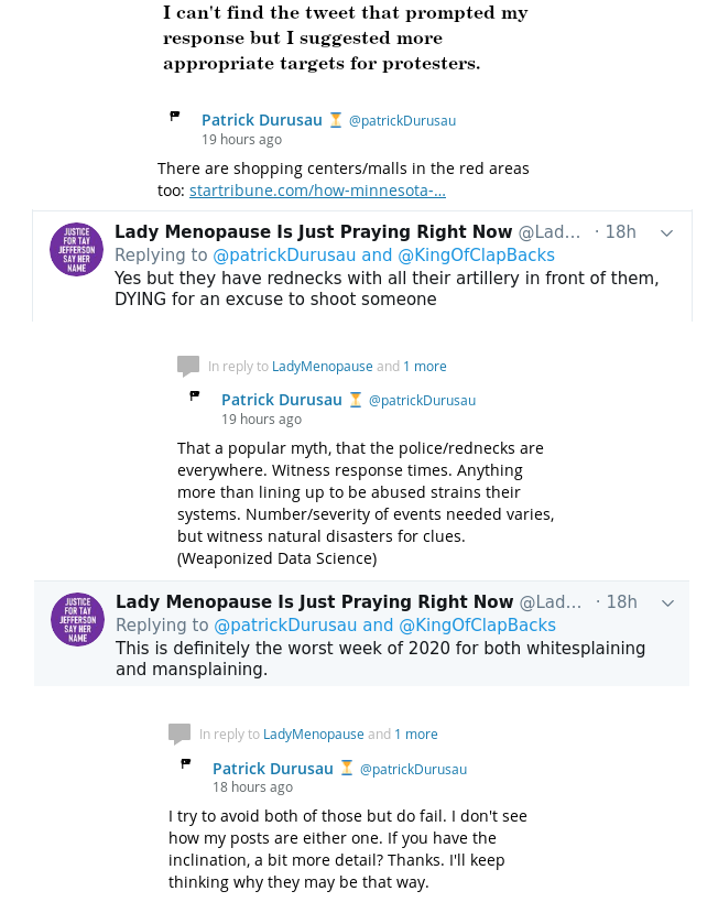
As far as “mansplaining,” the tweet that prompted by response by @LadyMenopause was not about protest tactics, targeting, the best ways to engage oppressors or anything of the sort. (I really need to start archiving my timeline.) So my initial response, suggesting better targeting for Republican majority areas, was off-topic and hijacking her thread, for a topic of no evidence interest to her.
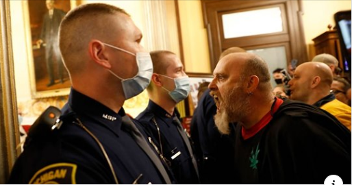
Another aspect of “mansplaining” was my dismissal of her view of Republican areas as guarded by “rednecks with all their artillery in front of them….” Whatever I or you may think about that view of Republican areas in Minneapolis, it is her view. I continued to err in treating the topic as one about tactics and strategies, which were not her focus.
On “whitesplaining,” I am a child of a violent white culture and assume that resources and tactics can be whistled up with little or no difficulty. My perspective also does not account for members of the Black community, their hopes and desires, to say nothing of their interest (or lack thereof) in wading in their oppressors blood. Unlike some white people, I don’t think I can evaluate or even properly consider the hopes and desires of the Black community. To suggestion action anyway, is a form of “whitesplaining.”
I’m utterly convinced that Black people, women, and others have been, are and likely will be oppressed by the white male capitalist patriarchy. I have had no doubts on that score for decades. I try to not speak the language of the Empire but as you can see, I can and do fail. Apologies to anyone who was offended and should you be called out for either “mansplaining” or “whitesplaining,” perhaps this will be a good starting point to discover your error.
PS: When you see me falling into “mansplaining” or “whitesplaining,” I’d appreciate a comment, here or on Twitter. Thanks!