Another Word For It Patrick Durusau on Topic Maps and Semantic Diversity

February 24, 2015

MILJS : Brand New JavaScript Libraries for Matrix Calculation and Machine Learning

Filed under: Javascript,Machine Learning,Visualization — Patrick Durusau @ 4:16 pm

MILJS : Brand New JavaScript Libraries for Matrix Calculation and Machine Learning by Ken Miura, et al.

Abstract:

MILJS is a collection of state-of-the-art, platform-independent, scalable, fast JavaScript libraries for matrix calculation and machine learning. Our core library offering a matrix calculation is called Sushi, which exhibits far better performance than any other leading machine learning libraries written in JavaScript. Especially, our matrix multiplication is 177 times faster than the fastest JavaScript benchmark. Based on Sushi, a machine learning library called Tempura is provided, which supports various algorithms widely used in machine learning research. We also provide Soba as a visualization library. The implementations of our libraries are clearly written, properly documented and thus can are easy to get started with, as long as there is a web browser. These libraries are available from this http URL under the MIT license.

Where “this http URL” = http://mil-tokyo.github.io/. It’s a hyperlink with that text in the original so I didn’t want to change the surface text.

The paper is a brief introduction to the JavaScript Libraries and ends with several short demos.

On this one, yes, run and get the code: http://mil-tokyo.github.io/.

Happy coding!

February 16, 2015

Structuredness coefficient to find patterns and associations

Filed under: Data Mining,Visualization — Patrick Durusau @ 5:27 pm

Structuredness coefficient to find patterns and associations by Livan Alonso.

From the post:

The structuredness coefficient, let’s denote it as w, is not yet fully defined – we are working on this right now. You are welcome to help us come up with a great, robust, simple, easy-to-compute, easy-to-understand, easy-to-interpret metric. In a nutshell, we are working under the following framework:

  • We have a data set with n points. For simplicity, let’s consider for now that these n points are n vectors (x, y) where x, y are real numbers.
  • For each pair of points {(x,y), (x’,y’)} we compute a distance d between the two points. In a more general setting, it could be a proximity metric between two keywords.
  • We order all the distances d and compute the distance distribution, based on these n points
  • Leaving-one-out: we remove one point at a time and compute the n new distance distributions, each based on n-1 points
  • We compare the distribution computed on n points, with the n ones computed on n-1 points
  • We repeat this iteration, but this time with n-2, then n-3, n-4 points etc.
  • You would assume that if there is no pattern, these distance distributions (for successive values of n) would have some kind of behavior uniquely characterizing the absence of structure, behavior that can be identified via simulations. Any deviation from this behavior would indicate the presence of a structure. And the pattern-free behavior would be independent of the underlying point distribution or domain – a very important point. All of this would have to be established or tested, of course.
  • It would be interesting to test whether this metric can identify patterns such as fractal distribution / fractal dimension. Would it be able to detect patterns in time series?

Note that this type of structuredness coefficient makes no assumption on the shape of the underlying domains, where the n points are located. These domains could be smooth, bumpy, made up of lines, made up of dual points etc. They might even be non numeric domain at all (e.g. if the data consists of keywords).

fractal

Deeply interesting work and I appreciate the acknowledgement that “structuredness coefficient” isn’t fully defined.

I will be trying to develop more links to resources on this topic. Please chime in if you have some already.

February 15, 2015

Debunking the Myth of Academic Meritocracy

Filed under: Visualization — Patrick Durusau @ 7:09 pm

Preface: I don’t think the results reported by the authors will surprise anyone. Heretofore the evidence has been whispered at conferences, ancedotal, and piecemeal. All of which made it easier to sustain the myth of an academic meritocracy. In the face of over 19,000 faculty positions over three distinct disciplines and careful analysis, sustaining the meritocracy myth will be much harder. It has been my honor to know truly meritorious scholars but I have also know the socialite type as well.

Systematic inequality and hierarchy in faculty hiring networks by Aaron Clauset, Samuel Arbesman, Daniel B. Larremore. (Science Advances 01 Feb 2015: Vol. 1 no. 1 e1400005 DOI: 10.1126/sciadv.1400005)

Abstract:

The faculty job market plays a fundamental role in shaping research priorities, educational outcomes, and career trajectories among scientists and institutions. However, a quantitative understanding of faculty hiring as a system is lacking. Using a simple technique to extract the institutional prestige ranking that best explains an observed faculty hiring network—who hires whose graduates as faculty—we present and analyze comprehensive placement data on nearly 19,000 regular faculty in three disparate disciplines. Across disciplines, we find that faculty hiring follows a common and steeply hierarchical structure that reflects profound social inequality. Furthermore, doctoral prestige alone better predicts ultimate placement than a U.S. News & World Report rank, women generally place worse than men, and increased institutional prestige leads to increased faculty production, better faculty placement, and a more influential position within the discipline. These results advance our ability to quantify the influence of prestige in academia and shed new light on the academic system.

A must read from the standpoint of techniques, methodology and the broader implications for our research/educational facilities and society at large.

The authors conclusion is quite chilling:

More broadly, the strong social inequality found in faculty placement across disciplines raises several questions. How many meritorious research careers are derailed by the faculty job market’s preference for prestigious doctorates? Would academia be better off, in terms of collective scholarship, with a narrower gap in placement rates? In addition, if collective scholarship would improve with less inequality, what changes would do more good than harm in practice? These are complicated questions about the structure and efficacy of the academic system, and further study is required to answer them. We note, however, that economics and the study of income and wealth inequality may offer some insights about the practical consequences of strong inequality (13).

In closing, there is nothing specific to faculty hiring in our network analysis, and the same methods for extracting prestige hierarchies from interaction data could be applied to study other forms of academic activities, for example, scientific citation patterns among institutions (32). These methods could also be used to characterize the movements of employees among firms within or across commercial sectors, which may shed light on mechanisms for economic and social mobility (33). Finally, because graduate programs admit as students the graduates of other institutions, a similar approach could be used to assess the educational outcomes of undergraduate programs.

I think there are three options at this point:

  • Punish the data
  • Ignore the data
  • See where the data takes us

Which one are you and your academic institution (if any), going to choose?

If you are outside academia, you might want to make a similar study of your organization or industry to help plot your career.

If you are outside academia and the private sector, consider a similar study of government.

I discovered this paper by seeing the Faculty Hiring Networks data page in a tweet by Aaron Clauset.

The software behind this clickbait data visualization will blow your mind

Filed under: R,Visualization — Patrick Durusau @ 4:26 pm

The software behind this clickbait data visualization will blow your mind by David Smith.

From the post:

New media sites like Buzzfeed and Upworthy have mastered the art of "clickbait": headlines and content designed to drive as much traffic as possible to their sites. One technique is to use coy headlines like "If you take a puppy video break today, make sure this is the dog video you watch." (Gawker apparently spends longer writing a headline than the actual article.) But the big stock-in-trade is "listicles": articles that are, well, just lists of things. (Exactly half of Buzzfeed's top 20 posts of this week are listicles, including "32 Paintings Paired With Quotes From 'Mean Girls'".)

If your goal is to maximize virality, how long should a listicle be? Max Woolf, an R user and Bay Area Software QA Engineer, set out to answer that question with data. Buzzfeed reports the number of Facebook shares for each of its articles, so he scraped BuzzFeed’s website and counted the number of items in 15,656 listicles. He then used R's ggplot2 package to plot number of Facebook shares versus number of listicle items, and added a smooth line to show the relationship:

Not that I read Buzzfeed very often but at least the lists are true lists, you aren’t forced to load each item separately with ads each time. Not great curation but one item at a time display or articles broken into multiple parts for ad reasons are far more objectionable.

That said, if you are looking for shares on Facebook, take this as your guide to creating listicles. 😉

February 14, 2015

Principal Component Analysis – Explained Visually [Examples up to 17D]

Filed under: Principal Component Analysis (PCA),Visualization — Patrick Durusau @ 11:37 am

Principal Component Analysis – Explained Visually by Victor Powell.

From the website:

Principal component analysis (PCA) is a technique used to emphasize variation and bring out strong patterns in a dataset. It’s often used to make data easy to explore and visualize.

Another stunning visualization (2D, 3D and 17D, yes, not a typo, 17D) from Explained Visually.

Probably not the top item in your mind on Valentine’s Day but you should bookmark it and return when you have more time. 😉

I first saw this in a tweet by Mike Loukides.

February 9, 2015

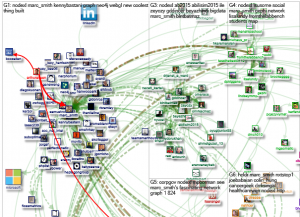
NodeXL Eye Candy

Filed under: Graphs,Visualization — Patrick Durusau @ 3:30 pm

node-xl-1

This only part of a graph visualization that you will find at: http://nodexlgraphgallery.org/Pages/Graph.aspx?graphID=39261. The visualization was produced by Marc Smith.

I first saw this mentioned in a tweet by Kenny Bastani.

With only two hundred and fifty-six nodes and five hundred and fifty-two unique edges, you can start to see some of the problems with graph visualization.

Can you visually determine the top ten (10) nodes in this display?

The more complex the graph, the harder it will be in some cases to visually evaluate the graph. Citation graphs for example, will exhibit recognizable clusters even if the graph is very “busy.” On the other hand, if you are seeking links between individuals, some connections are likely to be lost in the noise.

Without losing each node’s integrity as individual nodes, do you know of techniques to treat nodes as components of a larger node so that the larger nodes behavior in the visualization is determined by the “sub-“nodes it contains? Thinking of it as a way to “summarize” the data of the individual nodes and keep them in play for a visualization.

When interesting behavior is exhibited, the virtual node could be expanded and the relationships refined based on the nodes within.

February 7, 2015

100 pieces of flute music

Filed under: Design,Graphics,Music,Visualization — Patrick Durusau @ 3:28 pm

100 pieces of flute music – A quantified self project where music and design come together by Erika von Kelsch.

From the post:

flute-image1-680x490

(image: The final infographic | Erika von Kelsch)

The premise of the project was to organize 100 pieces of data into a static print piece. At least 7 metadata categories were to be included within the infographic, as well as a minimum of 3 overall data rollups. I chose 100 pieces of flute music that I have played that have been in my performance repertoire. Music was a potential career path for me, and the people and experiences I had through music influence how I view and explore the world around me to this day. The way I approach design is also influenced by what I learned from studying music, including the technical aspects of both flute and theory, as well as the emotional facets of performance. I decided to use this project as a vehicle to document this experience.

Not only is this a great visualization but the documentation of the design process is very impressive!

Have you ever attempted to document your design process during a project? That is what actually happened as opposed to what “must have happended” in the design process?

February 4, 2015

Oranges and Blues

Filed under: Image Understanding,UX,Visualization — Patrick Durusau @ 4:19 pm

Oranges and Blues by Edmund Helmer.

From the post:

Title-Fifth-Element

When I launched this site over two years ago, one of my first decisions was to pick a color scheme – it didn’t take long. Anyone who watches enough film becomes quickly used to Hollywood’s taste for oranges and blues, and it’s no question that these represent the default palette of the industry; so I made those the default of BoxOfficeQuant as well. But just how prevalent are the oranges and blues?

Some people have commented and researched how often those colors appear in movies and movie posters, and so I wanted to take it to the next step and look at the colors used in film trailers. Although I’d like to eventually apply this to films themselves, I used trailers because 1) They’re our first window into what a movie will look like, and 2) they’re easy to get (legally). So I’ve downloaded all the trailers available on the-numbers.com, 312 in total – not a complete set, but the selection looks random enough – and I’ve sampled across all the frames of these trailers to extract their Hue, Saturation, and Value. If you’re new to those terms, the chart below should make it clear enough: Hue is the color, Value is the distance from black, (and saturation, not shown, is the color intensity).

Edmund’s data isn’t “big” or “fast” but it is “interesting.” Unfortunately, “interesting” data is one of those categories where I know it when I see it.

I have seen movies and movie trailers but it never occurred to me to inspect the colors used in movie trailers. Turns out to not be a random choice. Great visualizations in this post and a link to further research on genre and colors, etc.

How is this relevant to you? Do you really want to use scary colors for your UI? It’s not really that simple but neither are movie trailers. What makes some capture your attention and stay with you? Others you could not repeat at the end of the next commercial. Personally, I would prefer a UI that captured my attention and that I remembered from the first time I saw it. (Especially if I were selling the product with that UI.)

You?

I first saw this in a tweet by Neil Saunders.

PS: If you are interested in statistics and film, BoxOfficeQuant – Statistics and Film (Edmund’s blog) is a great blog to follow.

February 2, 2015

Best of the Visualization Web… December 2014

Filed under: Graphics,Visualization — Patrick Durusau @ 9:38 am

Best of the Visualization Web… December 2014 by Andy Kirk.

From the post:

At the end of each month I pull together a collection of links to some of the most relevant, interesting or thought-provoking web content I’ve come across during the previous month. Here’s the latest collection from December 2014.

Andy lists:

Forty (40) links to visualizations.

Thirteen (13) links to articles.

Seven (7) links to learning and development.

Seven (7) links on visualization as a subject.

Six (6) sundry links that may be of interest.

Out of seventy-three (73) links, not one visual!

I rather like that because you can quickly scan Andy’s one line descriptions far faster than you could scroll through a sample from each site.

Worth bookmarking and returning to on a regular basis.

January 27, 2015

Eigenvectors and eigenvalues: Explained Visually

Filed under: Mathematics,Visualization — Patrick Durusau @ 2:42 pm

Eigenvectors and eigenvalues: Explained Visually by Victor Powell and Lewis Lehe

Very impressive explanation/visualization of eigenvectors and eigenvalues. What is more, it concludes with pointers to additional resources.

This is only a part of a larger visualization of algorithms projects at: Explained Visually.

Looking forward to seeing more visualizations on this site.

January 14, 2015

Data Analysis with Python, Pandas, and Bokeh

Filed under: Python,Visualization — Patrick Durusau @ 7:32 pm

Data Analysis with Python, Pandas, and Bokeh by Chris Metcalf.

From the post:

A number of questions have come up recently about how to use the Socrata API with Python, an awesome programming language frequently used for data analysis. It also is the language of choice for a couple of libraries I’ve been meaning to check out – Pandas and Bokeh.

No, not the endangered species that has bamboo-munched its way into our hearts and the Japanese lens blur that makes portraits so beautiful, the Python Data Analysis Library and the Bokeh visualization tool. Together, they represent an powerful set of tools that make it easy to retrieve, analyze, and visualize open data.

If you have ever wondered what days have the most “party” disturbance calls to the LA police department, your years of wondering are about to end. 😉

Seriously, just in this short post Chris makes a case for learning more about Python Data Analysis Library and the Bokeh visualization tool.

Becoming skilled with either package will take time but there is a nearly endless stream of data to practice upon.

I first saw this in a tweet by Christophe Lalanne.

Cool Interactive experiments of 2014

Filed under: Graphics,Interface Research/Design,Visualization — Patrick Durusau @ 7:21 pm

Cool Interactive experiments of 2014

From the post:

As we continue to look back at 2014, in search of the most interesting, coolest and useful pieces of content that came to our attention throughout the year, it’s only natural that we find projects that, despite being much less known and spoken of by the data visualization community than the ones of “The New York Times” or “The Washington Post”, have a certain “je ne sais quoi” to it, either it’s the project’s overall aesthetics, or the type of the data visualized.

Most of all, these projects show how wide the range of what visualization can be used for, outside the pressure of a client, a deadline or a predetermined tool to use. Self-promoting pieces, despite the low general value they might have, still play a determinant role in helping information designers test and expand their skills. Experimentation is at the core of this exciting time we are living in, so we gathered a couple of dozens of visual experiments that we had the opportunity to feature in our weekly “Interactive Inspiration” round ups, published every Friday.

Very impressive! I will just list the titles for you here:

  • The Hobbit | Natalia Bilenko, Asako Miyakawa
  • Periodic Table of Storytelling | James Harris
  • Graph TV | Kevin Wu
  • Beer Viz | Divya Anand, Sonali Sharma, Evie Phan, Shreyas
  • One Human Heartbeat | Jen Lowe
  • We can do better | Ri Liu
  • F1 Scope | Michal Switala
  • F1 Timeline | Peter Cook
  • The Largest Vocabulary in Hip hop | Matt Daniels
  • History of Rock in 100 Songs | Silicon Valley Data Science
  • When sparks fly | Lam Thuy Vo
  • The Colors of Motion | Charlie Clark
  • World Food Clock | Luke Twyman
  • Score to Chart | Davide Oliveri
  • Culturegraphy | Kim Albrecht
  • The Big Picture | Giulio Fagiolini
  • Commonwealth War Dead: First World War Visualised | James Offer
  • The Pianogram | Joey Cloud
  • Faces per second in episodes of House of Cards TV Series | Virostatiq
  • History Words Flow | Santiago Ortiz
  • Global Weirding | Cicero Bengler

If they have this sort of eye candy every Friday, mark me down as a regular visitor to VisualLoop.

BTW, I could have used XSLT to scrape the titles from the HTML but since there weren’t any odd line breaks, a regex in Emacs did the same thing with far fewer keystrokes.

I sometimes wonder if “interactive visualization” focuses too much on the visualization reacting to our input? After all, we are already interacting with visual stimuli in ways I haven’t seen duplicated on the image side. In that sense, reading books is an interactive experience, just on the user side.

Interactive Data Visualization for the Web

Filed under: D3,Graphics,Visualization — Patrick Durusau @ 4:26 pm

Interactive Data Visualization for the Web by Scott Murray.

From the webpage:

This online version of Interactive Data Visualization for the Web includes 44 examples that will show you how to best represent your interactive data. For instance, you’ll learn how to create this simple force layout with 10 nodes and 12 edges. Click and drag the nodes below to see the diagram react.

When you follow the link to the O’Reilly site, just ignore the eBook pricing and go directly to “read online.”

Much crisper than the early version I mention at: Interactive Data Visualization for the Web [D3].

I first saw this in a tweet by Kirk Borne.

January 5, 2015

Don’t make the Demo look Done

Filed under: Graphics,Marketing,Visualization — Patrick Durusau @ 5:11 pm

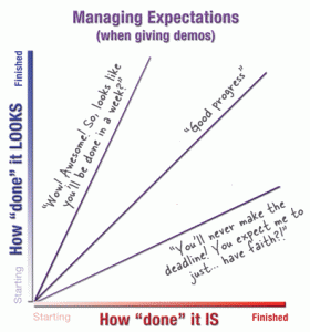
Don’t make the Demo look Done by Kathy Sierra.

From the post:

demo-not-done

When we show a work-in-progress (like an alpha release) to the public, press, a client, or boss… we’re setting their expectations. And we can do it one of three ways: dazzle them with a polished mock-up, show them something that matches the reality of the project status, or stress them out by showing almost nothing and asking them to take it “on faith” that you’re on track.

The bottom line:

How ‘done’ something looks should match how ‘done’ something is.

Not recent but very sound advice!

The only thing I would add is: Don’t BS your testers about how the demo is going to improve before going live before the customer. Not going to happen.

December 31, 2014

Developing a D3.js Edge

Filed under: D3,Graphics,Visualization — Patrick Durusau @ 2:34 pm

Developing a D3.js Edge by Chris Viau, Andrew Thornton, Ger Hobbelt, and Roland Dunn. (book)

From the description:

D3 is a powerful framework for producing interactive data visualizations. Many examples created in the real world with D3, however, can best be described as “spaghetti code.” So, if you are interested in using D3 in a reusable and modular way, which is of course in line with modern development practices, then this book is for you!

This book is aimed at intermediate developers, so to get the most from this book you need to know some JavaScript, and you should have experience creating graphics using D3. You will also want to have a good debugger handy (Chrome Developer panel or the Firefox/Firebug combo), to help you step through the many real world examples that you’ll find in this book. You should also be somewhat comfortable with any of these concepts:

If you read Kurt Cagle’s Ten Trends in Data Science 2015, you will recall him saying that 2014: “…demand for good data visualizers went from tepid to white hot” with the anticipation the same will be true for 2015.

Do note the qualifier “good.” That implies to me more than being able to use the stock charts and tools that you find in many low-end data tools.

Unlike the graphic capabilities of low-end data tools, D3 is limited more by your imagination than any practical limit to D3.

So, dust off your imagination and add D3 to your tool belt for data visualization.

PS: All the source code is here: https://github.com/backstopmedia/D3Edge

December 23, 2014

20 new data viz tools and resources of 2014

Filed under: Graphics,Visualization — Patrick Durusau @ 8:07 pm

20 new data viz tools and resources of 2014

From the post:

We continue our special posts with the best data viz related content of the year, with a useful list of new tools and resources that were made available throughout 2014. A pretty straightforward compilation that was much harder to produce than initially expected, we must say, since the number of mentions to include was way beyond our initial (poorly made) estimates. So many new options out there!

So, we had a hard time gathering 20 of those new platforms, tools and resources – if you’re a frequent reader of our weekly Data Viz News posts, you’ll might recall several of the mentions in this list, -, and we deliberately left out the new releases, versions and updates of existing tools, such as CartoDB, Mapbox, Tableau, D3.js, RAW, Infogr.am and others.

Of course, there’s always Visualising Data’s list of 250+ tools and resources for a much broader view of what’s available out there.

For now, here are the new resources and tools that caught our attention in 2014:

Kudos to Visualizing Data for doing the heavy lifting on this one. A site I need to follow in the coming year.

December 16, 2014

Cartography with complex survey data

Filed under: R,Visualization — Patrick Durusau @ 4:56 pm

Cartography with complex survey data by David Smith.

From the post:

Visualizing complex survey data is something of an art. If the data has been collected and aggregated to geographic units (say, counties or states), a choropleth is one option. But if the data aren't so neatly arranged, making visual sense often requires some form of smoothing to represent it on a map. 

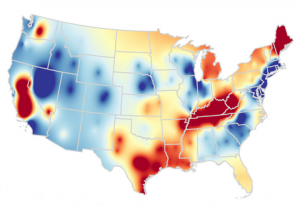
R, of course, has a number of features and packages to help you, not least the survey package and the various mapping tools. Swmap (short for "survey-weighted maps") is a collection of R scripts that visualize some public data sets, for example this cartogram of transportation share of household spending based on data from the 2012-2013 Consumer Expenditure Survey.

visual-r-us

In addition to finding data, there is also the problem of finding tools to process found data.

As in when I follow a link to a resource, that link is also submitted to a repository of other things associated with the data set I am requesting, such as the current locations of its authors, tools for processing the data, articles written using the data, etc.

That’s a long ways off but at least today you can record having found one more cache of tools for data processing.

Graph data from MySQL database in Python

Filed under: Graphics,Visualization — Patrick Durusau @ 2:08 pm

Graph data from MySQL database in Python

From the webpage:

All Python code for this tutorial is available online in this IPython notebook.

Thinking of using Plotly at your company? See Plotly’s on-premise, Plotly Enterprise options.

Note on operating systems: While this tutorial can be followed by Windows or Mac users, it assumes a Ubuntu operating system (Ubuntu Desktop or Ubuntu Server). If you don’t have a Ubuntu server, its possible to set up a cloud one with Amazon Web Services (follow the first half of this tutorial). If you’re using a Mac, we recommend purchasing and downloading VMware Fusion, then installing Ubuntu Desktop through that. You can also purchase an inexpensive laptop or physical server from Zareason, with Ubuntu Desktop or Ubuntu Server preinstalled.

Reading data from a MySQL database and graphing it in Python is straightforward, and all the tools that you need are free and online. This post shows you how. If you have questions or get stuck, email feedback@plot.ly, write in the comments below, or tweet to @plotlygraphs.

Just in case you want to start on adding a job skill over the holidays!

Whenever I see “graph” used in this sense, I wish it were some appropriate form of “visualize.” Unfortunately, “graphing” of data stuck too long ago to expect anyone to change now. To be fair, it is marking nodes on an edge, except that we treat all the space on one side or the other of the edge as significant.

Perhaps someone has treated the “curve” of a graph as a hyperedge? Connecting multiple nodes? I don’t know. You?

Whether they have or haven’t, I will continue to think of this type of “graphing” as visualization. Very useful but not the same thing as graphs with nodes/edges, etc.

December 15, 2014

Infinit.e Overview

Filed under: Data Analysis,Data Mining,Structured Data,Unstructured Data,Visualization — Patrick Durusau @ 11:04 am

Infinit.e Overview by Alex Piggott.

From the webpage:

Infinit.e is a scalable framework for collecting, storing, processing, retrieving, analyzing, and visualizing unstructured documents and structured records.

[Image omitted. Too small in my theme to be useful.]

Let’s provide some clarification on each of the often overloaded terms used in that previous sentence:

  • It is a "framework" (or "platform") because it is configurable and extensible by configuration (DSLs) or by various plug-ins types – the default configuration is expected to be useful for a range of typical analysis applications but to get the most out of Infinit.e we anticipate it will usually be customized.
    • Another element of being a framework is being designed to integrate with existing infrastructures as well run standalone.
  • By "scalable" we mean that new nodes (or even more granular: new components) can be added to meet increasing workload (either more users or more data), and that provision of new resources are near real-time.
    • Further, the use of fundamentally cloud-based components means that there are no bottlenecks at least to the ~100 node scale.
  • By "unstructured documents" we mean anything from a mostly-textual database record to a multi-page report – but Infinit.e’s "sweet spot" is in the range of database records that would correspond to a paragraph or more of text ("semi-structured records"), through web pages, to reports of 10 pages or less.
    • Smaller "structured records" are better handled by structured analysis tools (a very saturated space), though Infinit.e has the ability to do limited aggregation, processing and integration of such datasets. Larger reports can still be handled by Infinit.e, but will be most effective if broken up first.
  • By "processing" we mean the ability to apply complex logic to the data. Infinit.e provides some standard "enrichment", such as extraction of entities (people/places/organizations.etc) and simple statistics; and also the ability to "plug in" domain specific processing modules using the Hadoop API.
  • By "retrieving" we mean the ability to search documents and return them in ranking order, but also to be able to retrieve "knowledge" aggregated over all documents matching the analyst’s query.
    • By "query"/"search" we mean the ability to form complex "questions about the data" using a DSL (Domain Specific Language).
  • By "analyzing" we mean the ability to apply domain-specific logic (visual/mathematical/heuristic/etc) to "knowledge" returned from a query.

We refer to the processing/retrieval/analysis/visualization chain as document-centric knowledge discovery:

  • "document-centric": means the basic unit of storage is a generically-formatted document (eg useful without knowledge of the specific data format in which it was encoded)
  • "knowledge discovery": means using statistical and text parsing algorithms to extract useful information from a set of documents that a human can interpret in order to understand the most important knowledge contained within that dataset.

One important aspect of the Infinit.e is our generic data model. Data from all sources (from large unstructured documents to small structured records) is transformed into a single, simple. data model that allows common queries, scoring algorithms, and analytics to be applied across the entire dataset. …

I saw this in a tweet by Gregory Piatetsky yesterday and so haven’t had time to download or test any of the features of Infinit.e.

The list of features is a very intriguing one.

Definitely worth the time to throw another VM on the box and try it out with a dataset of interest.

Would appreciate your doing the same and sending comments and/or pointers to posts with your experiences. Suspect we will have different favorite features and hit different limitations.

Thanks!

PS: Downloads.

December 12, 2014

Building a Better Word Cloud

Filed under: R,Visualization,Word Cloud — Patrick Durusau @ 8:28 pm

Building a Better Word Cloud by Drew Conway.

From the post:

A few weeks ago I attended the NYC Data Visualization and Infographics meetup, which included a talk by Junk Charts blogger Kaiser Fung. Given the topic of his blog, I was a bit shocked that the central theme of his talk was comparing good and bad word clouds. He even stated that the word cloud was one of the best data visualizations of the last several years. I do not think there is such a thing as a good word cloud, and after the meetup I left unconvinced; as evidenced by the above tweet.

This tweet precipitated a brief Twitter debate about the value of word clouds, but from that straw poll it seemed the Nays had the majority. My primary gripe is that space is meaningless in word clouds. They are meant to summarize a single statistics—word frequency—yet they use a two dimensional space to express that. This is frustrating, since it is very easy to abuse the flexibility of these dimensions and conflate the position of a word with its frequency to convey dubious significance.

This came up on Twitter today even though Drew’s post dates from 2011. Great post though as Drew tries to improve upon the standard word cloud.

Not Drew’s fault but after reading his post I am where he was at the beginning on word clouds, I don’t see their utility. Perhaps your experience will be different.

Introducing Atlas: Netflix’s Primary Telemetry Platform

Filed under: BigData,Graphs,Visualization — Patrick Durusau @ 5:15 pm

Introducing Atlas: Netflix’s Primary Telemetry Platform

From the post:

Various previous Tech Blog posts have referred to our centralized monitoring system, and we’ve presented at least one talk about it previously. Today, we want to both discuss the platform and ecosystem we built for time-series telemetry and its capabilities and announce the open-sourcing of its underlying foundation.

atlas image

How We Got Here

While working in the datacenter, telemetry was split between an IT-provisioned commercial product and a tool a Netflix engineer wrote that allowed engineers to send in arbitrary time-series data and then query that data. This tool’s flexibility was very attractive to engineers, so it became the primary system of record for time series data. Sadly, even in the datacenter we found that we had significant problems scaling it to about two million distinct time series. Our global expansion, increase in platforms and customers and desire to improve our production systems’ visibility required us to scale much higher, by an order of magnitude (to 20M metrics) or more. In 2012, we started building Atlas, our next-generation monitoring platform. In late 2012, it started being phased into production, with production deployment completed in early 2013.

The use of arbitrary key/value pairs to determine a metrics identity merits a slow read. As does the query language for metrics, said “…to allow arbitrarily complex graph expressions to be encoded in a URL friendly way.”

Posted to Github with a longer introduction here.

The Wikipedia entry on time series offers this synopsis on time series data:

A time series is a sequence of data points, typically consisting of successive measurements made over a time interval. Examples of time series are ocean tides, counts of sunspots, and the daily closing value of the Dow Jones Industrial Average. Time series are very frequently plotted via line charts. Time series are used in statistics, signal processing, pattern recognition, econometrics, mathematical finance, weather forecasting, earthquake prediction, electroencephalography, control engineering, astronomy, communications engineering, and largely in any domain of applied science and engineering which involves temporal measurements.

It looks to me like a number of users communities should be interested in this release from Netflix!

Speaking of series, it occurs to me that is you count the character lengths of blanks in the Senate CIA torture report, you should be able to make some fairly good guesses on some of the names.

I am hopeful it doesn’t come to that because anyone with access to the full 6,000 page uncensored report has a moral obligation to post it to public servers. Surely there is one person with access to that report with a moral conscience.

I first saw this in a tweet by Roy Rapoport

December 6, 2014

Resisting Arrests: 15% of Cops Make 1/2 of Cases

Filed under: Data Analysis,Graphics,Visualization — Patrick Durusau @ 7:19 pm

Resisting Arrests: 15% of Cops Make 1/2 of Cases by WNYC

From the webpage:

Police departments around the country consider frequent charges of resisting arrest a potential red flag, as some officers might add the charge to justify use of force. WNYC analyzed NYPD records and found 51,503 cases with resisting arrest charges since 2009. Just five percent of arresting officers during that period account for 40% of resisting arrest cases — and 15% account for more than half of such cases.

Be sure to hit the “play” button on the graphic.

Statistics can be simple, direct and very effective.

First question: What has the police department done to lower those numbers for the 5% of the officers in question?

Second question: Who are the officers in the 5%?

Without transparency there is no accountability.

December 3, 2014

Periodic Table of Elements

Filed under: Maps,Science,Visualization — Patrick Durusau @ 8:17 pm

Periodic Table of Elements

You will have to follow the link to get anything approaching the full impact of this interactive graphic.

Would be even more impressive if elements linked to locations with raw resources and current futures markets.

I first saw this in a tweet by Lauren Wolf.

PS: You could even say that each element symbol is a locus for gathering all available information about that element.

November 30, 2014

Old World Language Families

Filed under: Graphics,Language,Visualization — Patrick Durusau @ 2:00 pm

language tree

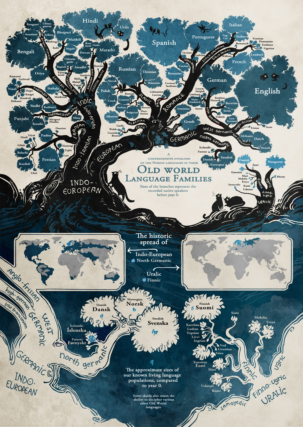
Be design (limitation of space) not all languages were included.

Despite that, the original post has gotten seven hundred and twenty-two (722) comments as of today. A large number of which mention wanting a poster of this visualization.

I could assemble the same information, sans the interesting graphic and get no comments and no requests for a poster version.

😉

What makes this presentation (map) compelling? Could you transfer it to another body of information with the same impact?

What do you make of: “The approximate sizes of our known living language populations, compared to year 0.”

Suggested reading on what makes some graphics compelling and others not?

Originally from: Stand Still Stay Silent Comic, although I first saw it at: Old World Language Families by Randy Krum.

PS: For extra credit, how many languages can you name that don’t appear on this map?

November 25, 2014

New York Times API extractor and Google Maps visualization (Wandora Tutorial)

Filed under: Topic Map Software,Visualization,Wandora — Patrick Durusau @ 4:37 pm

New York Times API extractor and Google Maps visualization (Wandora Tutorial)

From the description:

Video reviews the New York Times API extractor, the Google Maps visualization, and the graph visualization of Wandora application. The extractor is used to collect event data which is then visualized on a map and as a graph. Wandora is an open source tool for people who collect and process information, especially networked knowledge and knowledge about WWW resources. For more information see http://wandora.org

This is impressive, although the UI may have more options than MS Word. 😉 (It may not, I haven’t counted every way to access every option.)

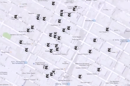
Here is the result that was obtained by use of drop down menus and selecting:

wandora event map

The Times logo marks events extracted from the New York Times and merged for display with Google Maps.

Not technically difficult but it is good to see a function of interest to ordinary users in a topic map application.

I have the latest release of Wandora. Need to start walking through the features.

The Sight and Sound of Cybercrime

Filed under: Cybersecurity,Graphics,Visualization — Patrick Durusau @ 2:56 pm

The Sight and Sound of Cybercrime Office for Creative Research.

From the post:

specimen box graphic

You might not personally be in the business of identity theft, spam delivery, or distributed hacking, but there’s a decent chance that your computer is. “Botnets” are criminal networks of computers that, unbeknownst to their owners, are being put to use for any number of nefarious purposes. Across the globe, millions of PCs have been infected with software that conscripts them into one of these networks, silently transforming these machines into accomplices in illegal activities and putting their users’ information at risk.

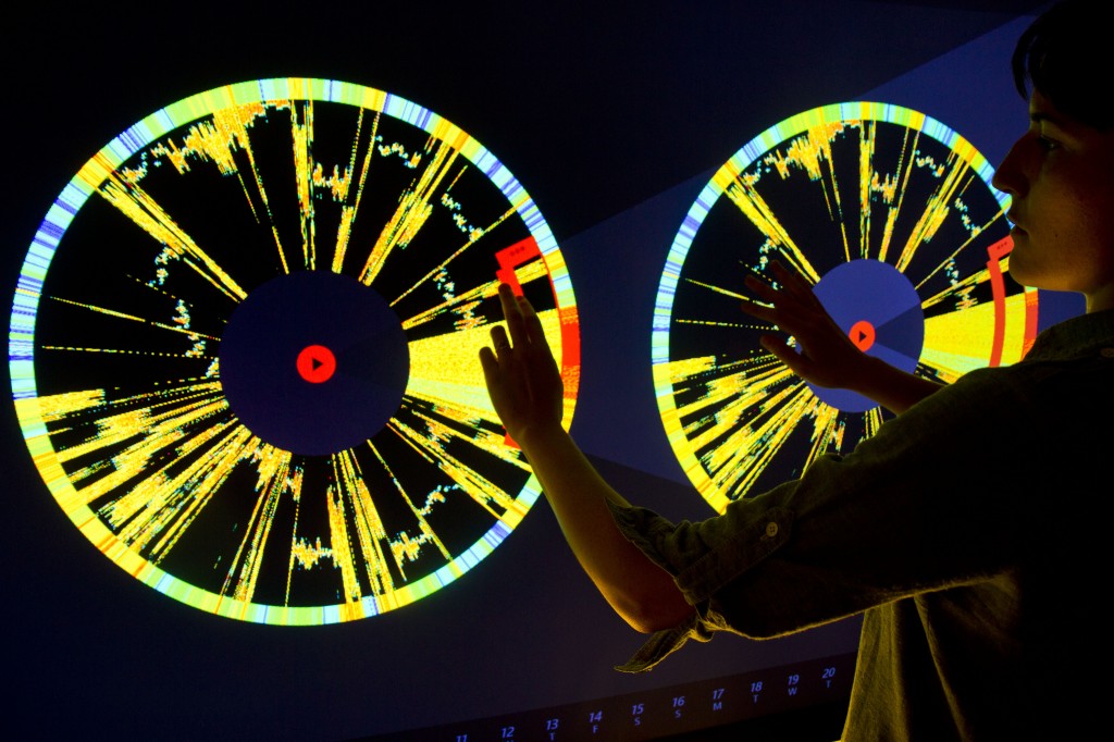
Microsoft’s Digital Crimes Unit has been tracking and neutralizing these threats for several years. In January, DCU asked The Office for Creative Research to explore novel ways to visualize botnet activity. The result is Specimen Box, a prototype exploratory tool that allows DCU’s investigators to examine the unique profiles of various botnets, focusing on the geographic and time-based communication patterns of millions of infected machines.

Specimen Box enables investigators to study a botnet the way a naturalist might examine a specimen collected in the wild: What are its unique characteristics? How does it behave? How does it propagate itself? How is it adapting to a changing environment?

Specimen Box combines visualization and sonification capabilities in a large-screen, touch-based application. Investigators can see and hear both live activity and historical ‘imprints’ of daily patterns across a set of 15 botnets. Because every botnet has its own unique properties, the visual and sonic portraits generated by the tool offer insight into the character of each individual network.

Very impressive graphic capabilities with several short video clips.

Would have been more impressive if the viewer was clued in on what the researchers were attempting to discover in the videos.

One point that merits special mention:

By default, the IP addresses are sorted around the circle by the level of communication activity. The huge data set has been optimized to allow researchers to instantly re-sort the IPs by longitude or by similarity. “Longitude Sort Mode” arranges the IPs geographically from east to west, while “Similarity Sort Mode” groups together IPs that have similar activity patterns over time, allowing analysts to see which groups of machines within the botnet are behaving the same way. These similarity clusters may represent botnet control groups, research activity from universities or other institutions, or machines with unique temporal patterns such as printers.

Think of “Similarity Sort Mode” as a group subject and this starts to resemble display of topics that have been merged* according to different criteria, in response to user requests.

*By “merged” I mean displayed as though “merged” in the TMDM sense of operations on a file.

November 23, 2014

Visual Classification Simplified

Filed under: Classification,Merging,Visualization — Patrick Durusau @ 3:41 pm

Visual Classification Simplified

From the post:

Virtually all information governance initiatives depend on being able to accurately and consistently classify the electronic files and scanned documents being managed. Visual classification is the only technology that classifies both types of documents regardless of the amount or quality of text associated with them.

From the user perspective, visual classification is extremely easy to understand and work with. Once documents are collected, visual classification clusters or groups documents based on their appearance. This normalizes documents regardless of the types of files holding the content. The Word document that was saved to PDF will be grouped with that PDF and with the TIF that was made from scanning a paper copy of either document.

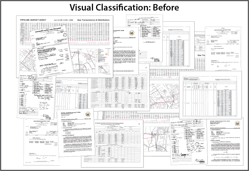
The clustering is automatic, there are no rules to write up front, no exemplars to select, no seed sets to try to tune. This is what a collection of documents might look like before visual classification is applied – no order and no way to classify the documents:

visual classification before

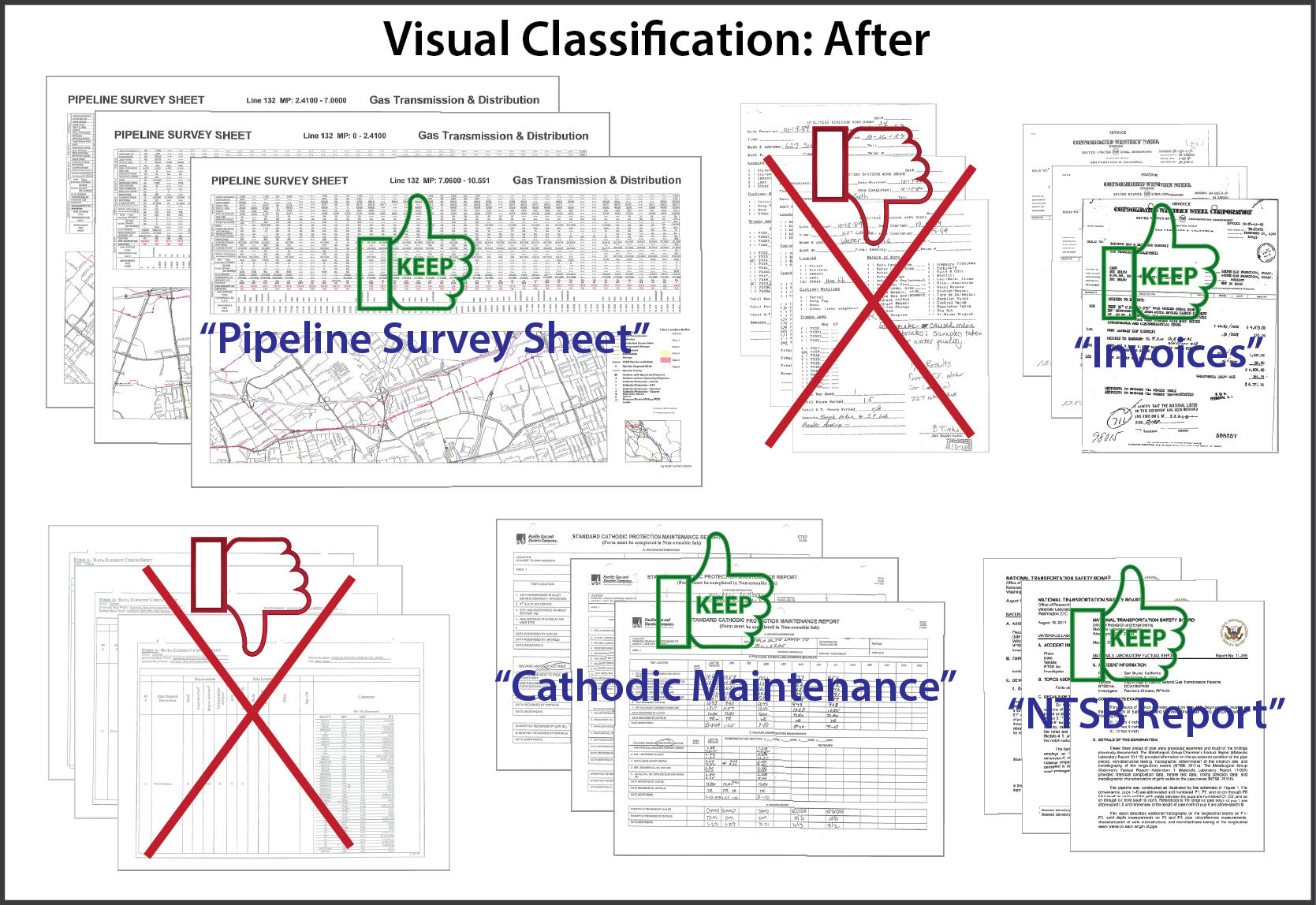
When the initial results of visual classification are presented to the client, the clusters are arranged according to the number of documents in each cluster. Reviewing the first clusters impacts the most documents. Based on reviewing one or two documents per cluster, the reviewer is able to determine (a) should the documents in the cluster be retained, and (b) if they should be retained, what document-type label to associate with the cluster.

visual classification after

By easily eliminating clusters that have no business or regulatory value, content collections can be dramatically reduced. Clusters that remain can have granular retention policies applied, be kept under appropriate access restrictions, and can be assigned business unit owners. Plus of course, the document-type labels can greatly assist users trying to find specific documents. (emphasis in original)

I suspect that BeyondRecognition, the host of this post, really means classification at the document level. A granularity that has plagued information retrieval for decades. Better than no retrieval at all but only just.

However, the graphics of visualization were just too good to pass up! Imagine that you are selecting merging criteria for a set of topics that represent subjects at a far lower granularity than document level.

With the results of those selections being returned to you as part of an interactive process.

If most topic map authoring is for aggregation, that is you author so that topics will merge, this would be aggregation by selection.

Hard to say for sure but I suspect that aggregation (merging) by selection would be far easier than authoring for aggregation.

Suggestions on how to test that premise?

November 21, 2014

Big bang of npm

Filed under: Graphs,Visualization — Patrick Durusau @ 2:17 pm

Big bang of npm

From the webpage:

npm is the largest package manager for javascript. This visualization gives you a small spaceship to explore the universe from inside. 106,317 stars (packages), 235,887 connections (dependencies).

Use WASD keys to move around. If you are browsing this with a modern smartphone – rotate your device around to control the camera (WebGL is required).

Navigation and other functions weren’t intuitive, at least not to me:

W – zooms in.

A – pans left.

S – zooms out.

D – pans right.

L – toggles links.

Choosing dependencies or dependents (lower left) filters the current view to show only dependencies or dependents of the chosen package.

Choosing a package name on lower left take you to the page for that package.

Search box at the top has a nice drop down of possible matches and displays dependencies or dependents by name, when selected below.

I would prefer more clues on the main display but given the density of the graph, that would quickly render it unusable.

Perhaps a way to toggle package names when displaying only a portion of the graph?

Users would have to practice with it but this technique could be very useful for displaying dense graphs. Say a map of the known contributions by lobbyists to members of Congress for example. 😉

I first saw this in a tweet by Lincoln Mullen.

November 20, 2014

Cytoscape.js != Cytoscape (desktop)

Filed under: Graphs,Javascript,Visualization — Patrick Durusau @ 11:29 am

Cytoscape.js

From the webpage:

Cytoscape.js is an open-source Cytoscape.jsgraph theory (a.k.a. network) library written in JavaScript. You can use Cytoscape.js for graph analysis and visualisation.

Cytoscape.js allows you to easily display and manipulate rich, interactive graphs. Because Cytoscape.js allows the user to interact with the graph and the library allows the client to hook into user events, Cytoscape.js is easily integrated into your app, especially since Cytoscape.js supports both desktop browsers, like Chrome, and mobile browsers, like on the iPad. Cytoscape.js includes all the gestures you would expect out-of-the-box, including pinch-to-zoom, box selection, panning, et cetera.

Cytoscape.js also has graph analysis in mind: The library contains many useful functions in graph theory. You can use Cytoscape.js headlessly on Node.js to do graph analysis in the terminal or on a web server.

Cytoscape.js is an open-source project, and anyone is free to contribute. For more information, refer to the Cytoscape.jsGitHub README.

The library was developed at the Cytoscape.jsDonnelly Centre at the University of Toronto. It is the successor of Cytoscape.jsCytoscape Web.

Cytoscape.js & Cytoscape

Though Cytoscape.js shares its name with Cytoscape, Cytoscape.js is not exactly the same as Cytoscape desktop. Cytoscape.js is a JavaScript library for programmers. It is not an app for end-users, and developers need to write code around Cytoscape.js to build graphcentric apps.

Cytoscape.js is a JavaScript library: It gives you a reusable graph widget that you can integrate with the rest of your app with your own JavaScript code. The keen members of the audience will point out that this means that Cytoscape plugins/apps — written in Java — will obviously not work in Cytoscape.js — written in JavaScript. However, Cytoscape.js supports its own ecosystem of extensions.

We are trying to make the two projects intercompatible as possible, and we do share philosophies with Cytoscape: Graph style and data should be separate, the library should provide core functionality with extensions adding functionality on top of the library, and so on.

Great demo graphs!

High marks on the documentation and its TOC. Generous use of examples.

One minor niggle on the documentation:

Note that metacharacters need to be escaped:

cy.filter('#some\\$funky\\@id');

I think the full set of metacharacters for JavaScript reads:

^ $ \ / ( ) | ? + * [ ] { } , .

Given that metacharacters vary between regex languages (unfortunately), it would be clearer to list the full set of JavaScript metacharacters and use only a few in the examples.

Thus:

Note that metacharacters ( ^ $ \ / ( ) | ? + * [ ] { } , . )need to be escaped:

cy.filter('#some\\$funky\\@id');

Overall a graph theory library that deserves your attention.

I first saw this in a tweet by Friedrich Lindenberg.


Update: I submitted a ticket on the metacharacters this morning and it was fixed shortly thereafter. Hard problems will likely take longer but definitely a responsive project!

November 18, 2014

emeeks’s blocks

Filed under: D3,Graphics,Visualization — Patrick Durusau @ 2:28 pm

emeeks’s blocks by Mike Bostock.

From the about page:

This is a simple viewer for code examples hosted on GitHub Gist. Code up an example using Gist, and then point people here to view the example and the source code, live!

The main source code for your example should be named index.html. You can also include a README.md using Markdown, and a thumbnail.png for preview. The index.html can use relative links to other files in your Gist; you can also use absolute links to shared files, such as D3, jQuery and Leaflet.

Rather remarkable page that includes a large number of examples from D3.js in Action.

« Newer PostsOlder Posts »

Powered by WordPress