Another Word For It Patrick Durusau on Topic Maps and Semantic Diversity

February 25, 2016

…but not if they have to do anything

Filed under: Design,Interface Research/Design,Usability,Users,UX — Patrick Durusau @ 5:07 pm

Americans want to be safer online – but not if they have to do anything by Bill Camarda.

From the post:

In the wake of non-stop news about identity theft, malware, ransomware, and all manner of information security catastrophes, Americans have educated themselves and are fully leveraging today’s powerful technologies to keep themselves safe… not.

While 67% told Morar Consulting they “would like extra layers of privacy,” far fewer use the technological tools now available to them. That’s the top-line finding of a brand-new survey of 2,000 consumers by Morar on behalf of the worldwide VPN provider “Hide My Ass!”

A key related finding: 63% of survey respondents have encountered online security issues. But, among the folks who’ve been bitten, just 56% have permanently changed their online behavior afterwards. (If you don’t learn the “hard way,” when do you learn?)

According to Morar, there’s still an odd disconnect between the way some people protect themselves offline and what they’re willing to do on the web. 51% of respondents would publicly post their email addresses, 26% their home addresses, and 21% their personal phone numbers.

Does this result surprise you?

If not:

How should we judge projects/solutions that presume conscious effort by users to:

  • Encode data (think linked data and topic maps)
  • Create maps between data sets
  • Create data in formats not their own
  • Use data vocabularies not their own
  • Use software not their own
  • Improve search results
  • etc.

I mention “search results” as it is commonly admitted that search results are, at best, a pig’s breakfast. The amount of improvement possible over current search results is too large to even be guesstimated.

Rather than beat the dead horse, “…users ought to…,” yes, they should, but they don’t, it is better to ask “Now what?”

Why not try metrics?

Monitor user interactions with information and test systems to anticipate those needs. Both are measurable categories.

Consider that back in the day, indexes never indexed everything. Magazine indexes omitted ads for example. Could have been indexed but indexing ads didn’t offer enough return for the effort required.

Why not apply that model to modern information systems? Yes, we can create linked data or other representations for everything in every post, but if no one uses 90% of that encoding, we have spent a lot of money for very little gain.

Yes, that means we will be discriminating against less often cited authors, for example. And your point?

The preservation of the Greek literature discriminated against authors whose work wasn’t important enough for someone to invest in preserving it.

Of course, we may not lose data in quite the same way but if it can’t be found, isn’t that the same a being lost?

Let’s apply metrics to information retrieval and determine what return justifies the investment to make information easily available.

Consign/condemn the rest of it to search.
January 3, 2015

PhantomFlow

Filed under: Graphics,Interface Research/Design,Usability,UX,Workflow — Patrick Durusau @ 4:12 pm

PhantomFlow

From the webpage:

PhantomFlow

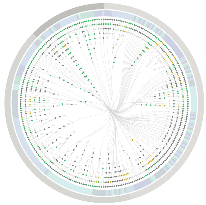
UI testing with decision trees. An experimental approach to UI testing, based on Decision Trees. A NodeJS wrapper for PhantomJS, CasperJS and PhantomCSS, PhantomFlow enables a fluent way of describing user flows in code whilst generating structured tree data for visualisation.

PhantomFlow Report: Test suite overview with radial Dendrogram and pie visualisation

The above visualisation is a real-world example, showing the complexity of visual testing at Huddle.

Aims

  • Enable a more expressive way of describing user interaction paths within tests
  • Fluently communicate UI complexity to stakeholders and team members through generated visualisations
  • Support TDD and BDD for web applications and responsive web sites
  • Provide a fast feedback loop for UI testing
  • Raise profile of visual regression testing
  • Support misual regression workflows, quick inspection & rebasing via UI.

If you are planning on being more user focused (translation: successful in gaining users) this year, PhantomFlow may be the tool for you!

It strikes me as a tool that can present the workflow differently than you are accustomed to seeing it. I find that helpful because I will overlook potential difficulties because I already know how some function works.

The red button labeled STOP! may mean to a user that the application stops. Not that the decryption key on the hard drive is trashed to prevent decryption even if I give up the key under torture. That may not occur to them. If that happens on their hard drive, they may be rather miffed.

September 16, 2014

User Onboarding

Filed under: Interface Research/Design,Usability,Users,UX — Patrick Durusau @ 4:27 pm

User Onboarding by Samuel Hulick.

From the webpage:

Want to see how popular web apps handle their signup experiences? Here’s every one I’ve ever reviewed, in one handy list.

I have substantially altered Samuel’s presentation to fit the list onto one screen and to open new tabs, enabling quick comparison of onboarding experiences.

Asana iOS Instagram OkCupid Slingshot
Basecamp InVision Optimizely Snapchat
Buffer LessAccounting Pinterest Trello
Evernote LiveChat Pocket Tumblr
Foursquare Mailbox for Mac Quora Twitter
GetResponse Meetup Shopify Vimeo
Gmail Netflix Slack WhatsApp

Writers become better by reading good writers.

Non-random good onboarding comes from studying previous good onboarding.

Enjoy!

I first saw this in a tweet by Jason Ziccardi.

June 24, 2014

Onboarding

Filed under: Interface Research/Design,Usability,UX — Patrick Durusau @ 1:20 pm

10 Tips to Immediately Improve User Onboarding by Pieter Walraven.

From the post:

User onboarding is an art. It can be deceivingly simple, but anyone that has ever designed a new user journey knows it’s incredibly hard.

For starters, there’s some tough questions to answer. What main value does my product offer? Who am I talking to? What is the one most important thing new users need to see? What does my product do? Why do we even exist?!

Luckily, there’s many great products out there with tested and optimized onboarding flows to get inspiration from (read: steal).

To make your life easier, I’ve analyzed some of the web’s most popular onboarding flows. I’ve also included some gaming-inspired learnings from my time as Product Manager at social games developer Playfish as well as insights from the onboarding design of Pie, the smart team chat app I’m currently working on.

Let’s dive in!

See Pieter’s post for the details but the highlights are:

  1. Don’t have a tutorial
  2. Let the user do it
  3. Don’t teach me all at once
  4. Let me experience the ‘wow!’
  5. Repeat to create a habit
  6. Use fewer words
  7. Don’t break flow
  8. Be adaptive
  9. Remove noise
  10. Use conventions

In terms of training/education, very little of this is new. For #6 “Use fewer words,” remember Strunk & White’s – “#13 Omit needless words.” Or compare #9 “remove noise” with Strunk & White #14 “Avoid a succession of loose sentences.”

Any decent UI/UX guide is going to give these rules in one form or another.

But it is important that they are repeated by different people and in various forms. Why? Open five applications at random on your phone or computer. How many out of those five have an interface that is immediately usable by a new user?

The message of what is required for good UI design is well known. Where that message fails is in the application of those principles.

At least to judge from current UIs. Yes?

Any “intuitive” UIs you would like to suggest as examples?

June 21, 2014

How To Design A Great User Interface

Filed under: Interface Research/Design,Usability,Users,UX — Patrick Durusau @ 7:50 pm

How To Design A Great User Interface

From the post:

The goal and only purpose of a user interface (UI), as the name implies, is to create an experience for the user.

Many automated solutions exist to make UI design simpler and faster; however, the designer must understand some basic rules of how to design a user interface. Because the focus is centered on the potential user, the user’s needs must primarily drive all design choices.

What are the needs of the user?

  • To accomplish the task with relative ease
  • To complete the task quickly
  • To enjoy the experience

The single most important characteristic of the UI is that it has to work well and work consistently. Secondly, the UI must carry out commands and respond quickly and intuitively. Lastly, but still very important the user interface should be visually appealing to the user.

Projects like Egas may give you a boost in the right direction for a topic map authoring/navigation interface but you are going to be ultimately responsible for your own design.

This post and the related ones will give you an opportunity to understand some of the primary issues you will face in creating a great user interface.

If you have no other take away from this post, notice that “impressing the user with how you view the paradigm” isn’t one of the goals of a great user interface.

May 31, 2014

Stop blaming spreadsheets…

Filed under: Spreadsheets,Usability — Patrick Durusau @ 5:09 pm

Stop blaming spreadsheets (and take a good look in the mirror) by Felienne Hermans.

From the post:

This week, spreadsheets hit the news again, when data for a book written by economist Pikkety turned out to contain spreadsheet errors. On this, Daniele Lemire wrote a blog post warning people not to use spreadsheets for serious work. This is useless advice, let me explain why.

See Felienne’s post for the three reasons. She writes very well and I might mangle it trying to summarize.

I see Lemire’s complaint as similar to exhortations that users should be using Oxygen to create structured XML documents.

As opposed to using Open Office and styles to author complex documents in XML (unseen by the user).

You can guess which one authors more XML every day.

Users want technologies that help them accomplish day to day tasks. Successful software, like spreadsheets, takes that into account.

May 3, 2014

Guerilla Usability Test: Yelp

Filed under: Interface Research/Design,Usability — Patrick Durusau @ 3:07 pm

Guerilla Usability Test: Yelp by Gary Yu.

Proof that usability testing doesn’t have to be overly complex or long.

Useful insights from five (5) users and a low-tech approach to analysis.

Like you, I have known organizations to spend more than a year on web design/re-design issues and demur on doing even this degree of user testing.

Lack of time, resources, expertise (they got that one right but not on the user testing issue), were the most common excuses.

There was a greatly reduced chance the executives would hear any disagreement with their design choices but I don’t consider that to be a goal in interface design.

April 18, 2014

A/B Tests and Facebook

Filed under: A/B Tests,Interface Research/Design,Usability,User Targeting — Patrick Durusau @ 2:32 pm

The reality is most A/B tests fail, and Facebook is here to help by Kaiser Fung.

From the post:

Two years ago, Wired breathlessly extolled the virtues of A/B testing (link). A lot of Web companies are in the forefront of running hundreds or thousands of tests daily. The reality is that most A/B tests fail.

A/B tests fail for many reasons. Typically, business leaders consider a test to have failed when the analysis fails to support their hypothesis. “We ran all these tests varying the color of the buttons, and nothing significant ever surfaced, and it was all a waste of time!” For smaller websites, it may take weeks or even months to collect enough samples to read a test, and so business managers are understandably upset when no action can be taken at its conclusion. It feels like waiting for the train which is running behind schedule.

Bad outcome isn’t the primary reason for A/B test failure. The main ways in which A/B tests fail are:

  1. Bad design (or no design);
  2. Bad execution;
  3. Bad measurement.

These issues are often ignored or dismissed. They may not even be noticed if the engineers running the tests have not taken a proper design of experiments class. However, even though I earned an A at school, it wasn’t until I started running real-world experiments that I really learned the subject. This is an area in which theory and practice are both necessary.

The Facebook Data Science team just launched an open platform for running online experiments, called PlanOut. This looks like a helpful tool to avoid design and execution problems. I highly recommend looking into how to integrate it with your website. An overview is here, and a more technical paper (PDF) is also available. There is a github page.

The rest of this post gets into some technical, sausage-factory stuff, so be warned.

For all of your software tests, do you run any A/B tests on your interface?

Or is your response to UI criticism, “…well, but all of us like it.” That’s a great test for a UI.

If you don’t read any other blog post this weekend, read Kaiser’s take on A/B testing.

March 17, 2014

Office Lens Is a Snap (Point and Map?)

Office Lens Is a Snap

From the post:

The moment mobile-phone manufacturers added cameras to their devices, they stopped being just mobile phones. Not only have lightweight phone cameras made casual photography easy and spontaneous, they also have changed the way we record our lives. Now, with help from Microsoft Research, the Office team is out to change how we document our lives in another way—with the Office Lens app for Windows Phone 8.

Office Lens, now available in the Windows Phone Store, is one of the first apps to use the new OneNote Service API. The app is simple to use: Snap a photo of a document or a whiteboard, and upload it to OneNote, which stores the image in the cloud. If there is text in the uploaded image, OneNote’s cloud-based optical character-recognition (OCR) software turns it into editable, searchable text. Office Lens is like having a scanner in your back pocket. You can take photos of recipes, business cards, or even a whiteboard, and Office Lens will enhance the image and put it into your OneNote Quick Notes for reference or collaboration. OneNote can be downloaded for free.

Less than five (5) years ago, every automated process in Office Lens would have been a configurable setting.

Today, it’s just point and shoot.

There is an interface lesson for topic maps in the Office Lens interface.

Some people will need the Office Lens API. But, the rest of us, just want to take a picture of the whiteboard (or some other display). Automatic storage and OCR are welcome added benefits.

What about a topic map authoring interface that looks a lot like MS Word™ or Open Office. A topic map is loaded much like a spelling dictionary. When the user selects “map-it,” links are inserted that point into the topic map.

Hover over such a link and data from the topic map is displayed. Can be printed, annotated, etc.

One possible feature would be “subject check” which displays the subjects “recognized” in the document. To enable the author to correct any recognition errors.

In case you are interested, I can point you to some open source projects that have general authoring interfaces. 😉

PS: If you have a Windows phone, can you check out Office Lens for me? I am still sans a cellphone of any type. Since I don’t get out of the yard a cellphone doesn’t make much sense. But I do miss out on the latest cellphone technology. Thanks!

February 3, 2014

UX Crash Course: 31 Fundamentals

Filed under: Interface Research/Design,Library,Library software,Usability,UX — Patrick Durusau @ 10:10 am

UX Crash Course: 31 Fundamentals by Joel Marsh.

From the post:

Basic UX Principles: How to get started

The following list isn’t everything you can learn in UX. It’s a quick overview, so you can go from zero-to-hero as quickly as possible. You will get a practical taste of all the big parts of UX, and a sense of where you need to learn more. The order of the lessons follows a real-life UX process (more or less) so you can apply these ideas as-you-go. Each lesson also stands alone, so feel free to bookmark them as a reference!

Main topics:

Introduction & Key Ideas

How to Understand Users

Information Architecture

Visual Design Principles

Functional Layout Design

User Psychology

Designing with Data

Users who interact with designers, librarians and library students come to mind, would do well to review these posts. If nothing else, it will give users better questions to ask vendors about their web interface design process.

September 2, 2013

Defining Usability

Filed under: Design,Interface Research/Design,Usability — Patrick Durusau @ 7:39 pm

Over the Labor Day holiday weekend (U.S.) i had a house full of librarians.

That happens when you are married to a librarian, who has a first cousin who is a librarian and your child is also a librarian.

It’s no surprise they talked about library issues and information technology issues in libraries in particular.

One primary concern was how to define “usability” for a systems engineer.

Patrons could “request” items and would be assured that they request had been accepted. However, the “receiver” module for that message, used by circulation, had no way to retrieve the requests.

From a systems perspective, the system was accepting requests, as designed. While circulation (who fulfills the requests) could not retrieve the messages, that was also part of the system design.

The user’s expectation their request would be seen and acted was being disappointed.

Disappointment of a user expectation, even if within system design parameters, is by definition, failure of the UI.

The IT expectation users would, after enough silence, make in-person or phone requests was the one that should be disappointed.

Or to put it another way, IT systems do not exist to provide employment for people interested in IT.

They exist solely and proximity to assist users in tasks that may have very little to do with IT.

Users are interested in “real life” (a counter-part to “real world”) research, discovery, publication, invention, business, pleasure and social interaction.

August 21, 2013

Wrap-up of the Solr Usability Contest

Filed under: Solr,Usability — Patrick Durusau @ 4:20 pm

Wrap-up of the Solr Usability Contest by Alexandre Rafalovitch.

From the post:

The Solr Usability Contest has finished. It run for four weeks, has received 29 suggestions, 113 votes and more than 300 visits. People from several different Solr communities participated.

See Alexandre’s post for the 29 suggestions.

Six (6) of them, including the #1 suggestion, concern documentation.

July 26, 2013

Announcing Solr Usability contest

Filed under: Solr,Usability — Patrick Durusau @ 1:02 pm

Announcing Solr Usability contest by Alexandre Rafalovitch.

From the post:

In collaboration with Packt Publishing and to celebrate the release of my new book Instant Apache Solr for Indexing Data How-to, we are organizing a contest to collect Solr Usability ideas.

I have written about the reasons behind the book before and the contest builds on that idea. Basically, I feel that a lot of people are able to start with Solr and get basic setup running, either directly or as part of other projects Solr is in. But then, they get stuck at a local-maximum of their understanding and have difficulty moving forward because they don’t fully comprehend how their configuration actually works or which of the parameters can be tuned to get results. And the difficulty is even greater when the initial Solr configuration is generated by an external system, such as Nutch, Drupal or SiteCore automatically behind the scenes.

The contest will run for 4 weeks (until mid-August 2013) and people suggesting the five ideas with most votes will get free electronic copies of my book. Of course, if you want to get the book now, feel free. I’ll make sure you will get rewarded in some other way, such as through advanced access to the upcoming Solr tools like SolrLint.

The results of the contest will be analyzed and fed into Solr improvement by better documentation, focused articles or feature requests on issue trackers. The end goal is not to give away a couple of books. There are much easier ways to do that. The goal is to improve Solr with specific focus on learning curve and easy adoption and integration.

Only five (5) suggestions so far?

Solr must have better tuning documentation than I have found. 😉

Do you have a suggestion?

June 24, 2013

Quantitative Research and Eye-Tracking:…

Filed under: Interface Research/Design,Usability,Users,UX — Patrick Durusau @ 1:33 pm

Quantitative Research and Eye-Tracking: A match made in UX heaven by James Breeze and Alexis Conomos.

From the post:

Administering many sessions of usability testing has shown us that people either attribute their failures to forces outside of their control (e.g. “The website doesn’t work and needs to be fixed) or to things they have influence over (e.g. “I’m not that good with computers but I could probably learn how to use it”).

A person’s perceived influence over outcomes is known, in psychobabble, as their ‘locus of control’ and it has a profound effect on usability testing results.

Qualitative data and verbatims from individuals with an internal locus of control often reflect a positive user experience, even when they have made several errors performing tasks. Similar to the respondent in the scenario depicted in the cartoon below, these individuals attribute their errors to their own actions, rather than failures of the product being tested.

(…)

The higher end of research on user experiences with technology.

Being aware of the issues may help you even if you lack funding for some of the tools and testing described in the post.

June 17, 2013

Google Visual Assets Guidelines – Part 1 [Link to 2]

Filed under: Interface Research/Design,Usability — Patrick Durusau @ 9:52 am

Google Visual Assets Guidelines – Part 1 [Link to 2]

From the post:

Google’s brand is shaped in many ways; one of which is through maintaining the visual coherence of our visual assets.

In January 2012, expanding on the new iconography style started by Creative Lab, we began creating this solid, yet flexible, set of guidelines that have been helping Google’s designers and vendors to produce high quality work that helps strengthen Google’s identity.

What you see here is a visual summary of the guidelines, divided into two Behance projects:

Part 1: Product icons and logo lockups
Part 2: User interface icons and Illustrations

This is a real treasure for improving your visual design.

Enjoy!

I first saw this at: Google’s Visual Design Guidelines

June 12, 2013

Easy mapping with Map Stack

Filed under: Interface Research/Design,Mapping,Maps,Usability — Patrick Durusau @ 11:25 am

Easy mapping with Map Stack by Nathan Yau.

Map Stack image

Nathan writes:

It seems like the technical side of map-making, the part that requires code or complicated software installations, fades a little more every day. People get to focus more on actual map-making than on server setup. Map Stack by Stamen is the most recent tool to help you do this.

(…)

It’s completely web-based, and you edit your maps via a click interface. Pick what you want (or use Stamen’s own stylish themes) and save an image. For the time being, the service is open only from 11am to 5pm PST, so just come back later if it happens to be closed.

Over 3,000 maps have been made over the last four days! Examples.

Now to see semantic mapping interfaces improve.

June 5, 2013

Usability & User Experience Community

Filed under: Interface Research/Design,Usability,UX — Patrick Durusau @ 3:51 pm

Usability & User Experience Community

From the webpage:

This web site is a forum to share information and experiences on issues related to the usability and user-centered design. It is the home of the Usability and User Experience Community of the Society for Technical Communication.

Home of the Heuristic Evaluation – A System Checklist resource.

An abundance of usability resources, particularly under “New to Usability?”

Every hour you spend at this site may save users days of unproductive annoyance with your products.

Heuristic Evaluation – A System Checklist

Filed under: Interface Research/Design,Usability,UX — Patrick Durusau @ 3:13 pm

Heuristic Evaluation – A System Checklist by Deniese Pierotti.

An interface review checklist, topic followed by # of questions:

  1. Visibility of System Status (29)
  2. Match Between System and the Real World (24)
  3. User Control and Freedom (23)
  4. Consistency and Standards (51)
  5. Help Users Recognize, Diagnose, and Recover from Errors (21)
  6. Error Prevention (15)
  7. Recognition Rather Than Recall (40)
  8. Flexibility and Minimalist Design (16)
  9. Aesthetic and Minimalist Design (12)
  10. Help and Documentation (23)
  11. Skills (22)
  12. Pleasurable and Respectful Interaction with the User (17)
  13. Privacy (3)

Almost three hundred (300) questions to make you think about your application and its interface.

A good basis for a web form populated with a history of prior ratings and comments, along with space for entry of new ratings and comments.

Being able to upload screen shots would be a nice touch as well.

I may be doing some UI evaluation soon so I will have to keep this in mind.

crowdcrafting

Filed under: Crowd Sourcing,Interface Research/Design,Usability — Patrick Durusau @ 8:04 am

crowdcrafting

Crowdcrafting is an instance of PyBossa:

From the about page:

PyBossa is a free, open-source crowd-sourcing and micro-tasking platform. It enables people to create and run projects that utilise online assistance in performing tasks that require human cognition such as image classification, transcription, geocoding and more. PyBossa is there to help researchers, civic hackers and developers to create projects where anyone around the world with some time, interest and an internet connection can contribute.

PyBossa is different to existing efforts:

  • It’s a 100% open-source
  • Unlike, say, “mechanical turk” style projects, PyBossa is not designed to handle payment or money — it is designed to support volunteer-driven projects.
  • It’s designed as a platform and framework for developing deploying crowd-sourcing and microtasking apps rather than being a crowd-sourcing application itself. Individual crowd-sourcing apps are written as simple snippets of Javascript and HTML which are then deployed on a PyBossa instance \(such as_ CrowdCrafting.org). This way one can easily develop custom apps while using the PyBossa platform to store your data, manage users, and handle workflow.

You can read more about the architecture in the PyBossa Documentation and follow the step-by-step tutorial to create your own apps.

Are interfaces for volunteer projects better than for-hire projects?

Do they need to be?

How would you overcome the gap between “…this is how I see the interface (the developers)…” versus the interface that users prefer?

Hint: 20th century advertising discovered that secret decades ago. See: Predicting What People Want and especially the reference to Selling Blue Elephants.

May 17, 2013

Organizing Digital Information for Others

Filed under: Interface Research/Design,Usability,Users,UX — Patrick Durusau @ 4:14 pm

Organizing Digital Information for Others by Maish Nichani. (ebook, no registration required)

From the description:

When we interact with web and intranet teams, we find many struggling to move beyond conceptual-level discussions on information organization. Hours on end are spent on discussing the meaning of “metadata”, “controlled vocabulary” and “taxonomy” without any strategic understanding of how everything fits together. Being so bogged down at this level they fail to look beyond to the main reason for their pursuit—organizing information for others (the end users) so that they can find the information easily.

Web and intranet teams are not the only ones facing this challenge. Staff in companies are finding themselves tasked with organizing, say, hundreds of project documents on their collaboration space. And they usually end up organizing it in the only way they know—for themselves. Team members then often struggle to locate the information that they thought should be in “this folder”!

In this short book, we explore how lists, categories, trees and facets can be better used to organize information for others. We also learn how metadata and taxonomies can connect different collections and increase the findability of information across the website or intranet.

But more than that we hope that this book can start a conversation around this important part of our digital lives.

So let the conversation begin!

The theme of delivering information to others cannot be emphasized enough.

Your notes, interface choices, etc., are just that, your notes, interface choices, etc.

Unless you are independently wealthy, that isn’t a very good marketing model.

Nor are users going to be “trained” to work, search, author, the “right way” in your view.

An introduction to be sure but this short (50 odd pages) work is entertaining and has additional references.

Very much worth the time to read.

May 14, 2013

CHI2013 [Warning: Cognitive Overload Ahead]

Filed under: CHI,HCIR,Interface Research/Design,Usability,Users,UX — Patrick Durusau @ 9:52 am

I have commented on several papers from CHI2013 Enrico Bertini posted to his blog.

I wasn’t aware of the difficulty Enrico must have had done to come up with his short list!

Take a look at the day-by-day schedule for CHI2013.

You will gravitate to some papers more than others. But I haven’t seen any slots that don’t have interesting material.

May be oversight on my part but I did not see any obvious links for the presentations/papers.

Definitely a resource to return to over and over again.

May 3, 2013

…The More Things Stay the Same (TECO Line Editor)

Filed under: Interface Research/Design,Usability,User Targeting,Users — Patrick Durusau @ 8:56 am

I just started reading Programming As If People Mattered by Nathaniel Borenstein.

To start chapter 5, Nathaniel relates this story about TECO, an “infamously powerful but hard-to-use line editor…”:

As you probably know, TECO is a line editor in which all of the commands are control characters. To enter some text you would type control-a, followed by the text, and a control-d to end the text. When I was first learning TECO I decided to type in a ten-page paper. I typed control-a, followed by all ten pages of text, followed by the control-d. Unfortunately, as I was typing in the paper I must have hit another control character. So when I typed the final control-d I received the message: ‘Unknown control character–input ignored.’ An hour of typing down the drain.

If that sounds like amusing but ancient history, recall in RSSOwl and Feed Validation a single errant control character in an RSS feed makes RSSOwl refuse the entire feed.

The date of the TECO story isn’t reported but TECO was invented in 1963. (Wikipedia has a nice article, TECO (text editor))

Fifty (50) years later we are still struggling with a sensible responses to errant control characters in data feeds?

Are you filtering non-valid control characters from RSS feeds?

Or are you still “current,” circa 1963?

Who nailed the principles of great UI design?

Filed under: Interface Research/Design,Usability,User Targeting,Users — Patrick Durusau @ 8:30 am

Who nailed the principles of great UI design? Microsoft, that’s who by Andrew C. Oliver.

From the post:

One of the best articles I’ve ever read on user interface design is this 12-year-old classic — written by Microsoft, no less. Published long before smartphones and modern tablets emerged, it fully explains the essence of good UI design. Amazingly, it criticizes Microsoft’s own UIs and explains why they are bad, though it was written at a time when Microsoft was not known for its humility.

Because my company has a mobile application division — and increasingly does full application development in our enterprise open source division — I often have to explain what makes a good or bad UI to customers. I’ve frequently referred to this article by way of explanation.

To give you an idea of my assessment of the “12-year-old classic,” I have saved the page and converted it to PDF for local reading/printing.

It is worth re-reading every month or so if you are interested in user interfaces.

Or should I say if you are interested in successful user interfaces.

Read Andrew’s post as well. It updates us on the continuing releance of IUI (Inductive User Interface) for desktop, web and mobile interfaces.

I first saw this at DZone.

April 30, 2013

Patterns of information use and exchange:…

Filed under: Design,Interface Research/Design,Marketing,Usability,Users — Patrick Durusau @ 3:05 pm

Patterns of information use and exchange: case studies of researchers in the life sciences

From the post:

A report of research patterns in life sciences revealing that researcher practices diverge from policies promoted by funders and information service providers

This report by the RIN and the British Library provides  a unique insight into how information is used by researchers across life sciences. Undertaken by the University of Edinburgh’s Institute for the Study of Science, Technology and Innovation, and the UK Digital Curation Centre and the University of Edinburgh?s Information Services, the report concludes that one-size-fits-all information and data sharing policies are not achieving scientifically productive and cost-efficient information use in life sciences.

The report was developed using an innovative approach to capture the day-to-day patterns of information use in seven research teams from a wide range of disciplines, from botany to clinical neuroscience. The study undertaken over 11 months and involving 56 participants found that there is a significant gap between how researchers behave and the policies and strategies of funders and service providers. This suggests that the attempts to implement such strategies have had only a limited impact. Key findings from the report include:

  • Researchers use informal and trusted sources of advice from colleagues, rather than institutional service teams, to help identify information sources and resources
  • The use of social networking tools for scientific research purposes is far more limited than expected
  • Data and information sharing activities are mainly driven by needs and benefits perceived as most important by life scientists rather than top-down policies and strategies
  • There are marked differences in the patterns of information use and exchange between research groups active in different areas of the life sciences, reinforcing the need to avoid standardised policy approaches

Not the most recent research in the area but a good reminder that users do as users do, not as system/software/ontology architects would have them do.

What approach does your software take?

Does it make users perform their tasks the “right” way?

Or does it help users do their tasks “their” way?

April 14, 2013

Let Them Pee:…

Filed under: Interface Research/Design,Usability,UX — Patrick Durusau @ 3:46 pm

Let Them Pee: Avoiding the Sign-Up/Sign-In Mobile Antipattern by Greg Nudelman.

From the post:

The application SitOrSquat is a brilliant little piece of social engineering software that enables people to find bathrooms on the go, when they gotta go. Obviously, the basic use case implies a, shall we say, certain sense of urgency. This urgency is all but unfelt by the company that acquired the app, Procter and Gamble (P&G), as it would appear for the express purposes of marketing the Charmin brand of toilet paper. (It’s truly a match made in heaven—but I digress.)

Not content with the business of simply “Squeezing the Charmin” (that is, simple advertising), P&G executives decided for some unfathomable reason to force people to sign up for the app in multiple ways. First, as you can see in Figure 1, the app forces the customer (who is urgently looking for a place to relieve himself, let’s not forget) to use the awkward picker control to select his birthday to allegedly find out if he has been “potty trained.” This requirement would be torture on a normal day, but—I think you’ll agree—it’s excruciating when you really gotta go.

The horror of SitOrSquat doesn’t stop there.

Greg’s telling of the story is masterful. You owe it to yourself to read it more than once.

Relevant for mobile apps but also to “free” whitepapers, demo software or the other crap that requires name/email/phone details.

Name/email/phone details support marketing people who drain funds away from development and induce potential customers to look elsewhere.

March 23, 2013

Seeing the Future, 1/10 second at a time

Filed under: Image Understanding,Interface Research/Design,Usability,Users — Patrick Durusau @ 11:16 am

Ever caught a basketball? (Lot of basketball noise in the US right now.)

Or a baseball?

Played any other sport with a moving ball?

Your brain takes about 1/10 of a second to construct a perception of reality.

At 10 MPH, a ball moves 14.67 feet, while your brain creates a perception of its original location.

How did you catch the ball with your hands and not your face?

Mark Changizi has an answer to that question in: Why do we see illusions?.

The question Mark does not address: How does that relate to topic maps?

I can answer that with another question:

Does your topic map application communicate via telepathy or does it have an interface?

If you said it has an interface, understanding/experimenting with human perception is an avenue to create a useful and popular topic map interface.

You can also use the “works for our developers” approach but I wouldn’t recommend it.


About Mark Changizi:

Mark Changizi is a theoretical neurobiologist aiming to grasp the ultimate foundations underlying why we think, feel, and see as we do. His research focuses on “why” questions, and he has made important discoveries such as why we see in color, why we see illusions, why we have forward-facing eyes, why the brain is structured as it is, why animals have as many limbs and fingers as they do, why the dictionary is organized as it is, why fingers get pruney when wet, and how we acquired writing, language, and music.

March 11, 2013

Studying PubMed usages in the field…

Filed under: Curation,Interface Research/Design,Searching,Usability,Users — Patrick Durusau @ 4:24 pm

Studying PubMed usages in the field for complex problem solving: Implications for tool design by Barbara Mirel, Jennifer Steiner Tonks, Jean Song, Fan Meng, Weijian Xuan, Rafiqa Ameziane. (Mirel, B., Tonks, J. S., Song, J., Meng, F., Xuan, W. and Ameziane, R. (2013), Studying PubMed usages in the field for complex problem solving: Implications for tool design. J. Am. Soc. Inf. Sci.. doi: 10.1002/asi.22796)

Abstract:

Many recent studies on MEDLINE-based information seeking have shed light on scientists’ behaviors and associated tool innovations that may improve efficiency and effectiveness. Few, if any, studies, however, examine scientists’ problem-solving uses of PubMed in actual contexts of work and corresponding needs for better tool support. Addressing this gap, we conducted a field study of novice scientists (14 upper-level undergraduate majors in molecular biology) as they engaged in a problem-solving activity with PubMed in a laboratory setting. Findings reveal many common stages and patterns of information seeking across users as well as variations, especially variations in cognitive search styles. Based on these findings, we suggest tool improvements that both confirm and qualify many results found in other recent studies. Our findings highlight the need to use results from context-rich studies to inform decisions in tool design about when to offer improved features to users.

From the introduction:

For example, our findings confirm that additional conceptual information integrated into retrieved results could expedite getting to relevance. Yet—as a qualification—evidence from our field cases suggests that presentations of this information need to be strategically apportioned and staged or they may inadvertently become counterproductive due to cognitive overload.

Curated data raises its ugly head, again.

Topic maps curate data and search results.

Search engines don’t curate data or search results.

How important is it for your doctor to find the right answers? In a timely manner?

Spatial Orientation and the Brain:…
[Uni-Sex Data Navigation?]

Filed under: Interface Research/Design,Navigation,Usability,Users — Patrick Durusau @ 12:05 pm

Spatial Orientation and the Brain: The Effects of Map Reading and Navigation by Rebecca Maxwell.

From the post:

The human brain is a remarkable organ. It has the ability to reason, create, analyze, and process tons of information each day. The brain also gives humans the ability to move around in an environment using an innate sense of direction. This skill is called spatial orientation, and it is especially useful for finding routes in an unfamiliar place, following directions to another person’s house, or making a midnight raid of the refrigerator in the dark. Spatial orientation is crucial for adapting to new environments and getting from one point to another. Without it, people will walk around in endless circles, never being able find which way they want to go.

The brain has a specialized region just for navigating the spatial environment. This structure is called the hippocampus, also known as the map reader of the brain. The hippocampus helps individuals determine where they are, how they got to that particular place, and how to navigate to the next destination. Reading maps and developing navigational skills can affect the brain in beneficial ways. In fact, using orientation and navigational skills often can actually cause the hippocampus and the brain to grow, forming more neural pathways as the number of mental maps increase.

A study by scientists at University College in London found that grey matter in the brains of taxi drivers grew and adapted to help them store detailed mental maps of the city. The drivers underwent MRI scans, and those scans showed that the taxi drivers have larger hippocampi when compared to other people. In addition, the scientists found that the more time the drivers spent on the job, the more the hippocampus changes structurally to accommodate the large amount of navigational experience. Drivers who spent more than forty years in a taxi had more developed hippocampi than those just starting out. The study shows that experience with the spatial environment and navigation can have a direct influence on the brain itself.

However, the use of modern navigational technology and smartphone apps has the potential to harm the brain depending on how it is used in today’s world. Map reading and orienteering are becoming lost arts in the world of global positioning systems and other geospatial technologies. As a result, more and more people are losing the ability to navigate and find their way in unfamiliar terrain. According to the BBC, police in northern Scotland issued an appeal for hikers to learn orienteering skills rather than relying solely on smartphones for navigation. This came after repeated rescues of lost hikers by police in Grampian, one of which included finding fourteen people using mountain rescue teams and a helicopter. The police stated that the growing use of smartphone apps for navigation can lead to trouble because people become too dependent on technology without understanding the tangible world around them.

….

Other studies demonstrate that men and women develop different methods of navigating and orienting themselves to the spatial environment because of differences in roles as hunters and gatherers. This could explain the reason why men get lost in supermarkets while women can find their way around in minutes. Research done at Queen Mary, University of London demonstrated that men are better at finding hidden objects while women are better at remembering where objects are at. In addition, Frank Furedi, a sociology professor at Kent University, states that women are better at making judgment calls while men tend to overcomplicate the most basic navigational tasks.

The use of map reading and navigating skills to explore the spatial environment can benefit the brain and cause certain areas to grow while the use of modern technology for navigation seems to only hinder the brain. No matter which strategy men and women use for navigation, it is important to practice those skills and tune into the environment. While technology is a useful tool, in the end the human brain remains the most sophisticated map reader.

Very interesting post on the impact of GIS systems on the human brain and gender differences in methods of navigation.

Question: Gender differences in navigation are more than folktales so why do we have uni-sex data navigation interfaces?

February 21, 2013

Why Business Intelligence Software Is Failing Business

Filed under: Design,Interface Research/Design,Usability — Patrick Durusau @ 8:37 pm

Why Business Intelligence Software Is Failing Business

From the post:

Business intelligence software is supposed to help businesses access and analyze data and communicate analytics and metrics. I have witnessed improvements to BI software over the years, from mobile and collaboration to interactive discovery and visualization, and our Value Index for Business Intelligence finds a mature set of technology vendors and products. But even as these products mature in capabilities, the majority lack features that would make them easy to use. Our recent research on next-generation business intelligence found that usability is the most important evaluation criteria for BI technology, outpacing functionality (49%) and even manageability (47%). The pathetic state of dashboards and the stupidity of KPI illustrate some of the obvious ways the software needs to improve for businesses to gain the most value from it. We need smarter business intelligence, and that means not just more advanced sets of capabilities that are designed for the analysts, but software designed for those who need to use BI information.

BI considerations

Our research finds the need to collaborate and share (67%) and inform and deliver (61%) are in the top five evaluation categories for software. A few communication improvements, highlighted below, would help organizations better utilize analytics and BI information.

Imagine that, usability is ahead of functionality.

Successful semantic software vendors will draw several lessons from this post.

February 13, 2013

Designing to Reward our Tribal Sides

Filed under: Design,Interface Research/Design,Usability — Patrick Durusau @ 3:07 pm

Designing to Reward our Tribal Sides by Nir Eyal.

From the post:

tribal rewards

We are a species of beings that depend on one another. Scientists theorize humans have specially adapted neurons that help us feel what others feel, providing evidence that we survive through our empathy for others. We’re meant to be part of a tribe and our brains seek out rewards that make us feel accepted, important, attractive, and included.

Many of our institutions and industries are built around this need for social reinforcement. From civic and religious groups to spectator sports, the need to feel social connectedness informs our values and drives much of how we spend our time.

Communication technology in particular has given rise to a long history of companies that have provided better ways of delivering what I call, “rewards of the tribe.”

However, it’s not only the reward we seek. Variability also keeps us engaged. From the telegraph to email, products that connect us are highly valued, but those that invoke an element of surprise are even more so. Recently, the explosion of Web technologies that cater to our insatiable search for validation provides clear examples of the tremendous appeal of the promise of social reward.

Do you capture the Stack Overflow lesson in your UI?

UI design that builds on and rewards our hard wiring seems like a good idea to me.

Older Posts »

Powered by WordPress