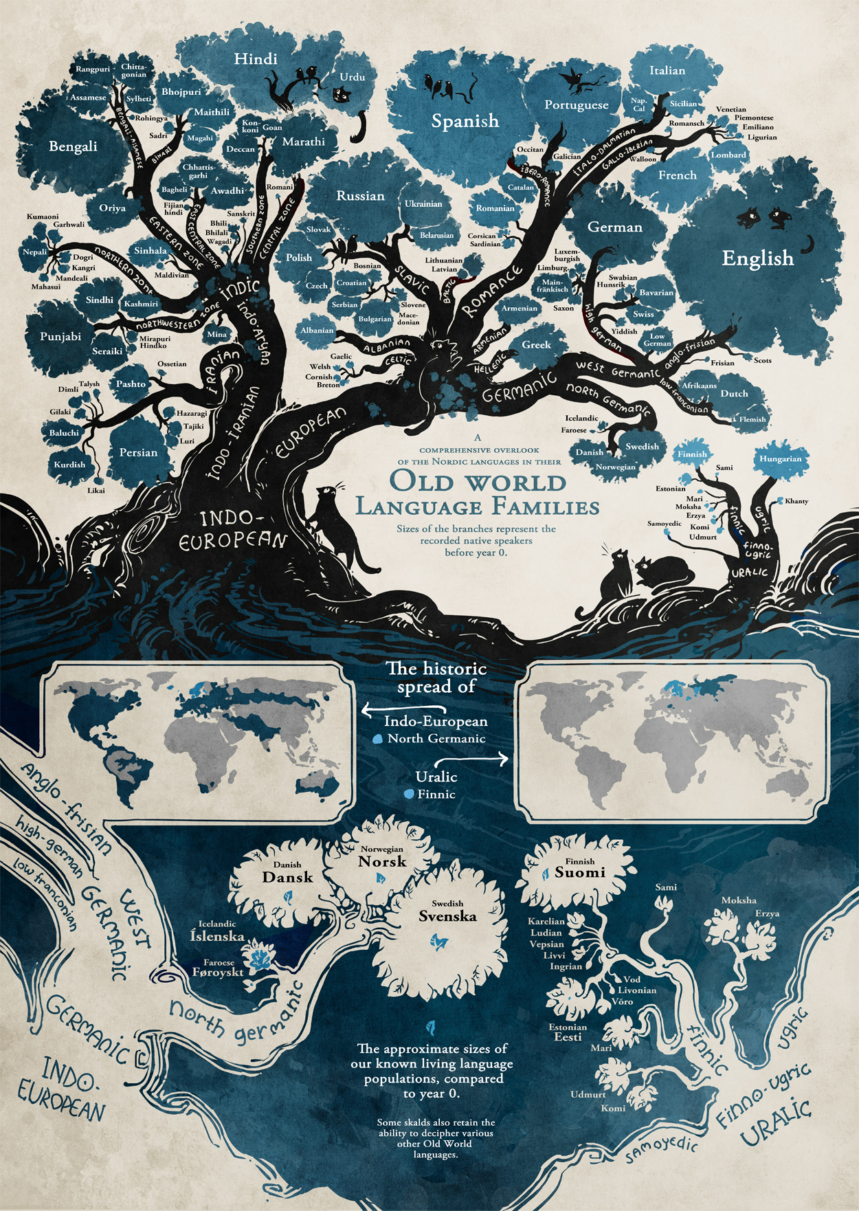
Be design (limitation of space) not all languages were included.
Despite that, the original post has gotten seven hundred and twenty-two (722) comments as of today. A large number of which mention wanting a poster of this visualization.
I could assemble the same information, sans the interesting graphic and get no comments and no requests for a poster version.
😉
What makes this presentation (map) compelling? Could you transfer it to another body of information with the same impact?
What do you make of: “The approximate sizes of our known living language populations, compared to year 0.”
Suggested reading on what makes some graphics compelling and others not?
Originally from: Stand Still Stay Silent Comic, although I first saw it at: Old World Language Families by Randy Krum.
PS: For extra credit, how many languages can you name that don’t appear on this map?