Another Word For It Patrick Durusau on Topic Maps and Semantic Diversity

December 26, 2017

Geocomputation with R – Open Book in Progress – Contribute

Filed under: Geographic Data,Geography,Geospatial Data,R — Patrick Durusau @ 8:57 pm

Geocomputation with R by Robin Lovelace, Jakub Nowosad, Jannes Muenchow.

Welcome to the online home of Geocomputation with R, a forthcoming book with CRC Press.

Development

p>Inspired by bookdown and other open source projects we are developing this book in the open. Why? To encourage contributions, ensure reproducibility and provide access to the material as it evolves.

The book’s development can be divided into four main phases:

  1. Foundations
  2. Basic applications
  3. Geocomputation methods
  4. Advanced applications

Currently the focus is on Part 2, which we aim to be complete by December. New chapters will be added to this website as the project progresses, hosted at geocompr.robinlovelace.net and kept up-to-date thanks to Travis….

Speaking of R and geocomputation, I’ve been trying to remember to post about Geocomputation with R since I encountered it a week or more ago. Not what I expect from CRC Press. That got my attention right away!

Part II, Basic Applications has two chapters, 7 Location analysis and 8 Transport applications.

Layering display of data from different sources should be included under Basic Applications. For example, relying on but not displaying topographic data to calculate line of sight between positions. Perhaps the base display is a high-resolution image overlaid with GPS coordinates at intervals and structures have the line of site colored on their structures.

Other “basic applications” you would suggest?

Looking forward to progress on this volume!

All targets have spatial-temporal locations.

Filed under: Geographic Data,Geography,Geophysical,Geospatial Data,R,Spatial Data — Patrick Durusau @ 5:29 pm

r-spatial

From the about page:

r-spatial.org is a website and blog for those interested in using R to analyse spatial or spatio-temporal data.

Posts in the last six months to whet your appetite for this blog:

The budget of a government for spatial-temporal software is no indicator of skill with spatial and spatial-temporal data.

How are yours?

September 28, 2017

Global Forest Change 2000–2015

Filed under: Geographic Data,Geography — Patrick Durusau @ 10:53 am

Global Forest Change 2000–2015

From the webpage:

Results from time-series analysis of Landsat images in characterizing global forest extent and change from 2000 through 2015. For additional information about these results, please see the associated journal article (Hansen et al., Science 2013).

Web-based visualizations of these results are also available at our main site:

http://earthenginepartners.appspot.com/science-2013-global-forest

Please use that URL when linking to this dataset.

We anticipate releasing updated versions of this dataset. To keep up to date with the latest updates, and to help us better understand how these data are used, please register as a user. Thanks!

User Notes for Version 1.3 Update

Some examples of improved change detection in the 2011–2015 update include the following:

  1. Improved detection of boreal forest loss due to fire.
  2. Improved detection of smallholder rotation agricultural clearing in dry and humid tropical forests.
  3. Improved detection of selective logging.
  4. Improved detection of the clearing of short cycle plantations in sub-tropical and tropical ecozones.

Detecting deforestation is the first step in walking up the chain of responsibility for this global scourge. One hopes with consequences at every level.

USGS Global Land Cover Characteristics Data Base Version 2.0

Filed under: Geographic Data,Geography — Patrick Durusau @ 10:14 am

Global Land Cover Characteristics Data Base Version 2.0

From the introduction:

The U.S. Geological Survey’s (USGS) National Center for Earth Resources Observation and Science (EROS), the University of Nebraska-Lincoln (UNL) and the Joint Research Centre of the European Commission have generated a 1-km resolution global land cover characteristics data base for use in a wide range of environmental research and modeling applications (Loveland and others, 2000). The land cover characterization effort is part of the National Aeronautics and Space Administration (NASA) Earth Observing System Pathfinder Program and the International Geosphere-Biosphere Programme-Data and Information System focus 1 activity. Funding for the project is provided by the USGS, NASA, U.S. Environmental Protection Agency, National Oceanic and Atmospheric Administration, U.S. Forest Service, and the United Nations Environment Programme.

The data set is derived from 1-km Advanced Very High Resolution Radiometer (AVHRR) data spanning a 12-month period (April 1992-March 1993) and is based on a flexible data base structure and seasonal land cover regions concepts. Seasonal land cover regions provide a framework for presenting the temporal and spatial patterns of vegetation in the database. The regions are composed of relatively homogeneous land cover associations (for example, similar floristic and physiognomic characteristics) which exhibit distinctive phenology (that is, onset, peak, and seasonal duration of greenness), and have common levels of primary production.

Rather than being based on precisely defined mapping units in a predefined land cover classification scheme, the seasonal land cover regions serve as summary units for both descriptive and quantitative attributes. The attributes may be considered as spreadsheets of region characteristics and permit updating, calculating, or transforming the entries into new parameters or classes. This provides the flexibility for using the land cover characteristics data base in a variety of models without extensive modification of model inputs.

The analytical strategy for global land cover characterization has evolved from methods initially tested during the development of a prototype 1-km land cover characteristics data base for the conterminous United States (Loveland and others, 1991, 1995; Brown and others, 1993). In the U.S. study, multitemporal AVHRR data, combined with other ancillary data sets, were used to produce a prototype land cover characteristics data base.

An older data set (April 1992-March 1993) at 1-km resolution, but still useful for data training, as historical data and you can imagine other planning uses.

Enjoy!

FAO GeoNETWORK

Filed under: Geographic Data,Geography — Patrick Durusau @ 10:05 am

FAO GeoNETWORK

From the about page:

The FAO GeoNetwork provides Internet access to interactive maps, satellite imagery and related spatial databases maintained by FAO and its partners.

It’s purpose is to improve access to and integrated use of spatial data and information.

Through this website FAO facilitates multidisciplinary approaches to sustainable development and supports decision making in agriculture, forestry, fisheries and food security.

Maps, including those derived from satellite imagery, are effective communicational tools and play an important role in the work of various types of users:

  • Decision Makers: e.g. Sustainable development planners and humanitarian and emergency managers in need of quick, reliable and up to date user-friendly cartographic products as a basis for action and better plan and monitor their activities.
  • GIS Experts in need of exchanging consistent and updated geographical data.
  • Spatial Analysts in need of multidisciplinary data to perform preliminary geographical analysis and reliable forecasts to better set up appropriate interventions in vulnerable areas.

The FAO GeoNetwork allows to easily share spatial data among different FAO Units, other UN Agencies, NGO’s and other institutions.

The FAO GeoNetwork site is powered by GeoNetwork opensource.

FAO and WFP, UNEP and more recently OCHA, have combined their research and mapping expertise to develop GeoNetwork opensource as a common strategy to effectively share their spatial databases including digital maps, satellite images and related statistics. The three agencies make extensive use of computer-based data visualization tools, known as Geographic Information System (GIS) and Remote Sensing (RS) software, mostly to create maps that combine various layers of information. GeoNetwork opensource provides them with the capacity to access a wide selection of maps and other spatial information stored in different databases around the world through a single entry point.

GeoNetwork opensource has been developed to connect spatial information communities and their data using a modern architecture, which is at the same time powerful and low cost, based on the principles of Free and Open Source Software (FOSS) and International and Open Standards for services and protocols (a.o. from ISO/TC211 and OGC).

For more information contact us at GeoNetwork@fao.org)

Apologies for the acronym heavy writing. Hard to say if it is meant as shorthand, as in scientific writing or to make ordinary writing opaque.

FAO – Food and Agriculture Organization of the United Nations

OCHA -United Nations Office for the Coordination of Humanitarian Affairs

OGC – Open Geospatial Consortium

UNEP – UN Environment

WFP – World Food Programme

Extremely rich collection of resources, not to mention opensource software for its use.

A site to bookmark in hopes your dreams of regime change evolve beyond spray paint and random acts of violence.

The CIA advises on such matters but their loyalty and motivations are highly suspect. Not to mention being subject to the whim and caprice of American politics.

Trust is ok, but independent analysis and verification is much better.

September 26, 2017

Global Land Survey (GLS) [Weaponizing Data]

Filed under: Geographic Data,Geography,Maps — Patrick Durusau @ 4:33 pm

Global Land Survey (GLS) is part of a collection I discovered at: 12 Sources to Download FREE Land Cover and Land Use Data. To use that collection you have to wade through pages of ads.

I am covering the sources separately and including their original descriptions.

From the GLS webpage:

The U.S. Geological Survey (USGS) and the National Aeronautics and Space Administration (NASA) collaborated from 2009 to 2011 to create the Global Land Surveys (GLS) datasets. Each of these collections were created using the primary Landsat sensor in use at the time for each collection epoch. The scenes used were a pre-collection format that met strict quality and cloud cover standards at the time the GLS files were created.

Additional details about the Global Land Survey collection can be found at http://landsat.usgs.gov/global-land-surveys-gls.

The Global Land Survey collection consists of images acquired from 1972 to 2012 combined into one dataset.

All Global Land Survey datasets contain the standard Landsat bands designated for each sensor. Band Designations can be found at http://landsat.usgs.gov/what-are-band-designations-landsat-satellites.

[data notes]

Global Land Survey data are available to search and download through EarthExplorer and GloVis. The collection can be found under the Global Land Survey category in EarthExplorer.

Users can download the full resolution LandsatLook jpg images http://landsat.usgs.gov/landsatlook-images, and the Level 1 Data Products http://landsat.usgs.gov/landsat-data-access.

Fifteen meter resolution in the panchromatic band. Nearly as accurate as someone stepping across a compound to establish target coordinates.

Which do you find more amazing: 1) Free access to data to weaponize or, 2) Lack of use of data as a weapon by NGOs?

MODIS Global Land Cover

Filed under: Geography,Geospatial Data,Maps — Patrick Durusau @ 1:11 pm

MODIS Global Land Cover is part of a collection I discovered at: 12 Sources to Download FREE Land Cover and Land Use Data. To use that collection you have to wade through pages of ads.

I am covering the sources separately and including their original descriptions.

From the webpage:

New NASA land cover maps are providing scientists with the most refined global picture ever produced of the distribution of Earth’s ecosystems and land use patterns. High-quality land cover maps aid scientists and policy makers involved in natural resource management and a range of research and global monitoring objectives.

The land cover maps were developed at Boston University in Boston, MA., using data from the Moderate Resolution Imaging Spectroradiometer (MODIS) instrument on NASA’s Terra satellite. The maps are based on a digital database of Earth images collected between November 2000 and October 2001.

“These maps, with spatial resolution of 1 kilometer (.6 mile), mark a significant step forward in global land cover mapping by providing a clearer, more detailed picture than previously available maps,” says Mark Friedl, one of the project’s investigators.

The MODIS sensor’s vantage point of a given location on Earth changes with each orbit of the satellite. An important breakthrough for these maps is the merging of those multiple looks into a single image. In addition, advances in remote sensing technology allow MODIS to collect higher-quality data than previous sensors. Improvements in data processing techniques have allowed the team to automate much of the classification, reducing the time to generate maps from months or years to about one week.

Each MODIS land cover map contains 17 different land cover types, including eleven natural vegetation types such as deciduous and evergreen forests, savannas, and wetlands. Agricultural land use and land surfaces with little or no plant cover—such as bare ground, urban areas and permanent snow and ice—are also depicted on the maps. Important uses include managing forest resources, improving estimates of the Earth’s water and energy cycles, and modeling climate and global carbon exchange among land, life, and the atmosphere.

Carbon cycle modeling is linked to greenhouse gas inventories—estimates of greenhouse emissions from human sources, and their removal by greenhouse gas sinks, such as plants that absorb and store carbon dioxide through photosynthesis. Many nations, including the United States, produce the inventories annually in an effort to understand and predict climate change.

“This product will have a major impact on our carbon budget work,” says Professor Steve Running of the University of Montana, Missoula, who uses the Boston University land cover maps in conjunction with other weekly observations from MODIS. “With the MODIS land cover product we can determine current vegetation in detail for each square kilometer; for example, whether there is mature vegetation, clear cutting, a new fire scar, or agricultural crops. This means we can produce annual estimates of net change in vegetation cover. This gets us one step closer to a global picture of carbon sources and sinks.”

This first map is an important milestone, but the land cover mapping group in Boston has other projects in progress. “With data collected over several years,” says Friedl, “we will be able to create maps that highlight global-scale changes in vegetation and land cover in response to climate change, such as drought. We’ll also be establishing the timing of seasonal changes in vegetation, defining when important transitions take place, such as the onset of the growing season.”

Launched December 18, 1999, Terra is the flagship of the Earth Observing System series of satellites and is a central part of NASA’s Earth Science Enterprise. The mission of the Earth Science Enterprise is to develop a scientific understanding of the Earth system and its response to natural and human-induced changes to enable improved prediction capability for climate, weather, and natural hazards.

Not recent data but depending upon your needs it is both a historical snapshot and a benchmark of then current technology.
Enjoy!

April 27, 2017

Coloring US Hacker Bigotry (Test Your Geographic Ignorance)

Filed under: Cybersecurity,Geography,Government — Patrick Durusau @ 4:22 pm

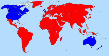
I failed to mention in How Do Hackers Live on $53.57? (‘Hack the Air Force’) that ‘Hack the Air Force’ is limited to hackers in Australia, Canada, New Zealand, and the United States (blue on the following map).

The dreaded North Korean hackers, the omnipresent Russian hackers (of Clinton fame), government associated Chinese hackers, not to mention the financially savvy East European hackers, and many others, are left out of this contest (red on the map).

The US Air Force is “fishing in the shallow end of the cybersecurity talent pool.”

I say this is “a partial cure for geographic ignorance,” because I started with the BlankMap-World4.svg map and proceeded in Gimp to fill in the outlines with appropriate colors.

There are faster map creation methods but going one by one, impressed upon me the need to improve my geographic knowledge!

August 26, 2016

Restricted U.S. Army Geospatial Intelligence Handbook

Restricted U.S. Army Geospatial Intelligence Handbook

From the webpage:

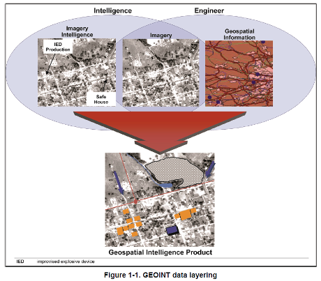
This training circular provides GEOINT guidance for commanders, staffs, trainers, engineers, and military intelligence personnel at all echelons. It forms the foundation for GEOINT doctrine development. It also serves as a reference for personnel who are developing doctrine; tactics, techniques, and procedures; materiel and force structure; and institutional and unit training for intelligence operations.

1-1. Geospatial intelligence is the exploitation and analysis of imagery and geospatial information to describe, assess, and visually depict physical features and geographically referenced activities on the Earth. Geospatial intelligence consists of imagery, imagery intelligence, and geospatial information (10 USC 467).

Note. TC 2-22.7 further implements that GEOINT consists of any one or any combination of the following components: imagery, IMINT, or GI&S.

1-2. Imagery is the likeness or presentation of any natural or manmade feature or related object or activity, and the positional data acquired at the same time the likeness or representation was acquired, including: products produced by space-based national intelligence reconnaissance systems; and likenesses and presentations produced by satellites, aircraft platforms, unmanned aircraft vehicles, or other similar means (except that such term does not include handheld or clandestine photography taken by or on behalf of human intelligence collection organizations) (10 USC 467).

1-3. Imagery intelligence is the technical, geographic, and intelligence information derived through the interpretation or analysis of imagery and collateral materials (10 USC 467).

1-4. Geospatial information and services refers to information that identifies the geographic location and characteristics of natural or constructed features and boundaries on the Earth, including: statistical data and information derived from, among other things, remote sensing, mapping, and surveying technologies; and mapping, charting, geodetic data, and related products (10 USC 467).

geospatial-intel-1-460

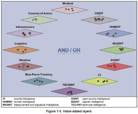
You may not have the large fixed-wing assets described in this handbook, the “value-added layers” are within your reach with open data.

geospatial-intel-2-460

In localized environments, your value-added layers may be more current and useful than those produced on longer time scales.

Topic maps can support geospatial collations of information along side other views of the same data.

A great opportunity to understand how a modern military force understands and uses geospatial intelligence.

Not to mention testing your ability to recreate that geospatial intelligence without dedicated tools.

August 23, 2016

Spatial Module in OrientDB 2.2

Filed under: Geographic Data,Geography,Geospatial Data,GIS,Mapping,Maps,OrientDB — Patrick Durusau @ 2:51 pm

Spatial Module in OrientDB 2.2

From the post:

In versions prior to 2.2, OrientDB had minimal support for storing and retrieving GeoSpatial data. The support was limited to a pair of coordinates (latitude, longitude) stored as double in an OrientDB class, with the possibility to create a spatial index against those 2 coordinates in order to speed up a geo spatial query. So the support was limited to Point.
In OrientDB v.2.2 we created a brand new Spatial Module with support for different types of Geometry objects stored as embedded objects in a user defined class

  • Point (OPoint)
  • Line (OLine)
  • Polygon (OPolygon)
  • MultiPoint (OMultiPoint)
  • MultiLine (OMultiline)
  • MultiPolygon (OMultiPlygon)
  • Geometry Collections

Along with those data types, the module extends OrientDB SQL with a subset of SQL-MM functions in order to support spatial data.The module only supports EPSG:4326 as Spatial Reference System. This blog post is an introduction to the OrientDB spatial Module, with some examples of its new capabilities. You can find the installation guide here.

Let’s start by loading some data into OrientDB. The dataset is about points of interest in Italy taken from here. Since the format is ShapeFile we used QGis to export the dataset in CSV format (geometry format in WKT) and import the CSV into OrientDB with the ETL in the class Points and the type geometry field is OPoint.

The enhanced spatial functions for OrientDB 2.2 reminded me of this passage in “Silences and Secrecy: The Hidden Agenda of Cartography in Early Modern Europe:”

Some of the most clear-cut cases of an increasing state concern with control and restriction of map knowledge are associated with military or strategic considerations. In Europe in the sixteenth and seventeenth centuries hardly a year passed without some war being fought. Maps were an object of military intelligence; statesmen and princes collected maps to plan, or, later, to commemorate battles; military textbooks advocated the use of maps. Strategic reasons for keeping map knowledge a secret included the need for confidentiality about the offensive and defensive operations of state armies, the wish to disguise the thrust of external colonization, and the need to stifle opposition within domestic populations when developing administrative and judicial systems as well as the more obvious need to conceal detailed knowledge about fortifications. (reprinted in: The New Nature of Maps: Essays in the History of Cartography, by J.B. Harley: Paul Laxton, John Hopkins, 2001. page 89)

I say “reminded me,” better to say increased my puzzling over the widespread access to geographic data that once upon a time had military value.

Is it the case that “ordinary maps,” maps of streets, restaurants, hotels, etc., aren’t normally imbued (merged?) with enough other information to make them “dangerous?”

If that’s true, the lack of commonly available “dangerous maps” is a disadvantage to emergency and security planners.

You can’t plan for the unknown.

Or to paraphrase Dibert: “Ignorance is not a reliable planning guide.”

How would you cure the ignorance of “ordinary” maps?

PS: While hunting for the quote, I ran across The Power of Maps by Denis Wood; with John Fels. Which has been up-dated: Rethinking the power of maps by Denis Wood; with John Fels and John Krygier. I am now re-reading the first edition and awaiting for the updated version to arrive.

Neither book is a guide to making “dangerous” maps but may awaken in you a sense of the power of maps and map making.

March 25, 2016

Dodging the Morality Police

Filed under: Geography,Georeferencing,Geospatial Data,Mapping — Patrick Durusau @ 7:54 am

This location-based app helps young Iranians avoid ‘morality police’ by Aleks Buczkowski.

From the post:

Many young Iranians are pretty liberated guys. They like to party and wear fancy clothes but they happened to live in a country where it’s prohibited. There is special police force dedicated to ensuring Iranians follow strict rules on clothing and conduct, called the Gasht-e-Ershad (or Guidance Patrol, commonly known as the “morality police”). Part of their activities include setting up checkpoints around cities and randomly inspecting vehicles driving by.

Now there is a way to avoid the Ershad controls. An anonymous team of Iranian developers have come up with a crowdsource app that allow users marking risky spots on the city map to help others avoid it. Something like Waze but for a much different purpose.

The Gershad app is pretty simple and easy to use. Users can mark where they encounter the “morality police”. The data is added to a database and visualised on a map. The more reports in one place, the bolder the warning on the map. When the number decreases, the alert will fade gradually from the map. Simple as it is.

Sounds quite adaptable to tracking police, FBI agents, narcs, etc. in modern urban environments.

Over time, with enough reports, patterns for police patrols would emerge from the data.

Enjoy!

January 3, 2016

Searching for Geolocated Posts On YouTube

Filed under: Geographic Data,Geography,Journalism,News,Reporting,Searching — Patrick Durusau @ 10:29 pm

Searching for Geolocated Posts On YouTube (video) by First Draft News.

Easily the most information filled 1 minutes and 18 seconds of the holiday season!

Illustrates searching for geolocated post to YouTube, despite YouTube not offering that option!

New tool in development may help!

Visit: http://youtube.github.io/geo-search-tool/search.html

Both the video and site are worth a visit!

Don’t forget to check out First Draft News as well!

June 24, 2015

World Factbook 2015 (paper, online, downloadable)

Filed under: Geography,Government,Government Data — Patrick Durusau @ 3:22 pm

World Factbook 2015 (GPO)

From the webpage:

The Central Intelligence Agency’s World Factbook provides brief information on the history, geography, people, government, economy, communications, transportation, military, and transnational issues for 267 countries and regions around world.

The CIA’s World Factbook also contains several appendices and maps of major world regions, which are located at the very end of the publication. The appendices cover abbreviations, international organizations and groups, selected international environmental agreements, weights and measures, cross-reference lists of country and hydrographic data codes, and geographic names.

For maps, it provides a country map for each country entry and a total of 12 regional reference maps that display the physical features and political boundaries of each world region. It also includes a pull-out Flags of the World, a Physical Map of the World, a Political Map of the World, and a Standard Time Zones of the World map.

Who should read The World Factbook? It is a great one-stop reference for anyone looking for an expansive body of international data on world statistics, and has been a must-have publication for:

  • US Government officials and diplomats
  • News organizations and researchers
  • Corporations and geographers
  • Teachers, professors, librarians, and students
  • Anyone who travels abroad or who is interested in foreign countries

The print version is $89.00 (U.S.), is 923 pages long and weighs in at 5.75 lb. in paperback.

A convenient and frequently updated alternative is the online CIA World Factbook.

I can’t compare the two versions because I am not going to spend $89.00 for an arm wrecker. 😉

You can also download a copy of the HTML version.

I downloaded and unzipped the file, only to find that the last update was in June, 2014.

That may be updated soon or it may not. I really don’t know.

If you just need background information that is unlikely to change or you want to avoid surveillance on what countries you look at and for how long, download the 2014 HTML version or pony up for the 2015 paper version.

May 28, 2015

Understanding Map Projections

Filed under: Cartography,Geography,Mapping,Maps — Patrick Durusau @ 3:22 pm

Understanding Map Projections by Tiago Veloso.

From the post:

Few subjects are so controversial – or at least, misunderstood- in cartography as map projections, especially if you’re taking your first steps in this field. And that’s simply because every flat map misrepresents the surface of the Earth in some way. So, in this matter, your work in map-mapping is basically to choose the best projection that suits your needs and reduces the distortion of the most important features you are trying to show/highlight.

But it’s not because you don’t have enough literature about it. There are actually a bunch of great resources and articles that will help you choose the correct projection for your map, so we decided to bring together a quick reference list.

Hope you enjoy it!

I rather like the remark:

…reduces the distortion of the most important features you are trying to show/highlight.

In part because I read it as a concession that all projections are distortions, including those that suit our particular purposes.

I would argue that all maps are at their inception distortions. They never represent every detail of what is being mapped and that implies a process of selective omission. Someone will consider what was omitted important, but it was less important than some other detail to the map maker.

Would the equivalent of projections for topic maps be choice of associations between topics or choices of subjects? Or both?

I lean towards the choice of associations and subjects because graphical rendering of associations creates impressions of the existence and strengths of relationships. Subjects because they are the anchors of the associations.

Speaking of distortion, I would consider any topic map about George H. W. Bush that doesn’t list his war crimes and members of his administration who were also guilty of war crimes as incomplete. There are other opinions on that topic (or at least so I am told).

Suggestions on how to spot “tells” of omission? What can be left out of a map that clues you in that something is missing? Varies from subject to subject but even a rough list would be helpful.

April 21, 2015

Imagery Processing Pipeline Launches!

Filed under: Geographic Data,Geography,Geophysical,Image Processing,Maps — Patrick Durusau @ 7:37 pm

Imagery Processing Pipeline Launches!

From the post:

Our imagery processing pipeline is live! You can search the Landsat 8 imagery catalog, filter by date and cloud coverage, then select any image. The image is instantly processed, assembling bands and correcting colors, and loaded into our API. Within minutes you will have an email with a link to the API end point that can be loaded into any web or mobile application.

Our goal is to make it fast for anyone to find imagery for a news story after a disaster, easy for any planner to get the the most recent view of their city, and any developer to pull in thousands of square KM of processed imagery for their precision agriculture app. All directly using our API

There are two ways to get started: via the imagery browser fetch.astrodigital.com, or directly via the the Search and Publish APIs. All API documentation is on astrodigital.com/api. You can either use the API to programmatically pull imagery though the pipeline or build your own UI on top of the API, just like we did.

The API provides direct access to more than 300TB of satellite imagery from Landsat 8. Early next year we’ll make our own imagery available once our own Landmapper constellation is fully commissioned.

Hit us up @astrodigitalgeo or sign up at astrodigital.com to follow as we build. Huge thanks to our partners at Development Seed who is leading our development and for the infinitively scalable API from Mapbox.

If you are interested in Earth images, you really need to check this out!

I haven’t tried the API but did get a link to an image of my city and surrounding area.

Definitely worth a long look!

February 24, 2015

Wiki New Zealand

Filed under: Data,Geography — Patrick Durusau @ 1:01 pm

Wiki New Zealand

From the about page:

It’s time to democratise data. Data is a language in which few are literate, and the resulting constraints at an individual and societal level are similar to those experienced when the proportion of the population able to read was small. When people require intermediaries before digesting information, the capacity for generating insights is reduced.

To democratise data we need to put users at the centre of our models, we need to design our systems and processes for users of data, and we need to realise that everyone can be a user. We will all win when everyone can make evidence-based decisions.

Wiki New Zealand is a charity devoted to getting people to use data about New Zealand.

We do this by pulling together New Zealand’s public sector, private sector and academic data in one place and making it easy for people to use in simple graphical form for free through this website.

We believe that informed decisions are better decisions. There is a lot of data about New Zealand available online today, but it is too difficult to access and too hard to use. We think that providing usable, clear, digestible and unbiased information will help you make better decisions, and will lead to better outcomes for you, for your community and for New Zealand.

We also believe that by working together we can build the most comprehensive, useful and accurate representation of New Zealand’s situation and performance: the “wiki” part of the name means “collaborative website”. Our site is open and free to use for everyone. Soon, anyone will be able to upload data and make graphs and submit them through our auditing process. We are really passionate about engaging with domain and data experts on their speciality areas.

We will not tell you what to think. We present topics from multiple angles, in wider contexts and over time. All our data is presented in charts that are designed to be compared easily with each other and constructed with as little bias as possible. Our job is to present data on a wide range of subjects relevant to you. Your job is to draw your own conclusions, develop your own opinions and make your decisions.

Whether you want to make a business decision based on how big your market is, fact-check a newspaper story, put together a school project, resolve an argument, build an app based on clean public licensed data, or just get to know this country better, we have made this for you.

Isn’t New Zealand a post-apocalypse destination? Thinking however great it may be now, the neighborhood is going down when all the post-apocalypse folks arrive. Something on the order of Mr. Rogers Neighborhood to Max Max Beyond Thunderdome. 😉

Hopefully, if there is an apocalypse, it will happen quickly enough to prevent a large influx of undesirables into New Zealand.

I first saw this in a tweet by Neil Saunders.

February 7, 2015

Geojournalism.org

Filed under: Geographic Data,Geography,Geospatial Data,Journalism,Mapping,Maps — Patrick Durusau @ 3:05 pm

Geojournalism.org

From the webpage:

Geojournalism.org provides online resources and training for journalists, designers and developers to dive into the world of data visualization using geographic data.

From the about page:

Geojournalism.org is made for:

Journalists

Reporters, editors and other professionals involved on the noble mission of producing relevant news for their audiences can use Geojournalism.org to produce multimedia stories or simple maps and data visualization to help creating context for complex environmental issues

Developers

Programmers and geeks using a wide variety of languages and tools can drink on the vast knowledge of our contributors. Some of our tutorials explore open source libraries to make maps, infographics or simply deal with large geographical datasets

Designers

Graphic designers and experts on data visualizations find in the Geojournalism.org platform a large amount of resources and tips. They can, for example, improve their knowledge on the right options for coloring maps or how to set up simple charts to depict issues such as deforestation and climate change

It is one thing to have an idea or even a story and quite another to communicate it effectively to a large audience. Geojournalism is designed as a community site that will help you communicate geophysical data to a non-technical audience.

I think it is clear that most governments are shy about accurate and timely communication with their citizens. Are you going to be one of those who fills in the gaps? Geojournalism.org is definitely a site you will be needing.

January 21, 2015

MrGeo (MapReduce Geo)

Filed under: Geo Analytics,Geographic Information Retrieval,Geography,Geospatial Data — Patrick Durusau @ 7:58 pm

MrGeo (MapReduce Geo)

From the webpage:

MrGeo was developed at the National Geospatial-Intelligence Agency (NGA) in collaboration with DigitalGlobe. The government has “unlimited rights” and is releasing this software to increase the impact of government investments by providing developers with the opportunity to take things in new directions. The software use, modification, and distribution rights are stipulated within the Apache 2.0 license.

MrGeo (MapReduce Geo) is a geospatial toolkit designed to provide raster-based geospatial capabilities that can be performed at scale. MrGeo is built upon the Hadoop ecosystem to leverage the storage and processing of hundreds of commodity computers. Functionally, MrGeo stores large raster datasets as a collection of individual tiles stored in Hadoop to enable large-scale data and analytic services. The co-location of data and analytics offers the advantage of minimizing the movement of data in favor of bringing the computation to the data; a more favorable compute method for Geospatial Big Data. This framework has enabled the servicing of terabyte scale raster databases and performed terrain analytics on databases exceeding hundreds of gigabytes in size.

The use cases sound interesting:

Exemplar MrGeo Use Cases:

  • Raster Storage and Provisioning: MrGeo has been used to store, index, tile, and pyramid multi-terabyte scale image databases. Once stored, this data is made available through simple Tiled Map Services (TMS) and or Web Mapping Services (WMS).
  • Large Scale Batch Processing and Serving: MrGeo has been used to pre-compute global 1 ArcSecond (nominally 30 meters) elevation data (300+ GB) into derivative raster products : slope, aspect, relative elevation, terrain shaded relief (collectively terabytes in size)
  • Global Computation of Cost Distance: Given all pub locations in OpenStreetMap, compute 2 hour drive times from each location. The full resolution is 1 ArcSecond (30 meters nominally)
  • I wonder if you started war gaming attacks on well known cities and posting maps on how the attacks could develop if that would be covered under free speech? Assuming your intent was to educate the general populace about areas that are more dangerous than others in case of a major incident.

    I first saw this in a tweet by Marin Dimitrov.

    August 22, 2014

    Getty Thesaurus of Geographic Names (TGN)

    Filed under: Geographic Data,Geography,Thesaurus — Patrick Durusau @ 3:07 pm

    Getty Thesaurus of Geographic Names Released as Linked Open Data by James Cuno.

    From the post:

    We’re delighted to announce that the Getty Research Institute has released the Getty Thesaurus of Geographic Names (TGN)® as Linked Open Data. This represents an important step in the Getty’s ongoing work to make our knowledge resources freely available to all.

    Following the release of the Art & Architecture Thesaurus (AAT)® in February, TGN is now the second of the four Getty vocabularies to be made entirely free to download, share, and modify. Both data sets are available for download at vocab.getty.edu under an Open Data Commons Attribution License (ODC BY 1.0).

    What Is TGN?

    The Getty Thesaurus of Geographic Names is a resource of over 2,000,000 names of current and historical places, including cities, archaeological sites, nations, and physical features. It focuses mainly on places relevant to art, architecture, archaeology, art conservation, and related fields.

    TGN is powerful for humanities research because of its linkages to the three other Getty vocabularies—the Union List of Artist Names, the Art & Architecture Thesaurus, and the Cultural Objects Name Authority. Together the vocabularies provide a suite of research resources covering a vast range of places, makers, objects, and artistic concepts. The work of three decades, the Getty vocabularies are living resources that continue to grow and improve.

    Because they serve as standard references for cataloguing, the Getty vocabularies are also the conduits through which data published by museums, archives, libraries, and other cultural institutions can find and connect to each other.

    A resource where you could loose some serious time!

    Try this entry for London.

    Or Paris.

    Bear in mind the data that underlies this rich display is now available for free downloading.

    June 9, 2014

    Map Distortion!

    Filed under: Cartography,Geography,Mapping,Maps — Patrick Durusau @ 1:49 pm

    Mercator: Extreme by Drew Roos.

    The link takes you to a display setting the pole to Atlanta, GA (near my present location).

    You should search for a location near you for the maximum impact of the display. Intellectually I have known about map distortion but seeing it for your location, that’s something different.

    Highly interactive and strongly recommended!

    Makes me wonder about visual displays of other map distortions. Not just well known map projections but policy distortions as well.

    Take for example a map that sizes countries by the amount of aid for the United States divided by their population.

    Are there any map artists in the audience?

    I first saw this in a tweet by Lincoln Mullen.

    May 11, 2014

    Twitter User Targeting Data

    Filed under: Geographic Data,Geography,Georeferencing,Tweets — Patrick Durusau @ 2:59 pm

    Geotagging One Hundred Million Twitter Accounts with Total Variation Minimization by Ryan Compton, David Jurgens, and, David Allen.

    Abstract:

    Geographically annotated social media is extremely valuable for modern information retrieval. However, when researchers can only access publicly-visible data, one quickly finds that social media users rarely publish location information. In this work, we provide a method which can geolocate the overwhelming majority of active Twitter users, independent of their location sharing preferences, using only publicly-visible Twitter data.

    Our method infers an unknown user’s location by examining their friend’s locations. We frame the geotagging problem as an optimization over a social network with a total variation-based objective and provide a scalable and distributed algorithm for its solution. Furthermore, we show how a robust estimate of the geographic dispersion of each user’s ego network can be used as a per-user accuracy measure, allowing us to discard poor location inferences and control the overall error of our approach.

    Leave-many-out evaluation shows that our method is able to infer location for 101,846,236 Twitter users at a median error of 6.33 km, allowing us to geotag roughly 89\% of public tweets.

    If 6.33 km sounds like a lot of error, check out NUKEMAP by Alex Wellerstein.

    April 5, 2014

    GeoCanvas

    Filed under: Geographic Data,Geography,Maps,Visualization — Patrick Durusau @ 7:34 pm

    Synthicity Releases 3D Spatial Data Visualization Tool, GeoCanvas by Dean Meyers.

    From the post:

    Synthicity has released a free public beta version of GeoCanvas, its 3D spatial data visualization tool. The software provides a streamlined toolset for exploring geographic data, lowering the barrier to learning and using geographic information systems.

    GeoCanvas is not limited to visualizing parcels in cities. By supporting data formats such as the widely available shapefile for spatial geometry and text files for attribute data, it opens the possibility of rapid 3D spatial data visualization for a wide range of uses and users. The software is expected to be a great addition to the toolkits of students, researchers, and practitioners in fields as diverse as data science, geography, planning, real estate analysis, and market research. A set of video tutorials explaining the basic concepts and a range of examples have been made available to showcase the possibilities.

    The public beta version of GeoCanvas is available as a free download from www.synthicity.com.

    Well, rats! I haven’t installed a VM with Windows 7/8 or Max OS X 10.8 or later.

    Sounds great!

    Comments from actual experience?

    February 27, 2014

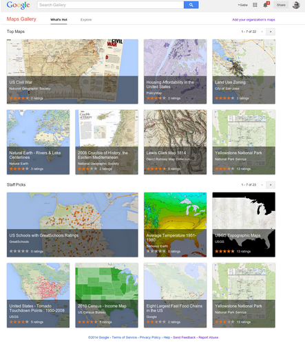
    Introducing Google Maps Gallery…

    Filed under: Geography,Google Maps,Mapping,Maps — Patrick Durusau @ 3:13 pm

    Introducing Google Maps Gallery: Unlocking the World’s Maps by Jordan Breckenridge.

    From the post:

    Governments, nonprofits and businesses have some of the most valuable mapping data in the world, but it’s often locked away and not accessible to the public. With the goal of making this information more readily available to the world, today we’re launching Google Maps Gallery, a new way for organizations to share and publish their maps online via Google Maps Engine.

    Google Map Gallery

    Maps Gallery works like an interactive, digital atlas where anyone can search for and find rich, compelling maps. Maps included in the Gallery can be viewed in Google Earth and are discoverable through major search engines, making it seamless for citizens and stakeholders to access diverse mapping data, such as locations of municipal construction projects, historic city plans, population statistics, deforestation changes and up-to-date emergency evacuation routes. Organizations using Maps Gallery can communicate critical information, build awareness and inform the public at-large.

    A great site as you would expect from Google.

    I happened upon US Schools with GreatSchools Ratings. Created by GreatSchools.org.

    There has been a rash of 1950’s style legislative efforts this year in the United States, seeking to permit business to discriminate on the basis of their religious beliefs. Recalling the days when stores sported “We Reserve the Right to Refuse Service to Anyone” signs.

    I remember those signs and how they were used.

    With that in mind, scroll around the GreatSchools Rating may and tell me what you think the demographics of non-rated schools look like?

    That’s what I thought too.

    February 11, 2014

    Build your own [Secure] Google Maps…

    Filed under: Geography,Google Maps,Maps — Patrick Durusau @ 2:03 pm

    Build your own Google Maps (and more) with GeoServer on OpenShift by Steven Citron-Pousty.

    From the post:

    Greetings Shifters! Today we are going to continue in our spatial series and bring up Geoserver on OpenShift and connect it to our PostGIS database. By the end of the post you will have your own map tile server OR KML (to show on Google Earth) or remote GIS server.

    The team at Geoserver has put together a nice short explanation of the geoserver and then a really detailed list. If you want commercial support, Boundless will give you a commercial release and/or support for all your corporate needs. Today though I am only going to focus on the FOSS bits.

    From the GeoServer site:

    GeoServer allows you to display your spatial information to the world. Implementing the Web Map Service (WMS) standard, GeoServer can create maps in a variety of output formats. OpenLayers, a free mapping library, is integrated into GeoServer, making map generation quick and easy. GeoServer is built on Geotools, an open source Java GIS toolkit.

    There is much more to GeoServer than nicely styled maps, though. GeoServer also conforms to the Web Feature Service (WFS) standard, which permits the actual sharing and editing of the data that is used to generate the maps. Others can incorporate your data into their websites and applications, freeing your data and permitting greater transparency.

    I added “[Secure]” to the title, assuming that you will not hand over data to the NSA about yourself or your maps. I can’t say that for everyone that offers mapping services on the WWW.

    Depending on how much security you need, certainly develop on OpenShift but I would deploy on shielded and physically secure hardware. Depends on your appetite for risk.

    October 10, 2013

    Geocode the world…

    Filed under: Geographic Data,Geography,GeoNames,Maps — Patrick Durusau @ 3:29 pm

    Geocode the world with the new Data Science Toolkit by Pete Warden.

    From the post:

    I’ve published a new version of the Data Science Toolkit, which includes David Blackman’s awesome TwoFishes city-level geocoder. Largely based on data from the Geonames project, the biggest improvement is that the Google-style geocoder now handles millions of places around the world in hundreds of languages:

    Who or what do you want to locate? 😉

    August 26, 2013

    Kindred Britain

    Filed under: D3,Genealogy,Geography,History,PHP,PostgreSQL — Patrick Durusau @ 12:48 pm

    Kindred Britian by Nicholas Jenkins, Elijah Meeks and Scott Murray.

    From the website:

    Kindred Britain is a network of nearly 30,000 individuals — many of them iconic figures in British culture — connected through family relationships of blood, marriage, or affiliation. It is a vision of the nation’s history as a giant family affair.

    A quite remarkable resource.

    Family relationships connecting people, a person’s relationship to geographic locations and a host of other associated details for 30,000 people await you!

    From the help page:

    ESSAYS

    Originating Kindred Britain by Nicholas Jenkins

    Developing Kindred Britain by Elijah Meeks and Karl Grossner

    Designing Kindred Britain by Scott Murray

    Kindred Britain: Statistics by Elijah Meeks

    GENERAL INFORMATION

    User’s Guide by Hannah Abalos and Nicholas Jenkins

    FAQs

    Glossary by Hannah Abalos and Emma Townley-Smith

    Acknowledgements

    Terms of Use

    If you notice a problem with the site or have a question or copyright concern, please contact us at kindredbritain@stanford.edu

    An acronym that may puzzle you: ODNB – Oxford Dictionary of National Biography.

    In Developing Kindred Britain you will learn Kindred Britain has no provision for reader annotation or contribution of content.

    Given a choice between the rich presentation and capabilities of Kindred Britain, which required several technical innovations and less capabilities but reader annotation, I would always choose the former over the latter.

    You should forward the link to Kindred Britain to anyone working on robust exploration and display of data, academic or otherwise.

    July 10, 2013

    Visualizing Web Scale Geographic Data…

    Filed under: Geographic Data,Geography,Graphics,Visualization — Patrick Durusau @ 2:22 pm

    Visualizing Web Scale Geographic Data in the Browser in Real Time: A Meta Tutorial by Sean Murphy.

    From the post:

    Visualizing geographic data is a task many of us face in our jobs as data scientists. Often, we must visualize vast amounts of data (tens of thousands to millions of data points) and we need to do so in the browser in real time to ensure the widest-possible audience for our efforts and we often want to do this leveraging free and/or open software.

    Luckily for us, Google offered a series of fascinating talks at this year’s (2013) IO that show one particular way of solving this problem. Even better, Google discusses all aspects of this problem: from cleaning the data at scale using legacy C++ code to providing low latency yet web-scale data storage and, finally, to rendering efficiently in the browser. Not surprisingly, Google’s approach highly leverages **alot** of Google’s technology stack but we won’t hold that against them.

    (…)

    Sean sets the background for two presentations:

    All the Ships in the World: Visualizing Data with Google Cloud and Maps (36 minutes)

    and,

    Google Maps + HTML5 + Spatial Data Visualization: A Love Story (60 minutes) (source code: https://github.com/brendankenny)

    Both are well worth your time.

    June 12, 2013

    Building A Visual Planetary Time Machine

    Filed under: Geography,Mapping,Maps,Visualization — Patrick Durusau @ 1:30 pm

    Building A Visual Planetary Time Machine by by Randy Sargent, Google/Carnegie Mellon University; Matt Hancher and Eric Nguyen, Google; and Illah Nourbakhsh, Carnegie Mellon University.

    From the post:

    When a societal or scientific issue is highly contested, visual evidence can cut to the core of the debate in a way that words alone cannot — communicating complicated ideas that can be understood by experts and non-experts alike. After all, it took the invention of the optical telescope to overturn the idea that the heavens revolved around the earth.

    Last month, Google announced a zoomable and explorable time-lapse view of our planet. This time-lapse Earth enables you explore the last 29 years of our planet’s history — from the global scale to the local scale, all across the planet. We hope this new visual dataset will ground debates, encourage discovery, and shift perspectives about some of today’s pressing global issues.

    This project is a collaboration between Google’s Earth Engine team, Carnegie Mellon University’s CREATE Lab, and TIME Magazine — using nearly a petabyte of historical record from USGS’s and NASA’s Landsat satellites. And in this post, we’d like to give a little insight into the process required to build this time-lapse view of our planet.

    Great imaging and a benchmark to compare future progress in this area.

    Within three to five (3-5) years, this should be doable as senior CS project. Graduate students and advanced hackers will be using higher resolution “spy” satellite images.

    From five to eight (5-8) years, software packages appear for the average consumer, processing on the local “grid.”

    From eight to ten (8-10) years, mostly due to the long product cycle, appears in MS Office XXI. 😉

    If not sooner!

    June 8, 2013

    JQVMAP

    Filed under: Geographic Data,Geography,GIS,JQuery — Patrick Durusau @ 3:47 pm

    JQVMAP

    From the webpage:

    JQVMap is a jQuery plugin that renders Vector Maps. It uses resizable Scalable Vector Graphics (SVG) for modern browsers like Firefox, Safari, Chrome, Opera and Internet Explorer 9. Legacy support for older versions of Internet Explorer 6-8 is provided via VML.

    Whatever your source of data, cellphone location data, user observation, etc., rendering it to a geographic display may be useful.

    May 26, 2013

    CLAVIN [Geotagging – Some Proofing Required]

    Filed under: Geography,GeoNames,Georeferencing,Maps — Patrick Durusau @ 10:21 am

    CLAVIN

    From the webpage:

    CLAVIN (*Cartographic Location And Vicinity INdexer*) is an open source software package for document geotagging and geoparsing that employs context-based geographic entity resolution. It combines a variety of open source tools with natural language processing techniques to extract location names from unstructured text documents and resolve them against gazetteer records. Importantly, CLAVIN does not simply “look up” location names; rather, it uses intelligent heuristics in an attempt to identify precisely which “Springfield” (for example) was intended by the author, based on the context of the document. CLAVIN also employs fuzzy search to handle incorrectly-spelled location names, and it recognizes alternative names (e.g., “Ivory Coast” and “Côte d’Ivoire”) as referring to the same geographic entity. By enriching text documents with structured geo data, CLAVIN enables hierarchical geospatial search and advanced geospatial analytics on unstructured data.

    See http://clavin.bericotechnologies.com/ for an online demo, videos and other materials.

    Your mileage may vary.

    I used a quote from today’s New York Times (Rockets Hit Hezbollah Stronghold in Lebanon):

    An ongoing battle in the Syrian town of Qusair on the Lebanese border has laid bare Hezbollah’s growing role in the Syrian conflict. The Iranian-backed militia and Syrian troops launched an offensive against the town last weekend. After dozens of Hezbollah fighters were killed in Qusair over the past week and buried in large funerals in Lebanon, Hezbollah could no longer play down its involvement.

    Col. Abdul-Jabbar al-Aqidi, commander of the Syrian rebels’ Military Council in Aleppo, appeared in a video this week while apparently en route to Qusair, in which he threatened to strike in Beirut’s southern suburbs in retaliation for Hezbollah’s involvement in Syria.

    “We used to say before, ‘We are coming Bashar.’ Now we say, ‘We are coming Bashar and we are coming Hassan Nasrallah,'” he said, in reference to Hezbollah’s leader.

    “We will strike at your strongholds in Dahiyeh, God willing,” he said, using the Lebanese name for Hezbollah’s power center in southern Beirut. The video was still online on Youtube on Sunday.

    Hezbollah lawmaker Ali Ammar said the incident targeted coexistence between the Lebanese and claimed the U.S. and Israel want to return Lebanon to the years of civil war. “They want to throw Lebanon backward into the traps of civil wars that we left behind,” he told reporters. “We will not go backward.”

    The results from CLAVIN:

    Locations Extracted and Resolved From Text

    ID Name Lat, Lon Country Code #
    272103 Lebanon 33.83333, 35.83333 LB 3
    6951366 Lebanese 44.49123, 26.0877 RO 3
    276781 Beirut 33.88894, 35.49442 LB 2
    162037 Dahiyeh 38.19023, 57.00984 TM 1
    6252001 U.S. 39.76, -98.5 US 1
    103089 Qusair 25.91667, 40.45 SA 1
    163843 Syria 35, 38 SY 1
    163843 Syrian 35, 38 SY 1
    294640 Israel 31.5, 34.75 IL 1
    170062 Aleppo 36.25, 37.5 SY 1

    (The highlight added to show incorrect resolutions.)

    FYI:

    RO = Romania

    SA = Saudia Arabia

    TM = Turkmenistan

    Plus “Qusair” appears twice in the quoted text.

    For the ten locations mentioned a seventy (70%) percent accuracy rate.

    Better than the average American but proofing is still an essential step in editorial workflow.

    I first saw this in Pete Warden’s Five short links.

    Older Posts »

    Powered by WordPress