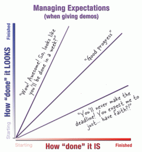
Don’t make the Demo look Done by Kathy Sierra.
From the post:
When we show a work-in-progress (like an alpha release) to the public, press, a client, or boss… we’re setting their expectations. And we can do it one of three ways: dazzle them with a polished mock-up, show them something that matches the reality of the project status, or stress them out by showing almost nothing and asking them to take it “on faith” that you’re on track.
The bottom line:
How ‘done’ something looks should match how ‘done’ something is.
Not recent but very sound advice!
The only thing I would add is: Don’t BS your testers about how the demo is going to improve before going live before the customer. Not going to happen.

I almost wish I hadn’t clicked through. The bit about the fake Vista demos at MSFT brings back bad memories; I was still an employee on the Windows team when that was going on and yeah, they were both very impressive and very unrealistic, and Vista never lived up to them. I actually didn’t realize how fake they were until after I left the company in 2004. The guy responsible for them now runs a software consultancy in Seattle.
Comment by marijane — January 5, 2015 @ 6:31 pm
marijane – Sorry to bring back bad memories! Will try to find happier themes!
Comment by Patrick Durusau — January 9, 2015 @ 10:58 am