Another Word For It Patrick Durusau on Topic Maps and Semantic Diversity

September 20, 2018

Software disenchantment (a must read)

Filed under: Computer Science,Design,Programming,Software,Software Engineering — Patrick Durusau @ 3:34 pm

Software disenchantment by Nikita Prokopov.

From the post:


Windows 95 was 30Mb. Today we have web pages heavier than that! Windows 10 is 4Gb, which is 133 times as big. But is it 133 times as superior? I mean, functionally they are basically the same. Yes, we have Cortana, but I doubt it takes 3970 Mb. But whatever Windows 10 is, is Android really 150% of that?

Google keyboard app routinely eats 150 Mb. Is an app that draws 30 keys on a screen really five times more complex than the whole Windows 95? Google app, which is basically just a package for Google Web Search, is 350 Mb! Google Play Services, which I do not use (I don’t buy books, music or videos there)—300 Mb that just sit there and which I’m unable to delete.

Yep, that and more. Brim full of hurtful remarks but also suggestions for a leaner, faster and more effective future.

Prokopov doesn’t mention malware but “ratio of bugs per line of code” has a great summary of various estimates of bugs to lines of code.

Government programmers and their contractors should write as much bloated code as their funding will support.

Programmers working in the public interest, should read Prokopov deeply and follow his advice.

August 3, 2018

Hints for Computer System Design

Filed under: Computer Science,Design — Patrick Durusau @ 7:24 pm

Hints for Computer System Design by Butler W. Lampson (1983)

Abstract:

Studying the design and implementation of a number of computer has led to some general hints for system design. They are described here and illustrated by many examples, ranging from hardware such as the Alto and the Dorado to application programs such as Bravo and Star.

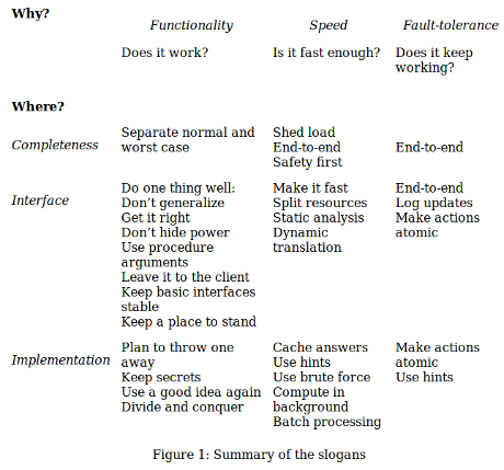
Figure 1 is the most common quote you will see:

Figure 1 is a great summary, but don’t cheat yourself by using it in place of reading the full article. All of those slogans have a context of origin and usage.

I saw this in a tweet by Joe Duffy, who says he reads it at least once a year. Not a bad plan.

June 8, 2017

You Are Not Google (Blasphemy I Know, But He Said It, Not Me)

Filed under: Design,Programming,Project Management — Patrick Durusau @ 4:30 pm

You Are Not Google by Ozan Onay.

From the post:

Software engineers go crazy for the most ridiculous things. We like to think that we’re hyper-rational, but when we have to choose a technology, we end up in a kind of frenzy — bouncing from one person’s Hacker News comment to another’s blog post until, in a stupor, we float helplessly toward the brightest light and lay prone in front of it, oblivious to what we were looking for in the first place.

This is not how rational people make decisions, but it is how software engineers decide to use MapReduce.

Spoiler: Onay will also say you are not Amazon or LinkedIn.

Just so you know and can prepare for the ego shock.

Great read that invokes Poyla’s First Principle:


Understand the Problem

This seems so obvious that it is often not even mentioned, yet students are often stymied in their efforts to solve problems simply because they don’t understand it fully, or even in part. Polya taught teachers to ask students questions such as:

  • Do you understand all the words used in stating the problem?
  • What are you asked to find or show?
  • Can you restate the problem in your own words?
  • Can you think of a picture or a diagram that might help you understand the problem?
  • Is there enough information to enable you to find a solution?

Onay coins a mnemonic for you to apply and points to additional reading.

Enjoy!

PS: Caution: Understanding a problem can cast doubt on otherwise successful proposals for funding. Your call.

October 23, 2016

Twitter Logic: 1 call on Github v. 885,222 calls on Twitter

Filed under: Design,Tweets,Twitter — Patrick Durusau @ 1:24 pm

Chris Albon’s collection of 885,222 tweets (ids only) for the third presidential debate of 2016 proves bad design decisions aren’t only made inside the Capital Beltway.

Chris could not post his tweet collection, only the tweet ids under Twitter’s terms of service.

The terms of service reference the Developer Policy and under that policy you will find:


F. Be a Good Partner to Twitter

1. Follow the guidelines for using Tweets in broadcast if you display Tweets offline.

2. If you provide Content to third parties, including downloadable datasets of Content or an API that returns Content, you will only distribute or allow download of Tweet IDs and/or User IDs.

a. You may, however, provide export via non-automated means (e.g., download of spreadsheets or PDF files, or use of a “save as” button) of up to 50,000 public Tweets and/or User Objects per user of your Service, per day.

b. Any Content provided to third parties via non-automated file download remains subject to this Policy.
…(emphasis added)

Just to be clear, I find Twitter extremely useful for staying current on CS research topics and think developers should be “…good partners to Twitter.”

However, Chris is prohibited from posting a data set of 885,222 tweets on Gibhub, where users could download it with no impact on Twitter, versus every user who want to explore that data set must submit 885,222 requests to Twitter servers.

Having one hit on Github for 885,222 tweets versus 885,222 on Twitter servers sounds like being a “good partner” to me.

Multiple that by all the researchers who are building Twitter data sets and the drain on Twitter resources grows without any benefit to Twitter.

It’s true that someday Twitter might be able to monetize references to its data collections, but server and bandwidth expenses are present line items in their budget.

Enabling the distribution of full tweet datasets is one step towards improving their bottom line.

PS: Please share this with anyone you know at Twitter. Thanks!

August 19, 2016

Typography for User Interfaces

Filed under: Design,Typography — Patrick Durusau @ 7:45 pm

Typography for User Interfaces by Viljami Salminen.

From the post:

Back in 2004, when I had just started my career, sIFR was the hottest thing out there. It was developed by Shaun Inman and it embedded custom fonts in a small Flash movie, which could be utilized with a little bit of JavaScript and CSS. At the time, it was basically the only way to use custom fonts in browsers like Firefox or Safari. The fact that this technique relied on Flash soon made it obsolete, with the release of the iPhone (without flash) in 2007.

Our interfaces are written, text being the interface, and typography being our main discipline.

In 2008, browsers started eventually supporting the new CSS3 @font-face rule. It had already been a part of the CSS spec in 1998, but later got pulled out of it. I remember the excitement when I managed to convince one of our clients to utilize the new @font-face and rely on progressive enhancement to deliver an enhanced experience for browsers which already supported this feature.

Since my early days in the industry, I’ve grown to love type and all the little nuances that go into setting it. In this article, I want to share some of the fundamentals that I’ve learned, and hopefully help you get better at setting type for user interfaces.

A nice stroll through the history of typography for user interfaces.

With ten (10) tips on choosing a typeface for a UI.

Enjoy and produce better UIs!

July 28, 2016

Web Design in 4 minutes

Filed under: Design,Publishing — Patrick Durusau @ 9:56 am

Web Design in 4 minutes by Jeremy Thomas.

From the post:

Let’s say you have a product, a portfolio, or just an idea you want to share with everyone on your own website. Before you publish it on the internet, you want to make it look attractive, professional, or at least decent to look at.

What is the first thing you need to work on?

This is more for me than you, especially if you consider my much neglected homepage.

Over the years my blog has consumed far more of my attention than my website.

I have some new, longer material that is more appropriate for the website so this post is a reminder to me to get my act together over there!

Other web design resource suggestions welcome!

June 24, 2016

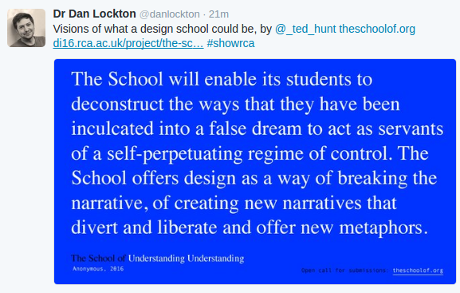
Visions of a Potential Design School

Filed under: Design — Patrick Durusau @ 7:17 pm

With cautions:

design-school-460

The URL that appears in the image: http://di16.rca.ac.uk/project/the-school-of-___/.

It’s not entirely clear to me if Chrome and/or Mozilla on Ubuntu are displaying these pages correctly. I am unable to scroll within the displayed windows of text. Perhaps that is intentional.

The caution is about the quote from Twitter:

“…deconstruct the ways that they have been inculcated….”

It does not promise you will be able to deconstruct the new narrative that enables you to “deconstruct” the old one.

That is we never stand outside of all narratives, but in a different narrative than the one we have under deconstruction. (sorry)

June 20, 2016

Tufte-inspired LaTeX (handouts, papers, and books)

Filed under: Design,TeX/LaTeX,Visualization — Patrick Durusau @ 2:51 pm

Tufte-LaTeX – A Tufte-inspired LaTeX class for producing handouts, papers, and books.

From the webpage:

As discussed in the Book Design thread of Edward Tufte’s Ask E.T Forum, this site is home to LaTeX classes for producing handouts and books according to the style of Edward R. Tufte and Richard Feynman.

Download the latest release, browse the source, join the mailing list, and/or submit patches. Contributors are welcome to help polish these classes!

Some examples of the Tufte-LaTeX classes in action:

  • Some papers by Jason Catena using the handout class
  • A handout for a math club lecture on volumes of n-dimensional spheres by Marty Weissman
  • A draft copy of a book written by Marty Weissman using the new Tufte-book class
  • An example handout (source) using XeLaTeX with the bidi class option for the ancient Hebrew by Kirk Lowery

Caution: A Tufte-inspired LaTeX class is no substitute for professional design advice and assistance. It will help you do “better,” for some definition of “better,” but professional design is in a class of its own.

If you are interested in TeX/LaTeX tips, follow: TexTips. One of several excellent Twitter feeds by John D. Cook.

April 23, 2016

The New Normal

Filed under: Design,Programming,Software Engineering — Patrick Durusau @ 8:09 pm

The New Normal, a series by Michael Nygard.

I encountered one of the more recent posts in this series and when looking for its beginning: The New Normal: Failure is a Good Thing.

From that starting post:


Everything breaks. It’s just a question of when and how badly.

What we need is a new approach where “continuous partial failure” is the normal state of affairs. Continuous partial failure opens the doors to making big changes happen because you’re already good at executing the small stuff.

In subsequent posts, I’ll talk about moving from the mentality of preventing problems to actually promoting them. I’ll look at the aging models for achieving resiliency and introduce microservices as an extension of the concept of antifragility into the design of IT infrastructure, applications, and organizations.

Along the way, I’ll share some stories about Netflix and their classic Chaos Monkey, how Amazon is becoming an increasingly terrifying competitor, the significance of maneuverability and the art of war, the unforeseen consequences of outsourcing and how Cognitect’s simple and sharp tools play a pivotal role in shaping the new IT blueprint.

Does anyone seriously doubt the the proposition: Everything breaks?

From a security perspective, I would not argue with Everything’s broken.

I’m starting at the beginning and working my way forward in this series. It promises to be seriously rewarding.

Enjoy!

March 12, 2016

The First Time A User Tests Your Product

Filed under: Design,Users,UX — Patrick Durusau @ 5:50 pm

Two humorous reminders that design and user testing should go hand in hand.

Enjoy!

March 4, 2016

Paul Klee’s Personal Notebooks Online (Art, Design)

Filed under: Art,Design — Patrick Durusau @ 5:33 pm

3,900 Pages of Paul Klee’s Personal Notebooks Are Now Online, Presenting His Bauhaus Teachings (1921-1931)

Two snippets and an image to get you interested:

Paul Klee led an artistic life that spanned the 19th and 20th centuries, but he kept his aesthetic sensibility tuned to the future. Because of that, much of the Swiss-German Bauhaus-associated painter’s work, which at its most distinctive defines its own category of abstraction, still exudes a vitality today.

Klee-Notebooks-3

More recently, the Zentrum Paul Klee made available online almost all 3,900 pages of Klee’s personal notebooks, which he used as the source for his Bauhaus teaching between 1921 and 1931. If you can’t read German, his extensively detailed textual theorizing on the mechanics of art (especially the use of color, with which he struggled before returning from a 1914 trip to Tunisia declaring, “Color and I are one. I am a painter”) may not immediately resonate with you. But his copious illustrations of all these observations and principles, in their vividness, clarity, and reflection of a truly active mind, can still captivate anybody — just as his paintings do.

A reminder that design is never a “solved” problem but one that changes as culture does.

I first saw this in a tweet by Alexis Lloyd.

March 1, 2016

Failure Is Not An Option [Really?]

Filed under: Cybersecurity,Design,Government,Politics,Security — Patrick Durusau @ 3:22 pm

Slogans such as this one distort policy discussions, planning and implementation on a variety of issues.

failure-option-02

The issue here is cybersecurity but it could be sexual harassment, rape, terrorist acts (other than the first two), fraud, hunger, suicide, etc.

Take it as a given there are no, repeat no sparrow shall fall systems.

Sorry to disappoint you but even with unlimited resources, which no project has, that’s not possible.

Every discussion of cybersecurity or other policy issue MUST include the issue of how much security (risk if you prefer) can be obtained for N resources?

More likely than not you are always going to want more security that you have resources to obtain but acknowledging that up front, enables you to prepare for what happens when security fails.

Which it is going to do. No ifs, ands or buts, all security systems fail. Some more often than others but they all fail.

I don’t consider Roswell to be a counter-example. The information, such as does exist, isn’t important enough for the effort required to obtain it. Some secrets remain secrets out of disinterest.

Realizing failure is not only an option but a certainty, designers don’t have to waste time on plausible deniability and/or responsibility for all breaches. Congress allocated $N resources and for $N resources, you get the rot-13 cipher level of security.

As opposed to the VA routine where Congress allocates $N resources to the VA but expects $N3 care for veterans. Why is anyone surprised the VA provided $N level of care and created mechanisms to deny $N3 care?

Of course, cheating and lying aren’t the best options for dealing with a shortfall in funding but that mirrors the VA funders so that isn’t surprising either.

Be up front with clients and say:

  • Yes, failure is not only an option, it’s going to happen.
  • Anyone who says differently hopes you manage by bumper stickers.
  • Evaluate what $N resources can buy you against risk R.
  • Plan your response to failure (as opposed to the post-failure blame game)

Such an approach will make you a novelty among consultants/contractors.

February 25, 2016

16 Famous Designers Show Us Their Favorite Notebooks [Analog Notebooks]

Filed under: Design,Graphics,Visualization — Patrick Durusau @ 5:45 pm

16 Famous Designers Show Us Their Favorite Notebooks by John Brownlee.

From the post:

Sure, digital design apps might be finally coming into their own, but there’s still nothing better than pen and paper. Here at Co.Design, we’re notebook fetishists, so we recently asked a slew of designers about their favorites—and whether they would mind giving us a look inside.

It turns out they didn’t. Across multiple disciplines, almost every designer we asked was thrilled to tell us about their notebook of choice and give us a look at how they use it. Our operating assumption going in was that most designers would probably be pretty picky about their notebooks, but this turned out not to be true: While Muji and Moleskine notebooks were the common favorites, some even preferred loose paper.

But what makes the notebooks of designers special isn’t so much what notebook they use, as how they use them. Below, enjoy a peek inside the working notebooks of some of the most prolific designers today—as well as their thoughts on what makes a great one.

Images of analog notebooks with links to sources!

I met a chief research scientist at a conference who had a small pad of paper for notes, contact information, etc. Could have had the latest gadget, etc., but chose not to.

That experience wasn’t unique as you will find from reading John’s post.

Notebooks, analog ones, have fewer presumptions and limitations than any digital notebook.

Albert Einstein had pen/pencil and paper.

Albert_Einstein_Head

Same was true for John McCarty.

200px-John_McCarthy_Stanford

Not to mention Donald Knuth.

192px-KnuthAtOpenContentAlliance

So, what have you done with your pen and paper lately?*


* I’m as guilty as anyone in thinking that pounding a keyboard = being productive. But the question: So, what have you done with your pen and paper lately? remains a valid one.

…but not if they have to do anything

Filed under: Design,Interface Research/Design,Usability,Users,UX — Patrick Durusau @ 5:07 pm

Americans want to be safer online – but not if they have to do anything by Bill Camarda.

From the post:

In the wake of non-stop news about identity theft, malware, ransomware, and all manner of information security catastrophes, Americans have educated themselves and are fully leveraging today’s powerful technologies to keep themselves safe… not.

While 67% told Morar Consulting they “would like extra layers of privacy,” far fewer use the technological tools now available to them. That’s the top-line finding of a brand-new survey of 2,000 consumers by Morar on behalf of the worldwide VPN provider “Hide My Ass!”

A key related finding: 63% of survey respondents have encountered online security issues. But, among the folks who’ve been bitten, just 56% have permanently changed their online behavior afterwards. (If you don’t learn the “hard way,” when do you learn?)

According to Morar, there’s still an odd disconnect between the way some people protect themselves offline and what they’re willing to do on the web. 51% of respondents would publicly post their email addresses, 26% their home addresses, and 21% their personal phone numbers.

Does this result surprise you?

If not:

How should we judge projects/solutions that presume conscious effort by users to:

  • Encode data (think linked data and topic maps)
  • Create maps between data sets
  • Create data in formats not their own
  • Use data vocabularies not their own
  • Use software not their own
  • Improve search results
  • etc.

I mention “search results” as it is commonly admitted that search results are, at best, a pig’s breakfast. The amount of improvement possible over current search results is too large to even be guesstimated.

Rather than beat the dead horse, “…users ought to…,” yes, they should, but they don’t, it is better to ask “Now what?”

Why not try metrics?

Monitor user interactions with information and test systems to anticipate those needs. Both are measurable categories.

Consider that back in the day, indexes never indexed everything. Magazine indexes omitted ads for example. Could have been indexed but indexing ads didn’t offer enough return for the effort required.

Why not apply that model to modern information systems? Yes, we can create linked data or other representations for everything in every post, but if no one uses 90% of that encoding, we have spent a lot of money for very little gain.

Yes, that means we will be discriminating against less often cited authors, for example. And your point?

The preservation of the Greek literature discriminated against authors whose work wasn’t important enough for someone to invest in preserving it.

Of course, we may not lose data in quite the same way but if it can’t be found, isn’t that the same a being lost?

Let’s apply metrics to information retrieval and determine what return justifies the investment to make information easily available.

Consign/condemn the rest of it to search.

February 11, 2016

Designing with Data (Clojure)

Filed under: Clojure,Design,Functional Programming — Patrick Durusau @ 9:00 pm

Designing with Data by Michael Dorgalis.

Slides from keynote at Clojure Remote 2016.

Without the video of the presentation, the usual difficulties of using slides in isolation obtain.

On the plus side, you have to work harder for the information and that may enhance your retention/comprehension.

Enjoy!

January 16, 2016

End The Lack Of Diversity On The Internet Today!

Filed under: Design,Diversity,Programming,Software,Software Engineering — Patrick Durusau @ 4:04 pm

Julia Evans tweeted earlier today:

“programmers are 0.66% of internet users, and build the software that everyone uses” – @heddle317

The strengths of having diversity on teams, including software teams, is well known and I won’t repeat those arguments here.

See: Why Diverse Teams Create Better Work, Diversity and Work Group Performance, More Diverse Personalities Mean More Successful Teams, Managing Groups and Teams/Diversity, or, How Diversity Makes Us Smarter, for five entry points into the literature on the diversity.

With 0.66% of internet users writing software for everyone, do you see the lack of diversity?

One response is to turn people into “Linus Torvalds” so we have a broader diversity of people programming. Good thought but I don’t know of anyone who wants to be a Linus Torvalds. (Sorry Linus.)

There’s a great benefit to having more people master programming but long-term, its not a solution to the lack of diversity in the production of software for the Internet.

Even if the number of people writing software for the Internet went up ten-fold, that’s only 6.6% of the population of Internet users. Far too monotone to qualify as any type of diversity.

There is another way to increase diversity in the production of Internet software.

Warnings: You will have to express your intuitive experience in words. You will have to communicate your experiences to programmers. Some programmers will think they know a “better way” for you to experience the interface. Always remember your experience is the “users” experience, unlike theirs.

You can use, express comments on, track your comments and respond to comments from programmers, on software built for the Internet. Programmers won’t seek you or your comments out so volunteering is the only option.

Programmers have their views, but if software doesn’t meet the need, habits, customs of users, it’s useless.

Programmers can only learn the needs, habits and customs of users from you.

Are you going to help end this lack of diversity and programmers to write better software or not?

December 24, 2015

Everything You Know About Latency Is Wrong

Filed under: Computer Science,Design,Statistics — Patrick Durusau @ 9:15 pm

Everything You Know About Latency Is Wrong by Tyler Treat.

From the post:

Okay, maybe not everything you know about latency is wrong. But now that I have your attention, we can talk about why the tools and methodologies you use to measure and reason about latency are likely horribly flawed. In fact, they’re not just flawed, they’re probably lying to your face.

When I went to Strange Loop in September, I attended a workshop called “Understanding Latency and Application Responsiveness” by Gil Tene. Gil is the CTO of Azul Systems, which is most renowned for its C4 pauseless garbage collector and associated Zing Java runtime. While the workshop was four and a half hours long, Gil also gave a 40-minute talk called “How NOT to Measure Latency” which was basically an abbreviated, less interactive version of the workshop. If you ever get the opportunity to see Gil speak or attend his workshop, I recommend you do. At the very least, do yourself a favor and watch one of his recorded talks or find his slide decks online.

The remainder of this post is primarily a summarization of that talk. You may not get anything out of it that you wouldn’t get out of the talk, but I think it can be helpful to absorb some of these ideas in written form. Plus, for my own benefit, writing about them helps solidify it in my head.

Great post, not only for the discussion of latency but for two extensions to the admonition (Moon is a Harsh Mistress) “Always cut cards:”

  • Always understand the nature of your data.
  • Always understand the nature your methodology.

If you fail at either of those, the results presented to you or that you present to others may or may not be true, false or irrelevant.

Treat’s post is just one example in a vast sea of data and methodologies which are just as misleading if not more so.

If you need motivation to put in the work, how’s your comfort level with being embarrassed in public? Like someone demonstrating your numbers are BS.

November 13, 2015

You do not want to be an edge case [The True Skynet: Your Homogenized Future]

Filed under: Design,Humanities,Identification,Programming — Patrick Durusau @ 1:15 pm

You do not want to be an edge case.

John D. Cook writes:

Hilary Mason made an important observation on Twitter a few days ago:

You do not want to be an edge case in this future we are building.

Systems run by algorithms can be more efficient on average, but make life harder on the edge cases, people who are exceptions to the system developers’ expectations.

Algorithms, whether encoded in software or in rigid bureaucratic processes, can unwittingly discriminate against minorities. The problem isn’t recognized minorities, such as racial minorities or the disabled, but unrecognized minorities, people who were overlooked.

For example, two twins were recently prevented from getting their drivers licenses because DMV software couldn’t tell their photos apart. Surely the people who wrote the software harbored no malice toward twins. They just didn’t anticipate that two drivers licence applicants could have indistinguishable photos.

I imagine most people reading this have had difficulty with software (or bureaucratic procedures) that didn’t anticipate something about them; everyone is an edge case in some context. Maybe you don’t have a middle name, but a form insists you cannot leave the middle name field blank. Maybe there are more letters in your name or more children in your family than a programmer anticipated. Maybe you choose not to use some technology that “everybody” uses. Maybe you happen to have a social security number that hashes to a value that causes a program to crash.

When software routinely fails, there obviously has to have a human override. But as software improves for most people, there’s less apparent need to make provision for the exceptional cases. So things could get harder for edge cases as they get better for more people.

Recent advances in machine learning have led reputable thinkers (Steven Hawking for example) to envision a future where an artificial intelligence will arise to dispense with humanity.

If you think you have heard that theme before, you have, most recently as Skynet, an entirely fictional creation in the Terminator science fiction series.

Given that no one knows how the human brain works, much less how intelligence arises, despite such alarmist claims making good press, the risk is less than a rogue black hole or a gamma-ray burst. I don’t lose sleep over either one of those, do you?

The greater “Skynet” threat to people and their cultures is the enforced homogenization of language and culture.

John mentions lacking a middle name but consider the complexities of Japanese names. Due to the creeping infection of Western culture and computer-based standardization, many Japanese list their names in Western order, given name, family name, instead of the Japanese order of family name, given name.

Even languages can start the slide to being “edge cases,” as you will see from the erosion of Hangul (Korean alphabet) from public signs in Seoul.

Computers could be preserving languages and cultural traditions, they have the capacity and infinite patience.

But they are not being used for that purpose.

Cellphones, for example, are linking humanity into a seething mass of impoverished social interaction. Impoverished social interaction that is creating more homogenized languages, not preserving diverse ones.

Not only should you be an edge case but you should push back against the homogenizing impact of computers. The diversity we lose could well be your own.

October 28, 2015

Five Design Sheet [TM Interface Design]

Filed under: Design,Interface Research/Design,Topic Maps — Patrick Durusau @ 1:02 pm

Five Design Sheet

Blog, resources and introductory materials for the Five Design Sheet (FdS) methodology.

FdS is described more formally in:

Sketching Designs Using the Five Design-Sheet Methodology by Jonathan C. Roberts, Chris James Headleand, Panagiotis D. Ritsos. (2015)

Abstract:

Sketching designs has been shown to be a useful way of planning and considering alternative solutions. The use of lo-fidelity prototyping, especially paper-based sketching, can save time, money and converge to better solutions more quickly. However, this design process is often viewed to be too informal. Consequently users do not know how to manage their thoughts and ideas (to first think divergently, to then finally converge on a suitable solution). We present the Five Design Sheet (FdS) methodology. The methodology enables users to create information visualization interfaces through lo-fidelity methods. Users sketch and plan their ideas, helping them express different possibilities, think through these ideas to consider their potential effectiveness as solutions to the task (sheet 1); they create three principle designs (sheets 2,3 and 4); before converging on a final realization design that can then be implemented (sheet 5). In this article, we present (i) a review of the use of sketching as a planning method for visualization and the benefits of sketching, (ii) a detailed description of the Five Design Sheet (FdS) methodology, and (iii) an evaluation of the FdS using the System Usability Scale, along with a case-study of its use in industry and experience of its use in teaching.

The Five Design-Sheet (FdS) approach for Sketching Information Visualization Designs by Jonathan C. Roberts. (2011)

Abstract:

There are many challenges for a developer when creating an information visualization tool of some data for a
client. In particular students, learners and in fact any designer trying to apply the skills of information visualization
often find it difficult to understand what, how and when to do various aspects of the ideation. They need to
interact with clients, understand their requirements, design some solutions, implement and evaluate them. Thus,
they need a process to follow. Taking inspiration from product design, we present the Five design-Sheet approach.
The FdS methodology provides a clear set of stages and a simple approach to ideate information visualization
design solutions and critically analyze their worth in discussion with the client.

As written, FdS is entirely appropriate for a topic map interface, but how do you capture the subjects users do or want to talk about?

Suggestions?

October 20, 2015

Making Learning Easy by Design

Filed under: Design,Interface Research/Design,Learning — Patrick Durusau @ 9:28 pm

Making Learning Easy by Design – How Google’s Primer team approached UX by Sandra Nam.

From the post:

How can design make learning feel like less of a chore?

It’s not as easy as it sounds. Flat out, people usually won’t go out of their way to learn something new. Research shows that only 3% of adults in the U.S. spend time learning during their day.¹

Think about that for a second: Despite all the information available at our fingertips, and all the new technologies that emerge seemingly overnight, 97% of people won’t spend any time actively seeking out new knowledge for their own development.

That was the challenge at hand when our team at Google set out to create Primer, a new mobile app that helps people learn digital marketing concepts in 5 minutes or less.

UX was at the heart of this mission. Learning has several barriers to entry: you need to figure out what, where, how you want to learn, and then you need the time, money, and energy to follow through.

A short read that makes it clear that designing a learning experience is not easy or quick.

Take fair warning from:

only 3% of adults in the U.S. spend time learning during their day

when you plan on users “learning” a better way from your app or software.

Targeting 3% of a potential audience isn’t a sound marketing strategy.

Google is targeting the other 97%. Shouldn’t you too?

March 3, 2015

Principles of Model Checking

Filed under: Design,Modeling,Software,Software Engineering — Patrick Durusau @ 5:15 pm

Principles of Model Checking by Christel Baier and Joost-Pieter Katoen. Foreword by Kim Guldstrand Larsen.

From the webpage:

Our growing dependence on increasingly complex computer and software systems necessitates the development of formalisms, techniques, and tools for assessing functional properties of these systems. One such technique that has emerged in the last twenty years is model checking, which systematically (and automatically) checks whether a model of a given system satisfies a desired property such as deadlock freedom, invariants, or request-response properties. This automated technique for verification and debugging has developed into a mature and widely used approach with many applications. Principles of Model Checking offers a comprehensive introduction to model checking that is not only a text suitable for classroom use but also a valuable reference for researchers and practitioners in the field.

The book begins with the basic principles for modeling concurrent and communicating systems, introduces different classes of properties (including safety and liveness), presents the notion of fairness, and provides automata-based algorithms for these properties. It introduces the temporal logics LTL and CTL, compares them, and covers algorithms for verifying these logics, discussing real-time systems as well as systems subject to random phenomena. Separate chapters treat such efficiency-improving techniques as abstraction and symbolic manipulation. The book includes an extensive set of examples (most of which run through several chapters) and a complete set of basic results accompanied by detailed proofs. Each chapter concludes with a summary, bibliographic notes, and an extensive list of exercises of both practical and theoretical nature.

The present IT structure has shown itself to be as secure as a sieve. Do you expect the “Internet of Things” to be any more secure?

If you are interested in secure or at least less buggy software, more formal analysis is going to be a necessity. This title will give you an introduction to the field.

It dates from 2008 so some updating will be required.

I first saw this in a tweet by Reid Draper.

February 20, 2015

Army Changing How It Does Requirements [How Are Your Big Data Requirements Coming?]

Filed under: BigData,Design,Requirements — Patrick Durusau @ 8:07 pm

Army Changing How It Does Requirements: McMaster by Sydney J. Freedberg Jr.

From the post:


So there’s a difficult balance to strike between the three words that make up “mobile protected firepower.” The vehicle is still just a concept, not a funded program. But past projects like FCS began going wrong right from those first conceptual stages, when TRADOC Systems Managers (TSMs) wrote up the official requirements for performance with little reference to what tradeoffs would be required in terms of real-world engineering. So what is TRADOC doing differently this time?

“We just did an Initial Capability Document [ICD] for ‘mobile protected firepower,’” said McMaster. “When we wrote that document, we brought together 18th Airborne Corps and other [infantry] and Stryker brigade combat team leadership” — i.e. the units that would actually use the vehicle — “who had recent operational experience.”

So they’re getting help — lots and lots of help. In an organization as bureaucratic and tribal as the Army, voluntarily sharing power is a major breakthrough. It’s especially big for TRADOC, which tends to take on priestly airs as guardian of the service’s sacred doctrinal texts. What TRADOC has done is a bit like the Vatican asking the Bishop of Boise to help draft a papal bull.

But that’s hardly all. “We brought together, obviously, the acquisition community, so PEO Ground Combat Vehicle was in on the writing of the requirements. We brought in the Army lab, TARDEC,” McMaster told reporters at a Defense Writers’ Group breakfast this morning. “We brought in Army Materiel Command and the sustainment community to help write it. And then we brought in the Army G-3 [operations and plans] and the Army G-8 [resources]” from the service’s Pentagon staff.

Traditionally, all these organizations play separate and unequal roles in the process. This time, said McMaster, “we wrote the document together.” That’s the model for how TRADOC will write requirements in the future, he went on: “Do it together and collaborate from the beginning.”

It’s important to remember how huge a hole the Army has to climb out of. The 2011 Decker-Wagner report calculated that, since 1996, the Army had wasted from $1 billion to $3 billion annually on two dozen different cancelled programs. The report pointed out an institutional problem much bigger than just the Future Combat System. Indeed, since FCS went down in flames, the Army has cancelled yet another major program, its Ground Combat Vehicle.

As I ask in the headline: How Are Your Big Data Requirements Coming?

Have you gotten all the relevant parties together? Have they all collaborated on making the business case for your use of big data? Or are your requirements written by managers who are divorced from the people to use the resulting application or data? (Think Virtual Case File.)

The Army appears to have gotten the message on requirements, temporarily at least. How about you?

February 12, 2015

Akin’s Laws of Spacecraft Design*

Filed under: Design,Software Engineering — Patrick Durusau @ 8:16 pm

Akin’s Laws of Spacecraft Design* by David Adkins.

I started to do some slight editing to make these laws of “software” design but if you can’t make that transposition for yourself, my doing isn’t going to help.

From the site of origin (unchanged):

1. Engineering is done with numbers. Analysis without numbers is only an opinion.

2. To design a spacecraft right takes an infinite amount of effort. This is why it’s a good idea to design them to operate when some things are wrong .

3. Design is an iterative process. The necessary number of iterations is one more than the number you have currently done. This is true at any point in time.

4. Your best design efforts will inevitably wind up being useless in the final design. Learn to live with the disappointment.

5. (Miller’s Law) Three points determine a curve.

6. (Mar’s Law) Everything is linear if plotted log-log with a fat magic marker.

7. At the start of any design effort, the person who most wants to be team leader is least likely to be capable of it.

8. In nature, the optimum is almost always in the middle somewhere. Distrust assertions that the optimum is at an extreme point.

9. Not having all the information you need is never a satisfactory excuse for not starting the analysis.

10. When in doubt, estimate. In an emergency, guess. But be sure to go back and clean up the mess when the real numbers come along.

11. Sometimes, the fastest way to get to the end is to throw everything out and start over.

12. There is never a single right solution. There are always multiple wrong ones, though.

13. Design is based on requirements. There’s no justification for designing something one bit "better" than the requirements dictate.

14. (Edison’s Law) "Better" is the enemy of "good".

15. (Shea’s Law) The ability to improve a design occurs primarily at the interfaces. This is also the prime location for screwing it up.

16. The previous people who did a similar analysis did not have a direct pipeline to the wisdom of the ages. There is therefore no reason to believe their analysis over yours. There is especially no reason to present their analysis as yours.

17. The fact that an analysis appears in print has no relationship to the likelihood of its being correct.

18. Past experience is excellent for providing a reality check. Too much reality can doom an otherwise worthwhile design, though.

19. The odds are greatly against you being immensely smarter than everyone else in the field. If your analysis says your terminal velocity is twice the speed of light, you may have invented warp drive, but the chances are a lot better that you’ve screwed up.

20. A bad design with a good presentation is doomed eventually. A good design with a bad presentation is doomed immediately.

21. (Larrabee’s Law) Half of everything you hear in a classroom is crap. Education is figuring out which half is which.

22. When in doubt, document. (Documentation requirements will reach a maximum shortly after the termination of a program.)

23. The schedule you develop will seem like a complete work of fiction up until the time your customer fires you for not meeting it.

24. It’s called a "Work Breakdown Structure" because the Work remaining will grow until you have a Breakdown, unless you enforce some Structure on it.

25. (Bowden’s Law) Following a testing failure, it’s always possible to refine the analysis to show that you really had negative margins all along.

26. (Montemerlo’s Law) Don’t do nuthin’ dumb.

27. (Varsi’s Law) Schedules only move in one direction.

28. (Ranger’s Law) There ain’t no such thing as a free launch.

29. (von Tiesenhausen’s Law of Program Management) To get an accurate estimate of final program requirements, multiply the initial time estimates by pi, and slide the decimal point on the cost estimates one place to the right.

30. (von Tiesenhausen’s Law of Engineering Design) If you want to have a maximum effect on the design of a new engineering system, learn to draw. Engineers always wind up designing the vehicle to look like the initial artist’s concept.

31. (Mo’s Law of Evolutionary Development) You can’t get to the moon by climbing successively taller trees.

32. (Atkin’s Law of Demonstrations) When the hardware is working perfectly, the really important visitors don’t show up.

33. (Patton’s Law of Program Planning) A good plan violently executed now is better than a perfect plan next week.

34. (Roosevelt’s Law of Task Planning) Do what you can, where you are, with what you have.

35. (de Saint-Exupery’s Law of Design) A designer knows that he has achieved perfection not when there is nothing left to add, but when there is nothing left to take away.

36. Any run-of-the-mill engineer can design something which is elegant. A good engineer designs systems to be efficient. A great engineer designs them to be effective.

37. (Henshaw’s Law) One key to success in a mission is establishing clear lines of blame.

38. Capabilities drive requirements, regardless of what the systems engineering textbooks say.

39. Any exploration program which "just happens" to include a new launch vehicle is, de facto, a launch vehicle program.

39. (alternate formulation) The three keys to keeping a new manned space program affordable and on schedule:
       1)  No new launch vehicles.
       2)  No new launch vehicles.
       3)  Whatever you do, don’t develop any new launch vehicles.

40. (McBryan’s Law) You can’t make it better until you make it work.

41. Space is a completely unforgiving environment. If you screw up the engineering, somebody dies (and there’s no partial credit because most of the analysis was right…)

I left the original as promised for for software projects I would re-cast #1 to read:

1. Software Engineering is based on user feedback. Analysis without user feedback is fantasy (yours).
Enjoy!

I first saw this in a tweet by Neal Richter.

February 8, 2015

TOGAF® 9.1 Translation Glossary: English – Norwegian

Filed under: Design,Enterprise Integration,IT — Patrick Durusau @ 5:03 pm

TOGAF® 9.1 Translation Glossary: English – Norwegian (PDF)

From the Wikipedia entry The Open Group Architecture Framework

The Open Group Architecture Framework (TOGAF) is a framework for enterprise architecture which provides an approach for designing, planning, implementing, and governing an enterprise information technology architecture.[2] TOGAF has been a registered trademark of The Open Group in the United States and other countries since 2011.[3]

TOGAF is a high level approach to design. It is typically modeled at four levels: Business, Application, Data, and Technology. It relies heavily on modularization, standardization, and already existing, proven technologies and products.

I saw a notice of this publication today and created a local copy for your convenience (the offical copy requires free registration and login). The downside is that over time, this copy will not be the latest version. The latest version can be downloaded from: www.opengroup.org/bookstore.

You can purchase TOGAF 9.1 here: http://www.opengroup.org/togaf/. I haven’t read it but at $39.95 for the PDF version, it compares favorably to other standards pricing.

February 7, 2015

100 pieces of flute music

Filed under: Design,Graphics,Music,Visualization — Patrick Durusau @ 3:28 pm

100 pieces of flute music – A quantified self project where music and design come together by Erika von Kelsch.

From the post:

flute-image1-680x490

(image: The final infographic | Erika von Kelsch)

The premise of the project was to organize 100 pieces of data into a static print piece. At least 7 metadata categories were to be included within the infographic, as well as a minimum of 3 overall data rollups. I chose 100 pieces of flute music that I have played that have been in my performance repertoire. Music was a potential career path for me, and the people and experiences I had through music influence how I view and explore the world around me to this day. The way I approach design is also influenced by what I learned from studying music, including the technical aspects of both flute and theory, as well as the emotional facets of performance. I decided to use this project as a vehicle to document this experience.

Not only is this a great visualization but the documentation of the design process is very impressive!

Have you ever attempted to document your design process during a project? That is what actually happened as opposed to what “must have happended” in the design process?

January 13, 2015

Adventures in Design

Filed under: Design,Medical Informatics,Software Engineering — Patrick Durusau @ 2:36 pm

Whether you remember the name or not, you have heard of the Therac-25, a radiation therapy machine responsible for giving massive radiation doses resulting in serious injury or death between 1985 and 1987. Classic case for software engineering.

The details are quite interesting but I wanted to point out that it doesn’t take complex or rare software failures to be dangerous.

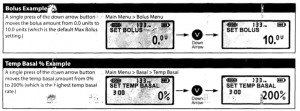
Case in point: I received a replacement insulin pump today that had the following header:

medtronic-models

The problem?

medtronic-roll-over

Interesting. You go down from “zero” to the maximum setting.

FYI, the device in question measures insulin in 0.05 increments, so 10.0 units is quite a bit. Particularly if that isn’t what you intended to do.

Medtronic has offered a free replacement for any pump with this “roll around feature.”

I have been using Medtronic devices for years and have always found them to be extremely responsive to users so don’t take this as a negative comment on them or their products.

It is, however, a good illustration that what may be a feature to one user may well not be a feature for another. Which makes me wonder, how do you design counters? Do they wrap at maximum/minimum values?

Design issues only come up when you recognize them as design issues. Otherwise they are traps for the unwary.

December 25, 2014

Inadvertent Algorithmic Cruelty

Filed under: Algorithms,Design — Patrick Durusau @ 8:11 pm

Inadvertent Algorithmic Cruelty by Eric A. Meyers.

From the post:

I didn’t go looking for grief this afternoon, but it found me anyway, and I have designers and programmers to thank for it. In this case, the designers and programmers are somewhere at Facebook.

I know they’re probably pretty proud of the work that went into the “Year in Review” app they designed and developed. Knowing what kind of year I’d had, though, I avoided making one of my own. I kept seeing them pop up in my feed, created by others, almost all of them with the default caption, “It’s been a great year! Thanks for being a part of it.” Which was, by itself, jarring enough, the idea that any year I was part of could be described as great.

Suffice it to say that Eric suffered a tragic loss this year and the algorithms behind “See Your Year” didn’t take that into account.

While I think Eric is right in saying users should have the ability to opt out of “See Your Year,” I am less confident about his broader suggestion:

If I could fix one thing about our industry, just one thing, it would be that: to increase awareness of and consideration for the failure modes, the edge cases, the worst-case scenarios. And so I will try.

That might be helpful but uncovering edge cases or worst-case scenarios takes time and resources, to say nothing of accommodating them. Once an edge case comes up, then it can be accommodated as I am sure Facebook will do next year with “See Your Year.” But it has to happen first and become noticed.

Keep Eric’s point that algorithms being “thoughtless” in mind when using machine learning techniques. Algorithms aren’t confirming your classification, they are confirming the conditions they have been taught to recognize are present. Not the same thing. Recalling that deep learning algorithms can be fooled into recognizing noise as objects..

November 18, 2014

When Information Design is a Matter of Life or Death

Filed under: Design,Interface Research/Design,Medical Informatics — Patrick Durusau @ 4:43 pm

When Information Design is a Matter of Life or Death by Thomas Bohm.

From the post:

In 2008, Lloyds Pharmacy conducted 20 minute interviews1 with 1,961 UK adults. Almost one in five people admitted to having taken prescription medicines incorrectly; more than eight million adults have either misread medicine labels or misunderstood the instructions, resulting in them taking the wrong dose or taking medication at the wrong time of day. In addition, the overall problem seemed to be more acute among older patients.

Almost one in five people admitted to having taken prescription medicines incorrectly; more than eight million adults have either misread medicine labels or misunderstood the instructions.

Medicine or patient information leaflets refer to the document included inside medicine packaging and are typically printed on thin paper (see figures 1.1–1.4). They are essential for the safe use of medicines and help answer people’s questions when taking the medicine.

If the leaflet works well, it can lead to people taking the medicine correctly, hopefully improving their health and wellness. If it works poorly, it can lead to adverse side effects, harm, or even death. Subsequently, leaflets are heavily regulated in the way they need to be designed, written, and produced. European2 and individual national legislation sets out the information to be provided, in a specific order, within a medicine information leaflet.

A good reminder that failure to communicate in some information systems has more severe penalties than others.

I was reminded while reading the “thin paper” example:

Medicine information leaflets are often printed on thin paper and folded many times to fit into the medicine package. There is a lot of show-through from the information printed on the back of the leaflet, which decreases readability. When the leaflet is unfolded, the paper crease marks affect the readability of the text (see figures 1.3 and 1.4). A possible improvement would be to print the leaflet on a thicker paper.

of a information leaflet that unfolded to be 18 inches wide and 24 inches long. A real tribute to the folding art. The typeface was challenging even with glasses and a magnifying glass. Too tiring to read much of it.

I don’t think thicker paper would have helped, unless the information leaflet became an information booklet.

What are the consequences if someone misreads your interface?

November 17, 2014

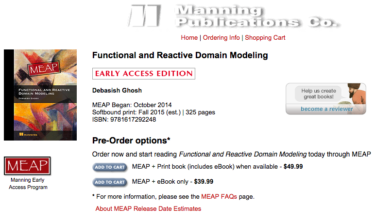
Functional and Reactive Domain Modeling

Functional and Reactive Domain Modeling by Debasish Ghosh.

From the post:

Manning has launched the MEAP of my upcoming book on Domain Modeling.

functional-reactive programming cover

The first time I was formally introduced to the topic was way back when I played around with Erik Evans’ awesome text on the subject of Domain Driven Design. In the book he discusses various object lifecycle patterns like the Factory, Aggregate or Repository that help separation of concerns when you are implementing the various interactions between the elements of the domain model. Entities are artifacts with identities, value objects are pure values while services model the coarse level use cases of the model components.

In Functional and Reactive Domain Modeling I look at the problem with a different lens. The primary focus of the book is to encourage building domain models using the principles of functional programming. It’s a completely orthogonal approach than OO and focuses on verbs first (as opposed to nouns first in OO), algebra first (as opposed to objects in OO), function composition first (as opposed to object composition in OO), lightweight objects as ADTs (instead of rich class models).

The book starts with the basics of functional programming principles and discusses the virtues of purity and the advantages of keeping side-effects decoupled from the core business logic. The book uses Scala as the programming language and does an extensive discussion on why the OO and functional features of Scala are a perfect fit for modelling complex domains. Chapter 3 starts the core subject of functional domain modeling with real world examples illustrating how we can make good use of patterns like smart constructors, monads and monoids in implementing your domain model. The main virtue that these patterns bring to your model is genericity – they help you extract generic algebra from domain specific logic into parametric functions which are far more reusable and less error prone. Chapter 4 focuses on advanced usages like typeclass based design and patterns like monad transformers, kleislis and other forms of compositional idioms of functional programming. One of the primary focus of the book is an emphasis on algebraic API design and to develop an appreciation towards ability to reason about your model.

An easy choice for your holiday wish list! Being a MEAP, it will continue to be “new” for quite some time.

Enjoy!

November 7, 2014

At A Glance – Design Pattern

Filed under: Design,Design Patterns — Patrick Durusau @ 3:44 pm

Spotted: clever and useful design patterns by Ben Terrett.

From the post:

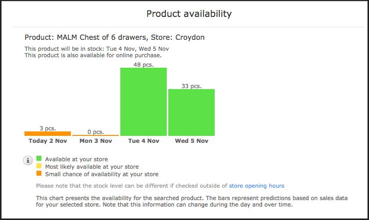
I was looking at the Ikea website at the weekend and noticed this smart design pattern.

product ad

Many websites tell you whether an item is in stock and many tell you whether a product is available in store. But this tells you how many are in stock today and how many will be in stock tomorrow and the two days after. It’s clever and useful. (Should you wish to check the current availability of Malm drawers in Croydon Ikea you can here.)

Ben goes on to point out one aspect of this design pattern is that it only requires a glance to understand.

I assume you can think of some topic map presentations with graphics that required more than a glance to understand. 😉

Comprehension “at a glance” isn’t always possible to realize but when it is never realized, take that as a warning sign. Particularly when it is customers who are having the difficulty.

Ben’s post has other examples and pointers on the issue of being “glanceable.”

Older Posts »

Powered by WordPress