Another Word For It Patrick Durusau on Topic Maps and Semantic Diversity

April 23, 2019

R Graphics Cookbook, 2nd edition

Filed under: Graphics,R — Patrick Durusau @ 3:28 pm

R Graphics Cookbook, 2nd edition by Winston Chang.

From the webpage:

Welcome to the R Graphics Cookbook, a practical guide that provides more than 150 recipes to help you generate high-quality graphs quickly, without having to comb through all the details of R’s graphing systems. Each recipe tackles a specific problem with a solution you can apply to your own project, and includes a discussion of how and why the recipe works.

Read online here for free, or buy a physical copy on Amazon.

Do us all a favor, buy a hard copy of it. It encourages healthy behavior on the part of publishers and it’s easier on your eyes.

Enjoy!

February 24, 2019

Layout Land

Filed under: Graphics,Interface Research/Design — Patrick Durusau @ 5:19 pm

Layout Land (YouTube)

If you need help creating attractive web content with CSS, then Layout Land is one place to start. You can tell by my website and blog, I have yet to watch and implement, any of the advice you find here.

Don’t take my lack of effort as a commentary on the channel, which has approximately 38K subscribers. Content creation is a necessary first step, but then it has to be effectively delivered to users to make a difference.

Make a difference, learn effective layout of web resources.

October 26, 2018

Best-First Search [Inspiration for Hackers]

Filed under: D3,Graphics — Patrick Durusau @ 9:09 pm

Best-First Search by Mike Bostock.

Take my first “best-first search” result:

as encouragement to see this “live code” for yourself!

Best-First Search represents, figuratively speaking, the process of breaching cybersystems of pipeline construction companies, pipeline operators, their lawyers, investors, etc. Magic bullets work but so does following best-first paths until success is achieved.

Good hunting!

August 22, 2018

Battle of Impressively Bad Military Graphics

Filed under: Communication,Graphics,Visualization — Patrick Durusau @ 3:32 pm

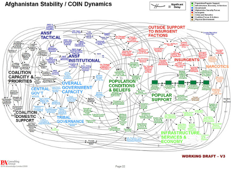
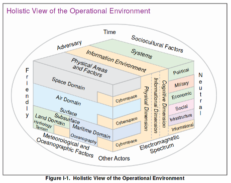
Cav The Knife started a thread on Twitter with this image:

The original can be found in Joint Intelligence Preparation of the Operational Environment, page I-3.

Rob Levinson counters with:

The original can be found in Dynamic Planning for COIN in Afghanistan at page 22. The slide deck includes numerous other offenses against the art of explanation and visualization.

The contest is somewhat unfair because the Joint Intelligence graphic was composed by military lifers versus the COIN in Afghanistan, created by professionals at PA Consulting Group.

For my money, COIN in Afghanistan takes the prize in this comparison as the worst graphic, but Joint Intelligence should get a “best in amateur class” mention.

Other contestants?

March 1, 2018

An Interactive Timeline of the Most Iconic Infographics

Filed under: Graphics,Infographics,Visualization — Patrick Durusau @ 8:26 pm

Map of Firsts: An Interactive Timeline of the Most Iconic Infographics by R. J. Andrews.

Careful with this one!

You might learn some history as well as discovering an infographic for your next project!

Enjoy!

February 26, 2018

FastPhotoStyle [Re-writing Dickens]

Filed under: Graphics,Visualization — Patrick Durusau @ 9:18 pm

Start Photo:

Style Photo:

Result Photo (start + style):

Impressive!

There are several other sample transformations at the webpage.

From the webpage:

This code repository contains an implementation of our fast photorealistic style transfer algorithm. Given a content photo and a style photo, the code can transfer the style of the style photo to the content photo. The details of the algorithm behind the code is documented in our arxiv paper. Please cite the paper if this code repository is used in your publications.

Yijun Li (UC Merced), Ming-Yu Liu (NVIDIA), Xueting Li (UC Merced), Ming-Hsuan Yang (NVIDIA, UC Merced), Jan Kautz (NVIDIA)A Closed-form Solution to Photorealistic Image Stylization” arXiv preprint arXiv:1802.06474

Re-writing Dickens:


Marley: Why do you not believe your own eyes?

Scrooge: Software makes them a cheat! A pass of PhotoShop or a round with Gimp, to say nothing of fast photorealistic style transfer algorithms.

Doesn’t have the same ring to it does it?

February 22, 2018

Learning Drawing Skills To Help You Communicate

Filed under: Art,Graphics,Visualization — Patrick Durusau @ 9:19 pm

I sigh with despair every time I see yet another drawing by Julia Evans.

All of it is clever, clear and without effort on my part, beyond me.

Yeah, it’s the “without effort on my part” that keeps me from learning basic drawing skills.

You’re never going to say of a drawing by me, “There’s a proper Julia Evans!” but I don’t think basic drawing skills beyond me, provided I take the time to practice.

How expensive are guidebooks? Does free sound OK?

By E.G. Lutz, What to Draw and How to Draw It (1913), Drawing Made Easy (1935).

BTW, Lutz inspired Walt Disney with: Animated Cartoons: How They Are Made, Their Origin and Development.

I found this at The Public Domain Review. Support for them is always a good idea.

Of course I would rather be exploring nuances of XQuery, but that’s because XQuery is already familiar.

It’s trying the unfamiliar that leads to new skills, hopefully. 😉

February 16, 2018

@GalaxyKate, Generators, Steganographic Fields Forever (+ Secure Message Tip)

Filed under: Graphics,Steganography,Virtualization — Patrick Durusau @ 11:57 am

Before you skip this post as just being about “pretty images,” know that generators span grammars to constraint solvers. Artistry for sure, but exploration can lead to hard core CS rather quickly.

I stumbled upon a @GalaxyKate‘s Generative Art & Procedural Content Starter Kit

Practical Procedural Generation for Everyone: Thirty or so minutes on YouTube, 86,133 views when I checked the link.

So you want to build a generator: In depth blog post with lots of content and links.

Encyclopedia of Generativity: As far as I can tell, a one issue zine by @GalaxyKate but it will take months to explore.

One resource I found while chasing these links was: Procedural Generation.

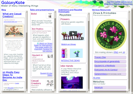
Oh, and you owe it to yourself to visit GalaxyKate’s homepage:

The small scale of my blog presentation makes that screenshot a pale imitation of what you will find. Great resource!

There’s no shortage of visual content on the Web, one estimate says in 2017, 74% of all internet traffic was video.

Still, if you practice steganographic concealment of information, you should make the work of the hounds as difficult as possible. Generators are an obvious way of working towards that goal.

One secure message tip: Other than for propaganda, which you want discovered and read, omit any greetings, closings, or other rote content, such as blessings, religious quotes, etc.

The famous German Enigma was broken by messages having the same opening text, routine information, closing text (Heil Hitler!), sending the same message in different encodings. Exploring the Enigma

Or in other words, Don’t repeat famous cryptographic mistakes!

February 15, 2018

Krita (open source painting program)

Filed under: Art,Graphics,Visualization — Patrick Durusau @ 9:30 am

Krita

Do you know Krita? Not being artistically inclined, I don’t often encounter digital art tools. Judging from the examples though:

I’m missing some great imagery, even if I can’t create the same.

Great graphics can enhance your interfaces, education apps, games, propaganda, etc.

November 12, 2017

Intro to Low-Level Graphics on Linux – Impressing Spouse’s Family

Filed under: C/C++,Graphics,Linux OS — Patrick Durusau @ 9:28 pm

Intro to Low-Level Graphics on Linux

From the webpage:

This tutorial attempts to explain a few of the possible methods that exist on Linux to access the graphics hardware from a low level. I am not talking about using Xlib instead of GTK+ or QT5, nor am I talking about using DirectFB, I want to go even lower than that; I’m talking about drawing graphics to the screen without needing any external dependencies; I’m talking about communicating directly with the Linux kernel. I will also provide information about programming for newer graphical systems (Wayland/Mir) even though those do not involve direct communication with the kernel drivers. The reason I want to provide this information in this tutorial is that even though their APIs are higher level, the programming techniques used in low-level graphics programming can easily be adapted to work with Wayland and Mir. Also, similar to fbdev and KMS/DRM APIs, good programming resources are hard to come by.

Most Linux systems actually provide a few different methods for drawing graphics to the screen; there are options. However, the problem is that documentation is basically non-existent. So, I would like to explain here what you need to know to get started.

Please note that this tutorial assumes you have a basic knowledge of C, this is not a beginner tutorial, this is for people who are interested in something like learning more about how Linux works, or about programming for embedded systems, or just doing weird experimental stuff for fun.

You can impress your spouse’s family this holiday season by writing C code for low-level graphics on Linux. They won’t know you are frantically typing comments to the example code and will be suitably impressed by compiling.

The other reason to mention this is the presence of Linux on embedded systems. Embedded systems such as in industrial controllers, monitoring equipment, etc. The more comfortable you are will such systems the easy they will be to explore.

Enjoy!

August 17, 2017

Emojipedia

Filed under: Graphics,Humor — Patrick Durusau @ 8:14 pm

Emojipedia

If you aren’t familiar with Emojipedia, be forewarned: It’s a real time sink! 😉

In small doses it’s highly entertaining and a necessity in some communities.

Enjoy!

June 7, 2017

Financial Times Visual Vocabulary

Filed under: D3,Graphics,Visualization — Patrick Durusau @ 4:08 pm

Financial Times Visual Vocabulary

From the webpage:

A poster and web site to assist designers and journalists to select the optimal symbology for data visualisations, by the Financial Times Visual Journalism Team. Inspired by the Graphic Continuum by Jon Schwabish and Severino Ribecca.

Read the Chart Doctor feature column for full background on why we made this: Simple techniques for bridging the graphics language gap

For D3 templates for producing many of these chart types in FT style, see our Visual Vocabulary repo.

The Financial Times sets a high bar for financial graphics.

Here it provides tools and guidance to help you meet with similar success.

Enjoy and pass this along.

May 29, 2017

Data Journalists! Data Gif Tool (Google)

Filed under: Graphics,Journalism,News,Reporting,Visualization — Patrick Durusau @ 10:03 am

While not hiding its prior salary discrimination against women, Google has created and released a tool for creating data gifs.

Make your own data gifs with our new tool by Simon Rogers.

From the post:

Data visualizations are an essential storytelling tool in journalism, and though they are often intricate, they don’t have to be complex. In fact, with the growth of mobile devices as a primary method of consuming news, data visualizations can be simple images formatted for the device they appear on.

Enter data gifs.

(gif omitted)

These animations can be used for a variety of sophisticated storytelling approaches among data journalists: one example is Lena Groeger, who has become *the* expert in working with data gifs.

Today we are releasing Data Gif Maker, a tool to help journalists make these visuals, which show share of search interest for two competing topics.

A good way to get your feet wet with simple data gifs.

Don’t be surprised that Google does good things for the larger community while engaging in evil conduct.

Racists sheriffs who used water cannon and dogs on Black children loved their own children and remembered their birthdays. WWII death camps guards attended church. Were kind to small animals.

People and their organizations are complicated and the reading public is ill-served by shallow reporting of only one aspect or another as the “true” view.

May 14, 2017

The Hitchhiker’s Guide to d3.js [+ a question]

Filed under: D3,Graphics,Visualization — Patrick Durusau @ 7:46 pm

The Hitchhiker’s Guide to d3.js by Ian Johnson.

From the post:

[graphic omitted: see post]

The landscape for learning d3 is rich, vast and sometimes perilous. You may be intimidated by the long list of functions in d3’s API documentation or paralyzed by choice reviewing the dozens of tutorials on the home page. There are over 20,000+ d3 examples you could learn from, but you never know how approachable any given one will be.

[graphic omitted: see post]

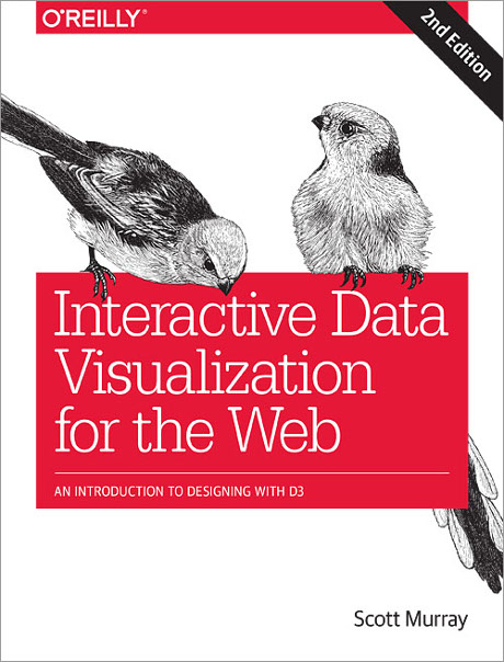
If all you need is a quick bar or line chart, maybe this article isn’t for you, there are plenty of charting libraries out there for that. If you’re into books, check out Interactive Data Visualization for the Web by Scott Murray as a great place to start. D3.js in Action by Elijah Meeks is a comprehensive way to go much deeper into some regions of the API.

This guide is meant to prepare you mentally as well as give you some fruitful directions to pursue. There is a lot to learn besides the d3.js API, both technical knowledge around web standards like HTML, SVG, CSS and JavaScript as well as communication concepts and data visualization principles. Chances are you know something about some of those things, so this guide will attempt to give you good starting points for the things you want to learn more about.

Depending on your needs and learning style, The Hitchhiker’s Guide to d3.js (Guide), may be just what you need.

The Guide focuses on how to use d3.js and not on: What visualization should I create?

Suggestions on what should be considered when moving from raw data to a visualization? Resources?

Thanks!

May 8, 2017

How to Spot Visualization Lies

Filed under: Graphics,Statistics,Visualization — Patrick Durusau @ 4:47 pm

How to Spot Visualization Lies : Keep your eyes open by Nathan Yau.

From the post:

It used to be that we’d see a poorly made graph or a data design goof, laugh it up a bit, and then carry on. At some point though — during this past year especially — it grew more difficult to distinguish a visualization snafu from bias and deliberate misinformation.

Of course, lying with statistics has been a thing for a long time, but charts tend to spread far and wide these days. There’s a lot of them. Some don’t tell the truth. Maybe you glance at it and that’s it, but a simple message sticks and builds. Before you know it, Leonardo DiCaprio spins a top on a table and no one cares if it falls or continues to rotate.

So it’s all the more important now to quickly decide if a graph is telling the truth. This a guide to help you spot the visualization lies.

Warning: Your blind acceptance/enjoyment of news graphics may be diminished by this post. You have been warned.

Beautifully illustrated as always.

Perhaps Nathan will product a double-sided, laminated version to keep by your TV chair. A great graduation present!

May 3, 2017

Interactive Data Visualization (D3, 2nd Ed) / Who Sank My Battleship?

Filed under: D3,Graphics,Visualization — Patrick Durusau @ 4:24 pm

Interactive Data Visualization for the Web, 2nd Edition: An Introduction to Designing with D3 by Scott Murray.

From the webpage:

Interactive Data Visualization for the Web addresses people interested in data visualization but new to programming or web development, giving them what they need to get started creating and publishing their own data visualization projects on the web. The recent explosion of interest in visualization and publicly available data sources has created need for making these skills accessible at an introductory level. The second edition includes greatly expanded geomapping coverage, more real-world examples, a chapter on how to put together all the pieces, and an appendix of case studies, in addition to other improvements.

It’s pre-order time!

Estimated to appear in August of 2017 at $49.99.

This shipping map, created by Kiln, based on data from the UCL Energy Institute, should inspire you to try D3.

The Interactive version, using 2012 data, illustrates the ability to select types of shipping:

  • Container
  • Dry Bulk
  • Gas Bulk
  • Tanker
  • Vehicles

with locations, port information and a variety of other information.

All of which reminds me of the Who Sank My Battleship? episode with Gen. Paul Van Riper (ret.), who during war games, used pleasure craft and highly original tactics to sink the vast majority of the opposing American fleet. So much so that the American fleet had to be “refloated” to continue the games with any chance of winning. War game was fixed to ensure American victory, claims general.

Given the effectiveness of Gen. Van Riper’s tactics had on military vessels, you can imagine how unarmored civilian shipping would fare. You don’t need an self-immolating F-35 or a nuclear sub to damage civilian shipping.

What you need is shipping broken down into targeting categories with their locations (see https://www.shipmap.org/), one or more pleasure craft stuffed with explosives and some rudimentary planning.


For the details of what I call the Who Sank My Battleship? episode, the official report, U.S. Joint Forces Command Millennium Challenge 2002: Experiment Report, runs some 752 pages.

April 18, 2017

D3 in Depth – Update

Filed under: D3,Graphics — Patrick Durusau @ 7:05 pm

D3 in Depth by Peter Cook

Peter has added three more chapters since my last visit:

There are another eight (8) to go.

I don’t know about you or Peter, but when people are showing interest in my work, I tend to work more diligently on it.

Drop by, ask questions, make suggestions.

Enjoy!

January 12, 2017

Interactive Color Wheel

Filed under: Graphics,Visualization — Patrick Durusau @ 9:05 pm

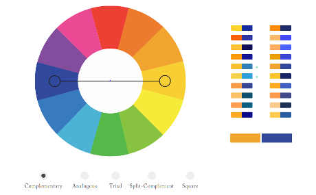
Interactive Color Wheel

color-wheel-460

You will need to visit this interactive color wheel to really appreciate its capabilities.

What I find most helpful is the display of hex codes for the colors. I can distinguish colors but getting the codes right can be a real challenge.

Enjoy!

December 23, 2016

2017/18 – When you can’t believe your eyes

Filed under: Artificial Intelligence,Graphics,Journalism,News,Reporting,Visualization — Patrick Durusau @ 9:15 pm

Artificial intelligence is going to make it easier than ever to fake images and video by James Vincent.

From the post:

Smile Vector is a Twitter bot that can make any celebrity smile. It scrapes the web for pictures of faces, and then it morphs their expressions using a deep-learning-powered neural network. Its results aren’t perfect, but they’re created completely automatically, and it’s just a small hint of what’s to come as artificial intelligence opens a new world of image, audio, and video fakery. Imagine a version of Photoshop that can edit an image as easily as you can edit a Word document — will we ever trust our own eyes again?

“I definitely think that this will be a quantum step forward,” Tom White, the creator of Smile Vector, tells The Verge. “Not only in our ability to manipulate images but really their prevalence in our society.” White says he created his bot in order to be “provocative,” and to show people what’s happening with AI in this space. “I don’t think many people outside the machine learning community knew this was even possible,” says White, a lecturer in creative coding at Victoria University School of design. “You can imagine an Instagram-like filter that just says ‘more smile’ or ‘less smile,’ and suddenly that’s in everyone’s pocket and everyone can use it.”

Vincent reviews a number of exciting advances this year and concludes:


AI researchers involved in this fields are already getting a firsthand experience of the coming media environment. “I currently exist in a world of reality vertigo,” says Clune. “People send me real images and I start to wonder if they look fake. And when they send me fake images I assume they’re real because the quality is so good. Increasingly, I think, we won’t know the difference between the real and the fake. It’s up to people to try and educate themselves.”

An image sent to you may appear to be very convincing, but like the general in War Games, you have to ask does it make any sense?

Verification, subject identity in my terminology, requires more than an image. What do we know about the area? Or the people (if any) in the image? Where were they supposed to be today? And many other questions that depend upon the image and its contents.

Unless you are using a subject-identity based technology, where are you going to store that additional information? Or express your concerns about authenticity?

December 22, 2016

Low fat computing

Filed under: Computer Science,Forth,Graphics,Visualization — Patrick Durusau @ 8:53 pm

Low fat computing by Karsten Schmidt

A summary of the presentation by Schmidt by Malcolm Sparks, along with the presentation itself.

Lots of strange and 3-D printable eye candy for the first 15 minutes or so with Schmidt’s background. Starts to really rock around 20 minutes in with Forth code and very low level coding.

To get a better idea of what Schmidt has been doing, see his website: thi.ng, or his Forth repl in Javascript, http://forth.thi.ng/, or his GitHub repository or at: Github: thi.ng

Stop by at http://toxiclibs.org/ although the material there looks dated.

December 11, 2016

Poor Presentation – Failure to Communicate

Filed under: Graphics,Maps,Visualization — Patrick Durusau @ 5:44 pm

If you ask about the age of city, do you expect to be told it founding date or its age?

If you said founding date, you will be as confused as I was by:

german-cities-poor-03

You can see the map in its full confusion.

The age of Aubsburg is indeed 2013, but 15 BCE (on orders of the Emperor Augustus) established the same fact with less effort on the part of the reader.

Making users work for information is always a poor communication strategy. Always.

November 21, 2016

Resources to Find the Data You Need, 2016 Edition

Filed under: Graphics,Visualization — Patrick Durusau @ 5:25 pm

Resources to Find the Data You Need, 2016 Edition by Nathan Yau.

From the post:

Before you get started on any data-related project, you need data. I know. It sounds crazy, but it’s the truth. It can be frustrating to sleuth for the data you need, so here are some tips on finding it (the openly available variety) and some topic-specific resources to begin your travels.

This is an update to the guide I wrote in 2009, which as it turns out, is now mostly outdated. So, 2016. Here we go.

If you know Nathan Yau’s work, FlowingData, then you know this is “the” starting list for data.

Enjoy!

September 17, 2016

Scalable Vector Graphics (SVG) 2

Filed under: Graphics,SVG — Patrick Durusau @ 8:32 pm

Scalable Vector Graphics (SVG) 2: W3C Candidate Recommendation 15 September 2016

Abstract:

This specification defines the features and syntax for Scalable Vector Graphics (SVG) Version 2. SVG is a language based on XML for describing two-dimensional vector and mixed vector/raster graphics. SVG content is stylable, scalable to different display resolutions, and can be viewed stand-alone, mixed with HTML content, or embedded using XML namespaces within other XML languages. SVG also supports dynamic changes; script can be used to create interactive documents, and animations can be performed using declarative animation features or by using script.

Comments:

Comments on this Candidate Recommendation are welcome. Comments can be sent to www-svg@w3.org, the public email list for issues related to vector graphics on the Web. This list is archived and senders must agree to have their message publicly archived from their first posting. To subscribe send an email to www-svg-request@w3.org with the word subscribe in the subject line.

W3C publishes a Candidate Recommendation to indicate that the document is believed to be stable and to encourage implementation by the developer community. This Candidate Recommendation is expected to advance to Proposed Recommendation no earlier than 15 July 2017, but we encourage early review, and requests for normative changes after 15 November 2016 may be deferred to SVG 3.

15 November 2016 will be here sooner than you realize. Read and comment early and often.

Enjoy!

How Mapmakers Make Mountains Rise Off the Page

Filed under: Cartography,Graphics,Mapping,Maps,Visualization — Patrick Durusau @ 10:34 am

How Mapmakers Make Mountains Rise Off the Page by Greg Miller.

From the post:

The world’s most beautiful places are rarely flat. From the soaring peaks of the Himalaya to the vast chasm of the Grand Canyon, many of the most stunning sites on Earth extend in all three dimensions. This poses a problem for mapmakers, who typically only have two dimensions to work with.

Fortunately, cartographers have some clever techniques for creating the illusion of depth, many of them developed by trial and error in the days before computers. The best examples of this work use a combination of art and science to evoke a sense of standing on a mountain peak or looking out an airplane window.

One of the oldest surviving maps, scratched onto an earthenware plate in Mesopotamia more than 4,000 years ago, depicts mountains as a series of little domes. It’s an effective symbol, still used today in schoolchildren’s drawings and a smartphone emoji, but it’s hardly an accurate representation of terrain. Over the subsequent centuries, mapmakers made mostly subtle improvements, varying the size and shape of their mountains, for example, to indicate that some were bigger than others.

But cartography became much more sophisticated during the Renaissance. Topographic surveys were done for the first time with compasses, measuring chains, and other instruments, resulting in accurate measurements of height. And mapmakers developed new methods for depicting terrain. One method, called hachuring, used lines to indicate the direction and steepness of a slope. You can see a later example of this in the 1807 map below of the Mexican volcano Pico de Orizaba. Cartographers today refer (somewhat dismissively) to mountains depicted this way as “woolly caterpillars.”

Stunning illusions of depth on maps, creating depth illusions in 2 dimensions (think computer monitors), history of map making techniques, are all reasons to read this post.

What seals it for me is that the quest for the “best” depth illusion continues. It’s not a “solved” problem. (No spoiler, see the post.)

Physical topography to one side, how are you going to bring “depth” to your topic map?

Some resources in a topic map may have great depth and others, unfortunately, may be like Wikipedia articles marked as:

This article has multiple issues.

How do you define and then enable navigation of your topic maps?

August 27, 2016

D3 in Depth

Filed under: D3,Graphics,Visualization — Patrick Durusau @ 4:26 pm

D3 in Depth by Peter Cook.

From the introduction:

D3 is an open source JavaScript library for:

  • data-driven manipulation of the Document Object Model (DOM)
  • working with data and shapes
  • laying out visual elements for linear, hierarchical, network and geographic data
  • enabling smooth transitions between user interface (UI) states
  • enabling effective user interaction

Let’s unpick these one by one.

Peter forgets to mention, there will be illustrations:

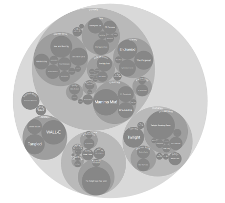
d3-tree-view-460

Same data as a packed circle:

d3-packed-circle-460

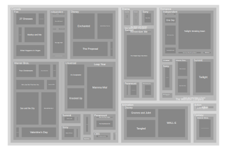
Same data as a treemap:

d3-treemap-460

The first two chapters are up and I’m waiting for more!

You?

PS: Follow Peter at: @animateddata.

August 21, 2016

The Ethics of Data Analytics

Filed under: Data Analysis,Data Science,Ethics,Graphics,Statistics,Visualization — Patrick Durusau @ 4:00 pm

The Ethics of Data Analytics by Kaiser Fung.

Twenty-one slides on ethics by Kaiser Fung, author of: Junk Charts (data visualization blog), and Big Data, Plainly Spoken (comments on media use of statistics).

Fung challenges you to reach your own ethical decisions and acknowledges there are a number of guides to such decision making.

Unfortunately, Fung does not include professional responsibility requirements, such as the now out-dated Canon 7 of the ABA Model Code Of Professional Responsibility:

A Lawyer Should Represent a Client Zealously Within the Bounds of the Law

That canon has a much storied history, which is capably summarized in Whatever Happened To ‘Zealous Advocacy’? by Paul C. Sanders.

In what became known as Queen Caroline’s Case, the House of Lords sought to dissolve the marriage of King George the IV

George IV 1821 color

to Queen Caroline

CarolineOfBrunswick1795

on the grounds of her adultery. Effectively removing her as queen of England.

Queen Caroline was represented by Lord Brougham, who had evidence of a secret prior marriage by King George the IV to Catholic (which was illegal), Mrs Fitzherbert.

Portrait of Mrs Maria Fitzherbert, wife of George IV

Brougham’s speech is worth your reading in full but the portion most often cited for zealous defense reads as follows:


I once before took leave to remind your lordships — which was unnecessary, but there are many whom it may be needful to remind — that an advocate, by the sacred duty of his connection with his client, knows, in the discharge of that office, but one person in the world, that client and none other. To save that client by all expedient means — to protect that client at all hazards and costs to all others, and among others to himself — is the highest and most unquestioned of his duties; and he must not regard the alarm, the suffering, the torment, the destruction, which he may bring upon any other; nay, separating even the duties of a patriot from those of an advocate, he must go on reckless of the consequences, if his fate it should unhappily be, to involve his country in confusion for his client.

The name Mrs. Fitzherbert never slips Lord Brougham’s lips but the House of Lords has been warned that may not remain to be the case, should it choose to proceed. The House of Lords did grant the divorce but didn’t enforce it. Saving fact one supposes. Queen Caroline died less than a month after the coronation of George IV.

For data analysis, cybersecurity, or any of the other topics I touch on in this blog, I take the last line of Lord Brougham’s speech:

To save that client by all expedient means — to protect that client at all hazards and costs to all others, and among others to himself — is the highest and most unquestioned of his duties; and he must not regard the alarm, the suffering, the torment, the destruction, which he may bring upon any other; nay, separating even the duties of a patriot from those of an advocate, he must go on reckless of the consequences, if his fate it should unhappily be, to involve his country in confusion for his client.

as the height of professionalism.

Post-engagement of course.

If ethics are your concern, have that discussion with your prospective client before you are hired.

Otherwise, clients have goals and the task of a professional is how to achieve them. Nothing more.
August 18, 2016

National Food Days

Filed under: Food,Graphics,Visualization — Patrick Durusau @ 2:12 pm

All the National Food Days by Nathan Yau.

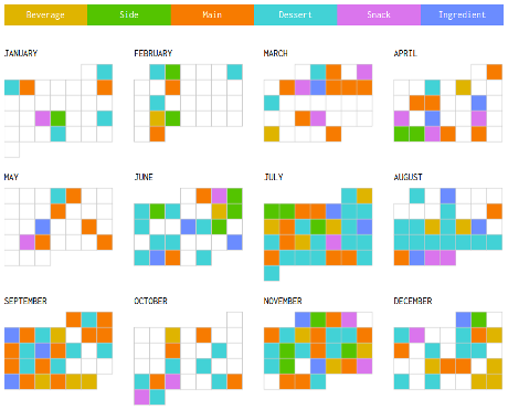
Nathan has created an interactive calendar of all the U.S. national food days.

Here is a non-working replica to entice you to see his interactive version:

national-food-days-460

What’s with July having a national food day every day?

Lobby for your favorite food and month!

August 10, 2016

Failure of Thinking and Visualization

Filed under: Analytics,Graphics,Intelligence,Visualization — Patrick Durusau @ 9:03 pm

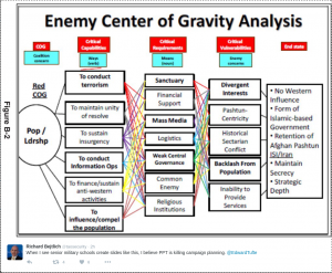
Richard Bejtlich posted this image (thumbnail, select for full size) with the note:

When I see senior military schools create slides like this, I believe PPT is killing campaign planning. @EdwardTufte

enemy-is-ppt

I am loathe to defend PPT but the problem here lies with the author and not PPT.

Or quite possibly with concept of “center of gravity analysis.”

Whatever your opinion about the imperialistic use of U.S. military force, 😉 , the U.S. military is composed of professional warriors who study their craft in great detail.

On the topic “center of gravity analysis,” try Addressing the Fog of COG: Perspectives on the Center of Gravity in US Military Doctrine, Celestino Perez, Jr., General Editor. A no-holds barred debate by military professionals on COG.

With or without a background on COG, how do your diagrams compare to this one?

August 1, 2016

Whose Chose Trump and Clinton?

Filed under: Graphics,Politics,Visualization — Patrick Durusau @ 8:52 pm

If you have been wondering who is responsible for choosing Trump and Clinton as the presidential nominees in 2016, you will find Only 9% of America Chose Trump and Clinton as the Nominees by Alicia Parlapiano and Adam Pearce quite interesting.

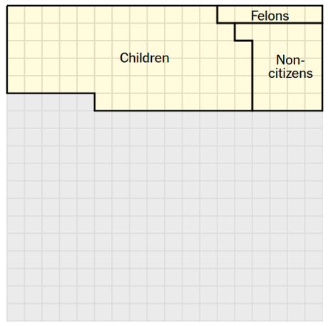
Using a fixed grid on the left hand side of the page that represents 324 million Americans, 1 square = 1 million people, the article inscribes boundaries on the grid for a series of factual statements.

For example, the first statement after the grid reads:

103 million of them are children, noncitizens or ineligible felons, and they do not have the right to vote.

For that statement, the grid displays:

chose-trump-clinton-460

An excellent demonstration that effective visualization requires a lot of thought and not necessarily graphics that jump and buzz with every movement of the mouse.

Successive statements reduce the area of people who voted in the primaries and even further by who voted for Trump or Clinton.

Eventually you are left with the 9% who chose the current nominees.

To be safe, you need 5% of the voting population to secure the nomination. Check the voting rolls for who votes in primaries and pay them directly. Cheaper than media campaigns and has the added advantage of not annoying the rest of the electorate with your ads.

If that sounds “undemocratic,” tell me what definition of democracy you are using where 9% of the population chooses the candidates and a little more than 30% will choose the winner?

July 28, 2016

Learning a Manifold of Fonts

Filed under: Fonts,Graphics — Patrick Durusau @ 9:43 am

Learning a Manifold of Fonts by Neill D.F. Campbell and Jan Kautz.

Abstract:

The design and manipulation of typefaces and fonts is an area requiring substantial expertise; it can take many years of study to become a proficient typographer. At the same time, the use of typefaces is ubiquitous; there are many users who, while not experts, would like to be more involved in tweaking or changing existing fonts without suffering the learning curve of professional typography packages.

Given the wealth of fonts that are available today, we would like to exploit the expertise used to produce these fonts, and to enable everyday users to create, explore, and edit fonts. To this end, we build a generative manifold of standard fonts. Every location on the manifold corresponds to a unique and novel typeface, and is obtained by learning a non-linear mapping that intelligently interpolates and extrapolates existing fonts. Using the manifold, we can smoothly interpolate and move between existing fonts. We can also use the manifold as a constraint that makes a variety of new applications possible. For instance, when editing a single character, we can update all the other glyphs in a font simultaneously to keep them compatible with our changes.

To get a realistic feel for this proposal, try the interactive demo!

One major caveat:

In another lifetime, I contacted John Hudson of Tyro Typeworks about the development of the SBL Font series:

sbl-fonts-460

The origins of that project are not reflected on the SBL webpage, but the difference between John’s work and that of non-professional typographers is obvious even to untrained readers.

Nothing against experimentation with fonts but realize that for truly professional results, you need to hire professionals who live and breath the development of high quality fonts.

Older Posts »

Powered by WordPress