Another Word For It Patrick Durusau on Topic Maps and Semantic Diversity

September 26, 2019

Thirty-Two Tips For…Propaganda And Manipulation

Filed under: #DAPL,Environment,Politics,Protests — Patrick Durusau @ 4:30 pm

Thirty-Two Tips For Navigating A Society That Is Full Of Propaganda And Manipulation by Caitlin Johnstone.

Johnstone in full voice and possibly at her best! Her automatic condemnation of propaganda and manipulation does cause concern.

What if propaganda and manipulation could end the $5.2 trillion in fossil fuel subsidies? (direct and indirect) What if propaganda and manipulation could lead to a non-development economy? Or propaganda and manipulation moving us towards less sexism and racism? Any objectors?

I’ll go first. No objections. What about you?

Society being full of propaganda and manipulation isn’t a recent thing. The slaver “founding fathers” of the United States rather handily manipulated the public into the U.S. farce known as a “democracy.” It is a very long way from any sane definition of democracy. The senate, electoral college, supreme court, wage/wealth gaps, just to name a few of the departures from “democracy.”

Climate news grows worse with every report, while industry plots to use the same techniques that drive climate change to save us, for a price. Now is not the time to be picky about how we enlist others to save themselves and the planet.

Study Johnstone’s list to avoid being manipulated and to perfect your techniques for a worthy cause.

June 18, 2019

Eight Miracles To Stop The MVP

Filed under: Environment,Pipelines (Oil/Gas),Protests,Weaponize Data — Patrick Durusau @ 8:20 pm

Cynthia Munley has a list of seven miracles that would stop the Mountain Valley Pipeline (MVP):

1. Virginia’s top law-enforcer, Attorney General Herring: Don’t negotiate MVP crimes. Stop work!

2. Banks: Divest from pipelines.

3. Voters: Rid Virginia of corporate Democrats.

4. Equitrans (ETRN): At your Pittsburgh stockholder meeting: Recognize that your MVP “engineering marvel” is an investors’ black hole and cut your losses.

5. Federal courts: Respect environmental rights over corporations.

6. FERC: Transform to “FREC” (Federal Renewable Energy Commission).

7. Congress: place fracking under the Clean Water Act.

https://www.roanoke.com/opinion/commentary/munley-seven-ways-to-stop-the-pipeline/article_8acee576-c629-51b7-8fdb-28b5f57c435d.html

Add to that list:

8. PowerBall or other lottery winnings sufficient to buy and close the MVP project.

How successful are Munley miracles at stopping pipelines?

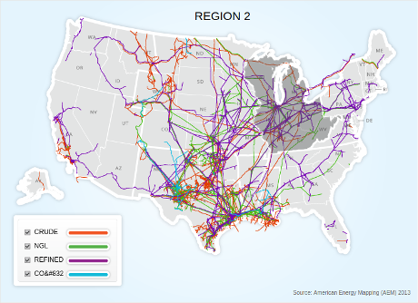
Pipeline 101 maps show how rare Munley miracles are in fact.

U.S. Liquid Pipelines

The U.S. has more than 2.4 million miles of energy pipelines, with 72,000 miles of crude oil lines connecting regional markets.

Munley miracles have a spotty record, to say the least, at stopping pipelines.

Protests and lawsuits have delayed pipelines, in some cases for years. But delay isn’t stopping and new pipelines are underway, in hopes of last minute profits in the face of accelerating climate change.

If Munley miracles don’t stop pipelines, then how? What does data science have to offer pipeline opponents? Can data be weaponized for the people?

April 8, 2019

Solnit, Unattended Luggage, Pipelines

Filed under: #DAPL,Environment,Pipelines (Oil/Gas) — Patrick Durusau @ 4:11 pm

Rebecca Solnit’s When the Hero is the Problem, triggered an insight for me that is likely old news to you: social resistance succeeds only when it is we (a group) and not me (the hero). Solnit writes of ecological sabotage saying:

For an embodiment of the word singlehanded you might turn to the heroine of the recent movie Woman at War. It’s about an Icelandic eco-saboteur who blows up rural power lines and hides in scenic spots from helicopters hunting her and is pretty good with a bow and arrow. But the most famous and effective eco-sabotage in the island’s history was not singlehanded.

In a farming valley on the Laxa River in northern Iceland in August 25, 1970, community members blew up a dam to protect farmland from being flooded. After the dam was dynamited, more than a hundred farmers claimed credit (or responsibility). There were no arrests, and there was no dam, and there were some very positive consequences, including protection of the immediate region and new Icelandic environmental regulations and awareness. It’s almost the only story I know of environmental sabotage having a significant impact, and it may be because it expressed the will of the many, not the few.

Solnit’s essay set me to thinking of ways for ecological sabotage to be a collective but uncoordinated expression of opposition to an oil or gas pipeline. Unbidden the endless loop warning at the Dallas Forth Worth (DFW) airport, in a deep Texas accent, “Watch out! … for unattended luggage and packages” (paraphrase from memory) came to mind. From there I remembered stories of abandoned packages, backpacks, etc., each of while provoked disproportionate and costly police responses.

Does unattended luggage attract the same attention as it would at DFW during the six stages of pipeline construction:

  1. Construction Staging Areas & Storage Yards
  2. Clear Cutting the ROW
  3. Excavating the Trench
  4. Pipe Transport, Stringing, & Assembly
  5. Obstacles: Roads & Streams
  6. Testing & Restoration?

If unattended luggage attracts a DFW level of attention on pipeline routes, defense and offense against pipeline construction takes on an entirely different complexion. Pipeline projects must secure the entire length of the pipeline from the time the pipeline route is fixed and the pipeline is complete. If anyone breeches pipeline security, any resulting unattended luggage or other packages, would require law enforcement attention before the project could proceed.

Rather than a focused area for law enforcement attention, think Standing Rock, pipeline proponents have to divide their resources between hundreds of miles of pipeline route for years. That sounds expensive, yes? On the other hand, opponents of pipelines can contribute to the rising cost of pipelines without leadership, charismatic or otherwise.

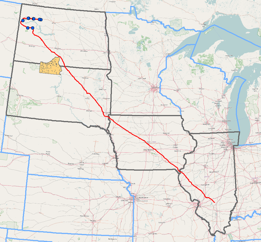
To illustrate, instead of “defending” against the protesters at Standing Rock (the entire reservation is shown in orange), imagine defending the entire route marked in red:

Advantage red team! Yes?

Do remember to post videos to the media and get word to investors about increasing pipeline costs.


June 5, 2018

Installing Google Earth – Ubuntu 16.04 (Tooling to help “Preserve The New River Valley”)

Filed under: Environment,Google Earth,Google Maps,Government — Patrick Durusau @ 7:20 pm

I encountered a remarkable resource, Proposed Route Using Google Earth and Geographic Information Systems (GIS) that details the route to be taken by the Mountain Valley Pipeline. (It’s hard to get in the way if you don’t know the route.)

But it requires use of Google Earth, an application I have only used on Windows. Time to change that!

Download Google Earth Pro for PC, Mac, or Linux then run:

sudo dpkg -i google-earth-stable_current_amd64.deb

in the same directory as the downloaded file.

It’s working!

Now back to the nifty resource I was talking about:

Dr. Stockton Maxwell, Assistant Professor of Geospatial Science at Radford University contacted EQT to request a Geographic Information Systems (GIS) request for the proposed pipeline route. A GIS is, in layman’s terms, a computer system that allows geographical data to be captured, stored, analyzed, and presented. Many counties and municipalities now use GIS to map all parcels and provide pertinent information on each parcel. Not surprising to those of us familiar with the EQT/NextEra Alliance, Mountain Valley Pipeline. LLC, they did not respond to Dr. Maxwell’s request. However, the company did have to share this information with the Virginia Department of Conservation and Recreation (DCR) as they are one of the stakeholders that must be notified during the pre-filing process. Dr. Maxwell contacted DCR and they shared the GIS information with him.

To make it easier for us to interpret the GIS information, Dr. Maxwell was kind enough to create a Google Earth file of the entire route (from Wetzel County, WV to Pittsylvania County, VA. He then created a buffer of 150 feet on each side of the route as this is the planned right-of-way during the construction phase of the project. To view this file, you will first need to download and install Google Earth — you can download it for free at: http://www.google.com/earth/download/ge/agree.html. Once you have downloaded Google Earth and installed it (or if you already have Google Earth installed), you will need to download the following file: http://preservethenrv.com/docs/MVP_Route.kmz. The file will download onto your computer. You can then Open the file (you will see the file name show at the bottom of your screen; click on the arrow to the right and select open) and it should open in Google Earth.

We are so lucky to have someone with Dr. Maxwell’s talents on our side — this resource will help landowners and citizens investigate the route better than the company’s maps.

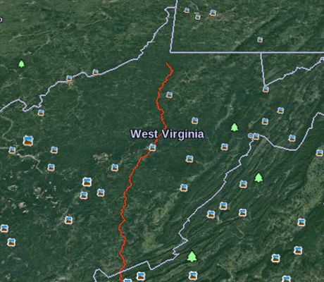
A portion of the default view:

I’m going to be looking for places where accidental traffic congestion will delay construction. Critical sites that need re-routing will require boots on the ground to find and document those places. Got boots?

December 27, 2017

From the Valley of Disinformation Rode the 770 – Opportunity Knocks

Filed under: Cybersecurity,Environment,Government,Government Data,Journalism,Reporting — Patrick Durusau @ 10:32 am

More than 700 employees have left the EPA since Scott Pruitt took over by Natasha Geiling.

From the post:

Since Environmental Protection Agency Administrator Scott Pruitt took over the top job at the agency in March, more than 700 employees have either retired, taken voluntary buyouts, or quit, signaling the second-highest exodus of employees from the agency in nearly a decade.

According to agency documents and federal employment statistics, 770 EPA employees departed the agency between April and December, leaving employment levels close to Reagan-era levels of staffing. According to the EPA’s contingency shutdown plan for December, the agency currently has 14,449 employees on board — a marked change from the April contingency plan, which showed a staff of 15,219.

These departures offer journalists a rare opportunity to bleed the government like a stuck pig. From untimely remission of login credentials to acceptance of spear phishing emails, opportunities abound.

Not for “reach it to me” journalists who use sources as shields from potential criminal liability. While their colleagues are imprisoned for the simple act of publication or murdered (as of today in 2017, 42).

Governments have not, are not and will not act in the public interest. Laws that criminalize acquisition of data or documents are a continuation of their failure to act in the public interest.

Journalists who serve the public interest, by exposing the government’s failure to do so, should use any means at their disposal to obtain data and documents that evidence government failure and misconduct.

Are you a journalist serving the public interest or a “reach it to me” journalist, serving the public interest when there’s no threat to you?

December 14, 2017

Spatial Microsimulation with R – Public Policy Advocates Take Note

Filed under: Environment,R,Simulations — Patrick Durusau @ 11:28 am

Spatial Microsimulation with R by Robin Lovelace and Morgane Dumont.

Apologies for the long quote below but spatial microsimulation is unfamiliar enough that it merited an introduction in the authors’ own prose.

We have all attended public meetings where developers, polluters, landfill operators, etc., had charts, studies, etc., and the public was armed with, well, its opinions.

Spatial Microsimulation with R can put you in a position to offer alternative analysis, meaningfully ask for data used in other studies, in short, arm yourself with weapons long abused in public policy discussions.

From Chapter 1, 1.2 Motivations:


Imagine a world in which data on companies, households and governments were widely available. Imagine, further, that researchers and decision-makers acting in the public interest had tools enabling them to test and model such data to explore different scenarios of the future. People would be able to make more informed decisions, based on the best available evidence. In this technocratic dreamland pressing problems such as climate change, inequality and poor human health could be solved.

These are the types of real-world issues that we hope the methods in this book will help to address. Spatial microsimulation can provide new insights into complex problems and, ultimately, lead to better decision-making. By shedding new light on existing information, the methods can help shift decision-making processes away from ideological bias and towards evidence-based policy.

The ‘open data’ movement has made many datasets more widely available. However, the dream sketched in the opening paragraph is still far from reality. Researchers typically must work with data that is incomplete or inaccessible. Available datasets often lack the spatial or temporal resolution required to understand complex processes. Publicly available datasets frequently miss key attributes, such as income. Even when high quality data is made available, it can be very difficult for others to check or reproduce results based on them. Strict conditions inhibiting data access and use are aimed at protecting citizen privacy but can also serve to block democratic and enlightened decision making.

The empowering potential of new information is encapsulated in the saying that ‘knowledge is power’. This helps explain why methods such as spatial microsimulation, that help represent the full complexity of reality, are in high demand.

Spatial microsimulation is a growing approach to studying complex issues in the social sciences. It has been used extensively in fields as diverse as transport, health and education (see Chapter ), and many more applications are possible. Fundamental to the approach are approximations of individual level data at high spatial resolution: people allocated to places. This spatial microdata, in one form or another, provides the basis for all spatial microsimulation research.

The purpose of this book is to teach methods for doing (not reading about!) spatial microsimulation. This involves techniques for generating and analysing spatial microdata to get the ‘best of both worlds’ from real individual and geographically-aggregated data. Population synthesis is therefore a key stage in spatial microsimulation: generally real spatial microdata are unavailable due to concerns over data privacy. Typically, synthetic spatial microdatasets are generated by combining aggregated outputs from Census results with individual level data (with little or no geographical information) from surveys that are representative of the population of interest.

The resulting spatial microdata are useful in many situations where individual level and geographically specific processes are in operation. Spatial microsimulation enables modelling and analysis on multiple levels. Spatial microsimulation also overlaps with (and provides useful initial conditions for) agent-based models (see Chapter 12).

Despite its utility, spatial microsimulation is little known outside the fields of human geography and regional science. The methods taught in this book have the potential to be useful in a wide range of applications. Spatial microsimulation has great potential to be applied to new areas for informing public policy. Work of great potential social benefit is already being done using spatial microsimulation in housing, transport and sustainable urban planning. Detailed modelling will clearly be of use for planning for a post-carbon future, one in which we stop burning fossil fuels.

For these reasons there is growing interest in spatial microsimulation. This is due largely to its practical utility in an era of ‘evidence-based policy’ but is also driven by changes in the wider research environment inside and outside of academia. Continued improvements in computers, software and data availability mean the methods are more accessible than ever. It is now possible to simulate the populations of small administrative areas at the individual level almost anywhere in the world. This opens new possibilities for a range of applications, not least policy evaluation.

Still, the meaning of spatial microsimulation is ambiguous for many. This book also aims to clarify what the method entails in practice. Ambiguity surrounding the term seems to arise partly because the methods are inherently complex, operating at multiple levels, and partly due to researchers themselves. Some uses of the term ‘spatial microsimulation’ in the academic literature are unclear as to its meaning; there is much inconsistency about what it means. Worse is work that treats spatial microsimulation as a magical black box that just ‘works’ without any need to describe, or more importantly make reproducible, the methods underlying the black box. This book is therefore also about demystifying spatial microsimulation.

If that wasn’t impressive enough, the authors:


We’ve put Spatial Microsimulation with R on-line because we want to reduce barriers to learning. We’ve made it open source via a GitHub repository because we believe in reproducibility and collaboration. Comments and suggests are most welcome there. If the content of the book helps your research, please cite it (Lovelace and Dumont, 2016).

How awesome is that!

Definitely a model for all of us to emulate!

December 6, 2017

Don’t trust NGOs, they have their own agendas (edited)

Filed under: Environment,Journalism,News,Reporting — Patrick Durusau @ 8:50 am

The direct quote is “Don’t trust NGOs, they may have their own agendas.”

I took out the “may” because NGOs are committed to themselves and their staffs before any cause or others. That alone justifies removing the “may.” They have their own agendas and you need to keep that in mind.

Wildlife Crimes: Focus On The Villain, Not The Victim by Ufrieda Ho, says in part:

Ease up on the blood shots, ditch the undercover ploys and think crime story, not animal story.

These are top tips from Bryan Christy, author, investigative journalist and National Geographic Society Fellow. He says environmental trafficking and smuggling should be treated like a “whodunnits” rather than yet another depressing tale of gore and horror.

Christy, a panelist at this morning’s GIJN session on Environmental Crime and Wildlife Smuggling, says: “We need to stop telling the rhino-victim story and start thinking about the trafficker-villain story.”

Christy says shifting the editorial telling of stories in this way is a tool to fight “sad story” fatigue. It trains the audience to follow the trail of a villain through plot-driven action rather than to be turned off by feeling hopeless and despairing in the face of another climate change story or another report on a butchered elephant.

“The criminal plot is also a pack horse – it can pack in a lot of information,” says Christy, understanding that the nature of environmental investigations on smuggling and trafficking is about exploring intricate webs.

That sounds like a data mining/science angle to wildlife crime to me!

There will be people in the field but connecting all the dots will require checking shipping, financial, even the Panama Papers and Paradise Papers for potential connections and leads.

November 19, 2017

Shirriffs and Elephant Poaching

Filed under: Data Science,Environment — Patrick Durusau @ 9:27 am

I asked on Twitter yesterday:

How can data/computer science disrupt, interfere with, burden, expose elephant hunters and their facilitators? Serious question.

@Pembient pointed to Vulcan’s Domain Awareness Tool, describe in New Tech Gives Rangers Real-Time Tools to Protect Elephants as:


The Domain Awareness System (DAS) is a tool that aggregates the positions of radios, vehicles, aircraft and animal sensors to provide users with a real-time dashboard that depicts the wildlife being protected, the people and resources protecting them, and the potential illegal activity threatening them.

“Accurate data plays a critical role in conservation,” said Paul Allen. “Rangers deserve more than just dedication and good luck. They need to know in real-time what is happening in their parks.”

The visualization and analysis capabilities of DAS allow park managers to make immediate tactical decisions to then efficiently deploy resources for interdiction and active management. “DAS has enabled us to establish a fully integrated approach to our security and anti-poaching work within northern Kenya,” said Mike Watson, chief executive officer of Lewa Conservancy where the first DAS installation was deployed late last year. “This is making us significantly more effective and coordinated and is showing us limitless opportunities for conservation applications.”

The system has been installed at six protected wildlife conservation sites since November 2016. Working with Save the Elephants, African Parks Network, Wildlife Conservation Society, and the Singita Grumeti Fund as well as the Lewa Conservancy and Northern Rangelands Trust, a total of 15 locations are expected to adopt the system this year.

Which is great and a project that needs support and expansion.

However, the question remains that having “spotted” poachers, where are the resources to physically safeguard elephants and other targets of poachers?

A second link, also suggested by @Pembient, Wildlife Works, Wildlife Works Carbon / Kasigau Corridor, Kenya, another great project, reminds me of the Shirriffs of the Hobbits, who were distinguished from other Hobbits by a feather they wore in their caps:


Physical protection and monitoring – Wildlife Works trained over 120 young people, men and women, from the local communities to be Wildlife Rangers, and they perform daily foot patrols of the forest to ensure that it remains intact. The rangers are unarmed, but have the power of arrest granted by the local community.

Environmental monitoring isn’t like confronting poachers, or ordinary elephant hunters for that matter, who travel in packs, armed with automatic weapons, with dubious regard for lives other than their own.

Great programs, having a real impact, that merit your support, but not quite on point to my question of:

How can data/computer science disrupt, interfere with, burden, expose elephant hunters and their facilitators? Serious question.

Poachers must be stopped with police/military force. The use of DAS and similar information systems have the potential to effective deploy forces to stop poachers. Assuming adequate forces are available. The estimated loss of 100 elephants per day suggests they are not.

Hunters, on the other hand, are protected by law and tradition in their slaughter of adult elephants, who have no natural predators.

To be clearer, we know the classes of elephant hunters and facilitators exist, how should we go about populating those classes with instances, where each instance has a name, address, employer, website, email, etc.?

And once having that information, what can be done to to acknowledge their past, present or ongoing hunting of elephants? Acknowledge it in such a way as to discourage any further elephant hunting by themselves or anyone who reads about them?

Elephants aren’t killed by anonymous labels such as “elephant hunters,” or “poachers,” but by identifiable, nameable, traceable individuals.

Use data science to identify, name and trace those individuals.
September 29, 2017

Pipeline Resistance – Pipeline Locations – Protest Activity (GPS Locations of Pipelines)

Filed under: #DAPL,Environment,Protests — Patrick Durusau @ 8:25 pm

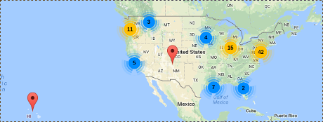
Mapping Fossil Fuel Resistance

An interactive map of groups resisting fossil fuel pipelines, which appears US-centric to me.

What do you think?

If you check the rest of the map, no groups at other locations, at least not yet.

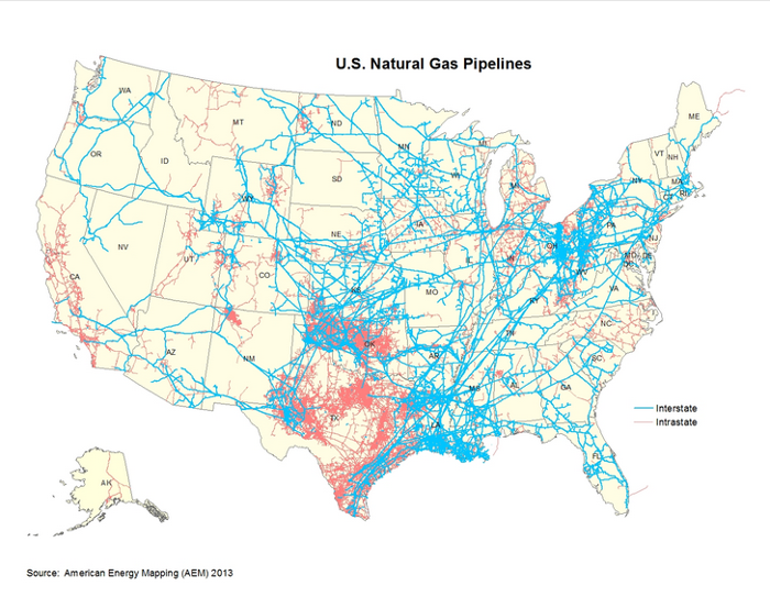
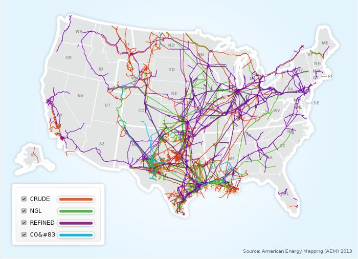
The distribution of protests is sparse, considering the number of pipelines in the US:

Pipeline image from: Pipeline 101 – Where Are Liquids Pipelines Located?.

Maps of pipelines, for national security reasons, are limited in their resolution.

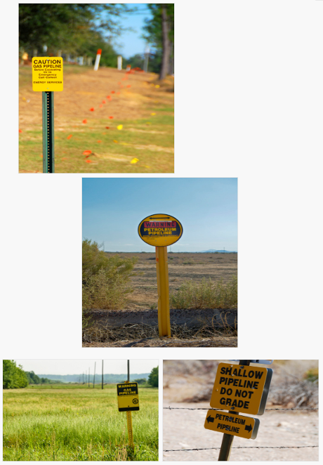
I’m not sure how effective limiting pipeline map resolution must be since Pipeline 101 -How Can You Identify Pipelines?, gives these examples:

You get close enough from a “security minded” pipeline map and then drive until you see a long flat area with a pipeline sign. That doesn’t sound very hard to me. You?

Possible protest activity. Using the GPS on your phone, record locations where pipelines cross highways. Collaborate on production of GPS-based pipeline maps. Free to the public (including protesters).

We have the technology. Do we have the will to create our own maps of pipeline locations?

February 26, 2017

ForWarn: Satellite-Based Change Recognition and Tracking [Looking for Leaks/Spills/Mines]

Filed under: Environment,Government,Image Processing,Mapping,Maps — Patrick Durusau @ 2:52 pm

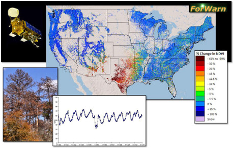
ForWarn: Satellite-Based Change Recognition and Tracking

From the introduction:

ForWarn is a vegetation change recognition and tracking system that uses high-frequency, moderate resolution satellite data. It provides near real-time change maps for the continental United States that are updated every eight days. These maps show the effects of disturbances such as wildfires, wind storms, insects, diseases, and human-induced disturbances in addition to departures from normal seasonal greenness caused by weather. Using this state of the art tracking system, it is also possible to monitor post-disturbance recovery and the cumulative effects of multiple disturbances over time.

This technology supports a broader cooperative management initiative known as the National Early Warning System (EWS). The EWS network brings together various organizations involved in mapping disturbances, climate stress, aerial and ground monitoring, and predictive efforts to achieve more efficient landscape planning and management across jurisdictions.

ForWarn consists of a set of inter-related products including near real time vegetation change maps, an archive of past change maps, an archive of seasonal vegetation phenology maps, and derived map products from these efforts. For a detailed discussion of these products, or to access these map products in the project’s Assessment Viewer or to explore these data using other GIS services, look through Data Access under the Products header.

  • ForWarn relies on daily eMODIS and MODIS satellite data
  • It tracks change in the Normalized Difference Vegetation Index (NDVI)
  • Coverage extends to all lands of the continental US
  • Products are at 232 meter resolution (13.3 acres or 5.4 hectares)
  • It has NDVI values for 46 periods per year (at 8-day intervals)
  • It uses a 24-day window with 8-day time steps to avoid clouds, etc.
  • The historical NDVI database used for certain baselines dates from 2000 to the present

Not everyone can be blocking pipeline construction and/or making DAPL the most-expensive non-operational (too many holes) pipeline in history.

Watching for leaks, discharges, and other environmental crimes as reflected in the surrounding environment is a valuable contribution as well.

All you need is a computer with an internet connection. Much of the heavy lifting has been done at no cost to you by ForWarn.

It occurs to me that surface mining operations and spoilage from them are likely to produce artifacts larger than 232 meter resolution. Yes?

Enjoy!

July 28, 2016

U.S. Climate Resilience Toolkit

Filed under: Environment,Government Data — Patrick Durusau @ 8:28 pm

Bringing climate information to your backyard: the U.S. Climate Resilience Toolkit by Tamara Dickinson and Kathryn Sullivan.

From the post:

Climate change is a global challenge that will requires local solutions. Today, a new version of the Climate Resilience Toolkit brings climate information to your backyard.

The Toolkit, called for in the President’s Climate Action Plan and developed by the National Oceanic and Atmospheric Administration (NOAA), in collaboration with a number of Federal agencies, was launched in 2014. After collecting feedback from a diversity of stakeholders, the team has updated the Toolkit to deliver more locally-relevant information and to better serve the needs of its users. Starting today, Toolkit users will find:

  • A redesigned user interface that is responsive to mobile devices;
  • County-scale climate projections through the new version of the Toolkit’s Climate Explorer;
  • A new “Reports” section that includes state and municipal climate-vulnerability assessments, adaptation plans, and scientific reports; and
  • A revised “Steps to Resilience” guide, which communicates steps to identifying and addressing climate-related vulnerabilities.

Thanks to the Toolkit’s Climate Explorer, citizens, communities, businesses, and policy leaders can now visualize both current and future climate risk on a single interface by layering up-to-date, county-level, climate-risk data with maps. The Climate Explorer allows coastal communities, for example, to overlay anticipated sea-level rise with bridges in their jurisdiction in order to identify vulnerabilities. Water managers can visualize which areas of the country are being impacted by flooding and drought. Tribal nations can see which of their lands will see the greatest mean daily temperature increases over the next 100 years.  

A number of decision makers, including the members of the State, Local, and Tribal Leaders Task Force, have called on the Federal Government to develop actionable information at local-to-regional scales.  The place-based, forward-looking information now available through the Climate Explorer helps to meet this demand.

The Climate Resilience Toolkit update builds upon the Administration’s efforts to boost access to data and information through resources such as the National Climate Assessment and the Climate Data Initiative. The updated Toolkit is a great example of the kind of actionable information that the Federal Government can provide to support community and business resilience efforts. We look forward to continuing to work with leaders from across the country to provide the tools, information, and support they need to build healthy and climate-ready communities.

Check out the new capabilities today at toolkit.climate.gov!

I have only started to explore this resource but thought I should pass it along.

Of particular interest to me is the integration of data/analysis from this resource with other data.

Suggestions/comments?

December 21, 2015

Natural England opens-up seabed datasets

Filed under: Environment,Oceanography,Open Data — Patrick Durusau @ 7:10 pm

Natural England opens-up seabed datasets by Hannah Ross.

From the post:

Following the Secretary of State’s announcement in June 2015 that Defra would become an open, data driven organisation we have been working hard at Natural England to start unlocking our rich collection of data. We have opened up 71 data sets, our first contribution to the #OpenDefra challenge to release 8000 sets of data by June 2016.

What is the data?

The data is primarily marine data which we commissioned to help identify marine protected areas (MPAs) and monitor their condition.

We hope that the publication of these data sets will help many people get a better understanding of:

  • marine nature and its conservation and monitoring
  • the location of habitats sensitive to human activities such as oil spills
  • the environmental impact of a range of activities from fishing to the creation of large marinas

The data is available for download on the EMODnet Seabed Habitats website under the Open Government Licence and more information about the data can be found at DATA.GOV.UK.

This is just the start…

Throughout 2016 we will be opening up lots more of our data, from species records to data from aerial surveys.

We’d like to know what you think of our data; please take a look and let us know what you think at OpenData@naturalengland.org.uk.

Image: Sea anemone (sunset cup-coral), Copyright (CC by-nc-nd 2.0) Natural England/Roger Mitchell 1978.

Great new data source and looking forward to more.

A welcome layer on this data would be, where possible, identification of activities and people responsible for degradation of sea anemone habitats.

Sea anemones are quite beautiful but lack the ability to defend against human disruption of those environment.

Preventing disruption of sea anemone habitats is a step forward.

Discouraging those who practice disruption of sea anemone habitats is another.

October 10, 2015

Skybox: A Tool to Help Investigate Environmental Crime

Filed under: Environment,Image Recognition — Patrick Durusau @ 6:47 am

Skybox: A Tool to Help Investigate Environmental Crime by Kristine M. Gutterød & Emilie Gjengedal Vatnøy.

From the post:

Today public companies have to provide reports with data, while many private companies do not have to provide anything. Most companies within the oil, gas and mining sector are private, and to get information can be both expensive and time-consuming.

Skybox is a new developing tool used to extract information from an otherwise private industry. Using moving pictures on ground level—captured by satellites—you can monitor different areas up close.

“You can dig into the details and get more valuable and action-filled information for people both in the public and private sector,” explained Patrick Dunagan, strategic partnerships manager at Google, who worked in developing Skybox.

The satellite images can be useful when investigating environmental crime because you can monitor different companies, for example the change in the number of vehicles approaching or leaving a property, as well as environmental changes in the world.

Excellent news!

Hopefully Skybox will include an option to link in ground level photographs that can identify license plates and take photos of drivers.

Using GPS coordinates with time data, activists will have a means of detecting illegal and/or new dumping sites for surveillance.

Couple that with license plate data and the noose starts to tighten on environmental violators.

You will still need to pierce the shell corporations and follow links to state and local authorities but catching the physical dumpers is a first step.

April 22, 2015

A Scary Earthquake Map – Oklahoma

Filed under: Environment,Government,Government Data — Patrick Durusau @ 8:15 pm

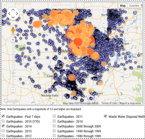
Earthquakes in Oklahoma – Earthquake Map

OK-earthquakes

Great example of how visualization can make the case that “standard” industry practices are in fact damaging the public.

The map is interactive and the screen shot above is only one example.

The main site is located at: http://earthquakes.ok.gov/.

From the homepage:

Oklahoma experienced 585 magnitude 3+ earthquakes in 2014 compared to 109 events recorded in 2013. This rise in seismic events has the attention of scientists, citizens, policymakers, media and industry. See what information and research state officials and regulators are relying on as the situation progresses.

The next stage of data mapping should be identifying the owners or those who profited from the waste water disposal wells and their relationships to existing oil and gas interests, as well as their connections to members of the Oklahoma legislature.

What is it that Republicans call it? Ah, accountability, as in holding teachers and public agencies “accountable.” Looks to me like it is time to hold some oil and gas interests and their owners, “accountable.”

PS: Said to not be a “direct” result of fracking but of the disposal of water used for fracking. Close enough for my money. You?

August 19, 2014

Complete Antarctic Map

Filed under: Environment,Mapping,Maps — Patrick Durusau @ 1:31 pm

Waterloo makes public most complete Antarctic map for climate research

From the post:

The University of Waterloo has unveiled a new satellite image of Antarctica, and the imagery will help scientists all over the world gain new insight into the effects of climate change.

Thanks to a partnership between the Canadian Space Agency (CSA), MacDonald, Dettwiler and Associates Ltd. (MDA), the prime contractor for the RADARSAT-2 program, and the Canadian Cryospheric Information Network (CCIN) at UWaterloo, the mosaic is free and fully accessible to the academic world and the public.

Using Synthetic Aperture Radar with multiple polarization modes aboard the RADARSAT-2 satellite, the CSA collected more than 3,150 images of the continent in the autumn of 2008, comprising a single pole-to-coast map covering all of Antarctica. This is the first such map of the area since RADARSAT-1 created one in 1997.

You can access the data at: Polar Data Catalogue.

From the Catalogue homepage:

The Polar Data Catalogue is a database of metadata and data that describes, indexes, and provides access to diverse data sets generated by Arctic and Antarctic researchers. The metadata records follow ISO 19115 and Federal Geographic Data Committee (FGDC) standard formats to provide exchange with other data centres. The records cover a wide range of disciplines from natural sciences and policy, to health and social sciences. The PDC Geospatial Search tool is available to the public and researchers alike and allows searching data using a mapping interface and other parameters.

What data would you associate with such a map?

I first saw this at: Most complete Antarctic map for climate research made public.

May 12, 2014

EnviroAtlas

Filed under: Data Integration,Environment,Government,Government Data — Patrick Durusau @ 4:13 pm

EnviroAtlas

From the homepage:

What is EnviroAtlas?

EnviroAtlas is a collection of interactive tools and resources that allows users to explore the many benefits people receive from nature, often referred to as ecosystem services. Key components of EnviroAtlas include the following:


Why is EnviroAtlas useful?

Though critically important to human well-being, ecosystem services are often overlooked. EnviroAtlas seeks to measure and communicate the type, quality, and extent of the goods and services that humans receive from nature so that their true value can be considered in decision-making processes.

Using EnviroAtlas, many types of users can access, view, and analyze diverse information to better understand how various decisions can affect an array of ecological and human health outcomes. EnviroAtlas is available to the public and houses a wealth of data and research.

EnvironAtlas integrates over 300 data layers listed in: Available EnvironAtlas data.

News about the cockroaches infesting the United States House/Senate makes me forget there are agencies laboring to provide benefits to citizens.

Whether this environmental goldmine will be enough to result in a saner environmental policy remains to be seen.

I first saw this in a tweet by Margaret Palmer.

February 22, 2014

80 Maps that “Explain” the World

Filed under: Environment,Government,Mapping,Maps,Politics — Patrick Durusau @ 3:06 pm

Max Fisher, writing for the Washington Post, has two posts on maps that “explain” the world. Truly remarkable posts.

40 maps that explain the world, 12 August 2014.

From the August post:

Maps can be a remarkably powerful tool for understanding the world and how it works, but they show only what you ask them to. So when we saw a post sweeping the Web titled “40 maps they didn’t teach you in school,” one of which happens to be a WorldViews original, I thought we might be able to contribute our own collection. Some of these are pretty nerdy, but I think they’re no less fascinating and easily understandable. A majority are original to this blog (see our full maps coverage here)*, with others from a variety of sources. I’ve included a link for further reading on close to every one.

* I repaired the link to “our full maps coverage here.” It is broken in the original post.

40 more maps that explain the world, 13 January 2014.

From the January post:

Maps seemed to be everywhere in 2013, a trend I like to think we encouraged along with August’s 40 maps that explain the world. Maps can be a remarkably powerful tool for understanding the world and how it works, but they show only what you ask them to. You might consider this, then, a collection of maps meant to inspire your inner map nerd. I’ve searched far and wide for maps that can reveal and surprise and inform in ways that the daily headlines might not, with a careful eye for sourcing and detail. I’ve included a link for more information on just about every one. Enjoy.

Bear in mind the usual caveats about the underlying data, points of view represented and unrepresented but this is a remarkable collection of maps.

Highly recommended!

BTW, don’t be confused by the Part two: 40 more maps that explain the world link in the original article. The January 2014 article doesn’t say Part two but after comparing the links, I am satisfied that is what was intended, although it is confusing at first glance.

January 21, 2014

Berkeley Ecoinformatics Engine

Filed under: Ecoinformatics,Environment — Patrick Durusau @ 7:58 pm

Berkeley Ecoinformatics Engine – An open API serving UC Berkeley’s Natural History Data

From the News page:

We are thrilled to release an early version of the Berkeley Ecoinformatics Engine API! We have a lot of data and tools that we’ll be pushing out in future releases so keep an eye out as we are just getting started.

To introduce eco-minded developers to this new resource, we are serving up two key data sets that will be available for this weekend’s EcoHackSF:

For this hackathon, we are encouraging participants to help us document our changing environment. Here’s the abstract:

Wieslander Vegetation Mapping Project – Data from the 1920s needs an update

During the 1920’s and 30’s Albert Everett Wieslander and his team at USGS compiled an amazing and comprehensive dataset known as the Wieslander Vegetation Mapping Project. The data collected includes landscape photos, species inventories, plot maps, and vegetation maps covering most of California. Several teams have been digitizing this valuable historic data over the last ten years, and much of it is now complete. We will be hosting all of the finalized data in our Berkeley Ecoinformatics Engine.

Our task for the EcoHack community will be to develop a web/mobile application that will allow people to view and find the hundreds of now-geotagged landscape photos, and reshoot the same scene today. These before and after images will provide scientists and enthusiasts with an invaluable view of how these landscapes have changed over the last century.

Though this site is focused on the development of the EcoEngine, this project is a part of a larger effort to address the challenge of identifying the interactions and feedbacks between different species and their environment. It will promote the type of multi-disciplinary building that will lead to breakthroughs in our understanding of the biotic input and response to global change. The EcoEngine will serve to unite previously disconnected perspectives from paleo-ecologists, population biologists, and ecologists and make possible the testing of predictive models of global change, a critical advance in making the science more rigorous. Visit globalchange.berkeley.edu to learn more.

Hot damn! Another project trying to reach across domain boundaries and vocabularies to address really big problems.

Maybe the original topic maps effort was just a little too early.

January 8, 2014

Introducing mangal,…

Filed under: Environment,Graphs,Networks,R,Taxonomy — Patrick Durusau @ 9:37 am

Introducing mangal, a database for ecological networks

From the post:

Working with data on ecological networks is usually a huge mess. Most of the time, what you have is a series of matrices with 0 and 1, and in the best cases, another file with some associated metadata. The other issue is that, simply put, data on ecological networks are hard to get. The Interaction Web Database has some, but it's not as actively maintained as it should, and the data are not standardized in any way. When you need to pull a lot of networks to compare them, it means that you need to go through a long, tedious, and error-prone process of cleaning and preparing the data. It should not be that way, and that is the particular problem I've been trying to solve since this spring.

About a year ago, I discussed why we should have a common language to represent interaction networks. So with this idea in mind, and with great feedback from colleagues, I assembled a series of JSON schemes to represent networks, in a way that will allow programmatic interaction with the data. And I'm now super glad to announce that I am looking for beta-testers, before I release the tool in a formal way. This post is the first part of a series of two or three posts, which will give informations about the project, how to interact with the database, and how to contribute data. I'll probably try to write a few use-cases, but if reading these posts inspire you, feel free to suggest some!

So what is that about?

mangal (another word for a mangrove, and a type of barbecue) is a way to represent and interact with networks in a way that is (i) relatively easy and (ii) allows for powerful analyses. It's built around a data format, i.e. a common language to represent ecological networks. You can have an overview of the data format on the website. The data format was conceived with two ideas in mind. First, it must makes sense from an ecological point of view. Second, it must be easy to use to exchange data, send them to database, and get them through APIs. Going on a website to download a text file (or an Excel one) should be a thing of the past, and the data format is built around the idea that everything should be done in a programmatic way.

Very importantly, the data specification explains how data should be formatted when they are exchanged, not when they are used. The R package, notably, uses igraph to manipulate networks. It means that anyone with a database of ecological networks can write an API to expose these data in the mangal format, and in turn, anyone can access the data with the URL of the API as the only information.

Because everyone uses R, as I've mentionned above, we are also releasing a R package (unimaginatively titled rmangal). You can get it from GitHub, and we'll see in a minute how to install it until it is released on CRAN. Most of these posts will deal with how to use the R package, and what can be done with it. Ideally, you won't need to go on the website at all to interact with the data (but just to make sure you do, the website has some nice eye-candy, with clickable maps and animated networks).

An excellent opportunity to become acquainted with the iGraph package for R (299 pages), IGraph for Python (394 pages), and iGraph C Library (812 pages).

Unfortunately, iGraph does not support multigraphs or hypergraphs.

November 14, 2013

Global Forest Change

Filed under: Climate Data,Environment,Mapping,Maps,Visualization — Patrick Durusau @ 7:46 pm

The first detailed maps of global forest change by Matt Hansen and Peter Potapov, University of Maryland; Rebecca Moore and Matt Hancher, Google.

From the post:

Most people are familiar with exploring images of the Earth’s surface in Google Maps and Earth, but of course there’s more to satellite data than just pretty pictures. By applying algorithms to time-series data it is possible to quantify global land dynamics, such as forest extent and change. Mapping global forests over time not only enables many science applications, such as climate change and biodiversity modeling efforts, but also informs policy initiatives by providing objective data on forests that are ready for use by governments, civil society and private industry in improving forest management.

In a collaboration led by researchers at the University of Maryland, we built a new map product that quantifies global forest extent and change from 2000 to 2012. This product is the first of its kind, a global 30 meter resolution thematic map of the Earth’s land surface that offers a consistent characterization of forest change at a resolution that is high enough to be locally relevant as well. It captures myriad forest dynamics, including fires, tornadoes, disease and logging.

Global map of forest change: http://earthenginepartners.appspot.com/science-2013-global-forest

If you are curious to learn more, tune in next Monday, November 18 to a live-streamed, online presentation and demonstration by Matt Hansen and colleagues from UMD, Google, USGS, NASA and the Moore Foundation:

Live-stream Presentation: Mapping Global Forest Change
Live online presentation and demonstration, followed by Q&A
Monday, November 18, 2013 at 1pm EST, 10am PST
Link to live-streamed event: http://goo.gl/JbWWTk
Please submit questions here: http://goo.gl/rhxK5X

For further results and details of this study, see High-Resolution Global Maps of 21st-Century Forest Cover Change in the November 15th issue of the journal Science.

These maps make it difficult to ignore warnings about global forest change. Forests not as abstractions but living areas that recede before your eyes.

The enhancement I would like to see to these maps is the linking of the people responsible with name, photo and last known location.

Deforestation doesn’t happen because of “those folks in government,” or “people who work for timber companies,” or “economic forces,” although all those categories of anonymous groups are used to avoid moral responsibility.

No, deforestation happens because named individuals in government, business, manufacturing, farming, have made individual decisions to exploit the forests.

With enough data on the individuals who made those decisions, the rest of us could make decisions too.

Such as how to treat people guilty of committing and conspiring to commit ecocide.

March 28, 2013

Biodiversity Heritage Library (BHL)

Filed under: Biodiversity,Biology,Environment,Library — Patrick Durusau @ 4:38 pm

Biodiversity Heritage Library (BHL)

Best described by their own “about” page:

The Biodiversity Heritage Library (BHL) is a consortium of natural history and botanical libraries that cooperate to digitize and make accessible the legacy literature of biodiversity held in their collections and to make that literature available for open access and responsible use as a part of a global “biodiversity commons.” The BHL consortium works with the international taxonomic community, rights holders, and other interested parties to ensure that this biodiversity heritage is made available to a global audience through open access principles. In partnership with the Internet Archive and through local digitization efforts , the BHL has digitized millions of pages of taxonomic literature , representing tens of thousands of titles and over 100,000 volumes.

The published literature on biological diversity has limited global distribution; much of it is available in only a few select libraries in the developed world. These collections are of exceptional value because the domain of systematic biology depends, more than any other science, upon historic literature. Yet, this wealth of knowledge is available only to those few who can gain direct access to significant library collections. Literature about the biota existing in developing countries is often not available within their own borders. Biologists have long considered that access to the published literature is one of the chief impediments to the efficiency of research in the field. Free global access to digital literature repatriates information about the earth’s species to all parts of the world.

The BHL consortium members digitize the public domain books and journals held within their collections. To acquire additional content and promote free access to information, the BHL has obtained permission from publishers to digitize and make available significant biodiversity materials that are still under copyright.

Because of BHL’s success in digitizing a significant mass of biodiversity literature, the study of living organisms has become more efficient. The BHL Portal allows users to search the corpus by multiple access points, read the texts online, or download select pages or entire volumes as PDF files.

The BHL serves texts with information on over a million species names. Using UBio’s taxonomic name finding tools, researchers can bring together publications about species and find links to related content in the Encyclopedia of Life. Because of its commitment to open access, BHL provides a range of services and APIs which allow users to harvest source data files and reuse content for research purposes.

Since 2009, the BHL has expanded globally. The European Commission’s eContentPlus program has funded the BHL-Europe project, with 28 institutions, to assemble the European language literature. Additionally, the Chinese Academy of Sciences (BHL-China), the Atlas of Living Australia (BHL-Australia), Brazil (through BHL-SciELO) and the Bibliotheca Alexandrinahave created national or regional BHL nodes. Global nodes are organizational structures that may or may not develop their own BHL portals. It is the goal of BHL to share and serve content through the BHL Portal developed and maintained at the Missouri Botanical Garden. These projects will work together to share content, protocols, services, and digital preservation practices.

A truly remarkable effort!

Would you believe they have a copy of “Aristotle’s History of animals.” In ten books. Tr. by Richard Cresswell? For download as a PDF?

Tell me, how would you reconcile the terminology of Aristotle or of Cresswell for that matter in translation, with modern terminology both for species and their features?

In order to enable navigation from this work to other works in the collection?

Moreover, how would you preserve that navigation for others to use?

Document level granularity is better than not finding a document at all but it is a far cry from being efficient.

BHL-Europe web portal opens up…

Filed under: Biodiversity,Biology,Environment,Library — Patrick Durusau @ 4:18 pm

BHL-Europe web portal opens up the world’s knowledge on biological diversity

From the post:

The goal of the Biodiversity Heritage Library for Europe (BHL-Europe) project is to make published biodiversity literature accessible to anyone who’s interested. The project will provide a multilingual access point (12 languages) for biodiversity content through the BHL-Europe web portal with specific biological functionalities for search and retrieval and through the EUROPEANA portal. Currently BHL-Europe involves 28 major natural history museums, botanical gardens and other cooperating institutions.

BHL-Europe is a 3 year project, funded by the European Commission under the eContentplus programme, as part of the i2010 policy.

Unlimited access to biological diversity information

The libraries of the European natural history museums and botanical gardens collectively hold the majority of the world’s published knowledge on the discovery and subsequent description of biological diversity. However, digital access to this knowledge is difficult.

The BHLproject, launched 2007 in the USA, is systematically attempting to address this problem. In May 2009 the ambitious and innovative EU project ‘Biodiversity Heritage Library for Europe’ (BHL-Europe) was launched. BHL-Europe is coordinated by the Museum für Naturkunde Berlin, Germany, and combines the efforts of 26 European and 2 American institutions. For the first time, the wider public, citizen scientists and decision makers will have unlimited access to this important source of information.

A project with enormous potential, although three (3) years seems a bit short.

Mentioned but without a link, the BHLproject has digitized over 100,000 volumes, with information on more than one million species names.

March 22, 2013

DataONE

Filed under: Climate Data,Environment — Patrick Durusau @ 9:13 am

DataONE

From the “about” page:

Data Observation Network for Earth (DataONE) is the foundation of new innovative environmental science through a distributed framework and sustainable cyberinfrastructure that meets the needs of science and society for open, persistent, robust, and secure access to well-described and easily discovered Earth observational data.

Supported by the U.S. National Science Foundation (Grant #OCI-0830944) as one of the initial DataNets, DataONE will ensure the preservation, access, use and reuse of multi-scale, multi-discipline, and multi-national science data via three primary cyberinfrastucture elements and a broad education and outreach program.

“…preservation, access, use and reuse of multi-scale, multi-discipline, and multi-national science data….”

Sounds like they are playing our song!

See also: DataONE: Survey of Earth Scientists, To Share or Not to Share Data, abstract of a poster from the American Geophysical Union, Fall Meeting 2010, abstract #IN11A-1062.

Interesting summary of the current data habits and preferences of scientists.

Starting point for shaping a topic map solution to problems as perceived by a group of users.

July 16, 2012

Processing Public Data with R

Filed under: Environment,Government Data,R — Patrick Durusau @ 4:30 pm

Processing Public Data with R

From the post:

I use R aplenty in analysis and thought it might be worthwhile for some to see the typical process a relative newcomer goes through in extracting and analyzing public datasets

In this instance I happen to be looking at Canadian air pollution statistics.

The data I am interested in is available on the Ontario Ministry of Environment’s website. I have downloaded the hourly ozone readings from two weather stations (Grand Bend and Toronto West) for two years (2000 and 2011) which are available in several formats , including my preference, csv. According to the 2010 annual report from the Ministry, the two selected represent the extremes in readings for that year

I firstly set the directory in which the code and the associated datafiles will reside and import the data. I would normally load any R packages I will utilize at the head of the script (if not already in my start up file) but will hold off here until they are put to use.

I had to do a small amount of row deletion in the csv files so that only the readings data was included

A useful look at using R to manipulate public data.

Do you know of any articles on using R to output topic maps?

June 7, 2012

I Dream of “Jini”

Filed under: Environment,Machine Learning,Smart-Phones — Patrick Durusau @ 2:20 pm

The original title reads: Argus Labs Celebrates The Launch Of The Beta Version Of Jini, The App That Goes Beyond The Check-In, And Unveils 2012 Roadmap For The First Time. See what you think:

Argus Labs, a deep data, machine learning and mobile start-up operating out of Antwerp (Belgium), will celebrate the closed beta of the mobile application the night before LeWeb 2012 at Tiger-Tiger, Haymarket in London’s West-End. From 18th June, registered users will be able to download and start evaluating the first version of the intelligent application, called Jini.

Jini is a personal advisor that helps discover unknown relations and hyper-personalised opportunities. Jini feels best when helping the user out in serendipitous moments, or propose things that respond to the affinity its user has with its environment. Having access to hot opportunities and continuously being ‘in the know’ means a user can boost the quality of offline life.

Jini aims to raise the bar for private social networks by going beyond the check-in, saving the user the effort of doing too many manual actions. Jini applies machine learning with ambient sensing technology, so that the user can focus exclusively on having an awesome social sharing and discovery experience on smart-phones.

During the London launch event users will be able to sign up and exclusively download the first beta release of the app. The number of beta users is limited, so be fast. Argus Labs love to pioneer and will also have some goodies in store for the first 250 beta-users of the app.

See the post for registration information.

I sense a contradiction between being “…continuously being ‘in the know’ means a user can boost the quality of offline life.” How am I going to be ‘in the know’ if I am offline?

Still, I suspect there are opportunities here to merge diverse data sets to provide users with “hyper-personalized opportunities,” so long as it doesn’t interrupt one “hyper-personalized” situation to advise of another, potential “hyper-personalized” opportunity.

That would be like a phone call from an ex-girlfriend at an inopportune time. Bad joss.

October 17, 2011

Biological and Environmental Research (BER) Abstracts Database

Filed under: Bibliography,Bioinformatics,Environment — Patrick Durusau @ 6:41 pm

Biological and Environmental Research (BER) Abstracts Database

From the webpage:

Since 1995, OSTI has provided assistance and support to the Office of Biological and Environmental Research (BER) by developing and maintaining a database of BER research project information. Called the BER Abstracts Database (http://www.osti.gov/oberabstracts/index.jsp), it contains summaries of research projects supported by the program. Made up of two divisions, Biological Systems Science Division and Climate and Environmental Sciences Division, BER is responsible for world-class biological and environmental research programs and scientific user facilities. BER’s research program is closely aligned with DOE’s mission goals and focuses on two main areas: the Nation’s Energy Security (developing cost-effective cellulosic biofuels) and the Nation’s Environmental Future (improving the ability to understand, predict, and mitigate the impacts of energy production and use on climate change).

The BER Abstracts Database is publicly available to scientists, researchers, and interested citizens. Each BER research project is represented in the database, including both current/active projects and historical projects dating back to 1995. The information available on each research project includes: project title, abstract, principal investigator, research institution, research area, project term, and funding. Users may conduct basic or advanced searches, and various sorting and downloading options are available.

The BER Abstracts Database serves as a tool for BER program managers and a valuable resource for the public. The database also meets the Department’s strategic goals to disseminate research information and results. Over the past 16 years, over 6,000 project records have been created for the database, offering a fascinating look into the BER research program and how it has evolved. BER played a major role in the development of genomics-based systems biology and in the biotechnology revolution occurring over this period, while also supporting ground-breaking research on the impacts of energy production and use on the environment. The BER Abstracts Database, made available through the collaborative partnership between BER and OSTI, highlights these scientific advancements and maximizes the public value of BER’s research.

Particularly if this is an area of interest for you, take some time to become familiar with the interface.

  1. What do you think about the basic vs. advanced search?
  2. Does the advanced search offer any substantial advantages or do you have to start off with more complete information?
  3. What advantages (if any) does the use of abstracts offer over full text searching?

September 21, 2011

CITRIS – Center for Information Technology Research in the Interest of Society

Filed under: Biomedical,Environment,Funding,Health care,Information Retrieval — Patrick Durusau @ 7:08 pm

CITRIS – Center for Information Technology Research in the Interest of Society

The mission statement:

The Center for Information Technology Research in the Interest of Society (CITRIS) creates information technology solutions for many of our most pressing social, environmental, and health care problems.

CITRIS was created to “shorten the pipeline” between world-class laboratory research and the creation of start-ups, larger companies, and whole industries. CITRIS facilitates partnerships and collaborations among more than 300 faculty members and thousands of students from numerous departments at four University of California campuses (Berkeley, Davis, Merced, and Santa Cruz) with industrial researchers from over 60 corporations. Together the groups are thinking about information technology in ways its never been thought of before.

CITRIS works to find solutions to many of the concerns that face all of us today, from monitoring the environment and finding viable, sustainable energy alternatives to simplifying health care delivery and developing secure systems for electronic medical records and remote diagnosis, all of which will ultimately boost economic productivity. CITRIS represents a bold and exciting vision that leverages one of the top university systems in the world with highly successful corporate partners and government resources.

I mentioned CITRIS as an aside (News: Summarization and Visualization) yesterday but then decided it needed more attention.

Its grants are limited the four University of California campuses mentioned above. Shades of EU funding restrictions. Location has a hand in the selection process.

Still, the projects funded by CITRIS could likely profit from the use of topic maps and as they say, a rising tide lifts all boats.

Powered by WordPress