Another Word For It Patrick Durusau on Topic Maps and Semantic Diversity

August 15, 2018

The Talk-First Strategy of Poster Design

Filed under: Conferences,Presentation — Patrick Durusau @ 1:22 pm

The Talk-First Strategy of Poster Design by Xanda Schofield and Prof. David Mimno.

From the post:

Posters are a great way to learn how to communicate your work, but designing and writing a poster is hard. Our group has developed a simple technique that works well, and we thought it could be helpful to others.

Presenting at poster sessions at conferences can be exhausting. You stand by your poster for several hours and, when people ask you for a description of your work, must give a tight three-to-five-minute talk. If you’re successful in grabbing the attention of passersby (and that in itself is a skill), this cycle could easily happen 10-20 times, each with a unique set of follow-up questions about what struck the listener as interesting or confusing. By the end of the session, we often find ourselves with a much clearer mental model of our work: you learn how to get someone’s interest quickly, what terms you need to define, what parts are confusing, and what the best examples are to illustrate successes and failures.

The problem with this pattern, of course, is that the great mental model arrives at the *end* of the process, when you are pulling out the thumb tacks and rolling up the poster. Oftentimes, we have presented posters that were full of things that we didn’t actually want to discuss. The clearest sign we had made this mistake was when we would find ourselves repeatedly pointing to one or two specific spots on the poster, and not really using anything else. It’s not that that content was bad or wrong; it may have been the key material of a longer talk. But in three to five minutes, there may not be space to actually explain everything.

So rather than spending a lot of time creating a poster in PowerPoint or OmniGraffle or something similar, and then figuring out what works and doesn’t at the poster session, we started what you might call the “talk first” method. The goal is to move away from thinking about a poster as a static document or a paper summary. Instead, we try to think of them as visual aids for mini-presentations — a series of things you want to point to as you are talking about your work. It’s not a bad thing for a poster to work as a self-contained, unattended unit. But it’s more important that it be the visual complement to your in-person description. By starting with that goal in mind, we have been able to design much more effective posters for our work,
… (emphasis in original)

Top three (3) lessons from Schofield and Mimno:

  1. Effective communication is NOT a matter of chance.
  2. People don’t luck into being good presenters.
  3. You can improve your presentation/poster skills. (with practice)

Schofield and Mimno provide a process for improving your poster presentation skills.

Caveat: You have to supply the practice on your own.

Good luck!

January 11, 2018

The David Attenborough Style of Scientific Presentation (Historic First for Balisage?)

Filed under: Communication,Conferences,Presentation — Patrick Durusau @ 4:17 pm

The David Attenborough Style of Scientific Presentation by Will Ratcliff.

From the post:

One of the biggest hurdles to giving a good talk is convincing people that it’s worth their mental energy to listen to you. This approach to speaking is designed to get that buy-in from the audience, without them even realizing they are doing so. The key to this is exploitation of a simple fact: people are curious creatures by nature and will pay attention to a cool story as long as that story remains absolutely clear.

In the D.A. style of speaking, you are the narrator of an interesting story. The goal is to have a visually streamlined talk where the audience is so engaged with your presentation that they forget you’re standing in front of them speaking. Instead, they’re listening to your narrative and seeing the visuals that accompany your story, at no point do they have to stop and try to make sense of what you just said.

A captivating two (2) page summary of the David Attenborough (DA) style for presentations, but at first, since I don’t travel any longer, I wasn’t going to mention it.

On a second or third read, the blindingly obvious hit me:

Rules that work for live conference presentations, also work for video podcasts, lectures, client presentations, anywhere you are seeking to effectively communicate to others. (I guess that rules out White House press briefings.)

Paper submission dates aren’t out yet for Balisage 2018 but your use of DA style for your presentation would be a historic first, so far as I know. 😉

No promises but a video in “normal” style with the same presentation in DA style, for the same presentation, could be an interesting data point.

June 5, 2014

Presenting: structure story and support

Filed under: Communication,Presentation — Patrick Durusau @ 3:13 pm

Presenting: structure story and support by Felienne Hermans.

From the description:

Conference presentations are the moment to share your results, and to connect with researchers about future directions. However, presentations are often created as an afterthought and as a result they are often not as exciting as they could be.

In this slidedeck Felienne Hermans shares hands-on techniques to engage an audience.

The talk covers the entire spectrum of presenting: we start with advice on how to structure a talk and how to incorporate a core message into it. Once we have addressed the right structure for a talk, we will work on adding stories and arcs of tension to your presentation. Finally, to really perform as a presenter, we will talk about how slide design and body language can support your presentation.

If you want to effectively present topic maps or other technologies, this is a slide deck you cannot miss!

If Felienne Hermans is presenting this or some future version of this presentation at a conference, that alone is a reason to register.

Seriously.

I first saw this in a tweet by Olga Liskin.

April 18, 2014

Non-Painful Presentations

Filed under: Conferences,Presentation — Patrick Durusau @ 1:55 pm

Looking to give fewer painful presentations?

Want advice to forward on non-painful presenting?

If you answered “yes,” to either of those questions, read: This Advice From IDEO’s Nicole Kahn Will Transform the Way You Give Presentations.

Nicole Kahn has short and engaging advice that boils down to three (3) touchstones for making a non-painful and perhaps even compelling presentation.

It’s easier to sell an idea, technology or product if the audience isn’t in pain after your presentation.

January 4, 2014

Ten Common Webinar Mistakes…

Filed under: Presentation,Web Conferencing — Patrick Durusau @ 3:16 pm

Ten Common Webinar Mistakes and How to Avoid Them

From the white paper (for which you have to register):

  1. The 1-week email promotion
  2. Failure to optimize registration and confirmation pages
  3. The vanilla webinar console.
  4. Leaving your audience out of the conversation
  5. Death by 1,000 bullets
  6. Selling, not helping
  7. The cell phone presenter
  8. Not respecting your audiences time
  9. Not having an on demand strategy
  10. Treating all leads equally

If you don’t understand the problem and/or its likely correction, register and download the white paper.

I haven’t encountered any of those problems as much as I have:

  1. General reviews of a software area during problem/issue webinars.
  2. Tag team presenters who offer little or no substantive content.
  3. No links for further information one sides.
  4. Intrusive registration forms (Don’t ask for telephone, address, etc.).
  5. Use of platform specific software for webinars.

Your webinars may be better lead generators if you fix the first ten problems.

Your webinars will be substantive contributions to your community if you correct the last five.

Your call.

January 3, 2014

How to Give a Killer Presentation

Filed under: Marketing,Presentation — Patrick Durusau @ 3:58 pm

How to Give a Killer Presentation by Chris Anderson.

As the curator of the TED conference since 2002, Chris is no stranger to great presentations!

In How to Give a Killer Presentation (viewing is free but requires registration), he gives a synopsis of what to do and just as importantly, what not to do for a “killer” presentation.

Whether you are presenting a paper on topic maps at a conference, making a presentation to a class or to a small group of decision makers, you will benefit from the advice that Chris has in this article.

None of the advice is new but compare the conference presentations you have seen to any good TED talk. See what I mean?

Don’t neglect Chris’ advice if you are preparing videos. Keeping an audience engaged is even harder when a presentation isn’t “live.”

I first saw this at: How to give a killer talk by Chris Crockett. That is a post at an astronomy blog trying to improve presentations at astronomy conferences.

The concerns of topic mappers may seem unique to us but for the most part, they are shared across disciplines.

May 31, 2013

Creating Effective Slides

Filed under: Communication,Presentation — Patrick Durusau @ 3:35 pm

A lecture given by Jean-luc Doumont on April 4, 2013 – Clark Center Stanford Univeristy.

Description:

Those of us who frequently attend presentations probably agree that most slides out there are ineffective, often detracting from what presenters are saying instead of enhancing their presentation. Slides have too much text for us to want to read them, or not enough for us to understand the point. They impress us with colors, clip art, and special effects, but not with content. As a sequence of information chunks, they easily create a feeling of tedious linearity. Based on Dr Doumont’s book, Trees, maps, and theorems about “effective communication for rational minds,” this lecture will discuss how to create more effective slides. Building on three simple yet solid principles, it will establish what (not) to include on a slide and why, how to optimize the slide’s layout to get the message across effectively, and how to use slides appropriately when delivering the presentation.

A truly delightful presentation on creating effective slides.

Even has three laws:

  1. Adapt to your audience
  2. Maximize the signal/noise ratio
  3. Use effective redundancy

Should be required viewing for conference presenters, at least annually.

Website with more resources: Principiæ.

I first saw this at Creating effective slides: Design, Construction, and Use in Science by Bruce Berriman.

March 30, 2013

When Presenting Your Data…

Filed under: Communication,Graphics,Presentation,Visualization — Patrick Durusau @ 10:46 am

When Presenting Your Data, Get to the Point Fast by Nancy Duarte.

From the post:

Projecting your data on slides puts you at an immediate disadvantage: When you’re giving a presentation, people can’t pull the numbers in for a closer look or take as much time to examine them as they can with a report or a white paper. That’s why you need to direct their attention. What do you want people to get from your data? What’s the message you want them to take away?

Data slides aren’t really about the data. They’re about the meaning of the data. And it’s up to you to make that meaning clear before you click away. Otherwise, the audience won’t process — let alone buy — your argument.

Nancy starts off with a fairly detailed table full of numbers, that is less complex than some topic map diagrams I have seen. 😉

Moves onto the infamous pie chart* and then to a bar chart.

The lesson being to present information in a way it can be immediately comprehended by your audience.

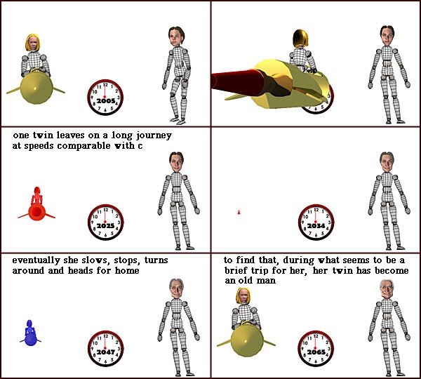
Here’s a non-topic map illustration, explaining time dilation:

Time Dilation

Here’s another explanation of time dilation:

Time Dilation

Both “explain” time dilation but one to c-suite types and the other to techies.

Problem: C-suite types control the purse strings.

Question: What issues do c-suite types see that topic maps can address?


*Leland Wilkinson in The Grammar of Graphics, 2nd ed., writes of pie charts:

A pie chart is perhaps the most ubiquitous of modern graphics. It has been reviled by statisticians (unjustifiably) and adored by managers (unjustifiably).

So far (I am at chapter 3), Wilkinson doesn’t elaborate on his response to criticisms of pie charts by statisticians.

Not important for this discussion but one of those tidbits that livens up a classroom discussion.

I first saw this in a tweet by Gregory Piatetsky.

September 14, 2012

Should We Focus on User Experience?

Should We Focus on User Experience? by Koen Claes.

From the post:

In the next seven minutes or so, this article hopes to convince you that our current notion of UX design mistakenly focuses on experience, and that we should go one step further and focus on the memory of an experience instead.

Studies of behavioral economics have changed my entire perspective on UX design, causing me to question basic tenets. This has led to ponderings like: “Is it possible that trying to create ‘great experiences’ is pointless?” Nobel Prize-winning research seems to hint that it is.

Via concrete examples, additional research sources, and some initial how-to tips, I aim to illustrate why and how we should recalibrate our UX design processes.

You will also like the narrative (with addition resources) from Koen’s presentation at IA Summit 2011, On Why We Should NOT Focus on UX.

The more I learn about the myriad aspects of communcation, the more I am amazed that we communicate at all. 😉

May 17, 2012

All Presentation Software is Broken

Filed under: Communication,Presentation,Web Analytics,Writing — Patrick Durusau @ 3:28 pm

All Presentation Software is Broken by Ilya Grigorik.

From the post:

Whenever the point I’m trying to make lacks clarity, I often find myself trying to dress it up: fade in the points, slide in the chart, make prettier graphics. It is a great tell when you catch yourself doing it. Conversely, I have yet to see a presentation or a slide that could not have been made better by stripping the unnecessary visual dressing. Simple slides require hard work and a higher level of clarity and confidence from the presenter.

All presentation software is broken. Instead of helping you become a better speaker, we are competing on the depth of transition libraries, text effects, and 3D animations. Prezi takes the trophy. As far as I can tell, it is optimized for precisely one thing: generating nausea.

Next Presentation Platform: Browser

If you want your message to travel, then the browser is your (future) presentation platform of choice. No proprietary formats, no conversion nightmares, instant access from billions of devices, easy sharing, and more. Granted, the frameworks and the authoring tools are still lacking, but that is only a matter of time.

Unfortunately, we are off to a false start. Instead of trying to make the presenter more effective, we are too busy trying to replicate the arsenal of useless visual transitions with the HTML5, CSS3 and WebGL stacks. Spinning WebGL cubes and CSS transitions make for a fun technology demo but add zero value – someone, please, stop the insanity. We have web connectivity, ability to build interactive slides, and get realtime feedback and analytics from the audience. There is nothing to prove by imitating the broken features of PowerPoint and Keynote, let’s leverage the strengths of the web platform instead. (emphasis added)

Imagine that. Testing your slides. Sounds like testing software before it is released to paying customers.

Test your slides on a real audience before a conference or meeting with your board or important client. What a novel concept.

By “real audience” I mean someone other than yourself or one of your office mates.

When you are tempted to say, “they just don’t understand….,” substitute, “I didn’t explain …. well.” (Depends on whether you want to feel smart or be an effective communicator. Your call.)

Presentation software isn’t fixable.

Presenters on the other hand, maybe.

But you have to fix yourself, no one can do it for you.

Powered by WordPress