Another Word For It Patrick Durusau on Topic Maps and Semantic Diversity

February 28, 2018

Six Degrees of Wikipedia – Eye Candy or Opportunity for Serendipity?

Filed under: Search Interface,Serendipity — Patrick Durusau @ 3:32 pm

Six Degrees of Wikipedia

As the name implies, finds the shortest path between two Wikipedia pages.

Whatis.com defines serendipity in part as:

In general, serendipity is the act of finding something valuable or delightful when you are not looking for it. In information technology, serendipity often plays a part in the recognition of a new product need or in solving a design problem. Web surfing can be an occasion for serendipity since you sometimes come across a valuable or interesting site when you are looking for something else.

Serendipity requires exposure to things you aren’t looking for, search engines excel at that, but their results are so noisy that serendipity is a rare occurrence.

Six Degrees of Wikipedia may have a different result.

First and foremost, humans created the links, for reasons unknown, that form the six degrees of separation. The resulting six degrees is a snapshot of human input from dozens, if not hundreds, of human actors. All of who had an unknown motivation.

Second, the limitation to six degrees results in a graph and nodes that can be absorbed in a glance.

Compare to the “I can make big and dense graphs” so typical in the “analysis” of social media results. (Hint: If any US government agency is asking, “The Russians did it.” is the correct response. Gin up supporting data on your own.)

Six degrees between topics would make a fascinating way to explore a topic map, especially one that merged topics from different domains. Randomly select labels to appear along side those more familiar to a user. Provoke serendipity!

October 30, 2017

Smart HTML Form Trick

Filed under: HTML,Search Interface,Searching — Patrick Durusau @ 7:37 pm

An HTML form trick to add some convenience to life by Bob DuCharme.

From the post:

On the computers that I use the most, the browser home page is an HTML file with links to my favorite pages and a “single” form that lets me search the sites that I search the most. I can enter a search term in the field for any of the sites, press Enter, and then that site gets searched. The two tricks that I use to create these fields have been handy enough that I thought I’d share them in case they’re useful to others.

I quote the word “single” above because it appears to be a single form but is actually multiple little forms in the HTML. Here is an example with four of my entries; enter something into any of the fields and press Enter to see what I mean:

As always, an immediately useful tip from DuCharme!

The multiple search boxes reminded me of the early metasearch engines that combined results from multiple search engines.

Will vary by topic but what resources would you search across day to day?

July 6, 2016

The Iraq Inquiry (Chilcot Report) [4.5x longer than War and Peace]

Filed under: ElasticSearch,Lucene,Search Algorithms,Search Interface,Solr,Topic Maps — Patrick Durusau @ 2:41 pm

The Iraq Inquiry

To give a rough sense of the depth of the Chilcot Report, the executive summary runs 150 pages. The report appears in twelve (12) volumes, not including video testimony, witness transcripts, documentary evidence, contributions and the like.

Cory Doctorow reports a Guardian project to crowd source collecting facts from the 2.6 million word report. The Guardian observes the Chilcot report is “…almost four-and-a-half times as long as War and Peace.”

Manual reading of the Chilcot report is doable, but unlikely to yield all of the connections that exist between participants, witnesses, evidence, etc.

How would you go about making the Chilcot report and its supporting evidence more amenable to navigation and analysis?

The Report

The Evidence

Other Material

Unfortunately, sections within volumes were not numbered according to their volume. In other words, volume 2 starts with section 3.3 and ends with 3.5, whereas volume 4 only contains sections beginning with “4.,” while volume 5 starts with section 5 but also contains sections 6.1 and 6.2. Nothing can be done for it but be aware that section numbers don’t correspond to volume numbers.

February 3, 2016

Reverse Image Search (TinEye) [Clue to a User Topic Map Interface?]

TinEye was mentioned in a post I wrote in 2015, Baltimore Burning and Verification, but I did not follow up at the time.

Unlike some US intelligence agencies, TinEye has a cool logo:

TinEye

Free registration enables you to share search results with others, an important feature for news teams.

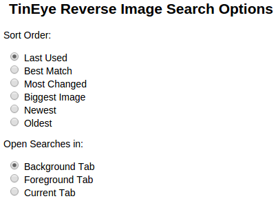
I only tested the plugin for Chrome, but it offers useful result options:

tineye-options

Once installed, use by hovering over an image in your browser, right “click” and select “Search image on TinEye.” Your results will be presented as set under options.

Clue to User Topic Map Interface

That is a good example of how one version of a topic map interface should work. Select some text, right “click” and “Search topic map ….(preset or selection)” with configurable result display.

That puts you into interaction with the topic map, which can offer properties to enable you to refine the identification of a subject of interest and then a merged presentation of the results.

As with a topic map, all sorts of complicated things are happening in the background with the TinEye extension.

But as a user, I’m interested in the results that FireEye presents not how it got them.

I used to say “more interested” to indicate I might care how useful results came to be assembled. That’s a pretension that isn’t true.

It might be true in some particular case, but for the vast majority of searches, I just want the (uncensored Google) results.

US Intelligence Community Logo for Same Capability

I discovered the most likely intelligence community logo for a similar search program:

peeping-tom_2734636b

The answer to the age-old question of “who watches the watchers?” is us. Which watchers are you watching?

January 24, 2016

A Comprehensive Guide to Google Search Operators

Filed under: News,Reporting,Search Engines,Search Interface,Searching — Patrick Durusau @ 5:25 pm

A Comprehensive Guide to Google Search Operators by Marcela De Vivo.

From the post:

Google is, beyond question, the most utilized and highest performing search engine on the web. However, most of the users who utilize Google do not maximize their potential for getting the most accurate results from their searches.

By using Google Search Operators, you can find exactly what you are looking for quickly and effectively just by changing what you input into the search bar.

If you are searching for something simple on Google like [Funny cats] or [Francis Ford Coppola Movies] there is no need to use search operators. Google will return the results you are looking for effectively no matter how you input the words.

Note: Throughout this article whatever is in between these brackets [ ] is what is being typed into Google.

When [Francis Ford Coppola Movies] is typed into Google, Google reads the query as Francis AND Ford AND Coppola AND Movies. So Google will return pages that have all those words in them, with the most relevant pages appearing first. Which is fine when you’re searching for very broad things, but what if you’re trying to find something specific?

What happens when you’re trying to find a report on the revenue and statistics from the United States National Park System in 1995 from a reliable source, and no using Wikipedia.

I can’t say that Marcela’s guide is comprehensive for Google in 2016, because I am guessing the post was written in 2013. Hard to say if early or late 2013 without more research than I am willing donate. Dating posts makes it easy for readers to spot current or past-use-date information.

For the information that is present, this is a great presentation and list of operators.

One way to use this post is to work through every example but use terms from your domain.

If you are mining the web for news reporting, compete against yourself on successive stories or within a small group.

Great resource for creating a search worksheet for classes.

March 17, 2015

Internet Search as a Crap Shoot in a Black Box

Filed under: Search Algorithms,Search Interface,Searching — Patrick Durusau @ 2:57 pm

The post, Google To Launch New Doorway Page Penalty Algorithm by Barry Schwartz reminded me that Internet search is truly a crap shoot in a black box.

Google has over two hundred (200) factors that are known (or suspected) to play a role in its search algorithms and their ranking of results.

Even if you memorized the 200, if you are searching you don’t know how those factors will impact pages with information you want to see. (Unless you want to drive web traffic, the 200 factors are a curiosity and not much more.)

When you throw your search terms, like dice, in to the Google black box, you don’t know how they will interact with the unknown results of the ranking algorithms.

To make matters worse, yes, worse, the Google algorithms change over time. Some major, some not quite so major. But every change stands a chance to impact any ad hoc process you have adopted for finding information.

A good number of you won’t remember print indexes but one of their attractive features (in hindsight) was that the indexing was uniform, at least within reasonable limits, for decades. If you learned how to effectively use the printed index, you could always find information using that technique, without fear that the familiar results would simply disappear.

Perhaps that is a commercial use case for the Common Crawl data. Imagine a disclosed ranking algorithm that could be exposed to create a custom ranking for a sub-set of the data against which to perform searches. So the ranking against which you are searching is known and can be explored.

It would not have the very latest data but that’s difficult to extract from Google since it apparently tosses the information about when it first encountered a page. Or at the very least doesn’t make it available to users. At least as an option, being able to pick the most recent resources matching a search would be vastly superior to the page-rank orthodoxy at Google.

Not to single Google out too much because I haven’t encountered other search engines that are more transparent. They may exist but I am unaware of them.

February 24, 2014

Findability and Exploration:…

Findability and Exploration: the future of search by Stijn Debrouwere.

From the introduction:

The majority of people visiting a news website don’t care about the front page. They might have reached your site from Google while searching for a very specific topic. They might just be wandering around. Or they’re visiting your site because they’re interested in one specific event that you cover. This is big. It changes the way we should think about news websites.

We need ambient findability. We need smart ways of guiding people towards the content they’d like to see — with categorization and search playing complementary goals. And we need smart ways to keep readers on our site, especially if they’re just following a link from Google or Facebook, by prickling their sense of exploration.

Pete Bell recently opined that search is the enemy of information architecture. That’s too bad, because we’re really going to need great search if we’re to beat Wikipedia at its own game: providing readers with timely information about topics they care about.

First, we need to understand a bit more about search. What is search?

A classic (2010) statement of the requirements for a “killer” app. I didn’t say “search” app because search might not be a major aspect of its success. At least if you measure success in terms of user satisfaction after using an app.

A satisfaction that comes from obtaining the content they want to see. How they got there isn’t important to them.

December 9, 2013

Building Client-side Search Applications with Solr

Filed under: Lucene,Search Interface,Searching,Solr — Patrick Durusau @ 7:46 pm

Building Client-side Search Applications with Solr by Daniel Beach.

Description:

Solr is a powerful search engine, but creating a custom user interface can be daunting. In this fast paced session I will present an overview of how to implement a client-side search application using Solr. Using open-source frameworks like SpyGlass (to be released in September) can be a powerful way to jumpstart your development by giving you out-of-the box results views with support for faceting, autocomplete, and detail views. During this talk I will also demonstrate how we have built and deployed lightweight applications that are able to be performant under large user loads, with minimal server resources.

If you need a compelling reason to watch this video, check out:

Global Patent Search Network.

What is the Global Patent Search Network?

As a result of cooperative effort between the United States Patent and Trademark Office (USPTO) and State Intellectual Property Office (SIPO) of the People’s Republic of China, Chinese patent documentation is now available for search and retrieval from the USPTO website via the Global Patent Search Network. This tool will enable the user to search Chinese patent documents in the English or Chinese language. The data available include fulltext Chinese patents and machine translations. Also available are full document images of Chinese patents which are considered the authoritative Chinese patent document. Users can search documents including published applications, granted patents and utility models from 1985 to 2012.

Something over four (4) million patents.

Try the site, then watch the video.

Software mentioned: Spyglass, Ember.js.

October 20, 2013

Crawl Anywhere

Filed under: Search Engines,Search Interface,Solr,Webcrawler — Patrick Durusau @ 5:59 pm

Crawl Anywhere 4.0.0-release-candidate available

From the Overview:

What is Crawl Anywhere?

Crawl Anywhere allows you to build vertical search engines. Crawl Anywhere includes :   

  • a Web Crawler with a powerful Web user interface
  • a document processing pipeline
  • a Solr indexer
  • a full featured and customizable search application

You can see the diagram of a typical use of all components in this diagram.

Why was Crawl Anywhere created?

Crawl Anywhere was originally developed to index in Apache Solr 5400 web sites (more than 10.000.000 pages) for the Hurisearch search engine: http://www.hurisearch.org/. During this project, various crawlers were evaluated (heritrix, nutch, …) but one key feature was missing : a user friendly web interface to manage Web sites to be crawled with their specific crawl rules. Mainly for this raison, we decided to develop our own Web crawler. Why did we choose the name "Crawl Anywhere" ? This name may appear a little over stated, but crawl any source types (Web, database, CMS, …) is a real objective and Crawl Anywhere was designed in order to easily implement new source connectors.

Can you create a better search corpus for some domain X than Google?

Less noise and trash?

More high quality content?

Cross referencing? (Not more like this but meaningful cross-references.)

There is only one way to find out!

Crawl Anywhere will help you with the technical side of creating a search corpus.

What it won’t help with is developing the strategy to build and maintain such a corpus.

Interested in how you go beyond creating a subject specific list of resources?

A list that leaves a reader to sort though the chaff. Time and time again.

Pointers, suggestions, comments?

June 30, 2013

mapFAST Mobile

Filed under: Geographic Information Retrieval,OCLC,Search Interface — Patrick Durusau @ 6:26 pm

Explore the world: find books or other library materials about places with mapFAST Mobile

From the post:

The new mapFAST Mobile lets you search WorldCat.org from your smartphone or mobile browser for materials related to any location and find them in the nearest library.

Available on the web and now as an Android app in the Google Play store, mapFAST is a Google Maps mashup that allows users to identify a point of interest and see surrounding locations or events using mapFAST’s Google Maps display with nearby FAST geographic headings (including location-based events), then jump to WorldCat.org, the world’s largest library catalog, to find specific items and the nearest holding library. WorldCat.org provides a variety of “facets” allowing users to narrow a search by type of item, year of publication, language and more.

“Libraries hold and provide access to a wide variety of information resources related to geographic locations,” said Rick Bennett, OCLC Consulting Software Engineer and lead developer on the project. “When looking for information about a particular place, it’s often useful to investigate nearby locations as well. mapFAST’s Google Maps interface allows for easy selection of the location, with a link to enter a search directly into WorldCat.org.”

With mapFAST Mobile, smartphone and mobile browser users can do a search based on their current location, or an entered search. The user’s location or search provides a center for the map, and nearby FAST subject headings are added as location pins. A “Search WorldCat” link then connects users to a list of records for materials about that location in WorldCat.org.

This sounds cool enough to almost temp me into getting a cell phone. 😉

I haven’t seen the app but if it works as advertised, this could be the first step in a come back by libraries.

Very cool!

April 27, 2013

Designing Search: Displaying Results

Filed under: Interface Research/Design,Search Interface,Searching — Patrick Durusau @ 6:32 pm

Designing Search: Displaying Results by Tony Russell-Rose.

From the post:

Search is a conversation: a dialogue between user and system that can be every bit as rich as human conversation. Like human dialogue, it is bidirectional: on one side is the user with their information need, which they articulate as some form of query.

On the other is the system and its response, which it expresses a set of search results. Together, these two elements lie at the heart of the search experience, defining and shaping much of the information seeking dialogue. In this piece, we examine the most universal of elements within that response: the search result.

Basic Principles

Search results play a vital role in the search experience, communicating the richness and diversity of the overall result set, while at the same time conveying the detail of each individual item. This dual purpose creates the primary tension in the design: results that are too detailed risk wasting valuable screen space while those that are too succinct risk omitting vital information.

Suppose you’re looking for a new job, and you browse to the 40 or so open positions listed on UsabilityNews. The results are displayed in concise groups of ten, occupying minimal screen space. But can you tell which ones might be worth pursuing?

As always a great post by Tony but a little over the top with:

“…a dialogue between user and system that can be every bit as rich as human conversation.”

Not in my experience but that’s not everyone’s experience.

Has anyone tested the thesis that dialogue between a user and search engine is as rich as between user and reference librarian?

March 14, 2013

Leading People to Longer Queries

Filed under: Interface Research/Design,Search Behavior,Search Interface,Searching — Patrick Durusau @ 6:55 pm

Leading People to Longer Queries by Elena Agapie, Gene Golovchinsky, Pernilla Qvarfordt.

Abstract:

Although longer queries can produce better results for information seeking tasks, people tend to type short queries. We created an interface designed to encourage people to type longer queries, and evaluated it in two Mechanical Turk experiments. Results suggest that our interface manipulation may be effective for eliciting longer queries.

The researchers encouraged longer queries by varying a halo around the search box.

Not conclusive but enough evidence to ask the questions:

What does your search interface encourage?

What other ways could you encourage query construction?

How would you encourage graph queries?

I first saw this in a tweet by Gene Golovchinsky.

February 22, 2013

typeahead.js [Autocompletion Library]

Filed under: Interface Research/Design,Javascript,JQuery,Search Interface,Searching — Patrick Durusau @ 1:58 pm

typeahead.js

From the webpage:

Inspired by twitter.com‘s autocomplete search functionality, typeahead.js is a fast and fully-featured autocomplete library.

Features

  • Displays suggestions to end-users as they type
  • Shows top suggestion as a hint (i.e. background text)
  • Works with hardcoded data as well as remote data
  • Rate-limits network requests to lighten the load
  • Allows for suggestions to be drawn from multiple datasets
  • Supports customized templates for suggestions
  • Plays nice with RTL languages and input method editors

Why not use X?

At the time Twitter was looking to implement a typeahead, there wasn’t a solution that allowed for prefetching data, searching that data on the client, and then falling back to the server. It’s optimized for quickly indexing and searching large datasets on the client. That allows for sites without datacenters on every continent to provide a consistent level of performance for all their users. It plays nicely with Right-To-Left (RTL) languages and Input Method Editors (IMEs). We also needed something instrumented for comprehensive analytics in order to optimize relevance through A/B testing. Although logging and analytics are not currently included, it’s something we may add in the future.

A bit on the practical side for me, ;-), but I can think of several ways that autocompletion could be useful with a topic map interface.

Not just the traditional completion of a search term or phrase but offering possible roles for subjects already in a map and other uses.

If experience with XML and OpenOffice is any guide, the easier authoring becomes (assuming the authoring outcome is useful), the greater the adoption of topic maps.

It really is that simple.

I first saw this at: typeahead.js : Fully-featured jQuery Autocomplete Library.

February 9, 2013

‘What’s in the NIDDK CDR?’…

Filed under: Bioinformatics,Biomedical,Search Interface,Searching — Patrick Durusau @ 8:21 pm

‘What’s in the NIDDK CDR?’—public query tools for the NIDDK central data repository by Nauqin Pan, et al., (Database (2013) 2013 : bas058 doi: 10.1093/database/bas058)

Abstract:

The National Institute of Diabetes and Digestive Disease (NIDDK) Central Data Repository (CDR) is a web-enabled resource available to researchers and the general public. The CDR warehouses clinical data and study documentation from NIDDK funded research, including such landmark studies as The Diabetes Control and Complications Trial (DCCT, 1983–93) and the Epidemiology of Diabetes Interventions and Complications (EDIC, 1994–present) follow-up study which has been ongoing for more than 20 years. The CDR also houses data from over 7 million biospecimens representing 2 million subjects. To help users explore the vast amount of data stored in the NIDDK CDR, we developed a suite of search mechanisms called the public query tools (PQTs). Five individual tools are available to search data from multiple perspectives: study search, basic search, ontology search, variable summary and sample by condition. PQT enables users to search for information across studies. Users can search for data such as number of subjects, types of biospecimens and disease outcome variables without prior knowledge of the individual studies. This suite of tools will increase the use and maximize the value of the NIDDK data and biospecimen repositories as important resources for the research community.

Database URL: https://www.niddkrepository.org/niddk/home.do

I would like to tell you more about this research, since “[t]he National Institute of Diabetes and Digestive and Kidney Diseases (NIDDK) is part of the National Institutes of Health (NIH) and the U.S. Department of Health and Human Services” (that’s a direct quote) and so doesn’t claim copyright on its publications.

Unfortunately, the NIDDK published this paper in the Oxford journal Database, which does believe in restricting access to publicly funded research.

Do visit the search interface to see what you think about it.

Not quite the same as curated content but an improvement over raw string matching.

February 3, 2013

DuckDuckGo Architecture…

Filed under: Search Engines,Search Interface,Search Requirements,Searching — Patrick Durusau @ 6:58 pm

DuckDuckGo Architecture – 1 Million Deep Searches A Day And Growing Interview with Gabriel Weinberg.

From the post:

This is an interview with Gabriel Weinberg, founder of Duck Duck Go and general all around startup guru, on what DDG’s architecture looks like in 2012.

Innovative search engine upstart DuckDuckGo had 30 million searches in February 2012 and averages over 1 million searches a day. It’s being positioned by super investor Fred Wilson as a clean, private, impartial and fast search engine. After talking with Gabriel I like what Fred Wilson said earlier, it seems closer to the heart of the matter: We invested in DuckDuckGo for the Reddit, Hacker News anarchists.
                  
Choosing DuckDuckGo can be thought of as not just a technical choice, but a vote for revolution. In an age when knowing your essence is not about about love or friendship, but about more effectively selling you to advertisers, DDG is positioning themselves as the do not track alternative, keepers of the privacy flame. You will still be monetized of course, but in a more civilized and anonymous way. 

Pushing privacy is a good way to carve out a competitive niche against Google et al, as by definition they can never compete on privacy. I get that. But what I found most compelling is DDG’s strong vision of a crowdsourced network of plugins giving broader search coverage by tying an army of vertical data suppliers into their search framework. For example, there’s a specialized Lego plugin for searching against a complete Lego database. Use the name of a spice in your search query, for example, and DDG will recognize it and may trigger a deeper search against a highly tuned recipe database. Many different plugins can be triggered on each search and it’s all handled in real-time.

Can’t searching the Open Web provide all this data? No really. This is structured data with semantics. Not an HTML page. You need a search engine that’s capable of categorizing, mapping, merging, filtering, prioritizing, searching, formatting, and disambiguating richer data sets and you can’t do that with a keyword search. You need the kind of smarts DDG has built into their search engine. One problem of course is now that data has become valuable many grown ups don’t want to share anymore.

Being ad supported puts DDG in a tricky position. Targeted ads are more lucrative, but ironically DDG’s do not track policies means they can’t gather targeting data. Yet that’s also a selling point for those interested in privacy. But as search is famously intent driven, DDG’s technology of categorizing queries and matching them against data sources is already a form of high value targeting.

It will be fascinating to see how these forces play out. But for now let’s see how DuckDuckGo implements their search engine magic…

Some topic map centric points from the post:

Dream is to appeal to more niche audiences to better serve people who care about a particular topic. For example: lego parts. There’s a database of Lego parts, for example. Pictures of parts and part numbers can be automatically displayed from a search.

  • Some people just use different words for things. Goal is not to rewrite the query, but give suggestions on how to do things better.
  • “phone reviews” for example, will replace phone with telephone. This happens through an NLP component that tries to figure out what phone you meant and if there are any synonyms that should be used in the query.

Those are the ones that caught my eye, there are no doubt others.

Not to mention a long list of DuckDuckGo references at the end of the post.

What place(s) would you suggest to DuckDuckGo where topic maps would make a compelling difference?

January 9, 2013

izik Debuts as #1 Free Reference App on iTunes

Filed under: Interface Research/Design,izik,Search Engines,Search Interface — Patrick Durusau @ 12:04 pm

izik Debuts as #1 Free Reference App on iTunes

From the post:

We launched izik, our search app for tablets, last Friday and are amazed at the responses we’ve received! Thanks to our users, on day one izik was the #1 free reference app on iTunes and #49 free app overall. Yesterday we were mentioned twice in the New York Times, here and here (also in the B1 story in print). We are delighted that there is such a strong desire to see something fresh and new in search, and that our vision with izik is so well received.

The twitterverse has been especially active in spreading the word about izik. We’ve seen a lot of comments about the beautiful design and interface, the useful categories, and most importantly the high quality results that make izik a truly viable choice for searching on tablets.

Just last Monday I remarked: “From the canned video I get the sense that the interface is going to make search different.” (izik: Take Search for a Joy Ride on Your Tablet)

Users with tablets have supplied the input I asked for in that post and it is overwhelmingly in favor of izik.

To paraphrase Ray Charles in the Blues Brothers:

“E-excuse me, uh, I don’t think there’s anything wrong with the action on [search applications].”

There is plenty of “action” left in the search space.

izik is fresh evidence for that proposition.

January 7, 2013

izik: Take Search for a Joy Ride on Your Tablet

Filed under: Interface Research/Design,Search Interface,Searching — Patrick Durusau @ 7:40 am

izik: Take Search for a Joy Ride on Your Tablet

From the post:

We are giddy to announce the launch of izik, our new search app built specifically with the iPad and Android tablets in mind. With izik, every search on your tablet is transformed into a beautiful, glossy page that utilizes rich images, categories, and, of course, gesture controls. Check it: so much content, so many ways to explore.

Tablets are increasingly getting integrated into our lives, so we wracked our noggins to figure out how we could use our search technology to optimally serve tablet users. Not surprisingly, our research revealed that tablets take on a very different role in our lives than laptops and desktops. Laptops are for work; tablets are for fun. Laptops are task-oriented (“what’s the capital of Bulgaria?”); tablets are more exploratory (“what’s Jennifer Lopez doing these days?”).

So, our goal with izik was to move the task-oriented search product we all use on our computers (aka 10 blue links) and turn it into a more fun, tablet-appropriate product. That means an image-rich layout with an appearance and experience very different than what we’re used to seeing on a laptop.

I remain without a tablet so am dependent upon your opinions for how izik works for real users.

From the canned video I get the sense that the interface is going to make search different.

Is the scroll gesture more natural than using a mouse? Are some movements easier using gestures?

What other features of a tablet interface can change/improve search experiences?

December 17, 2012

Go3R [Searching for Alternatives to Animal Testing]

Go3R

A semantic search engine for finding alternatives to animal testing.

I mention it as an example of a search interface that assists the user in searching.

The help documentation is a bit sparse if you are looking for an opportunity to contribute to such a project.

I did locate some additional information on the project, all usefully with the same title to make locating it “easy.” 😉

[Introduction] Knowledge-based semantic search engine for alternative methods to animal experiments

[PubMed – entry] Go3R – semantic Internet search engine for alternative methods to animal testing by Sauer UG, Wächter T, Grune B, Doms A, Alvers MR, Spielmann H, Schroeder M. (ALTEX. 2009;26(1):17-31).

Abstract:

Consideration and incorporation of all available scientific information is an important part of the planning of any scientific project. As regards research with sentient animals, EU Directive 86/609/EEC for the protection of laboratory animals requires scientists to consider whether any planned animal experiment can be substituted by other scientifically satisfactory methods not entailing the use of animals or entailing less animals or less animal suffering, before performing the experiment. Thus, collection of relevant information is indispensable in order to meet this legal obligation. However, no standard procedures or services exist to provide convenient access to the information required to reliably determine whether it is possible to replace, reduce or refine a planned animal experiment in accordance with the 3Rs principle. The search engine Go3R, which is available free of charge under http://Go3R.org, runs up to become such a standard service. Go3R is the world-wide first search engine on alternative methods building on new semantic technologies that use an expert-knowledge based ontology to identify relevant documents. Due to Go3R’s concept and design, the search engine can be used without lengthy instructions. It enables all those involved in the planning, authorisation and performance of animal experiments to determine the availability of non-animal methodologies in a fast, comprehensive and transparent manner. Thereby, Go3R strives to significantly contribute to the avoidance and replacement of animal experiments.

[ALTEX entry – full text available] Go3R – Semantic Internet Search Engine for Alternative Methods to Animal Testing

November 25, 2012

Complexificaton: Is ElasticSearch Making a Case for a Google Search Solution?

Filed under: ElasticSearch,Interface Research/Design,Search Interface,Searching — Patrick Durusau @ 10:15 am

Complexificaton: Is ElasticSearch Making a Case for a Google Search Solution? by Stephen Arnold.

From the post:

I don’t have any dealings with Google, the GOOG, or Googzilla (a word I coined in the years before the installation of the predator skeleton on the wizard zone campus). In the briefings I once endured about the GSA (Google speak for the Google Search Appliance), I recall three business principles imparted to me; to wit:

  1. Search is far too complicated. The Google business proposition was and is that the GSA and other Googley things are easy to install, maintain, use, and love.
  2. Information technology people in organizations can often be like a stuck brake on a sports car. The institutionalized approach to enterprise software drags down the performance of the organization information technology is supposed to serve.
  3. The enterprise search vendors are behind the curve.

Now the assertions from the 2004 salad days of Google are only partially correct today. As everyone with a colleague under 25 years of age knows, Google is the go to solution for information. A number of large companies have embraced Google’s all-knowing, paternalistic approach to digital information. However, others—many others, in fact—have not.

I won’t repeat Stephen’s barbs at ElasticSearch but his point applies to search interfaces and approaches in general.

Is your search application driving business towards simpler solutions? (If the simpler solution isn’t yours, isn’t that the wrong direction?)

November 22, 2012

eGIFT: Mining Gene Information from the Literature

eGIFT: Mining Gene Information from the Literature by Catalina O Tudor, Carl J Schmidt and K Vijay-Shanker.

Abstract:

Background

With the biomedical literature continually expanding, searching PubMed for information about specific genes becomes increasingly difficult. Not only can thousands of results be returned, but gene name ambiguity leads to many irrelevant hits. As a result, it is difficult for life scientists and gene curators to rapidly get an overall picture about a specific gene from documents that mention its names and synonyms.

Results

In this paper, we present eGIFT (http://biotm.cis.udel.edu/eGIFT webcite), a web-based tool that associates informative terms, called iTerms, and sentences containing them, with genes. To associate iTerms with a gene, eGIFT ranks iTerms about the gene, based on a score which compares the frequency of occurrence of a term in the gene’s literature to its frequency of occurrence in documents about genes in general. To retrieve a gene’s documents (Medline abstracts), eGIFT considers all gene names, aliases, and synonyms. Since many of the gene names can be ambiguous, eGIFT applies a disambiguation step to remove matches that do not correspond to this gene. Another additional filtering process is applied to retain those abstracts that focus on the gene rather than mention it in passing. eGIFT’s information for a gene is pre-computed and users of eGIFT can search for genes by using a name or an EntrezGene identifier. iTerms are grouped into different categories to facilitate a quick inspection. eGIFT also links an iTerm to sentences mentioning the term to allow users to see the relation between the iTerm and the gene. We evaluated the precision and recall of eGIFT’s iTerms for 40 genes; between 88% and 94% of the iTerms were marked as salient by our evaluators, and 94% of the UniProtKB keywords for these genes were also identified by eGIFT as iTerms.

Conclusions

Our evaluations suggest that iTerms capture highly-relevant aspects of genes. Furthermore, by showing sentences containing these terms, eGIFT can provide a quick description of a specific gene. eGIFT helps not only life scientists survey results of high-throughput experiments, but also annotators to find articles describing gene aspects and functions.

Website: http://biotm.cis.udel.edu/eGIFT

Another lesson for topic map authoring interfaces: Offer domain specific search capabilities.

Using a ****** search appliance is little better than a poke with a sharp stick in most domains. The user is left to their own devices to sort out ambiguities, discover synonyms, again and again.

Your search interface may report > 900,000 “hits,” but anything beyond the first 20 or so are wasted.

(If you get sick, get something that comes up in the first 20 “hits” in PubMed. Where most researchers stop.)

November 8, 2012

HCIR 2012 papers published!

Filed under: HCIR,Interface Research/Design,Search Interface,Searching — Patrick Durusau @ 3:45 pm

HCIR 2012 papers published! by Gene Golovchinsky.

Gene calls attention to four papers from the HCIR Symposium:

Great looking set of papers!

September 18, 2012

A Model of Consumer Search Behaviour

Filed under: Search Behavior,Search Interface,Searching — Patrick Durusau @ 8:08 pm

A Model of Consumer Search Behaviour by Tony Russell-Rose.

From the post:

A couple of weeks ago I posted the slides to my talk at EuroHCIR on A Model of Consumer Search Behaviour. Finally, as promised, here is the associated paper, which is co-authored with Stephann Makri (and also available as a pdf in the proceedings). I hope it addresses the questions that the slide deck provoked, and provides further food for thought 🙂

ABSTRACT

In order to design better search experiences, we need to understand the complexities of human information-seeking behaviour. In previous work [13], we proposed a model of information behavior based on an analysis of the information needs of knowledge workers within an enterprise search context. In this paper, we extend this work to the site search context, examining the needs and behaviours of users of consumer-oriented websites and search applications.

We found that site search users presented significantly different information needs to those of enterprise search, implying some key differences in the information behaviours required to satisfy those needs. In particular, the site search users focused more on simple “lookup” activities, contrasting with the more complex, problem-solving behaviours associated with enterprise search. We also found repeating patterns or ‘chains’ of search behaviour in the site search context, but in contrast to the previous study these were shorter and less complex. These patterns can be used as a framework for understanding information seeking behaviour that can be adopted by other researchers who want to take a ‘needs first’ approach to understanding information behaviour.

Take the time to read the paper.

How would you test the results?

Placeholder: Probably beyond the bounds of the topic maps course but a guest lecture on designing UI tests could be very useful for library students. They will be selecting interfaces to be used by patrons and knowing how to test candidate interfaces could be valuable.

September 15, 2012

Blame Google? Different Strategy: Let’s Blame Users! (Not!)

Let me quote from A Simple Guide To Understanding The Searcher Experience by Shari Thurow to start this post:

Web searchers have a responsibility to communicate what they want to find. As a website usability professional, I have the opportunity to observe Web searchers in their natural environments. What I find quite interesting is the “Blame Google” mentality.

I remember a question posed to me during World IA Day this past year. An attendee said that Google constantly gets search results wrong. He used a celebrity’s name as an example.

“I wanted to go to this person’s official website,” he said, “but I never got it in the first page of search results. According to you, it was an informational query. I wanted information about this celebrity.”

I paused. “Well,” I said, “why are you blaming Google when it is clear that you did not communicate what you really wanted?”

“What do you mean?” he said, surprised.

“You just said that you wanted information about this celebrity,” I explained. “You can get that information from a variety of websites. But you also said that you wanted to go to X’s official website. Your intent was clearly navigational. Why didn’t you type in [celebrity name] official website? Then you might have seen your desired website at the top of search results.”

The stunned silence at my response was almost deafening. I broke that silence.

“Don’t blame Google or Yahoo or Bing for your insufficient query formulation,” I said to the audience. “Look in the mirror. Maybe the reason for the poor searcher experience is the person in the mirror…not the search engine.”

People need to learn how to search. Search experts need to teach people how to search. Enough said.

What a novel concept! If the search engine/software doesn’t work, must be the user’s fault!

I can save you a trip down the hall to the marketing department. They are going to tell you that is an insane sales strategy. Satisfying to the geeks in your life but otherwise untenable, from a business perspective.

Remember the stats on using Library of Congress subject headings I posted under Subject Headings and the Semantic Web:

Overall percentages of correct meanings for subject headings in the original order of subdivisions were as follows: children, 32%, adults, 40%, reference 53%, and technical services librarians, 56%.

?

That is with decades of teaching people to search both manual and automated systems using Library of Congress classification.

Test Question: I have a product to sell. 60% of my all buyers can’t find it with a search engine. Do I:

  • Teach all users everywhere better search techniques?
  • Develop better search engines/interfaces to compensate for potential buyers’ poor searching?

I suspect the “stunned silence” was an audience with greater marketing skills than the speaker.

July 13, 2012

Broccoli: Semantic Full-Text Search at your Fingertips

Filed under: Broccoli,Ontology,Search Engines,Search Interface,Searching,Semantic Search — Patrick Durusau @ 5:51 pm

Broccoli: Semantic Full-Text Search at your Fingertips by Hannah Bast, Florian Bäurle, Björn Buchhold, and Elmar Haussmann.

Abstract:

We present Broccoli, a fast and easy-to-use search engine for what we call semantic full-text search. Semantic full-text search combines the capabilities of standard full-text search and ontology search. The search operates on four kinds of objects: ordinary words (e.g. edible), classes (e.g. plants), instances (e.g. Broccoli), and relations (e.g. occurs-with or native-to). Queries are trees, where nodes are arbitrary bags of these objects, and arcs are relations. The user interface guides the user in incrementally constructing such trees by instant (search-as-you-type) suggestions of words, classes, instances, or relations that lead to good hits. Both standard full-text search and pure ontology search are included as special cases. In this paper, we describe the query language of Broccoli, a new kind of index that enables fast processing of queries from that language as well as fast query suggestion, the natural language processing required, and the user interface. We evaluated query times and result quality on the full version of the EnglishWikipedia (32 GB XML dump) combined with the YAGO ontology (26 million facts). We have implemented a fully-functional prototype based on our ideas, see this http URL

It’s good to see CS projects work so hard to find unambiguous names. That won’t be confused with far more common uses of the same names. 😉

For all that, on quick review it does look like a clever, if annoyingly named, project.

Hmmm, doesn’t like the “-” (hyphen) character. “graph-theoretical tree” returns 0 results, “graph theoretical tree” returns 1 (the expected one).

Definitely worth a close read.

One puzzle though. There are a number of projects that use Wikipedia data dumps. The problem is most of the documents I am interested in searching aren’t in Wikipedia data dumps. Like the Enron emails.

Techniques that work well with clean data may work less well with documents composed of the vagaries of human communication. Or attempts at communication.

July 4, 2012

Designing Search (part 5): Results pages

Filed under: Interface Research/Design,Search Interface,Searching — Patrick Durusau @ 4:43 pm

Designing Search (part 5): Results pages by Tony Russell-Rose.

From the post:

In the previous post, we looked at the ways in which a response to an information need can be articulated, focusing on the various forms that individual search results can take. Each separate result represents a match for our query, and as such, has the potential to fulfil our information needs. But as we saw earlier, information seeking is a dynamic, iterative activity, for which there is often no single right answer.

A more informed approach therefore is to consider search results not as competing alternatives, but as an aggregate response to an information need. In this context, the value lies not so much with the individual results but on the properties and possibilities that emerge when we consider them in their collective form. In this section we examine the most universal form of aggregation: the search results page.

As usual, Tony illustrates each of his principles with examples drawn from actual webpages. Makes a very nice checklist to use when constructing a results page. Concludes with references and links to all the prior posts in this series.

Unless you are a UI expert, defaulting to following Tony’s advice is not a bad plan. May not be anyway.

June 27, 2012

Become a Google Power Searcher

Filed under: Search Engines,Search Interface,Searching — Patrick Durusau @ 9:15 am

Become a Google Power Searcher by Terry Ednacot.

From the post:

You may already be familiar with some shortcuts for Google Search, like using the search box as a calculator or finding local movie showtimes by typing [movies] and your zip code. But there are many more tips, tricks and tactics you can use to find exactly what you’re looking for, when you most need it.

Today, we’ve opened registration for Power Searching with Google, a free, online, community-based course showcasing these techniques and how you can use them to solve everyday problems. Our course is aimed at empowering you to find what you need faster, no matter how you currently use search. For example, did you know that you can search for and read pages written in languages you’ve never even studied? Identify the location of a picture your friend took during his vacation a few months ago? How about finally identifying that green-covered book about gardening that you’ve been trying to track down for years? You can learn all this and more over six 50-minute classes.

Lessons will be released daily starting on July 10, 2012, and you can take them according to your own schedule during a two-week window, alongside a worldwide community. The lessons include interactive activities to practice new skills, and many opportunities to connect with others using Google tools such as Google Groups, Moderator and Google+, including Hangouts on Air, where world-renowned search experts will answer your questions on how search works. Googlers will also be on hand during the course period to help and answer your questions in case you get stuck.

I know, I know, you are way beyond using Google but you may know some people who are not.

Try to suggest this course in a positive way, i.e., non-sneering sort of way.

Will be a new experience.

You may want to “audit” the course.

Would be unfortunate for someone to ask you a Google search question you can’t answer.

😉

June 25, 2012

Google search parameters in 2012

Filed under: Search Engines,Search Interface,Searching — Patrick Durusau @ 3:02 pm

Google search parameters in 2012

From the post:

Knowing the parameters Google uses in its search is not only important for SEO geeks. It allow you to use shortcuts and play with the Google filters. The parameters also reveal more juicy things: Is it safe to share your Google search URLs or screenshots of your Google results? This post argues that it is important to be aware of the complicated nature of the Google URL. As we will see later posting your own Google URL can reveal personal information about you that you might not feel too comfortable sharing. So read on to learn more about the Google search parameters used in 2012.

Why do I say “in 2012″? Well, the Google URL changed over time and more parameters were added to keep pace with the increasing complexity of the search product, the Google interface and the integration of verticals. Before looking at the parameter table below, though, I encourage you to quickly perform the following 2 things:

  1. Go directly to Google and search for your name. Look at the URL.
  2. Go directly to DuckDuckGo and perform the same search. Look at the URL.

This little exercise serves well to demonstrate just how simple and how complicated URLs used by search engines can look like. These two cases are at the opposing ends: While DuckDuckGo has only one search parameter, your query, and is therefore quite readable, Google uses a cryptic construct that only IT professionals can try to decipher. What I find interesting is that on my Smartphone, though, the Google search URL is much simpler than on the desktop.

This blog post is primarily aimed at Google’s web search. I will not look at their other verticals such as scholar or images. But because image search is so useful, I encourage you to look at the image section of the Unofficial Google Advanced Search guide

The tables of search parameters are a nice resource.

Suggestions of similar information for other search engines?

June 24, 2012

What’s Your Default Search Engine?

Filed under: Search Engines,Search Interface,Searching — Patrick Durusau @ 3:55 pm

Bing’s Evolving Local Search by Matthew Hurst.

From the post:

Recently, there have been a number of announcements regarding the redesign of Bing’s main search experience. The key difference is the use of three parallel zones in the SERP. Along with the traditional page results area, there are two new results columns: the task pane, which highlights factual data and the social pane which currently highlights social information from individuals (I distinguish social from ‘people’ as entities – for example a restaurant – can have a social presence even though they are only vaguely regarded as people).

I don’t get out much but I can appreciate the utility of the aggregate results for local views.

Matthew writes:

  1. When we provide flat structured data (as Bing did in the past), while we continued to strive for high quality data, there is no burning light focused on any aspect of the data. However, when we require to join the data to the web (local results are ‘hanging off’ the associated web sites), the quality of the URL associated with the entity record becomes a critical issue.
  2. The relationship between the web graph and the entity graph is subtle and complex. Our legacy system made do with the notion of a URL associated with an entity. As we dug deeper into the problem we discovered a very rich set of relationships between entities and web sites. Some entities are members of chains, and the relationships between their chain home page and the entity is quite different from the relationship between a singleton business and its home page. This also meant that we wanted to treat the results differently. See below for the results for {starbucks in new york}
  3. The structure of entities in the real world is subtle and complex. Chains, franchises, containment (shop in mall, restaurant in casino, hotel in airport), proximity – all these qualities of how the world works scream out for rich modeling if the user is to be best supported in navigating her surroundings.

Truth be told, the structure of entities in the “real world” and their representatives (somewhere other than the “real” world), not to mention their relationships to each other, are all subtle and complex.

That is part of what makes searching, discovery, mapping such exciting areas for exploration. There is always something new just around the next corner.

June 13, 2012

Social Annotations in Web Search

Social Annotations in Web Search by Aditi Muralidharan,
Zoltan Gyongyi, and Ed H. Chi. (CHI 2012, May 5–10, 2012, Austin, Texas, USA)

Abstract:

We ask how to best present social annotations on search results, and attempt to find an answer through mixed-method eye-tracking and interview experiments. Current practice is anchored on the assumption that faces and names draw attention; the same presentation format is used independently of the social connection strength and the search query topic. The key findings of our experiments indicate room for improvement. First, only certain social contacts are useful sources of information, depending on the search topic. Second, faces lose their well-documented power to draw attention when rendered small as part of a social search result annotation. Third, and perhaps most surprisingly, social annotations go largely unnoticed by users in general due to selective, structured visual parsing behaviors specific to search result pages. We conclude by recommending improvements to the design and content of social annotations to make them more noticeable and useful.

The entire paper is worth your attention but the first paragraph of the conclusion gives much food for thought:

For content, three things are clear: not all friends are equal, not all topics benefit from the inclusion of social annotation, and users prefer different types of information from different people. For presentation, it seems that learned result-reading habits may cause blindness to social annotations. The obvious implication is that we need to adapt the content and presentation of social annotations to the specialized environment of web search.

The complexity and sublty of semantics on human side keeps bumping into the search/annotate with a hammer on the computer side.

Or as the authors say: “…users prefer different types of information from different people.”

Search engineers/designers who use their preferences/intuitions as the designs to push out to the larger user universe are always going to fall short.

Because all users have their own preferences and intuitions about searching and parsing search results. What is so surprising about that?

I have had discussions with programmers who would say: “But it will be better for users to do X (as opposed to Y) in the interface.”

Know what? Users are the only measure of the fitness of an interface or success of a search result.

A “pull” model (user preferences) based search engine will gut all existing (“push” model, engineer/programmer preference) search engines.


PS: You won’t discover the range of user preferences by study groups with 11 participants. Ask one of the national survey companies and have them select several thousand participants. Then refine which preferences get used the most. Won’t happen overnight but every precentage gain will be one the existing search engines won’t regain.

PPS: Speaking of interfaces, I would pay for a web browser that put webpages back under my control (the early WWW model).

Enabling me to defeat those awful “page is loading” ads from major IT vendors who should know better. As well as strip other crap out. It is a data stream that is being parsed. I should be able to clean it up before viewing. That could be a real “hit” and make page load times faster.

I first saw this article in a list of links from Greg Linden.

June 6, 2012

A Taxonomy of Site Search

Filed under: Search Behavior,Search Interface,Searching — Patrick Durusau @ 7:50 pm

A Taxonomy of Site Search by Tony Russell-Rose.

From the post:

Here are the slides from the talk I gave at Enterprise Search Europe last week on A Taxonomy of Site Search. This talk extends and validates the taxonomy of information search strategies (aka ‘search modes’) presented at last year’s event, and reviews some of their implications for design. But this year we looked specifically at site search rather than enterprise search, and explored the key differences in user needs and behaviours between the two domains. [see Tony’s post for the slides]

There is a lot to be learned (and put to use) from investigations of search behavior.

Older Posts »

Powered by WordPress