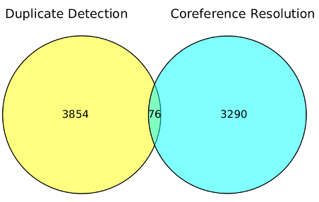
I used searches for “duplicate detection” (3,854) and “coreference resolution” (3290) in “Ironically, Entity Resolution has many duplicate names” [Data Loss] to illustrate potential data loss in searches.
Here is a rough visualization of the information loss if you use only one of those terms:
If you search for “duplicate detection,” you miss all the articles shaded in blue.
If you search for “coreference resolution,” you miss all the articles shaded in yellow.
Suggestions for improving this visualization?
It is a visualization that could be performed on client’s data, using their search engine/database.
In order to identify the data loss they are suffering now from search across departments.
With the caveat that not all data loss is bad and/or worth avoiding.
Imaginary example (so far): What if you could demonstrate no overlapping of terminology for two vendors for the United States Army and the Air Force. That is no query terms for one returned useful results for the other.
That is a starting point for evaluating the use of topic maps.
While the divergence in terminologies is a given, the next question is: What is the downside to that divergence? What capability is lost due to that divergence?
Assuming you can identify such a capacity, the next question is to evaluate the cost of reducing and/or eliminating that divergence versus the claimed benefit.
I assume the most relevant terms are going to be those internal to customers and/or potential customers.
Interest in working this up into a client prospecting/topic map marketing tool?
Separately I want to note my discovery (you probably already knew about it) of VennDIS: a JavaFX-based Venn and Euler diagram software to generate publication quality figures. Download here. (Apologies, the publication itself if firewalled.)
The export defaults to 800 x 800 resolution. If you need something smaller, edit the resulting image in Gimp.
It’s a testimony to the software that I was able to produce a useful image in less than a day. Kudos to the software!
