Spotted: clever and useful design patterns by Ben Terrett.
From the post:
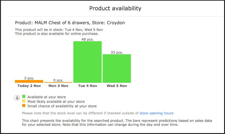
I was looking at the Ikea website at the weekend and noticed this smart design pattern.
Many websites tell you whether an item is in stock and many tell you whether a product is available in store. But this tells you how many are in stock today and how many will be in stock tomorrow and the two days after. It’s clever and useful. (Should you wish to check the current availability of Malm drawers in Croydon Ikea you can here.)
…
Ben goes on to point out one aspect of this design pattern is that it only requires a glance to understand.
I assume you can think of some topic map presentations with graphics that required more than a glance to understand. 😉
Comprehension “at a glance” isn’t always possible to realize but when it is never realized, take that as a warning sign. Particularly when it is customers who are having the difficulty.
Ben’s post has other examples and pointers on the issue of being “glanceable.”
