Another Word For It Patrick Durusau on Topic Maps and Semantic Diversity

June 20, 2014

Processing satellite imagery

Filed under: Image Processing,Mapping,Maps — Patrick Durusau @ 7:06 pm

Processing satellite imagery

From the post:

Need to add imagery to your map? This tutorial will teach you the basics of image processing for mapping, including an introduction to raster data, and how to acquire, publish and process raster imagery of our world.

Open-source and at your fingertips. Let’s dive in.

From Mapbox and very cool!

It’s not short so get a fresh cup of coffee and enjoy the tour!

June 16, 2014

Digital Mapping + Geospatial Humanities

Filed under: Geographic Data,GIS,Humanities,Mapping,Maps — Patrick Durusau @ 3:59 pm

Digital Mapping + Geospatial Humanities by Fred Gibbs.

From the course description:

We are in the midst of a major paradigm shift in human consciousness and society caused by our ubiquitous connectedness via the internet and smartphones. These globalizing forces have telescoped space and time to an unprecedented degree, while paradoxically heightening the importance of local places.

The course explores the technologies, tools, and workflows that can help collect, connect, and present online interpretations of the spaces around us. Throughout the week, we’ll discuss the theoretical and practical challenges of deep mapping (producing rich, interactive maps with multiple layers of information). Woven into our discussions will be numerous technical tutorials that will allow us to tell map-based stories about Albuquerque’s fascinating past.


This course combines cartography, geography, GIS, history, sociology, ethnography, computer science, and graphic design. While we cover some of the basics of each of these, the course eschews developing deep expertise in any of these in favor of exploring their intersections with each other, and formulating critical questions that span these normally disconnected disciplines. By the end, you should be able to think more critically about maps, place, and our online experiences with them.


We’ll move from creating simple maps with Google Maps/Earth to creating your own custom, interactive online maps with various open source tools like QGIS, Open Street Map, and D3 that leverage the power of open data from local and national repositories to provide new perspectives on the built environment. We’ll also use various mobile apps for data collection, online exhibit software, (physical and digital) historical archives at the Center for Southwest Research. Along the way we’ll cover the various data formats (KML, XML, GeoJSON, TopoJSON) used by different tools and how to move between them, allowing you to craft the most efficient workflow for your mapping purposes.

Course readings that aren’t freely availabe online (and even some that are) can be accessed via the course Zotero Library. You’ll need to be invited to join the group since we use it to distribute course readings. If you are not familiar with Zotero, here are some instructions.

All of that in a week! This week as a matter of fact.

One of the things I miss about academia are the occasions when you can concentrate on one subject to the exclusion of all else. Of course, being unmarried at that age, unemployed, etc. may have contributed to the ability to focus. 😉

Just sampled some of the readings and this appears to be a really rocking course!

June 10, 2014

Invading Almost Everybody

Filed under: History,Mapping,Maps — Patrick Durusau @ 7:14 pm

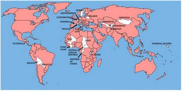
A map showing the 22 countries that Great Britain has not invaded

Britian invades

A map that makes the United States look almost benign. 😉

Invasion of America

Filed under: History,Mapping,Maps — Patrick Durusau @ 7:06 pm

Invasion of America

One of the most compelling combinations of a history timeline and a map I have ever seen!

In a nutshell, the map shows the loss of territory by native Americans from 1776 until present.

This should be shown and assigned as homework in every American history class.

Some people who merit a special shout-out for this work:

The Invasion of America is a project of eHistory.org.

Project director: Claudio Saunt, Russell Professor of History at the University of Georgia

Technical director: Sergio Bernardes, Center for Geospatial Research

Special thanks to David Holcomb and Daniel Reeves at ITOS for implementing the map on ArcGIS Server.

The Invasion of America

Filed under: Graphics,History,Mapping,Maps,Visualization — Patrick Durusau @ 3:30 pm

The Invasion of America

A dynamic map with a timeline of United States history and its “acquisition” of land from the inhabitants already present.

The continued power of American exceptionalism, the force that drove that conquest, makes the map all the more frightening.

I first saw this in a tweet by Lincoln Mullen.

June 9, 2014

Map Distortion!

Filed under: Cartography,Geography,Mapping,Maps — Patrick Durusau @ 1:49 pm

Mercator: Extreme by Drew Roos.

The link takes you to a display setting the pole to Atlanta, GA (near my present location).

You should search for a location near you for the maximum impact of the display. Intellectually I have known about map distortion but seeing it for your location, that’s something different.

Highly interactive and strongly recommended!

Makes me wonder about visual displays of other map distortions. Not just well known map projections but policy distortions as well.

Take for example a map that sizes countries by the amount of aid for the United States divided by their population.

Are there any map artists in the audience?

I first saw this in a tweet by Lincoln Mullen.

May 21, 2014

Mapped with a purpose

Filed under: Mapping,Maps — Patrick Durusau @ 8:02 pm

Mapped with a purpose by Andrew Janes.

From the post:

A few years ago, a colleague asked me for help in finding a map. What he wanted, he told me, was a fairly up-to-date map that showed Great Britain at ‘a normal scale’.

After laughing briefly at him, and then apologising for my rudeness, I plucked a road atlas from one of the bookshelves in our staff reading room. Fortunately, this seemed to fit the bill perfectly.

With the benefit of hindsight, I think that there are two morals to this story:

1. What is obvious to one person is not obvious to another. Like any good researcher, my colleague should have tried to explain what he wanted in a less ambiguous way. Equally, like any good public services archivist, I should have helped him to shape his request into something more sensible.

2. There is no such thing as a ‘normal’ map. The features and attributes of any map (including its scale) depend on its purpose. Why was it made and what was it intended to be used for? Two maps of the same place made at roughly the same time, but for different reasons, can look quite unlike one another.

Andrew illustrates his point with three maps of Nottingham made during the early 20th century. Vastly different even to the unpracticed eye.

The maps are quite fascinating but I leave to you to visit Andrew’s post for those.

Andrew then concludes with:

If you want to look for an old map and you think that The National Archives might have what you want, the map pages on our website are your best starting point.

When searching, bear in mind that a map showing the right place at the right date may not suit your needs in other ways. In other words, think about ‘what’ and ‘why’, as well as ‘where’ and ‘when’.

Those are some of the same rules for writing and reading topic maps.

I say “some” because Andrew is presuming a location on a particular sphere, whereas topic maps don’t start with that presumption. 😉

May 20, 2014

Interactive Maps with D3.js, Three.js, and Mapbox

Filed under: D3,MapBox,Mapping,Maps — Patrick Durusau @ 7:05 pm

Interactive Maps with D3.js, Three.js, and Mapbox by Steven Hall.

From the post:

Over the past couple of weeks I have been experimenting with creating 2D maps that can be explored in three dimensional space using D3.js and Three.js.  The goal was to produce some highly polished prototypes with multiple choropleth maps that could be easily navigated on a single page.  Additionally, I wanted to make sure to address some of the common tasks that arise when presenting map data such as applying well-formatted titles, legends and elegantly handling mouse-over events. The two examples presented below use D3.js for for generating nested HTML elements that contain the maps, titles and labeling information and use Three.js to position the elements in 3D space using CSS 3D transforms.  Importantly, there is no WebGL used in these examples.  Everything is rendered in the DOM using CSS 3D transforms which, at the time of writing, has much wider browser support than WebGL.

This article is an extension of two of my previous articles on D3.js and Three.js that can be found here and here.   Below, I’ll go into more depth about how the examples are produced and some of the roadblocks I encountered in putting these demos together, but for more background on the general process it may be good to look at the first article in this series: D3.js, Three.js and CSS 3D Transforms.

The maps here are geographical maps but what Steve covers could be easily applied to other types of maps.

May 16, 2014

There Should Be a Checklist for Maps

Filed under: Mapping,Maps — Patrick Durusau @ 7:07 pm

There Should Be a Checklist for Maps by Betsy Mason.

From the post:

Earlier this week, Stephanie Evergreen posted this great checklist for data visualizations. She and Ann Emery designed it to help social scientists understand the elements of a successful graph and offer guidance on how to make a graph better.

I’ve seen the list tweeted by data viz experts like Alberto Cairo and had it forwarded it to me by a designer I used to work with. It got me thinking that a list like this for maps would be really useful. We’re beginners at mapmaking here at Map Lab, and we’d love a list like this to check our own maps against, and to help us evaluate maps we come across.
….

Betsy has located one such guide but is seeking your advice on what should be on the checklist for map?

A checklist for maps, no disrespect intended towards data visualizations, is a very deep question. Maps, useful ones at any rate, reflect their author, purpose, intended audience, social context, technology for making the map, etc.

Suggestions? Comments?

May 8, 2014

Creating Maps From Drone Imagery

Filed under: Image Processing,Mapping — Patrick Durusau @ 2:31 pm

Creating Maps From Drone Imagery by Bobby Sudekum.

From the post:

Here is an end to end walkthrough showing how to process drone imagery into maps and then share it online, all using imagery we collected on a recent flight with the 3D Robotics team and their Aero drone.

Whether you are pulling data from someone else’s drone or your own, imagery will need post-capture processing.

One way to prevent illegal use of drones would be to require imagery transmission to include identifying codes and on open channels. Reasoning that if you were doing something illegal, you would not put your ID on it and transmit on an open channel. I may be wrong about that.

We have littered the ocean, land, space and now it appears we are going to litter the sky with drones.

More data to be sure but what use cases justify degradation of the sky?

May 6, 2014

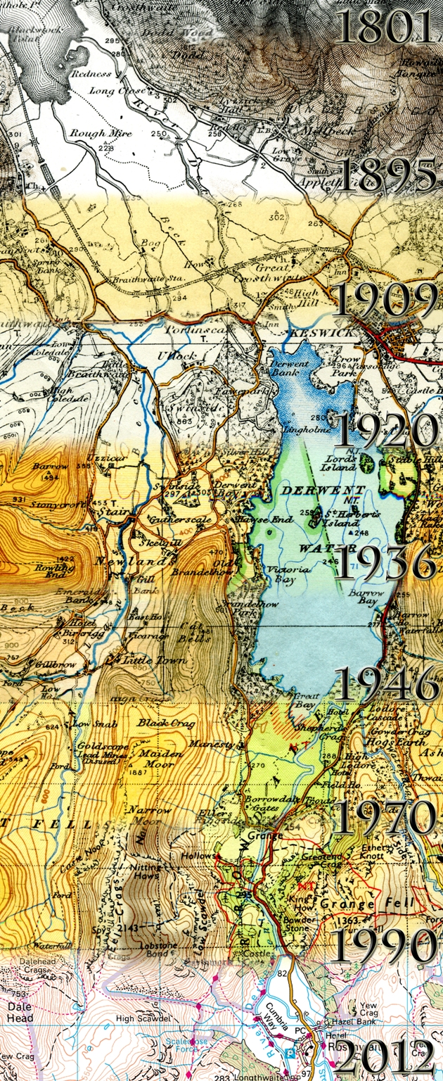
The evolution of Ordnance Survey mapping

Filed under: Mapping,Maps — Patrick Durusau @ 6:58 pm

Evolution of Ordnance Survey mapping

From: The evolution of Ordance Survey mapping:

If you’re a lover of old maps, you may be aware of the changes that have taken place on Ordnance Survey maps over the years. Changes to colour, styling, the depiction of roads and vegetation for example. As you can imagine, visitors to our Southampton head office often want to visit our Cartography teams and see the work they’re doing now – and compare this to how things used to be done.

The Cartography team put their heads together and came up with a display to show visitors the past present and future roles of cartography. One aspect of the display was produced by Cartographer Alicja Karpinska, making use of her photography and digital image manipulation skills, to complete an image showing the evolution of Ordnance Survey mapping.

See the post for more details.

Assuming that topic maps recur in particular subject areas, a similar evolution of mapping is a distinct possibility at some point in the future.

Indexers map properties to subjects every day so topic map can’t claim to be the first to do so.

However, topic maps are the first technology that I am aware of that makes that mapping explicit. That a rather important difference and is crucial to supporting an “evolution of mapping” for topic maps at some point in the future.

May 3, 2014

Judgmental Maps

Filed under: Humor,Mapping,Maps — Patrick Durusau @ 3:59 pm

Judgmental Maps

Imagine a map of a city with the neighborhood names removed but the interstate highways and a few other geographic features remaining.

Now further imagine that you have annotated that map with new names to represent the neighborhoods and activities in that city.

I tried to pick my favorite but in these sensitive times, someone would be offended by any choice I made.

You can create an submit maps in addition to viewing ones already posted.

I first saw this at Judgmental Maps on Chart Porn.

May 1, 2014

Digitising Tithe Maps

Filed under: Mapping,Maps — Patrick Durusau @ 7:40 pm

Digitising Tithe Maps by Einion Gruffudd.

From the post:

Cynefin is a Welsh word for the area you are familiar with. It is also the name of a project for digitising the Tithe Maps of Wales. This is a considerable challenge, there are over a thousand of them and they are large, some are two by three metres or more. The maps are highly popular with the public, and with television programmes, and it is easy to see why. Not only are the maps very detailed, but they also have attached schedules or apportionment documents which include the names of the people who were paying tithes around the 1840s, and where they were farmers, as most were, more often than not the names of their fields are included.

The Cynefin project will produce digitised images of the maps and the apportionment documents, and much more as well. As there is such a wealth of information in the apportionment documents, they will be transcribed, but for this we are reliant on help from the community. We also plan to link the apportionment entries directly to the field numbers which are on the maps, this work will also involve volunteers. There will soon be a crowd sourcing platform giving the public an opportunity to contribute directly to the project.

Think of these maps as being the equivalents of a modern data tax assessor’s maps for property taxes, sans the need to tithe to support the local church.

Such rich maps offer many opportunities to create links (read associations) between these records and other sources of information from the same time period.

Enjoy!

April 22, 2014

Jane Goodall MOOC!

Filed under: Mapping,Maps — Patrick Durusau @ 7:20 pm

From Jane Goodall’s roots & shoots:

In Africa, the Jane Goodall Institute’s experts in conservation and science use Participatory Mapping to incorporate local, indigenous knowledge in the creation of conservation and development projects around chimpanzee habitats. At Roots & Shoots, our young people are the experts! You will use the same strategy as the Jane Goodall Institute field professionals to explore your community and identify areas to make a difference with a tool called Community Mapping.

Why Map?

How do you know where to make a difference if you don’t have a strong awareness of where you live? When you map your community you REALLY get to know about the people, animals and environment around you. Mapping is the key to discovering a real community need that leads to the most effective service campaigns. Master your mapping skills and get to know your community on a whole new level!

How to Map

There are several types of mapping tools for you to choose from. Are you tech savvy and love digital maps? Or are you the type that prefers to chart by hand? Regardless of which mapping tool you use (and you can use more than one), what matters is that you get out and take action!

Jane Goodall launched this effort on her 80th birthday.

Check out the course as well as the article that tipped me off about it.

It will be interesting to see how communities are viewed by their members and not urban planners.

Perhaps conventional maps are more imperialistic than they appear at first blush. Ordinary people have lacked to tools to put forth contending views on mapping their communities. Mapping between “conventional” and “community” maps could be contentious.

I first saw this at: Jane Goodall launches online course in digital mapping by Katie Collins.

April 21, 2014

Norse Live Attack Map

Filed under: Cybersecurity,Mapping,Maps,Security — Patrick Durusau @ 12:43 pm

Norse Live Attack Map

From the post:

Today, we’d also like to announce the availability of a completely new and updated version of the Norse Live Attack Map. When we posted our first map back in late 2012, we did not really think much about it to be honest. Norse CTO Tommy Stiansen created it on a whim one weekend using mostly open source code, and attack maps are not necessarily a new concept. Like a lot of things, it was created out of a need for a quick and easy way for people to visualize the global and live nature of Norse’s threat intelligence platform. While the activity on the map is just a small subset (less than 1%) of the total attack traffic flowing into the Norse platform at any point in time, map visualizations can be a powerful way to communicate time-based geographic data sets.

Over the past year, the reaction by all types of people to the map has been great and we’ve received a lot of requests for enhancements and new features. Like all early stage companies, we’ve had to focus our development efforts and resources. That meant that improvements to the map were often put on the back burner. Having a new and improved map in the Norse booth at RSA 2014 provided a great incentive and target date for the team however, and we showed a preview version at the show. Aside from the completely new visual design, here is a summary of the new features.

Interesting eye candy for a Monday morning!

While the IP origins of attacks are reported, the IP targets of attacks are not.

Possible artifact of when I loaded the attack map but the United States had low numbers for being on the attack. At least until shortly after 10 A.M. East Coast time. Do you think that has anything to do with the start of the workday on the East Coast? 😉

Live Attack Map (Norse)

BTW, from under the “i” icon on the Norse map:

Norse exposes its threat intelligence via high-performance, machine-readable APIs in a variety of forms. Norse also provides products and solutions that assist organizations in protecting and mitigating cyber attacks.

That must be where the target IPs are located. Maybe they offer a “last month’s data” discount of some sort. Will inquire.

Just a random observation but South American, Africa and Australia are mostly or completely dark. No attacks, no attackers. Artifact of the collection process?

Mapping IPs, route locations, attack vectors, with physical and social infrastructures could be quite interesting.

PS: If you leave the webpage open in a tab and navigate to another page, cached updates are loaded, resulting in a wicked display.

April 17, 2014

Reproducible Research/(Mapping?)

Filed under: Mapping,Research Methods,Science,Semantics,Topic Maps — Patrick Durusau @ 2:48 pm

Implementing Reproducible Research edited by Victoria Stodden, Friedrich Leisch, and Roger D. Peng.

From the webpage:

In many of today’s research fields, including biomedicine, computational tools are increasingly being used so that the results can be reproduced. Researchers are now encouraged to incorporate software, data, and code in their academic papers so that others can replicate their research results. Edited by three pioneers in this emerging area, this book is the first one to explore this groundbreaking topic. It presents various computational tools useful in research, including cloud computing, data repositories, virtual machines, R’s Sweave function, XML-based programming, and more. It also discusses legal issues and case studies.

There is a growing concern over the ability of scientists to reproduce the published results of other scientists. The Economist rang one of many alarm bells when it published: Trouble at the lab [Data Skepticism].

From the introduction to Reproducible Research:

Literate statistical programming is a concept introduced by Rossini () that builds on the idea of literate programming as described by Donald Knuth. With literate statistical programming, one combines the description of a statistical analysis and the code for doing the statistical analysis into a single document. Subsequently, one can take the combined document and produce either a human-readable document (i.e. PDF) or a machine readable code file. An early implementation of this concept was the Sweave system of Leisch which uses R as its programming language and LATEX as its documentation language (). Yihui Xie describes his knitr package which builds substantially on Sweave and incorporates many new ideas developed since the initial development of Sweave. Along these lines, Tanu Malik and colleagues describe the Science Object Linking and Embedding framework for creating interactive publications that allow authors to embed various aspects of computational research in document, creating a complete research compendium. Tools

Of course, we all cringe when we read that a drug company can reproduce only 1/4 of 67 “seminal” studies.

What has me curious is why we don’t have the same reaction when enterprise IT systems require episodic remapping, which requires the mappers to relearn what was known at the time of the last remapping? We all know that enterprise (and other) IT systems change and evolve, but practically speaking, no effort is make to capture the knowledge that would reduce the time, cost and expense of every future remapping.

We can see the expense and danger of science not being reproducible, but when our own enterprise data mappings are not reproducible, that’s just the way things are.

Take inspiration from the movement towards reproducible science and work towards reproducible semantic mappings.

I first saw this in a tweet by Victoria Stodden.

April 13, 2014

Cross-Scheme Management in VocBench 2.1

Filed under: Mapping,SKOS,Software,Vocabularies,VocBench — Patrick Durusau @ 1:54 pm

Cross-Scheme Management in VocBench 2.1 by Armando Stellato.

From the post:

One of the main features of the forthcoming VB2.1 will be SKOS Cross-Scheme Management

I started drafting some notes about cross-scheme management here: https://art-uniroma2.atlassian.net/wiki/display/OWLART/SKOS+Cross-Scheme+Management

I think it is important to have all the integrity checks related to this aspect clear for humans, and not only have them sealed deep in the code. These notes will help users get acquainted with this feature in advance. Once completed, these will be included also in the manual of VB.

For the moment I’ve only written the introduction, some notes about data integrity and then described the checks carried upon the most dangerous operation: removing a concept from a scheme. Together with the VB development group, we will add more information in the next days. However, if you have some questions about this feature, you may post them here, as usual (or you may use the vocbench user/developer user groups).

A consistent set of operations and integrity checks for cross-scheme are already in place for this 2.1, which will be released in the next days.

VB2.2 will focus on other aspects (multi-project management), while we foresee a second wave of facilities for cross-scheme management (such as mass-move/add/remove actions, fixing utilities, analysis of dangling concepts, corrective actions etc..) for VB2.3

I agree that:

I think it is important to have all the integrity checks related to this aspect clear for humans, and not only have them sealed deep in the code.

But I am less certain that following the integrity checks of SKOS is useful in all mappings between schemes.

If you are interested in such constraints, see Armando’s notes.

March 10, 2014

Mapillary to OpenStreetMap

Filed under: Mapillary,Mapping,OpenStreetMap — Patrick Durusau @ 8:58 am

Mapillary to OpenStreetMap by Johan Gyllenspetz.

From the post:

We have been working with the OpenStreetMap community lately and we wanted to investigate how Mapillary can be used as a tool for some serious mapping.

First of all I needed to find a possible candidate area for mapping. After some investigation I found this little park in West Hollywood, called West Hollywood park. The park was under construction on the Bing images in the Id editor and nobody has traced the park yet.

If a physical map lacks your point of interest, you have to mark on the map or use some sort of overlay.

Like a topic map, with Mapillary and OpenStreetMap, you can add your point of interest with a suitable degree of accuracy.

You don’t need the agreement of your local department of highways or civil defense authorities.

Enjoy!

I first saw this in a tweet by Map@Syst.

February 27, 2014

Introducing Google Maps Gallery…

Filed under: Geography,Google Maps,Mapping,Maps — Patrick Durusau @ 3:13 pm

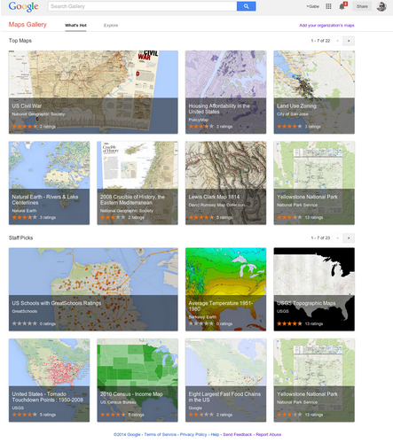
Introducing Google Maps Gallery: Unlocking the World’s Maps by Jordan Breckenridge.

From the post:

Governments, nonprofits and businesses have some of the most valuable mapping data in the world, but it’s often locked away and not accessible to the public. With the goal of making this information more readily available to the world, today we’re launching Google Maps Gallery, a new way for organizations to share and publish their maps online via Google Maps Engine.

Google Map Gallery

Maps Gallery works like an interactive, digital atlas where anyone can search for and find rich, compelling maps. Maps included in the Gallery can be viewed in Google Earth and are discoverable through major search engines, making it seamless for citizens and stakeholders to access diverse mapping data, such as locations of municipal construction projects, historic city plans, population statistics, deforestation changes and up-to-date emergency evacuation routes. Organizations using Maps Gallery can communicate critical information, build awareness and inform the public at-large.

A great site as you would expect from Google.

I happened upon US Schools with GreatSchools Ratings. Created by GreatSchools.org.

There has been a rash of 1950’s style legislative efforts this year in the United States, seeking to permit business to discriminate on the basis of their religious beliefs. Recalling the days when stores sported “We Reserve the Right to Refuse Service to Anyone” signs.

I remember those signs and how they were used.

With that in mind, scroll around the GreatSchools Rating may and tell me what you think the demographics of non-rated schools look like?

That’s what I thought too.

February 22, 2014

80 Maps that “Explain” the World

Filed under: Environment,Government,Mapping,Maps,Politics — Patrick Durusau @ 3:06 pm

Max Fisher, writing for the Washington Post, has two posts on maps that “explain” the world. Truly remarkable posts.

40 maps that explain the world, 12 August 2014.

From the August post:

Maps can be a remarkably powerful tool for understanding the world and how it works, but they show only what you ask them to. So when we saw a post sweeping the Web titled “40 maps they didn’t teach you in school,” one of which happens to be a WorldViews original, I thought we might be able to contribute our own collection. Some of these are pretty nerdy, but I think they’re no less fascinating and easily understandable. A majority are original to this blog (see our full maps coverage here)*, with others from a variety of sources. I’ve included a link for further reading on close to every one.

* I repaired the link to “our full maps coverage here.” It is broken in the original post.

40 more maps that explain the world, 13 January 2014.

From the January post:

Maps seemed to be everywhere in 2013, a trend I like to think we encouraged along with August’s 40 maps that explain the world. Maps can be a remarkably powerful tool for understanding the world and how it works, but they show only what you ask them to. You might consider this, then, a collection of maps meant to inspire your inner map nerd. I’ve searched far and wide for maps that can reveal and surprise and inform in ways that the daily headlines might not, with a careful eye for sourcing and detail. I’ve included a link for more information on just about every one. Enjoy.

Bear in mind the usual caveats about the underlying data, points of view represented and unrepresented but this is a remarkable collection of maps.

Highly recommended!

BTW, don’t be confused by the Part two: 40 more maps that explain the world link in the original article. The January 2014 article doesn’t say Part two but after comparing the links, I am satisfied that is what was intended, although it is confusing at first glance.

February 20, 2014

Selfie City:…

Filed under: Mapping,Visualization — Patrick Durusau @ 9:30 pm

Selfie City: a Visualization-Centric Analysis of Online Self-Portraits by Andrew Vande Moere.

From the post:

Selfie City [selfiecity.net], developed by Lev Manovich, Moritz Stefaner, Mehrdad Yazdani, Dominikus Baur and Alise Tifentale, investigates the socio-popular phenomenon of self-portraits (or selfies) by using a mix of theoretic, artistic and quantitative methods.

The project is based on a wide, sophisticated analysis of tens of thousands of selfies originating from 5 different world cities (New York, Sao Paulo, Berlin, Bangkok, Moscow), with statistical data derived from both automatic image analysis and crowd-sourced human judgements (i.e. Amazon Mechanical Turk). Its analysis process and its main findings are presented through various interactive data visualizations, such as via image plots, bar graphs, an interactive dashboard and other data graphics.

Andrew’s description is great but you need to visit the site to get the full impact.

Are there patterns in the images we take or posts?

February 18, 2014

Legendary Lands:…

Filed under: Mapping,Maps,Metaphors,Symbol — Patrick Durusau @ 3:38 pm

Legendary Lands: Umberto Eco on the Greatest Maps of Imaginary Places and Why They Appeal to Us by Maria Popova.

From the review:

“Often the object of a desire, when desire is transformed into hope, becomes more real than reality itself.”

Celebrated Italian novelist, philosopher, essayist, literary critic, and list-lover Umberto Eco has had a long fascination with the symbolic and the metaphorical, extending all the way back to his vintage semiotic children’s books. Half a century later, he revisits the mesmerism of the metaphorical and the symbolic in The Book of Legendary Lands (public library) — an illustrated voyage into history’s greatest imaginary places, with all their fanciful inhabitants and odd customs, on scales as large as the mythic continent Atlantis and as small as the fictional location of Sherlock Holmes’s apartment. A dynamic tour guide for the human imagination, Eco sets out to illuminate the central mystery of why such utopias and dystopias appeal to us so powerfully and enduringly, what they reveal about our relationship with reality, and how they bespeak the quintessential human yearning to make sense of the world and find our place in it — after all, maps have always been one of our greatest sensemaking mechanisms for life, which we’ve applied to everything from the cosmos to time to emotional memory.

Eco writes in the introduction:

Legendary lands and places are of various kinds and have only one characteristic in common: whether they depend on ancient legends whose origins are lost in the mists of time or whether they are an effect of a modern invention, they have created flows of belief.

The reality of these illusions is the subject of this book.

Definitely going to the top of my wish list!

I suspect that like Gladwell‘s Tipping Point, Blink, Flop (forthcoming?), it is one thing to see a successful utopia in retrospect but quite another to intentionally create one.

Tolkien did with the Hobbit but for all of its power, it has never, to my knowledge, influenced a United States Congress appropriations bill.

Perhaps it is more accurate to say that successful utopias are possible but it is difficult to calculate their success and/or impact.

In any event, I am looking forward to spending serious time with The Book of Legendary Lands.

PS: For the library students among us, the subject classifications given by WorldCat:

  • Geographical myths in literature.
  • Geographical myths in art — Pictorial works.
  • Geographical myths.
  • Art and literature.
  • Geographical myths in art.

I haven’t gotten a copy of the book, yet, but that looks really impoverished to me. If I am looking for materials on reality, belief, social consensus, social fabric, legends, etc. I am going to miss this book in your library?

Suggestions?

A Tool for Wicked Problems:…

Filed under: Mapping,Uncategorized,Wicked Problems — Patrick Durusau @ 1:42 pm

A Tool for Wicked Problems: Dialogue Mapping™ FAQs

From the webpage:

What is Dialogue Mapping™?

Dialogue Mapping™ is a radically inclusive facilitation process that creates a diagram or ‘map’ that captures and connects participants’ comments as a meeting conversation unfolds. It is especially effective with highly complex or “Wicked” problems that are wrought with both social and technical complexity, as well as a sometimes maddening inability to move forward in a meaningful and cost effective way.

Dialogue Mapping™ creates forward progress in situations that have been stuck; it clears the way for robust decisions that last. It is effective because it works with the non-linear way humans really think, communicate, and make decisions.

I don’t disagree that humans really think in a non-linear way but some of that non-linear thinking is driven by self-interest, competition, and other motives that you are unlikely to capture with dialogue mapping.

Still, to keep you from hunting for software, the CompendiumInstitute was at the Open University until early 2013.

CompediumNG has taken over maintenance of the project.

All three sites have videos and other materials that you may find of interest.

If you want to go beyond dialogue mapping per se, consider augmenting a dialogue map, post-dialogue with additional information. Just as you would add information to any other subject identification.

Or in real time if you really want a challenge.

A live dialogue map of one of the candidate “debates” could be very amusing.

I put “debates” in quotes because no moderator ever penalizes the participants for failing to answer questions. The faithful hear what they want to hear and strain at the mote in the opposition’s eye.

I first saw this in a tweet by Neil Saunders.

February 17, 2014

ViziCities

Filed under: Mapping,Maps,Visualization,WebGL — Patrick Durusau @ 11:43 am

ViziCities: Bringing cities to life using the power of open data and the Web by Robin Hawkes and Peter Smart.

From the webpage:

ViziCities is a 3D city and data visualisation platform, powered by WebGL. Its purpose is to change the way you look at cities and the data contained within them. It is the brainchild of Robin Hawkes and Peter Smartget in touch if you’d like to discuss the project with them in more detail.

Demonstration

Here’s a demo of ViziCities so you can have a play without having to build it for yourself. Cool, ey?

What does it do?

ViziCities aims to combine data visualisation with a 3D representation of a city to provide a better understanding what’s going on. It’s a powerful new way of looking at and understanding urban areas.

Aside from seeing a city in 3D, here are some of the others things you’ll have the power to do:

This is wickedly cool! (Even though in pre-alpha state.)

Governments, industry, etc. have had these capabilities for quite some time.

Now, you too can do line of sight, routing, and integration of other data onto a representation of a cityscape.

Could be quite important in Bangkok, Caracas, Kiev, and other locations with non-responsive governments.

Used carefully, information can become an equalizer.

Other resources:

ViziCities website

ViziCities announcement

Videos of ViziCities experiments

“ViziCities” as a search term shows a little over 1,500 “hits” today. Expect that to expand rapidly.

February 3, 2014

Path Language to Topic Maps Mapping Syntax

Filed under: Mapping,Topic Maps — Patrick Durusau @ 5:37 pm

Path Language to Topic Maps Mapping Syntax by Johannes Schmidt.

From the webpage:

The “Path Language to Topic Maps Mapping Syntax (PLTTM)” defines a language to map serialized domain specific subject representations to Topic Maps equivalents. Therefore, PLTTM enables (semantic) data federation.

PLTTM uses path language statements e.g. in XPath or JSONPath to address subject representations in e.g. XML or JSON serializations. The path language statements are furthermore used to extract the relevant portions of data. […]

Cool!

Give this a close read!

January 29, 2014

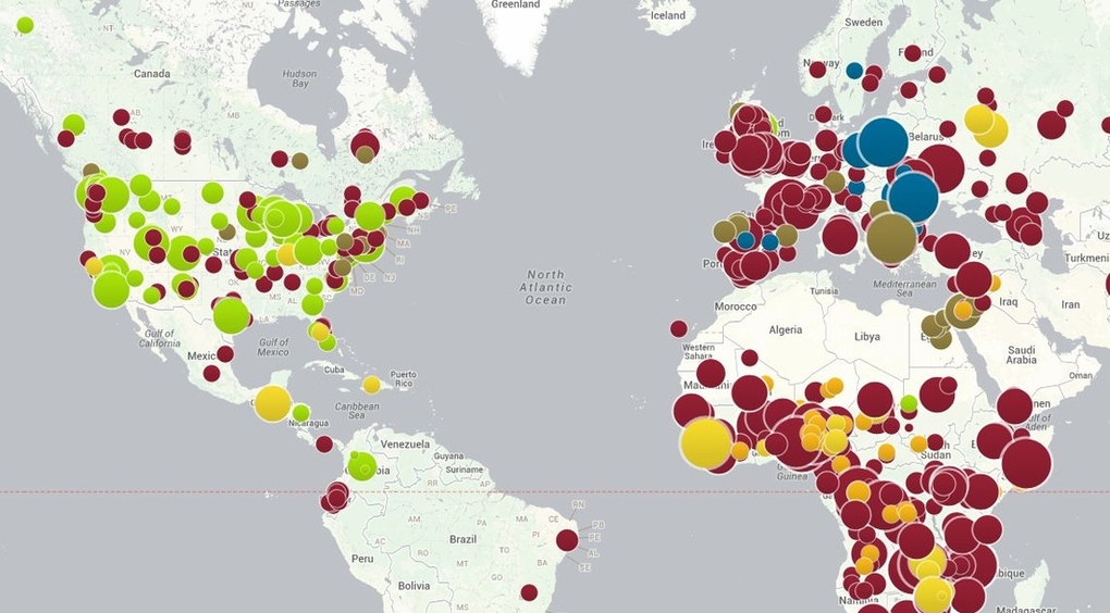
Map of Preventable Diseases

Filed under: Biomedical,Mapping,Maps — Patrick Durusau @ 5:57 pm

preventable disease

Be sure to see the interactive version of this map by the Council on Foreign Relations.

I first saw this at Chart Porn, which was linking to Map of preventable disease outbreaks shows the influence of anti-vaccination movements by Rich McCormick, which in turn pointed to the CFG map.

The dataset is downloadable from the CFG.

Vaccination being more a matter of public health, I have always wondered by anyone would be allowed an option to decline. Certainly some people will have adverse reactions, even die, and they or their families should be cared for and/or compensated. But they should not be allowed to put large numbers of others at risk.

BTW, when you look at the interactive map, locate Georgia in the United States and you will see the large green dot reports 247 cases of whooping cough for Georgia. The next green dot which slightly overlaps with it, reports 2 cases. While being more than half the size of the dot on Georgia.

Disproportionate scaling of icons reduces the accuracy of the information conveyed by the map. Unfortunate because this is an important public health issue.

December 12, 2013

Google Map Overlays

Filed under: Google Maps,Mapping,Maps — Patrick Durusau @ 7:10 pm

Google Map Overlays by Dustin Smith.

From the post:

National Geographic is adding 500 of their classic maps to the Google public data archive. Basically, these are layers mapped onto Google’s existing map engine. The press release contained two examples, but bizarrely, no link to the public gallery where the NattyG maps will eventually appear.

My experience with press releases and repeated press release sites is that they rarely include meaningful links.

I don’t have an explanation as to why but I have seen it happen too often to be by chance.

Some sites include off-site links but trap you within a window from that site with their ads.

December 7, 2013

Free GIS Data

Filed under: Data,GIS,Mapping — Patrick Durusau @ 2:13 pm

Free GIS Data by Robin Wilson.

Over 300 GIS data sets. As of 7 December 2013, last updated 6 December 2013.

A very wide ranging collection of “free” GIS data.

Robin recommends you check the licenses of individual data sets. The meaning of “free” varies from person to person.

If you discover “free” GIS resources not listed on Robin’s page, drop him a note.

I first saw this in Pete Warden’s Five Short Links for November 30, 2013.

November 14, 2013

Global Forest Change

Filed under: Climate Data,Environment,Mapping,Maps,Visualization — Patrick Durusau @ 7:46 pm

The first detailed maps of global forest change by Matt Hansen and Peter Potapov, University of Maryland; Rebecca Moore and Matt Hancher, Google.

From the post:

Most people are familiar with exploring images of the Earth’s surface in Google Maps and Earth, but of course there’s more to satellite data than just pretty pictures. By applying algorithms to time-series data it is possible to quantify global land dynamics, such as forest extent and change. Mapping global forests over time not only enables many science applications, such as climate change and biodiversity modeling efforts, but also informs policy initiatives by providing objective data on forests that are ready for use by governments, civil society and private industry in improving forest management.

In a collaboration led by researchers at the University of Maryland, we built a new map product that quantifies global forest extent and change from 2000 to 2012. This product is the first of its kind, a global 30 meter resolution thematic map of the Earth’s land surface that offers a consistent characterization of forest change at a resolution that is high enough to be locally relevant as well. It captures myriad forest dynamics, including fires, tornadoes, disease and logging.

Global map of forest change: http://earthenginepartners.appspot.com/science-2013-global-forest

If you are curious to learn more, tune in next Monday, November 18 to a live-streamed, online presentation and demonstration by Matt Hansen and colleagues from UMD, Google, USGS, NASA and the Moore Foundation:

Live-stream Presentation: Mapping Global Forest Change
Live online presentation and demonstration, followed by Q&A
Monday, November 18, 2013 at 1pm EST, 10am PST
Link to live-streamed event: http://goo.gl/JbWWTk
Please submit questions here: http://goo.gl/rhxK5X

For further results and details of this study, see High-Resolution Global Maps of 21st-Century Forest Cover Change in the November 15th issue of the journal Science.

These maps make it difficult to ignore warnings about global forest change. Forests not as abstractions but living areas that recede before your eyes.

The enhancement I would like to see to these maps is the linking of the people responsible with name, photo and last known location.

Deforestation doesn’t happen because of “those folks in government,” or “people who work for timber companies,” or “economic forces,” although all those categories of anonymous groups are used to avoid moral responsibility.

No, deforestation happens because named individuals in government, business, manufacturing, farming, have made individual decisions to exploit the forests.

With enough data on the individuals who made those decisions, the rest of us could make decisions too.

Such as how to treat people guilty of committing and conspiring to commit ecocide.
September 24, 2013

« Newer PostsOlder Posts »

Powered by WordPress