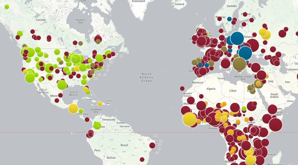
Be sure to see the interactive version of this map by the Council on Foreign Relations.
I first saw this at Chart Porn, which was linking to Map of preventable disease outbreaks shows the influence of anti-vaccination movements by Rich McCormick, which in turn pointed to the CFG map.
The dataset is downloadable from the CFG.
Vaccination being more a matter of public health, I have always wondered by anyone would be allowed an option to decline. Certainly some people will have adverse reactions, even die, and they or their families should be cared for and/or compensated. But they should not be allowed to put large numbers of others at risk.
BTW, when you look at the interactive map, locate Georgia in the United States and you will see the large green dot reports 247 cases of whooping cough for Georgia. The next green dot which slightly overlaps with it, reports 2 cases. While being more than half the size of the dot on Georgia.
Disproportionate scaling of icons reduces the accuracy of the information conveyed by the map. Unfortunate because this is an important public health issue.