Another Word For It Patrick Durusau on Topic Maps and Semantic Diversity

April 21, 2014

Norse Live Attack Map

Filed under: Cybersecurity,Mapping,Maps,Security — Patrick Durusau @ 12:43 pm

Norse Live Attack Map

From the post:

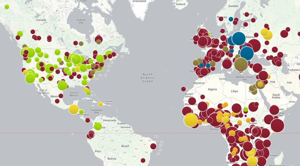
Today, we’d also like to announce the availability of a completely new and updated version of the Norse Live Attack Map. When we posted our first map back in late 2012, we did not really think much about it to be honest. Norse CTO Tommy Stiansen created it on a whim one weekend using mostly open source code, and attack maps are not necessarily a new concept. Like a lot of things, it was created out of a need for a quick and easy way for people to visualize the global and live nature of Norse’s threat intelligence platform. While the activity on the map is just a small subset (less than 1%) of the total attack traffic flowing into the Norse platform at any point in time, map visualizations can be a powerful way to communicate time-based geographic data sets.

Over the past year, the reaction by all types of people to the map has been great and we’ve received a lot of requests for enhancements and new features. Like all early stage companies, we’ve had to focus our development efforts and resources. That meant that improvements to the map were often put on the back burner. Having a new and improved map in the Norse booth at RSA 2014 provided a great incentive and target date for the team however, and we showed a preview version at the show. Aside from the completely new visual design, here is a summary of the new features.

Interesting eye candy for a Monday morning!

While the IP origins of attacks are reported, the IP targets of attacks are not.

Possible artifact of when I loaded the attack map but the United States had low numbers for being on the attack. At least until shortly after 10 A.M. East Coast time. Do you think that has anything to do with the start of the workday on the East Coast? šŸ˜‰

Live Attack Map (Norse)

BTW, from under the “i” icon on the Norse map:

Norse exposes its threat intelligence via high-performance, machine-readable APIs in a variety of forms. Norse also provides products and solutions that assist organizations in protecting and mitigating cyber attacks.

That must be where the target IPs are located. Maybe they offer a “last month’s data” discount of some sort. Will inquire.

Just a random observation but South American, Africa and Australia are mostly or completely dark. No attacks, no attackers. Artifact of the collection process?

Mapping IPs, route locations, attack vectors, with physical and social infrastructures could be quite interesting.

PS: If you leave the webpage open in a tab and navigate to another page, cached updates are loaded, resulting in a wicked display.
April 18, 2014

Precision from Disaggregation

Filed under: Census Data,Maps,Visualization — Patrick Durusau @ 1:06 pm

Building Precise Maps with Disser by Brandon Martin-Anderson.

From the post:

Spatially aggregated statistics are pretty great, but what if you want more precision? Here at Conveyal we built a utility to help with that: aggregate-disser. Let me tell you how it works.

Letā€™s start with a classic aggregated data set – the block-level population counts from the US Census. Hereā€™s a choropleth map of total population for blocks around lower Manhattan and Brooklyn. The darkest shapes contain about five thousand people.

Brandon combines census data with other data sets to go from 5,000 person census blocks to locating every job and bed in Manhattan into individual buildings.

Very cool!

Not to mention instructive when you encounter group subjects that need to be disaggregated before being combined with other data.

I first saw this in a tweet by The O.C.R.

April 5, 2014

GeoCanvas

Filed under: Geographic Data,Geography,Maps,Visualization — Patrick Durusau @ 7:34 pm

Synthicity Releases 3D Spatial Data Visualization Tool, GeoCanvas by Dean Meyers.

From the post:

Synthicity has released a free public beta version of GeoCanvas, its 3D spatial data visualization tool. The software provides a streamlined toolset for exploring geographic data, lowering the barrier to learning and using geographic information systems.

GeoCanvas is not limited to visualizing parcels in cities. By supporting data formats such as the widely available shapefile for spatial geometry and text files for attribute data, it opens the possibility of rapid 3D spatial data visualization for a wide range of uses and users. The software is expected to be a great addition to the toolkits of students, researchers, and practitioners in fields as diverse as data science, geography, planning, real estate analysis, and market research. A set of video tutorials explaining the basic concepts and a range of examples have been made available to showcase the possibilities.

The public beta version of GeoCanvas is available as a free download from www.synthicity.com.

Well, rats! I haven’t installed a VM with Windows 7/8 or Max OS X 10.8 or later.

Sounds great!

Comments from actual experience?

April 2, 2014

Open Access Maps at NYPL

Filed under: Maps,Open Access — Patrick Durusau @ 3:47 pm

Open Access Maps at NYPL by Matt Knutzen, Stephen A. Schwarzman Building, Map Division.

From the post:

The Lionel Pincus & Princess Firyal Map Division is very proud to announce the release of more than 20,000 cartographic works as high resolution downloads. We believe these maps have no known US copyright restrictions.* To the extent that some jurisdictions grant NYPL an additional copyright in the digital reproductions of these maps, NYPL is distributing these images under a Creative Commons CC0 1.0 Universal Public Domain Dedication. The maps can be viewed through the New York Public Libraryā€™s Digital Collections page, and downloaded (!), through the Map Warper. First, create an account, then click a map title and go. Hereā€™s a primer and more extended blog post on the warper.

…image omitted…

Whatā€™s this all mean?

It means you can have the maps, all of them if you want, for free, in high resolution. Weā€™ve scanned them to enable their use in the broadest possible ways by the largest number of people.

Though not required, if youā€™d like to credit the New York Public Library, please use the following text “From The Lionel Pincus & Princess Firyal Map Division, The New York Public Library.ā€ Doing so helps us track what happens when we release collections like this to the public for free under really relaxed and open terms. We believe our collections inspire all kinds of creativity, innovation and discovery, things the NYPL holds very dear.

In case you were unaware of it, librarians as a class have a very subversive agenda.

They want to provide as many people as much access to information as is possible.

People + information is a revolutionary mixture.

March 25, 2014

USGS Maps!

Filed under: Government Data,Maps — Patrick Durusau @ 7:07 pm

USGS Maps (Google Map Gallery)

Wicked cool!

Followed a link from this post:

Maps were made for public consumption, not for safekeeping under lock and key. From the dawn of society, people have used maps to learn whatā€™s around us, where we are and where we can go.

Since 1879, the U.S. Geological Survey (USGS) has been dedicated to providing reliable scientific information to better understand the Earth and its ecosystems. Mapping is an integral part of what we do. From the early days of mapping on foot in the field to more modern methods of satellite photography and GPS receivers, our scientists have created over 193,000 maps to understand and document changes to our environment.

Government agencies and NGOs have long used our maps everything from community planning to finding hiking trails. Farmers depend on our digital elevation data to help them produce our food. Historians look to our maps from years past to see how the terrain and built environment have changed over time.

While specific groups use USGS as a resource, we want the public at-large to find and use our maps, as well. The content of our mapsā€”the information they convey about our land and its heritageā€”belongs to all Americans. Our maps are intended to serve as a public good. The more taxpayers use our maps and the more use they can find in the maps, the better.

We recognize that our expertise lies in mapping, so partnering with Google, which has expertise in Web design and delivery, is a natural fit. Google Maps Gallery helps us organize and showcase our maps in an efficient, mobile-friendly interface thatā€™s easy for anyone to find what theyā€™re looking for. Maps Gallery not only publishes USGS maps in high-quality detail, but makes it easy for anyone to search for and discover new maps.

My favorite line:

Maps were made for public consumption, not for safekeeping under lock and key.

Very true. Equally true for all the research and data that is produced at the behest of the government.

March 6, 2014

The “Tube” as History of Music

Filed under: Maps,Music,Visualization — Patrick Durusau @ 9:14 pm

The history of music shown by the London Underground

I have serious difficulties with the selection of music to be mapped, but that should not diminish your enjoyment of this map if you find it more to your taste.

Great technique if somewhat lacking in content. šŸ˜‰

It does illustrate the point that every map is from a point of view, even if it is an incorrect one (IMHO).

I first saw this in a tweet by The O.C.R.

February 27, 2014

R resources for Hydrologists

Filed under: Maps,R — Patrick Durusau @ 5:37 pm

R resources for Hydrologists by Riccardo Rigon.

From the post:

R is my statistical software of election. I had hard time to convince my Ph.D. students to adopt it, but finally they did, and, as usually happens, many of them became more proficient than me in the field. Now it seems natural to use it for everything, but this was not always the case.

An annotated list of R resources for hydrologists, annotated by Riccardo with comments.

Great for hydrologists but also good for anyone who wants to participate in water planning issues for rural or urban areas.

I first saw this in a tweet by Ben Gillespie.

Introducing Google Maps Gallery…

Filed under: Geography,Google Maps,Mapping,Maps — Patrick Durusau @ 3:13 pm

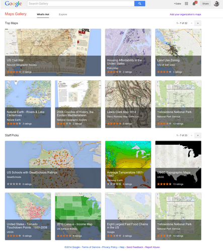
Introducing Google Maps Gallery: Unlocking the Worldā€™s Maps by Jordan Breckenridge.

From the post:

Governments, nonprofits and businesses have some of the most valuable mapping data in the world, but itā€™s often locked away and not accessible to the public. With the goal of making this information more readily available to the world, today weā€™re launching Google Maps Gallery, a new way for organizations to share and publish their maps online via Google Maps Engine.

Google Map Gallery

Maps Gallery works like an interactive, digital atlas where anyone can search for and find rich, compelling maps. Maps included in the Gallery can be viewed in Google Earth and are discoverable through major search engines, making it seamless for citizens and stakeholders to access diverse mapping data, such as locations of municipal construction projects, historic city plans, population statistics, deforestation changes and up-to-date emergency evacuation routes. Organizations using Maps Gallery can communicate critical information, build awareness and inform the public at-large.

A great site as you would expect from Google.

I happened upon US Schools with GreatSchools Ratings. Created by GreatSchools.org.

There has been a rash of 1950’s style legislative efforts this year in the United States, seeking to permit business to discriminate on the basis of their religious beliefs. Recalling the days when stores sported “We Reserve the Right to Refuse Service to Anyone” signs.

I remember those signs and how they were used.

With that in mind, scroll around the GreatSchools Rating may and tell me what you think the demographics of non-rated schools look like?

That’s what I thought too.

February 22, 2014

80 Maps that “Explain” the World

Filed under: Environment,Government,Mapping,Maps,Politics — Patrick Durusau @ 3:06 pm

Max Fisher, writing for the Washington Post, has two posts on maps that “explain” the world. Truly remarkable posts.

40 maps that explain the world, 12 August 2014.

From the August post:

Maps can be a remarkably powerful tool for understanding the world and how it works, but they show only what you ask them to. So when we saw a post sweeping the Web titled “40 maps they didn’t teach you in school,” one of which happens to be a WorldViews original, I thought we might be able to contribute our own collection. Some of these are pretty nerdy, but I think they’re no less fascinating and easily understandable. A majority are original to this blog (see our full maps coverage here)*, with others from a variety of sources. I’ve included a link for further reading on close to every one.

* I repaired the link to “our full maps coverage here.” It is broken in the original post.

40 more maps that explain the world, 13 January 2014.

From the January post:

Maps seemed to be everywhere in 2013, a trend I like to think we encouraged along with August’s 40 maps that explain the world. Maps can be a remarkably powerful tool for understanding the world and how it works, but they show only what you ask them to. You might consider this, then, a collection of maps meant to inspire your inner map nerd. I’ve searched far and wide for maps that can reveal and surprise and inform in ways that the daily headlines might not, with a careful eye for sourcing and detail. I’ve included a link for more information on just about every one. Enjoy.

Bear in mind the usual caveats about the underlying data, points of view represented and unrepresented but this is a remarkable collection of maps.

Highly recommended!

BTW, don’t be confused by the Part two: 40 more maps that explain the world link in the original article. The January 2014 article doesn’t say Part two but after comparing the links, I am satisfied that is what was intended, although it is confusing at first glance.

February 20, 2014

The case for big cities, in 1 map

Filed under: Maps,Politics,Skepticism — Patrick Durusau @ 9:52 pm

The case for big cities, in 1 map by Chris Cillizza.

From the post:

New Yorkers who don’t live in New York City hate the Big Apple. Missourians outside of St. Louis and Kansas City are skeptical about the people (and politicians) who come from the two biggest cities in the state. Politicians from the Chicago area (and inner suburbs) often meet skepticism when campaigning in downstate Illinois. You get the idea. People who don’t live in the big cities tend to resent those who do.

Fair enough. Growing up in semi-rural southeastern Connecticut, I always hated Hartford. (Not really.) But, this map built by Reddit user Alexandr Trubetskoy shows — in stark terms — how much of the country’s economic activity (as measured by the gross domestic product) is focused in a remarkably small number of major cities.

A great map, at least if you live in the greater metro area of any of these cities.

I could 21 red spots, although on the East coast they are so close together some were fused together.

It is also an illustration that a map doesn’t always tell the full story.

Say 21 or more cities produce have of the GDP.

Care to guess how many states are responsible for 50% of the agricultural production in the United States?

Answer.

February 18, 2014

Legendary Lands:…

Filed under: Mapping,Maps,Metaphors,Symbol — Patrick Durusau @ 3:38 pm

Legendary Lands: Umberto Eco on the Greatest Maps of Imaginary Places and Why They Appeal to Us by Maria Popova.

From the review:

“Often the object of a desire, when desire is transformed into hope, becomes more real than reality itself.”

Celebrated Italian novelist, philosopher, essayist, literary critic, and list-lover Umberto Eco has had a long fascination with the symbolic and the metaphorical, extending all the way back to his vintage semiotic children’s books. Half a century later, he revisits the mesmerism of the metaphorical and the symbolic in The Book of Legendary Lands (public library) — an illustrated voyage into history’s greatest imaginary places, with all their fanciful inhabitants and odd customs, on scales as large as the mythic continent Atlantis and as small as the fictional location of Sherlock Holmes’s apartment. A dynamic tour guide for the human imagination, Eco sets out to illuminate the central mystery of why such utopias and dystopias appeal to us so powerfully and enduringly, what they reveal about our relationship with reality, and how they bespeak the quintessential human yearning to make sense of the world and find our place in it — after all, maps have always been one of our greatest sensemaking mechanisms for life, which we’ve applied to everything from the cosmos to time to emotional memory.

Eco writes in the introduction:

Legendary lands and places are of various kinds and have only one characteristic in common: whether they depend on ancient legends whose origins are lost in the mists of time or whether they are an effect of a modern invention, they have created flows of belief.

The reality of these illusions is the subject of this book.

Definitely going to the top of my wish list!

I suspect that like Gladwell‘s Tipping Point, Blink, Flop (forthcoming?), it is one thing to see a successful utopia in retrospect but quite another to intentionally create one.

Tolkien did with the Hobbit but for all of its power, it has never, to my knowledge, influenced a United States Congress appropriations bill.

Perhaps it is more accurate to say that successful utopias are possible but it is difficult to calculate their success and/or impact.

In any event, I am looking forward to spending serious time with The Book of Legendary Lands.

PS: For the library students among us, the subject classifications given by WorldCat:

  • Geographical myths in literature.
  • Geographical myths in art — Pictorial works.
  • Geographical myths.
  • Art and literature.
  • Geographical myths in art.

I haven’t gotten a copy of the book, yet, but that looks really impoverished to me. If I am looking for materials on reality, belief, social consensus, social fabric, legends, etc. I am going to miss this book in your library?

Suggestions?

February 17, 2014

Linux Kernel Map

Filed under: Interface Research/Design,Linux OS,Maps — Patrick Durusau @ 3:41 pm

Linux Kernel Map by Antony Peel.

A very good map of the Linux Kernel.

I haven’t tried to reproduce it here because the size reduction would make it useless.

In sufficient resolution, this would make a nice interface to usenet Linux postings.

I may have to find a print shop that can convert this into a folding map version.

Enjoy!

ViziCities

Filed under: Mapping,Maps,Visualization,WebGL — Patrick Durusau @ 11:43 am

ViziCities: Bringing cities to life using the power of open data and the Web by Robin Hawkes and Peter Smart.

From the webpage:

ViziCities is a 3D city and data visualisation platform, powered by WebGL. Its purpose is to change the way you look at cities and the data contained within them. It is the brainchild of Robin Hawkes and Peter Smart ā€” get in touch if you’d like to discuss the project with them in more detail.

Demonstration

Here’s a demo of ViziCities so you can have a play without having to build it for yourself. Cool, ey?

What does it do?

ViziCities aims to combine data visualisation with a 3D representation of a city to provide a better understanding what’s going on. It’s a powerful new way of looking at and understanding urban areas.

Aside from seeing a city in 3D, here are some of the others things you’ll have the power to do:

This is wickedly cool! (Even though in pre-alpha state.)

Governments, industry, etc. have had these capabilities for quite some time.

Now, you too can do line of sight, routing, and integration of other data onto a representation of a cityscape.

Could be quite important in Bangkok, Caracas, Kiev, and other locations with non-responsive governments.

Used carefully, information can become an equalizer.

Other resources:

ViziCities website

ViziCities announcement

Videos of ViziCities experiments

“ViziCities” as a search term shows a little over 1,500 “hits” today. Expect that to expand rapidly.

February 12, 2014

…Open GIS Mapping Data To The Public

Filed under: Geographic Data,GIS,Maps,Open Data — Patrick Durusau @ 9:13 pm

Esri Allows Federal Agencies To Open GIS Mapping Data To The Public by Alexander Howard.

From the post:

A debate in the technology world that’s been simmering for years, about whether mapping vendor Esri will allow public geographic information systems (GIS) to access government customers’ data, finally has an answer: The mapping software giant will take an unprecedented step, enabling thousands of government customers around the U.S. to make their data on the ArcGIS platform open to the public with a click of a mouse.

“Everyone starting to deploy ArcGIS can now deploy an open data site,” Andrew Turner, chief technology officer of Esri’s Research and Development Center in D.C., said in an interview. “We’re in a unique position here. Users can just turn it on the day it becomes public.”

Government agencies can use the new feature to turn geospatial information systems data in Esri’s format into migratable, discoverable, and accessible open formats, including CSVs, KML and GeoJSON. Esri will demonstrate the ArcGIS feature in ArcGIS at the Federal Users Conference in Washington, D.C. According to Turner, the new feature will go live in March 2014.

I’m not convinced that GIS data alone is going to make government more transparent but it is a giant step in the right direction.

To have even partial transparency in government, not only would you need GIS data but to have that correlated with property sales and purchases going back decades, along with tracing the legal ownership of property past shell corporations and holding companies, to say nothing of the social, political and professional relationships of those who benefited from various decisions. For a start.

Still, the public may be a better starting place to demand transparency with this type of data.

February 11, 2014

Build your own [Secure] Google Maps…

Filed under: Geography,Google Maps,Maps — Patrick Durusau @ 2:03 pm

Build your own Google Maps (and more) with GeoServer on OpenShift by Steven Citron-Pousty.

From the post:

Greetings Shifters! Today we are going to continue in our spatial series and bring up Geoserver on OpenShift and connect it to our PostGIS database. By the end of the post you will have your own map tile server OR KML (to show on Google Earth) or remote GIS server.

The team at Geoserver has put together a nice short explanation of the geoserver and then a really detailed list. If you want commercial support, Boundless will give you a commercial release and/or support for all your corporate needs. Today though I am only going to focus on the FOSS bits.

From the GeoServer site:

GeoServer allows you to display your spatial information to the world. Implementing the Web Map Service (WMS) standard, GeoServer can create maps in a variety of output formats. OpenLayers, a free mapping library, is integrated into GeoServer, making map generation quick and easy. GeoServer is built on Geotools, an open source Java GIS toolkit.

There is much more to GeoServer than nicely styled maps, though. GeoServer also conforms to the Web Feature Service (WFS) standard, which permits the actual sharing and editing of the data that is used to generate the maps. Others can incorporate your data into their websites and applications, freeing your data and permitting greater transparency.

I added “[Secure]” to the title, assuming that you will not hand over data to the NSA about yourself or your maps. I can’t say that for everyone that offers mapping services on the WWW.

Depending on how much security you need, certainly develop on OpenShift but I would deploy on shielded and physically secure hardware. Depends on your appetite for risk.

February 7, 2014

Stunning Maps of World Topography [In 3 Lines of R]

Filed under: Maps,Topography — Patrick Durusau @ 4:06 pm

Stunning Maps of World Topography by James Chesire.

From the post:

Robin Edwards, a researcher at UCL CASA, has created these stunning topographic maps using the high resolution elevation data provided by the British Oceanographic Data Centre. The transitions from black (high areas) to blue (low areas) give the maps a slightly ethereal appearance to dramatic effect.

The maps are truly impressive.

BTW, the maps really required “3 lines of R.”

February 4, 2014

Middle Earth Maps

Filed under: Maps — Patrick Durusau @ 8:21 pm

If Middle-Earth Were Real, These Exquisite Shots Would Be Its Vacation Brochure by Peter Rubin.

From the post:

While Westeros is making a run for it, JRR Tolkienā€™s Middle-earth is still the undisputed champ of fantasy worlds beloved by cartographers. Several projects over the years have tried to map the land of Lord of the Ringsā€”some great, some unrealized. Now, however, the most ambitious among them has joined forces with a videogame middleware company to transcend simple drawings and create the most stunning shots thus far.

Peter covers the results of a collaboration between Outerra and the ME-DEM (Middle-earth Digital Elevation Model) Project. Quite stunning.

To see the demo at ME-DEM, I need to install a newer version of Windows on a VM. Windows 8.1 Pro? Need to see if it is compatible with a NVIDIA video card.

I’m as confused as you are about Peter saying “…were real…” with regard to Middle Earth.

The stories of Middle Earth have influenced more people and events than many things thought to be “more real.”

January 29, 2014

Map of Preventable Diseases

Filed under: Biomedical,Mapping,Maps — Patrick Durusau @ 5:57 pm

preventable disease

Be sure to see the interactive version of this map by the Council on Foreign Relations.

I first saw this at Chart Porn, which was linking to Map of preventable disease outbreaks shows the influence of anti-vaccination movements by Rich McCormick, which in turn pointed to the CFG map.

The dataset is downloadable from the CFG.

Vaccination being more a matter of public health, I have always wondered by anyone would be allowed an option to decline. Certainly some people will have adverse reactions, even die, and they or their families should be cared for and/or compensated. But they should not be allowed to put large numbers of others at risk.

BTW, when you look at the interactive map, locate Georgia in the United States and you will see the large green dot reports 247 cases of whooping cough for Georgia. The next green dot which slightly overlaps with it, reports 2 cases. While being more than half the size of the dot on Georgia.

Disproportionate scaling of icons reduces the accuracy of the information conveyed by the map. Unfortunate because this is an important public health issue.

January 22, 2014

Easy data maps with R: the choroplethr package

Filed under: Maps,R — Patrick Durusau @ 8:16 pm

Easy data maps with R: the choroplethr package by David Smith.

From the post:

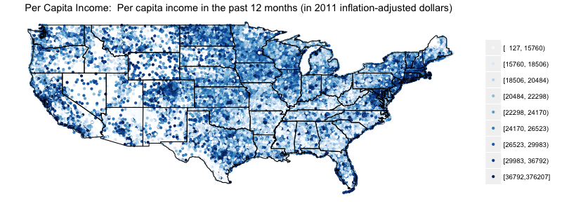
Choropleth maps are a popular way of representing spatial or geographic data, where a statistic of interest (say, income, voting results or crime rate) are color-coded by region. R includes all of the necessary tools for creating choropleth maps, but Trulia's Ari Lamstein has made the process even easier with the new choroplethr package now available on github. With couple of lines of code, you can easily convert a data frame of values coded by country, state, county or zip code into a choropleth like this:

us map

This sounds like a great tool for the General Social Survey data in Social Science Dataset Prize!

My Mind

Filed under: Maps,Mind Maps — Patrick Durusau @ 7:52 pm

My Mind by Ondřej Å½Ć”ra.

From the webpage:

My Mind is a web application for creating and managing Mind maps. It is free to use and you can fork its source code. It is distributed under the terms of the MIT license.

Be sure to check out the Mind map features version. (Check out the documentation for basic commands.)

I first saw this in Nat Torkington’s Four short links: 22 January 2014.

January 13, 2014

Euler’s Seven Bridges X Seven Minus 2

Filed under: Graphs,Maps — Patrick Durusau @ 5:34 pm

We Used New York City’s 47 Bridges To Solve An 18th Century Math Puzzle by Andy Kiersz.

From the post:

The George Washington Bridge isn’t the only way to get from one landmass to another in New York City.

NYC is built on an archipelago, and consequently has a ton of bridges. There are 47 non-rail-only bridges in New York City that appear on Wikipedia’s list of said bridges.

In this exercise, we answer: Is it possible to get around NYC by crossing every bridge just once?

This is more than just a fun math puzzle. The process for answering this question eventually led to modern-day, real-world applications that couldn’t have been imagined when a similar question was first posed nearly 300 years ago.

A highly entertaining examination of how to solve the Seven Bridges of Koenigsburg for the “47ish Bridges of NYC.”

Profusely illustrated with maps to help you follow the narration.

Good introductory material on graphs.

Would need supplementing to strengthen the cases for graphs being important. For example, “relationships between people on social networking sites” can be modeled as a graph, doesn’t really capture the imagination.

Whereas, your relationships to other people in high school, college, work and on social network sites can be represented in a graph, might provoke a more visceral reaction.

December 27, 2013

Topological maps or topographic maps?

Filed under: Maps,Topography,Topology — Patrick Durusau @ 5:06 pm

Topological maps or topographic maps? by Dave Richeson.

From the post:

While surfing the web the other day I read an article in which the author refers to a ā€œtopological map.ā€ I think it is safe to say that he meant to write ā€œtopographic map.ā€ This is an error Iā€™ve seen many times before.

A topographic map is a map of a region that shows changes in elevation, usually with contour lines indicating different fixed elevations. This is a map that you would take on a hike.

A topological map is a continuous function between two topological spacesā€”not the same thing as a topographic map at all!

I thought for sure that there was no cartographic meaning for topological map. It turns out, however, that there is.

A topological map is a map that is only concerned with relative locations of features on the map, not on exact locations. A famous example is the graph that we use to solve the Bridges of Kƶnigsberg problem.

A useful reminder.

Although I would use even topological maps of concepts, establishing relative locations, with caution. Concepts have no universal metric and therefore placement on a topological map is largely arbitrary.

December 19, 2013

Military footprint

Filed under: Data,Maps — Patrick Durusau @ 7:50 pm

Military footprint by Nathan Yau.

Nathan has found a collection of aerial photographs of military bases around the world. Along with their locations.

Excellent information for repackaging with other information about military bases and their surroundings.

WARNING: Laws concerning the collection and/or sale of information about military bases varies from one jurisdiction to another.

Just so you know and can price your services appropriately.

Have You Been Naughty Or Nice?

Filed under: Humor,Maps — Patrick Durusau @ 3:47 pm

Maps Of Seven Deadly Sins In America

From the post:

Geographers from Kansas State University have created a map of the spatial distribution of the Seven Deadly Sins across the United States. How? By mapping demographic data related to each of the Sins.

Below are screenshots of the maps in standard deviation units; red naturally is more sinful, blue less sinful.

I’m not vouching for the accuracy of these maps. šŸ˜‰

I could not find the original project, which was apparently a presentation at a geography conference in Las Vegas.

Has anyone mapped the levels in Dante’s Inferno to a U.S. map?

Based on crime and other socio-economic data?

That would be a real interesting map.

Although not the sort of thing you would find at the tourist bureau.

December 12, 2013

Google Map Overlays

Filed under: Google Maps,Mapping,Maps — Patrick Durusau @ 7:10 pm

Google Map Overlays by Dustin Smith.

From the post:

National Geographic is adding 500 of their classic maps to the Google public data archive. Basically, these are layers mapped onto Googleā€™s existing map engine. The press release contained two examples, but bizarrely, no link to the public gallery where the NattyG maps will eventually appear.

My experience with press releases and repeated press release sites is that they rarely include meaningful links.

I don’t have an explanation as to why but I have seen it happen too often to be by chance.

Some sites include off-site links but trap you within a window from that site with their ads.

December 8, 2013

Updating OpenStreetMap…

Filed under: Maps,OpenStreetMap — Patrick Durusau @ 8:38 pm

Updating OpenStreetMap with the latest US road data by Eric Fisher.

From the post:

We can now pull the most current US government index of all roads directly into OpenStreetMap for tracing. Just go to OpenStreetMap.org, click Edit, and choose the “New & Misaligned TIGER Roads” option from the layer menu. “TIGER” is the name of the US road database managed by the Census Bureau. The TIGER layer will reveal in yellow any roads that have been corrected in or added to TIGER since 2006 and that have not also been corrected in OpenStreetMap. Zoom in on any yellow road to see how TIGER now maps it, verify it against the aerial imagery, and correct it in OpenStreetMap.

This could be very useful.

For planning protest, retreat, escape routes and such. šŸ˜‰

November 14, 2013

Global Forest Change

Filed under: Climate Data,Environment,Mapping,Maps,Visualization — Patrick Durusau @ 7:46 pm

The first detailed maps of global forest change by Matt Hansen and Peter Potapov, University of Maryland; Rebecca Moore and Matt Hancher, Google.

From the post:

Most people are familiar with exploring images of the Earthā€™s surface in Google Maps and Earth, but of course thereā€™s more to satellite data than just pretty pictures. By applying algorithms to time-series data it is possible to quantify global land dynamics, such as forest extent and change. Mapping global forests over time not only enables many science applications, such as climate change and biodiversity modeling efforts, but also informs policy initiatives by providing objective data on forests that are ready for use by governments, civil society and private industry in improving forest management.

In a collaboration led by researchers at the University of Maryland, we built a new map product that quantifies global forest extent and change from 2000 to 2012. This product is the first of its kind, a global 30 meter resolution thematic map of the Earthā€™s land surface that offers a consistent characterization of forest change at a resolution that is high enough to be locally relevant as well. It captures myriad forest dynamics, including fires, tornadoes, disease and logging.

Global map of forest change: http://earthenginepartners.appspot.com/science-2013-global-forest

If you are curious to learn more, tune in next Monday, November 18 to a live-streamed, online presentation and demonstration by Matt Hansen and colleagues from UMD, Google, USGS, NASA and the Moore Foundation:

Live-stream Presentation: Mapping Global Forest Change
Live online presentation and demonstration, followed by Q&A
Monday, November 18, 2013 at 1pm EST, 10am PST
Link to live-streamed event: http://goo.gl/JbWWTk
Please submit questions here: http://goo.gl/rhxK5X

For further results and details of this study, see High-Resolution Global Maps of 21st-Century Forest Cover Change in the November 15th issue of the journal Science.

These maps make it difficult to ignore warnings about global forest change. Forests not as abstractions but living areas that recede before your eyes.

The enhancement I would like to see to these maps is the linking of the people responsible with name, photo and last known location.

Deforestation doesn’t happen because of “those folks in government,” or “people who work for timber companies,” or “economic forces,” although all those categories of anonymous groups are used to avoid moral responsibility.

No, deforestation happens because named individuals in government, business, manufacturing, farming, have made individual decisions to exploit the forests.

With enough data on the individuals who made those decisions, the rest of us could make decisions too.

Such as how to treat people guilty of committing and conspiring to commit ecocide.

October 10, 2013

Geocode the world…

Filed under: Geographic Data,Geography,GeoNames,Maps — Patrick Durusau @ 3:29 pm

Geocode the world with the new Data Science Toolkit by Pete Warden.

From the post:

Iā€™ve published a new version of the Data Science Toolkit, which includes David Blackmanā€™s awesome TwoFishes city-level geocoder. Largely based on data from the Geonames project, the biggest improvement is that the Google-style geocoder now handles millions of places around the world in hundreds of languages:

Who or what do you want to locate? šŸ˜‰

September 24, 2013

September 23, 2013

Map: Where the People Are

Filed under: Mapping,Maps — Patrick Durusau @ 6:14 pm

Map: Where the People Are by Joshua Keating.

Maps created by Radical Cartography (yes, that is how I found the site) that show the distribution of the world population by latitude and longitude. Data for the year 2000.

Would be interesting to see latitude/longitude maps like this for every ten (10) years starting in about 1800.

Did the population increase in place or expand to new places? Or were there spikes of expansion followed by spikes of increased density?

« Newer PostsOlder Posts »

Powered by WordPress